Federal Reserve Chair Kevin Warsh (Photo from federalreserve.com)
Each year since 1982, the Federal Reserve Bank of Kansas City has sponsored an economic policy symposium in Jackson Hole, Wyoming. (The site was supposedly first chosen in the hopes that Fed Chair Paul Volcker would attend because of the opportunities for fly fishing in the local area.)
In most years since 1989, the Fed chair has given the keynote address at the symposium. The address gives the Fed chair a chance to provide his or her assessment of the state of the U.S. economy and the outlook for inflation and employment—the two parts of the dual mandate Congress has given to the Fed.
Image created by ChatGPT
This year’s address by Fed Chair Kevin Warsh was highly anticipated. In his press conference following the last meeting of the Fed’s policymaking Federal Open Market Committee (FOMC), Warsh reiterated his determination to bring inflation back to the Fed’s 2 percent annual target. But he faced a number of questions from reporters as to why, with inflation running well above 2 percent, he wasn’t advocating an increase in the FOMC’s target for the federal funds rate. Warsh has stated that he wantesto steer the committee from using forward guidance to affect interest rates. Accordingly he was reluctant to state explicitly what direction Fed policy might take.
Investors in the bond market appear to have interpreted Warsh’s statements as “dovish”; that is, they believed that his reluctance to support rate increases indicated that inflation might remain above the Fed’s target for longer. As we discussed in earlier blog posts, when investors believe that inflation will be higher they require that bond yields rise enough to compensate them for the additional purchasing power. (As we discuss in Money, Banking, and the Financial System, Chapter 4, economists refer to the increase in nominal interest rates following an increase in the expected inflation rate as the Fisher effect.) The rise in the yield on the 30-year Treasury bond in the days following Warsh’s press conference likely reflected bond investors expecting somewhat higher inflation than they had previously.
In today’s address, Warsh attempted to counter the conclusion that he is reluctant to increase interest rates to slow the rate of inflation. First, though, he repeated his opposition to Fed chairs routinely engaging in forward guidance: “Oversharing policy deliberations and overcommitting to future decisions can lead markets, businesses, and households astray. And I believe when policymakers make quasi-commitments on interest rates through the cycle, we inhibit our own freedom to make the right calls when it’s time to decide.”
He again stated forcefully his commitment to the Fed’s inflation target: “The Fed’s price-stability objective of 2 percent, as measured by the personal consumption expenditures (PCE) price index, is a firm, fixed target. … It is the Fed’s job to deliver stable prices.” He noted that all measures of inflation “tell a similar story: Inflation is running above our 2 percent target. So the Fed’s predominant focus right now should be on prices.”
Warsh also observed that “progress over the past two years [toward the 2 percent target] has been modest.” He concluded that: “There is one signal nobody can miss: The responsibility for 65 months of sustained, elevated inflation sits squarely with the central bank. And that is where it belongs.”
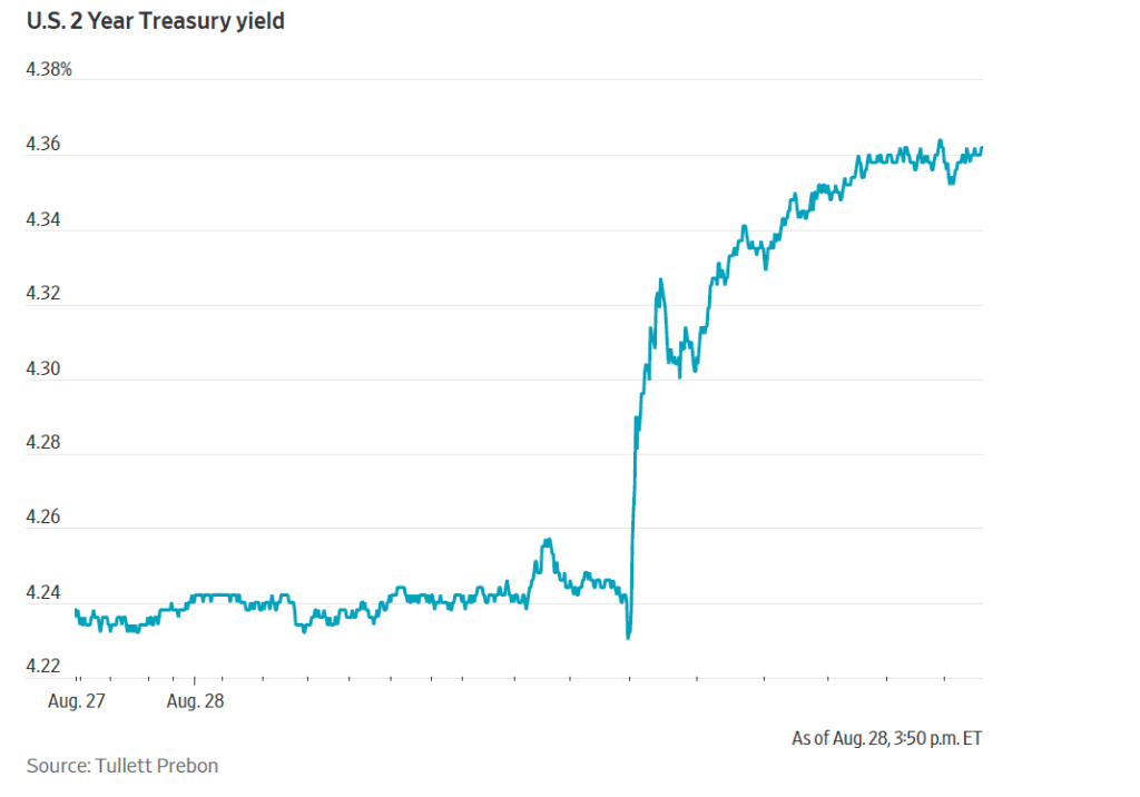
The following figure from the Wall Street Journal reflects the bond market’s immediate reaction when the text of Warsh’s address was released.
The two-year Treasury note is directly affected by investors’ expectations of the future path of the federal funds rate. (We discuss this link in Money, Banking, and the Financial System, Chapter 5.) Investors interpreted Warsh’s address as indicating he would take a more “hawkish” view of the need to raise the FOMC’s target for the federal funds rate than he had appeared to take in his earlier press conference.
Investors in the federal funds future market also quickly revised their expectations of the likelihood of the FOMC raising its target for the federal funds rate. Trading in the futures marker resulted in the probability increasing from 35.4 percent yesterday to 57.5 percent this afternoon of the committee raising its target range for the federal funds by 0.25 percentage points (25 basis points) at its next meeting on September 15–16. The probability that after the meeting on October 27–28, the committee will have raised its target range by at least 25 basis points increased from 52.6 percent yesterday to 70.7 percent this afternoon.
The Bureau of Economic Analysis (BEA) released two reports this morning (August 26): “GDP (Second Estimate) and Corporate Profits, 2nd Quarter 2026” and “Personal Income and Outlays, July 2026.” The BEA’s second estimate is that real GDP grew at annual rate of 1.5 percent in second quarter of 2026, which is unchanged from the BEA’s initial estimate released last month and is equal to the forecast of economists surveyed by the Wall Street Journal.
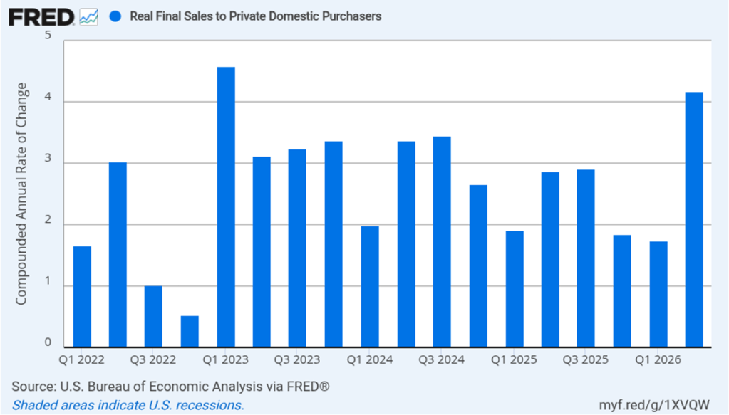
As we’ve discussed in previous blog posts, to better gauge the state of the economy, Federal Reserve policymakers often prefer to strip out the effects of imports, inventory investment, and government expenditures—which can be volatile—by looking at real final sales to private domestic purchasers, which includes only spending by U.S. households and firms on domestic production. As the following figure shows, real final sales to domestic purchasers increased at an annual rate of 4.2 percent in the second quarter, up from 3.9 percent in last month’s initial estimate. The growth rate in real final sales to domestic purchasers was more than twice the rate of growth of real GDP, as well as far above the U.S. economy’s expected long-run annual real growth rate of 1.8 percent. So growth in real final sales to domestic purchasers indicates that the U.S. economy is expanding rapidly, as opposed to the much weaker growth shown by real GDP data. Typically, growth in real final sales to domestic purchasers is steadier than growth in real GDP and is likely a better indicator of the underlying growth rate in the economy.
The BEA’s “Personal Income and Outlays” report this morning included monthly data on the personal consumption expenditures (PCE) price index. The Fed relies on annual changes in the PCE price index to evaluate whether it’s meeting its 2 percent annual inflation target. As we noted in a recent blog post, Fed Chair Kevin Warsh indicated in his press conference following the July meeting of the Federal Open Market Committee (FOMC) that the committee intended to continue using the PCE price index as its gauge of inflation, although that decision would be revisited early next year. Warsh may have intended this statement to reassure financial markets that there would be continuity in the Fed’s measure of inflation. However, some investors appear to have interpreted Warsh’s statement that the decision would be revisited next year as an indication that he favored moving to a measure that would show lower rates of inflation than those shown by the PCE.
In other words, some investors believe that in the future the FOMC might be willing to accept higher levels of PCE inflation. Perhaps in response to this interpretation, the yield on the 30-year U.S. Treasury bond increased in the days following Warsh’s press conference. Higher expected inflation can lead to lower bond prices and higher bond yields. (We discuss this point in Money, Banking, and the Financial System, Chapter 5, which is now available in a new edition.) Warsh is scheduled to speak on Friday at the Kansas City Fed’s annual Jackson Hole Economic Policy Symposium. His speech will cover his views on the current state of the economy and may give clues as to the future monetary policy actions he may support.
Image created by ChatGPT
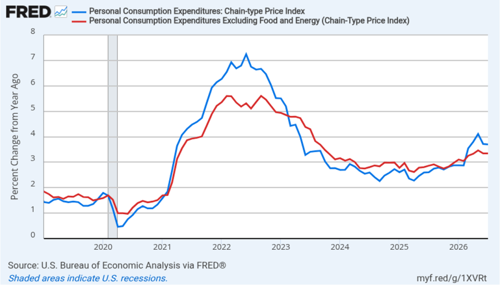
The following figure shows headline PCE inflation (the blue line) and core PCE inflation (the red line)—which excludes energy and food prices—for the period since January 2019, with inflation measured as the percentage change in the PCE from the same month in the previous year. In July, headline PCE inflation was 3.7 percent, unchanged from June. Core PCE inflation in July was 3.3 percent, also unchanged from June. Headline PCE inflation was slightly higher than forecast by economists surveyed by the Wall Street Journal, while core PCE was equal to the forecast. Both headline PCE inflation and core PCE inflation remain well above the Fed’s 2 percent annual inflation target.
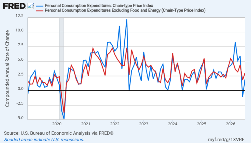
The following figure shows headline PCE inflation and core PCE inflation calculated by compounding the current month’s rate over an entire year. (Often referred to as 1-month inflation.) Measured this way, headline PCE inflation increased from –1.3 in June to 1.9 percent in July. Core PCE inflation increased from 1.8 percent in June to 3.0 percent in July. Headline inflation was very low in June—prices actually fell during the month—largely because of falling gasoline prices. Today’s data show here was a noticeable acceleration in inflation during July. Of course, it’s important not to overinterpret the data from a single month.
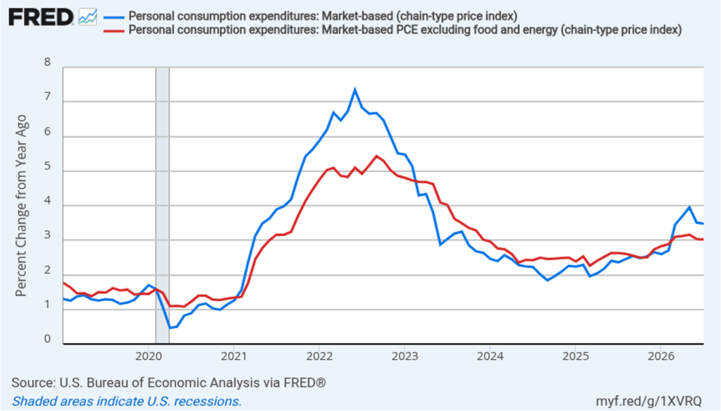
Fed policymakers believe that inflation in non-market services can skew PCE inflation. Non-market services are services whose prices the BEA imputes rather than measures directly. For instance, the BEA assumes that prices of financial services—such as brokerage fees—vary with the prices of financial assets. So that if stock prices rise, the prices of financial services included in the PCE price index also rise. Former Fed Chair Jerome Powell has argued that these imputed prices “don’t really tell us much about … tightness in the economy. They don’t really reflect that.” The following figure shows 12-month headline inflation (the blue line) and 12-month core inflation (the red line) for market-based PCE. (The BEA explains the market-based PCE measure here.)
Headline market-based PCE inflation was 3.5 percent in July, unchanged from June. Core market-based PCE inflation was 3.0 percent in July, also unchanged from June. So, both market-based measures show inflation in July remaining well above the Fed’s 2 percent target.
Fed Chair Kevin Warsh argued in testimony at his confirmation hearing before the Senate that the Fed should stop relying on headline PCE inflation: “The measures [of inflation] I prefer are looking at things that are called trimmed averages. We take out all of the tail-risks, all of the one-off items, and we ask ourselves whether the generalized change in prices is having second-order effects on the economy.”
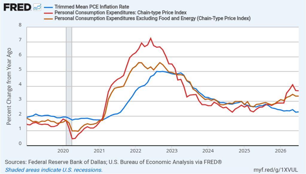
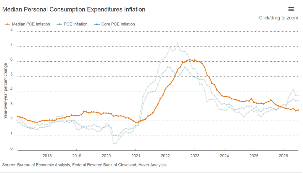
Trimmed-mean PCE inflationdrops the 31 percent of goods and services with the highest inflation rates and the 24 percent of goods and services with the lowest inflation rates. A closely related measure, median PCE inflation, is calculated by listing the inflation rate in each individual good or service included in the PCE and identifying the inflation rate of the good or service that is in the middle of the list—that is, the inflation rate in the price of the good or service that has an equal number of higher and lower inflation rates.
The following figure shows headline PCE inflation the (red line), core PCE inflation (the brown line) and trimmed-mean PCE inflation (the blue line). Trimmed-mean PCE inflation in July was 2.3 percent, well below both headline and core PCE inflation.
The following figure from the web site of the Federal Reserve Bank of Cleveland shows headline PCE inflation (the green line), core PCE inflation (the blue line), and median PCE inflation (the brown line). In July, median PCE inflation was 2.7 percent, which was unchanged from June. So Warsh has a point that these two measures of inflation, which are less affected by particularly high or low rates of inflation in some goods and services, indicate that inflation has been running below the Fed’s currently preferred measure. But these measures also show inflation still running well above the Fed’s 2 percent annual inflation target.
Today’s macro data releases appear to have had little effect on the views of investors who buy and sell federal funds futures contracts. These investors believe that the FOMC will likely not raise its target for the federal funds rate at its meeting on September 15–16 as some analysts have speculated. The probability that the committee will leave its target range unchanged at 3.50 percent to 3.75 percent declined only slightly from 60.4 percent yesterday to 59.9 percent this afternoon. Investors assign a probability of 54.7 percent to the FOMC raising its target range by o.25 percentage points (25 basis points) at its meeting on October 27–28.
When did the recession that began at the end of 2007 turn into the Global Financial Crisis? Most economists believe a key turning occurred on Monday, September 15, 2008, when the Lehman Brothers investment bank declared bankruptcy. By the time Lehman failed, the U.S. economy was already in a recession caused by the effects on financial markets of the sharp decline in housing prices. Many financial firms had invested in mortgage-backed securities, which are bundles of mortgage loans that function like a bond. Just as an investor can buy a bond issued by Amazon, an investor can buy a mortgage-backed security issued by a government agency of a financial firm.
The decline in housing prices, increased the number of people who defaulted on their mortgages. Rising mortgage defaults sharply reduced the value of mortgage-back securities, causing some financial firms that had invested in these securities to become insolvent. When Lehman declared bankruptcy and defaulted on its debts, other firms found it difficult to borrow money. The resulting credit crunch, led to falling production and employment.
Image generated by ChatGPT
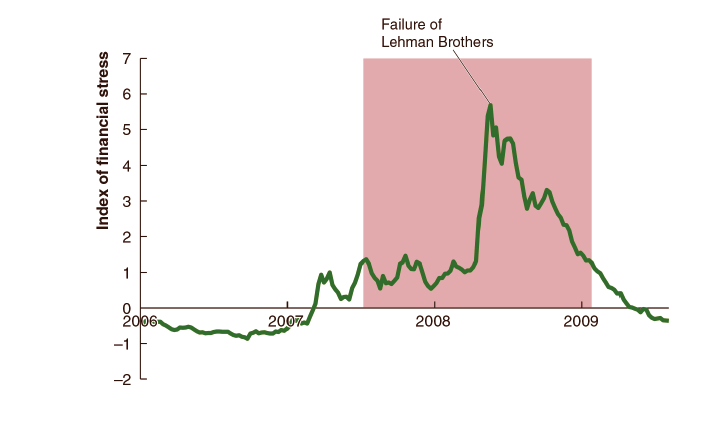
(Some of the following is a modified version of the discussion in Money, Banking, and the Financial System, Chapter 12. The new fifth edition of the text is now available.) The effect of Lehman’s failure can be seen in movements in an index of financial stress compiled by the Federal Reserve Bank of St. Louis. The index is an average of 18 financial variables, including spreads between interest rates on corporate bonds and Treasury securities, that tend to increase during periods when investors engage in a flight to safety and households and firms face difficulty securing credit. The following figure shows movements in the index from immediately before to immediately after the recession of 2007–2009. The average value of the index is zero, with periods of greater-than-normal financial stress having positive values and periods of lower-than-normal financial stress having negative values.
The figure shows that following the failure of Lehman, financial stress jumped dramatically. As households and firms had difficulty obtaining credit and as uncertainty about the economy markedly increased, spending declined sharply. The spending declines resulted in a contraction in production and employment. From the beginning of the recession in December 2007 to the failure of Lehman, total employment in the United States declined by 1.6 million. From the failure of Lehman through the end of 2009, employment declined by an additional 7 million. This employment decline was by far the largest in such a brief period in U.S. history to that time. (Although during the Covid pandemic employment declined by 20 million in April 2020, it began increasing the following month.)
Policymakers and economists have offered two main explanations for why the Fed did not take steps that might have kept Lehman out of bankruptcy:
1. Criticism by members of Congress over the actions the Fed had taken in March 2008 to save the Bear Stearns investment bank coupled with fear of increasing moral hazard in the financial system led the Fed to allow Lehman to declare bankruptcy.
2. Provisions of the Federal Reserve Act tied the Fed’s hands and made it impossible for the Fed to legally save Lehman.
If correct, explanation 1 means that the Fed could have saved Lehman but chose not to, while explanation 2 means that, legally, the Fed could not have saved Lehman even if it had wanted to do so.
Ben Bernanke served as Fed chair during the financial crisis. In his memoirs, published in 2015, Bernanke argued that because Lehman was insolvent, the Federal Reserve Act barred the Fed from saving it:
“It became evident that Lehman was deeply insolvent. . . . Lehman’s insolvency made it impossible to save with Fed lending alone. . . . We were required [by the Federal Reserve Act] to lend against adequate collateral. The Fed had no authority to inject capital or (what is more or less the same thing) make a loan that we were not reasonably sure could be fully repaid.”
But was Lehman Brothers actually insolvent? After Lehman’s bankruptcy, some of its creditors were paid back less than what the firm owed them, which seems to indicate that the value of the firm’s assets was less than the value of its liabilities—the definition of insolvency. But economist Laurence Ball of Johns Hopkins University has disputed Bernanke’s account. Ball argues that there is no evidence that Fed policymakers were concerned about Lehman’s solvency at the time they were considering whether to make loans to the bank. Ball believes that Lehman did have sufficient collateral to secure a loan that would have met its short-run liquidity needs. He also notes that the Federal Reserve Act, as it was in 2008 (before it was subsequently amended by the Dodd–Frank Act in 2010), did not keep the Fed from making loans to insolvent firms, provided that the loan being made was secured by adequate collateral. In other words, the fact that Lehman proved to be insolvent once it declared bankruptcy did not necessarily preclude the Fed from making loans large enough to have kept the bank from failing.
Image of then Fed Chair Ben Bernanke and then Secretary of the Treasury Henry Paulson generated by ChatGPT.
Ball argues that explanation 1 above is the reason that the Fed allowed Lehman to fail. In particular, he believes that Treasury Secretary Henry Paulson was heavily involved in the decision and that he was sensitive to the political criticism he had received following the actions the Treasury and Fed had taken to save Bear Stearns the previous spring.
In a recent book, Tyler Goodspeed, chief economist of ExxonMobile and chair of the Council of Economic Advisers during the first Trump administration, has discussed a sometimes overlooked aspect of Lehman’s failure. Goodspeed notes that as Lehman neared bankruptcy, Barclays, a British bank, indicated that it was interested in buying Lehman. According to Goodspeed on Sunday September 14:
“Keen to ensure that Lehman could open for business Monday morning, the U.S. Treasury and Federal Reserve insisted that any buyer guarantees Lehman’s trades. But [United Kingdom] securities regulations required that unless the UK Financial Services Authority (FSA) issued a waiver, such a guarantee would require a vote of Barclays shareholders.”
Given that Lehman was prepared to declare bankruptcy the next day, there wasn’t sufficient time to conduct a vote of Barclays shareholders. The head of the FSA told U.S. financial regulators that he was unwilling to grant a waiver that would have allowed Barclays purchase of Lehman to go through. Treasury Secretary Paulson appealed directly to U.K. Chancellor of the Exchequer Alistair Darling to approve the needed waiver. (The chancellor of the exchequer is the equivalent in the U.K. government of the U.S. secretary of the treasury.) Darling was unwilling to do so however, because he feared that buying Lehman might weaken Barclays financial condition, potentially calling the bank’s solvency into question.
Image created by ChatGPT of the headquarters of the U.K. Treasury
In his memoir, Bernanke gives a similar account:
“{Treasury Secretary] Hank [Paulson] reported that he appealed to his British counterpart, Alistair Darling, chancellor of the exchequer, for a waiver of the shareholder approval requirement. Darling refused to cooperate on the grounds that suspending the rule would be ‘overriding the rights of millions of shareholders.'”
The failure of the British financial regulators to allow Barclays to purchase Lehman made it inevitable that Lehman would declare bankruptcy the following morning. Lehman’s failure led to turmoil in both the U.S. and U.K. financial systems, helping to transform the recession that had already begun in the United States the pervious December into the Global Financial Crisis.
However, the role played by British regulators in Lehman’s bankruptcy is not entirely clear-cut. An article in the Financial Times published late on the afternoon of Sunday, September 14, discussed the attempts to save Lehman from bankruptcy. The article indicates that executives at Barclays saw U.S. financial regulators, not U.K. financial regulators, as responsible for stopping their purchase of Barclays.
According to the article, U.S. regulators were unwilling to guarantee Lehman’s transactions for a period long enough for Barclays to complete the purchase. Barclays would have had to guarantee Lehman’s transactions without funding from U.S. regulators. According to a statement issued by Barclays,“The proposed transaction required a guarantee for the trading operations of Lehman Brothers that was potentially open-ended, and we were not willing to provide that guarantee.”
After nearly 100 years, economists still debate whether the Fed could have acted to avoid the panic panics of the 1930s that significantly worsened the Great Depression. The debate over the failure of Lehman Brothers in 2008 is likely to also continue for years to come.
Join authors Glenn Hubbard & Tony O’Brien as they discuss rising long-term bond yields and their economic implications. Topics discussed include the federal government’s large budget deficit, concerns about fiscal credibility, and the Federal Reserve’s inability to meet its inflation target. The discussion also touched on the connection between federal budget deficits and trade imbalances, highlighting how large deficits require the U.S. to borrow from foreign investors.
Image created by ChatGPT, as are the other images in this post.
Technological breakthroughs are often embodied in machinery, equipment, or, as in the case of artificial intelligence (AI), software. For example, the Industrial Revolution of the late 1700s, which involved mass production of low-priced cotton textiles, was made possible by the development in England of large cotton spinning machines that were often powered by steam engines.
Other technological breakthroughs are disembodied because they involve reorganizing production rather than employing new machinery or software. For example, the just-in-time (JIT) system that Toyota developed beginning in the 1940s, lowered the costs of assembling automobiles by, among other things, having parts arrive at a factory just when needed.
Across U.S. history, there have been a number of technological revolutions that required massive capital investments. For instance, the transportation revolution of the early 1800s that significantly reduced the costs of shipping freight, relied on substantial investments in canals. Later in the 1800s, transportation costs were reduced further as firms invested in the largest network of railroads in the world. Electrification of businesses and private homes in the late 1800s and early 1900s required the building of power plants and transmission lines. In the late 1990s, many firms competed to build networks of fiber-optic cable to carry the rapid increase in digital traffic resulting from the development of the internet.
Each of these technological revolutions succeeded in providing consumers with new or lower-cost goods or services. But building the physical capital that embodied these technologies could result in substantial losses or bankruptcy. For example, in the 1830s, several states, including Pennsylvania, Illinois, and Michigan, defaulted on the bonds they had issued to finance canal instruction.
Similarly, in the 1890s, some of the largest private railroad companies in the United States, including the Union Pacific, the Northern Pacific, and the Atchison, Topeka & Santa Fe, went bankrupt. In the early 2000, investors realized that internet commerce wouldn’t expand as rapidly as they had expected. As a result, several prominent internet firms, such as Pets.com and eToys.com, saw their stock prices collapse in what was called the dot com crash, and eventually declared bankruptcy. Several firms that had invested in building large fiber-optic networks, including Worldcom and Global Crossing, also failed.
Why did the companies making large capital investments in new technologies sometimes fail even though the technologies themselves proved to be revolutionary? The answer in part is that forecasting accurately the demand for a new product can be difficult. For example, ultimately the level of internet traffic was more than great enough to justify the investment in fiber-optic networks, but the increase came too late for some companies to avoid bankruptcy. Competition among firms to take advantage of a new technology can lead to overbuilding, as when railroad companies built more miles of track than were needed to meet the demand to transport freight and passengers.
A number of economists and investment analysts have noted that the very heavy investment in data centers used to power AI models resembles the large capital investments firms made during earlier technological revolutions. As the following figure shows, beginning in early 2023, shortly after the public release of ChatGPT, the first widely used AI chatbot, investment in information processing equipment and software as a percentage of all nonresidential fixed investment has increased dramatically.
Do the firms building data centers run the risk of overestimating demand for AI and overbuilding data centers? More generally, how does the build-out of AI data centers compare with the earlier build-outs of railroads and fiber-optic networks? Who better to answer this question than ChatGPT!
The following (very long!) answer was ChatGPT’s response to the following prompt: “In what ways is the current build-out of AI data centers similar to the build-out of the railroad network in the United States in the late nineteenth century and the build-out of the fiber-optic network in the United States in the 1990s and in what ways is it different?” (A quick summary is given in the brief “Bottom Line” section at the very end.)
AI Data Centers, Railroads, and Fiber-Optic Networks
The best way to frame the comparison is this:
The railroad analogy is most useful for understanding the physical scale, bottlenecks, public subsidies, and geographic consequences of the AI buildout. The fiber-optic analogy is most useful for understanding its financial risks, uncertain demand, rapid technological improvement, and potential for overcapacity.
AI data centers nevertheless differ importantly from both. They are not simply links in a transportation or communications network. They are more like factories that produce computing services, and the extremely expensive machinery inside them becomes obsolete much faster than either railroad rights-of-way or buried fiber.
The scale is already extraordinary. The International Energy Agency estimates that the largest technology companies spent more than $400 billion on capital investment in 2025 and expects that figure to rise about 75 percent in 2026. U.S. data centers consumed approximately 176 terawatt-hours of electricity in 2023—4.4 percent of U.S. electricity use—and Berkeley Lab projects consumption of 325–580 terawatt-hours by 2028.
Ways the three buildouts are similar
1. All three are investments in enabling infrastructure
Railroads did much more than generate revenue from tickets and freight charges. They brought previously isolated regions into a national market, encouraged settlement, changed the location of factories and cities, and made complementary investments in farms, mines, warehouses, and factories more valuable. The United States added roughly 170,000 miles of railroad track between 1871 and 1900.
Fiber-optic builders similarly expected abundant bandwidth to generate applications that could not yet be foreseen. More bandwidth would encourage new internet services, which would increase bandwidth demand, which would justify still more fiber.
The AI argument is nearly identical: companies are building computing capacity before all its profitable applications have been discovered. The value of the data centers will depend partly on complementary developments—better models, proprietary data, new software, organizational changes, and the willingness of companies and consumers to pay for AI services.
In all three cases, therefore, infrastructure and applications are jointly determined. Waiting until demand is plainly visible can mean waiting too long, because the infrastructure itself helps create the demand.
2. High fixed costs encourage companies to build ahead of demand
A railroad requires land, grading, bridges, tunnels, stations, track, and rolling stock before it carries its first paying customer. A fiber network requires rights-of-way, trenches, cable, switching equipment, and connections before it can sell substantial bandwidth.
AI data centers likewise require sites, grid connections, substations, transformers, cooling systems, generators, networking equipment, and large orders for advanced chips. Many of those expenditures are sunk: once a company has built a substation or a specialized data-center shell in a particular location, much of the investment cannot readily be recovered.
Companies also face a strategic incentive to build early. An individual hyperscaler may reasonably conclude that the loss from having insufficient computing capacity—lost customers, inferior models, or technological dependence on a competitor—would be greater than the loss from temporarily having too much. But when every major company reasons this way, the industry can collectively build more capacity than it needs. The IEA reports increasingly severe bottlenecks involving electricity, grid connections, chips, memory, transformers, and capital, even while acknowledging that many announced projects will never be completed.
3. Each boom rests on highly uncertain projections of future demand
Railroad promoters projected the future settlement, agricultural production, and mineral output of regions that were sometimes scarcely populated. Eventually, railroad projects began to outpace the demand for their capacity, reducing returns and contributing to widespread defaults.
Fiber builders extrapolated the extraordinary early growth of internet traffic. They assumed that new applications and fiber connections to homes and businesses would arrive rapidly enough to absorb the new long-distance capacity. Those assumptions proved too optimistic, at least in the short run.
AI companies are making similarly difficult forecasts. No one knows with much confidence:
how much computing future models will require;
how quickly businesses will reorganize around AI;
how much customers will pay for AI services;
whether most AI revenue will accrue to model developers, cloud companies, application providers, or users; or
how much improved chips and algorithms will reduce the computing required for a given task.
The uncertainty does not mean that the investment is irrational. It means that large forecast errors—in both directions—are likely.
4. Rapid technological progress can itself produce overcapacity
This was especially important during the fiber boom. In 1996, one fiber strand could carry approximately 2.5 gigabits per second. By 2000, improved multiplexing equipment could raise the capacity of the same strand to approximately 100 gigabits per second. Thus, companies were not merely laying more fiber; technology was multiplying the capacity of fiber already in the ground. Communications-equipment investment rose from about $62 billion at an annual rate in early 1996 to more than $135 billion in late 2000, before falling sharply.
AI faces an analogous risk. The cost of running a model with roughly GPT-3.5-level performance fell more than 280-fold between November 2022 and October 2024, according to Stanford’s AI Index. Hardware costs were declining by about 30 percent annually and energy efficiency was improving by approximately 40 percent annually.
Consequently, today’s estimates of the number of data centers needed in 2030 may prove too high if chips, models, and software become much more efficient. That is the closest parallel to the fiber glut.
But there is an important countervailing effect: cheaper computation can generate much more use. The IEA estimates that energy consumption per basic AI task has recently fallen by at least an order of magnitude annually, yet more demanding reasoning, video, and agentic applications are expanding so quickly that total data-center electricity consumption is still projected to roughly double between 2025 and 2030. Efficiency may therefore lower the cost of AI without lowering total demand for computing or electricity.
5. A private investment failure can leave a valuable social legacy
Many railroad investors lost money, and many railroad companies entered receivership, even though the resulting network transformed the American economy. The Panic of 1873 began in substantial part because railroad construction had outrun demand and heavily indebted companies could not refinance, but the tracks themselves did not cease to be useful.
The fiber experience was similar. Long-distance fiber companies failed, telecommunications shares collapsed, and equipment investment fell, but the underlying fiber remained available to carry later increases in internet traffic. The glut helped drive down the price of communications capacity and made subsequent internet businesses less expensive to operate. The Richmond Fed concluded that excessive investment and rational responses to genuinely revolutionary—but highly uncertain—technology were not mutually exclusive explanations.
AI could follow the same pattern. A future decline in data-center rents or computing prices might be bad for data-center owners and chip suppliers but good for application developers and users. AI could be economically transformative while a substantial fraction of current AI investment earns a disappointing return.
Important differences
1. A data center is not a network in quite the same sense
A railroad line moves something between two locations. A fiber-optic cable transmits information between locations. Their usefulness depends strongly on connections to the rest of the network.
A data center primarily produces computation. It resembles an electricity-generating plant, steel mill, or semiconductor fabrication plant more than a railroad line. It needs fiber connections to communicate with users and other data centers, but its principal economic output is processing rather than transportation.
This matters because railroad and fiber networks have especially strong physical network effects: a route becomes more valuable when it connects to additional routes. AI has powerful scale economies and ecosystem effects, but much of that advantage resides in models, data, software, cloud platforms, and proprietary chip architectures rather than merely in connecting one data-center building to another.
2. Technological progress affects the installed assets differently
With fiber, new electronics could greatly increase the capacity of fiber that was already buried. Technological improvement therefore often enhanced the usefulness of the old physical asset.
With AI, a new generation of accelerators may make the previous generation significantly less economical. The site, building, electrical connection, cooling system, and fiber links can remain useful, but the chips and servers may have to be replaced.
Meta’s 2025 annual report estimated useful lives of five to five-and-a-half years for servers and network assets, compared with 25–30 years for its buildings. Even five years may overstate the competitive life of some frontier AI equipment if newer chips provide much better performance per dollar or per watt.
This makes unused AI capacity more perishable than “dark fiber.” A buried fiber strand can sit unused for years and later be equipped with improved electronics. A warehouse full of unused accelerators loses value simply as better chips arrive.
3. AI data centers have unusually large continuing resource costs
After fiber has been installed, transmitting another unit of information has a very low marginal cost. Railroads have significant continuing costs—labor, fuel, maintenance, and rolling stock—but the track itself does not require a massive continuous energy input merely to remain economically relevant.
AI computation consumes large amounts of electricity whenever it is used and requires cooling, maintenance, networking, and periodic hardware replacement. The IEA expects global data-center electricity consumption to rise from approximately 485 terawatt-hours in 2025 to about 950 terawatt-hours in 2030. AI-related servers are expected to account for much of the increase.
Thus, an overbuilt AI center can continue generating costs even after the initial construction bill has been paid. Its economics depend not merely on filling the building but on earning enough revenue to cover electricity, maintenance, hardware depreciation, and financing.
4. Today’s leading builders are financially stronger than many railroad and fiber promoters were
The railroad boom was heavily financed through bonds. When railroad returns declined and European investors withdrew, defaults spread to banks and securities firms and helped produce the Panic of 1873.
The 1990s fiber boom included numerous new or rapidly expanding companies—Global Crossing, Level 3, Qwest and others—whose survival depended on continued access to capital and rapid growth in wholesale bandwidth demand. When demand disappointed, many failed or were reorganized.
The principal AI builders—Amazon, Microsoft, Alphabet and Meta—began with enormous revenues, cash flows, and valuable existing businesses. That makes a wave of immediate hyperscaler bankruptcies considerably less likely than nineteenth-century railroad failures or the failures of many fiber entrants.
The distinction is narrowing, however. Amazon, Alphabet, Meta and Oracle had issued about $194 billion of bonds during 2026 through July 7, 79 percent more than they issued in all of 2025. Goldman Sachs estimated that debt would finance roughly one-third of 2026 hyperscaler capital spending.
Companies are also shifting projects into leases and joint ventures. A $14 billion Meta–BlackRock data-center project in El Paso, for example, will be 80 percent owned by BlackRock-managed funds and partly financed with $12.5 billion of debt, while Meta leases the capacity.
My inference is that a downturn would be more likely to produce project cancellations, asset write-downs, lower returns, and losses for developers, lenders, lessors, utilities, and equipment suppliers than the wholesale disappearance of the leading technology companies. But increasing reliance on debt and outside capital means the financial consequences would no longer be confined to their own shareholders.
5. The return on AI investment is harder to observe
A railroad could measure freight and passenger revenue against the cost of operating a route. A wholesale fiber company could measure the bandwidth it leased and the price per unit of capacity.
Much AI infrastructure is used internally. AI may improve advertising, search, recommendation systems, programming, logistics, customer service, or the defensive position of an existing business. The return may not appear as separately identified “AI revenue.”
That gives the builders greater flexibility, but it also makes investment discipline more difficult. A company may continue spending because it fears falling behind, even when it cannot demonstrate that the next data center will earn an adequate direct return. Meta, for example, derives most of its revenue from advertising while making enormous infrastructure investments intended both to support that business and to develop new AI products.
6. The principal bottleneck is electricity rather than merely construction capital
Railroads competed for land and rights-of-way. Fiber companies needed trenches, conduits, poles, and access to local networks.
AI data centers compete above all for dependable electricity and rapid grid connections. A data center can be completed in two or three years, while new transmission, generation, and other energy infrastructure can require much longer. In some regions, expected data-center loads already exceed available capacity, causing projects to be delayed or paired with on-site natural-gas generation.
This creates a distinctive public-policy problem. Utilities may build generation and transmission for projected data-center demand, only to be left with underused assets if projects are cancelled or use less power than anticipated. Depending on rate design, households and other businesses could bear some of those costs.
7. The form of government assistance is different
Four of the five transcontinental railroads received federal land grants, giving them both rights-of-way and land they could sell to finance construction.
AI data centers have not received an equivalent nationwide transfer of federal land. Assistance has instead generally taken the form of state and local tax concessions, discounted or specially designed electricity tariffs, accelerated permitting, semiconductor subsidies, and publicly regulated grid investment. That creates similar questions about who receives the gains and who bears the costs, but through less visible mechanisms
Which historical analogy is the more useful one?
For the next several years, the fiber analogy is probably more informative. Both involve rapidly improving technology, uncertain demand for applications that do not yet fully exist, extrapolation of very high early growth rates, and the possibility that efficiency improvements will create more usable capacity than planners expected.
For the longer-run physical and economic consequences, the railroad analogy may be more informative. AI is driving investment not only in servers but also in power plants, transmission lines, substations, gas pipelines, batteries, cooling technology, chip factories, and fiber connections. Those investments may alter the economic geography of the United States and remain useful long after the first generation of AI chips has been replaced.
My tentative expectation is therefore a fiber-style shakeout within a railroad-scale infrastructure transformation:
Some announced data centers will never be completed.
Older accelerators will depreciate faster than expected.
Computing prices and profit margins may fall.
The strongest cloud and technology companies will absorb or outlast weaker developers.
Much of the underlying electrical, building, and communications infrastructure will survive and support applications that are not yet apparent.
That is an inference rather than a confident forecast. AI demand might grow quickly enough to absorb most of the planned capacity, especially as lower costs generate more intensive applications. But the historical comparisons show why “AI will transform the economy” and “too much AI capacity is currently being built” are entirely compatible propositions.
Bottom line
The three buildouts share a common economic pattern:
A genuinely revolutionary technology creates a race to build costly infrastructure ahead of uncertain demand. Competition and optimism produce duplication and sometimes overinvestment. Investors may suffer when expectations are revised, yet the surplus infrastructure can lower costs and accelerate the technology’s eventual diffusion.
The largest difference is that railroad rights-of-way and buried fiber are unusually durable, while the most expensive part of an AI data center—the computing equipment—is rapidly depreciating and must be continuously powered. The crucial question is therefore not simply whether demand for AI will grow. It almost certainly will. The question is whether monetizable demand will grow quickly enough to cover the extraordinary depreciation, electricity, and financing costs of the capacity now being installed.
Supports:Microeconomics and Economics, Chapter 14, Section 14.2.
Image created by ChatGPT
An article in the Wall Street Journal discussed why the price of chicken in supermarkets has been falling. The article notes that, “Bigger chicken breeds and flocks not being decimated by disease over the summer have led to a glut in an industry that slaughters more than nine billion birds a year.” The article quotes an industry analyst who is critical of the decisions U.S. poultry famers. According to the analyst, “The industry shot themselves in the foot this year. All you had to do was just be disciplined around production.”
According to the U.S. Department of Agriculture, more than 150,000 farms in the United States sell at least some poultry and eggs, and more than 70,000 farms specialize in selling poultry and eggs.
a. What does the analyst mean by arguing that poultry famers should have been more “disciplined”? What does the analyst expect the result would have been of farmers having been more disciplined?
b. Given the information provided, why might poultry farmers have failed to be more disciplined?
Solving the Problem Step 1: Review the chapter material. This problem is about the difficulty firms have in implicitly colluding if there are many firms in an industry, so you may want to review Chapter 14, Section 14.2, “Game Theory and Oligopoly.”
Step 2: Answer part a. by explaining what that analyst meant by poultry farmers having failed to have been “disciplined” and what he expected the result of farmers being more disciplined would have been. Given the context that U.S. poultry farmers had produced an unusually large number of chickens, the analyst is suggesting that if farmers had been more disciplined, they would have produced fewer chickens. Producing fewer chickens would have reduced the supply of chickens to the market and avoided the decline in chicken prices.
Step 3: Answer part b. by explaining why poultry farmers failed to be more disciplined. The information provided indicates that there are a large number of poultry farmers in the United States. As a result, the quantity of chickens produced by any one farmer is small relative to the total quantity of chickens produced in the market. Therefore, poultry farmers are price takers and no one poultry farmer is able to significantly affect the market price of chicken. (In Chapter 12, Section 12.1, we discuss why firms in a competitive market are price takers.) The only way for poultry farmers to have maintained chicken prices would have been to collude, either explicitly or implicitly, to produce fewer chickens. Explicit collusion is a violation of the antitrust laws and is unlikely to have been effective in any case because individual poultry farmers have a strong incentive to cheat on any agreement to restrict output. The same is true of an attempt by farmers to implicitly collude to restrict supply.
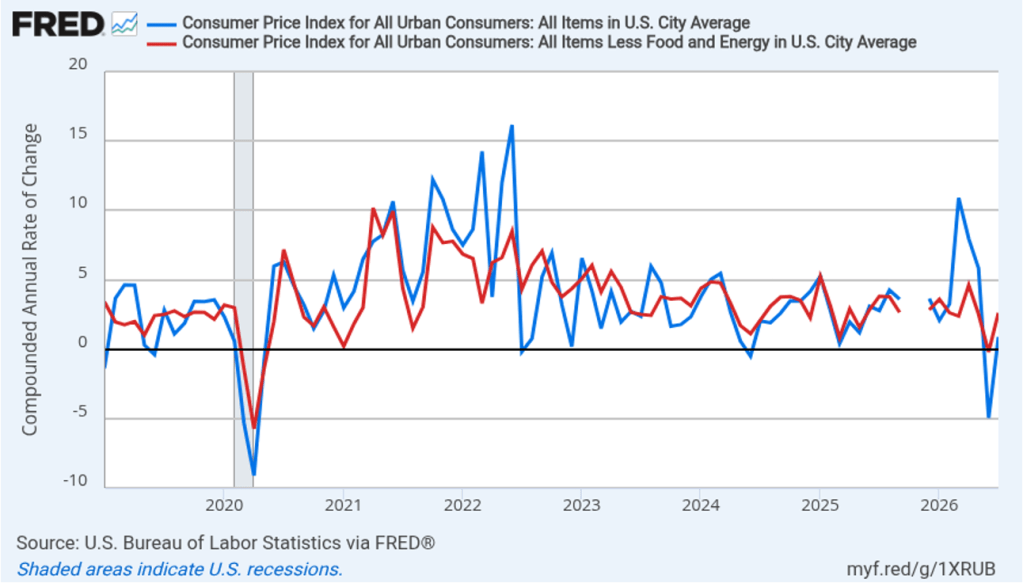
Today (August 12), the Bureau of Labor Statistics (BLS) released its report on the consumer price index (CPI) for July. Lower energy and grocery prices contributed to a slight decline in the inflation rate in July compared with June.
The following figure compares headline CPI inflation (the blue line) and core CPI inflation (the red line).
The headline inflation rate, which is measured by the percentage change in the CPI from the same month in the previous year, was 3.4 percent in July, down from 3.5 percent in June.
The core inflation rate,which excludes the prices of food and energy, was 2.5 percent in July, down from 2.6 in June.
Headline inflation and core inflation were both equal to the forecasts of economists surveyed by FactSet. (Note that because of last year’s federal government shutdown, inflation data for October 2025 are not available.)
In the following figure, we look at the 1-month inflation rate for headline and core inflation—that is the annual inflation rate calculated by compounding the current month’s rate over an entire year. Calculated as the 1-month inflation rate, both headline (the blue line) and core inflation (the red line) increased in July from the negative values in June. That is, the U.S. economy experienced deflation in June because the price level, measured by the CPI and by the CPI less food and energy prices, fell in that month.
In July, 1-month headline CPI inflation was 0.9 percent and 1-month core CPI inflation was 2.6 percent.
The following figure illustrates the role played by energy prices in contributing to the large swings in the monthly inflation rate since the conflict in Iran began at the end of February. The red line shows the 1-month inflation rate in all energy prices included in the CPI. Inflation in energy prices, which had increased at annual rate of 245 percent in March, declined at an annual rate of 16.4 percent in July. The blue line shows the 1-month inflation rate in gasoline prices, which in March had spiked to more than 900 percent measured at an annual rate, declined at an annual rate of 29.4 percent in July. A return to full-scale hostilities in the Middle East would increase oil prices, which would likely lead to an increase in the U.S. inflation rate.
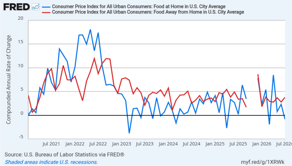
There had been a fear that the rise in energy prices that began in March would pass through to increases in food prices, which are a key concern for many consumers. The following figure shows 1-month inflation in the CPI category “food at home” (the blue bar)—primarily food purchased at grocery stores—and the category “food away from home” (the red bar)—primarily food purchased at restaurants. Inflation in grocery prices, which increased 2.3 percent in June, declined 0.9 percent in July. Inflation in food prices away from home increased from 2.8 percent in June to 3.8 percent in July. To this point, increases in energy priced do not seem to have caused a significant increase in either grocery prices or restaurant prices.
Today’s relatively good inflation report, following last week’s report showing an unexpected decline in employment, has likely reduced the chance that Federal Reserve policymakers will increase their target for the federal funds rate at the next meeting of the Federal Open Market Committee (FOMC) on September 15–16. In trading in the federal funds futures market this afternoon, investors assigned a 62.1 percent probability to the FOMC keeping its target unchanged at that meeting, which was up from a 51.6 probability yesterday. Traders assign a 53.2 percent probability to the committee increasing its target at its October 27–28 meeting, down from 62.2 percent yesterday.
It’s worth noting, however, that inflation is still running above the Federal Reserve’s 2 percent annual inflation target. In testimony before Congress in a hearing on his nomination as Fed Chair, Kevin Warsh cautioned that good news in a single month’s inflation report should be treated with caution. Warsh has intentionally moved away from discussing the circumstances under which monetary policy might change in the future—so-called forward guidance. (We discuss forward guidance in Macroeconomics, Chapter 15 (Economics, Chapter 25)). Uncertainty about actions the FOMC may take during its three remaining meeting this year remains high.
This morning (August 7), the Bureau of Labor Statistics (BLS) released its “Employment Situation” report (often called the “jobs report”) for July. The report showed a decline in employment.
The jobs report has two estimates of the change in employment during the month: one estimate from the establishment survey, often referred to as the payroll survey, and one from the household survey. As we discuss in Macroeconomics, Chapter 9, Section 9.1 (Economics, Chapter 19, Section 19.1), many economists and Federal Reserve policymakers believe that employment data from the establishment survey provide a more accurate indicator of the state of the labor market than do the household survey’s employment and unemployment data. (The groups included in the employment estimates from the two surveys are somewhat different, as we discuss in this post.)
According to the establishment survey, there was a net decrease of 23,000 nonfarm jobs during July. Economists surveyed by the Wall Street Journal had forecast an increase of 83,000 jobs. Economists surveyed by FactSet had forecast a higher net increase of 100,000 jobs. The BLS revised downward its previous estimates of employment in May and June by a combined 103,000 jobs. (The BLS notes that: “Monthly revisions result from additional reports received from businesses and government agencies since the last published estimates and from the recalculation of seasonal factors.”)
The following figure from the jobs report shows the net change in nonfarm payroll employment for each month in the last two years. The figure shows that since peaking in March with a net increase of 214,000 jobs, job growth has slowed markedly over the last four months. Over the last three months, we’ve seen only an average of 20,000 net new jobs created.
The slow pace of recent job growth is consistent with the view among some economists that slowing labor force growth has driven the break-even rate of employment growth—the rate required to keep the unemployment rate constant—down to nearly zero
Despite the decrease in employment in July, the unemployment rate, which is calculated from data in the household survey, declined to 4.1 percent from 4.2 percent in June. The decline in the unemployment rate was due to a decline in the estimated size of the labor force. Although the estimated size of the labor force can fluctuate significantly from month to month, July was the fifth month in a row during which the labor force is estimated to have declined. Despite that fact, as the following figure shows, the unemployment rate has been remarkably stable over the past year and a half, staying between 4.0 percent and 4.4 percent in each month since June 2024. The Federal Open Market Committee’s current estimate of the natural rate of unemployment—the normal rate of unemployment over the long run—is 4.2 percent. So, currently the unemployment rate is slightly below that estimate of the natural rate. (We discuss the natural rate of unemployment in Macroeconomics, Chapter 9 and Economics, Chapter 19.)
As the following figure shows, the monthly net change in jobs from the household survey moves much more erratically than does the net change in jobs from the establishment survey. As measured by the household survey, there was a net decrease of 87,000 jobs in July, roughly similar to the net decrease in employment shown in the establishment survey. Since January, the household survey has sown a net increase in jobs in only one month, with a total net decrease of 1.8 million jobs. In contrast, the establishment survey has shown a net increase of 426,000 jobs over the same period. (Note that because of last year’s shutdown of the federal government, there are no data for October or November.)
The household survey has another important labor market indicator: the employment-population ratio forprime age workers—those workers aged 25 to 54. In July, the ratio increased to 80.4 percent, partially reversing the sharp decline in June. The prime-age population ratio can show volatility from month to month but has remained above 80 percent every month since December 2022.
There have been media reports of firms, including Salesforce, Cloudflare, Coinbase, Cisco Systems, and Meta Platforms, laying off workers in information systems. The following figure shows net employment changes in the BLS employment category of “computing infrastructure providers, data processing, web hosting, and related services.” Employment in this sector has been declining during most months since the beginning of 2023. July was an exception with a net increase of 2,400 jobs.
The establishment survey also includes data on average hourly earnings (AHE). As we noted in earlier posts, many economists and policymakers believe the employment cost index (ECI) is a better measure of wage pressures in the economy than is AHE. AHE does have the important advantage of being available monthly, whereas the ECI is only available quarterly. The following figure shows the percentage change in AHE from the same month in the previous year. AHE increased 3.2 percent in July, down from 3.4 percent in June. The rate of increase in AHE has been below 4.0 percent each month since August 2025, indicating that cost pressure from wage increases has not been a significant source of price inflation during the past year.
With inflation having been above the Federal Reserve’s 2 percent annual target every month since March 2021, there has been increasing speculation that the Fed’s policymaking Federal Open Market Committee (FOMC) would increase its target for the federal funds rate at least once before the end of 2026. At the FOMC’s last meeting in late July, three members of the committee voted to increase the target, an unusual amount of dissent from a committee decision.
Does the slowdown in employment growth in recent months reduce the chance that the FOMC will increase its target range for the federal funds rate at its next meeting on September 15–16? Investors in the federal funds futures market believe that the answer is “yes.” Yesterday, investors assigned only a 45.0 percent probability to the committee keeping its target rate unchanged. This afternoon, that probability had increased to 55.9 percent. The BLS will release its estimate of inflation as measured by the consumer price index next Wednesday. That report will provide further evidence about the current state of inflation.
Supports:Macroeconomics, Chapter 14, Section 14.1, Economics, Chapter 24, Section 24.1, and Money, Banking, and the Financial System, Chapter 2, Section 2.1.
Image created by ChatGPT
A rare book dealer who often posts to YouTube made the following observation in one of his videos:
“… thousands of years ago, they had the barter system where you could literally exchange wheat for barley and barley for wheat directly. And the idea behind that was to … have a quick solution for [a] transaction, but over time they invented a monetary unit—coinage and money—and they thought that that would inject some efficiency into economic transactions. And in some ways it’s done the complete opposite. There’s a lot of inefficiency because now unfortunately I cannot go right into Bloomingdale’s and take a nice black suit off the shelf and exchange it for a Geneva Bible. I actually have to sell the Bible first … then go buy the suit. So that gives me a lot of extra work, so I’d rather go back to bartering ….”
The dealer may not have been entirely serious, but assuming that he was, is he correct that transacting using barter is more efficient than transacting using money? In your answer, be sure to define “efficient” in this context.
Solving the Problem Step 1: Review the chapter material. This problem is about the efficiency of using money to purchase goods rather than engaging in barter, so you may want to review Macroeconomics, Chapter 15, Section 15.1, “What Is Money and Why Do We Need It?”
Step 2: Answer the problem by explaining why using money is more efficient than engaging in barter. The book dealer is correct that thousands of years ago, most societies used barter rather than money. Societies transitioned from barter to money because of the inefficiencies of barter. A key inefficiency of barter is the need for a double coincidence of wants. For a barter transaction to take place, each person must want what the other person has. It’s not enough for the book dealer to want a black suit from the Bloomingdale’s department store; Bloomingdale’s must be willing to trade the suit for a copy of the Geneva Bible—which is unlikely.
To use a copy of the Geneva Bible to obtain a suit using barter, the book dealer might have to make—possibly many—additional trades until he obtains some good that Bloomingdale’s would accept in exchange for the suit. In practice, it might be difficult to find such a good and doing so would likely involve substantial search costs.
We can conclude that money has replaced barter in most transaction because it is more efficient in the sense that it allows transactions to be completed at a lower cost.
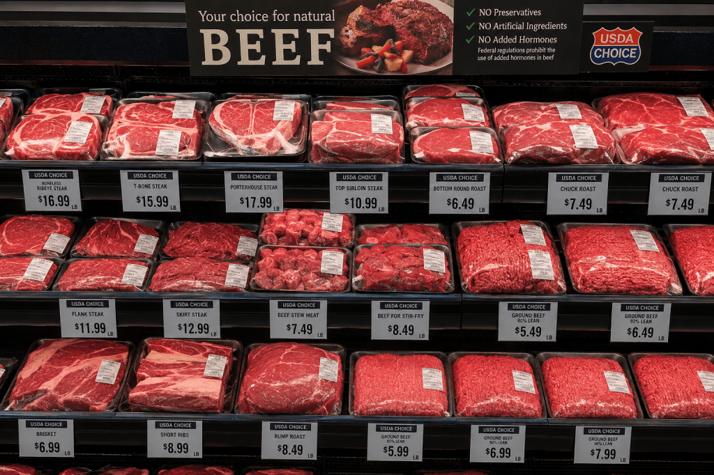
The following was the first sentence of an article yesterday on axios.com discussing the market for beef: “Beef sales are plunging, but processors continue to raise prices as a yearslong cattle shortage strains the industry.”
The sentence seems to be describing a paradox: Why would meat processors, such as Tyson, JBS, and Cargill, raise beef prices if their sales are falling? The key to resolving the apparent paradox is the reference to a “cattle shortage.” The number of cattle raised in the United States has been declining for several reasons, including severe drought in cattle-raising states—which has reduced the pasture that cattle forage on—and a reduction in beef imports from Mexico as the United States Department of Agriculture (USDA) tries to limit the spread of screwworm.
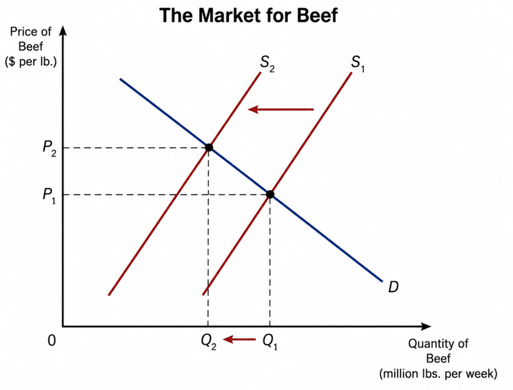
In other words, using the model of demand and supply we develop in Chapter 3 of Microeconomics, the supply curve for beef in the United States has shifted to the left. The result is shown in the following figure:
When the supply curve shifts to the left from S1 to S2, the price of beef rises from P1 to P2 and the equilibrium quantity of beef falls from Q1 to Q2. In other words, when a market experiences a decline in supply, we would expect to observe both higher prices and falling sales. So, the situation described in the first sentence of the article is not a paradox, but instead reflects the normal working of demand and supply in a market. You can explain a lot just by knowing that demand curves slope downward!
The article also observes with respect to Tyson Foods that: “In its most recent quarter, ended June 27, beef volumes declined by 15.9% from a year ago, while prices Tyson charged grocery stores, restaurants and other customers rose 12.1%.” The USDA estimates that the retail price elasticity of demand for beef is about –1. If we assume that no other factors affecting the demand for Tyson’s beef changed during this three-month period, then the price elasticity of demand for Tyson’s beef is –15.9%/12.1% = –1.3. (Note that the USDA elasticity estimates are for beef sold in supermarkets and other retail venues. So the estimates may not directly apply to sales to restaurants and “other customers.”)
We would expect that the price elasticity of demand for Tyson’s beef would be larger (in absolute value) than the price elasticity of demand for beef as a good. As we discuss in Chapter 6 of Microeconomics, if the price of one brand of a good increases, consumers can switch to another brand. In this case, if the price of Tyson’s beef increases, some consumers will switch to Cargill’s or some other firm’s beef. But if the price of beef as a good increases, consumers would have to eat a different protein to avoid the price increase.
















 HubbardOBrienEconomics.com Blog