Thoroughly revised with an up-to-date discussion of the Fed’s operating procedures and many new features, the new Fifth Edition is available now for fall course adoption. Instructors can request an examination copy here.
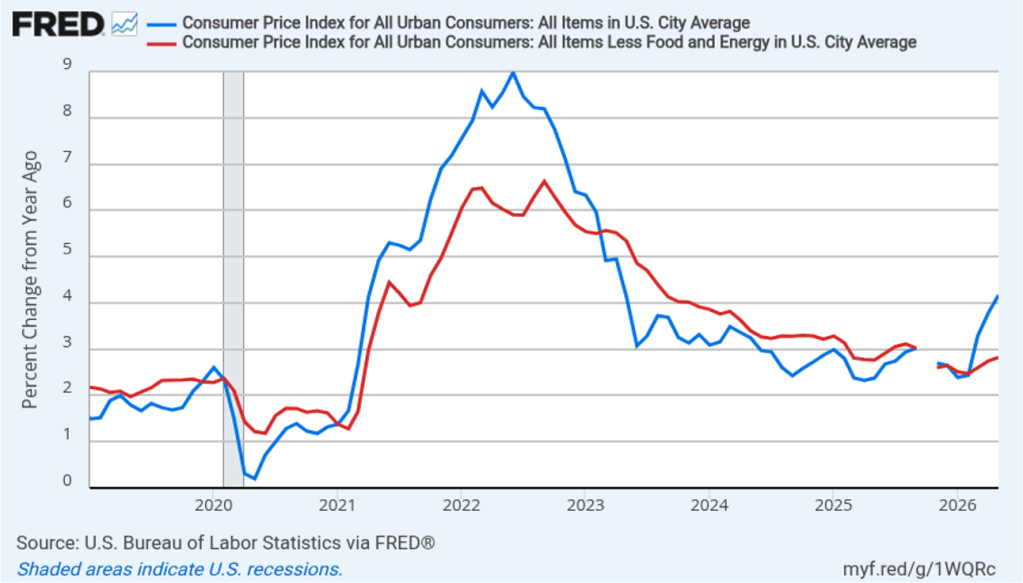
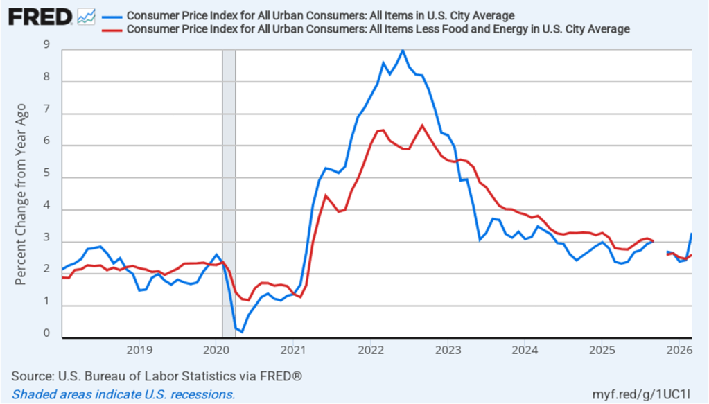
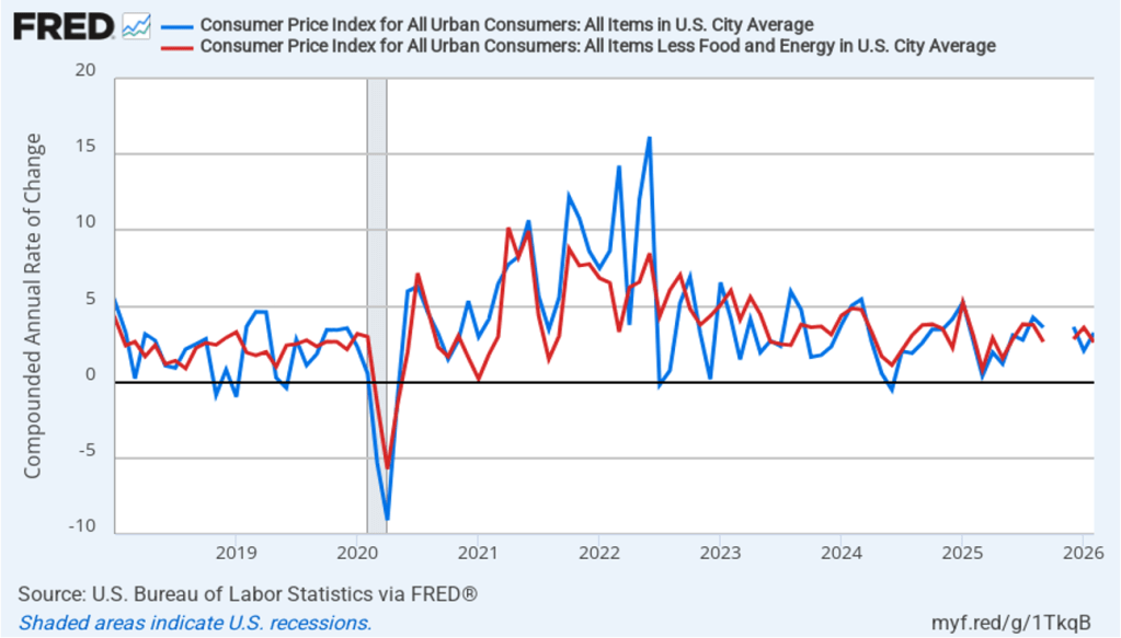
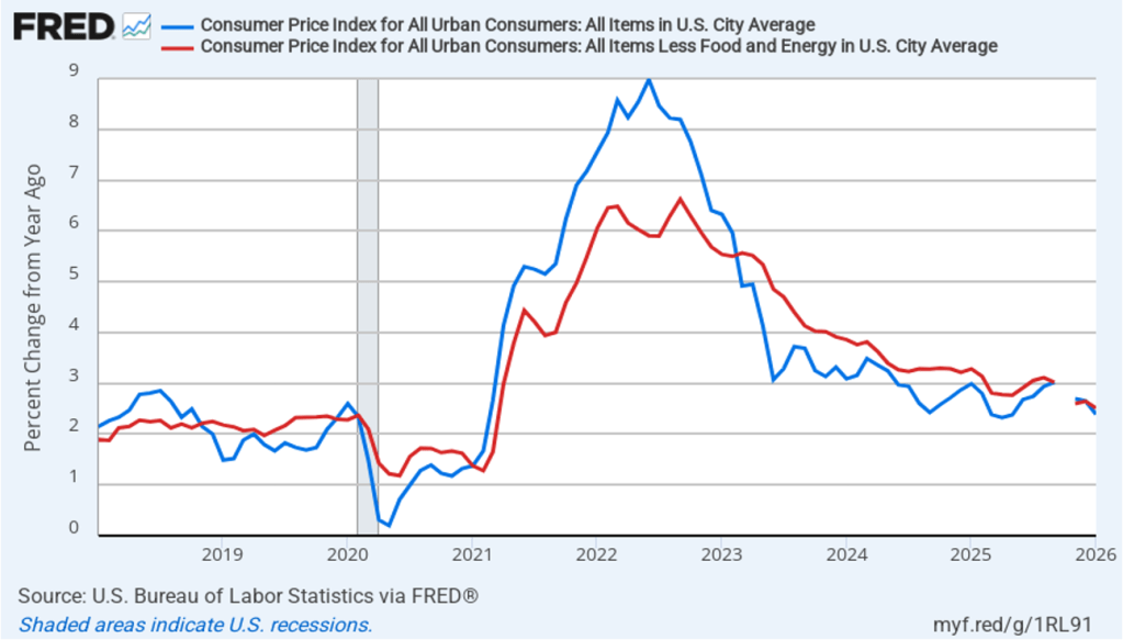
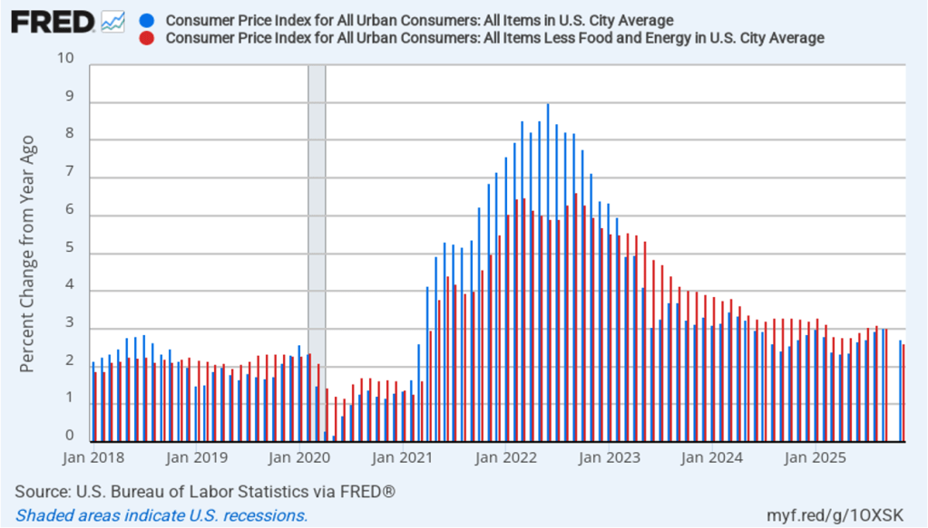
Today (July 14), the Bureau of Labor Statistics (BLS) released its report on the consumer price index (CPI) for June. In May, higher energy prices caused by the conflict in Iran contributed to inflation increasing to the highest rate in more than three years. In June, as energy prices decreased, inflation experienced the largest one-month decrease since April 2020.
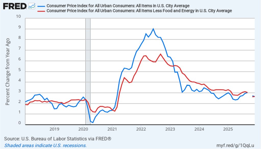
The following figure compares headline CPI inflation (the blue line) and core CPI inflation (the red line).
The headline inflation rate, which is measured by the percentage change in the CPI from the same month in the previous year, was 3.5 percent in June, down from 4.2 percent in May.
The core inflation rate,which excludes the prices of food and energy, declined from 2.8 percent in May to 2.6 percent in June.
Headline inflation and core inflation were both well below the forecasts of economists surveyed by FactSet. (Note that because of last year’s federal government shutdown, inflation data for October and November 2025 are not available.)
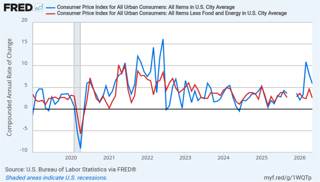
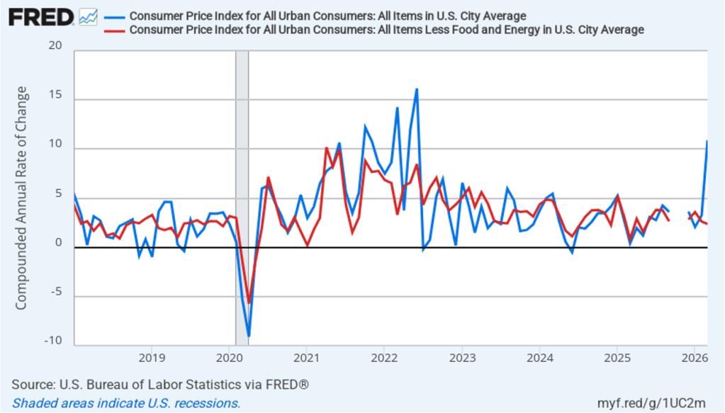
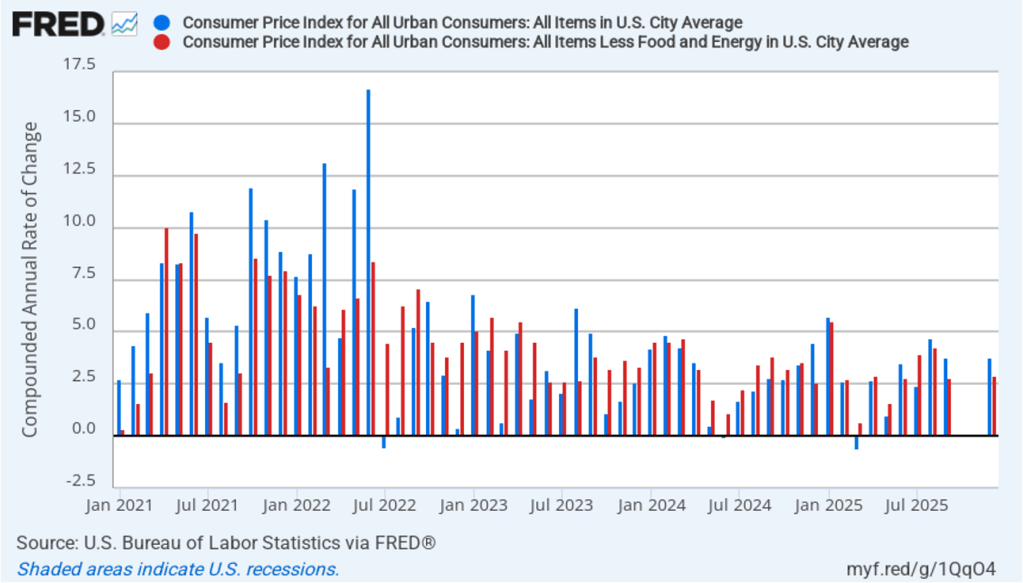
In the following figure, we look at the 1-month inflation rate for headline and core inflation—that is the annual inflation rate calculated by compounding the current month’s rate over an entire year. Calculated as the 1-month inflation rate, both headline (the blue line) and core inflation (the red line) were negative in June. That is, the U.S. economy experienced deflation last month because the price level, measures by the CPI and by the CPI less food and energy prices, fell in June.
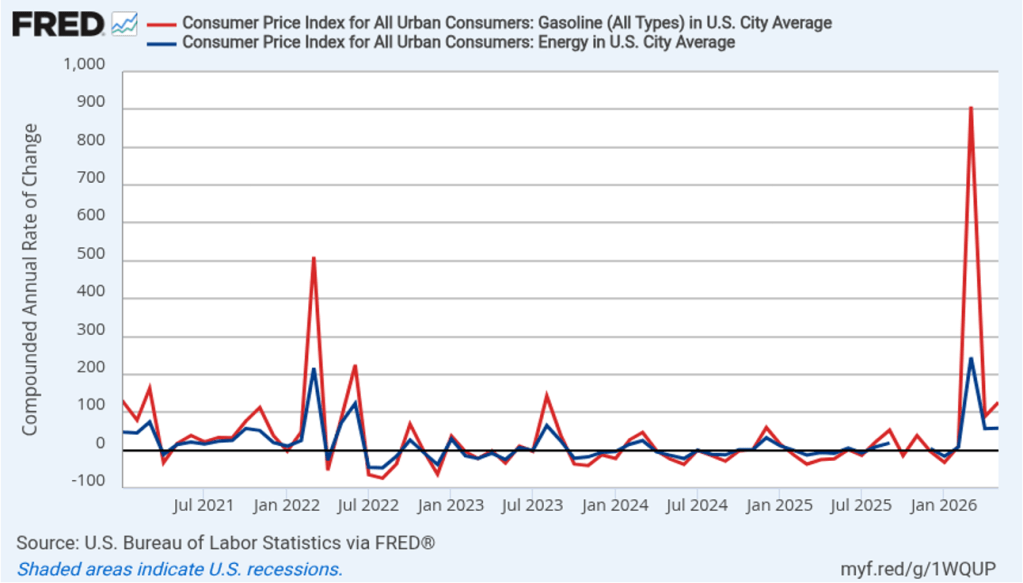
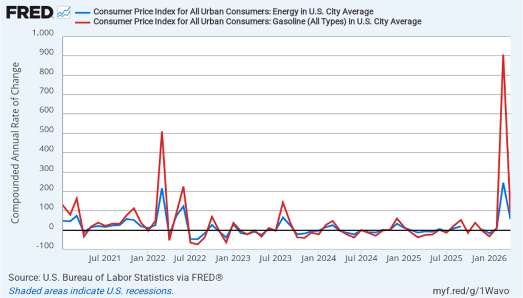
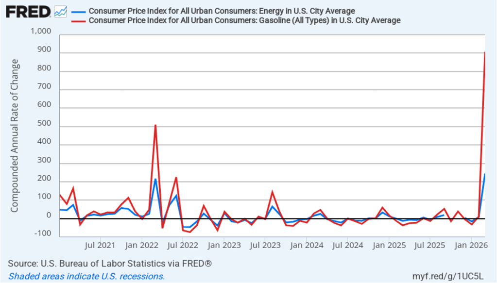
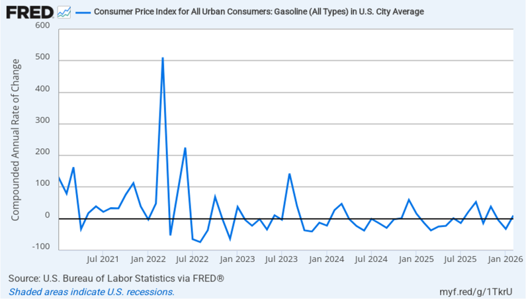
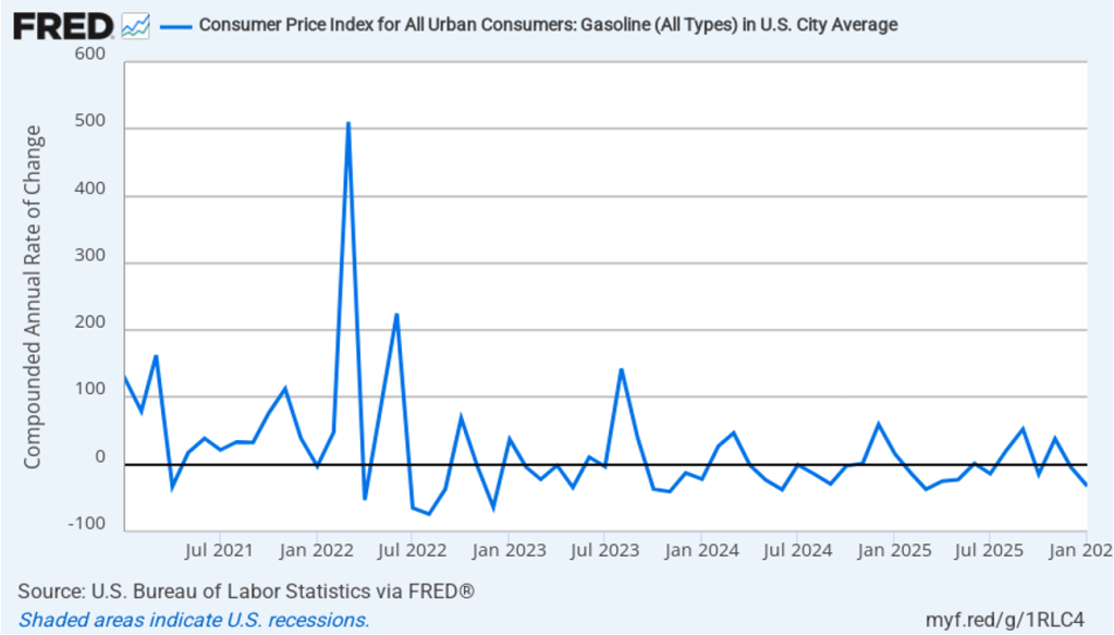
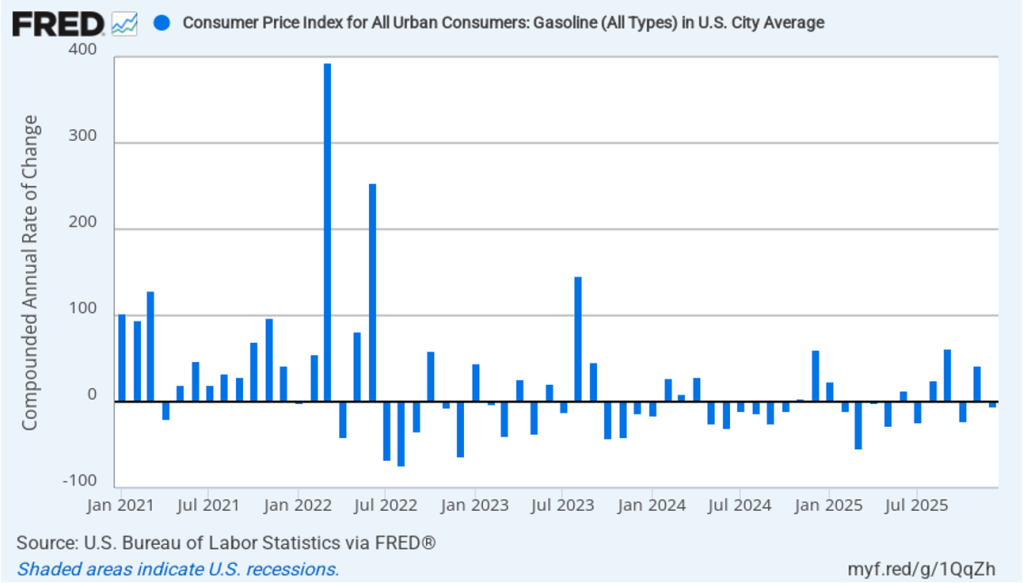
The following figure illustrates the role played by energy prices in causing the large swings in the monthly inflation rate since the conflict in Iran began at the end of February. The red line shows the 1-month inflation rate in all energy prices included in the CPI. Inflation in energy prices, which had increased at annual rate of 245 percent in March, fell at annual rate of 50.6 percent in June. The blue line shows the 1-month inflation rate in gasoline prices, which in March had spiked to more than 900 percent measured at an annual rate, fell at an annual rate of 70.6 percent in June. The recent escalation in the conflict in Iran has increased oil prices, which will likely lead to an increase in the inflation rate in July.
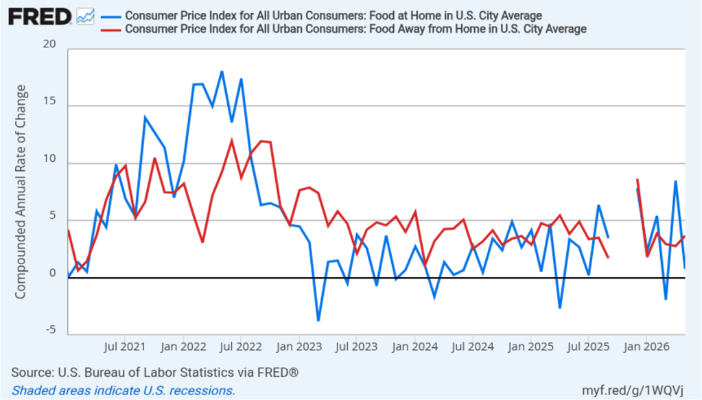
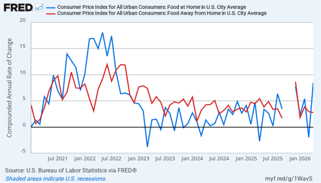
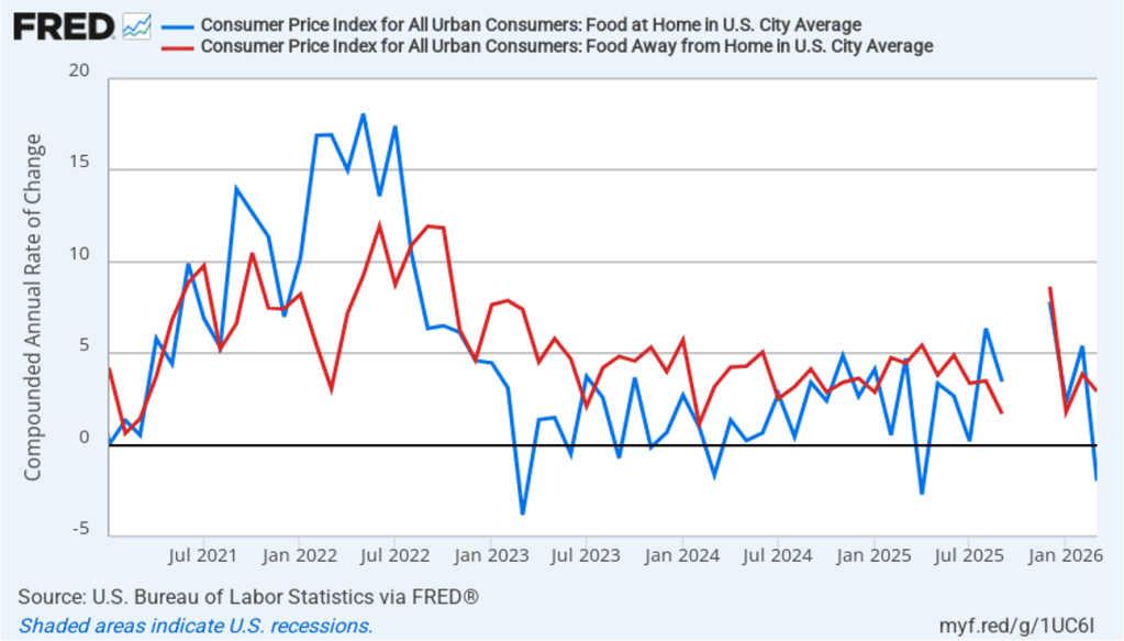
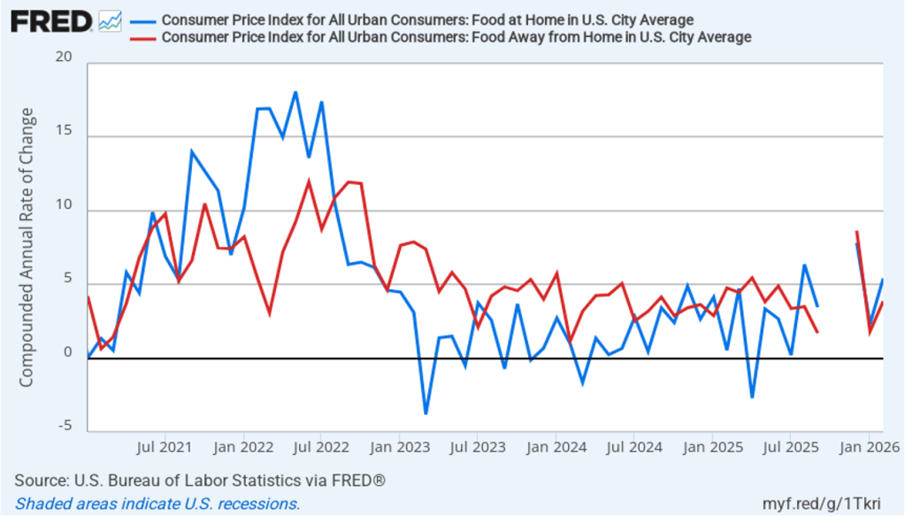
There has been a fear that the rise in energy prices that began in March would pass through to increases in food prices, which are a key concern for many consumers. The following figure shows 1-month inflation in the CPI category “food at home” (the blue bar)—primarily food purchased at grocery stores—and the category “food away from home” (the red bar)—primarily food purchased at restaurants. Inflation in grocery prices increased from 0.8 percent in May to a still fairly low 2.3 percent in June. Inflation in food prices away from home fell from 3.7 percent in May to 2.8 percent in June. To this point, increases in energy priced do not seem to have had much effect on grocery prices or on restaurant prices.
The unexpectedly large decline in inflation in today’s report has likely reduced the chance that Federal Reserve policymakers will increase their target for the federal funds rate at the next meeting of the Federal Open Market Committee (FOMC) on July 28–29. In trading in the federal funds futures market this morning, investors assigned a 83.4 percent probability to the FOMC keeping its target unchanged, which was up sharply from a 58.3 probability yesterday. Traders assign a 61.3 percent probability to the committee increasing its target at its September 15–16 meeting, down from 75.1 percent yesterday.
In testimony before Congress today after the CPI report was released, Fed Chair Kevin Warsh cautioned that good news in a single month’s inflation report should be treated with caution: “There might be some who look at today’s data and say ‘mission accomplished.’ That is not my view.”
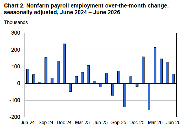
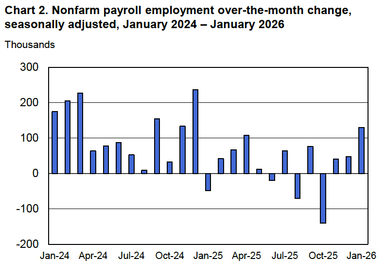
This morning (July 2)—one day early because tomorrow is a federal holiday—the Bureau of Labor Statistics (BLS) released its “Employment Situation” report (often called the “jobs report”) for June. The report showed a smaller than expected increase in employment.
The jobs report has two estimates of the change in employment during the month: one estimate from the establishment survey, often referred to as the payroll survey, and one from the household survey. As we discuss in Macroeconomics, Chapter 9, Section 9.1 (Economics, Chapter 19, Section 19.1), many economists and Federal Reserve policymakers believe that employment data from the establishment survey provide a more accurate indicator of the state of the labor market than do the household survey’s employment and unemployment data. (The groups included in the employment estimates from the two surveys are somewhat different, as we discuss in this post.)
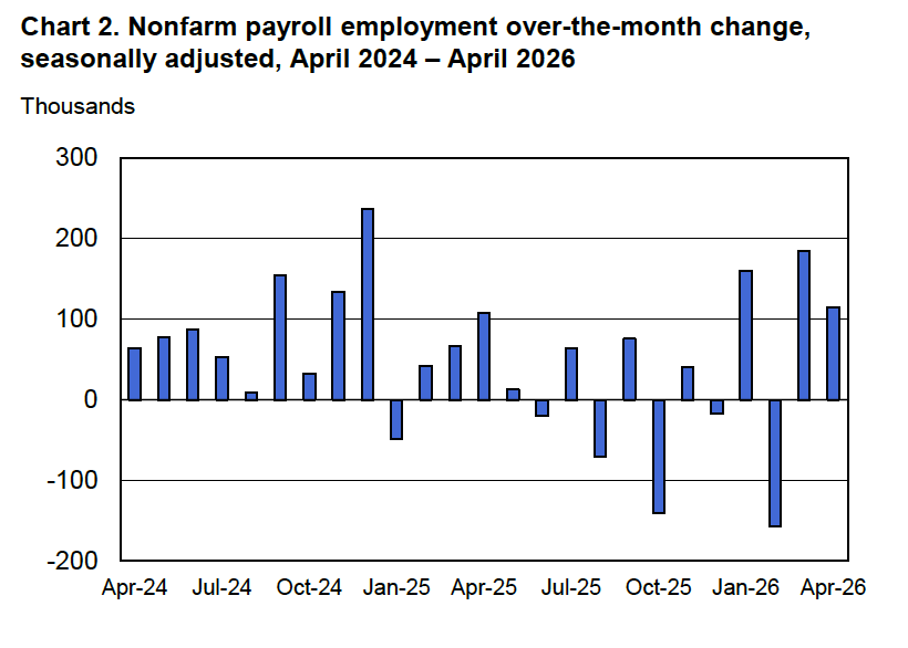
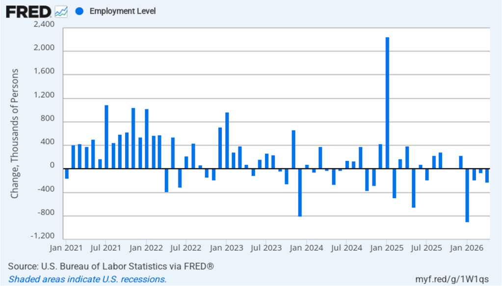
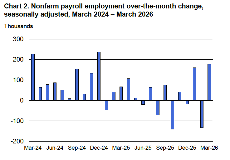
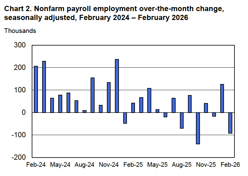
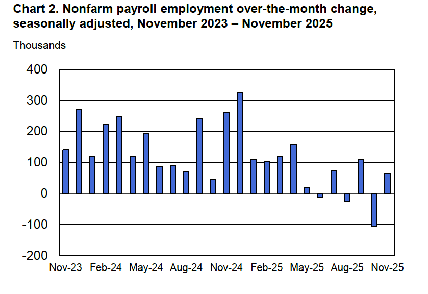
According to the establishment survey, there was a net increase of 57,000 nonfarm jobs during June. Economists surveyed by the Wall Street Journal had forecast an increase of 115,000 jobs. Economists surveyed by FactSet had a lower forecast of a net increase of 100,000 jobs. The BLS revised downward its previous estimates of employment in April and May by a combined 74,000 jobs. (The BLS notes that: “Monthly revisions result from additional reports received from businesses and government agencies since the last published estimates and from the recalculation of seasonal factors.”)
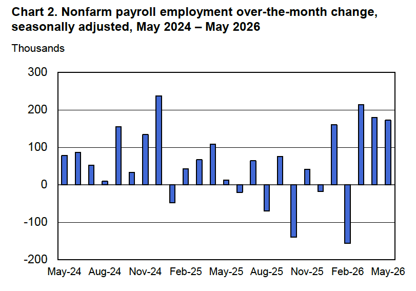
The following figure from the jobs report shows the net change in nonfarm payroll employment for each month in the last two years. The figure shows that the relatively strong 137,000 average net increase in jobs over the past four months represents a break from the unusual pattern in that began in the middle of 2025 in which months of declining employment and months of increasing employment had been alternating.
These employment gains conflict with a popular view among economists that slowing labor force growth has driven the break-even rate of employment growth—the rate required to keep the unemployment rate constant—down to nearly zero
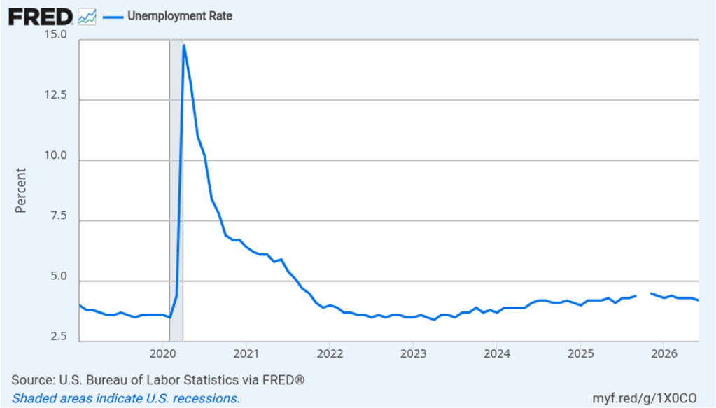
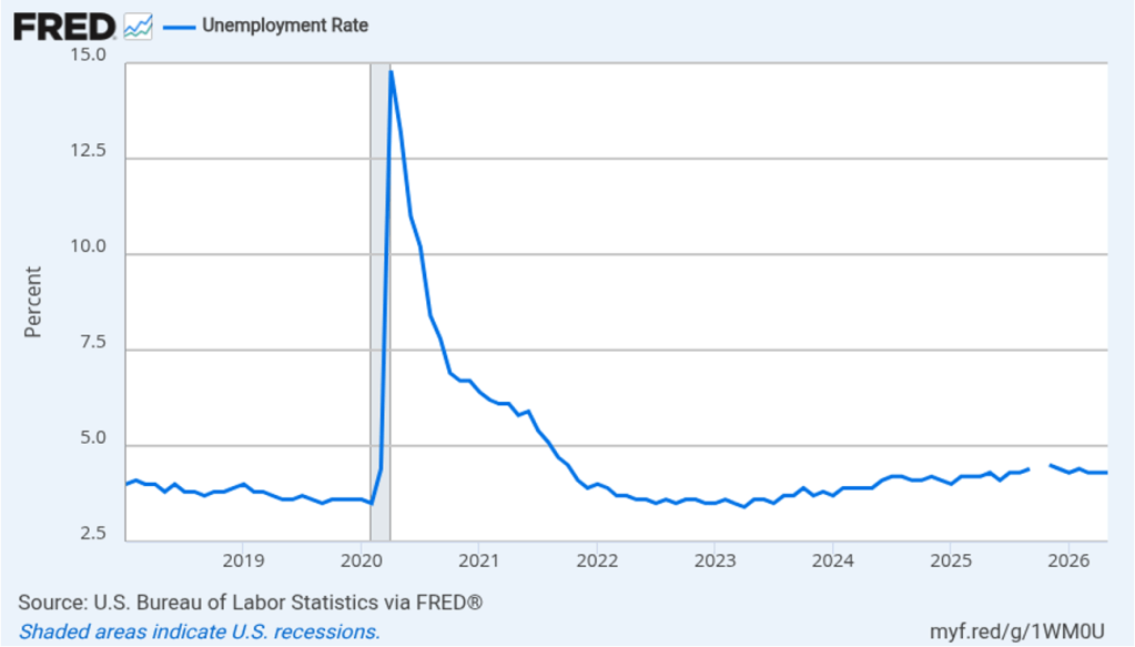
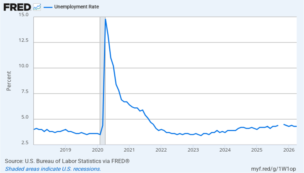
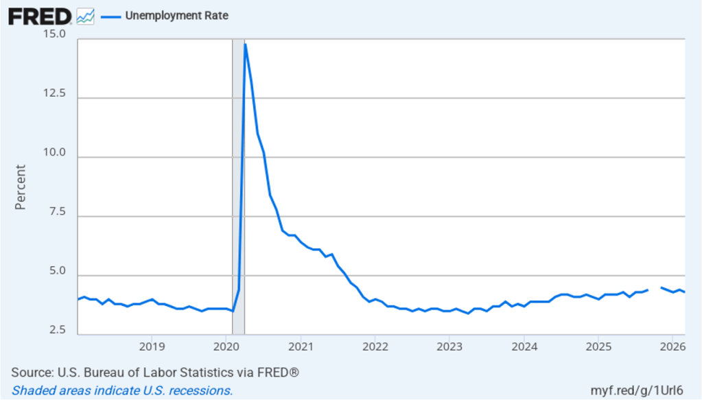
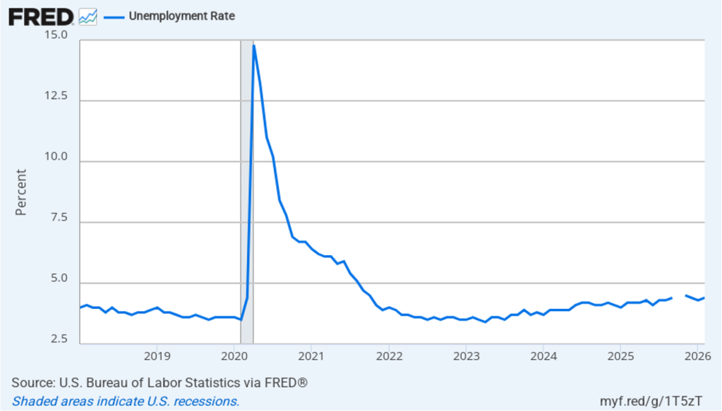
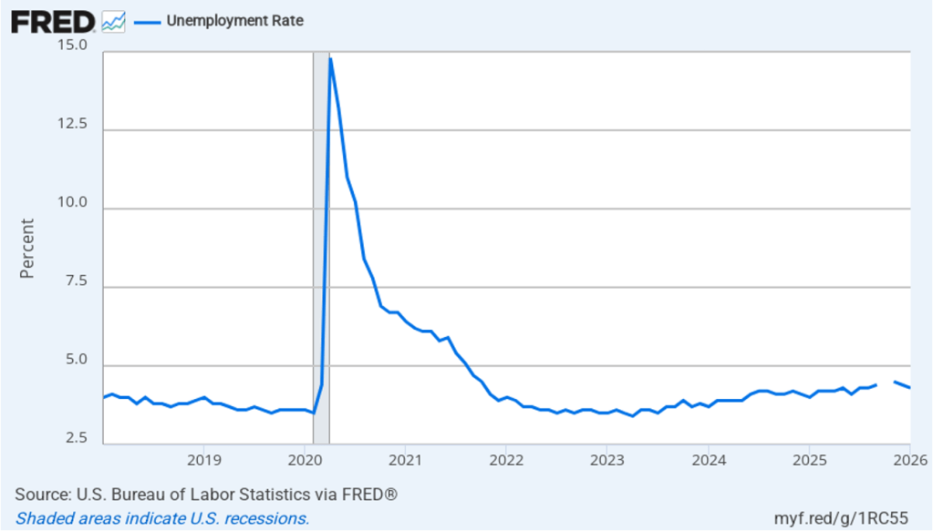
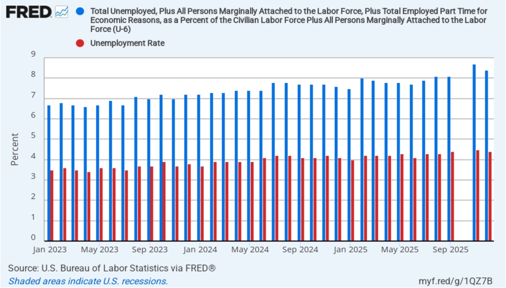
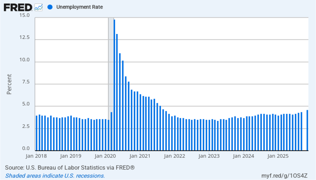
Despite the relatively small increase in employment in June, the unemployment rate, which is calculated from data in the household survey, declined to 4.2 percent from 4.3 percent in May at 4.3. The decline in the unemployment rate was due to a decline in the estimated size of the labor force, an estimate that fluctuates significantly from month to month. Despite that fact, as the following figure shows, the unemployment rate has been remarkably stable over the past year and a half, staying between 4.0 percent and 4.4 percent in each month since May 2024. The Federal Open Market Committee’s current estimate of the natural rate of unemployment—the normal rate of unemployment over the long run—is 4.2 percent. So, currently the unemployment rate is equal to that estimate of the natural rate. (We discuss the natural rate of unemployment in Macroeconomics, Chapter 9 and Economics, Chapter 19.)
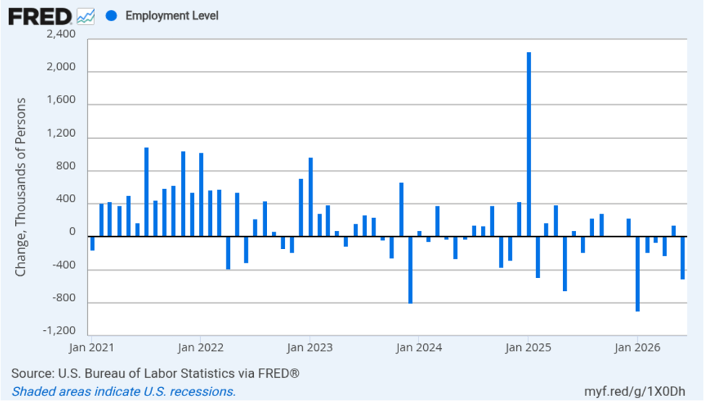
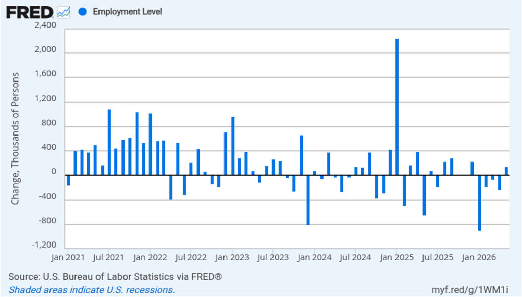
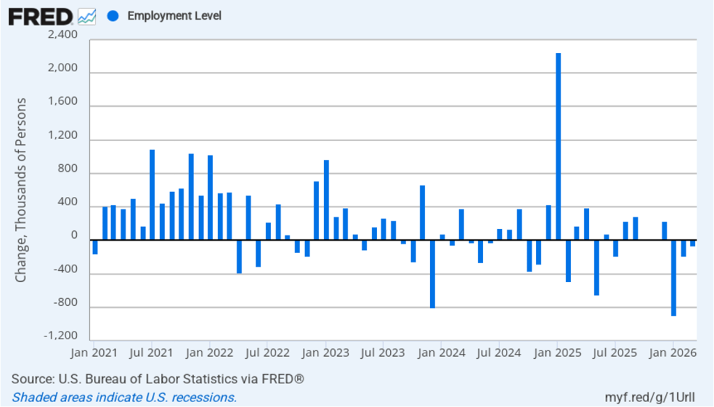
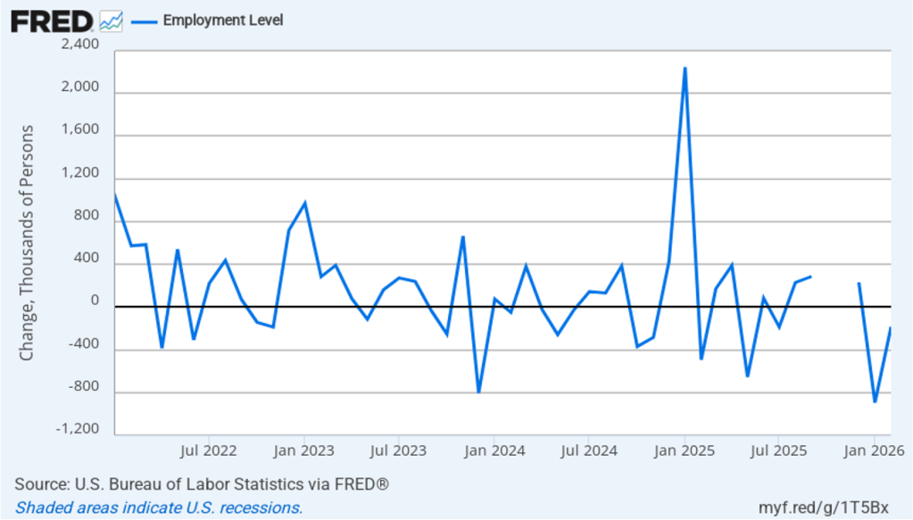
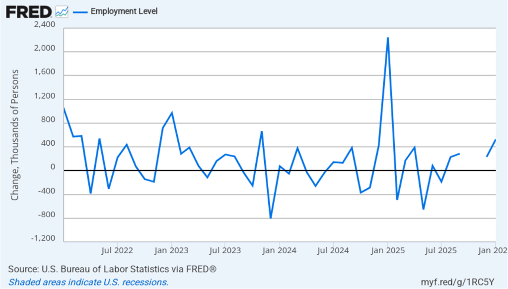
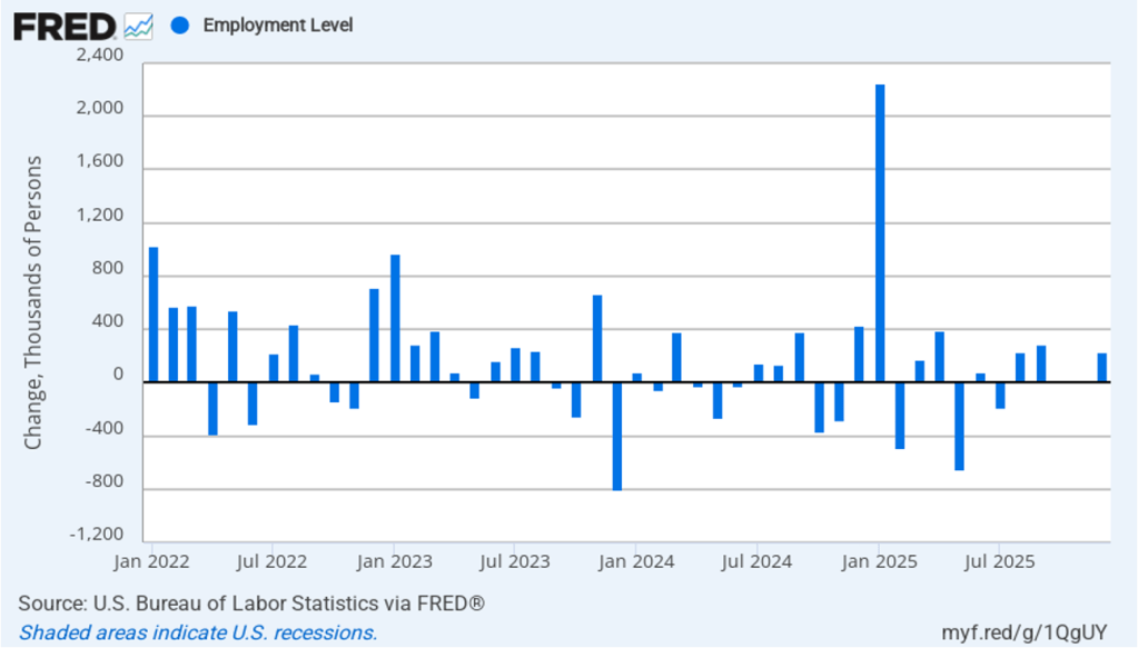
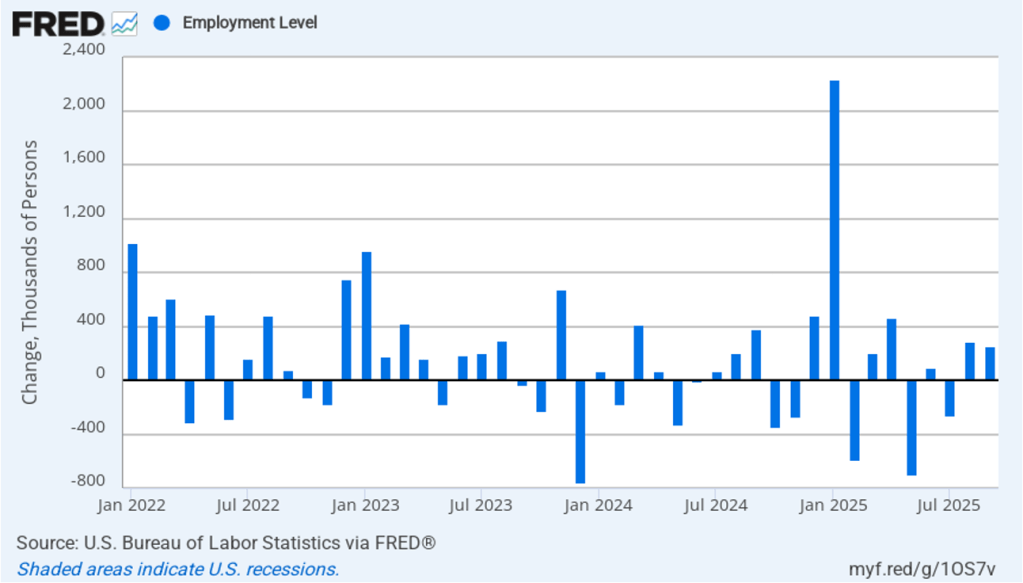
As the following figure shows, the monthly net change in jobs from the household survey moves much more erratically than does the net change in jobs from the establishment survey. As measured by the household survey, there was a net decrease of 507,000 jobs in June, as compared to the net increase in employment shown in the establishment survey. In addition, the household survey shows a significant net decline in jobs during the past six months, in contrast to the significant net increase in jobs shown in the establishment survey. (Note that because of last year’s shutdown of the federal government, there are no data for October or November.)
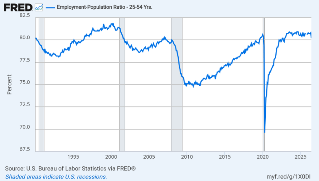
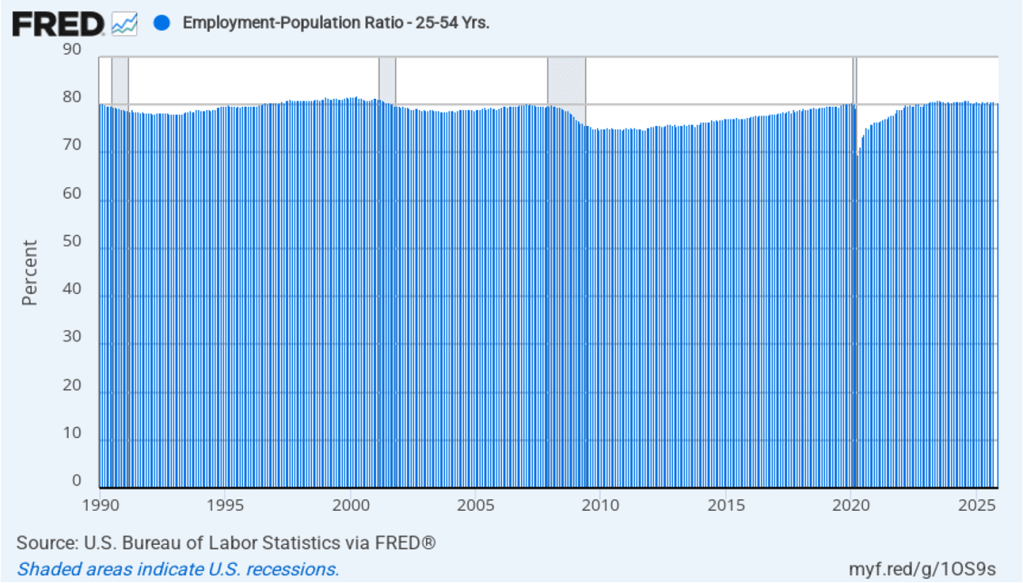
The household survey has another important labor market indicator: the employment-population ratio forprime age workers—those workers aged 25 to 54. In June. the ratio declined sharply to 80.2 percent from 80.8 percent in May, the lowest value since December 2022. The decline in the prime-age population ratio is difficult to reconcile with the net increase in employment shown in the payroll survey. The state of the labor market in June seemed significantly weaker in household survey data than in establishment survey data.
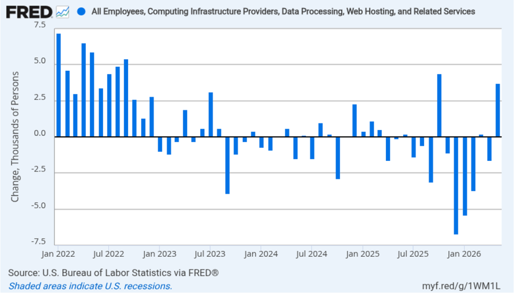
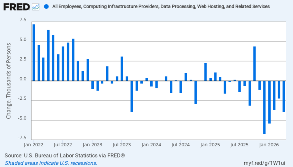
There have been media reports of firms, including Salesforce, Cloudflare, Coinbase, Cisco Systems, and Meta Platforms, laying off workers in information systems. The following figure shows net employment changes in the BLS employment category of “computing infrastructure providers, data processing, web hosting, and related services.” Employment in this sector has been declining during most months since the beginning of 2023. June was no exception with a net decrease of 3,300 jobs.
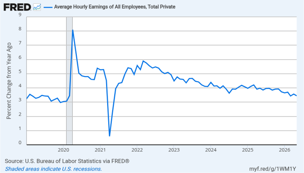
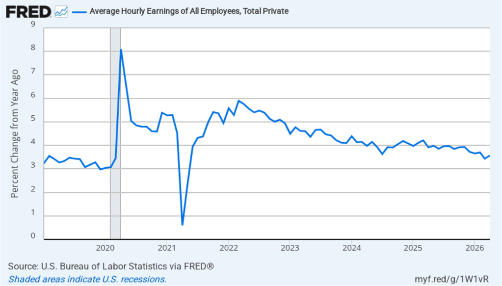
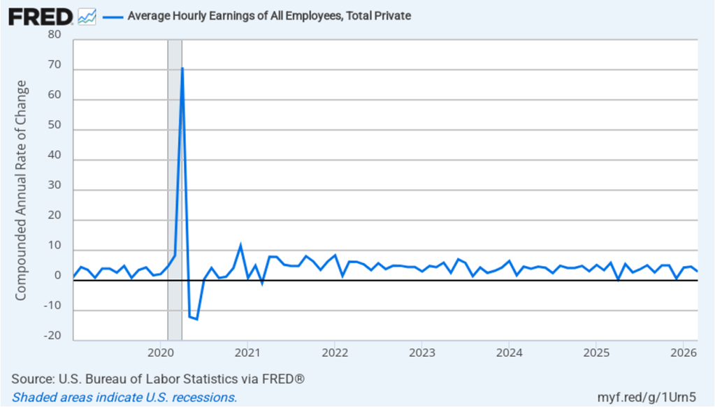
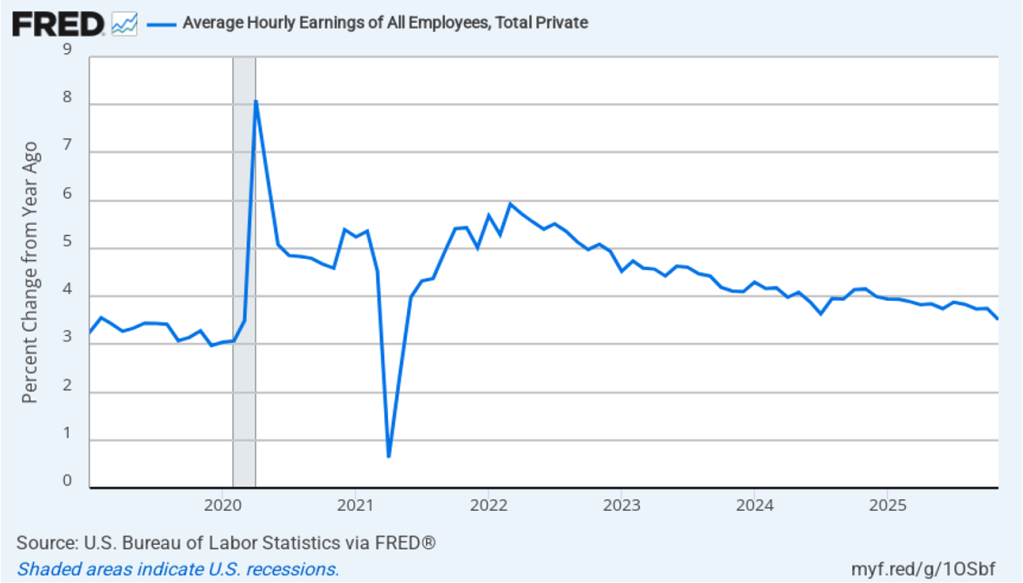
The establishment survey also includes data on average hourly earnings (AHE). As we noted in this post, many economists and policymakers believe the employment cost index (ECI) is a better measure of wage pressures in the economy than is the AHE. The AHE does have the important advantage of being available monthly, whereas the ECI is only available quarterly. The following figure shows the percentage change in the AHE from the same month in the previous year. The AHE increased 3.5 percent in June, up slightly from 3.4 percent in May.
What effect is this jobs report likely to have on the decisions of the Federal Reserve’s policymaking Federal Open Market Committee (FOMC) at its next meeting on July 28–19? The slowdown in employment growth reduces the chance that the FOMC will increase its target range for the federal funds rate. The probability that investors in the federal funds futures market assign to the FOMC increasing its target range at that meeting fell from 28.9 percent yesterday to 17.6 percent this morning. Investors still assign a 54.0 percent probability to the FOMC raising its target range at its September meeting, but that was down from 64.1 percent yesterday.
Image created by ChatGPT of the U.S. Supreme Court building
The Federal Reserve Act states that a member of the Federal Reserve’s Board of Governors “shall hold office for a term of fourteen years from the expiration of the term of his predecessor, unless sooner removed for cause by the President.” In August 2025, President Trump attempted to remove Governor Lisa Cook from the Board on the grounds that she had made misrepresentations in a mortgage application in an attempt to secure a lower interest rate. Cook filed suit arguing that, rather than removing her for cause, the president wished to remove her because he disagreed with some of her policy positions. She also argued that she had not been given an opportunity to rebut the accusations against her.
Her lawsuit made its way through the federal courts, eventually reaching the Supreme Court. Today, in a 5 to 4 ruling, the justices sent the case back to a lower court to determine the merit of the accusation against Cook. The majority opinion stated that, “Under the Court’s precedents, Cook was entitled to notice and some opportunity to respond before her termination.”
Image created by ChatGPT of of President Franklin Roosevelt
As we noted in a blog post last year, President Trump’s attempt to fire Governor Cook involved a larger issue. The ability of Congress to limit the president’s power to appoint and remove heads of commissions, agencies, and other bodies in the executive branch of government—such as the Federal Reserve—is not clearly specified in the Constitution. For years, the federal courts had followed the precedent established in the 1935 case of Humphrey’s Executor. In that case, the Court ruled that President Franklin Roosevelt couldn’t remove a member of the Federal Trade Commission (FTC) because in creating the FTC, Congress specified that members could only be removed for cause.
In recent years, the Court has been narrowing the scope of the Humphrey’s Executor ruling. Today, in a case involving President Trump’s attempt to fire a commissioner serving on the Federal Trade Commission (FTC), the Court overturned its ruling in Humphrey’s Executor. Henceforward, president’s will be allowed to fire members of any regulatory commission or other body in the Executive Branch of the federal government without having to establish a cause for the firing.
The Court did not, however, rule today as to whether presidents are allowed to fire members of the Fed’s Board of Governors or whether the Federal Reserve has a special role in the government that requires presidents to remove Governors only for cause. The majority opinion contains a summary of the history of central banks in the United States. That summary seems to indicate that, in fact, a majority of the Court does see the Fed as having a special role in the government. In other words, it seems likely that the government would have to prove that Governor Cook had engaged in significant wrongdoing for her to be removed from office by the president.
Image created by ChatGPT of the Federal Reserve’s headquarters
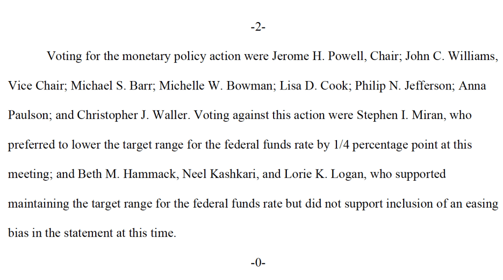
The majority in this case consisted of Chief Justice John Roberts, Justice Brett Kavanaugh—both of whom were appointed to the Court by Republican presidents—and the three justices who were appointed by Democratic presidents. Three of the other Republican-appointed justices dissented on the grounds that the Court should have waited until the charges against Cook had been resolved in a lower court before ruling. It’s possible that if the case returns to the Supreme Court after questions of fact have been decided in a lower court, one or more of these justices may side with the majority in today’s ruling in holding that members of the Board of Governors cannot be removed from office except for cause. Justice Clarence Thomas—who was also appointed by a Republican president—was the only justice to argue that presidents should be allowed to freely remove members of the Board of Governors. Justice Thomas specifically rejected the argument that the Fed plays a special role in the federal government that differs from the roles played by other agencies such as the FTC: “The Court makes many policy arguments for an ‘independent’ banking agency that exercises executive power free from accountability … but those are ultimately arguments against the Constitution.”
Supports: Microeconomics and Economics, Chapter 6, Section 6.3, and Essentialsof Economics, Chapter 7, Section 7.7.
Image created by ChatGPT
An article in the Wall Street Journal on June 25, noted that after Apple increased the prices of iPads and MacBooks, the price of its stock declined by 6.1 percent. That decline meant that the total value of Apple’s stock—its market cap—fell by $215 billion dollars that day. Investors were expecting that Apple would likely also increase the prices of iPhones. As we discuss in Microeconomics, Chapter 8 (Macroeconomics and Essentials of Economics, Chapter 6), the price of a firm’s stock reflects investors forecasts of the future profitability of the firm. Why would Apple increasing the prices of its products cause investors to believe that Apple’s profit would decline? Shouldn’t Apple become more profitable after increasing its prices?
Solving the Problem Step 1: Review the chapter material. This problem is about the effect on a firm’s profit of increasing the price of its product, so you may want to review Chapter 6, Section 6.3, “The Relationship between Price Elasticity of Demand and Total Revenue.”
Step 2: Answer the question by explaining under what circumstances a firm may reduce its profit by raising prices. It might make sense to think that any time a firm raises its price, it will increase its profit. But recall that because demand curves slope downward, an increase in price always results in a decrease in the quantity of the good sold. If the firm’s demand curve is elastic at the current price level, raising the price will decrease the firm’s revenue because the quantity sold will fall by proportionally more than the price increases. In this case, investors appear to have assumed that the revenue Apple would lose as a result of raising prices would be greater than the additional revenue it would earn on the quantities it would sell at the higher prices. Revenue isn’t the same as profit because Apple’s total cost will decrease as it sells a smaller quantity. Because the price of Apple’s stock declined substantially on the day the firm announced the price increases, investors must be expecting that the net effect of the price increases would be to reduce Apple’s profit.
Image created by ChatGPT of Alan Greenspan as a maestro
Earlier this week, Alan Greenspan, former chair of the Federal Reserve passed away at the age of 100. Greenspan may have been the best-known Fed chair in history. People who follow the economics and business news know who Jerome Powell and Kevin Warsh are. But many people who don’t follow the news likely have never heard of them. During his term as Fed chair from 1987 to 2006, Greenspan achieved a level of celebrity that made him one of the best known public officials of the past 50 years.
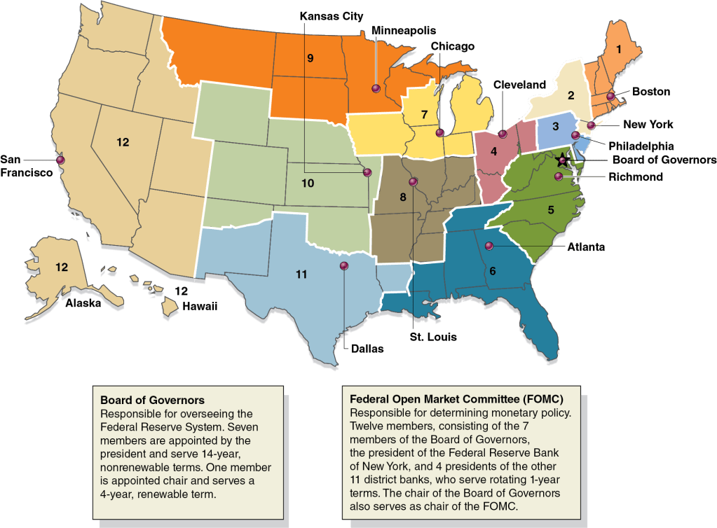
Greenspan served as Fed chair for 18 years and 5 months, a term in office exceeded only by William McChesney Martin who served as chair for 5 months longer. The Federal Reserve Act requires that the president choose as chair a member of the Fed’s Board of Governors. As we discuss in Macroeconomics, Chapter 14, Section 14.4 (Economics, Chapter 24, Section 24.4, and Money, Banking, and the Financial System, Chapter 13, Section 13.1), after being nominated by the president and confirmed by the Senate, members of the Board of Governors serve 14-year, nonrenewable terms. The following figure, reproduced from Chapter 14, illustrates the structure of the Fed.
If members of the Board of Governs serve a single 14-year term, how did both Greenspan and Martin serve for more than 18 years? The answer is that, although a member of the Board of Governors cannot be nominated to a second term, someone who serves out the remainder of the term of a member who has left the board can be nominated by the president to a full term. In August 1987, Greenspan was nominated by President Ronald Reagan to fill the remainder of Paul Volcker’s term on the Board of Governors and to replace Volcker as chair. Volcker had been nominated by President Jimmy Carter in 1979 to the unexpired term of G. William Miller. When the Miller/Volcker/Greenspan term expired in 1992, President George H. W. Bush nominated Greenspan to a new 14-year term. Volcker stepped down from the Board of Governors in 1987 after deciding that he would not ask President Reagan to nominate him to a third term as chair. (In this oral history, Volcker discusses the somewhat ambiguous circumstances under which he came to his decision.)
Greenspan served out the 4 years and 5 months that remained in the Miller/Volcker term and then served the 14 years of his own term. When his term expired in January 2006, President George W. Bush nominated Ben Bernanke to take Greenspan’s place as chair. One other institutional note: It’s sometimes written that the chair of the Board of Governors is automatically the chair of the Federal Open Market Committee. In fact, under the Federal Reserve Act, the FOMC chooses its own chair. In practice, though, the chair of the Board of Governors has always been elected chair by the members of the FOMC, as happened in May when Warsh began his term of chair of the Board of Governors and was voted chair by the members of the FOMC.
Photo of Paul Volcker from federalreserve.gov
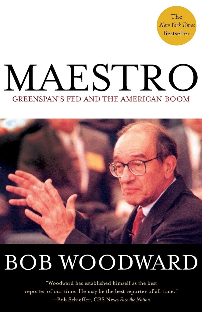
During his time as chair, economists, Fed watchers on Wall Street, and members of Congress generally commended Greenspan’s performance. In particular, Greenspan received praise for his handling of the 1987 stock market crash, the failure of the Long-Term Capital Management hedge fund in 1997, and the foreign debt crises in the 1990s and early 2000s involving Mexico, several Asian countries, Russia, and Argentina. In July 1995, Greenspan began the modern procedure of explicitly stating the FOMC’s target for the federal funds rate after each meeting. Prior to that time, financial analysts and economists tried to determine the target federal funds rate by observing the size of the Fed’s New York Trading Desk transactions with primary dealers and by determining how much banks were charging each other for short-term loans in the federal funds market. In 2001, journalist Bob Woodward wrote a very favorable account of Greenspan’s role as Fed chair in the book Maestro: Greenspan’s Fed and the American Boom.
Photo from Amazon.com
Greenspan’s reputation was dimmed by the severity of the Global Financial Crisis of 2007–2009, which began nearly two years after his term of office. Greenspan was criticized for having kept the target for the federal funds rate too low in the years following the 2001 recession. Critics argue that low borrowing costs increased the amount of speculation in financial markets. Greenspan was also criticized for the Fed’s failure to use its legal authority to more closely regulate the mortgage market, which might have stopped mortgage lenders from weakening credit standards, thereby increasing the number of borrowers who would have difficulty making payments on their mortgages if housing prices declined. Greenspan also resisted increased regulation of financial derivatives, particularly those not traded on financial markets. During the financial crisis, the rapidly falling prices of some derivatives undermined the solvency of some financial firms. (In Money, Banking, and the Financial System, we discuss derivative markets in Chapter 7.)
A brief biography of Greenspan can be found here. A useful overview of Greenspan’s career is given in this article by Nick Timiraos in the Wall Street Journal. (A subscription may be required.)
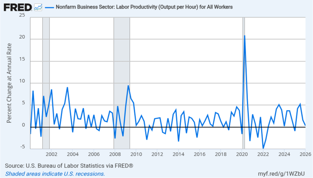
When Kevin Warsh was sworn in as Fed chair, Greenspan was the only one of his predecessors that he mentioned by name, despite Warsh having served several years on the Board of Governors when Ben Bernanke was Fed chair. On several occasions, Warsh has praised Greenspan for resisting pressure during the 1990s to raise the target for the federal funds rate. During that period, Greenspan believed, correctly, that the information revolution resulting from the spread of personal computers and the greater use of the internet meant that real GDP and employment could increase rapidly without leading to an increase in inflation. Warsh believes that the AI revolution has put the Fed in a similar situation today. According to an article in the Financial Times, “Warsh predicts the AI boom will upend the world of work quickly, with the best companies doing ‘things that are unimaginable’ within a year.”
Warsh argues that rising productivity from the spread of AI will allow the Fed to keep the target for the federal funds rate lower without risking rising inflation in a way similar to Greenspan’s policy in the 1990s. The following figure shows productivity growth, as measured by the annual rate of change of output per hour worked for the nonfarm business sector, during the period from the first quarter of 2000 through the first quarter of 2026. Productivity has grown at an annual rate of 2.6 percent since the first quarter of 2023 as opposed to a rate of 2.0 percent for the whole period since 2000.
Productivity moves erratically over short periods, so it’s not yet clear whether AI, in fact, will cause a sustained increase in output per hour worked. Many economists argue that over the short run, AI may be increasing demand more than it is increasing supply. The most important effect of AI to this point might be the surge in demand for data centers, which accounts for more than a third of new capital investment. In addition, Warsh’s remarks at his press conference following the last FOMC meeting made it clear that his top priority is to bring inflation back to the Fed’s 2 percent target. Investors trading in the federal funds futures market now assign a 60 percent probability to the FOMC raising its target for the federal funds rate at its September meeting.
If Warsh intends to follow Greenspan’s strategy of keeping interest rates low to facilitate rapid economic growth during a surge in productivity, he likely won’t begin doing so until well into 2027.
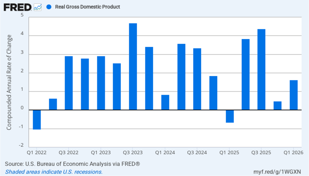
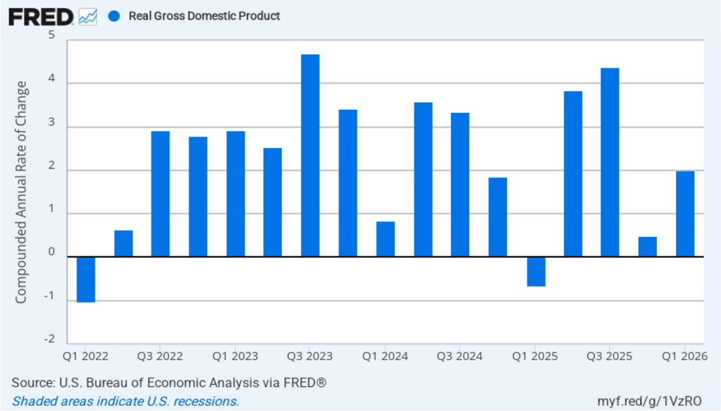
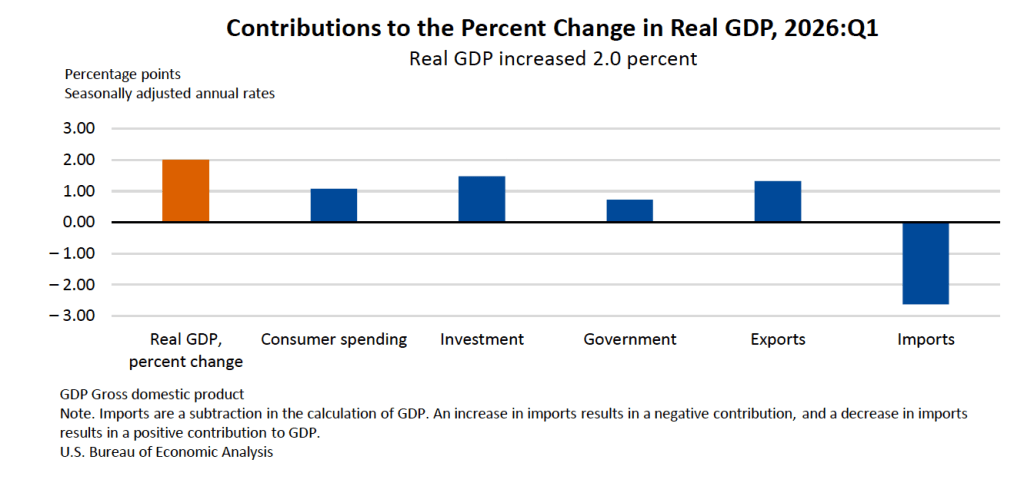
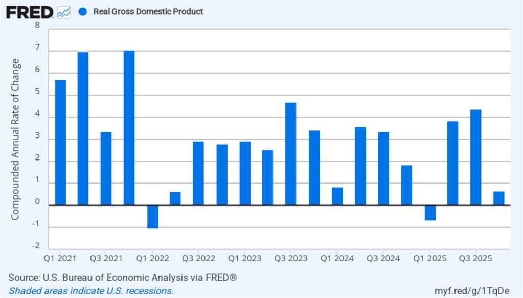
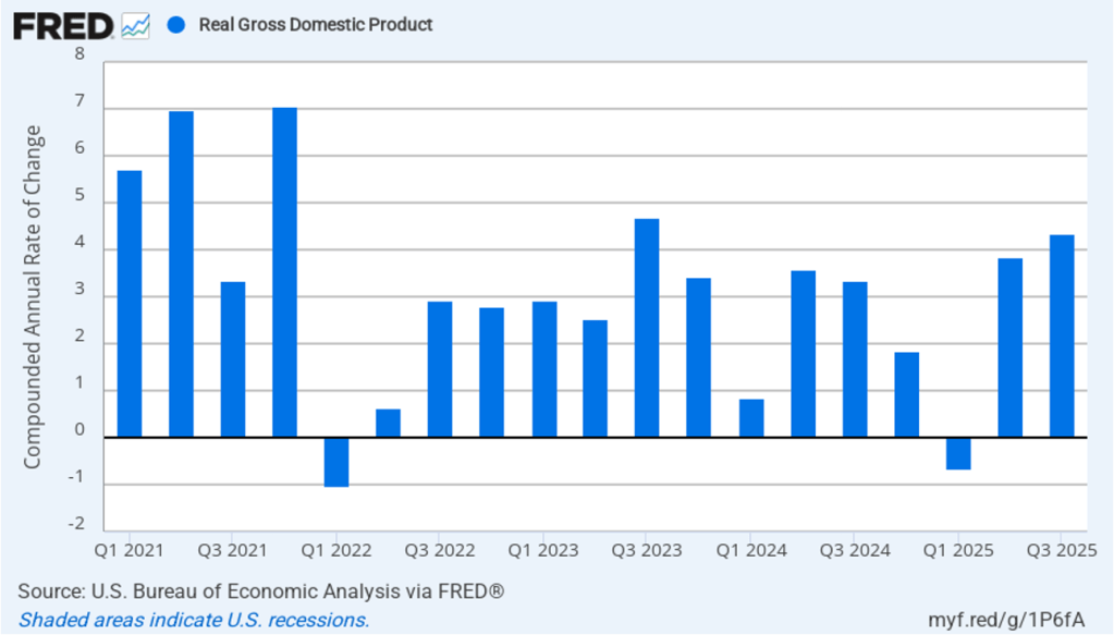
The Bureau of Economic Analysis (BEA) released two reports this morning (June 25): “GDP (Third Estimate), Industries, Corporate Profits, State GDP, and State Personal Income, 1st Quarter 2026” and “Personal Income and Outlays, May 2026.” The BEA revised upward its estimate of real GDP growth in the first quarter of 2026 from an annual rate of 1.6 percent to an annual rate of 2.1 percent. Economists surveyed by LSEG had expected that the BEA would leave its estimate of real GDP growth in the first quarter unchanged. The following figure shows the BEA’s estimated rates of real GDP growth in each quarter beginning with the first quarter of 2022.
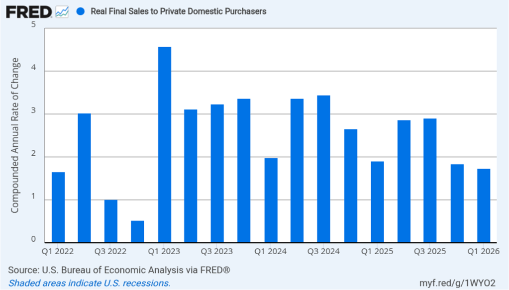
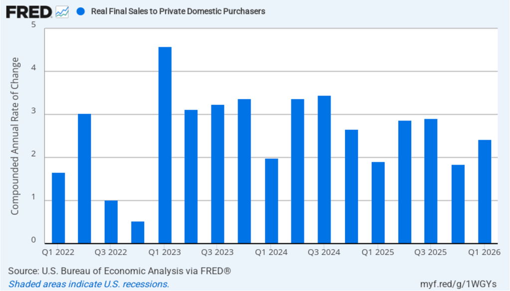
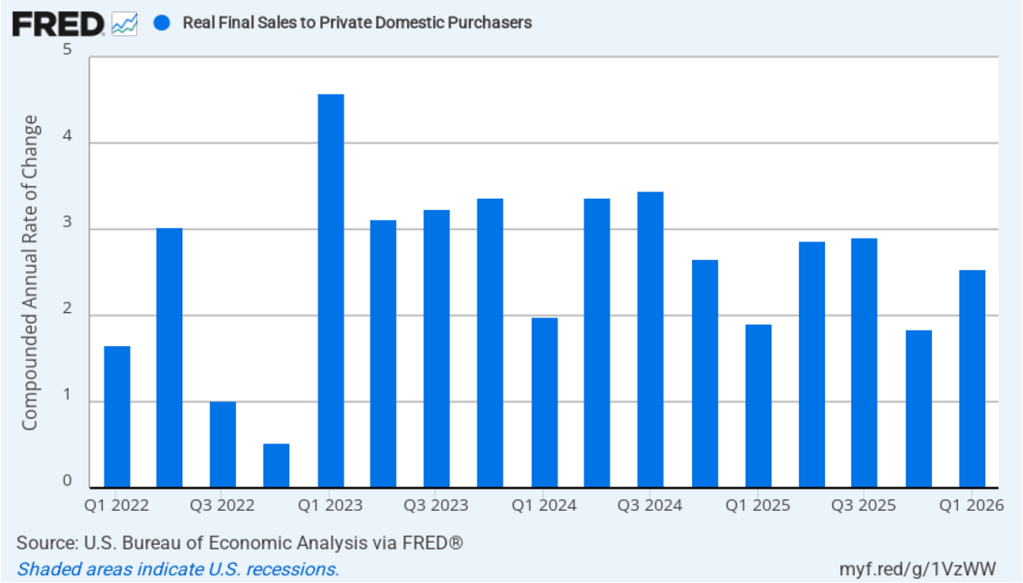
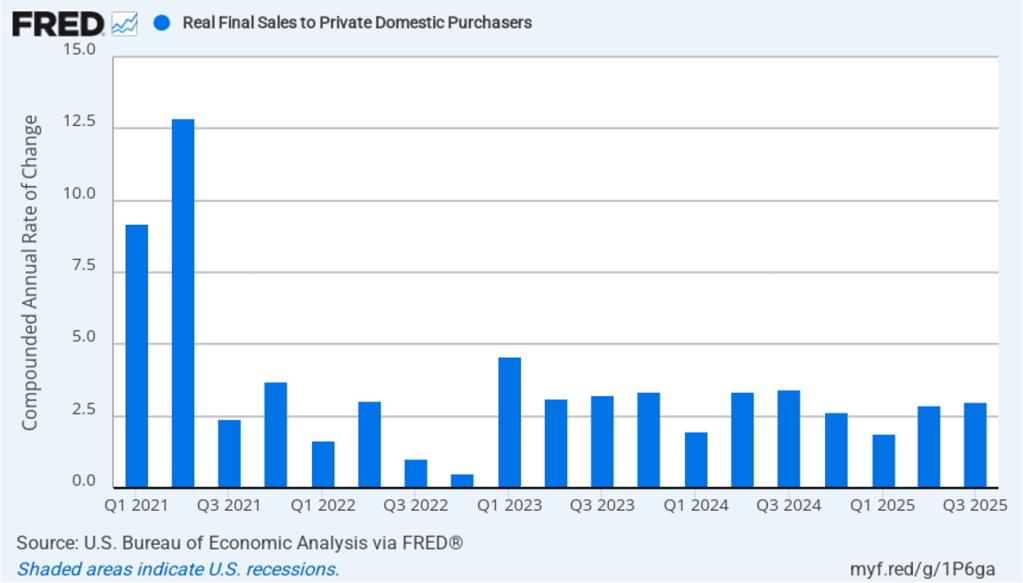
As we’ve discussed in previous blog posts, to better gauge the state of the economy, policymakers—including former Fed Chair Jerome Powell—often prefer to strip out the effects of imports, inventory investment, and government expenditures—which can be volatile—by looking at real final sales to private domestic purchasers, which includes only spending by U.S. households and firms on domestic production. As the following figure shows, real final sales to domestic purchasers increased at an annual rate of 1.7 percent in the first quarter, below the 2.1 percent rate of increase in real GDP and close to the U.S. economy’s expected long-run annual real growth rate of 1.8 percent. Note also that real final sales to private domestic purchasers grew by 2.9 percent in the third quarter of 2025, during which real GDP grew by 4.4 percent, and by 1.9 percent in the first quarter of 2025, when real GDP declined by 0.6 percent. So this measure of output is more stable, and likely is a better indicator of the underlying growth rate in the economy, than is the growth rate of real GDP.
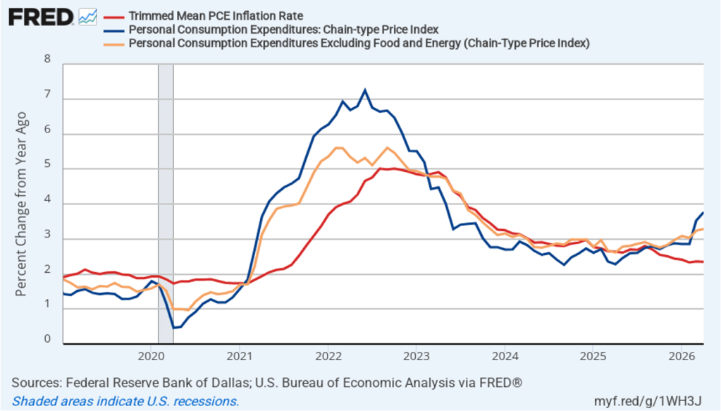
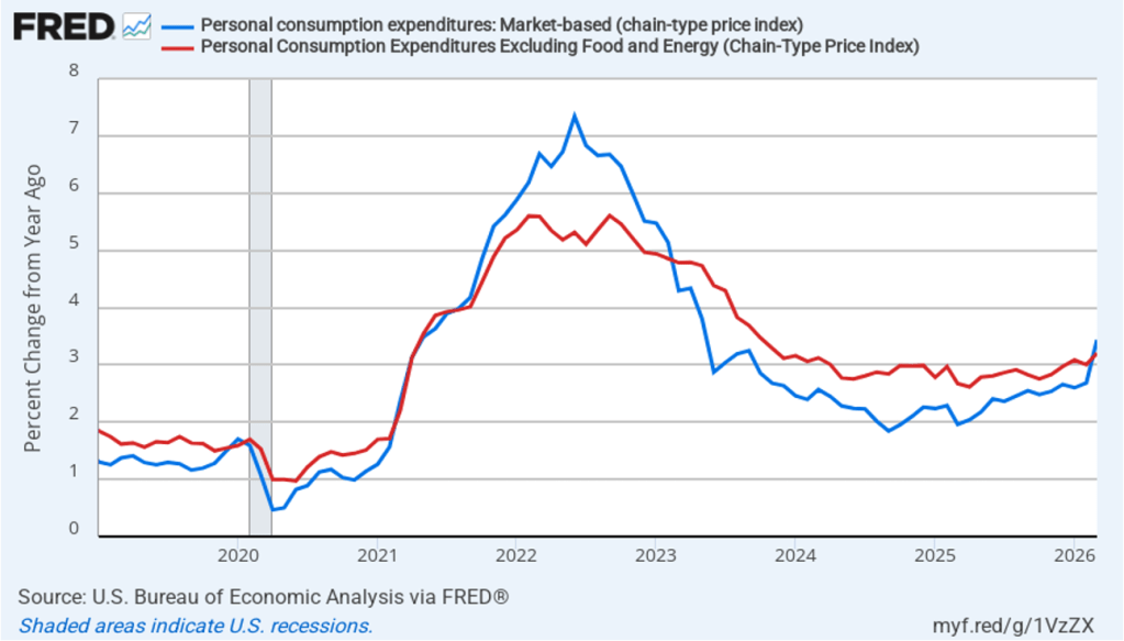
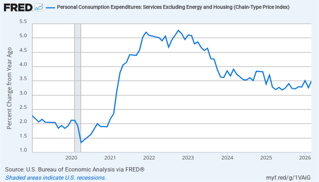
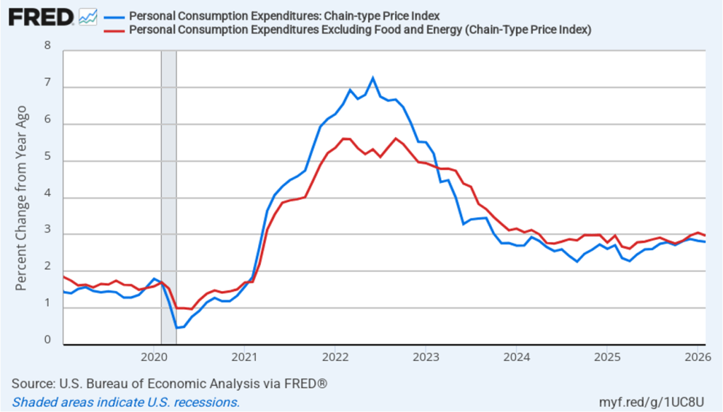
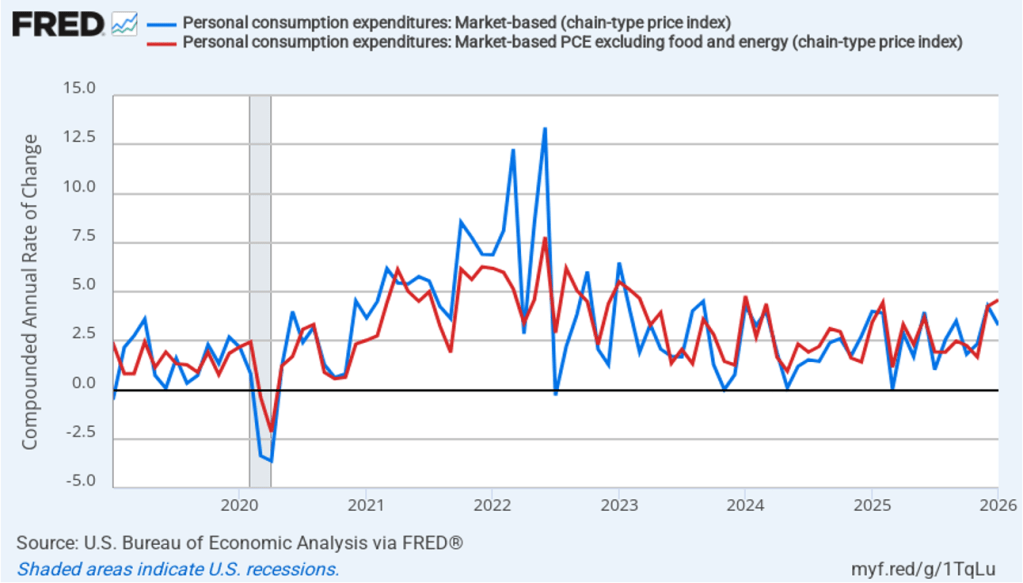
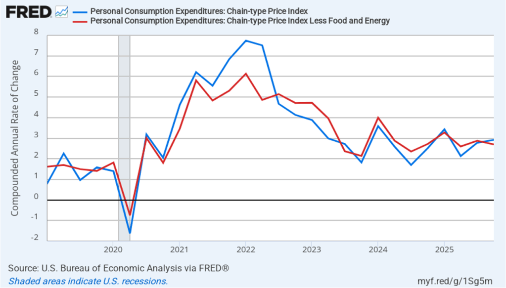
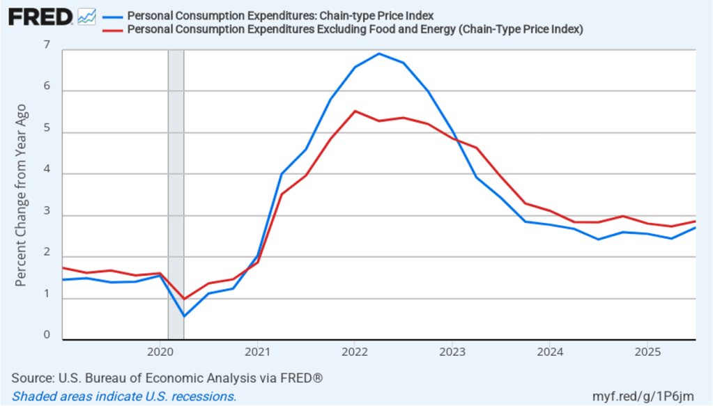
The BEA’s “Personal Income and Outlays” report this morning included monthly data on the personal consumption expenditures (PCE) price index. The Fed relies on annual changes in the PCE price index to evaluate whether it’s meeting its 2 percent annual inflation target. (Fed Chair Kevin Warsh has indicated that in the future he may want the Fed to focus on a different measure of inflation.)
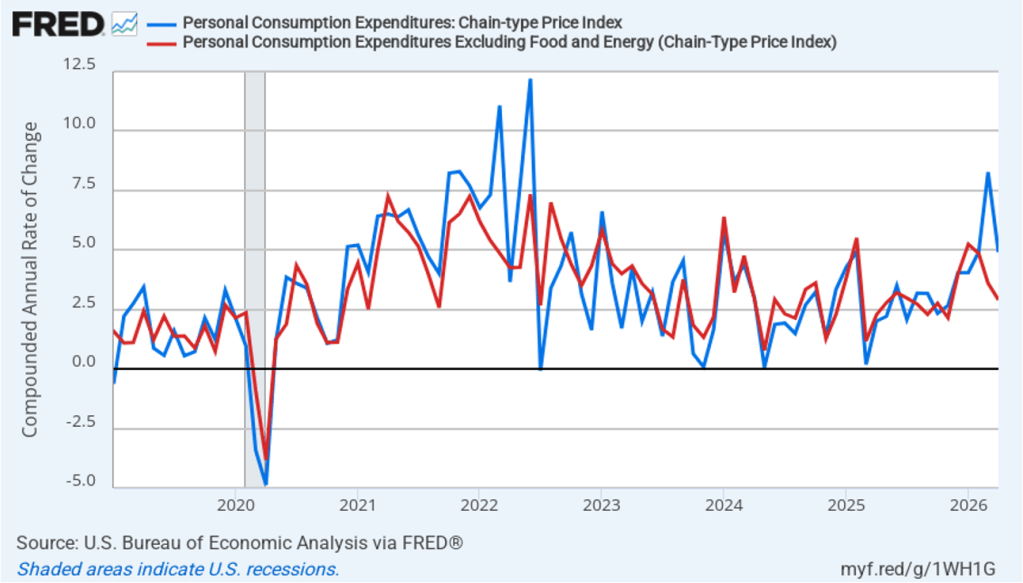
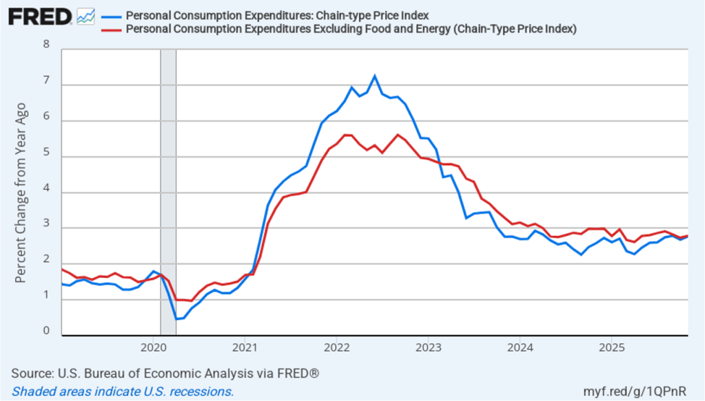
The following figure shows headline PCE inflation (the blue line) and core PCE inflation (the red line)—which excludes energy and food prices—for the period since January 2019, with inflation measured as the percentage change in the PCE from the same month in the previous year. In May, headline PCE inflation was 4.1 percent, up from 3.8 percent in April, and the highest rate since April 2023. Core PCE inflation in May was 3.4 percent, up slightly from 3.3 percent in April. Headline PCE inflation was equal to the forecasts of economists surveyed by FactSet, while core PCE inflation was slightly higher. Both headline PCE inflation and core PCE inflation remain well above the Fed’s 2 percent annual inflation target.
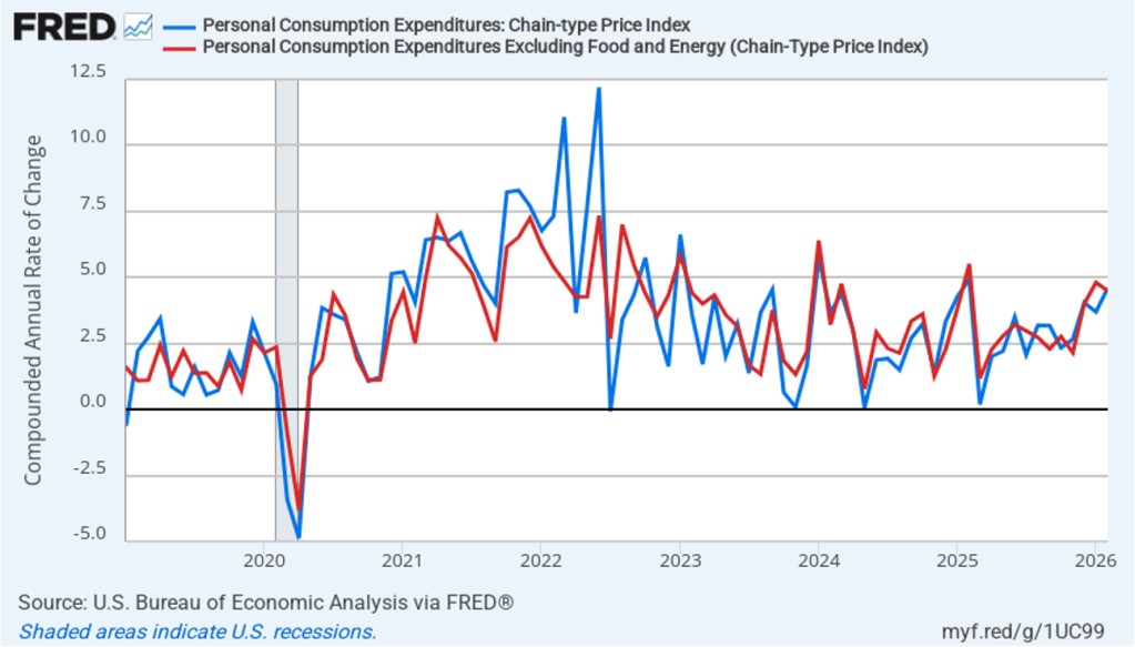
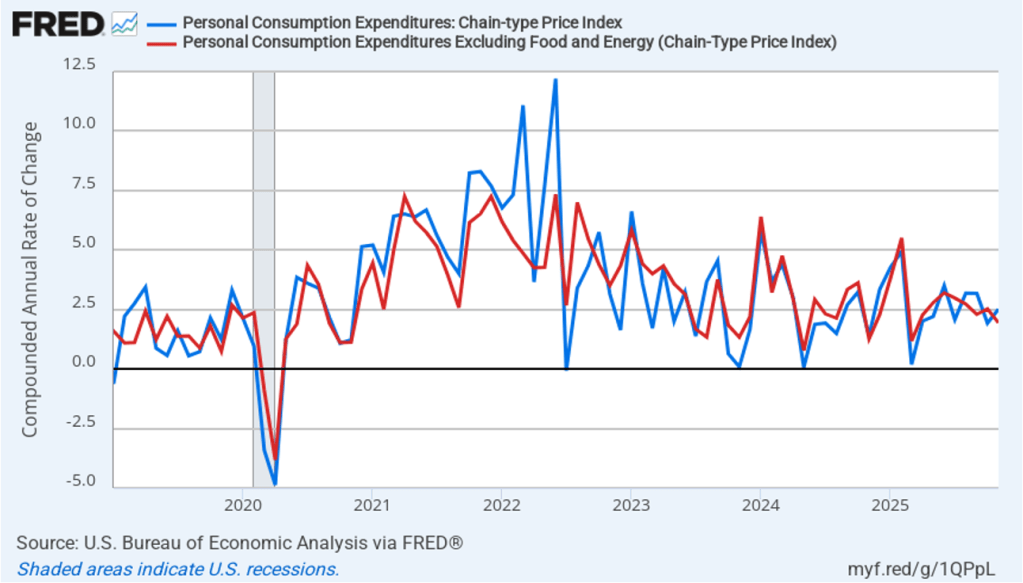
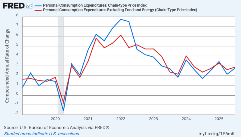
The following figure shows monthly PCE inflation and monthly core PCE inflation calculated by compounding the current month’s rate over an entire year. (Often referred to as 1-month inflation.) Measured this way, headline PCE inflation increased from 5.0 percent in April to 5.5 percent in May. Core PCE inflation rose from 3.0 in April to 3.9 percent in May. Even leaving aside the effect of rising gasoline prices on headline PCE, these data show that in May both core and headline PCE inflation were well above the Fed’s target.
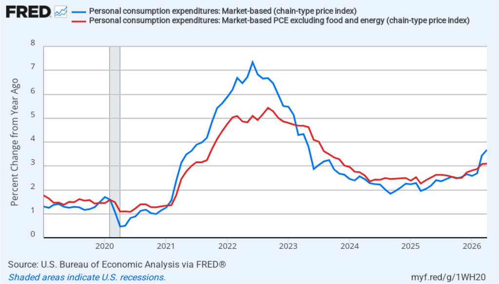
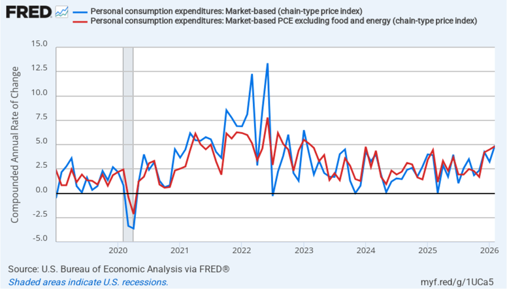
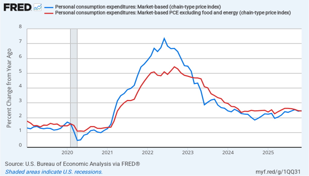
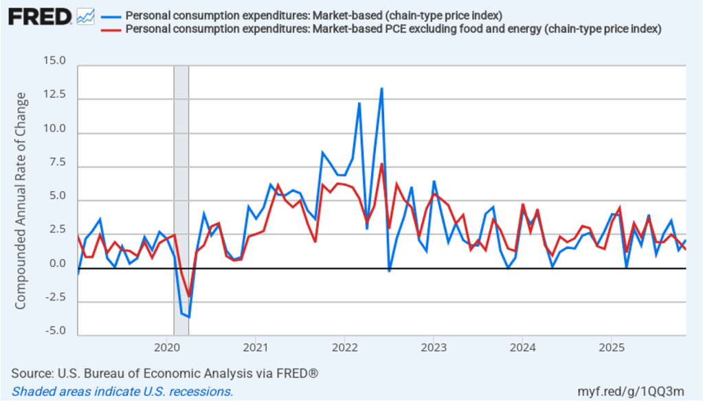
Former Fed Chair Jerome Powell frequently mentioned that inflation in non-market services can skew PCE inflation. Non-market services are services whose prices the BEA imputes rather than measures directly. For instance, the BEA assumes that prices of financial services—such as brokerage fees—vary with the prices of financial assets. So that if stock prices rise, the prices of financial services included in the PCE price index also rise. Powell has argued that these imputed prices “don’t really tell us much about … tightness in the economy. They don’t really reflect that.” The following figure shows 12-month headline inflation (the blue line) and 12-month core inflation (the red line) for market-based PCE. (The BEA explains the market-based PCE measure here.)
Headline market-based PCE inflation was 3.9 percent in May, up from 3.7 percent in April. Core market-based PCE inflation was 3.2 percent in May, up slightly from 3.1 percent in April. So, both market-based measures, although lower than the full PCE measures, show inflation in May remaining well above the Fed’s 2 percent target.
New Fed Chair Kevin Warsh argued in testimony before the Senate that the Fed should stop relying on headline PCE inflation: “The measures [of inflation] I prefer are looking at things that are called trimmed averages. We take out all of the tail-risks, all of the one-off items, and we ask ourselves whether the generalized change in prices is having second-order effects on the economy.”
Trimmed-mean PCE inflationdrops the 31 percent of goods and services with the highest inflation rates and the 24 percent of goods and services with the lowest inflation rates. A closely related measure, median PCE inflation, is calculated by listing the inflation rate in each individual good or service included in the PCE and identifying the inflation rate of the good or service that is in the middle of the list—that is, the inflation rate in the price of the good or service that has an equal number of higher and lower inflation rates.
The following figure shows headline PCE inflation the (blue line), core PCE inflation (the red line) and trimmed-mean PCE inflation (the brown line). Trimmed-mean PCE inflation in May was 2.4 percent, well below both headline and core PCE inflation.
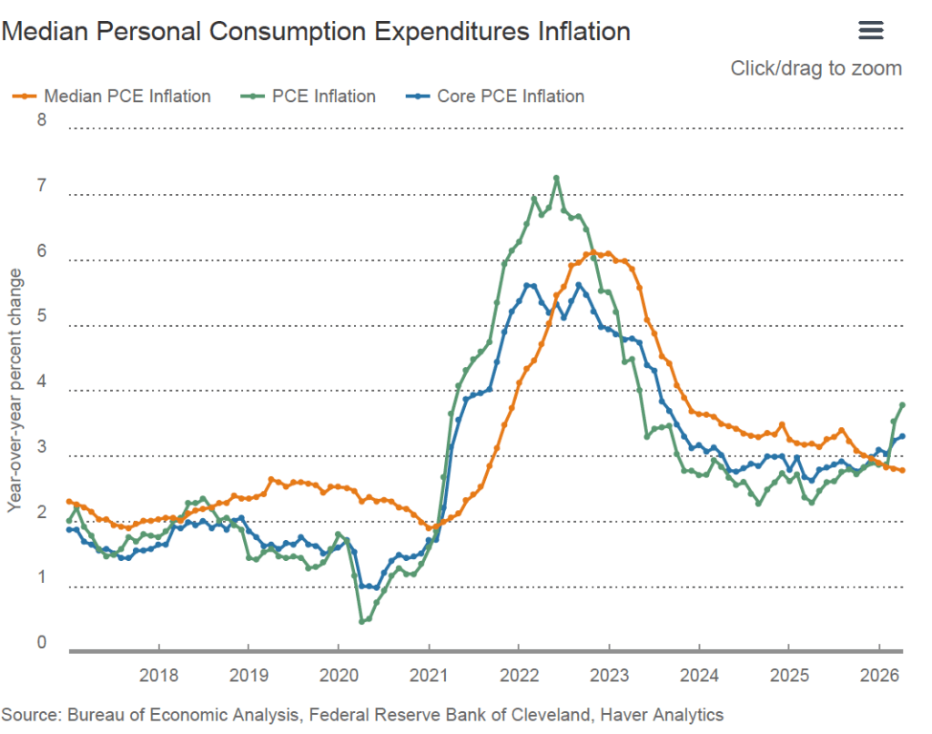
The following figure from the web site of the Federal Reserve Bank of Cleveland shows headline PCE inflation (the green line), core PCE inflation (the blue line), and median PCE inflation (the brown line). In May, median PCE inflation was 2.8 percent, also below both headline and core inflation. So Warsh has a point that these two measures of inflation, which are less affected by particularly high or low rates of inflation in some goods and services, indicate that inflation has been running below the Fed’s currently preferred measure. But these measures also show inflation still running well above the Fed’s 2 percent annual inflation target.
Today’s macro data have had little effect on investors who buy and sell federal funds futures contracts. These investors still expect that the Federal Open Market Committee (FOMC) will leave its target for the federal funds rate unchanged at its meeting on July 28–29 but will raise the target by 0.25 percentage point at its September 15–16 meeting.
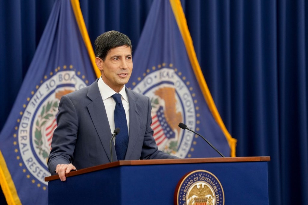
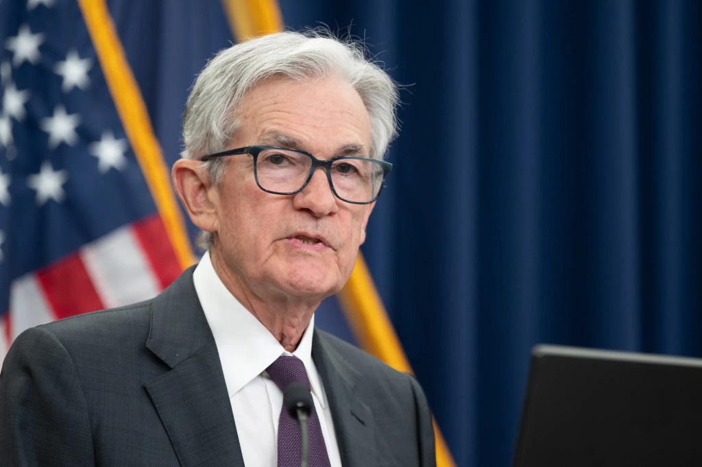
Photo of Kevin Warsh from bloomberg.com via the Wall Street Journal
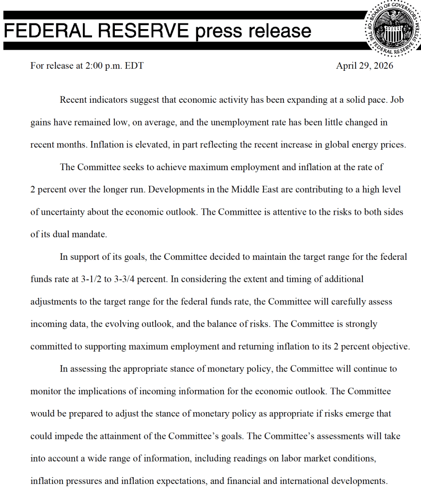
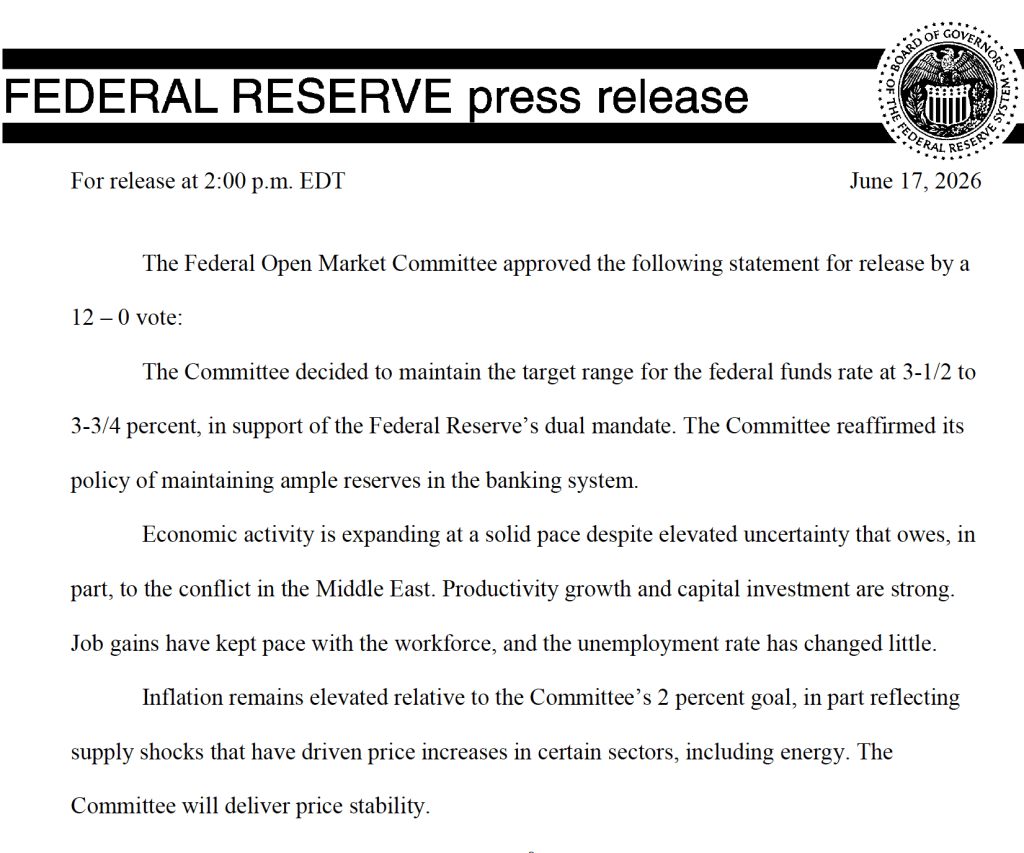
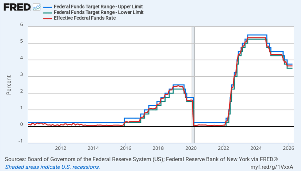
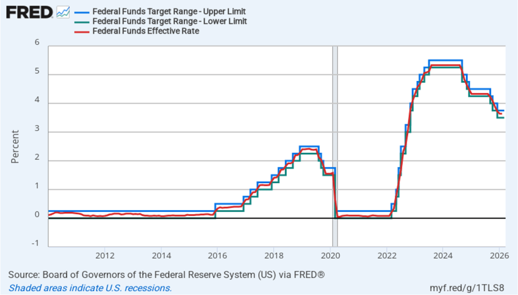
It was a foregone conclusion that at its meeting that ended today, the Federal Open Market Committee (FOMC) would leave unchanged its target range for the federal funds rate at 3.50 percent to 3.75 percent. There was great interest, however, about whether at his first meeting as chair of the committee, Kevin Warsh might indicate changes he would push for in the committee’s procedures.
One immediate change was evident in the statement that the committee released at the end of its meeting. The first statement reproduced below is from April 29, the last meeting Jerome Powell presided over as chair. The second statement is the statement that the committee released today.
The statement released today is much shorter and omits any mention of how the committee might respond in the future to new economic data, other than the simple statement that, “The Committee will deliver price stability.”
The brevity of the statement reflects the skepticism Warsh had voiced in his Senate confirmation hearings on the usefulness of forward guidance, or statements by the FOMC about how it will conduct monetary policy in the future. We discuss forward guidance in Macroeconomics, Chapter 15 (Economics, Chapter 25).
In his press conference following the meeting, Warsh announced that he was forming five new committees to look at: 1) Fed communications, 2) the Fed’s balance sheet, 3) the Fed’s use of data, 4) the effects of technological change and productivity, particularly with respect to artificial intelligence, and 5) the inflation process, with the aim of identifying key drivers of inflation. He indicated that the committees would include members from outside the Fed and were expected to report their findings by the end of the year.
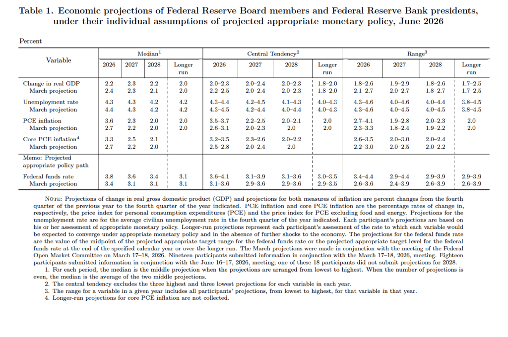
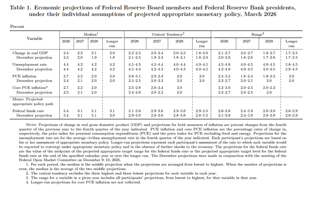
After the meeting, the committee also released a “Summary of Economic Projections” (SEP)—as it typically does after its March, June, September, and December meetings. The SEP presents median values of the, typically, 19 committee members’ forecasts of key economic variables. Notably, Warsh indicated that, although he encouraged his colleagues on the committee to continue submitting their forecasts to be compiled in the SEP, he didn’t submit forecasts. He indicated that the future of the SEP is one of the issues to be considered by his new committee on Fed communications.
The forecasts of key economic variables from the SEP are summarized in the following table, reproduced from the release. (Note that only 5 of the district bank presidents vote at FOMC meetings, although all 12 presidents participate in the discussions and prepare forecasts for the SEP.)
There are several aspects of these forecasts worth noting:
Compared with the previous SEP in March, the committee members reduced their forecast of real GDP growth in 2026 from 2.4 percent to 2.2 percent. The committee members left unchanged their forecast of long-run growth in real GDP at 2.0 percent. Despite reducing their forecast of real GDP growth in 2026, the committee lowered their forecast of the unemployment rate in 2026 from 4.4 percent to 4.3 percent. The committee members left their forecast of the long-run rate of unemployment, often called the natural rate of unemployment, unchanged at 4.2 percent.
Committee members significantly raised their forecast of personal consumption expenditures (PCE) price inflation in 2026 to 3.6 percent from 2.7 percent in March. They raised their forecast of inflation in 2027 slightly and continued to forecast that PCE inflation will decline to the Fed’s 2.0 percent annual target in 2028.
The committee’s forecasts of the federal funds rate at the end of each year from 2026 through 2028 were increased, indicating that the committee sees the federal funds rate as likely to be “higher for longer.” The forecast for the long-run federal funds rate was left unchanged at 3.1 percent.
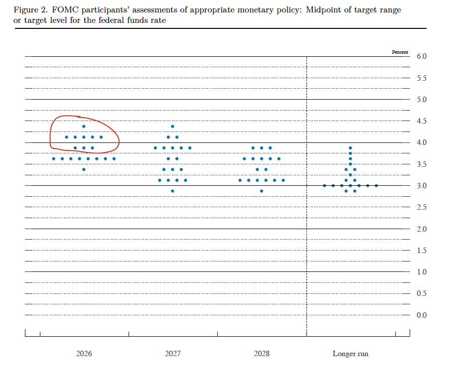
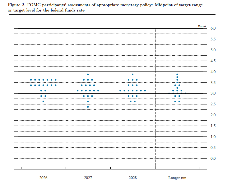
Prior to the meeting, there was much discussion in the business press and among investment analysts about the dot plot, shown below. Each dot in the plot represents the projection of an individual committee member. (The committee doesn’t disclose which member is associated with which dot.) Note that there are 18 dots, representing the 6 members of the Fed’s Board of Governors who provided forecasts and all 12 presidents of the Fed’s district banks.
The dots plotted on the far left of the figure represent the projections by the 18 members of the value of the federal funds rate at the end of 2026. The plots indicate that at this point eight members of the committee forecast no change in the federal funds rate this year, nine members (circled in red) expect at least one increase in the federal funds rate by the end of the year, and only one member expected that there would be a cut in the federal funds by year’s end. The dots plotted on the far right of the figure indicate that there is substantial disagreement among committee members as to what the long-run value of the federal funds rate—the so-called neutral rate—should be. Of course, the plots only represent the forecasts of the committee members and individual committee members are likely to adjust their forecasts as additional macroeconomic data become available in the coming months.
Warsh indicated at his press conference that it was unlikely that he would hold a press conference after each meeting of the committee as Jerome Powell had been doing beginning with the January 2019 meeting.
Warsh made several other notable points at the press conference. He reiterated that the Fed’s inflation target would remain an annual increase of 2.0 percent in the PCE. He noted that he saw the current level of the federal funds rate as having a restrictive effect on only the housing market. And he expressed dissatisfaction with how the economic statistics the FOMC relies upon when setting policy were being compiled. He indicated that the new committee on the Fed’s use of data might formulate suggestions to other federal government agencies, such as the Bureau of Economic Analysis and the Bureau of Labor Statistics, on changes in how they collect data.
Today (June 10), the Bureau of Labor Statistics (BLS) released its report on the consumer price index (CPI) for May. As expected, higher energy prices caused by the conflict in Iran have continued to result in high rates of inflation. The following figure compares headline CPI inflation (the blue line) and core CPI inflation (the red line).
The headline inflation rate, which is measured by the percentage change in the CPI from the same month in the previous year, was 4.2 percent in May, up from 3.8 in April. This was the highest inflation rate since April 2023.
The core inflation rate,which excludes the prices of food and energy, ticked up only slightly to 2.8 percent in May from 2.7 percent in April.
Headline inflation was equal to and core inflation was slightly lower than economists surveyed by FactSet had forecast. (Note that because of last year’s federal government shutdown, inflation data for October and November 2025 are not available.)
In the following figure, we look at the 1-month inflation rate for headline and core inflation—that is the annual inflation rate calculated by compounding the current month’s rate over an entire year. Calculated as the 1-month inflation rate, headline inflation (the blue line) was high at 5.8 percent in May, but down from a very high 8.0 percent in April and 10.9 percent in March. Core inflation (the red line) was 2.5 percent in May, down significantly from 4.6 percent in April.
The following figure emphasizes the role played by energy prices in causing the jump in inflation. The blue line shows the 1-month inflation rate in all energy prices included in the CPI. Inflation in energy prices increased from a very high 56.6 percent in April to a slightly higher 58.8 percent in May. The red line shows the 1-month inflation rate in gasoline prices, which rose from a very high 88.8 percent in April to an even higher 126.4 percent in May.
Did the jump in energy prices pass through to increases in food prices, which are a key concern for many consumers? The following figure shows 1-month inflation in the CPI category “food at home” (the blue bar)—primarily food purchased at grocery stores—and the category “food away from home” (the red bar)—primarily food purchased at restaurants. Inflation in grocery prices slowed markedly to 0.8 percent in May from 8.5 percent in April. Inflation in food prices away from home was 3.7 percent in May, up from 2.8 percent in April. April’s very high rate of increase in grocery prices was due to rising energy prices, but also to sharp increases in beef and fruit and vegetable prices, which had risen for reasons largely unrelated to higher energy costs. Consumers enjoyed some relief in May from the sharp decrease in the rate of increase in grocery prices.
This inflation report is unlikely to have much effect on Fed policymakers as they prepare for the next meeting of the Federal Open Market Committee (FOMC) on June 16–17—Kevin Warsh’s first meeting as Fed chair. Persistently high inflation rates combined with relatively strong data on economic growth and employment make it more likely that the FOMC will increase, rather than cut, its target for the federal funds rate later in the year.
At this point, trading in the federal funds futures market indicates that investors believe that its unlikely that the committee will raise or lower its target for the federal funds rate at its June, July, or September meetings. This morning, investors assigned a 48.6 percent probability of the FOMC raising its target for the federal funds rate at its October 27–28 meeting and a 66.2 percent of doing so at its meeting on December 8–9.
People have collected sports cards for decades. For many years, the most sought-after and highest-priced example was a baseball card featuring Pittsburgh Pirates shortstop Honus Wagner. In the early twentieth century, baseball cards were often included in packs of cigarettes. In 1909, each pack of Sweet Caporal Cigarettes included a baseball card from what collectors call the T206 set. Although Wagner was a major star, relatively few of his cards were issued. That may have been because he was opposed to tobacco use and didn’t want his card to help sell cigarettes or because the tobacco company declined to pay him the fee he required.
There are probably only 50 to 60 Wagner cards in existence. In August 2022, the Wagner card shown below sold at auction for $7.25 million, which was at the time a record.
Image from goldin.co
This record was broken a few days later when the Topps rookie card for New York Yankees outfielder Mickey Mantle sold for $12.6 million.
Image from ha.com
A new record as the highest-priced sports card was set in August 2025, when a card featuring basketball stars Michael Jordan and Kobe Bryant sold for $12.932 million.
Image from ha.com
In recent years, collecting cards from trading card games (TCG) such as Magic: The Gathering, Yu-Gi-Oh!, and, especially, Pokémon has become increasingly popular. Collectors pay higher prices for cards that are in nicer condition. Accordingly, many collectors and dealers submit cards to grading companies that assign the cards a numerical grade, with 10 being the highest grade. The leading card grading company is Professional Sports Authenticator (PSA). Despite its name, PSA now grades more TCG cards than sports card. In 2025, PSA graded 11.5 million TCG cards and 7.7 million sports cards.
In February of this year, a rare PSA-graded 1998 Japanese Pikachu Illustrator Pokémon card with a perfect grade of 10 sold for $16.492 million.
Image from goldin.co
The increasing popularity of collecting TCG cards and the publicity from media reports of the high sales prices of some cards has led to a surge in submissions to card grading companies. PSA is the largest card grading company, grading nearly four times as many cards as its closest competitor. Card grading fees increase with the market value of the card being graded. PSA charges significantly higher prices than its competitors. Collectors are apparently willing to pay the higher prices because PSA-graded cards often sell for higher prices than do cards graded by competitors.
On May 28, PSA surprised many card collectors by announcing that its backlog of cards collectors had submitted but that the company had not yet graded had reached 10 million. As a result, the company stated it was no longer accepting new submissions of lower priced cards. (Cards submitted to its Value Bulk, Value, Value Plus, and Value Max tiers.) The company described the policy as a “temporary pause” that would remain in place until its backlog of ungraded cards had declined to 5 million. PSA estimated that it would take four months to reach that target.
Why did PSA allow its backlog of ungraded cards to grow to 10 million? The backlog is an indication that at the prices it was charging, the quantity of its grading services demanded was much greater than the quantity of grading services it could supply with its existing workforce and grading equipment. Why, then, didn’t it raise its prices to reduce the quantity of its grading services demanded?
In Microeconomics, Chapter 10, Section 10.3, we describe several examples of firms being a situation similar to the one PSA finds itself in. In these situations, firms choose not to raise their prices even though doing so would seem to increase their profits. As we discuss in that chapter, the key reason firms don’t raise prices is they believe their customers might see the price increases as being unfair.
We thought it would be interesting to ask ChatGPT to analyze why PSA didn’t raise its prices when faced with a rapidly expanding backlog of ungraded cards. Here’s ChatGPT’s—lengthy!—answer to this economic puzzle:
Image generated by ChatGPT
They probably could have raised price enough to slow submissions, but that would not have solved the whole problem PSA was trying to solve. In the current 2026 pause, PSA said Value Bulk, Value, Value Plus, and Value Max submissions were being paused because a surge added 1.6 million cards and pushed the active backlog toward 10 million; PSA’s stated goal is to reduce that backlog to 5 million before reopening those tiers. In other words, the target was not “new submissions = grading capacity.” The target was new submissions well below capacity so the existing queue could shrink.
The clean economic answer is:
1. A market-clearing price would only stop the backlog from getting worse. Suppose PSA can grade 90,000 cards per day, a capacity figure PSA itself recently gave for global output. If they priced submissions so exactly 90,000 new cards arrived per day, the backlog would not fall; it would stay stuck. To reduce a 10-million-card backlog to 5 million, they need throughput to exceed incoming volume by millions of cards over the pause period. That means they needed rationing that was stronger than ordinary price clearing.
2. They actually did use price rationing, just in a blunt tiered way. PSA did not close everything. It paused the lower-priced value tiers and left Regular, Express, Super Express, Walk-Through, and premium services open. PSA’s own pricing page shows Regular at $79.99/card, Express at $149/card, Super Express at $349/card, Walk-Through at $599/card, and premium tiers much higher. Baseball America summarized the effect as PSA temporarily pausing all card grading tiers under $80. So one way to read the move is: PSA effectively raised the minimum direct price for new card grading to the Regular tier, while refusing to call the paused Value tiers “available at a surge price.”
3. The demand curve was probably unstable and hard to estimate. A normal market-clearing price assumes the firm can predict how many units will arrive at each price. PSA’s demand was not behaving smoothly. In 2021, after a price increase, PSA still reported receiving more cards in three days than it had received in the prior three months. In 2026, PSA said updated turnaround/service announcements were followed by another rapid demand spike. In that environment, “raise the price until volume equals capacity” is not simple, because each price change can trigger a rush, panic submissions, dealer behavior, and speculation.
4. A huge price increase would damage the brand more than a pause. If PSA had said, “Value Bulk is still open, but now it costs $80, $120, or $200 per card,” many collectors would view that as gouging, especially because value-tier grading is used for lower-value cards. A pause lets PSA say, “we are protecting turnaround times and existing customers,” rather than “we are monetizing a bottleneck.” PSA explicitly framed the 2026 pause as a way to avoid compromising existing orders and to focus on cards already in its care.
5. Grading quality is part of the product. PSA is not just selling a slot in a queue; it is selling trust in the grade. If a backlog forces rushed hiring, rushed training, overloaded receiving, or inconsistent review, the long-term asset — confidence in PSA 10, PSA 9, etc. — can be worth more than the short-term revenue from accepting every card at a higher price. PSA’s own statement tied the pause to protecting the “integrity of the PSA standard.”
6. A pause is easier to reverse than a surge-price regime. A temporary stop says: “These tiers are closed until backlog conditions improve.” A giant price hike creates other problems: customers anchor to the new price, dealers renegotiate, memberships lose value, submitters complain when prices later fall, and competitors can market PSA as exploitative. PSA instead extended Collectors Club memberships during the pause, which suggests they were trying to preserve customer goodwill while reducing intake.
So the best answer is: because the bottleneck was a stock problem, not just a flow problem. Raising prices enough to make new submissions equal daily capacity would still leave the backlog in place. To drain the backlog, PSA needed submissions below capacity; pausing the cheapest/highest-volume tiers achieved that more predictably, while keeping high-value urgent tiers open and avoiding the optics of extreme surge pricing.
This morning (June 5), the Bureau of Labor Statistics (BLS) released its “Employment Situation” report (often called the “jobs report”) for May. The report showed a stronger than expected increase in employment.
The jobs report has two estimates of the change in employment during the month: one estimate from the establishment survey, often referred to as the payroll survey, and one from the household survey. As we discuss in Macroeconomics, Chapter 9, Section 9.1 (Economics, Chapter 19, Section 19.1), many economists and Federal Reserve policymakers believe that employment data from the establishment survey provide a more accurate indicator of the state of the labor market than do the household survey’s employment and unemployment data. (The groups included in the employment estimates from the two surveys are somewhat different, as we discuss in this post.)
According to the establishment survey, there was a net increase of 172,000 nonfarm jobs during May. Economists surveyed by the Wall Street Journal had forecast an increase of only 80,000 jobs. Economists surveyed by Bloomberg had a slightly higher forecast of a net increase of 88,000 jobs. The BLS revised upward its previous estimates of employment in March and April by a combined 93,000 jobs. (The BLS notes that: “Monthly revisions result from additional reports received from businesses and government agencies since the last published estimates and from the recalculation of seasonal factors.”)
The following figure from the jobs report shows the net change in nonfarm payroll employment for each month in the last two years. The figure shows that the relatively strong employment increases of the past three months represent a break from the unusual pattern in that began in the middle of 2025 in which months of declining employment and months of increasing employment had been alternating.
These increased employment gains are not consistent with an increasingly popular view among economists that slowing labor force growth had resulted in the break-even rate of employment growth—the rate of employment growth at which the unemployment rate remains constant—having fallen to close to zero.
In fact, despite the strong increase in employment, the unemployment rate, which is calculated from data in the household survey, was unchanged in May at 4.3 percent. As the following figure shows, the unemployment rate has been remarkably stable over the past year and a half, staying between 4.0 percent and 4.4 percent in each month since May 2024. The Federal Open Market Committee’s current estimate of the natural rate of unemployment—the normal rate of unemployment over the long run—is 4.2 percent. So, unemployment is slightly above that estimate of the natural rate. (We discuss the natural rate of unemployment in Macroeconomics, Chapter 9 and Economics, Chapter 19.)
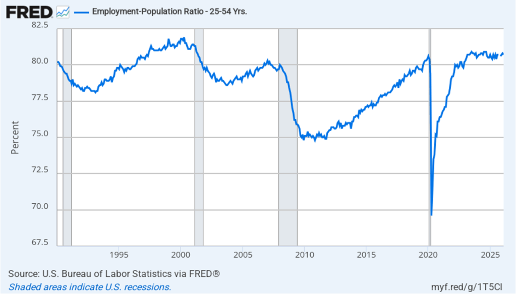
As the following figure shows, the monthly net change in jobs from the household survey moves much more erratically than does the net change in jobs from the establishment survey. As measured by the household survey, there was a net increase of 149,000 jobs in May, roughly similar to the increase in the establishment survey. But the household survey shows an overall decline in jobs during the past five months, in contrast to the net increase in jobs shown in the establishment survey. (Note that because of last year’s shutdown of the federal government, there are no data for October or November.) It’s not unusual for the two surveys to show significantly different movements in net job creation, particularly over short periods of time.
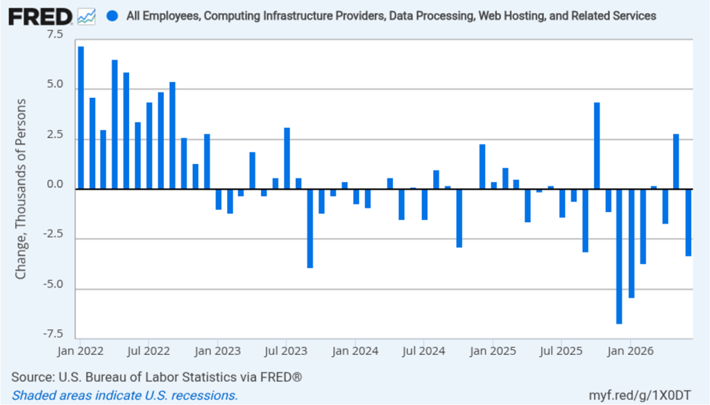
The household survey has another important labor market indicator: the employment-population ratio forprime age workers—those workers aged 25 to 54. In May the ratio was 80.8 percent, up slightly from 80.7 percent in April. The prime-age population ratio remains above its value for most of the period since 2001. The persistently high levels of the prime-age employment-population ratio indicate continuing strength in the labor market.
There have been media reports of firms, including Salesforce, Cloudflare, Coinbase, Cisco Systems, and Meta Platforms, laying off workers in information systems. The following figure shows net employment changes in the BLS employment category of “computing infrastructure providers, data processing, web hosting, and related services.” Employment in this sector has been declining during most months since the beginning of 2023, but May was an exception with a net increase of 3,700 jobs.
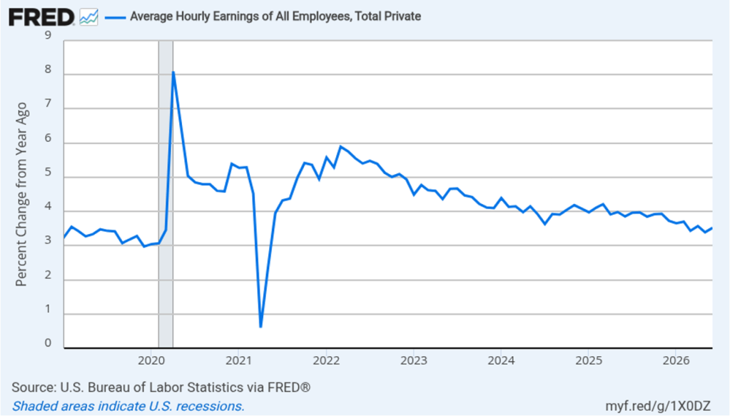
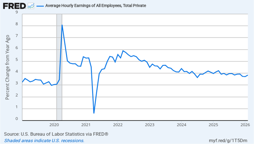
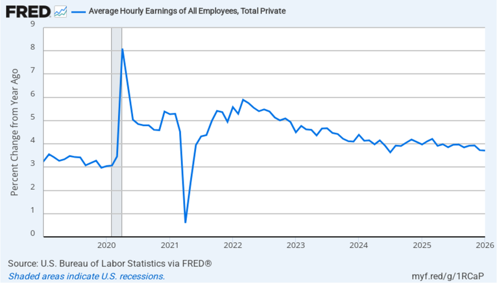
The establishment survey also includes data on average hourly earnings (AHE). As we noted in this post, many economists and policymakers believe the employment cost index (ECI) is a better measure of wage pressures in the economy than is the AHE. The AHE does have the important advantage of being available monthly, whereas the ECI is only available quarterly. The following figure shows the percentage change in the AHE from the same month in the previous year. The AHE increased 3.4 percent in May, down from 3.6 percent in April.
What effect is this jobs report likely to have on the decisions of the Federal Reserve’s policymaking Federal Open Market Committee (FOMC) at its next meeting on June 16–17, the first meeting with Kevin Warsh as chair? The relatively strong growth in employment during the past three months make it unlikely that the FOMC will see current conditions in the job market as warranting a cut in the committee’s target range for the federal funds rate. In addition, disruptions to the world oil market as a result of the conflict in Iran have caused oil prices to rise, putting upward pressure on the price level. The effects of tariff increases have likely not yet fully passed through to increases in prices. These factors make it likely that the committee will keep its target range for the federal funds rate unchanged at its next meeting and may even begin considering future increases in the target range.
The probability that investors in the federal funds futures market assign to the FOMC keeping its target rate unchanged at its June meeting increased to 97.2 percent this morning from 95.4 percent yesterday. Investors now assign a higher probability to a rate increase by the end of the year than to a rate cut.
The period between the two World Wars—the 1920s and 1930s—is often called the Golden Age of Mystery Novels. Authors such as Agatha Christie and Dorothy Sayers in the United Kingdom, and Ellery Queen (pen name of cousins Frederic Dannay and Manfred B. Lee) and Mary Roberts Rinehart in the United States, topped the bestseller lists and are still read today.
One of the attractions of mystery stories from this period is the, often accidental, insights they give into life during those times. Some customs differ sharply from those of today. For instance, absolutely everyone—man or woman—both smokes and drinks alcohol. Racial attitudes were far from enlightened. For a particularly shocking example, search online for the original title of the Agatha Christie novel now published as And Then There Were None. Attitudes toward women were at least somewhat less problematic in part because some of the most widely read mystery writers were women.
But in some respects, the attitudes of characters in these novels could be surprisingly contemporary. British writer Freeman Wills Crofts wrote a series of mysteries featuring the Scotland Yard Chief Inspector Joseph French. The following appears in Crofts’s novel Fatal Venture, first published in 1939:
“Generally speaking, the deceased was not popular. … He was also a keen and successful businessman, and, as the Chief Inspector knew, one man’s gain meant another man’s loss and there must have been many financial casualties who had no cause to love him.”
As a side note, if you had to be a character in a Golden Age mystery, you absolutely didn’t want to be an unpleasant, older, wealthy man. The half-life of such characters was generally measured in hours. In this case, John Stott—the person Inspector French is referring to—is the wealthy victim whose murder French has to solve.
Image of the novel from Amazon.com
Inspector French’s view that “one man’s gain meant another man’s loss” echoes recent arguments that rich businesspeople don’t deserve the wealth their success brings. This view runs counter to the fundamental economic idea that if a transaction is freely entered into, the transaction must benefit both parties. Otherwise, why would the party who is made worse off have agreed to the transaction?
Even in the case where there is an imbalance in economic power—for instance, when a consumer is buying a product from a monopolist—the purchase must have made the buyer better off, or he or she wouldn’t have made it. In this case, though, we can argue that, by forming monopolies, sellers make themselves better off at the expense of consumers. In the United States, the antitrust laws are intended to deal with that situation by making illegal mergers and other business practices that make consumers worse off.
In general, though, entrepreneurs, by starting new businesses or introducing new products, make consumers better off even if the entrepreneurs become very wealthy. In a famous academic paper, Nobel laureate William Nordhaus of Yale University, estimated the “fraction of the benefits from new technologies that have been captured by innovators … as compared to the fraction that have been passed on in lower prices.” He found that innovators captured only 2.2 percent of the social returns to innovation. The remainder of the returns represent consumer surplus. (We discuss the role of entrepreneurs in a market system in Microeconomics, Chapter 2, Section 2.3. We discuss the concept of consumer surplus in Chapter 4.)
In an opinion column on bloomberg.com, Michael Strain of the American Enterprise Institute noted that “a back-of-the-envelope calculation [applying] Nordhaus’s result to Bezos suggests he has created $5.4 trillion in value for the rest of society.” As Strain’s reference to this calculation as being “back-of-the-envelope” indicates, it’s not clear that Nordhaus’s analysis, which is based on data for the U.S. nonfarm business sector, can be applied to the contribution of a single entrepreneur like Bezos. But most economists would agree with the general point that entrepreneurs generate benefits to consumers that are far greater than the return the entrepreneurs receive for their contributions—even if the entrepreneurs end up earning billions.
Inspector French solved the mystery of John Stott’s murder, proving himself to have been an excellent detective even if he wasn’t a very good economist.
Note: In this opinion column, Glenn discusses issues—including the U.S. current account deficit, the role of the U.S. dollar in the international financial system, and the effect of the exchange value of the dollar on the U.S. economy—covered in Macroeconomics, Chapter 18 (Economics, Chapter 28).
This opinion column first appeared in Project Syndicate.
The Policy Pivot Trump Needs
US President Donald Trump’s administration believes that the dollar’s reserve-currency status has tilted the global playing field against America and undermined the country’s competitiveness. While wrong about the dollar, the White House is right about an issue that economists—who, unlike voters, abstract from the exchange rate’s distributional effects—often ignore. As November’s midterm elections approach, the administration needs a policy pivot if it is to meet its rebalancing goals and strengthen the US economy.
To be sure, the dollar’s global role, all else being equal, increases its value but also leaves the United States running larger current-account deficits than it would otherwise. But focusing solely on a reserve currency’s challenges overlooks its benefits and, importantly, the non-tariff policy tools that can address domestic spillovers—the impetus for Trump’s “Liberation Day” tariffs, which aimed to rein in imports and promote exports.
Economists have responded to the Trump administration’s concerns about US Federal Reserve swap lines with foreign central banks by arguing that they are a feature, not a bug, of the dollar’s position, which requires the US to supply greenbacks when needed. They have also pointed out that while current-account deficits may be associated with a strong dollar, the US has had large trade imbalances, with the attendant fretting, even when the greenback’s foreign-exchange value has been relatively low.
Instead, economists emphasize the dollar’s “exorbitant privilege,” including lower borrowing costs and the ability to impose financial sanctions on geopolitical adversaries. Moreover, they counter that tariffs are not an effective response to the dollar’s impact on US exports because they raise domestic manufacturing costs (roughly half of US imports are intermediate goods) and do not reduce the macro imbalances driving the overall trade deficit.
These arguments are correct, but also incomplete. In fact, Trump’s concerns reflect a crucial political-economy question: the distributional implications of dollar dominance.
To see why, consider Robert E. Rubin’s tenure as US Treasury Secretary in the Clinton administration. His mantra was that “a strong dollar is good for America.” He could have been referring to the features of the US economy that underpin the dollar’s status, such as institutional and policy stability and deep financial markets. Whatever the exact meaning, his stance reflected the prevailing view on Wall Street, which benefited from the stronger dollar implied by reserve-currency status.
But for all the benefits that accrue to financiers and consumers, a stronger dollar makes it harder for US industry to compete globally, to the detriment of industrial employment, incomes, and communities. Trump’s position is thus reminiscent of the political tug-of-war in 1925 in the UK over returning pound sterling to its pre-World War I exchange rate under the gold standard. Despite supporting financial interests and the stronger pound, then-Chancellor of the Exchequer Winston Churchill said: “I would rather see finance less proud and industry more content.”
Trump’s economic agenda recognizes the adverse effects of globalization and technological advances on certain parts of American society, in contrast to economists’ emphasis on averages and overall benefits. But Trump misses the simple insight that there are more—and better—ways to help US manufacturing and its left-behind workers than through a weaker dollar alone. He has several policy instruments at his disposal that can address these voters’ concerns and help achieve his administration’s goals while preserving support for the dollar’s reserve-currency role.
For starters, the administration can support a robust industrial sector by increasing public funding for basic research, which advances technology, and a network of applied research centers to diffuse advances in industrial processes. Streamlining regulatory approvals for construction and electricity transmission will also be crucial.
Second, to help workers develop new skills, the administration could channel more resources toward community colleges, while a substantially expanded Earned Income Tax Credit would increase rewards for work. Lastly, more targeted place-based aid could help those areas facing severe disruptions from globalization and technology.
By focusing on the problems associated with a stronger dollar, Trump and his economic advisers have asked an old question in a new way. Their mistake is insisting on answering it with the wrong instrument. Weakening the dollar, including by eroding policy predictability and the economic institutions underpinning its hegemony, will exacerbate the affordability pressures many Americans face and harm the country’s fiscal position. The question now is whether the administration will see the need for a policy pivot in time to affect the midterms.
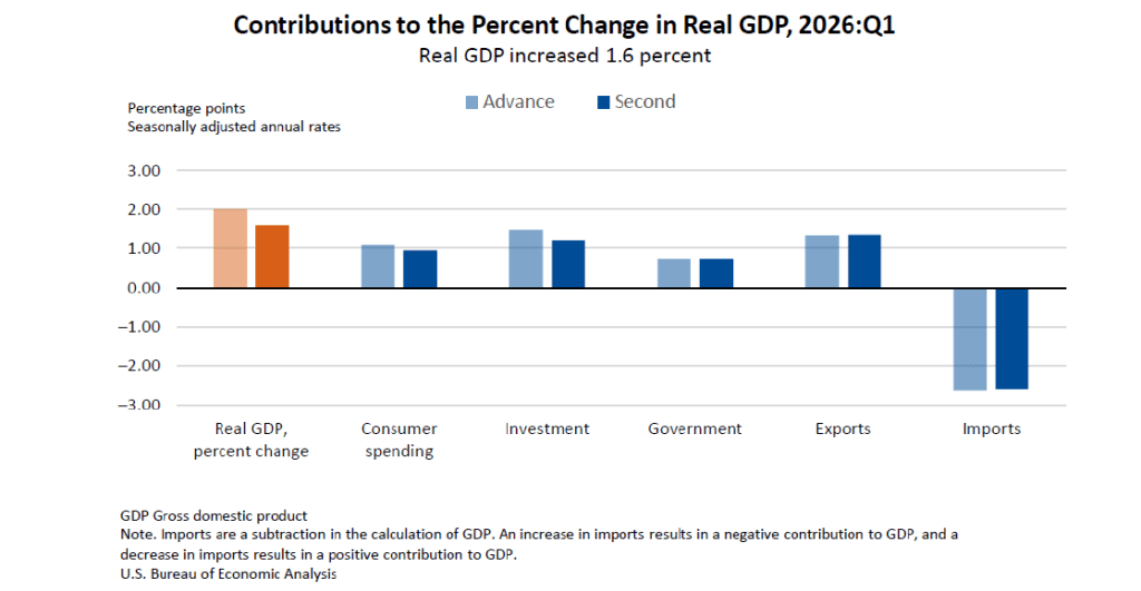
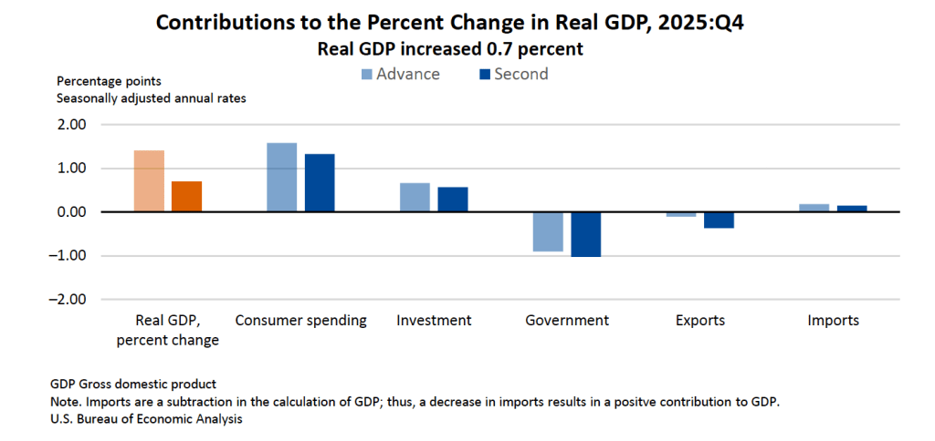
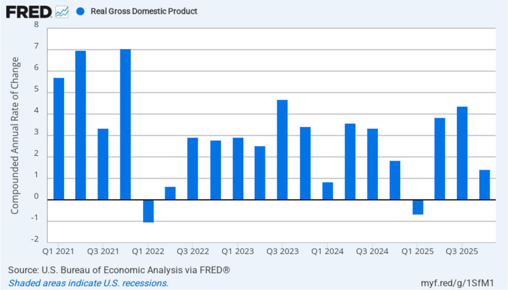
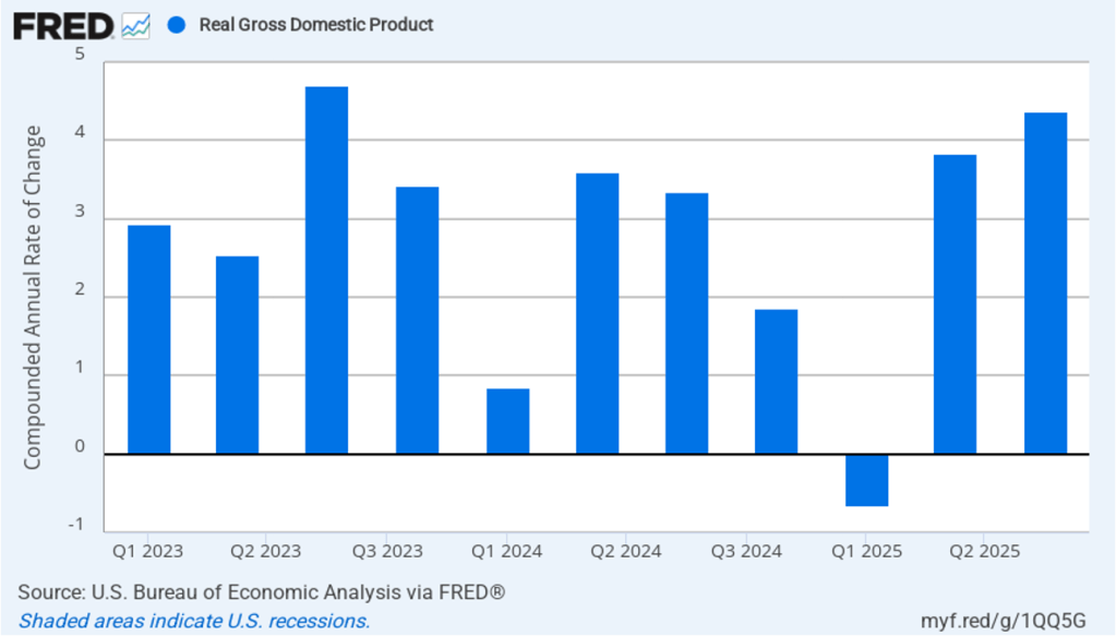
The Bureau of Economic Analysis (BEA) released two reports this morning (May 28): “GDP (Second Estimate) and Corporate Profits, 1st Quarter 2026” and “Personal Income and Outlays, April 2026.” The BEA revised downward its estimate of real GDP growth in the first quarter of 2026 from an annual rate of 2.0 percent to an annual rate of 1.6 percent. Economists surveyed by the Wall Street Journal had expected that the BEA would leave its estimate of real GDP growth in the first quarter unchanged. The following figure shows the BEA’s estimated rates of GDP growth in each quarter beginning with the first quarter of 2022.
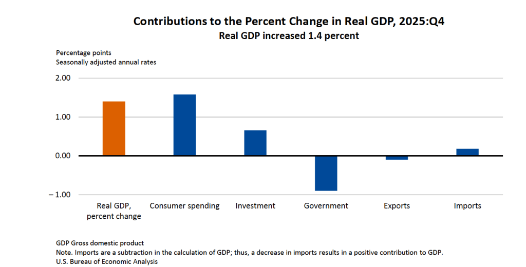
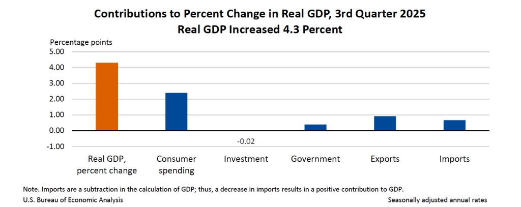
The following figure—taken from the BEA report—shows the contributions of each component of spending to the BEA’s downward revision of its estimate of GDP growth. The growth of both consumption spending and investment spending, which are the largest component of GDP, were revised downward. The downward revision in consumption spending reflects lower spending on services and the downward revision in investment spending reflects lower business spending on inventories.
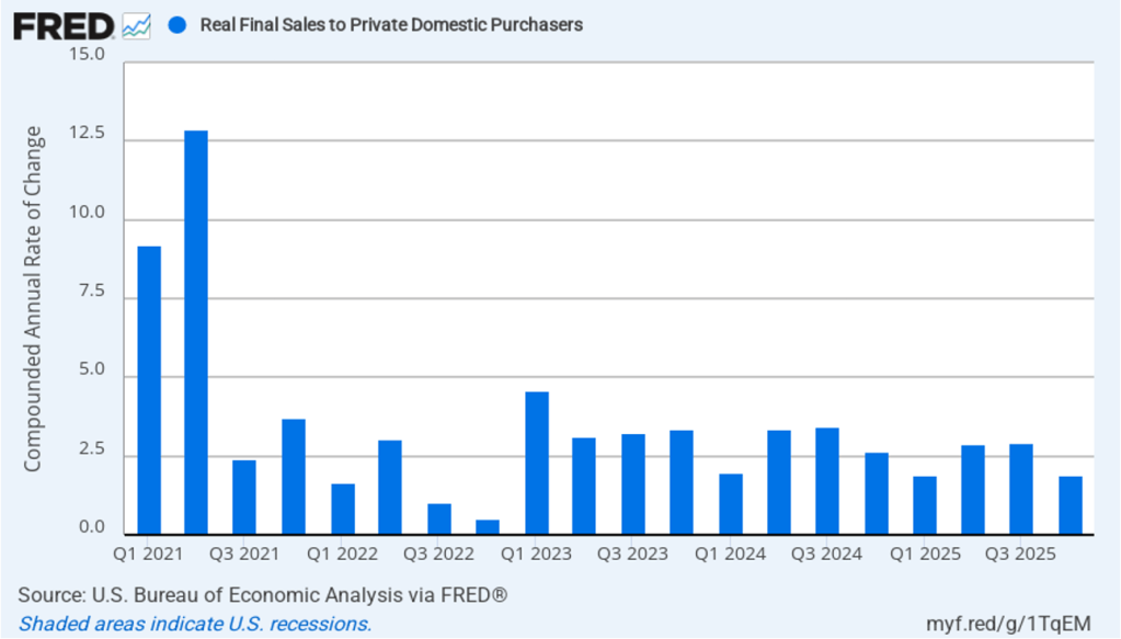
As we’ve discussed in previous blog posts, to better gauge the state of the economy, policymakers—including former Fed Chair Jerome Powell—often prefer to strip out the effects of imports, inventory investment, and government expenditures—which can be volatile—by looking at real final sales to private domestic purchasers, which includes only spending by U.S. households and firms on domestic production. As the following figure shows, real final sales to domestic purchasers increased at an annual rate of 2.4 percent in the first quarter, which was well above the 1.6 percent rate of increase in real GDP and also above the U.S. economy’s expected long-run annual real growth rate of 1.8 percent. Note also that real final sales to private domestic purchasers grew by 2.9 percent in the third quarter of 2025, during which real GDP grew by 4.4 percent, and by 1.9 percent in the first quarter of 2025, when real GDP declined by 0.6 percent. So this measure of output is more stable and likely is a better indicator of the underlying growth rate in the economy than is the growth rate of real GDP.
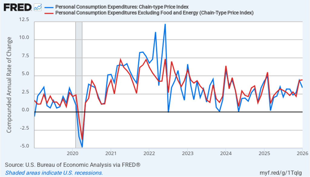
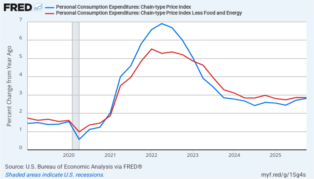
The BEA’s “Personal Income and Outlays” report this morning included monthly data on the personal consumption expenditures (PCE) price index. The Fed relies on annual changes in the PCE price index to evaluate whether it’s meeting its 2 percent annual inflation target. The following figure shows headline PCE inflation (the blue line) and core PCE inflation (the red line)—which excludes energy and food prices—for the period since January 2019, with inflation measured as the percentage change in the PCE from the same month in the previous year. In April, headline PCE inflation was 3.8 percent, up from 3.5 percent in March. Core PCE inflation in April was 3.3 percent, up slightly from 3.2 percent in March. Headline PCE inflation was slightly below and core PCE inflation was equal to the forecasts of economists surveyed by FactSet. Both headline PCE inflation and core PCE inflation remain well above the Fed’s 2 percent annual inflation target.
The following figure shows monthly PCE inflation and monthly core PCE inflation calculated by compounding the current month’s rate over an entire year. (Often referred to as 1-month inflation.) Measured this way, headline PCE inflation fell from the very high rate of 8.9 percent in March to a still high rate of 4.9 percent in April. Core PCE inflation declined from 3.6 in March to 2.9 percent in April. Even leaving aside the effect of rising gasoline prices on headline PCE, these data show that in March both core and headline PCE inflation were well above the Fed’s target.
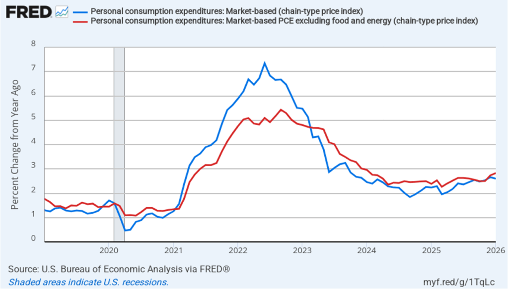
Former Fed Chair Jerome Powell frequently mentioned that inflation in non-market services can skew PCE inflation. Non-market services are services whose prices the BEA imputes rather than measures directly. For instance, the BEA assumes that prices of financial services—such as brokerage fees—vary with the prices of financial assets. So that if stock prices rise, the prices of financial services included in the PCE price index also rise. Powell has argued that these imputed prices “don’t really tell us much about … tightness in the economy. They don’t really reflect that.” The following figure shows 12-month headline inflation (the blue line) and 12-month core inflation (the red line) for market-based PCE. (The BEA explains the market-based PCE measure here.)
Headline market-based PCE inflation was 3.7 percent in April, up from 3.4 percent in March. Core market-based PCE inflation was 3.1 percent in April, unchanged from March. So, both market-based measures, although lower than the full PCE measures, show inflation in April remaining well above the Fed’s 2 percent target.
New Fed Chair Kevin Warsh argued in testimony before the Senate that the Fed should stop relying on headline PCE inflation: “The measures [of inflation] I prefer are looking at things that are called trimmed averages. We take out all of the tail-risks, all of the one-off items, and we ask ourselves whether the generalized change in prices is having second-order effects on the economy.”
Trimmed-mean PCE inflationdrops the 31 percent of goods and services with the highest inflation rates and the 24 percent of goods and services with the lowest inflation rates. A closely related measure, median PCE inflation, is calculated by listing the inflation rate in each individual good or service included in the PCE and identifying the inflation rate of the good or service that is in the middle of the list—that is, the inflation rate in the price of the good or service that has an equal number of higher and lower inflation rates.
The following figure shows headline PCE inflation the (blue line), core PCE inflation (the brown line) and trimmed-mean PCE inflation (the red line). Trimmed-mean PCE inflation in April was 2.4 percent, well below both headline and core PCE inflation.
The following figure from the web site of the Federal Reserve Bank of Cleveland shows headline PCE inflation (the green line), core PCE inflation (the blue line), and median PCE inflation (the brown line). In April, median PCE inflation was 2.8 percent, also below both headline and core inflation. So Warsh has a point that these two measures of inflation, which are less affected by particularly high or low rates of inflation in some goods and services, indicate that inflation has been running below the Fed’s currently preferred measure. But these measures also show inflation running well above the Fed’s 2 percent annual inflation target.
Today’s macro data have had little effect on investors who buy and sell federal funds futures contracts. For some time, investors have seen little likelihood that the Fed’s policymaking Federal Open Market Committee would cut its target for the federal funds rate until sometime next year. These investors see it as far more likely that the committee will raise its target by the end of the year than that it will cut it.
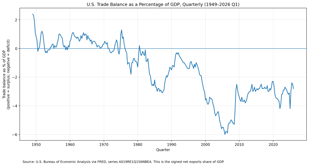
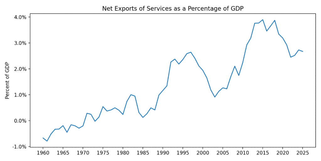
The United States hasn’t exported more goods and services than its imported since 1975. The following figure shows the U.S. trade deficits since 1949 as a percentage of GDP. (In this figure, we’re measuring the trade balance as net exports rather than the trade balance as reported in the balance of payment accounts. The two measures are highly correlated.)
As we discuss in Macroeconomics, Chapter 18 (Economics, Chapter 28), a trade deficit is driven by the relationship between a country’s national saving and domestic investment rather than by the competitiveness of a country’s exports or by the trade agreements a country has with its trading partners.
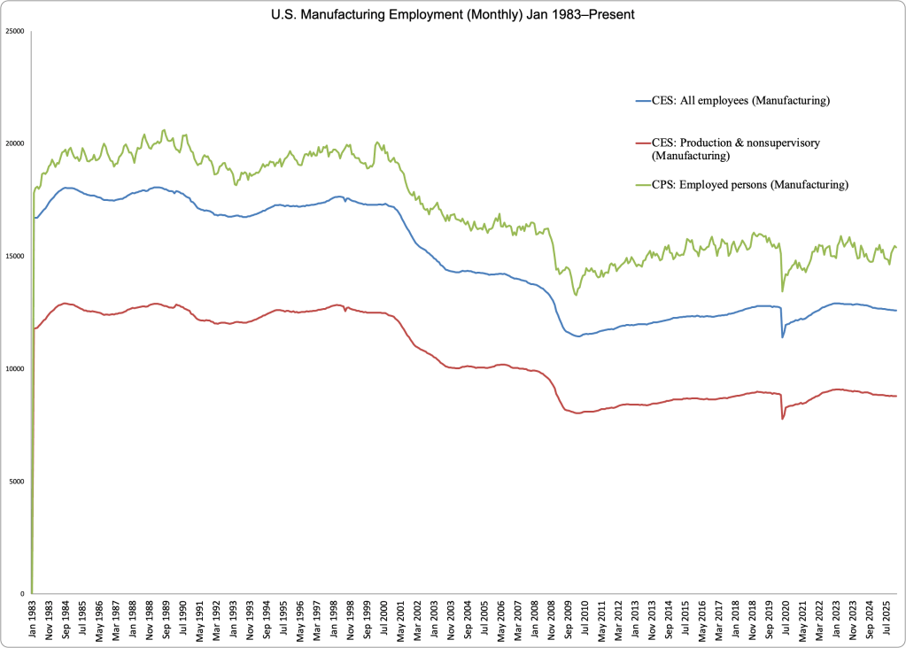
Clearly, though, many politicians see a trade deficit as a problem. Some politicians have argued that the U.S. trade deficit would shrink if more of the manufactured goods Americans consume were produced in the United States. Would it be possible, for example, to produce more consumer electronics in the United States? A few months ago, Apple stopped assembling units of the Mac Pro, its high-end, professional workstation computer, at a facility in Austin, Texas. More recently, Apple announced that it would begin assembling its Mac Mini, a compact desktop computer that lacks a keyboard and a monitor, in a new factory in Houston. These examples indicate that Apple can produce electronic products in the United States. But the number of Mac Pros or Mac Minis Apple sells each year is very small compared with the estimated 248 million iPhones it sold in 2025.
In March, Apple introduced the MacBook Neo. At a price of $599 ($499 if you are a college student or faculty member), the Neo is Apple’s first entry into the low-priced laptop market that had been dominated by the Google Chromebook. By the end of April, sales were running far above Apple’s initial forecasts and the firm was planning to double production of the Neo from 5 million units to 10 million—all of which would be assembled in China or Vietnam.
Why doesn’t Apple assemble the Neo in the United States? There are several reasons, but the most important is that the Neo is Apple’s first entry into the low-priced laptop market that is now dominated by Google’s Chromebook—all of which are assembled overseas. Apple is able to price the Neo at $599 only if it keeps its production costs very low. Workers who assemble electronic products like laptops require substantial training. Firms such as Foxconn and Quanta Computer have been assembling electronic products for many years in countries such as China and Vietnam. As a result, these countries have large numbers of workers experienced in assembling electronic products. U.S.-based firms have many fewer workers with this experience.
Assembly lines for electronic products need to be flexible to respond quickly when firms introduce new models like the Neo. So, in addition to hiring hundreds of thousands of workers to work on assembly lines, Foxconn, Quanta, and other firms operating in China, India, and Vietnam hire thousands of engineers. Typically, these engineers do not have college degrees, but they have sufficient training to rapidly redesign and reconfigure assembly lines to produce new models. In 2010, when President Barack Obama pressed Steve Jobs, the late Apple CEO, to produce iPhones in the United States, Jobs stated that he would need 30,000 such engineers if Apple were to make iPhones in the United States, but “you can’t find that many in America to hire.”
In addition, wages are much higher in the United States than in China or Vietnam. Workers assembling electronic products in China earn about $6 per hour. Workers doing the same jobs in Vietnam earn only about $2 per hour. In the United States, according to the Bureau of Labor Statistics, in April 2026, production workers in computer and electronic product manufacturing were earning $39.32 per hour.
The factories that assemble Apple products in Asia typically have many suppliers located near them—a so-called supplier ecosystem. Some suppliers make components of the products—although other components are produced outside of Asia, including in the United States—as well as providing repair, maintenance, and other services to the factories. The lack of such a supplier ecosystem would make assembling Neos in the United States very difficult. According to an article in the New York Times, when Apple started producing the Mac Pro in Austin, Texas, it had trouble finding a local firm to produce the custom screws needed in assembling the computers. According to the article, “In China, Apple relied on factories that can produce vast quantities of custom screws on short notice. In Texas, … [Apple had to rely on a] 20-employee machine shop that … could produce at most 1,000 screws a day.”
Production of some electronic goods—notably computer chips—has been expanding in the United States. In 2022, Congress passed the Creating Helpful Incentives to Produce Semiconductors (CHIPS) and Science Act. The Act authorized the federal government to pay subsidies to help firms increase chip production in the United States. Intel, TSMC, Samsung, and Micron have all constructed new chip factories in the United States. As we mentioned earlier, Apple intends to assemble its Mac Mini in a new factory in Houston.
But the United States lacks a comparative advantage in the assembly of high-volume electronic products like the iPhone or MacBook Neo. So it’s unlikely that the expansion of U.S. chip production will be followed by a similar expansion in the assembly of smartphones and computers.
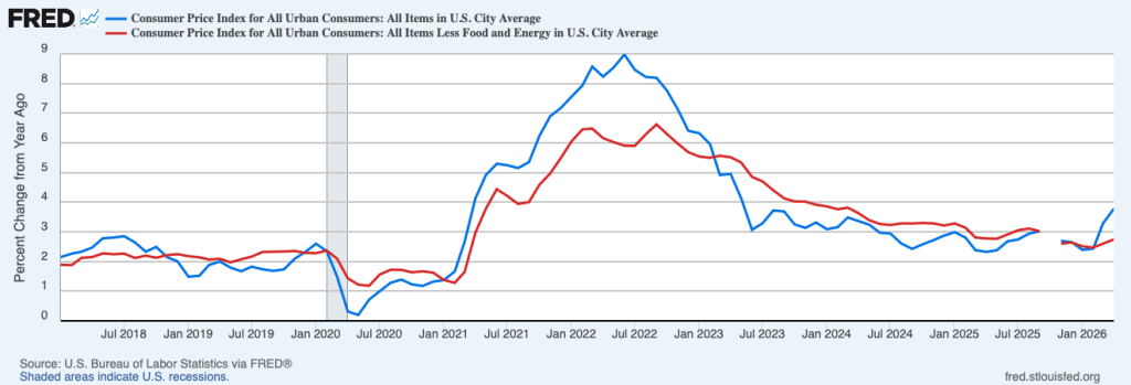
Today (May 12), the Bureau of Labor Statistics (BLS) released its report on the consumer price index (CPI) for April. As expected, higher energy prices resulting from the conflict in Iran led to a jump in inflation. The following figure compares headline CPI inflation (the blue line) and core CPI inflation (the red line).
The headline inflation rate, which is measured by the percentage change in the CPI from the same month in the previous year, was 3.8 percent in April, up from 3.3 in March. This was the highest inflation rate since May 2023.
The core inflation rate,which excludes the prices of food and energy, was 2.7 percent in April, up slightly from 2.6 percent in March.
Headline inflation and core inflation were both slightly higher than economists surveyed by the Wall Street Journal had expected.
In the following figure, we look at the 1-month inflation rate for headline and core inflation—that is the annual inflation rate calculated by compounding the current month’s rate over an entire year. Calculated as the 1-month inflation rate, headline inflation (the blue line) was a very high 8.0 percent in April, which was actually down from 10.9 percent in March. Core inflation (the red line) was 4.6 percent in April, up from 2.4 percent in March.
The following figure emphasizes the role played by energy prices in causing the jump in inflation. The blue line shows the 1-month inflation rate in all energy prices included in the CPI. Inflation in energy prices declined from a very high 245.1 percent in March to a still high 56.6 percent in April. The red line shows the 1-month inflation rate in gasoline prices, which declined from an astounding 907.4 percent in March to a still very painful 88.8 percent in April.
Did the jump in energy prices pass through to increases in food prices, which are a key concern for many consumers? The following figure shows 1-month inflation in the CPI category “food at home” (the blue bar)—primarily food purchased at grocery stores—and the category “food away from home” (the red bar)—primarily food purchased at restaurants. Inflation in grocery prices rose 8.5 percent in April after declining in March. Inflation in food prices away from home was 2.8 percent in April, down from 2.9 percent in March. The high rate of increase in grocery prices was due to rising energy prices, as well as to sharp increases in beef and fruit and vegetable prices, which rose for reasons largely unrelated to higher energy costs.
What effect is this inflation report likely to have on the Fed’s policymaking Federal Open Market Committee (FOMC) at its next meeting on June 16–17—Kevin Warsh’s first meeting as Fed chair? Earlier this year, some market analysts believed that replacing Jerome Powell as chair with Warsh would increase the probability of the FOMC cutting its target for the federal funds rate this year. But the acceleration in inflation during the past two months, even if it proves to be temporary, and relatively strong data on economic growth and employment make it unlikely that Warsh will push for a rate cut any time soon. At this point, trading by investors in the federal funds futures market favors the FOMC neither raising nor lowering its federal funds rate target during the remainder of this year.
This morning (May 8), the Bureau of Labor Statistics (BLS) released its “Employment Situation” report (often called the “jobs report”) for April. The report showed a stronger than expected increase in employment.
The jobs report has two estimates of the change in employment during the month: one estimate from the establishment survey, often referred to as the payroll survey, and one from the household survey. As we discuss in Macroeconomics, Chapter 9, Section 9.1 (Economics, Chapter 19, Section 19.1), many economists and Federal Reserve policymakers believe that employment data from the establishment survey provide a more accurate indicator of the state of the labor market than do the household survey’s employment and unemployment data. (The groups included in the employment estimates from the two surveys are somewhat different, as we discuss in this post.)
According to the establishment survey, there was a net increase of 115,000 nonfarm jobs during April. Economists surveyed by the Wall Street Journal had forecast an increase of only 55,000 jobs. Economists surveyed by Bloomberg had a slightly higher forecast of a net increase of 62,000 jobs. The BLS revised downward its previous estimates of employment in February and March by a combined 16,000 jobs. (The BLS notes that: “Monthly revisions result from additional reports received from businesses and government agencies since the last published estimates and from the recalculation of seasonal factors.”)
The following figure from the jobs report shows the net change in nonfarm payroll employment for each month in the last two years. The figure shows an unusual pattern in the job market since the middle of 2025 in which months of declining employment and months of increasing employment have been alternating. March and April of 2026 are the first back-to-back months of increasing net employment since March and April of 2025.
These fluctuations of net employment gains around roughly zero are consistent with a recent analysis from economists at the Federal Reserve Bank of Dallas that estimates the break-even rate of employment growth—the rate of employment growth at which the unemployment rate remains constant. They note that “continued net outflows of unauthorized immigrants, together with shifts in labor force participation, have pushed the monthly break-even employment growth lower than previously thought.” They conclude that: “The break-even rate [of employment growth] peaked at about 250,000 jobs per month in 2023, fell to roughly 10,000 by July 2025, and declined to near zero thereafter, averaging about –3,000 jobs per month from August to December 2025, indicating, if anything, a modest net jobs loss over this period.” In other words, in the current labor market, the break-even rate of employment growth may actually be negative.
The unemployment rate, which is calculated from data in the household survey, was 4.3 percent in April, unchanged from March. As the following figure shows, the unemployment rate has been remarkably stable over the past year and a half, staying between 4.0 percent and 4.4 percent in each month since May 2024. The Federal Open Market Committee’s current estimate of the natural rate of unemployment—the normal rate of unemployment over the long run—is 4.2 percent. So, unemployment is slightly above that estimate of the natural rate. (We discuss the natural rate of unemployment in Macroeconomics, Chapter 9 and Economics, Chapter 19.)
As the following figure shows, the monthly net change in jobs from the household survey moves much more erratically than does the net change in jobs from the establishment survey. As measured by the household survey, there was a net decrease of 226,000 in April, the fourth consecutive month of decreases. (Note that because of last year’s shutdown of the federal government, there are no data for October or November.) In any particular month, the story told by the two surveys can be inconsistent. In this case, the establishment survey shows a strong increase in net employment, while the household survey shows a decline.
The household survey has another important labor market indicator: the employment-population ratio forprime age workers—those workers aged 25 to 54. In April the ratio was 80.7 percent, the same as in February and March. The prime-age population ratio remains above its value for most of the period since 2001. The continued high levels of the prime-age employment-population ratio indicate continuing strength in the labor market.
There have been media reports of firms, including Salesforce, Cloudflare, Coinbase, and Freshworks, laying off workers in information systems. The following figure shows net employment changes in the BLS employment category of “computing infrastructure providers, data processing, web hosting, and related services.” Employment in this sector declined for the sixth straight month in April. Since November 2025, the sector has experienced a net decline of 23,000 jobs.
The establishment survey also includes data on average hourly earnings (AHE). As we noted in this post, many economists and policymakers believe the employment cost index (ECI) is a better measure of wage pressures in the economy than is the AHE. The AHE does have the important advantage of being available monthly, whereas the ECI is only available quarterly. The following figure shows the percentage change in the AHE from the same month in the previous year. The AHE increased 3.6 percent in April, up from 3.4 percent in March.
What effect is this jobs report likely to have on the decisions of the Federal Reserve’s policymaking Federal Open Market Committee at its next meeting on June 16–17, the first meeting with Kevin Warsh as chair? Although employment growth has been relatively slow in recent months, as noted earlier, even that slow rate may be close to the break-even rate of employment growth. So, it’s unlikely that the FOMC will see current conditions in the job market as warranting a cut in the committee’s target range for the federal funds rate. In addition, disruptions to the world oil market as a result of the conflict in Iran have caused oil prices to rise, putting upward pressure on the price level. And the effects of tariff increases have likely not yet fully passed through to increases in prices. These factors make it likely that the committee will keep its target range for the federal funds rate unchanged at its next meeting and may even begin considering future increases in the target range.
The probability that investors in the federal funds futures market assign to the FOMC keeping its target rate unchanged at its June meeting decreased slightly this afternoon to 93.9 percent, from 96.4 percent yesterday. Investors no longer assign a greater than a 50 percent probability to a rate cut occuring at any meeting through the end of 2027.
Image created by ChatGPT of the Department of Commerce building in Washington, DC
The Bureau of Economic Analysis (BEA) released two reports this morning: “GDP (Advance Estimate), 1st Quarter 2026” and “Personal Income and Outlays, March 2026.” The BEA estimates that real GDP grew at annual rate of 2.0 percent in the first quarter of 2026. That rate was up sharply from 0.5 percent in the fourth quarter of 2025, but below the 2.2 percent rate economists surveyed by the Wall Street Journal had forecast. The following figure shows the BEA’s estimated rates of GDP growth in each quarter beginning with the first quarter of 2022.
As the following figure—taken from the BEA report—shows, investment spending made the largest contribution to the growth of real GDP in the first quarter, with consumption spending growing at a slower rate than during the previous three quarters. Spending on imports grew significantly more than did spending on exports, resulting in net exports reducing real GDP growth by 1.3 percentage points.
As we’ve discussed in previous blog posts, to better gauge the state of the economy, policymakers—including Fed Chair Jerome Powell—often prefer to strip out the effects of imports, inventory investment, and government expenditures—which can be volatile—by looking at real final sales to private domestic purchasers, which includes only spending by U.S. households and firms on domestic production. As the following figure shows, real final sales to domestic purchasers increased by 2.5 percent at an annual rate in the first quarter, which was well above the 2.0 percent increase in real GDP and also above the U.S. economy’s expected long-run annual real growth rate of 1.8 percent. Note also that real final sales to private domestic purchasers grew by 2.9 percent in the third quarter of 2025, during which real GDP grew by 4.4 percent, and by 1.9 percent in the first quarter of 2025, when real GDP declined by 0.6 percent. So this measure of output is more stable and likely is a better indicator of the underlying growth rate in the economy than is growth in real GDP.
The BEA’s “Personal Income and Outlays” report this morning included monthly data on the personal consumption expenditures (PCE) price index. The Fed relies on annual changes in the PCE price index to evaluate whether it’s meeting its 2 percent annual inflation target. The following figure shows headline PCE inflation (the blue line) and core PCE inflation (the red line)—which excludes energy and food prices—for the period since January 2019, with inflation measured as the percentage change in the PCE from the same month in the previous year. In March, headline PCE inflation was 3.4 percent, up from 2.7 percent in February. Core PCE inflation in March was 3.2 percent, up from 3.0 percent in February. Both headline PCE inflation and core PCE inflation remained well above the Fed’s 2 percent annual inflation target.
The following figure shows monthly PCE inflation and monthly core PCE inflation calculated by compounding the current month’s rate over an entire year. (Often referred to as 1-month inflation.) Measured this way, headline PCE inflation soared to 9.2 percent in March, up from to 4.9 percent in February. Core PCE inflation fell to 3.6 percent in March from 5.2 percent in February. Even leaving aside the effect of rising gasoline prices on headline PCE, these data show that in March both core and headline PCE inflation were far above the Fed’s target.
Fed Chair Jerome Powell has frequently mentioned that inflation in non-market services can skew PCE inflation. Non-market services are services whose prices the BEA imputes rather than measures directly. For instance, the BEA assumes that prices of financial services—such as brokerage fees—vary with the prices of financial assets. So that if stock prices rise, the prices of financial services included in the PCE price index also rise. Powell has argued that these imputed prices “don’t really tell us much about … tightness in the economy. They don’t really reflect that.” The following figure shows 12-month headline inflation (the blue line) and 12-month core inflation (the red line) for market-based PCE. (The BEA explains the market-based PCE measure here.)
Headline market-based PCE inflation was 3.4 percent in March, up from 2.9 percent in February. Core market-based PCE inflation was 3.1 percent in March, up from 2.9 percent in February. So, both market-based measures show inflation in March remaining well above the Fed’s 2 percent target.
Increases in rent have been one driver of inflation. The following figure shows the 12-month change in service prices, excluding energy and housing prices. Inflation in service prices measured this way was 3.5 percent in March. One-month inflation (not shown) was even higher at 4.6 percent.
However measured, inflation is clearly running well above the Fed’s 2 percent target. Incoming Fed Chair Kevin Warsh is walking into a difficult situation. He’s likely to come under pressure from President Trump to convince his colleagues on the Federal Open Market Committee to cut the target for the federal funds rate. But it seems unlikely that a majority of the committee would be willing to cut the target with inflation remaining well above 2 percent. As we mentioned in yesterday’s post, investors who buy and sell federal funds futures contracts don’t expect that the target rate will be lowered before the committee’s meeting on December 14–15 2027.
Screenshot of Fed Chair Jerome Powell at his FOMC press conferenceon April 29
Today’s meeting of the Federal Reserve’s policymaking Federal Open Market Committee (FOMC) had the expected result with the committee deciding to leave unchanged its target for the federal funds rate at its current range of 3.50 percent to 3.75 percent. The members of the committee voted 8 to 4 in favor of the decision. Fed Governor Stephen Miran voted against the decision, preferring to lower the target range for the federal funds rate by 0.25 percentage point (25 basis points). Beth Hammack, president of the Federal Reserve Bank of Cleveland; Neel Kashkari, president of the Federal Reserve Bank of Minneapolis; and Lorie Logan, president of the Federal Reserve Bank of Dallas; supported keeping the target rate unchanged but “but did not support inclusion of an easing bias in the statement at this time.”
Perhaps the most significant news came at Chair Powell’s press conference at the conclusion of the meeting. Powell noted that Kevin Warsh’s nomination to be Fed chair had advanced out of the Senate Banking Committee this morning. Powell expected that Warsh would assume the role of chair by the time Powell’s term as chair ends on May 15. However, Powell announced that he would break with decades of tradition and remain on the Board of Governors. He noted that: “I have said that I will not leave the Board until this investigation [into his testimony before Congress concerning the renovations of the Fed’s headquarters building] is well and truly over, with transparency and finality, and I stand by that…. After my term as Chair ends on May 15, I will continue to serve as a governor for a period of time, to be determined. I plan to keep a low profile as a governor.” Powell’s term on the Board expires on January 31, 2028.
Powell will be the first Fed chair to remain on the Board after the end of his term as chair since Marriner Eccles continued to serve for three years after the end of his term as chair in 1948. The person whom the president has nominated as chair of the Board of Governors, once confirmed by the Senate, by tradition also serves as the chair of the FOMC. However, the Federal Reserve Act allows the FOMC to select its own chair. To head off any speculation that he might attempt to remain as chair of the FOMC, Powell stated at his press conference that: “When Kevin Warsh is confirmed and sworn, he will be that Chair. Once sworn in as Board Chair, his new colleagues will elect him to chair the FOMC as well.”
The FOMC has left its target for federal funds rate unchanged since lowering it by 25 basis points on December 10 of last year. The following figure shows for the period since January 2010, the upper bound (the blue line) and the lower bound (the green line) for the FOMC’s target range for the federal funds rate, as well as the actual values for the federal funds rate (the red line). Note that the Fed has been successful in keeping the value of the federal funds rate in its target range. (We discuss the monetary policy tools the FOMC uses to maintain the federal funds rate within its target range in Macroeconomics, Chapter 15, Section 15.2 (Economics, Chapter 25, Section 25.2).)
During his press conference, Powell discussed the reasons for the dissenting votes by Hammack, Kashkari, and Logan. The area of disagreement has to do with this sentence from the committee’s statement: “In considering the extent and timing of additional adjustments to the target range for the federal funds rate, the Committee will carefully assess incoming data, the evolving outlook, and the balance of risks.” The three dissenters believe that the statement implies that the next change would likely be to lower the target range for the federal funds. They wished the language to be changed to communicate that the next change might also be to raise the target range. The four dissents were the most at an FOMC meeting since 1992.
Powell stated that he believed the current target range was mildly restrictive, which he believed was appropriate given that the economy was still experiencing strong output growth and that the labor market appears to be stable, while tariffs and rising oil prices are putting upward pressure on the price level.
When might the FOMC lower its target range for the federal funds rate? One indication of expectations of future changes in the FOMC’s target for the federal funds rate comes from investors who buy and sell federal funds futures contracts. There are four more FOMC meeting scheduled for this year and for each meeting investors assign a probability of greater than 98 percent that the committee will either keep its target constant or raise it. For each meeting in 2027 until the last one on December 17–18, investors assign a probability of greater than 70 percent that the committee will keep its target constant or raise it. In other words, investors don’t believe that the target rate will be cut until the end of next year.
The next FOMC meeting will be on June 16–17. At that meeting, the committee is scheduled to release its quarterly Summary of Economic Projections (SEP), which includes a “dot plot” that represents each member’s expectations of future values of the federal funds rate. Warsh has questioned whether the SEP and the dot plot serve a good purpose and he may attempt to persuade the committee to abandon them. He has also questioned whether the chair should hold a press conference after every FOMC meeting as Powell has done since January 2019.
If Warsh does hold a press conference after the June meeting, his responses to questions will be closely analyzed for clues about the direction he intends to take the committee.
The Wealth of Nations offers a useful lens for understanding why US President Donald Trump’s mercantilist agenda has fallen short of its own stated goals. It also points to a better path, combining competitive markets with policies that help workers and communities build skills and keep pace with economic change.
November’s midterm elections pose a serious challenge for US President Donald Trump. Key components of his economic agenda, especially its protectionist measures, have raised concerns about the rising cost of living, prompted a rare rebuke from the Supreme Court, and cast doubt on the legal basis for his tariffs. Fortunately for Trump and the Republicans, they still have time to pivot to a pro-growth agenda that better addresses voter anxieties before the midterms.
Trump’s agenda is rooted in voter concerns about economic disruption driven by technological change and globalization. Breaking with the bipartisan embrace of market-friendly policies, his administration has sought to shield US producers from competition. While Treasury Secretary Scott Bessent has hinted that a pivot to a pro-growth strategy is in the works, reconciling it with the administration’s mercantilist approach will be difficult.
There is, however, an alternative path that better aligns with Trump’s stated goal of helping people and communities buffeted by economic change. For guidance, it is worth turning to Adam Smith. The Wealth of Nations, published 250 years ago, grappled with many of the same tensions and pointed to a pragmatic middle ground.
At first glance, Smith may seem at odds with Trump’s approach. After all, The Wealth of Nations centers on Smith’s critique of the mercantilist order of his day. Mercantilism prizes trade surpluses and the accumulation of national wealth in the hands of the state. To work, it requires extensive government intervention in commerce, trade, and labor markets. But that expansive role invites rent-seeking and excessive control, a key concern for Smith.
Smith’s treatise turned this system on its head by posing a radical question: Where does national wealth come from? For Smith, the answer stood in contrast to mercantilism. A competitive economy, with limited government intervention, would be accompanied by openness and specialization, in turn raising living standards.
While Smith did not develop a formal theory of growth, his intuition about the importance of openness to markets and innovation is consistent with modern growth models and stands in contrast to Trump-era policymaking. As Nobel laureate economist Joel Mokyr has noted, science, practical knowledge, and openness to change are key drivers of long-term prosperity.
But Trump has also identified an important tension. Modern growth models are like a coin. The “heads” side is growth and its benefits for living standards; the “tails” side is disruption—the upending of existing investments, firms, jobs, and even communities. It is here that Trump’s mercantilism, with its focus on minimizing the effects of disruption on voters’ lives, gains political traction.
Smith challenges this perspective in two ways. First, he reminds us of the limits mercantilism places on living standards. Second, in The Theory of Moral Sentiments, which he considered his finest work, he emphasizes empathy and what my Columbia colleague Edmund S. Phelps calls “mass flourishing,” which aims to ensure that everyone benefits from economic progress, including those disrupted by its forward march.
Here, then, is the policy alternative to both Trumpian mercantilism and market orthodoxy: augmenting Smith’s concept of “competition” with the “ability to compete.” Such an agenda would center on preparation and reconnection, both vital for participation in—and support for—an open economy.
One place to begin is workforce development. In the United States, community colleges are well positioned to serve as training grounds for skill development and career transitions, often working closely with local employers to create quality jobs. While support for community colleges has declined in many states, a federal block grant focused on completion and skill development would significantly enhance their impact.
Similarly, a more generous Earned Income Tax Credit could boost labor-force participation and attachment. Increased funding for basic research, alongside support for applied research centers across the country, could raise productivity by bringing cutting-edge tools to businesses, much as land-grant colleges have historically done in agriculture and manufacturing.
To reconnect displaced workers, personal re-employment accounts—combining funds for training with re-employment bonuses—could help reduce the duration of joblessness. For communities affected by structural economic change, more effective place-based aid could support productivity-enhancing business services in lower-income areas with higher unemployment.
Such measures, along with a growth-oriented agenda, could reshape the electoral landscape. Investments in AI and electricity generation could be accelerated through regulatory reform, particularly by easing permitting rules under the National Environmental Policy Act. To increase the housing supply, a prerequisite for mobility and growth, the administration could propose incentives for state and local governments to scale back restrictive construction regulations.
Going further, the administration would need to abandon its nativist immigration policies. Increasing the number of high-skilled immigrants, particularly in STEM fields, would boost growth, as immigrants have been shown to drive technological innovation, leading to more patents, higher productivity, and rising incomes.
Likewise, expanding federal support for research and development would yield high returns. Some estimates suggest that the returns are so large that the net cost to taxpayers may be zero or even negative, as higher productivity generates enough additional tax revenue to offset the cost. Combined with a stable macroeconomic environment and pro-investment policies of the kind Trump has championed, these changes could significantly accelerate growth.
A more constructive approach to economic disruption would shift away from broad tariffs and protectionism, which tend to raise consumer prices and erode the competitiveness of US manufacturing by increasing input costs. The Supreme Court’s recent reversal of many tariffs imposed by Trump under the International Emergency Economic Powers Act has created an opportunity—and underscored the need—for a course correction.
Trump has rightly raised questions about the economic consequences of technological change and globalization. Two and a half centuries after its publication, The Wealth of Nations points toward a necessary pivot away from mercantilism and toward a more balanced, pro-growth framework.
The Marriner S. Eccles building, headquarters of the Federal Reserve in Washington, DC. Image from federalreserve.gov.
The following opinion column appeared in the Financial Times.
What Warsh Should Do at the Fed
Donald Trump’s nomination of Kevin Warsh as chair of the Federal Reserve comes at a pivotal time for the American economy and for the US central bank. A pall has been cast by the administration’s unforced error of trumped-up charges against Jay Powell, the current Fed chair, and the president’s renewed threats to fire him if he does not leave by the end of his term. But the nominee’s credentials and experience ought to ensure a smooth confirmation. The question now should be what happens next.
The Fed faces three challenges. In the short term, the potential impact of the Iran war on employment calls for a careful assessment of the direction of the US economy. In the medium term, inflation continuing to run above the 2 per cent target will limit the central bank’s room for maneuver, and also call its credibility into question. In the longer term, questions remain about the effectiveness of quantitative easing, the size of the Fed’s balance sheet, errors made in the aftermath of the Covid pandemic, and the central bank’s forays into areas better left to fiscal or regulatory policy.
All of which means that when Warsh eventually takes up the post, he should launch an evaluation of the purpose, strategy and structure of the Fed straight away.
First, purpose. The Federal Reserve was established as a lender of last resort designed to mitigate financial crises. After it struggled to discharge that role during the Great Depression, it turned to managing aggregate demand and inflation. In 1978, Congress used the Humphrey-Hawkins Act to codify its focus on inflation and employment, while giving the Fed leeway on how to achieve those objectives. It also required the Fed chair to report to Congress on its outcomes and outlook.
Warsh should now offer justifications for each of these objectives, set out clearly what trade-offs they entail and how progress will be communicated. This clarity focuses markets and elected officials on the importance of low and steady inflation for US economic performance. And the advent of a new chair provides an opportunity to make the Fed’s lender-of-last-resort decision-making clearer. Such explanations would be helpful in the present environment of economic and public policy uncertainty.
Next comes strategy. This is about choosing a set of activities that deliver objectives consistently. For the Fed, independence in monetary policy and the ability to flex its balance sheet enable it to keep inflation low and manage financial turmoil. Political assaults on its independence, of the type we have recently seen, or restrictions on its balance sheet as a lender of last resort put these strategic advantages at risk.
To deliver on purpose and strategy, the incoming chair should optimize the Fed’s structure. The arrangement of a board of governors in Washington, district banks led by district presidents, a Federal Open Market Committee of the board and (a rotation of) five district presidents is set by law. But there are three practical steps Warsh could take to improve the effectiveness of this setup.
First, the central bank should cast a wider net to gather insights from economists, business leaders and financial market participants, with Fed conferences reopened to members of these communities. Second, decisions and direction should be communicated to financial markets and the public consistently by the chair and by other officials.
Third, replace the notorious “dot plots”, which map FOMC members’ projections for the federal funds rate, with scenarios. Dot plots can be misinterpreted as signals about the future path of interest rates. By contrast, scenario analysis models how policy would respond to important changes, such as shifts in AI investment, supply constraints, the natural rate of unemployment, and medium-run effects on inflation, the dollar and US economic activity from the conflict in Iran.
Such a comprehensive evaluation of purpose, strategy and structure would give Warsh and the Fed both renewed organizational cohesion—and, more importantly, a game plan.
On the perennial question of interest rates, the US economy’s near-term momentum and elevated inflation are likely to tilt the balance of risks against further cuts, despite Trump’s enthusiasm for an immediate cut. And while Warsh is right to point out that the Fed should learn more about the economic effects of AI, over the medium run a high-productivity-growth economy is associated with a higher, not lower, real rate of interest.
Over this crucial period, the ability of the new chair to communicate clearly to the public the value of low and steady inflation will be vital. The rules governing the Fed’s role as lender of last resort should also be made clearer. Finally, Warsh is correct that the Fed should take care to avoid engaging in the kind of backdoor fiscal policy it has practiced in recent years.
Warsh is smart, informed, experienced in crisis management and an excellent communicator. If the president allows him a free hand as chair, the American economy should reap the benefits. Stay tuned.
What happens when the Fed chair’s seat is about to change hands—and inflation still won’t behave? In this episode of the Hubbard & O’Brien Economics Podcast, Tony O’Brien and Glenn Hubbard break down the looming transition from Jerome Powell to Kevin Warsh, what the latest inflation and energy-price pressures mean for interest rates, and why navigating the FOMC could be Warsh’s toughest test yet. They also unpack the Fed’s massive balance sheet, the regulatory constraints around shrinking it, and a surprising new risk on the horizon: AI-driven security threats that could expose vulnerabilities across the financial system. If you want a clear, candid take on where monetary policy may be headed next, this is the listen.
This morning, the Bureau of Labor Statistics (BLS) released its report on the consumer price index (CPI) for March. Yesterday, the Bureau of Economic Analysis (BEA) released monthly data on the personal consumption expenditures (PCE) price index for February as part of its “Personal Income and Outlays” report. Both reports showed that the inflation has worsened. Note that data for the PCE were collected before the beginning of the conflict with Iran.
CPI Inflation jumped to a level well above the Federal Reserve’s 2 percent annual inflation target. The following figure compares headline CPI inflation (the blue line) and core CPI inflation (the red line). Because of the effects of the federal government shutdown, the BLS didn’t report inflation rates for October or November, so both lines show gaps for those months.
The headline inflation rate, which is measured by the percentage change in the CPI from the same month in the previous year, was 3.3 percent in March, up from 2.4 percent in February.
The core inflation rate,which excludes the prices of food and energy, was 2.6 percent in March, up only slightly from 2.5 percent in February.
Headline inflation was equal to the forecast of economists surveyed by the Wall Street Journal but well below the 3.7 percent rate forecast by economists surveyed by FactSet. Core inflation was slightly below the forecast of 2.7 percent in both surveys. Higher energy prices drove the jump in CPI inflation.
In the following figure, we look at the 1-month inflation rate for headline and core inflation—that is the annual inflation rate calculated by compounding the current month’s rate over an entire year. Calculated as the 1-month inflation rate, headline inflation (the blue line) was 10.9 percent in March, up from 3.2 percent in February. Core inflation (the red line) actually decreased to 2.4 in March from 2.6 percent in February.
The following figure emphasizes the role paid by energy prices in causing the jump in inflation. The blue line shows the 1-month inflation rate in all energy prices included in the CPI. The red line shows the 1-month inflation rate in gasoline prices—which was an astounding 907.4 percent.
Did the jump in energy prices pass through to increases in food prices, which are a key concern for many consumers? The following figure shows 1-month inflation in the CPI category “food at home” (the blue bar)—primarily food purchased at grocery stores—and the category “food away from home” (the red bar)—primarily food purchased at restaurants. Inflation in both measures fell in March, indicating that they hadn’t (yet?) been affected by rising energy prices. Food at home actually decreased by 1.9 percent in March after increasing by 5.4 percent in February. Food away from home increased 2.9 percent in March, down from 3.9 percent in February.
Turning now to PCE inflation for February. The following figure shows headline PCE inflation (the blue line) and core PCE inflation (the red line)—which excludes energy and food prices—with inflation measured as the percentage change in the PCE from the same month in the previous year. Headline PCE inflation was 2.8 percent in February, unchanged from January. Core PCE inflation was 3.0 percent in February, down slight from 3.1 percent in January . Headline inflation was slightly higher and core inflation was equal to the forecast of economists surveyed by FactSet.
The following figure shows 1-month headline PCE inflation and core PCE. Measured this way, headline PCE inflation increased from 3.7 percent in January to 4.6 percent in February. Core PCE inflation declined from 4.8 percent in January to 4.5 percent in February. So, even before the effects of the escalation in energy prices, both 1-month and 12-month PCE inflation are telling the same story of inflation above the Fed’s target—well above in the case of 1-month inflation. These numbers raise significant concern about whether inflation was making progress toward the Fed’s 2 percent target even before the effects of the rise in energy prices.
Fed Chair Jerome Powell has frequently mentioned that inflation in non-market services can skew PCE inflation. Non-market services are services whose prices the BEA imputes rather than measures directly. For instance, the BEA assumes that prices of financial services—such as brokerage fees—vary with the prices of financial assets. So that if stock prices rise, the prices of financial services included in the PCE price index also rise. Powell has argued that these imputed prices “don’t really tell us much about … tightness in the economy. They don’t really reflect that.” The following figure shows 12-month headline inflation (the blue line) and 12-month core inflation (the red line) for market-based PCE. (The BEA explains the market-based PCE measure here.)
Headline market-based PCE inflation was 2.7 percent in February, up slightly from 2.6 percent in January. Core market-based PCE inflation was 2.9 percent in February, up slightly from 2.8 percent in January. So, both market-based measures show inflation as stable but well above the Fed’s 2 percent target.
In the following figure, we look at 1-month inflation using these measures. One-month headline market-based inflation increased to 2.1 percent in November from 1.3 percent in October. One-month core market-based inflation fell to 1.3 percent in November from 2.0 percent in October. So, in November, 1-month market-based inflation was at or below the Fed’s annual inflation target. As the figure shows, the 1-month inflation rates are more volatile than the 12-month rates, which is why the Fed relies on the 12-month rates when gauging how close it is coming to hitting its target inflation rate.
What effect are these troubling inflation reports likely to have on the Fed’s policymaking Federal Open Market Committee (FOMC) at its next meeting on April 28–29—likely Jerome Powell’s last meeting as Fed chair? Economists generally recommend that central banks “look through”—that is, take no action—in response to a supply shock. A supply shock ordinarily results in a one-time increase in the price level, rather than a long-lasting increase in inflation. Fed policymakers, though, are aware that inflation has been running above their 2 percent target for more than five years. The possibility that even a temporary spike in inflation might result in a significant increase in the inflation rate that households and firms expect is a concern. At this point, investors in the federal funds futures market assign only a very small probability to the FOMC raising or lowering its target for the federal funds rate at the next several meetings. Following the next meeting, Powell will give his thoughts on these and other issues at a press conference.
This morning (April 3), the Bureau of Labor Statistics (BLS) released its “Employment Situation” report (often called the “jobs report”) for March. The report showed a stronger than expected increase in employment.
The jobs report has two estimates of the change in employment during the month: one estimate from the establishment survey, often referred to as the payroll survey, and one from the household survey. As we discuss in Macroeconomics, Chapter 9, Section 9.1 (Economics, Chapter 19, Section 19.1), many economists and Federal Reserve policymakers believe that employment data from the establishment survey provide a more accurate indicator of the state of the labor market than do the household survey’s employment data and unemployment data. (The groups included in the employment estimates from the two surveys are somewhat different, as we discuss in this post.)
According to the establishment survey, there was a net increase of 178,000 nonfarm jobs during March. Economists surveyed by the Wall Street Journal had forecast an increase of only 59,000 jobs. Economists surveyed by FactSet had a similar forecast of a net increase of 60,000 jobs. The BLS revised downward its previous estimates of employment in January and February by a combined 7,000 jobs. (The BLS notes that: “Monthly revisions result from additional reports received from businesses and government agencies since the last published estimates and from the recalculation of seasonal factors.”)
The following figure from the jobs report shows the net change in nonfarm payroll employment for each month in the last two years. The figure shows an unusual pattern in the job market since the middle of 2025 in which months of declining employment and months of increasing employment alternate.
These fluctuations of net employment gains around zero are consistent with a recent analysis from economists at the Federal Reserve Bank of Dallas that estimates the break-even rate of employment growth—the rate of employment growth at which the unemployment rate remains constant. They note that “continued net outflows of unauthorized immigrants, together with shifts in labor force participation, have pushed the monthly break-even employment growth lower than previously thought.” They conclude that: “The break-even rate [of employment growth] peaked at about 250,000 jobs per month in 2023, fell to roughly 10,000 by July 2025, and declined to near zero thereafter, averaging about –3,000 jobs per month from August to December 2025, indicating, if anything, a modest net jobs loss over this period.” In other words, in the current labor market, the break-even rate of employment growth may actually be negative.
The unemployment rate, which is calculated from data in the household survey, declined from 4.4 percent in February for 4.3 percent in March. As the following figure shows, the unemployment rate has been remarkably stable over the past year and a half, staying between 4.0 percent and 4.4 percent in each month since May 2024. The Federal Open Market Committee’s current estimate of the natural rate of unemployment—the normal rate of unemployment over the long run—is 4.2 percent. So, unemployment is slightly above that estimate of the natural rate. (We discuss the natural rate of unemployment in Macroeconomics, Chapter 9 and Economics, Chapter 19.)
As the following figure shows, the monthly net change in jobs from the household survey moves much more erratically than does the net change in jobs from the establishment survey. As measured by the household survey, there was a net decrease of 64,000 in March. (Note that because of last year’s shutdown of the federal government, there are no data for October or November.) In any particular month, the story told by the two surveys can be inconsistent. In this case, the establishment survey shows a strong increase in net employment, while the household survey shows a decline. (In this blog post, we discuss the differences between the employment estimates in the two surveys.)
The household survey has another important labor market indicator: the employment-population ratio forprime age workers—those workers aged 25 to 54. In March the ratio was 80.7 percent, unchanged from February. The prime-age population ratio remains above its value for most of the period since 2001. The continued high levels of the prime-age employment-population ratio indicate some continuing strength in the labor market.
The Trump Administration’s layoffs of some federal government workers are clearly shown in the estimate of total federal employment for October, when many federal government employees exhausted their severance pay. (The BLS notes that: “Employees on paid leave or receiving ongoing severance pay are counted as employed in the establishment survey.”) As the following figure shows, there was a decline in federal government employment of 166,000 in October, with additional declines in the following five months. The total decline in federal government employment since the beginning of February 2025 is 352,000. But the decline has been slowing, with a net decrease of 18,000 jobs in March. So, the effect of layoffs of federal government workers is no longer a major factor in month-to-month changes in total employment.
The establishment survey also includes data on average hourly earnings (AHE). As we noted in this post, many economists and policymakers believe the employment cost index (ECI) is a better measure of wage pressures in the economy than is the AHE. The AHE does have the important advantage of being available monthly, whereas the ECI is only available quarterly. The following figure shows the percentage change in the AHE from the same month in the previous year. The AHE increased 3.5 percent in March, down from 3.8 percent in February.
The following figure shows wage inflation calculated by compounding the current month’s rate over an entire year. (The figure above shows what is sometimes called 12-month wage inflation, whereas this figure shows 1-month wage inflation.) One-month wage inflation is much more volatile than 12-month wage inflation—note the very large swings in 1-month wage inflation in April and May 2020 during the business closures caused by the Covid pandemic. In March, the 1-month rate of wage inflation was 2.9 percent, down from 4.6 percen in February. So both 12-month and 1-month wage inflation show wages increasing slowing.
What effect is this jobs report likely to have on the decisions of the Federal Reserve’s policymaking Federal Open Market Committee at its next meeting on April 28–29? Although employment growth has been slow in recent months, as noted earlier, even that slow rate may be close to the break-even rate of employment growth. So, it’s unlikely that the FOMC will see current conditions in the job market as warranting a cut in the committee’s target range for the federal funds rate. In addition, disruptions to the world oil market as a result of the conflict in Iran have caused oil prices to rise, putting upward pressure on the price level. These factors make it likely that the committee will keep its target range for the federal funds rate unchanged at its next meeting.
The probability that investors in the federal funds futures market assign to the FOMC keeping its target rate unchanged at its April meeting was 99.5 percent this afternoon, only a slight decrease from 100.0 percent yesterday.
Recently, Rustam Jamilov of the University of Oxford posted the following figure to X, noting that: “A new paper shows that the release of Pirates of the Caribbean was associated with a 38% decline in real-world piracy incidents. The lives saved by Disney are staggering.”
A recent article in the New York Times had the headline “Get a Dog, Live Longer.” The article stated that: “Research dating back decades has found that people who own pets, especially dogs, tend to be healthier than people who don’t.” A “large review of studies published in 2019 found that owning a dog was associated with a 24 percent lower risk of dying from all causes over the course of 10 years.”
An article in the Washington Post had the headline “Drink Coffee to Prevent Dementia? It’s Not So Far-Fetched.” The article reports on a study in which “The researchers analyzed data from more than 131,000 people over multiple decades.” The key finding of the study was that “Those who regularly drank caffeinated coffee had an 18 percent lower risk [of developing dementia] compared to people who drank little or none. Regular coffee drinkers also performed better on some cognitive tests and were less likely to report mental decline.”
All three of these cases involve observational studies, rather than experiments. In experiments, researchers assign some randomly selected people to a treatment group and other people to a control group. If you wanted to test the effect of having a dog on a person’s health, you could give a dog to a randomly selected group of people—the treatment group—and assign another randomly selected group of people to remain without a dog—the control group. Then you would follow both groups for a period of years and see if there was any difference in health outcomes between the people with a dog and those without a dog.
As this example indicates, experiments can be an impractical way to test a hypothesis. So instead, researchers often follow a group of people over time and then look for correlations between their activities—having a dog or drinking coffee, for example—and their life outcomes: Are people who engage in these activities healthier, happier, more likely to be married, have higher incomes, and so on. Observational studies can generate correlations between two variables, but it’s not clear if they establish causation—does owning a dog cause you to be healthier.
Some correlations are obvious nonsense. Rustam Jamilov is joking when he pretends that, because a decline in piracy in the real world followed the release of the first Pirates of the Caribbean movie, releasing the movie reduced piracy. In Chapter 6 of Money, Banking, and the Financial System we discuss the nonsense correlation discovered by Leonard Koppett when he noticed that—for a period of 11 years—which conference the winner of the National Football League’s Super Bowl was from was correlated with the performance of the stock market in the following year.
The claims that owning a dog or drinking coffee might improve your health seem more plausible because you can think of reasonable causal mechanisms. For instance, if you own a dog you might be more likely to take long walks, which may improve your health. And there may be some attribute of caffeine that makes coffee drinkers less likely to suffer from dementia.
The problem is that because people in an observational study aren’t randomly assigned to engage in the activity being studied—owning a dog or drinking coffee—we can’t be sure if people engaging in these activities differ systematically from those who don’t. As the article on the health benefits of dogs points out: “Dog owners tend to be younger and richer than non-owners, characteristics that correspond with better health.” Observational studies generally fail to control for these confounding factors, making it more difficult to determine if the correlations they find are causal.
Image created by ChatGPT
A famous example of concluding that a correlation was causal when it likely wasn’t comes from the Nurses’ Health Study (NHS), which followed more than 30,000 postmenopausal nurses beginning in 1976. The nurses who used hormone therapies were more than 40 percent less likely to develop coronary heart disease. This correlation was believed to be causal, which resulted in many more postmenopausal women being proscribed hormone therapies.
This conclusion was reversed by the Women’s Health Initiative (WHI), which was conducted in the 1990s and randomly assigned women to receive hormone therapy or a placebo. The women receiving the hormone therapy turned out to be more likely to experience coronary problems. Part of the explanation appears to be that the nurses in the NHS who used the hormone therapy were already healthier in some respects, such as having lower weight and lower blood pressure, than the nurses who did not use the hormone therapy. (Note: The findings in this area complex and are still being debated, so don’t take our brief summary as a definitive account!)
Image created by ChatGTP
In recent years, economists have often used natural experiments to attempt to identify causal results from observational studies. With a natural experiment, economists identify some variable of interest—say, an increase in the minimum wage—that has changed for one group of people—say, fast-food workers in one state—while remaining unchanged for another similar group of people—say, fast-food workers in a neighboring state. Researchers can draw an inference about the effects of the change by looking at the difference between the outcomes for the two groups. In this example, the difference between changes in employment at fast-food restaurants in the two states can be used to measure the effect of an increase in the minimum wage.
In a famous study of the effect of the minimum wage on employment in the fast food industry published in 1994 in the American Economic Review, David Card of the University of California, Berkeley and the late Alan Krueger of Princeton University pioneered the use of natural experiments. In that study, Card and Krueger analyzed the effect of the minimum wage on employment in fast-food restaurants by comparing what happened to employment in New Jersey when it raised the state minimum wage from $4.25 to $5.05 per hour with employment in eastern Pennsylvania where the minimum wage remained unchanged. They found that, contrary to the usual analysis that increases in the minimum wage lead to decreases in the employment of unskilled workers, employment of fast-food workers in New Jersey actually increased relative to employment of fast-food workers in Pennsylvania. Card shared the 2021 Nobel Prize in Economics with Joshua Angrist of the Massachusetts Institute of Technology; and Guido Imbens of Stanford University in part for his work using natural experiments.
The following graphic from Nobel Prize website summarizes the study. (Note that not all economists have accepted the results of Card and Krueger’s study. We briefly summarize the debate over the effects of the minimum wage in Microeconomics and Economics, Chapter 4, Section 4.3.)
So, attempting to draw causal inferences from observational studies is hard. Having a dog or drinking coffee may not actually improve your health.
Today’s meeting of the Federal Reserve’s policymaking Federal Open Market Committee (FOMC) had the expected result with the committee deciding to leave unchanged its target for the federal funds rate at its current range of 3.50 percent to 3.75 percent. The members of the committee voted 11 to in favor of the decision. Fed Governor Stephen Miran voted against the decision, preferring to lower the target range for the federal funds rate by 0.25 percentage point (25 basis points).
The following figure shows for the period since January 2010, the upper bound (the blue line) and the lower bound (the green line) for the FOMC’s target range for the federal funds rate, as well as the actual values for the federal funds rate (the red line). Note that the Fed has been successful in keeping the value of the federal funds rate in its target range. (We discuss the monetary policy tools the FOMC uses to maintain the federal funds rate within its target range in Macroeconomics, Chapter 15, Section 15.2 (Economics, Chapter 25, Section 25.2).)
After the meeting, the committee also released a “Summary of Economic Projections” (SEP)—as it typically does after its March, June, September, and December meetings. The SEP presents median values of the 19 committee members’ forecasts of key economic variables. The values are summarized in the following table, reproduced from the release. (Note that only 5 of the district bank presidents vote at FOMC meetings, although all 12 presidents participate in the discussions and prepare forecasts for the SEP.)
There are several aspects of these forecasts worth noting:
Compared with December, the committee members increased their forecasts of real GDP growth for each year from 2025 through 2027. The committee members also increased their forecast of long-run growth in real GDP to 2.0 percent from 1.8 percent in December. Although that increase may seem small, as we discuss in Macroeconomics, Chapter 10, Section 10.1 (Economics, Chapter 20, Section 20.1), over time, small increases in growth rates in real GDP can result in substantial increases in the standard of living. Despite increasing their forecast of growth in real GDP, committee members left their forecasts of the unemployment rate unchanged.
Committee members reduced their forecast for 2026 of personal consumption expenditures (PCE) price inflation significantly to 2.7 percent from 2.4 percent in December. They raised their forecast for inflation in 2027 slightly and continued to forecast that PCE inflation will decline to the Fed’s 2.0 percent annual target in 2028.
The committee’s forecasts of the federal funds rate at the end of each year from 2026 through 2028 were unchanged but the forecast for the long-run federal funds rate was increased to 3.1 percent from 3.0 percent in December.
Prior to the meeting there was much discussion in the business press and among investment analysts about the dot plot, shown below. Each dot in the plot represents the projection of an individual committee member. (The committee doesn’t disclose which member is associated with which dot.) Note that there are 19 dots, representing the 7 members of the Fed’s Board of Governors and all 12 presidents of the Fed’s district banks.
The plots on the far left of the figure represent the projections by the 19 members of the value of the federal funds rate at the end of 2026. The plots indicate that at this point there is majority support on the committee for one 25 basis point cut by the end of the year in the federal funds rate from its current range of 3.50 percent to 3.25 percent to a range of 3.25 percent to 3.00 percent. The plots on the far right of the figure indicate that there is substantial disagreement among committee members as to what the long-run value of the federal funds rate—the so-called neutral rate—should be. Of course, the plots only represent the forecasts of the committee members and individual committee members are likely to adjust their forecasts as additional macroeconomic data become available in the coming months.
During his press conference following the meeting, Powell indicated that the effects of the conflict in Iran on the U.S. economy were uncertain. He noted that traditionally central banks “look through” increases in oil prices because they result in only a one-time increase in the price level rather than in sustained inflation. He noted, though, that the committee might take steps to offset the effect of higher oil prices if there were an indication that the price increases were affecting long-run expectations of inflation.
He noted that the increase in inflation in recent months was largely due to the effects of the increase in tariffs on goods prices. Powell indicated that committee members expect that the tariff increases will have largely passed through the economy by the middle of the year. Powell attributed committee members increasing their forecast of long-run growth in real GDP to their expectation that recent increases in productivity growth would be sustained.
Finally, Powell discussed the end of his term as chair on May 15. (Powell will be chair for one more meeting of the FOMC on April 28–29.) He stated that if the Senate doesn’t confirm Kevin Warsh as his replacement as chair by May 15, he would follow the law and Fed tradition by continuing to serve as chair in a temporary capacity. Powell’s term as a member of the Board of Governors doesn’t end until January 31, 2028. He indicated that he will only step down from his position on the Board if the legal case the Department of Justice has opened against him for having given allegedly false testimony to Congress is “well and truly over, with transparency and finality.”
The Burea of Economic Analysis (BEA) released two reports this morning. One report included a revision of estimated growth in real GDP during the fourth quarter of 2025 from an advance estimate of 1.4 percent—which was already lower than had been expected—to 0.7 percent. Economists surveyed by the Wall Street Journal had expected that fourth quarter growth would be revised upward to 1.5 percent. The BEA’s “Personal Income and Outlays, January 2026” report indicated that the personal consumption expenditures (PCE) price index had increased 2.8 percent over the past year, slightly below the 2.9 percent that economists had expected.
The following figure shows the estimated rates of GDP growth in each quarter beginning with the first quarter of 2021.
As the following figure—taken from the BEA report—shows, consumer spending, investment spending, government spending, and net exports were all revised downward from the original advance estimates. The decline in real government expenditures of –1.0 percent at an annual rate—revised downward from –0.9 percent—was the most important factor contributing to the slowing growth in real GDP during the fourth quarter. The decline in government expenditures is largely attributable to the federal government shutdown, which lasted from October 1, 2025 to November 12, 2025.
As we’ve discussed in previous blog posts, to better gauge the state of the economy, policymakers—including Fed Chair Jerome Powell—often prefer to strip out the effects of imports, inventory investment, and government expenditures—which can be volatile—by looking at real final sales to private domestic purchasers, which includes only spending by U.S. households and firms on domestic production. As the following figure shows, real final sales to domestic purchasers increased by 1.9 percent in the fourth quarter at an annual rate—revised downward from the advance estimate of 2.4 percent—which was well above the 0.9 percent increase in real GDP and slightly above the U.S. economy’s expected long-run annual real growth rate of 1.8 percent. Note also that real final sales to private domestic purchasers grew by 2.9 percent in the third quarter, during which real GDP grew by 4.4 percent, and by 1.9 percent in the first quarter of 2025, when real GDP declined by 0.6 percent. So this measure of output is more stable and likely is a better indicator of the underlying growth rate in the economy than is growth in real GDP.
The second BEA report this morning included monthly data on the personal consumption expenditures (PCE) price index for January 2026. The Fed relies on annual changes in the PCE price index to evaluate whether it’s meeting its 2.0 percent annual inflation target. The following figure shows headline PCE inflation (the blue line) and core PCE inflation (the red line)—which excludes energy and food prices— with inflation measured as the percentage change in the PCE from the same month in the previous year. In January 2026, headline PCE inflation was 2.8 percent, down slightly from 2.9 percent in December 2025 (which was also the inflation rate economists had expected for January 2026). Core PCE inflation in January was 3.1 percent, up slightly from 3.0 in December. Both headline PCE inflation and core PCE inflation remained above the Fed’s 2.0 percent annual inflation target.
The following figure shows headline PCE inflation and core PCE inflation calculated by compounding the current month’s rate over an entire year. (The figure above shows what is sometimes called 12-month inflation, while the figure below shows 1-month inflation.) Measured this way, headline PCE inflation declined to 3.4 percent in January, from to 4.4 percent in December. Core PCE inflation fell to 4.4 percent in January from 4.5 percent in December. Measured this way, both core and headline PCE inflation were well above the Fed’s target.
Fed Chair Jerome Powell has frequently mentioned that inflation in non-market services can skew PCE inflation. Non-market services are services whose prices the BEA imputes rather than measures directly. For instance, the BEA assumes that prices of financial services—such as brokerage fees—vary with the prices of financial assets. So that if stock prices fall, the prices of financial services included in the PCE price index also fall. Powell has argued that these imputed prices “don’t really tell us much about … tightness in the economy. They don’t really reflect that.” The following figure shows 12-month headline inflation (the blue line) and 12-month core inflation (the red line) for market-based PCE. (The BEA explains the market-based PCE measure here.)
Headline market-based PCE inflation was 2.6 percent in January, down from 2.7 percent in December. Core market-based PCE inflation was 2.8 percent in January, up from 2.7 in December. So, both market-based measures show inflation as stable but above the Fed’s 2 percent target.
In the following figure, we look at 1-month inflation using these measures. One-month headline market-based inflation was 3.3 percent in January, down from 4.3 percent in December. One-month core market-based inflation increased to 4.6 percent in January from 4.4 percent in December. As the figure shows, the 1-month inflation rates are more volatile than the 12-month rates, which is why the Fed relies on the 12-month rates when gauging how close it is coming to hitting its target inflation rate.
Today’s data arrive against the backdrop of the conflict in Iran. According to the AAA, gasoline prices have risen to an average of $3.63 per gallon from $2.94 a month ago. Assuming that the conflict is resolved relatively soon, that increase should have only a transitory effect on inflation. Chair Powell as indicated that he believes that the upward pressure of tariffs on the price level is also still working its way through the economy.
Recent macroeconomic data, along with the effects of tariffs and the conflict in Iran, make it unlikely that members of the Fed’s policymaking Federal Open Market Committee (FOMC) will reduce their target range for the federal funds rate any time soon. The probability that investors in the federal funds futures market assign to the FOMC keeping its target rate unchanged at its March 17–18 meeting decreased only slightly this afternoon to 99.1 percent from rom 99.9 percent yesterday. Investors don’t assign a greater than 50 percent probability to the FOMC cutting its federal funds rate target at any meeting before the meeting on October 27–28.
The news this morning on inflation was ho-hum. The Bureau of Labor Statistics (BLS) released its report on the consumer price index (CPI) for February. Inflation was about as expected and remained moderately above the Federal Reserve’s 2 percent annual inflation target. The following figure compares headline CPI inflation (the blue line) and core CPI inflation (the red line). Because of the effects of the federal government shutdown, the BLS didn’t report inflation rates for October or November, so both lines show gaps for those months.
The headline inflation rate, which is measured by the percentage change in the CPI from the same month in the previous year, was 2.4 percent in February, unchanged from January.
The core inflation rate,which excludes the prices of food and energy, was 2.5 percent in February, also unchanged from January.
Headline and core inflation were both equal to the forecasts of economists surveyed by the Wall Street Journal.
In the following figure, we look at the 1-month inflation rate for headline and core inflation—that is the annual inflation rate calculated by compounding the current month’s rate over an entire year. Calculated as the 1-month inflation rate, headline inflation (the blue line) was 3.2 percent in February, up from 2.1 percent in January. Core inflation (the red line) decreased to 2.6 percent in February from 3.6 percent in January.
The 1-month and 12-month headline and core inflation rates are telling similar stories, with both measures indicating that the rate of price increase is running somewhat above the Fed’s 2 percent inflation target.
Of course, it’s important not to overinterpret the data from a single month. The figure shows that the 1-month inflation rate is particularly volatile. Also note that the Fed uses the personal consumption expenditures (PCE) price index, rather than the CPI, to evaluate whether it is hitting its 2 percent annual inflation target. February data on the PCE will be released on Friday.
In recent months, there have been many media reports on how consumers are concerned about declining affordability. Affordability has no exact interpretation but typically means concern about inflation in goods and services that consumers buy frequently.
Many consumers seem worried about inflation in food prices. The following figure shows 1-month inflation in the CPI category “food at home” (the blue bar)—primarily food purchased at groceries stores—and the category “food away from home” (the red bar)—primarily food purchased at restaurants. Inflation in both measures rose in February. Food at home increased 5.4 percent in February, up from 2.3 percent in January. Food away from home increased 3.9 percent in February, up from 1.8 percent in January. Again, 1-month inflation rates can be volatile.
Gasoline prices, which bounce around a lot from month to month, were up in February. The following figure shows 1-month inflation in gasoline prices. In February the price of gasoline increase at an annual rate of 10.1 percent, after having fallen at an annual rate of 32.2 percent in January. These data were gathered before the increase in gasoline prices caused by the conflict in Iran. The increase in food and gasoline prices helped push headline inflation above core inflation in February.
The affordability discussion has also focused on the cost of housing. The price of shelter in the CPI, as explained here, includes both rent paid for an apartment or a house and “owners’ equivalent rent of residences (OER),” which is an estimate of what a house (or apartment) would rent for if the owner were renting it out. OER is included in the CPI to account for the value of the services an owner receives from living in an apartment or house. The following figure shows 1-month inflation in shelter.
One-month inflation in shelter, which has been trending down since early 2023, increased slightly to 2.8 percent in February from 2.7 in January.
It’s unlikely that this inflation report will have much effect on the views of the members of the Federal Reserve’s policymaking Federal Open Market Committee (FOMC). The FOMC is unlikely to lower its target for the federal funds rate at its next meeting on March 17–18. The probability that investors in the federal funds futures market assign to the FOMC keeping its target rate unchanged at that meeting increased only slightly from 98.4 percent yesterday to 99.4 percent this afternoon.
This morning (March 6), the Bureau of Labor Statistics (BLS) released its “Employment Situation” report (often called the “jobs report”) for February. The jobs report for January showed a much stronger than expected increase in employment. Today’s report was a surprise in the opposite direction with employment unexpectedly declining.
The jobs report has two estimates of the change in employment during the month: one estimate from the establishment survey, often referred to as the payroll survey, and one from the household survey. As we discuss in Macroeconomics, Chapter 9, Section 9.1 (Economics, Chapter 19, Section 19.1), many economists and Federal Reserve policymakers believe that employment data from the establishment survey provide a more accurate indicator of the state of the labor market than do the household survey’s employment data and unemployment data. (The groups included in the employment estimates from the two surveys are somewhat different, as we discuss in this post.)
According to the establishment survey, there was a net decrease of 92,000 nonfarm jobs during February. Economists surveyed by the Wall Street Journal had forecast an increase of 50,000 jobs. Economists surveyed by FactSet had a higher forecast of a net increase of 70,000 jobs. The BLS revised downward its previous estimates of employment in December and January by a combined 69,000 jobs. The revised estimate indicates that employment fell in December by 17,000 rather than increasing by 48,000 as in the previous estimate. (The BLS notes that: “Monthly revisions result from additional reports received from businesses and government agencies since the last published estimates and from the recalculation of seasonal factors.”)
The following figure from the jobs report shows the net change in nonfarm payroll employment for each month in the last two years. The current estimates show a net decrease in employment during five of the last nine months.
The unemployment rate, which is calculated from data in the household survey, increased to 4.4 percent in February for 4.3 percent in January. As the following figure shows, the unemployment rate has been remarkably stable over the past year and a half, staying between 4.0 percent and 4.4 percent in each month since May 2024. The Federal Open Market Committee’s current estimate of the natural rate of unemployment—the normal rate of unemployment over the long run—is 4.2 percent. So, unemployment is slightly above that estimate of the natural rate. (We discuss the natural rate of unemployment in Macroeconomics, Chapter 9 and Economics, Chapter 19.)
As the following figure shows, the monthly net change in jobs from the household survey moves much more erratically than does the net change in jobs from the establishment survey. As measured by the household survey, there was a net decrease of 185,000 in February. (Note that because of last year’s shutdown of the federal government, there are no data for October or November.) In any particular month, the story told by the two surveys can be inconsistent. In this case, both surveys indicate a net decline in employment. (In this blog post, we discuss the differences between the employment estimates in the two surveys.)
The household survey has another important labor market indicator: the employment-population ratio forprime age workers—those workers aged 25 to 54. In February the ratio was 80.7 percent, down slightly from 80.8 percent in January. The prime-age population ratio remains above its value for most of the period since 2001. The continued high levels of the prime-age employment-population ratio indicate some continuing strength in the labor market.
The Trump Administration’s layoffs of some federal government workers are clearly shown in the estimate of total federal employment for October, when many federal government employees exhausted their severance pay. (The BLS notes that: “Employees on paid leave or receiving ongoing severance pay are counted as employed in the establishment survey.”) As the following figure shows, there was a decline in federal government employment of 166,000 in October, with additional declines in the following four months. The total decline in federal government employment since the beginning of February 2025 is 327,000. But the decline has been slowing, with a net decrease of 10,000 jobs in February.
The establishment survey also includes data on average hourly earnings (AHE). As we noted in this post, many economists and policymakers believe the employment cost index (ECI) is a better measure of wage pressures in the economy than is the AHE. The AHE does have the important advantage of being available monthly, whereas the ECI is only available quarterly. The following figure shows the percentage change in the AHE from the same month in the previous year. The AHE increased 3.8 percent in February, up slightly from 3.7 percent in January.
The following figure shows wage inflation calculated by compounding the current month’s rate over an entire year. (The figure above shows what is sometimes called 12-month wage inflation, whereas this figure shows 1-month wage inflation.) One-month wage inflation is much more volatile than 12-month wage inflation—note the very large swings in 1-month wage inflation in April and May 2020 during the business closures caused by the Covid pandemic. In February, the 1-month rate of wage inflation was 5.0 percent, unchanged from January. This high rate of wage growth is surprising given the decline in employment. But two month’s data from such a volatile series may not accurately reflect longer-run trends in wage inflation.
What effect is this weak jobs report likely to have on the decisions of the Federal Reserve’s policymaking Federal Open Market Committee at its next meeting on March 17–18? Taken by itself, employment having fallen in five of the last nine months might be expected to cause the committee to cut its target range for the federal funds rate. But disruptions to the world oil market as a result of the U.S. and Israeli bombing campaign in Iraq have caused oil prices to rise, putting upward pressure on the price level. In addition, wage growth in the United States appears higher than is consistent with price inflation returning to the Fed’s 2 percent annual target. These factors make it likely that the committee will keep its target range for the federal funds rate unchanged at its next meeting.
The probability that investors in the federal funds futures market assign to the FOMC keeping its target rate unchanged at its March meeting was largely unchanged this morning at 95.6 percent, only a slight decrease from 96.3 percent yesterday.
Every president dating back to at least Ronald Reagan, who took office in January 1981, has promised to increase manufacturing employment. Manufacturing jobs are often seen as making it possible for workers without a college degree to earn a middle-class income. As the following figure shows, though, since 2018, average hourly earnings of workers in manufacturing have actually been less than average hourly earnings of all workers.
If we look at just the wages of production and nonsupervisory workers in manufacturing—like the workers shown in the image above—during the past 20 years, the average hourly earnings of production workers in manufacturing have generally been about 20 percent less than the average hourly earnings of all workers.
The following figure shows the absolute number of all employees in manufacturing (the blue line) and production and nonsupervisory employees in manufacturing monthly since 1939. Employment of production workers peaked in 1943, during World War II. Employment of all employees in manufacturing peaked in 1979. (All employees in manufacturing include, in addition to production workers, managers and other employees with administrative duties, accountants, lawyers, salespeople, and all other employees not directly concerned with production.) The trend in manufacturing employment has generally been downward since 1979 and has been below 13 million every month since December 2008. In January 2026, there were 12.6 million total employees in manufacturing of whom 8.8 million were production workers.
The following figure shows manufacturing employment as a percentage of total employment for each month since 1939. Manufacturing employment peaked as percentage of total employment at 38.7 percent in 1943. It has slowly trended down since that time, being below 10 percent every month since September 2007. In January 2026, manufacturing employment was 7.9 percent of total employment.
All of the data in the figurs shown so far are from the establishment survey (formally, the Current Employment Statistics (CES)). Recently, Adam Ozimek, Benjamin Glasner, and Jiaxin He of the Economic Innovation Group have examined the discrepancy between the number of manufacturing workers as reported in establishment survey and the larger number of manufacturing workers reported in the household survey (formally, the Current Population Survey (CPS).) Each month when the Bureau of Labor Statistics (BLS) releases its “Employment Situation” report, usually referred to as the “jobs report,” attention focuses on two numbers: The change in total employment as calculated from the establishment survey and the unemployment rate as calculated from the household survey.
In addition to the unemployment rate, the BLS releases monthly data on total employment and on employment by industry from the household survey. Most economists, policymakers, and investment analysts pay little attention to the data on employment by industry from the household survey because the employment by industry data from the establishment survey is considered more reliable. In fact, the employment by industry data from the household survey isn’t included among the many macro series available on the FRED site. The following figure reproduces the two establishment survey (CES) data (the blue and red lines) shown in the third figure above along with the household survey (CPS) data (the green line) from the BLS site. (Note that the household survey data is choppier than the data in the other two series because it is not seasonally adjusted.)
Manufacturing employment is consistently larger in the household survey data than in the establishment survey data. For example, in January 2026, total manufacturing employment according to the establishment survey was 12.6 million, whereas total manufacturing employment according to the household survey was 15.4 million—a difference of 2.7 million. Put another way, if the household survey is accurate, manufacturing employment is actually 20 percent higher than it appears from the widely-used establishment survey data.
The establishment survey data is collected by surveying firms, whereas the household survey data is collected from surveying workers. In other words, in January, 2.7 million more workers considered themselves to be in manufacturing than firms reported were actually working in manufacturing. Typically, economists and policymakers consider results from the establishment survey to be more reliable because firms are legally obliged to keep accurate accounts of the number of their employees, whereas the answers from workers responding to surveys are accepted without additional checking.
Ozimek, Glasner, and He note that the persistence of a gap between the establishment and household data on manufacturing employment indicates that there are some establishments that the census considers to be engaged in some activity other than manufacturing but whose workers consider themselves to be in manufacturing. The authors present a careful discussion of the issues involved and the entire piece (linked to above) is worth reading carefully by anyone who is concerned about this issue, but we can mention here one particularly interesting point.
The authors link to a paper by Andrew Bernard and Theresa Fort of Dartmouth College discussing “factoryless goods producing firms,” which are “manufacturing-like as they perform many of the tasks and activities found in manufacturing firms” but that don’t actually manufacture goods. Ozimek, Glasner, and He give as one example Apple’s Elk Grove, California site. They note that at one time Apple assembled computers at that site but that currently “there is no assembly at that location, but thousands of Apple employees work there on logistics, distribution, repair, and customer support.” In other words, the site contributes to manufacturing Apple’s products and, if surveyed, many of its employees might respond that they work in manufacturing, but because no products are actually assembled at the site, the site won’t be considered as engaged in manufacturing by the establishment survey. They conclude that: “These sorts of employees—who work adjacent to manufacturing, but not in categorized establishments—make up a big chunk of the 2.2 to 2.8 million missing manufacturing workers.”
Clearly, an important issue in an accurate count of manufacturing workers is a definition of what we mean by manufacturing. Should a particular site—establishment—be considered as engaged in manufacturing only if products are assembled at that site? Or should a site be considered as engaged in manufacturing if its purpose is to support assembly that is done elsewhere?
Because the number of manufacturing workers and the fraction of the labor force engaged in manufacturing have been important political issues for decades, it’s somewhat surprising how little attention has been devoted to ensuring that we’re actually correctly measuring manufacturing employment.
Recent macro data had been showing relatively strong growth in output and steady growth in employment. This morning’s release of the initial estimate of real GDP growth for the fourth quarter of 2025 from the Bureau of Economic Analysis (BEA) was expected to show continuing solid growth. (The report can be found here.) Instead, the BEA estimates that real GDP increased in the fourth quarter by only 1.4 percent measured at an annual rate. Growth was down sharply from the 4.4 percent increase in the third quarter of 2025. Economists surveyed by the Wall Street Journal had forecast a 2.5 percent increase. The following figure shows the estimated rates of GDP growth in each quarter beginning with the first quarter of 2021.
As the following figure—taken from the BEA report—shows, the decline in real government expenditures of –0.90 percent at an annual rate was the most important factor contributing to the slowing growth in real GDP during the fourth quarter. The decline in government expenditures is largely attributable to the federal government shutdown, which lasted from October 1, 2025 to November 12, 2025.
As we’ve discussed in previous blog posts, to better gauge the state of the economy, policymakers—including Fed Chair Jerome Powell—often prefer to strip out the effects of imports, inventory investment, and government expenditures—which can be volatile—by looking at real final sales to private domestic purchasers, which includes only spending by U.S. households and firms on domestic production. As the following figure shows, real final sales to domestic purchasers increased by 2.4 percent at an annual rate in the fourth quarter, which was well above the 1.4 percent increase in real GDP and also above the U.S. economy’s expected long-run annual real growth rate of 1.8 percent. Note also that real final sales to private domestic purchasers grew by 2.9 percent in the third quarter, during which real GDP grew by 4.4 percent, and by 1.9 percent in the first quarter of 2025, when real GDP declined by 0.6 percent. So this measure of output is more stable and likely is a better indicator of the underlying growth rate in the economy than is growth in real GDP.
The BEA report this morning also included quarterly data on the personal consumption expenditures (PCE) price index. The Fed relies on annual changes in the PCE price index to evaluate whether it’s meeting its 2 percent annual inflation target. The following figure shows headline PCE inflation (the blue line) and core PCE inflation (the red line)—which excludes energy and food prices—for the period since the first quarter of 2019, with inflation measured as the percentage change in the PCE from the same quarter in the previous year. In the fourth quarter of 2025, headline PCE inflation was 2.8 percent, up slightly from 2.7 percent in the third quarter. Core PCE inflation in the third quarter was 2.9 percent, unchanged from the third quarter. Both headline PCE inflation and core PCE inflation remained above the Fed’s 2 percent annual inflation target.
The following figure shows quarterly PCE inflation and quarterly core PCE inflation calculated by compounding the current quarter’s rate over an entire year. Measured this way, headline PCE inflation increased to 2.9 percent in the fourth quarter of 2025, up from to 2.8 percent in the third quarter. Core PCE inflation fell to 2.7 percent in the fourth quarter of 2025 from 2.9 percent in the third quarter. Measured this way, both core and headline PCE inflation were also above the Fed’s target.
Today was also notable for a decision from the U.S. Supreme Court that invalidated some of the Trump administration’s tariff increases that began to be implemented in April 2025. President Trump announced this afternoon that he would impose a new 10 percent across-the-board tariff, relying on Section 122 of the Trade Act of 1974, rather than on the International Emergency Economic Powers Act (IEEPA), which the Supreme Court ruled today did not authorize presidents to unilaterally impose tariffs.
Today’s developments appeared unlikely to have much effect on the views of the members of the Fed’s policymaking Federal Open Market Committee (FOMC). The FOMC is unlikely to lower its target for the federal funds rate at its next meeting on March 17–18. The probability that investors in the federal funds futures market assign to the FOMC keeping its target rate unchanged at that meeting increased only slightly from 94.6 percent yesterday to 96.0 percent this afternoon.
There was good news this morning on inflation. (Although maybe not quite good enough to justify the exuberance of the people in the AI-generated image above!) The Bureau of Labor Statistics (BLS) released its report on the consumer price index (CPI) for January. The following figure compares headline CPI inflation (the blue line) and core CPI inflation (the red line). Because of the effects of the federal government shutdown, the BLS didn’t report inflation rates for October or November, so both lines show gaps for those months. (Today’s report was delayed two days by the recent brief government shutdown.)
The headline inflation rate, which is measured by the percentage change in the CPI from the same month in the previous year, was 2.4 percent in January, down from 2.7 percent in December.
The core inflation rate,which excludes the prices of food and energy, was 2.5 percent in January, down from 2.6 percent in December.
Headline inflation was lower than the forecast of economists surveyed by FactSet, while core inflation was at the forecast rate.
In the following figure, we look at the 1-month inflation rate for headline and core inflation—that is the annual inflation rate calculated by compounding the current month’s rate over an entire year. Calculated as the 1-month inflation rate, headline inflation (the blue line) was 2.1 percent in January, down from 3.6 percent in December. Core inflation (the red line) increased to 3.6 percent in January from 2.8 percent in December.
The 1-month and 12-month headline inflation rates are telling similar stories, with both measures indicating that the rate of price increase is running slightly above the Fed’s 2 percent inflation target. The 1-month core inflation rate shows inflation running well above the Fed’s target.
Of course, it’s important not to overinterpret the data from a single month. The figure shows that the 1-month inflation rate is particularly volatile. Also note that the Fed uses the personal consumption expenditures (PCE) price index, rather than the CPI, to evaluate whether it is hitting its 2 percent annual inflation target.
In recent months, there have been many media reports on how consumers are concerned about declining affordability. These concerns are thought to have contributed to Zohran Mamdani’s victory in New York City mayoral race. Affordability has no exact interpretation but typically means concern about inflation in goods and services that consumers buy frequently.
Many consumers seem worried about inflation in food prices. The following figure shows 1-month inflation in the CPI category “food at home” (the blue bar)—primarily food purchased at groceries stores—and the category “food away from home” (the red bar)—primarily food purchased at restaurants. Inflation in both measures fell in January from the very high leves of December. Food at home increased 2.3 percent in January, down sharply from up from 7.8 percent in December. Food away from home increased 1.8 percent in January, also down sharply from 8.7 percent in December. Again, 1-month inflation rates can be volatile, but the deceleration in inflation in food prices would be a welcome development if it can be sustained in future months.
There was also good news in the falling price of gasoline. The following figure shows 1-month inflation in gasoline prices. In January the price of gasoline fell at an annual rate of 32.2 percent, after having fallen at an annual rate of 4.0 percent in December. As those values imply, 1-month inflation rates in gasoline are quite volatile.
The affordability discussion has also focused on the cost of housing. The price of shelter in the CPI, as explained here, includes both rent paid for an apartment or a house and “owners’ equivalent rent of residences (OER),” which is an estimate of what a house (or apartment) would rent for if the owner were renting it out. OER is included in the CPI to account for the value of the services an owner receives from living in an apartment or house. The following figure shows 1-month inflation in shelter.
One-month inflation in shelter decreased to 2.7 percent in January from 4.7 in December, which is also good news if it can be sustained.
What effect have the tariffs that the Trump administration announced on April 2 had on inflation? (Note that many of the tariff increases announced on April 2 have since been reduced.) There has been a debate among policymakers and economists as to whether the full effects of tariff increases have already shown up in prices of final goods. In his press conference following the last meeing of the Fed’s Federal Open Market Committee (FOMC), Fed Chair Jerome Powell indicated that he believed that tariffs would cause further price increases later in the year:
“The U.S. economy has pushed right through [the tariff increases]. Partly that is—that the way that what was implemented was significantly less than what was announced at the beginning. In addition, other countries didn’t retaliate, and, in addition, a good part of it hasn’t been passed through to consumers yet. It’s being—it’s being taken by companies that stand between the consumer and the exporter.”
The following figure shows 12-month inflation in durable goods—such as furniture, appliances, and cars—which are likely to be affected directly by tariffs, and 12-month inflation in services, which are less likely to be affected by tariffs. In January, inflation in durable goods was 0.4 percent, down from 1.2 percent in December. Inflation in services was 3.2 percent in January, down slightly from 3.3 percent in December. So to this point, upward pressure on goods prices from the tariffs is not reflected in the most recent data.
It’s unlikely that this inflation report will have much effect on the views of the members of the FOMC. The FOMC is unlikely to lower its target for the federal funds rate at its next meeting on March 17–18. The probability that investors in the federal funds futures market assign to the FOMC keeping its target rate unchanged at that meeting declined only slightly from 91.6 percent yesterday to 90.2 percent after the release of today’s inflation report.
It’s not surprising that employment in health care has been increasing. The National Health Expenditure (NHE) Projections Model of the Centers for Medicare & Medicaid Services estimates that the long-run income elasticity of demand for private personal health care spending is 1.58. So, a 10 percent increase in U.S. disposable personal income will result in the long run in a 15.8 percent increase in private personal health care spending. In other words, we would expect personal health care spending to become an increasing fraction of total household spending. In addition, the median age of the U.S. population has increased from 32.9 years in 1990 to a projected 40.1 years in 2025. As people age, their demand for health care increases. Finally, holding income and age constant, demand for health care has also increased as a result of the increasing effectiveness of medical care in treating disease.
Despite these long-run trends, it’s surprising how dependent increases in U.S. employment have become recently on the growth in health care jobs. The following figure shows monthly changes in a broad measure of health care employment (the blue bars) and in total nonfarm employment (the red bars), using data from the establishment survey from the Bureau of Labor Statistics (BLS). (This blog post yesterday discussed the latest “Employment Situation” report from the BLS.)
The values for January 2023 through December 2024 show what we might expect—the increase in total employment being significantly larger than the increase in health care employment. During this period, health care employment was about 48.5 percent of total employment. In other words, although health care employment was a key driver of increases in employment, non-health care employment was also steadily increasing. The situation since January 2025 is much different with health care employment increasing by 817,000, while total employment increased by only 311,000. In other words, since January 2025, employment outside of health care (again, broadly defined) has fallen by more than 500,000 jobs.
We can look at longer term trends in health care employment relative to employment in other industries. The following maps show the change over time in the industry with the most employment in each state, using data from the BLS’s “Quarterly Census of Employment and Wages.” The industries are grouped into four broad categories: manufacturing, retail trade, leisure and hospitality, and health care. (Industries are defined as follows using the North American Industry Classification System (NAICS): Manufacturing is NAICS 31–33, Retail trade is NAICS 44–45, Leisure and hospitality is NAICS 72, and health care is NAICS 62.)
In 1990, manufacturing was the largest source of private employment in most states, and in no state was health care the largest employer. By 2000, manufacturing was still the largest employer in 27 states, but health care had become the largest employer in 2 states. The results for 2024 are strikingly different: Manufacturing was no longer the largest employer in any state, and health care was the largest employer in 48 states—every state except for Hawaii and Nevada.
In 1990, almost twice as many people in the United States worked in manufacturing as worked in health care. In 2024, employment in health care was 80 percent greater than employment in manufacturing. And these trends are likely to continue. The BLS forecast in 2025 that 12 of the 20 fastest-growing occupations over the next 10 years will be in health care.
This morning (February 11), the Bureau of Labor Statistics (BLS) released its “Employment Situation” report (often called the “jobs report”) for January. The report was originally scheduled to be released last Friday but was postponed by the brief federal government shutdown. The data in the report show that the labor market was much stronger than expected in January.
The jobs report has two estimates of the change in employment during the month: one estimate from the establishment survey, often referred to as the payroll survey, and one from the household survey. As we discuss in Macroeconomics, Chapter 9, Section 9.1 (Economics, Chapter 19, Section 19.1), many economists and Federal Reserve policymakers believe that employment data from the establishment survey provide a more accurate indicator of the state of the labor market than do the household survey’s employment data and unemployment data. (The groups included in the employment estimates from the two surveys are somewhat different, as we discuss in this post.)
According to the establishment survey, there was a net increase of 130,000 nonfarm jobs during January. This increase was well above the increase of 55,000 that economists surveyed by the Wall Street Journal had forecast. Economists surveyed by Bloomberg had a higher forecast of 65,000 net jobs. The BLS revised downward its previous estimates of employment in November and December by a combined 17,000 jobs. (The BLS notes that: “Monthly revisions result from additional reports received from businesses and government agencies since the last published estimates and from the recalculation of seasonal factors.”)
The following figure from the jobs report shows the net change in nonfarm payroll employment for each month in the last two years. The increase in net jobs in January was the largest since December 2024.
The unemployment rate, which is calculated from data in the household survey, fell from 4.4 percent in December to 4.3 percent in January. As the following figure shows, the unemployment rate has been remarkably stable over the past year and a half, staying between 4.0 percent and 4.4 percent in each month since May 2024. The Federal Open Market Committee’s current estimate of the natural rate of unemployment—the normal rate of unemployment over the long run—is 4.2 percent. So, unemployment is slightly above the natural rate. (We discuss the natural rate of unemployment in Macroeconomics, Chapter 9 and Economics, Chapter 19.)
As the following figure shows, the monthly net change in jobs from the household survey moves much more erratically than does the net change in jobs from the establishment survey. As measured by the household survey, there was a net increase of 528,000 in January, far above the increase in jobs from the payroll survey. (Note that because of last year’s shutdown of the federal government, there are no data for October or November.) In any particular month, the story told by the two surveys can be inconsistent. In this case, both surveys indicate unexpectedly strong job growth, with the increase in household employment being particularly strong. (In this blog post, we discuss the differences between the employment estimates in the two surveys.)
The household survey has another important labor market indicator: the employment-population ratio forprime age workers—those workers aged 25 to 54. In January the ratio was 80.9 percent, the highest since September 2024. In addition to matching the recent highs reached in mid-2024, the prime-age employment-population ratio is above what the ratio was in any month since April 2001. The continued high levels of the prime-age employment-population ratio indicates some continuing strength in the labor market.
The Trump Administration’s layoffs of some federal government workers are clearly shown in the estimate of total federal employment for October, when many federal government employees exhausted their severance pay. (The BLS notes that: “Employees on paid leave or receiving ongoing severance pay are counted as employed in the establishment survey.”) As the following figure shows, there was a decline federal government employment of 166,000 in October, with additional declines in the following three months. The total decline in federal government employment since the beginning of February 2025 is 324,000.
The establishment survey also includes data on average hourly earnings (AHE). As we noted in this post, many economists and policymakers believe the employment cost index (ECI) is a better measure of wage pressures in the economy than is the AHE. The AHE does have the important advantage of being available monthly, whereas the ECI is only available quarterly. The following figure shows the percentage change in the AHE from the same month in the previous year. The AHE increased 3.7 percent in January, the same as in December.
The following figure shows wage inflation calculated by compounding the current month’s rate over an entire year. (The figure above shows what is sometimes called 12-month wage inflation, whereas this figure shows 1-month wage inflation.) One-month wage inflation is much more volatile than 12-month wage inflation—note the very large swings in 1-month wage inflation in April and May 2020 during the business closures caused by the Covid pandemic. In January, the 1-month rate of wage inflation was 5.0 percent, up from 0.7 percent in December. This increase in wage growth may be an indication of a strengthening labor market. But one month’s data from such a volatile series may not accurately reflect longer-run trends in wage inflation.
In today’s jobs report, the BLS also included its final annual benchmark revision to the establishment employment data. (We discussed the preliminary annual revision in this blog post last September.) The following table from the jobs report indicates that the revision was quite substantial. The revised estimate of payroll employment is 1,029,000 jobs lower than the original estimate. The increase in total nonfarm employment in 2025 was revised down to only 181,000 from the original estimate of 584,000. Leaving aside the collapse in employment in 2020 during the Covid pandemic, job growth in 2025 was the slowest since 2010 in the immediate aftermath of the Great Recession of 2007–2009.
Despite the large downward revision to job growth in 2025, the strong job growth for January in today’s jobs report makes it unlikely that the Federal Reserve’s policymaking Federal Open Market Committee (FOMC) will lower its target for the federal funds rate at its next meeting on March 17–18. The probability that investors in the federal funds futures market assign to the FOMC keeping its target rate unchanged at that meeting jumped from 79.9 percent yesterday to 92.1 percent after the release of today’s jobs report.
Today (February 5), the Bureau of Labor Statistics (BLS) released its “Job Openings and Labor Turnover” (JOLTS) report for December 2025. The report indicated that labor market conditions may be weakening. The following figure shows that the rate of job openings fell to 3.9 percent in December from 4.2 percent in November. The rate was 4.5 percent in October. The job openings rate is the lowest since April 2020, at the start of the Covid pandemic. We should note the usual caveat that the monthly JOLTS data is subject to potentially large revisions as the BLS receives more complete data.
(The BLS defines a job opening as a full-time or part-time job that a firm is advertising and that will start within 30 days. The rate of job openings is the number of job openings divided by the number of job openings plus the number employed workers, multiplied by 100.)
In the following figure, we show a measure of the state of the labor market that economists frequently use: the total number of job openings to the total number of people unemployed. In December there were 0.87 job openings per unemployed person, the lowest value for that measure since March 2021, during the recovery from the pandemic. The value was 1.0 in September. (Note that data for October and November are unavailable because the data weren’t collected during the shutdown of the federal government from October 1 to November 12 last year.) The value for December is well below the 1.21 job openings per employed person in February 2020, just before the pandemic. (Note that, as we discussed in this blog post, the employment-population ratio for prime age workers, which many economists consider a key measure of the state of the labor market, rose in December, putting it above what the ratio was in any month during the period from January 2008 to February 2020.)
The rate at which workers are willing to quit their jobs is an indication of how they perceive the ease of finding a new job. As the following figure shows, the quit rate declined slowly from a peak of 3 percent in late 2021 and early 2022 to 2.0 percent in August 2024, the same value as in December 2025. That rate is below the rate during 2019 and early 2020. By this measure, workers’ perceptions of the state of the labor market have remained remarkably stable over the last year and a half.
Overall, this JOLTS report is consistent with what some economists have labeled a “slow hire, slow fire” labor market. Fed Chair Jerome Powell’s remarks at his press conference following the last meeting of the Federal Open Market Committee (FOMC) indicates that Fed policymakers share this view, which Powell believes complicates monetary policymaking:
“So there are lots of … little places that suggest that the labor market has softened, but part of … payroll job softening is that both the supply and demand for labor has come down … growth in those two have come down. So that makes it a difficult time to read the labor market. So, imagine they both came down a lot, to the point where there is no job growth. Is that full employment? In a sense it is. If demand and supply are … in balance, you could say that’s full employment. At the same time, is it—do we really feel like … that’s a maximum employment economy? It’s a challenging—it’s very challenging and quite unusual situation.”
The BLS was scheduled to release its monthly “Employment Situation” report (often called the “jobs report”) for January 2026 tomorrow. Because of the temporary lapse in funding that began Saturday, the report will instead be released next Wednesday, February 11. That report will provide additional data on the state of the labor market. (Note that the data in the JOLTS report lag the data in the “Employment Situation” report by one month.)
Photo of Kevin Warsh from Bloomberg News via the Wall Street Journal
This morning, President Trump ended the suspense over who he would nominate for Chair of the Board of Governors of the Federal Reserve by choosing Kevin Warsh. Warsh was considered one of the four finalists, along with Kevin Hassett, director of the National Economic Council, Fed Governor Christopher Waller, and Rick Rieder, who is an executive at BlackRock, an investment firm.
Warsh had been appointed to the Board of Governors in 2006 by President George W. Bush. Warsh was the youngest person ever appointed to the Board and served from 2006 to 2011. He is generally credited with having been heavily involved in formulating policy during the Great Financial Crisis of 2007–2009. He, along with Fed Chair Ben Bernanke, Fed Governor Donald Kohn, and New York Fed President Timothy Geithner were labeled the “four musketeers” of monetary policy during that period. (We discuss the reasons why during that period Bernanke relied on a small group for policymaking in Money, Banking, and the Financial System, Chapter 13.)
Warsh had been considered an inflation hawk, which would indicate that he would be in favor of keeping the target for the federal funds relatively high until inflation returns to the Fed’s 2 percent annual target and would also want to shrink the Fed’s balance sheet by continuing quantitative tightening (QT). Warsh’s current views are summarized in an op-ed he wrote for the Wall Street Journal in November titled” The Federal Reserve’s Broken Leadership” (a subscription may be required). In that op-ed, Warsh seems to advocate that the Federal Open Market Committee (FOMC) should be lowering its target for the federal funds rate more quickly. Presumably, Warsh’s views on appropriate monetary policy will be discussed at his confirmation hearing.
Assuming that Warsh has sufficient support in the Senate to be confirmed there remains the question of which seat on the Board of Governors he will fill. Current Chair Jerome Powell’s term as chair expires on May 15, 2026. If Powell follows recent precedent, he will step down when his term as chair ends, providing an open seat that Warsh can fill. But Powell’s term as a Fed governor doesn’t end until January 31, 2028, so he could chose to remain on the board until that time. If Powell doesn’t step down, Warsh would presumably fill the seat currently occupied by Stephen Miran, whose term technically ends tomorrow (January 31). Miran will likely remain on the board until Warsh is confirmed.
The Wall Street Journal printed a useful graphic showing the current membership of the board. Powell is listed with the Presidents Obama and Biden’s appointees because he was first appointed to the board by President Obama in 2012. But Powell was appointed as Fed chair by President Trump in 2018. He was reappointed as chair by President Biden in 2022. If Powell steps down from the board when Warsh is confirmed and if Miran is appointed to another term, or if he steps down and President Trump appoints someone else to that seat, President Trump will have appointed a majority of board members. It’s worth remembering that 5 Fed District Bank presidents vote at each meeting of the FOMC (all 12 District Bank presidents attend each meeting) and that District Bank presidents are not appointed by the U.S. president.
Photo of Fed Chair Jerome Powell from federalreserve.gov
Today’s meeting of the Federal Reserve’s policymaking Federal Open Market Committee (FOMC) had the expected result with the committee deciding to keep its target range for the federal funds rate unchanged at 3.50 percent to 3.75 percent. Fed Governors Stephen Miran and Christopher Waller voted against the action, preferring to lower the target range for the federal funds rate by 0.25 percentage point or 25 basis points.
The following figure shows for the period since January 2010, the upper limit (the blue line) and the lower limit (the green line) for the FOMC’s target range for the federal funds rate, as well as the actual values for the federal funds rate (the red line). Note that the Fed has been successful in keeping the value of the federal funds rate in its target range. (We discuss the monetary policy tools the FOMC uses to maintain the federal funds rate within its target range in Macroeconomics, Chapter 15, Section 15.2 (Economics, Chapter 25, Section 25.2).)
Powell’s press conference following the meeting was his first opportunity to discuss the Department of Justice having served the Federal Reserve with grand jury subpoenas, which indicted that Powell might face a criminal indictment related to his testimony before the Senate Banking Committee in June concerning expenditures on renovating Federal Reserve buildings in Washington DC. It was also his first opportunity to discuss his attendance at the Supreme Court during oral arguments in the case that Fed Governor Lisa Cook brought attempting to block President Trump’s attempt to remove her from the Fed’s Board of Governors.
Powell stated that he had attended the Supreme Court hearing because he believed the case to be the most important in the Fed’s history. He noted that there was a precedent for his attendance in that Fed Chair Paul Volcker had attended a Supreme Court during his term. Powell declined to say anything further with respect to the Department of Justice subpoenas or with respect to whether he would stay on the Board of Governors after his term as chair ends in May. (Powell’s term as chair ends on May 15; his term as a Fed governor ends on January 31, 2028.)
With respect to the economy, Powell stated that he saw the risks to the two parts of the Fed’s dual mandate for price stability and maximum employment to be roughly balanced. Although inflation continues to be above the Fed’s annual target of 2 percent, committee members believe that inflation is elevated because of one-time price increases resulting from tariffs. The committee’s staff economists believe that most of the effects of tariffs on the price level were likely to have passed through the economy sometime in the middle of the year.
Powell noted that the economy had surprised the committee with its strength and that the outlook for further growth in output was good. He noted that there continued to be signs of slight weakening of the labor market. In particular, he cited increases in the broadest measure of the unemployment rate released by the Bureau of Labor Statistics (BLS).
The following figure shows the U-6 measure of the unemployment rate (the blue bars). This measure differs from the more familiar (U-3) measure of the unemployment rate (the red bars) in that it includes people who are working part time for economic reasons and people who are marginally attached to the labor force. The BLS counts people as marginally attached to the labor force if they “indicate that they have searched for work during the prior 12 months (or since their last job if it ended within the last 12 months), but not in the most recent 4 weeks. Because they did not actively search for work in the last 4 weeks, they are not classified as unemployed [according to the U-3 measure].” Between June 2025 and December 2025, the U-3 meaure of unemployment increased by 0.3 percentage point, while the U-6 measure increased by 0.7 percentage point.
When asked whether he had advice for his successor as Fed chair, Powell said the Fed chairs should not get pulled into commenting on elective politics and should earn their democratic legitimacy through their interactions with Congress.
Looking forward, Powell repeated the sentiment included in the committee’s statement that: “In assessing the appropriate stance of monetary policy, the Committee will continue to monitor the implications of incoming information for the economic outlook. The Committee would be prepared to adjust the stance of monetary policy as appropriate if risks emerge that could impede the attainment of the Committee’s goals.”
The next FOMC meeting is on March 17–18. One indication of expectations of future changes in the FOMC’s target for the federal funds rate comes from investors who buy and sell federal funds futures contracts. (We discuss the futures market for federal funds in this blog post.)
As of this afternoon, investors assigned a 86.5 percent probability to the committee keeping its target range for the federal funds rate unchanged at 3.50 percent to 3.75 percent at its March meeting. That expectation reflects the view that a solid majority of the committee believes, as Powell indicated in today’s press conference, that the unemployment rate is unlikely to rise significantly in coming months, while the inflation rate is likely to decline as the effects of the tariff increases finish passing through the economy.
Cracker Barrel’s original logo on the left and the logo it temporarily adopted in 2025 on the right. (Logos from nrn.com)
Dan Evins opened the first Cracker Barrel Old Country Store on Highway 109 in Lebanon, Tennessee in 1969 to attract more customers to his Shell service station. The restaurant offered traditional Southern-style food such as buttermilk biscuits, country-fried steak, and chicken and dumplings. Cracker Barrel was an immediate success and by 1977 had expanded to 13 locations in Tennessee and Georgia, with each location including a restaurant and an attached store designed to resemble the traditional general stores that were once common in rural areas. In 2026, Cracker Barrel had 657 locations in 44 states.
In Chapter 13, we study monopolistically competitive markets. One key feature of these markets is low barriers to entry. So we would expect that in a monopolistically competitive market such as restaurants, if an entrepreneur uses a new strategy that earns an economic profit, that strategy is likely to be copies by other firms. A number of other restaurant chains compete with Cracker Barrel offering similar menus and approaches that are intended to appeal to consumers who are older, likely to live in rural or suburban areas—particularly in the South and Midwest—and prefer traditional country-style cooking. These competitors include Golden Corral, Bob Evans, Black Bear Diner, Denny’s, and Waffle House. The entry into the market and expansion of these chains resulted in declining profits for Cracker Barrel. The chain also lost breakfast customers to IHOP, McDonald’s, and Eggs Up Grill.
In 2020, Cracker Barrel was severely affected by the Covid pandemic because many of its older customers were reluctant to eat in restaurants. Even after the effects of the pandemic had passed, Cracker Barrel’s profit continued to decline, falling from $255 million in 2021 to $40 million in 2024. In response to this falling profit, in 2024 the firm’s board of directors hired Julie Felss Masino as CEO to lead a “strategic transformation.” On being hired, Masino stated that: “We know from our research that despite high levels of consumer affinity, we’re just not as relevant as we once were. We need to address these dynamics by refreshing and refining the brand ….”
Masino oversaw a $700 million plan to transform the chain by renovating the restaurants including removing many of the vintage signs, knickknacks, tools, and photos that had decorated walls, changing the marketing approach, and updating the menu by dropping some items and adding 20 new items such as New York strip steaks, chicken sandwiches, Mimosas, and Strawberry Peach Lemonade. The aim was to attract younger and more urban customers.
Many long-time customers were opposed to changes but, overall, initially revenue and profit increased. Then in August 2025, Cracker Barrel introduced a new more streamlined and modern logo that, importantly, eliminated from the logo the drawing of an older man—often referred to as “Old Timer”—sitting on a chair with his arm on a barrel. The change led to an immediate negative response on social media from Cracker Barrel customers. The controversy was soon widely covered in the business media and elsewhere. The number of customers in Cracker Barrel’s restaurants declined by 8 percent and its stock price dropped by 40 percent as investors concluded that the firm’s rebranding was a major error that it might have difficulty coming back from.
After only a week, Masino and other company executives reversed course and reverted to using the older logo. The company also suspended the plan to remodel its restaurants and restored to its menu some items that it had dropped. Masino was quoted as stating that: “We are doubling down on delicious, scratch-made food the way our guests expect it and that great country hospitality that we’re known for.”
Will Cracker Barrel be able to bounce back from reversing its strategy of modernizing its restaurants, its menu, and its marketing to appeal to younger urban customers? It has a difficult task. The chain was originally intended to appeal to particular market niche. As competition for consumers in that niche increased and as the number of those consumers declined, the chain was faced with a difficult choice: Either reduce costs sufficiently to remain profitable with fewer customers or change its strategy in an attempt to appeal to new customers. They chose to do some of both, making the changes discussed earlier and also cutting costs in food preparation. The cost cutting was also criticized as customers objected to such changes as making its signature biscuits in large batches rather than making them as needed and reheating green beans rather than cooking them on demand. In early 2026, the outlook for the chain didn’t appear promising.
Sources: Heather Haddon, “Now Cracker Barrel Diehards Think the Food Isn’t Up to Scratch, Either,” Wall Street Journal, December 9, 2025; Nathaniel Meyerson, “Cracker Barrel Isn’t Doomed Just Yet,” edition.cnn.com, September 13, 2025; Dee-Ann Durbin, “Cracker Barrel Is Keeping Its Old-Time Logo after New Design Elicited an Uproar,” apnews.com, August 27, 2025; Dee-Ann Durbin, “Breakfast Is Booming at US Restaurants. Is It Also Contributing to High Egg Prices?” apnews.com, February 13, 2025; Heather Haddon, “After a Bruising Year, Casual-Dining Chains Try to Stage a Comeback,” Wall Street Journal, June 20, 2025; Cracker Barrel Old Coun-try Store, “Cracker Barrel Launches Flavor Packed Summer Menu Featuring Exclusive New Beed Sting Fried Chicken, Plus More,” prnewswire.com, May 8, 2024; Joanna Fantozzi, “Cracker Bar-rel Unveils ‘Strategic Transformation’ Amid Financial Struggles,” nrn.com, May 18, 2024; Lynn and Cele Seldon, “Cracker Barrel Anniversary,” trailblazer.thousandtrails.com, September 12, 2019; “About Cracker Barrel,” crackerbarrel.com; and Cracker Barrel Old Country Store, Annual Report, various years.
On January 22, the Bureau of Economic Analysis (BEA) released monthly data on the personal consumption expenditures (PCE) price index and on real personal consumption spending for October and November as part of its “Personal Income and Outlays” report. Because of the federal government shutdown, two months of data were released together with some of the price data for October being imputed because the Bureau of Labor Statistics was unable to collect some consumer price data in that month. The release of data for December has been delayed.
The following figure shows headline PCE inflation (the blue line) and core PCE inflation (the red line)—which excludes energy and food prices—with inflation measured as the percentage change in the PCE from the same month in the previous year. In November, headline PCE inflation was 2.8 percent, up slightly from 2.7 percent in October. Core PCE inflation in November was also 2.8 percent, up slightly from 2.7 percent in November. Both headline and core PCE inflation for November were equal to the forecast of economists surveyed by the Wall Street Journal.
The following figure shows headline PCE inflation and core PCE inflation calculated by compounding the current month’s rate over an entire year. (The figure above shows what is sometimes called 12-month inflation, while the figure below shows 1-month inflation.) Measured this way, headline PCE inflation increased from 1.9 percent in October to 2.5 percent in November. Core PCE inflation declined from 2.5 percent in October to 1.9 percent in November. So, both 1-month and 12-month PCE inflation are telling the same story of inflation somewhat above the Fed’s target. The usual caution applies that 1-month inflation figures are volatile (as can be seen in the figure).
Fed Chair Jerome Powell has frequently mentioned that inflation in non-market services can skew PCE inflation. Non-market services are services whose prices the BEA imputes rather than measures directly. For instance, the BEA assumes that prices of financial services—such as brokerage fees—vary with the prices of financial assets. So that if stock prices rise, the prices of financial services included in the PCE price index also rise. Powell has argued that these imputed prices “don’t really tell us much about … tightness in the economy. They don’t really reflect that.” The following figure shows 12-month headline inflation (the blue line) and 12-month core inflation (the red line) for market-based PCE. (The BEA explains the market-based PCE measure here.)
Headline market-based PCE inflation was 2.5 percent in November, up slightly from 2.4 percent in October. Core market-based PCE inflation was 2.4 percent in November, down slightly from 2.5 percent in October. So, both market-based measures show inflation as stable but above the Fed’s 2 percent target.
In the following figure, we look at 1-month inflation using these measures. One-month headline market-based inflation increased to 2.1 percent in November from 1.3 percent in October. One-month core market-based inflation fell to 1.3 percent in November from 2.0 percent in October. So, in November, 1-month market-based inflation was at or below the Fed’s annual inflation target. As the figure shows, the 1-month inflation rates are more volatile than the 12-month rates, which is why the Fed relies on the 12-month rates when gauging how close it is coming to hitting its target inflation rate.
Data on real personal consumption expenditures were also included in this report. The following figure shows compound annual rates of growth of real personal consumptions expenditures for each month since January 2023. Measured this way, the growth in real personal consumptions expenditures rebounded from 1.3 percent in September to 3.7 percent in both October and October and November.
Strong growth in real personal consumption is consistent with the strong growth in real GDP in the third quarter of 2025 shown in the following figure, which reflects revised data that the BEA released yesterday. Real GDP grew at a compound annual rate of 3.8 percent in October and 4.4 percent in November. indicating a strong rebound in output growth following a 0.6 percent decrease in real GDP in the first quarter of 2025.
Is it likely that real GDP continued its strong growth in the fourth quarter of 2025? Economists at the Federal Reserve Bank of Atlanta prepare nowcasts of real GDP. A nowcast is a forecast that incorporates all the information available on a certain date about the components of spending that are included in GDP. The Atlanta Fed calls its nowcast GDPNow. As the following figure from the Atlanta Fed website shows, today the GDPNow estimate—taking into account this week’s macroeconomic data—is that real GDP grew at an annual rate of 5.4 percent in the fourth quarter of 2025.
These data confirm the widely-held view among economists and investors that the Federal Reserve’s policy-making Federal Open Market committee will keep its target for the federal funds rate unchanged at is next meeting on January 27–28.
Supports:Macroeconomics Chapter 4, Section 4.3, and Chapter 14, Section 14.3 and Economics, Chapter 4, Section 4.3, and Chapter 24, Section 24.3.
Image created by ChatGPT
Credit cards provide two main services: 1) They are more convenient to use than cash and are more widely accepted than are personal checks, and 2) they are a source of short-term credit. People who pay their balances off at the end of each month get (very short-term) credit for free. People who don’t pay their balances off have to pay interest on the unpaid balance. Credit cards are the leading source of short-term credit to small businesses. We can think of the interest rate on credit card balances as the price of credit card services, although people who pay off their balances each month avoid paying this price. (Note that banks and other credit card issuers also earn fees from merchants who accept credit cards. These processing fees are usually between 1.5 percent and 3.5 percent of the price of the transaction.)
President Trump announced that he intends to cap the interest rate on credit cards at 10 percent. (Imposing such a cap is usually thought to require Congressional approval.) Currently, the average interest rate on credit cards is about 21 percent, although interest rates vary across cards due to differences in the awards the cards give to card holders and the credit history of the card holders.
In this problem, we look at the effect of capping credit card interest rates on the market for credit card services. An interest rate cap is effectively a price ceiling, so we can use the analysis in Chapter 4, Section 4.4, “Government Intervention in the Market: Price Floors and Price Ceilings” to analyze the effect of the interest rate cap on the market for credit card services. We briefly discuss the effects of a cap on credit card interest rates in the Apply the Concept “Help for Young Borrowers: Fintech or Ceilings on Interest Rates?” in Chapter 14, Section 14.3.
Use a demand and supply graph to illustrate the effect of a cap on credit card interest rates on the market for credit card services. Be sure that your graph shows the equilibrium price (interest rate) and quantity of credit card services before and after the imposition of the cap. Briefly explain why you would expect the demand curve for credit card services to be downward sloping and the supply curve for credit card services to be upward sloping.
Which groups would you expect to be most affected and which would you expect to be least affected by the imposition of a cap on credit card interest rates?
Solving the Problem Step 1: Review the chapter material. This problem is about the effect of an interest rate cap on the market for credit card services, so you may want to review Chapter 4, Section 4.4, “Government Intervention in the Market: Price Floors and Price Ceilings” and the Apply the Concept “Help for Young Borrowers: Fintech or Ceilings on Interest Rates?” in Chapter 14, Section 14.3.
Step 2: Answer part a. by drawing a demand and supply graph of the market for credit card services that illustrates the effect of an interest rate cap. The following figure is simlar to Chapter 4, Figure 4.10, which shows the effect of rent control on the market for rental apartments. We can show the interest rate cap as a horizontal line at an interest rate of 10%. The inital equilibrium, before the imposition of a cap, is at an interest rate of 20 percent and a quantity of credit card services, Q1, where the demand curve for credit card services crosses the supply curve for credit card services. After imposition of the interest rate ceiling, the equilibrium interest falls to 10 percent and the equilibrium quantity of credit card services falls from Q1 to Q2.
We would expect that the higher the interest rate on credit card balances, the fewer the quantity of credit card services consumers will demand. Therefore, the demand curve for credit card services should be downward sloping. We would also expect that the higher the interest rate on credit card balances, the great the quantity of credit card services that banks and other credit card issuers will supply. Therefore, the supply curve for credit card services should be upward sloping.
Step 2: Answer part b. by discussing which groups you would expect to be most affected and which you would expect to be least affected by the imposition of a cap on credit card interest rates. The figure shows that after the imposition of an interest rate ceiling there is a shortage of credit card services equal to the quantity Q3 – Q2. Because Q2 is less than Q1, we know that some people who would have credit cards prior to the imposition of the interest rate ceiling will no longer be able to qualify for them. These people will be affected most by the interest rate cap. We would expect that people who have a higher risk of defaulting on their credit card balances would be most likely to be unable to obtain credit cards following the imposition of the interest rate cap because credit card issuers won’t be able to charge them an interest rate high enough to compensate the issuers for the higher risk of default. In addition, those people who are still able to receive credit cards and who typically don’t pay off their balance each month will benefit from the decline in the interest rate on unpaid balances from 20 percent to 10 percent.
The people who pay off their balances each month will be least affected because they weren’t paying interest. There are some complications, however. Credit card issuers may respond to the interest rate cap by reducing the rewards—such as cash back on their purchases or points toward buying airline tickets or hotel stays—that card holders receive for using their cards. Reducing rewards would affect even those people who pay off their balances each month.
Extra credit: There has been a debate over how many people would be affected by the imposition of a cap on credit card interest rates. For example, Brian Shearer of Vanderbilt University argues that credit card issuers will only modestly reduce the number of people with weak credit histories who they will no longer be willing to issue credit cards to. Paul Calem and Alexander Kim of the Bank Policy Institute, a banking industry trade group, argue that up to two-thirds of people who currently fail to pay off their credit card balances each month are likely to no longer qualify for credit cards or will qualify for credit cards will lower dollar limits following the imposition of a credit card cap.
This morning (January 13), the Bureau of Labor Statistics (BLS) released its report on the consumer price index (CPI) for December. The following figure compares headline CPI inflation (the blue line) and core CPI inflation (the red line). Because of the effects of the federal government shutdown, the BLS didn’t report inflation rates for October or November, so both lines show gaps for those months.
The headline inflation rate, which is measured by the percentage change in the CPI from the same month in the previous year, was 2.7 percent in December..
The core inflation rate,which excludes the prices of food and energy, was 2.6 percent in December.
Headline inflation was the same as economists surveyed by FactSet had forecast, while core inflation was slightly lower.
In the following figure, we look at the 1-month inflation rate for headline and core inflation—that is the annual inflation rate calculated by compounding the current month’s rate over an entire year. We switch from lines to bars to make the December inflation rates easier to see.
Calculated as the 1-month inflation rate, headline inflation (the blue line) was 3.8 percent in December, the same as in September which is the most recent month with data. Core inflation (the red line) was up slightly to 2.9 percent in December from 2.8 percent in September.
The 1-month and 12-month inflation rates are telling similar stories, with both measures indicating that the rate of price increase is running moderately above the Fed’s 2 percent inflation target.
Of course, it’s important not to overinterpret the data from a single month. The figure shows that the 1-month inflation rate is particularly volatile. Also note that the Fed uses the personal consumption expenditures (PCE) price index, rather than the CPI, to evaluate whether it is hitting its 2 percent annual inflation target.
In recent months, there have been many media reports on how consumers are concerned about declining affordability. These concerns are thought to have contributed to Zohran Mamdani’s victory in New York City mayoral race. Affordability has no exact interpretation but typically means concern about inflation in goods and services that consumers buy frequently.
Many consumers seem worried about inflation in food prices. The following figure shows 1-month inflation in the CPI category “food at home” (the blue bar)—primarily food purchased at groceries stores—and the category “food away from home” (the red bar)—primarily food purchased at restaurants. Both measures increased rapidly in December. Food at home increased 9.0 percent in December, up from 4.0 percent in September. Food away from home increased 8.7 percent in December, up from 1.7 percent in September. Again, 1-month inflation rates can be volatile, but these large increases in food prices in December may help explain the recent focus on affordability.
The news on changes in the price of gasoline was better for consumers. The following figure shows 1-month inflation in gasoline prices. In December, the price of gasoline fell by 5.3 percent after a very large 41.9 percent in November. As those values imply, 1-month inflation rates in gasoline are quite volatile.
The affordability discussion has also focused on the cost of housing. The price of shelter in the CPI, as explained here, includes both rent paid for an apartment or a house and “owners’ equivalent rent of residences (OER),” which is an estimate of what a house (or apartment) would rent for if the owner were renting it out. OER is included in the CPI to account for the value of the services an owner receives from living in an apartment or house. The following figure shows 1-month inflation in shelter.
One-month inflation in shelter jumped in December to 5.0 percent from 2.5 percent in September, although it was down from 5.4 percent in August.
Overall, then, inflation in food and shelter was high in December, although gasoline prices fell in that month.
This CPI report is unlikely to affect the action the Federal Reserve’s policymaking Federal Open Market Committee (FOMC) may take at its next meeting on January 27–28. Investors who buy and sell federal funds futures contracts assign a very high probability to the FOMC leaving its target for the federal funds rate unchanged at that meeting as well as at its meeting on March 17–18. Investors don’t expect the committee to cut its target range for the federal funds rate until its June 16–17 meeting. (We discuss the futures market for federal funds in this blog post.)
By the time of the FOMC’s June meeting, the committee will have several additional months’ data on inflation, employment, and output. Jerome Powell’s term as Fed chair will end on May 15, so presumably the FOMC will have a new chair at that meeting. (This blog post from yesterday includes Powell’s response to the news that he is under investigation by the U.S. Department of Justice and a statement by Glenn and other economists who have served in government objecting to the investigation because they believe that it will undermine the independence of the Fed. We discuss the issue of Fed independence in Macroeconomics, Chapter 17 (Economics, Chapter 27) and Money, Banking, and the Financial System, Chapter 13.)
The Federal Reserve’s independence and the public’s perception of that independence are critical for economic performance, including achieving the goals Congress has set for the Federal Reserve of stable prices, maximum employment, and moderate long-term interest rates. The reported criminal inquiry into Federal Reserve Chair Jay Powell is an unprecedented attempt to use prosecutorial attacks to undermine that independence. This is how monetary policy is made in emerging markets with weak institutions, with highly negative consequences for inflation and the functioning of their economies more broadly. It has no place in the United States whose greatest strength is the rule of law, which is at the foundation of our economic success.
SIGNATORIES
Ben S. Bernanke served two terms as Chair of the Board of Governors of the Fed, as well as Chair of the Council of Economic Advisers under President George W. Bush.
Jared Bernstein served as Chair of the Council of Economic Advisers under President Joe Biden.
Jason Furman served as Chair of the Council of Economic Advisers under President Barack Obama.
Timothy F. Geithner served as the 75th Secretary of the Treasury under President Barack Obama, as well as President and Chief Executive Officer of the Federal Reserve Bank of New York.
Alan Greenspan served five terms as Chair of the Board of Governors of the Fed, first appointed by President Ronald Reagan and then reappointed by Presidents George H.W. Bush, Bill Clinton, and George W. Bush. He also was Chair of the Council of Economic Advisers under President Gerald Ford.
Glenn Hubbard served as Chair of the Council of Economic Advisers under President George W. Bush.
Jacob J. Lew served as the 76th Secretary of the Treasury under President Barack Obama.
N. Gregory Mankiw served as Chair of the Council of Economic Advisers under President George W. Bush.
Henry M. Paulson served as the 74th Secretary of the Treasury under President George W. Bush.
Kenneth Rogoff is the Maurits C. Boas Professor of International Economics at Harvard University and former chief economist of the International Monetary Fund.
Christina Romer served as Chair of the Council of Economic Advisers under President Barack Obama.
Robert E. Rubin served as the 70th Secretary of the Treasury under President Bill Clinton, after serving as the first director of the White House National Economic Council.
Janet Yellen served as the 78th Secretary of the Treasury under President Joe Biden, Chair and Vice Chair of the Board of Governors of the Fed, Chair of the Council of Economic Advisers under President Bill Clinton, and President and CEO of the Federal Reserve Bank of San Francisco.
*********************
Separately, Federal Reserve Chair Jerome Powell issued the following statement last night. (Here is a link to Powell’s statement and to a video of Powell reading the statement.)
Good evening.
On Friday, the Department of Justice served the Federal Reserve with grand jury subpoenas, threatening a criminal indictment related to my testimony before the Senate Banking Committee last June. That testimony concerned in part a multi-year project to renovate historic Federal Reserve office buildings.
I have deep respect for the rule of law and for accountability in our democracy. No one—certainly not the chair of the Federal Reserve—is above the law. But this unprecedented action should be seen in the broader context of the administration’s threats and ongoing pressure.
This new threat is not about my testimony last June or about the renovation of the Federal Reserve buildings. It is not about Congress’s oversight role; the Fed through testimony and other public disclosures made every effort to keep Congress informed about the renovation project. Those are pretexts. The threat of criminal charges is a consequence of the Federal Reserve setting interest rates based on our best assessment of what will serve the public, rather than following the preferences of the President.
This is about whether the Fed will be able to continue to set interest rates based on evidence and economic conditions—or whether instead monetary policy will be directed by political pressure or intimidation.
I have served at the Federal Reserve under four administrations, Republicans and Democrats alike. In every case, I have carried out my duties without political fear or favor, focused solely on our mandate of price stability and maximum employment. Public service sometimes requires standing firm in the face of threats. I will continue to do the job the Senate confirmed me to do, with integrity and a commitment to serving the American people.
This morning (January 9), the Bureau of Labor Statistics (BLS) released its “Employment Situation” report (often called the “jobs report”) for December. Both the increase in employment and the unemployment rate were lower than had been expected.
The jobs report has two estimates of the change in employment during the month: one estimate from the establishment survey, often referred to as the payroll survey, and one from the household survey. As we discuss in Macroeconomics, Chapter 9, Section 9.1 (Economics, Chapter 19, Section 19.1), many economists and Federal Reserve policymakers believe that employment data from the establishment survey provide a more accurate indicator of the state of the labor market than do the household survey’s employment data and unemployment data. (The groups included in the employment estimates from the two surveys are somewhat different, as we discuss in this post.)
According to the establishment survey, there was a net increase of 50,000 nonfarm jobs during December. This increase was below the increase of 75,000 net new jobs that economists surveyed by FactSet had forecast. Economists surveyed by the Wall Street Journal had forecast an increase of 71,000 jobs. In addition, the BLS revised downward its previous estimates of employment in October and November by a combined 76,000 jobs. (The BLS notes that: “Monthly revisions result from additional reports received from businesses and government agencies since the last published estimates and from the recalculation of seasonal factors.”)
During 2025, the U.S. economy experienced an average monthly net increase of 49,000 jobs, down from an average monthly net increase of 168,000 jobs during 2024.
The following figure from the jobs report shows the net change in nonfarm payroll employment for each month in the last two years. The figure illustrates that monthly job growth has moved erratically since April. The Trump administration announced sharp increases in U.S. tariffs on April 2. Media reports indicate that some firms have slowed hiring due to the effects of the tariffs or in anticipation of those effects.
The unemployment rate decreased from 4.5 percent in November to 4.4 percent in December. The unemployment rate is below the 4.5 percent rate economists surveyed by FactSet had forecast. As the following figure shows, the unemployment rate had been remarkably stable over the past year, staying between 4.0 percent and 4.2 percent in each month May 2024 to July 2025 before breaking out of that range in August. Not that the gap in the figure for October reflects the fact that the federal government shutdown resulted in the BLS not conducting a household survey in that month.
Each month, the Federal Reserve Bank of Atlanta estimates how many net new jobs are required to keep the unemployment rate stable. Given a slowing in the growth of the working-age population due to the aging of the U.S. population and a sharp decline in immigration, the Atlanta Fed currently estimates that the economy would have to create 113,487 net new jobs each month to keep the unemployment rate stable at 4.4 percent. If this estimate is accurate, continuing monthly net job increases of only 50,000 would result in a rising unemployment rate.
As the following figure shows, the monthly net change in jobs from the household survey moves much more erratically than does the monthly net change in jobs from the establishment survey. As measured by the household survey, there was a net increase of 232,000 jobs in December. (There is no employment estimate from the household survey for October or November.) As an indication of the volatility in the employment changes in the household survey note the very large swings in net new jobs in January and February. In any particular month, the story told by the two surveys can be inconsistent, as was the case this month with employment increasing much more in the household survey than in the employment survey. (In this blog post, we discuss the differences between the employment estimates in the two surveys.)
The household survey has another important labor market indicator: the employment-population ratio forprime age workers—those aged 25 to 54. In December the ratio rose to 80.7 percent from 80.6 percent in November. The prime-age employment-population ratio is somewhat below the high of 80.9 percent in mid-2024, but is still above what the ratio was in any month during the period from January 2008 to February 2020. The increase in the prime-age employment-population ratio is a particular bright spot in this month’s jobs report.
The following figure shows monthly net changes in federal government employment as measured by the establishment survey. Following the very large net decrease of 179,000 federal government jobs in October, the data for the last two months were more typical of the changes in earlier years with a net increase of 3,000 federal jobs in November and 2,000 jobs in December. In these two months, changes to federal employment had only a small effect on the overall labor market.
The establishment survey also includes data on average hourly earnings (AHE). As we noted in this post, many economists and policymakers believe the employment cost index (ECI) is a better measure of wage pressures in the economy than is the AHE. The AHE does have the important advantage of being available monthly, whereas the ECI is only available quarterly. The following figure shows the percentage change in the AHE from the same month in the previous year. The AHE increased 3.8 percent in December, up from an increase of 3.6 percent in November.
The following figure shows wage inflation calculated by compounding the current month’s rate over an entire year. (The figure above shows what is sometimes called 12-month wage inflation, whereas this figure shows 1-month wage inflation.) One-month wage inflation is much more volatile than 12-month wage inflation—note the very large swings in 1-month wage inflation in April and May 2020 during the business closures caused by the Covid pandemic. In December, the 1-month rate of wage inflation was 4.0 percent, up from 3.0 percent in November. Both the 1-month and the 12-month data for average hourly earnings show that wage growth remains fairly strong.
What effect might today’s jobs report have on the decisions of the Federal Reserve’s policymaking Federal Open Market Committee (FOMC) with respect to setting its target for the federal funds rate? One indication of expectations of future changes in the FOMC’s target for the federal funds rate comes from investors who buy and sell federal funds futures contracts. (We discuss the futures market for federal funds in this blog post.) In recent weeks, investors have expected that the FOMC would leave its target for the federal funds rate unchanged at its next meeting on January 27–28. This afternoon, as the following figure shows, investors raised the probability they assign to the committee leaving its target for the federal funds rate unchanged to 95.0 percent from 88.9 percent yesterday. The relatively strong jobs report combined with measures of inflation remaining above the Fed’s 2 percent annual target, makes it likely that the committee will wait to receive additional data on employment, inflation, and GDP before adjusting its federal funds rate target.
This morning (December 23), the Bureau of Economic Analysis (BEA) released its initial estimate of real GDP for the third quarter of 2025. (The report can be found here.) The BEA estimates that real GDP increased in the third quarter by 4.3 percent measured at an annual rate. Economists surveyed by FactSet had forecast a 3.2 percent increase. Real GDP experienced strong growth for the second quarter in a row, following an estimated 0.6 percent decline in the first quarter of 2025. The following figure shows the estimated rates of GDP growth in each quarter beginning with the first quarter of 2021.
As the following figure—taken from the BEA report—shows, the growth in consumer spending in the third quarter was the most important factor contributing to the increase in real GDP. Increases in net exports and in government spending also contributed to GDP growth, while investment spending declined.
To better gauge the state of the economy, policymakers often prefer to strip out the effects of imports, inventory investment, and government purchases—which can be volatile—by looking at real final sales to private domestic purchasers, which includes only spending by U.S. households and firms on domestic production. As the following figure shows, real final sales to domestic purchasers increased by 3.0 percent at an annual rate in the third quarter, which was below the 4.3 percent increase in real GDP but still well above the U.S. economy’s expected long-run annual growth rate of 1.8 percent. Note also that real final sales to private domestic purchasers grew by 1.9 percent in the first quarter, during which real GDP declined. So this measure of output indicates solid growth during the first three quarters of the year.
The BEA report this morning included quarterly data on the personal consumption expenditures (PCE) price index. The Fed relies on annual changes in the PCE price index to evaluate whether it’s meeting its 2 percent annual inflation target. The following figure shows headline PCE inflation (the blue line) and core PCE inflation (the red line)—which excludes energy and food prices—for the period since the first quarter of 2019, with inflation measured as the percentage change in the PCE from the same quarter in the previous year. In the third quarter, headline PCE inflation was 2.7 percent, up from 2.4 percent in the second quarter. Core PCE inflation in the third quarter was 2.9 percent, up from 2.7 percent in the second quarter. Both headline PCE inflation and core PCE inflation remained well above the Fed’s 2 percent annual inflation target.
The following figure shows quarterly PCE inflation and quarterly core PCE inflation calculated by compounding the current quarter’s rate over an entire year. Measured this way, headline PCE inflation increased to 2.8 percent in the third quarter of 2025, up from to 2.1 percent in the second quarter. Core PCE inflation increased to 2.9 percent in the third quarter of 2025 from 2.6 percent in the second quarter. Measured this way, both core and headline PCE inflation were well above the Fed’s target.
The relatively strong growth and above-target inflation data from today’s report contrast with last week’s mixed but somewhat weak employment data (which we discuss here) and CPI data that showed inflation significantly slowing (which we discuss here). Note, though, that the employment data were affected by the unusually large decline in federal government employment and the CPI report relied on incomplete data. And, of course, both the employment and GDP data are subject to revision.
In guiding monetary policy, the Federal Reserve’s policymaking Federal Open Market Committee (FOMC) will look for further indications as to whether today’s data showing strong real GDP growth and inflation stuck above the Fed’s target or last week’s data showing both employment growth and inflation slowing are giving a more accurate picture of the state of economy. The FOMC meets next on January 27–28.
A recent post on the blog of the Federal Reserve Bank of St. Louis reminds us that although the media and some policymakers tend to focus on the fact that the United States typically runs a deficit in trade in goods, it also typically runs a surplus in trade in services. We discuss these points in Economics, Chapter 9, Section 9.1 and Chapter 28, Section 28.1 (Macroeconomics, Chapter 7, Section 7.1 and Chapter 18, Section 18.1, and Microeconomics, Section 9.1). The first of the following figures shows U.S. net exports in services in dollar terms for the period from the first quarter of 1960 through the second quarter of 2025. The second figure show U.S. net exports in services as a percentage of U.S. GDP.
How does the United States compare to other countries? The following figure shows for 2024 the leaders in net exports of services for large economies (those with GDP of $1 trillion or more). The United States has largest value for net exports of services followed by the United Kingdom. China had negative net exports of services in 2024.
The following figure shows net exports in services as percentage of GDP among large economies. Measured this way, the largest net exporter of services is the United Kingdom, followed by Spain. The United States is included in graph (in red) for comparison and ranks ninth.
The following table from the St. Louis Fed’s blog posts shows the U.S. industries that export the most services.
The export of travel services represents largely foreign tourism in the United States. For example, if a family from France visits Walt Disney World in Florida, their spending would be included as an export of travel services.
On Thursday (December 18) the Bureau of Labor Statistics (BLS) released its latest report on the consumer price index (CPI). The federal government shutdown, which lasted from October 1 to November 12, is still affecting the macroeconomic statistics being gathered by the BLS and other agencies. The BLS notes in the report:
“BLS did not collect survey data for October 2025 due to a lapse in appropriations. BLS was unable to retroactively collect these data. For a few indexes, BLS uses nonsurvey data sources instead of survey data to make the index calculations. BLS was able to retroactively acquire most of the nonsurvey data for October. CPI data collection resumed on November 14, 2025.”
The following table from the CPI report gives an indication of how much data that is normally collected wasn’t collected in October or November.
Bearing in mind the missing data, the following figure compares headline CPI inflation (the blue bar) and core CPI inflation (the red bar) as reported in this month’s CPI report.
The headline inflation rate, which is measured by the percentage change in the CPI from the same month in the previous year, was 2.7 percent in November, down from 3.0 in September.
The core inflation rate,which excludes the prices of food and energy, was 2.6 percent in November, down from 3.0 percent in September.
Economists who were surveyed by Fact Set had forecast that both headline inflation and core inflation would rise to 3.1 percent in November. Economists surveyed by the Wall Street Journal also forecast that headline inflation would rise to 3.1 percent in November, but forecast that core inflation would rise slightly less to 3.0 percent. It’s unclear whether the economists were aware at the time they were surveyed how much data for October and November would be missing from this month’s report.
Because of how much data that is normally collected was missing from the calculations of November’s inflation rate, the results should be treated with caution. The Wall Street Journalquoted an economist at the investment bank UBS as advising: “I think you largely just put this one to the side. Maybe this report gives a minor downward sign for overall inflation, but the vast, vast majority of this is just noise and should be ignored.”
Several economists were concerned about the computation the BLS had to make to deal with the lack of direct data on the price of “shelter.” The price of shelter in the CPI, as explained here, includes both rent paid for an apartment or a house and “owners’ equivalent rent of residences (OER),” which is an estimate of what a house (or apartment) would rent for if the owner were renting it out. OER is included in the CPI to account for the value of the services an owner receives from living in an apartment or house. The following figure shows CPI inflation, measured as the percentage change since the same month in the previous year, leaving out the price of shelter. Measured this way, inflation was 2.6 percent in November, which is slightly lower than the 2.7 percent inflation rate the BLS reported when including all items.
What effect have the tariffs that the Trump administration announced on April 2 had on inflation? (Note that many of the tariff increases announced on April 2 have since been reduced.) The following figure shows 12-month inflation in durable goods—such as furniture, appliances, and cars—which are likely to be affected directly by tariffs, and services, which are less likely to be affected by tariffs. To make recent changes clearer, we look only at the months since January 2022. In November, inflation in durable goods decreased to 1.8 percent from 2.2 percent in September. Inflation in services in November was 3.2 percent, down from 3.6 percent in September. So the upward pressure on goods prices from the tariffs seems to be declining. But, again, missing data makes it’s unclear to what extent November inflation numbers are representative of what’s actually happening currently to prices.
It’s unlikely that this inflation report will have much effect on the views of the members of the Federal Reserve’s policymaking Federal Open Market Committee. In a press conference after the committee’s most recent meeting, Fed Chair Jerome Powell cautioned against drawing firm conclusions from data for October and November:
“I should mention on the data, as long as I’m talking about it, that we’re going to need to be careful in assessing particularly the household survey data. There are very technical reasons about the way data are collected in some of these measures, both in, you know, inflation and in labor—in the labor market so that the data may be distorted. And not just sort of more volatile, but distorted. And that—it’s—and that’s really because data was not collected in October and half of November. So we’re going to get data, but we’re going to have to look at it carefully and with a somewhat skeptical eye by the time of the January meeting ….”
Because of the federal government shutdown from October 1 to November 12, the regular release by the Bureau of Labor Statistics (BLS) of its monthly “Employment Situation” report (often called the “jobs report”) has been disrupted. The jobs report usually has two estimates of the change in employment during the month: one estimate from the establishment survey, often referred to as the payroll survey, and one from the household survey. As we discuss in Macroeconomics, Chapter 9, Section 9.1 (Economics, Chapter 19, Section 19.1), many economists and Federal Reserve policymakers believe that employment data from the establishment survey provide a more accurate indicator of the state of the labor market than do the household survey’s employment data and unemployment data. (The groups included in the employment estimates from the two surveys are somewhat different, as we discuss in this post.)
Today, the BLS released a jobs report that has data from the payroll survey for both October and November, but data from the household survey only for November. Because of the government shutdown, the household survey for October wasn’t conducted.
According to the establishment survey, there was a net decrease of 105,000 nonfarm jobs in October and a net increase of 64,000 nonfarm jobs in November. The increase for November was above the increase of 40,000 that economists surveyed by FactSet had forecast. Economists surveyed by the Wall Street Journal had forecast a net increase of 45,000 jobs. The BLS revised downward by a combined 33,000 jobs its previous estimates of employment in August and September. (The BLS notes that: “Monthly revisions result from additional reports received from businesses and government agencies since the last published estimates and from the recalculation of seasonal factors.”)
The following figure from the jobs report shows the net change in nonfarm payroll employment for each month in the last two years. The figure illustrates that, as the BLS notes in the report, nonfarm payroll employment “has shown little net change since April.” The Trump administration announced sharp increases in U.S. tariffs on April 2. Media reports indicate that some firms have slowed hiring due to the effects of the tariffs or in anticipation of those effects. In addition, a sharp decline in immigration has slowed growth in the labor force.
The unemployment rate estimate relies on data collected in the household survey, so there id no unemployment estimate for October. As shown in the following figure, the unemployment rate increased from 4.4 percent in September to 4.6 percent in November, the highest rate since September 2021. The unemployment rate is above the 4.4 percent rate economists surveyed by FactSet had forecast. The unemployment rate had been remarkably stable, staying between 4.0 percent and 4.2 percent in each month from May 2024 to July 2025, before breaking out of that range in August. The Federal Open Market Committee’s current estimate of the natural rate of unemployment—the normal rate of unemployment over the long run—is 4.2 percent. So, unemployment is now well above the natural rate. (We discuss the natural rate of unemployment in Macroeconomics, Chapter 9 and Economics, Chapter 19.)
As the following figure shows, the monthly net change in jobs from the household survey moves much more erratically than does the net change in jobs from the establishment survey. As measured by the household survey, there was a net increase of 96,000 jobs from September to November. In the payroll survey, there was a net decrease in of 41,000 jobs from September to November. In any particular month, the story told by the two surveys can be inconsistent. In this case, we are measuring the change in jobs over a two month interval because there is no estimate from the household survey of employment in October. Over that two month period the household survey is showing more strength in the labor market than is the payroll survey. (In this blog post, we discuss the differences between the employment estimates in the two surveys.)
The household survey has another important labor market indicator: the employment-population ratio forprime age workers—those workers aged 25 to 54. In November the ratio was 80.6 percent, down slightly from 80.7 in September. (Again, there is no estimate for October.) The prime-age employment-population ratio is somewhat below the high of 80.9 percent in mid-2024, but is still above what the ratio was in any month during the period from January 2008 to February 2020. The continued high levels of the prime-age employment-population ratio indicates some continuing strength in the labor market.
The Trump Administration’s layoffs of some federal government workers are clearly shown in the estimate of total federal employment for October, when many federal government employees exhausted their severance pay. (The BLS notes that: “Employees on paid leave or receiving ongoing severance pay are counted as employed in the establishment survey.”) As the following figure shows, there was a decline federal government employment of 162,000 in October, with an additional decline of 6,000 In November. The total decline since the beginning of February 2025 is 271,000. At this point, we can say that the decline in federal employment has had a significant effect on the overall labor market and may account for some of the rise in the unemployment rate.
The establishment survey also includes data on average hourly earnings (AHE). As we noted in this post, many economists and policymakers believe the employment cost index (ECI) is a better measure of wage pressures in the economy than is the AHE. The AHE does have the important advantage of being available monthly, whereas the ECI is only available quarterly. The following figure shows the percentage change in the AHE from the same month in the previous year. The AHE increased 3.5 percent in November, down from 3.7 percent in October.
The following figure shows wage inflation calculated by compounding the current month’s rate over an entire year. (The figure above shows what is sometimes called 12-month wage inflation, whereas this figure shows 1-month wage inflation.) One-month wage inflation is much more volatile than 12-month wage inflation—note the very large swings in 1-month wage inflation in April and May 2020 during the business closures caused by the Covid pandemic. In November, the 1-month rate of wage inflation was 1.6 percent, down from 5.4 percent in October. This slowdown in wage growth may be an indication of a weakening labor market. But one month’s data from such a volatile series may not accurately reflect longer-run trends in wage inflation.
What effect might today’s jobs report have on the decisions of the Federal Open Market Committee (FOMC) with respect to setting its target range for the federal funds rate? Today’s jobs report provides a mixed take on the state of the labor market with very slow job growth—although the large decline in federal employment is a confounding factor—a continued high employment-population ratio for prime age workers, and slowing wage growth.
One indication of expectations of future changes in the FOMC’s target for the federal funds rate comes from investors who buy and sell federal funds futures contracts. (We discuss the futures market for federal funds in this blog post.) This morning, investors assigned a 75.6 percent probability to the committee leaving its target range unchanged at 3.50 percent to 3.75 percent at its next meeting on January 27–28. That probability is unchanged from the probability yesterday before the release of the jobs report. Investors apparently don’t see today’s report as providing much new information on the current state of the economy.