Photo of Kevin Warsh from bloomberg.com via the Wall Street Journal
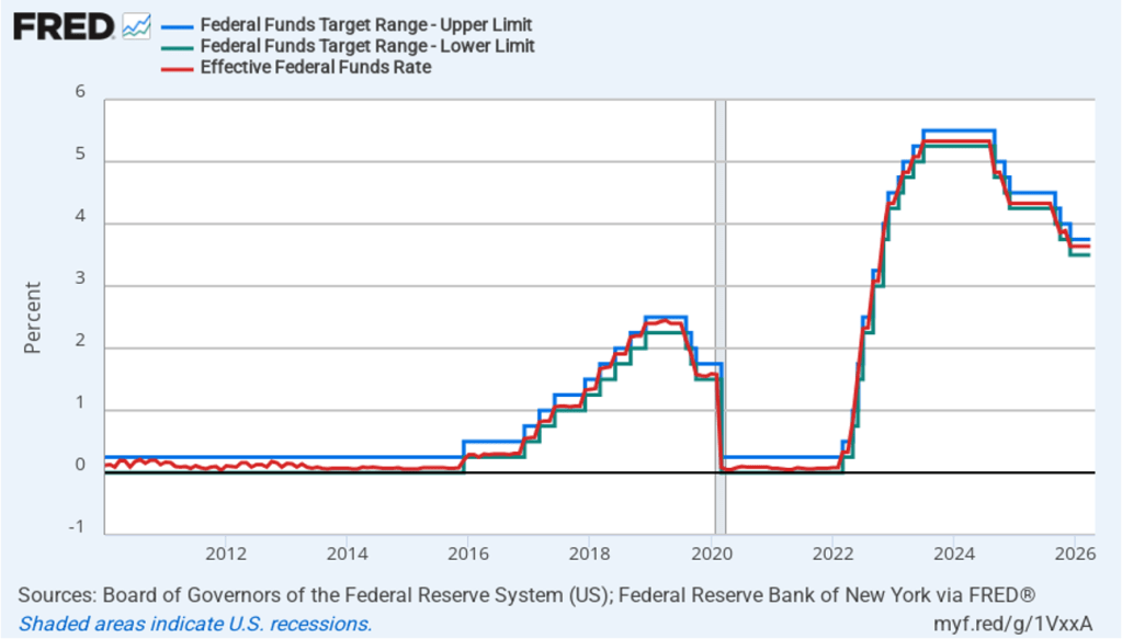
It was a foregone conclusion that at its meeting that ended today, the Federal Open Market Committee (FOMC) would leave unchanged its target range for the federal funds rate at 3.50 percent to 3.75 percent. There was great interest, however, about whether at his first meeting as chair of the committee, Kevin Warsh might indicate changes he would push for in the committee’s procedures.
One immediate change was evident in the statement that the committee released at the end of its meeting. The first statement reproduced below is from April 29, the last meeting Jerome Powell presided over as chair. The second statement is the statement that the committee released today.
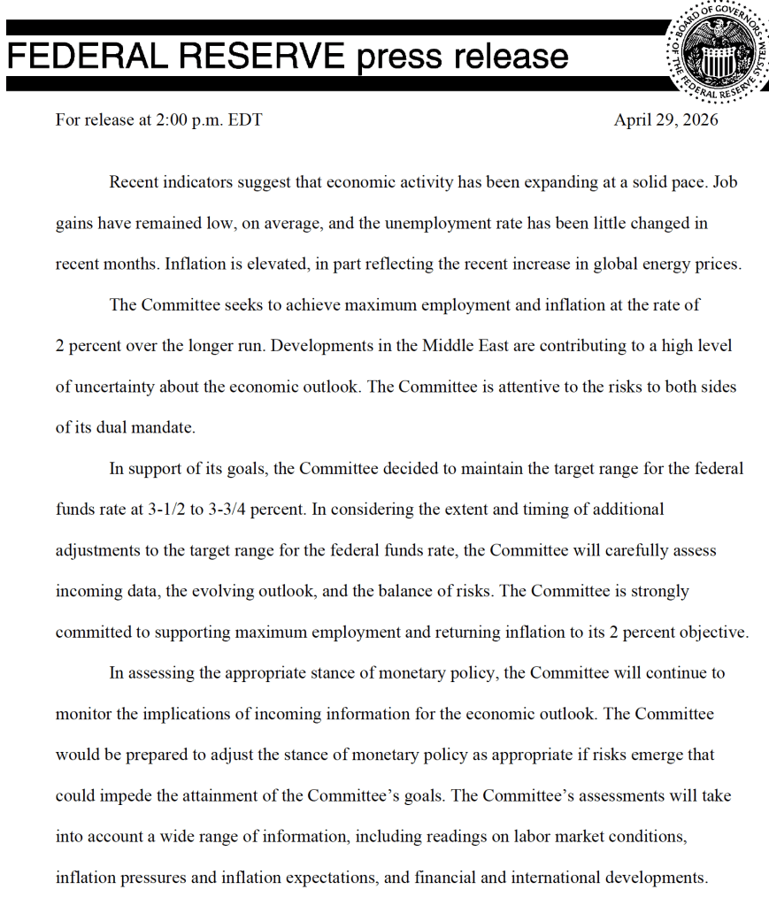
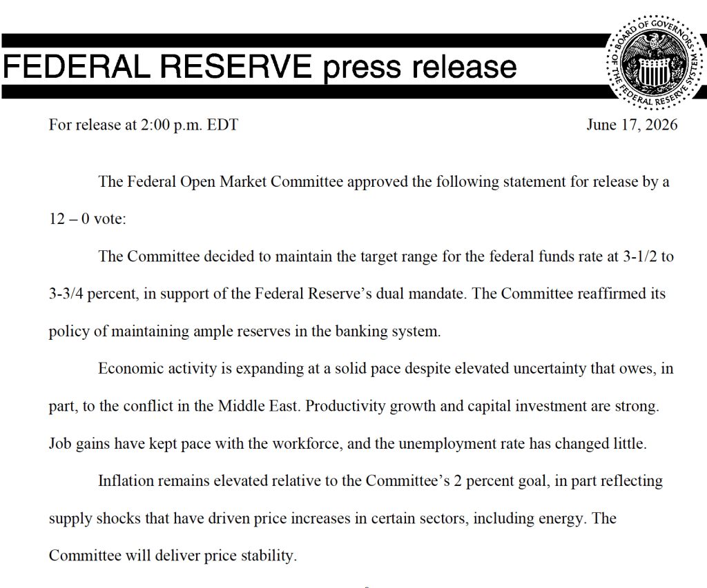
The statement released today is much shorter and omits any mention of how the committee might respond in the future to new economic data, other than the simple statement that, “The Committee will deliver price stability.”
The brevity of the statement reflects the skepticism Warsh had voiced in his Senate confirmation hearings on the usefulness of forward guidance, or statements by the FOMC about how it will conduct monetary policy in the future. We discuss forward guidance in Macroeconomics, Chapter 15 (Economics, Chapter 25).
In his press conference following the meeting, Warsh announced that he was forming five new committees to look at: 1) Fed communications, 2) the Fed’s balance sheet, 3) the Fed’s use of data, 4) the effects of technological change and productivity, particularly with respect to artificial intelligence, and 5) the inflation process, with the aim of identifying key drivers of inflation. He indicated that the committees would include members from outside the Fed and were expected to report their findings by the end of the year.
After the meeting, the committee also released a “Summary of Economic Projections” (SEP)—as it typically does after its March, June, September, and December meetings. The SEP presents median values of the, typically, 19 committee members’ forecasts of key economic variables. Notably, Warsh indicated that, although he encouraged his colleagues on the committee to continue submitting their forecasts to be compiled in the SEP, he didn’t submit forecasts. He indicated that the future of the SEP is one of the issues to be considered by his new committee on Fed communications.
The forecasts of key economic variables from the SEP are summarized in the following table, reproduced from the release. (Note that only 5 of the district bank presidents vote at FOMC meetings, although all 12 presidents participate in the discussions and prepare forecasts for the SEP.)
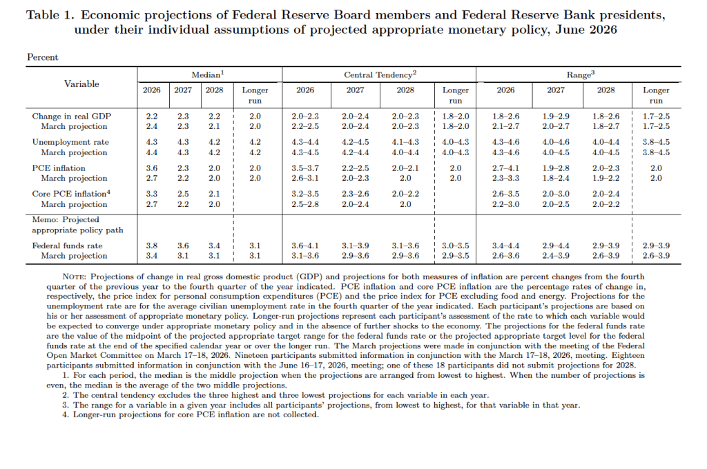
There are several aspects of these forecasts worth noting:
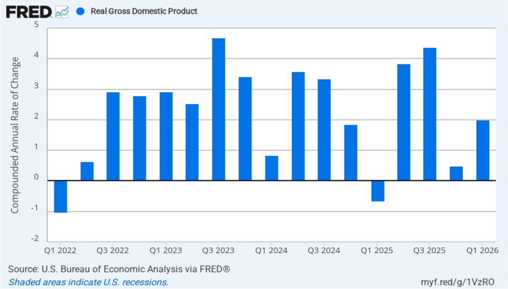
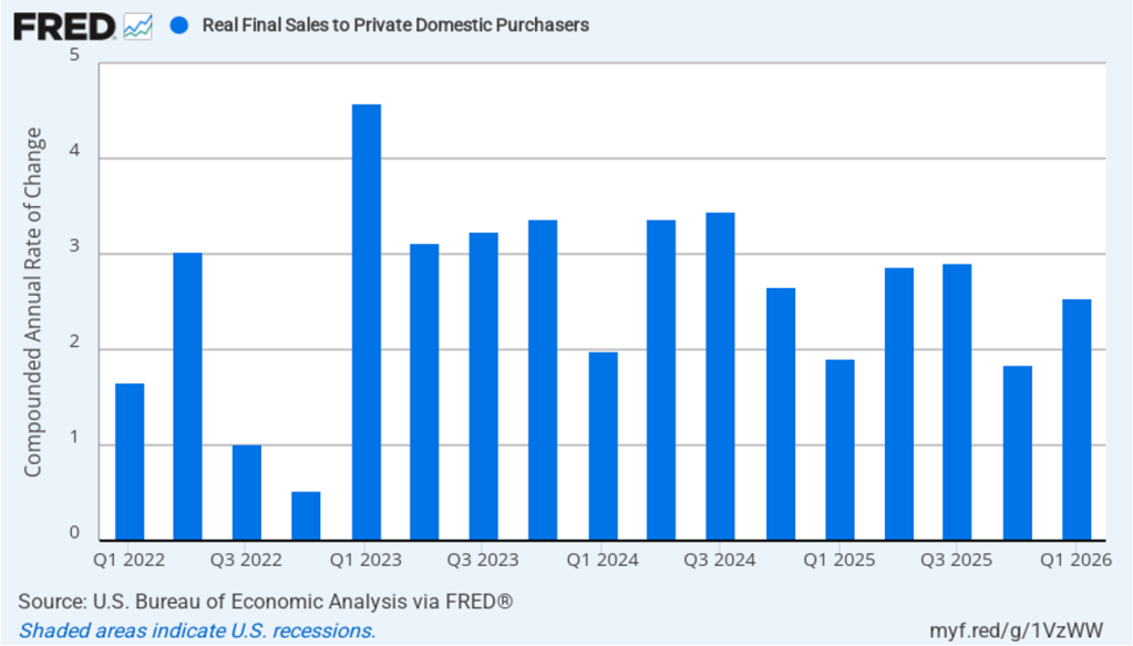
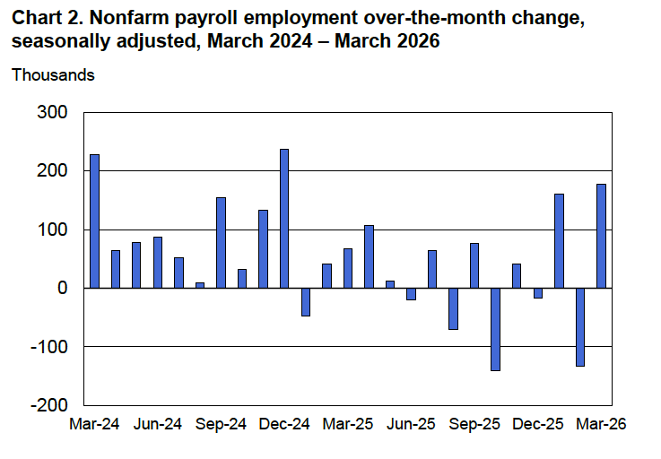
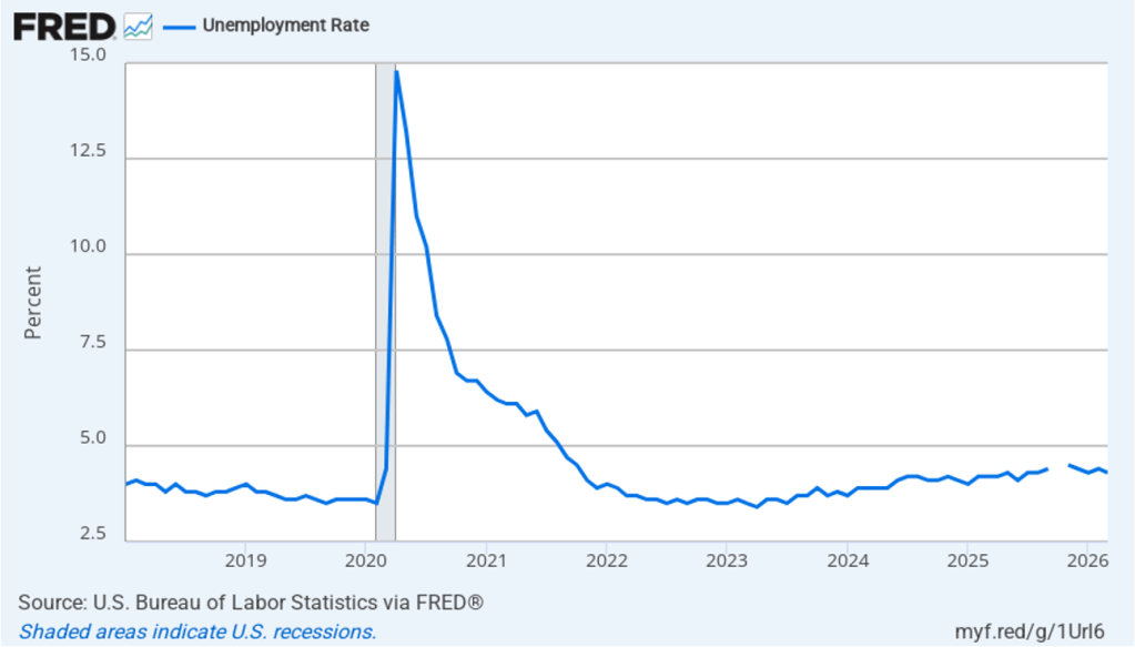
- Compared with the previous SEP in March, the committee members reduced their forecast of real GDP growth in 2026 from 2.4 percent to 2.2 percent. The committee members left unchanged their forecast of long-run growth in real GDP at 2.0 percent. Despite reducing their forecast of real GDP growth in 2026, the committee lowered their forecast of the unemployment rate in 2026 from 4.4 percent to 4.3 percent. The committee members left their forecast of the long-run rate of unemployment, often called the natural rate of unemployment, unchanged at 4.2 percent.
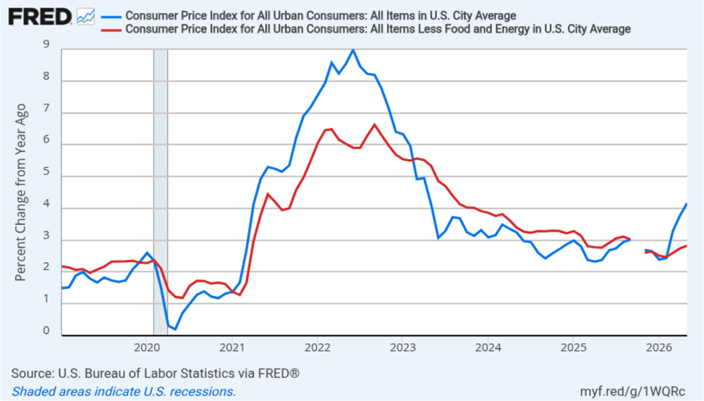
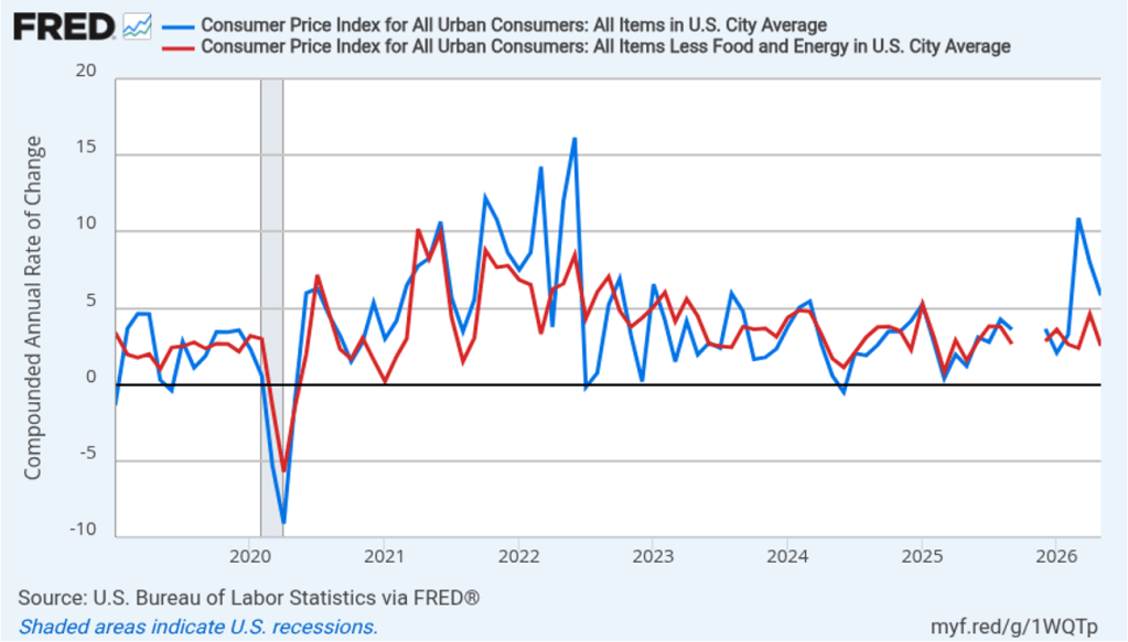
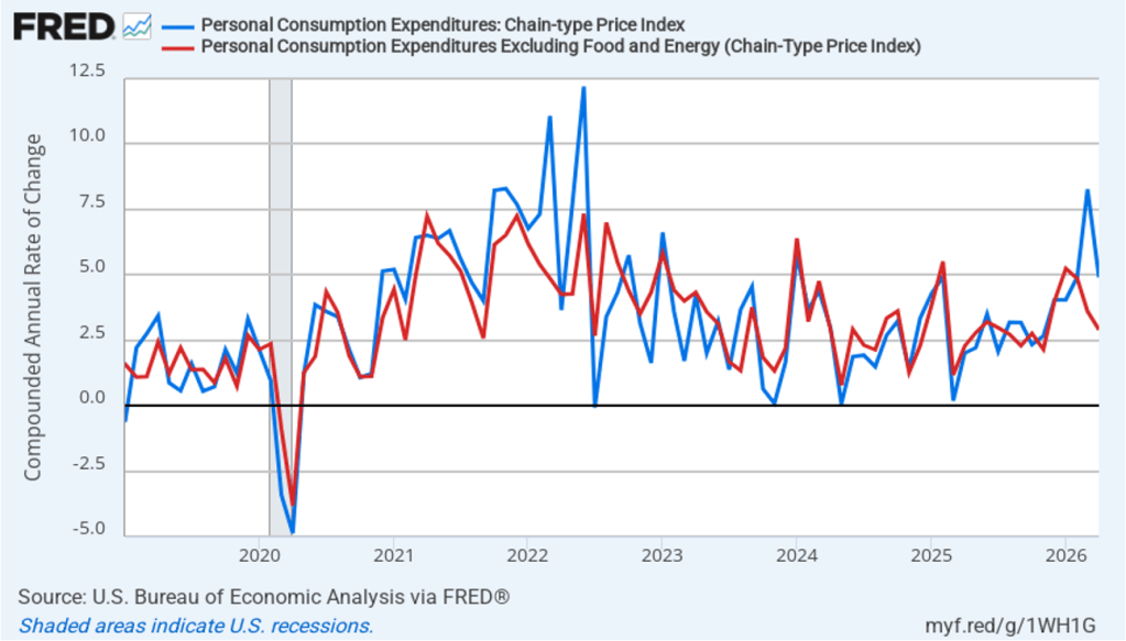
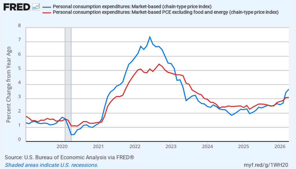
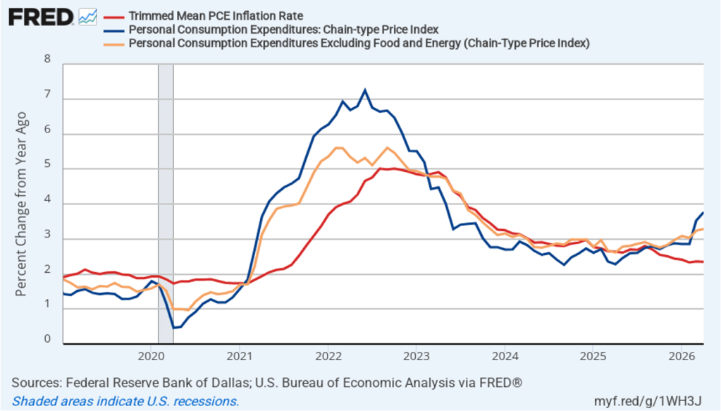
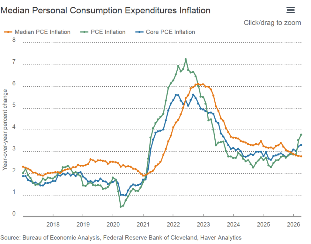
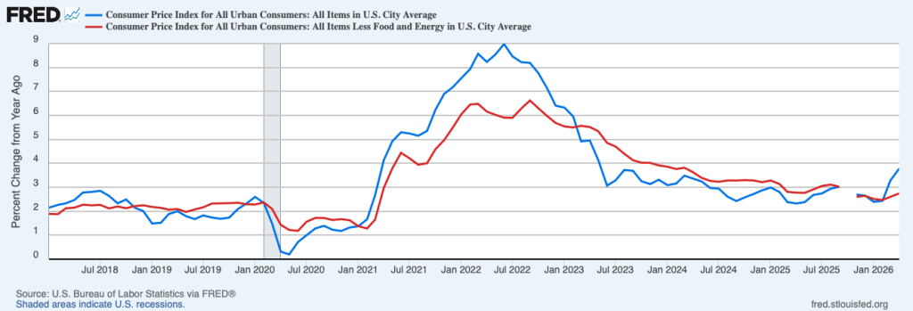
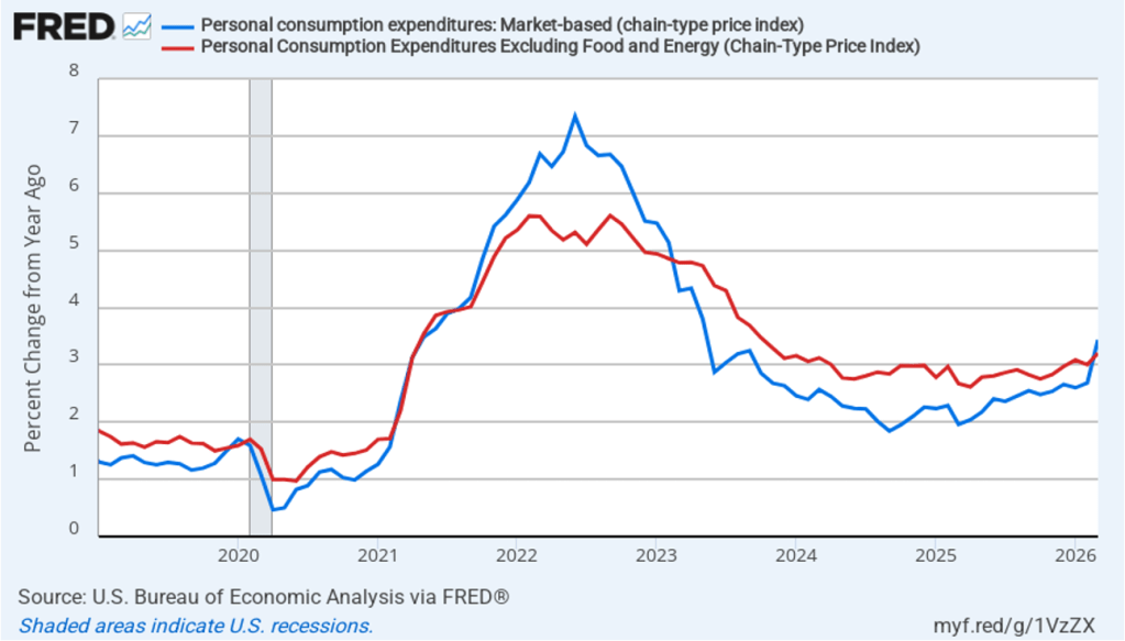
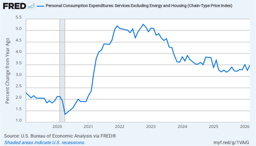
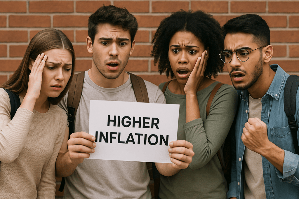
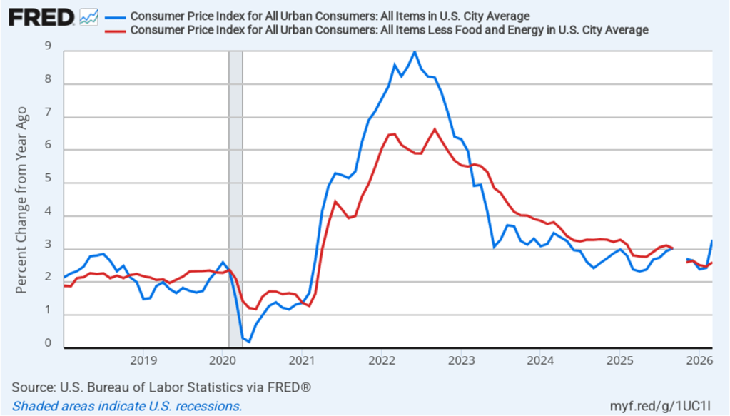
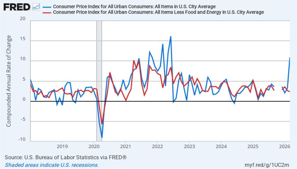
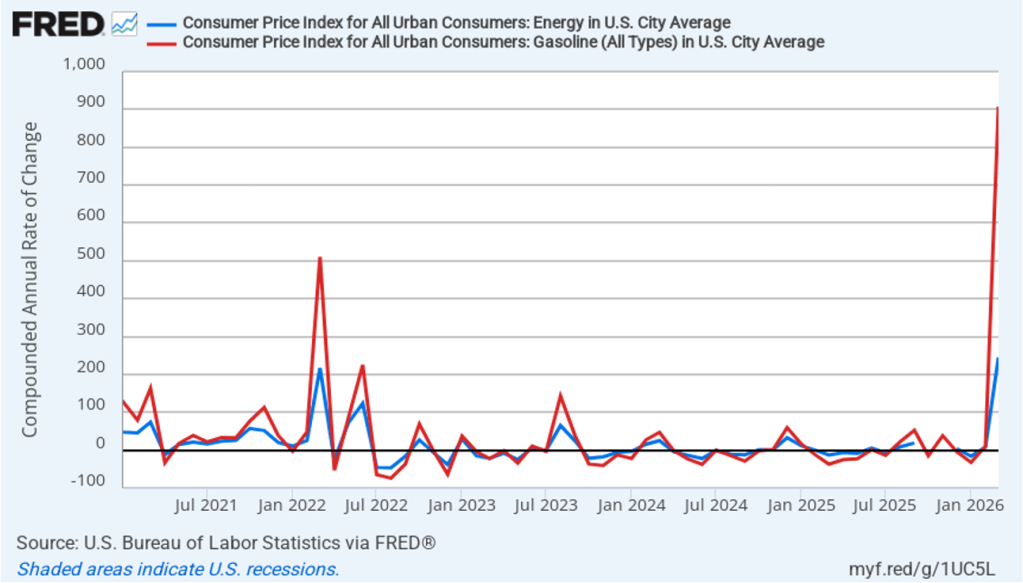
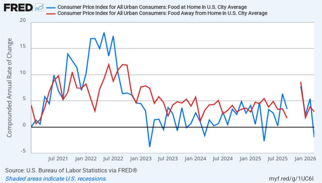
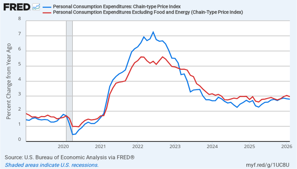
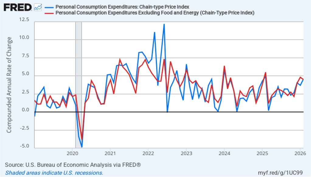
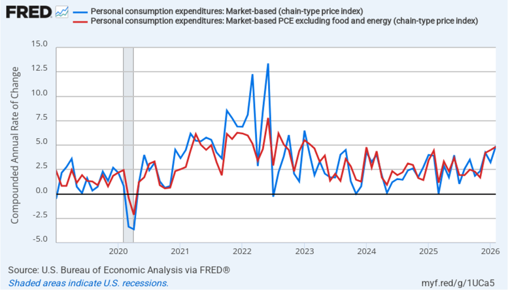
- Committee members significantly raised their forecast of personal consumption expenditures (PCE) price inflation in 2026 to 3.6 percent from 2.7 percent in March. They raised their forecast of inflation in 2027 slightly and continued to forecast that PCE inflation will decline to the Fed’s 2.0 percent annual target in 2028.
- The committee’s forecasts of the federal funds rate at the end of each year from 2026 through 2028 were increased, indicating that the committee sees the federal funds rate as likely to be “higher for longer.” The forecast for the long-run federal funds rate was left unchanged at 3.1 percent.
Prior to the meeting, there was much discussion in the business press and among investment analysts about the dot plot, shown below. Each dot in the plot represents the projection of an individual committee member. (The committee doesn’t disclose which member is associated with which dot.) Note that there are 18 dots, representing the 6 members of the Fed’s Board of Governors who provided forecasts and all 12 presidents of the Fed’s district banks.
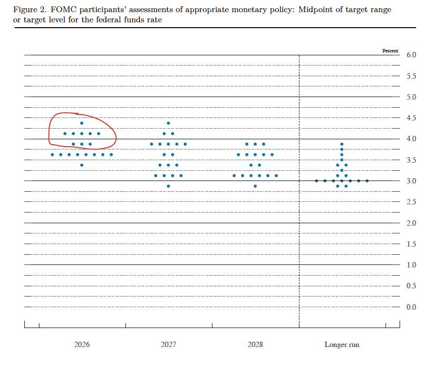
The dots plotted on the far left of the figure represent the projections by the 18 members of the value of the federal funds rate at the end of 2026. The plots indicate that at this point eight members of the committee forecast no change in the federal funds rate this year, nine members (circled in red) expect at least one increase in the federal funds rate by the end of the year, and only one member expected that there would be a cut in the federal funds by year’s end. The dots plotted on the far right of the figure indicate that there is substantial disagreement among committee members as to what the long-run value of the federal funds rate—the so-called neutral rate—should be. Of course, the plots only represent the forecasts of the committee members and individual committee members are likely to adjust their forecasts as additional macroeconomic data become available in the coming months.
Warsh indicated at his press conference that it was unlikely that he would hold a press conference after each meeting of the committee as Jerome Powell had been doing beginning with the January 2019 meeting.
Warsh made several other notable points at the press conference. He reiterated that the Fed’s inflation target would remain an annual increase of 2.0 percent in the PCE. He noted that he saw the current level of the federal funds rate as having a restrictive effect on only the housing market. And he expressed dissatisfaction with how the economic statistics the FOMC relies upon when setting policy were being compiled. He indicated that the new committee on the Fed’s use of data might formulate suggestions to other federal government agencies, such as the Bureau of Economic Analysis and the Bureau of Labor Statistics, on changes in how they collect data.