Surprisingly Strong Jobs Report

Photo courtesy of Lena Buonanno.

This morning of Friday, February 2, the Bureau of Labor Statistics (BLS) issued its “Employment Situation Report” for January 2024.  Economists and policymakers—notably including the members of the Fed’s Federal Open Market Committee (FOMC)—typically focus on the change in total nonfarm payroll employment as recorded in the establishment, or payroll, survey. That number gives what is generally considered to be the best gauge of the current state of the labor market.

Economists surveyed in the past few days by business news outlets had expected that growth in payroll employment would slow to an increase of between 180,000 and 190,000 from the increase in December, which the BLS had an initially estimated as 216,00. (For examples of employment forecasts, see here and here.) Instead, the report indicated that net employment had increased by 353,000—nearly twice the expected amount. (The full report can be found here.)

In this previous blog post on the December employment report, we noted that although the net increase in employment in that month was still well above the increase of 70,000 to 100,000 new jobs needed to keep up with population growth, employment increases had slowed significantly in the second half of 2023 when compared with the first.

That slowing trend in employment growth did not persist in the latest monthly report. In addition, to the strong January increase of 353,000 jobs, the November 2023 estimate was revised upward from 173,000 jobs to 182,000 jobs, and the December estimate was substantially revised from 216,000 to 333,000. As the following figure from the report shows, the net increase in jobs now appears to have trended upward during the last three months of 2023.

Economists surveyed were also expecting that the unemployment rate—calculated by the BLS from data gathered in the household survey—would increase slightly to 3.8 percent. Instead, it remained constant at 3.7 percent. As the following figure shows, the unemployment rate has been remarkably stable for more than two years and has been below 4.0 percent each month since December 2021. The members of the FOMC expect that the unemployment rate during 2024 will be 4.1 percent, a forcast that will be correct only if the demand for labor declines significantly over the rest of the year.

The “Employment Situation Report” also presents data on wages, as measured by average hourly earnings. The growth rate of average hourly earnings, measured as the percentage change from the same month in the previous year, had been slowly declining from March 2022 to October 2023, but has trended upward during the past few months. The growth of average hourly earnings in January 2024 was 4.5 percent, which represents a rise in firms’ labor costs that is likely too high to be consistent with the Fed succeeding in hitting its goal of 2 percent inflation. (Keep in mind, though, as we note in this blog post, changes in average hourly earnings have shortcomings as a measure of changes in the costs of labor to businesses.)

Taken together, the data in today’s “Employment Situation Report” indicate that the U.S. labor market remains very strong. One implication is that the FOMC will almost certainly not cut its target for the federal funds rate at its next meeting on March 19-20. As Fed Chair Jerome Powell noted in a statement to reporters after the FOMC earlier this week: “The Committee does not expect it will be appropriate to reduce the target range until it has gained greater confidence that inflation is moving sustainably toward 2 percent. We will continue to make our decisions meeting by meeting.” (A transcript of Powell’s press conference can be found here.) Today’s employment report indicates that conditions in the labor market may not be consistent with a further decline in price inflation.

It’s worth keeping several things in mind when interpreting today’s report.

  1. The payroll employment data and the data on average hourly earnings are subject to substantial revisions. This fact was shown in today’s report by the large upward revision in net employment creation in December, as noted earlier in this post.
  2. A related point: The data reported in this post are all seasonally adjusted, which means that the BLS has revised the raw (non-seasonally adjusted) data to take into account normal fluctuations due to seasonal factors. In particular, employment typically increases substantially during November and December in advance of the holiday season and then declines in January. The BLS attempts to take into account this pattern so that it reports data that show changes in employment during these months holding constant the normal seasonal changes. So, for instance, the raw (non-seasonally adjusted) data show a decrease in payroll employment during January of 2,635,000 as opposed to the seasonally adjusted increase of 353,000. Over time, the BLS revises these seasonal adjustment factors, thereby also revising the seasonally adjusted data. In other words, the BLS’s initial estimates of changes in payroll employment for these months at the end of one year and the beginning of the next should be treated with particular caution.
  3. The establishment survey data on average weekly hours worked show a slow decline since November 2023. Typically, a decline in hours worked is an indication of a weakening labor market rather than the strong labor market indicated by the increase in employment. But as the following figure shows, the data on average weekly hours are noisy in that the fluctuations are relatively large, as are the revisons the BLS makes to these data over time.

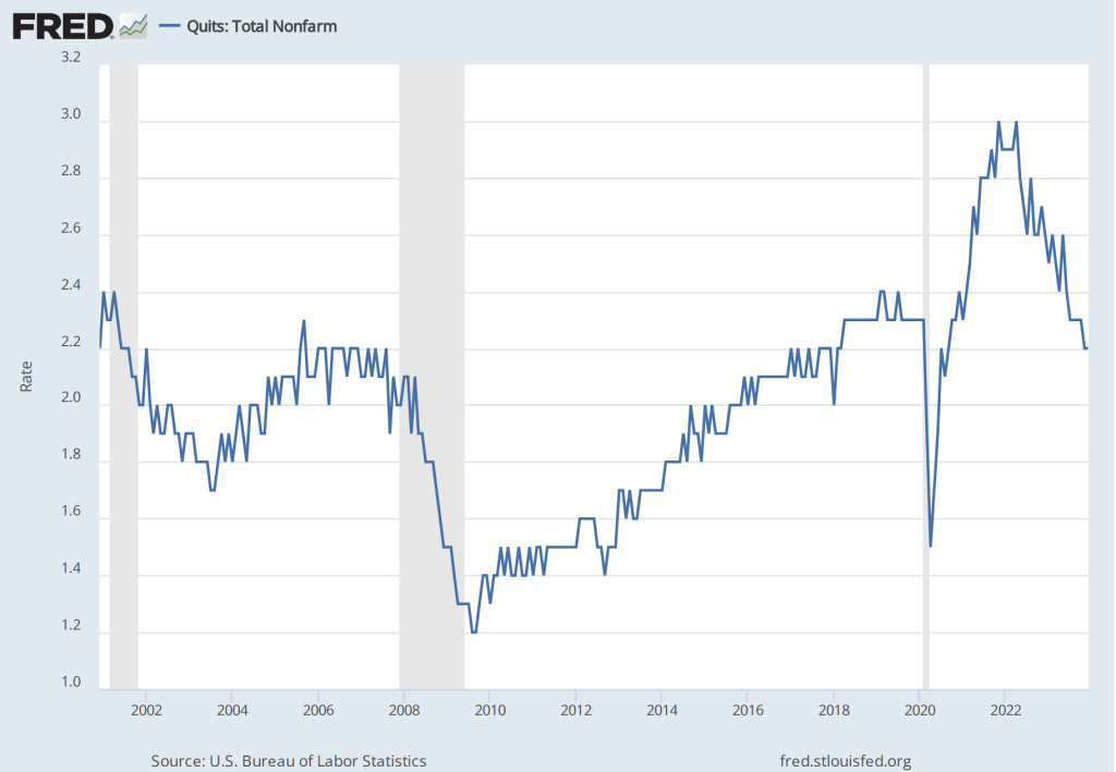
4. In contrast to today’s jobs report, other labor market data seem to indicate that the demand for labor is slowing. For instance, quit rates—or the number of people voluntarily leaving their jobs as a percentage of the total number of people employed—have been declining. As shown in the following figure, the quit rate peaked at 3.0 percent in November 2021 and March 2022, and has declined to 2.2 percent in December 2023—a rate lower than just before the beginning of the Covid–19 pandemic.

Similarly, as the following figure shows, the number of job openings per unemployed person has declined from a high of 2.0 in March 2022 to 1.4 in December 2023. This value is still somewhat higher than just before the beginning of the Covid–19 pandemic.

To summarize, recent data on conditions in the labor market have been somewhat mixed. The strong increases in net employment and in average hourly earnings in recent months are in contrast with declining average number of hours worked, a declining quit rate, and a falling number of job openings per unemployed person. Taken together, these data make it likely that the FOMC will be in no hurry to cut its target for the federal funds rate. As a result, long-term interest rates are also likely to remain high in the coming months. The following figure from the Wall Street Journal provides a striking illustration of the effect of today’s jobs report on the bond market, as the interest rate on the 10-year Treasury note rose above 4.0 percent for the first time in more than a month. The interest rate on the 10-year Treasury note plays an important role in the financial system, influencing interest rates on mortgages and corporate bonds. 

Inflation, Disinflation, Deflation, and Consumers’ Perceptions of Inflation

Inflation has declined, although many consumers are skeptical. What explains consumer skepticism? First we can look at what’s happened to inflation in the period since the beginning of 2015. The figure below shows inflation measured as the percentage change in the consumer price index (CPI) from the same month in the previous year. We show both so-called headline inflation, which includes the prices of all goods and services in the index, and core inflation, which excludes energy and food prices. Because energy and food prices can be volatile, most economists believe that the core inflation provides a better indication of underlying inflation. 

Both measures show inflation following a similar path. The inflation rate begins increasing rapidly in the spring of 2021, reaches a peak in the summer of 2022, and declines from there. Headline CPI peaks at 8.9 percent in June 2022 and declines to 3.7 percent in August 2023. Core inflation reaches a peak of 6.6 percent in September 2022 and declines to 4.4 percent in August 2022.

As we discuss in Macroeconomics, Chapter 15, Section 15.5 (Economics, Chapter 25, Section 25.5, and Essentials of Economics, Chapter 17, Section 17.5), the Fed’s inflation target is stated in terms of the personal consumption expenditure (PCE) price index, not the CPI. The PCE includes the prices of all the goods and services included in the consumption component of GDP. Because the PCE includes the prices of more goods and services than does the CPI, it’s a broader measure of inflation. The following figure shows inflation as measured by the PCE and by the core PCE, which excludes energy and food prices.

Inflation measured using the PCE or the core PCE shows the same pattern as inflation measured using the CPI: A sharp increase in inflation in the spring of 2021, a peak in the summer of 2022, and a decline thereafter.

Although it has yet to return to the Fed’s 2 percent target, the inflation rate has clearly fallen substantially during the past year. Yet surveys of consumers show that majorities are unconvinced that inflation has been declining. A Pew Research Center poll from June found that 65 percent of respondents believe that inflation is “a very big problem,” with another 27 percent believing that inflation is “a moderately big problem.” A Gallup poll from earlier in the year found that 67 percent of respondents thought that inflation would go up, while only 29 percent thought it would go down. Perhaps not too surprisingly, another Gallup poll found that only 4 percent of respondents had a “great deal” of confidence in Federal Reserve Chair Jerome Powell, with another 32 percent having a “fair amount” of confidence. Fifty-four percent had either “only a little” confidence in Powell or “almost none.”

There are a couple of reasons why most consumers might believe that the Fed is doing worse in its fight against inflation than the data indicate. First, few people follow the data releases as carefully as economists do. As a result, there can be a lag between developments in the economy—such as declining inflation—and when most people realize that the development has occurred.

Probably more important, though, is the fact that most people think of inflation as meaning “high prices” rather than “increasing prices.” Over the past year the U.S. economy has experienced disinflation—a decline in the inflation rate. But as long as the inflation rate is positive, the price level continues to increase. Only deflation—a declining price level—would lead to prices actually falling. And an inflation rate of 3 percent to 4 percent, although considerably lower than the rates in mid-2022, is still significantly higher than the inflation rates of 2 percent or below that prevailed during most of the time since 2008.

Although, core CPI and core PCE exclude energy and food prices, many consumers judge the state of inflation by what’s happening to gasoline prices and the price of food in supermarkets. These are products that consumers buy frequently, so they are particularly aware of their prices. The figure below shows the component of the CPI that represents the prices of food consumers buy in groceries or supermarkets and prepare at home. The price of food rose rapidly beginning in the spring of 2021. Althought increases in food prices leveled off beginning in early 2023, they were still about 24 percent higher than before the pandemic.

There is a similar story with respect to gasoline prices. Although the average price of gasoline in August 2023 at $3.84 per gallon is well below its peak of nearly $5.00 per gallon in June 2022, it is still well above average gasoline prices in the years leading up to the pandemic.

Finally, the figure below shows that while percentage increases in rent are below their peak, they are still well above the increases before and immediately after the recession of 2020. (Note that rents as included in the CPI include all rents, not just rental agreements that were entered into that month. Because many rental agreements, particularly for apartments in urban areas, are for one year or more, in any given month, rents as measured in the CPI may not accurately reflect what is currently happening in rental housing markets.)

Because consumers continue to pay prices that are much higher than the prices they were paying prior to the pandemic, many consider inflation to still be a problem. Which is to say, consumers appear to frequently equate inflation with high prices, even when the inflation rate has markedly declined and prices are increasing more slowly than they were.

We Will Never See Anything Like It Again: Movements in Real GDP during the Covid-19 Recession

There are a number of ways in which the Covid-19 pandemic was unlike anything the United States has experienced since the 1918 influenza pandemic. Most striking from an economic perspective were the extraordinary swings in real GDP. The following figure shows quarterly changes in real GDP seasonally adjusted and calculated at an annual rate. There were three recessions during this period (shown by the shaded areas).

The first of these recessions occurred during 2001 and was similar to most recessions in the United States since 1950 in being short and relatively mild. Real GDP declined by 1.5 percent during the third quarter of 2001. The recession of 2007–2009 was the most severe to that point since the Great Depression of the 1930s. The worst periods of the 2007–2009 were the fourth quarter of 2008, when real GDP declined by 8.5 percent—the largest decline to that point during any quarter since 1960—and the first quarter of 2009, when real GDP declined by 4.6 percent. 

Turning to the 2020 recession, during the first quarter of 2020, only at the end of which did Covid-19 begin to seriously affect the U.S. economy, real GDP declined by 5.1 percent. Then in the second quarter a collapse in production occurred unlike anything previously experienced in the United States over such a short period: Real GDP declined by 31.2 percent. But that collapse was followed in the next quarter by an extraordinary recovery in production when real GDP increased by 33.8 percent—by far the largest increase in a single quarter in U.S. history.

The following figure shows the changes in the components of real GDP during the second and third quarters of 2020. In the second quarter of 2020, consumption spending declined by about the same percentage as GDP, but investment spending declined by more, as many residential and commercial construction projects were closed. Exports declined by nearly 60 percent and imports declined by nearly as much as many ports were temporarily closed. In the third quarter of 2020, many state and local governments relaxed their restrictions on business operations and the components of spending bounced back, although they remained below their levels of late 2019 until mid-2021. 

Even when compared with the Great Depression of the 1930s, the movements in real GDP during the Covid-19 pandemic stand out for the size of the fluctuations. The official U.S. Bureau of Economic Analysis data on real GDP are available only annually for the 1930s. The following figure shows the changes in these annual data for the years 1929 to 1939. As severe as the Great Depression was, in 1932, the worst year of the downturn, real GDP declined by less than 13 percent—or only about a third as much as real GDP declined during the worst of the 2020 recession.

We have to hope that we will never again experience a pandemic as severe as the Covid-19 pandemic or fluctuations in the economy as severe as those of 2020.

Source: U.S. Bureau of Economic Analysis. Note: Because the BEA doesn’t provide an estimate of real GDP in 1928, our value for the change in real GDP during 1929 is the percentage change in real GDP per capita from 1928 to 1929 using the data on real GDP per capita compiled by Robert J. Barro and José F. Ursúa. LINK

The Demographics of Covid-19 Mortality

Few diseases affect all demographic groups equally.  For example, the 1918–1919 influenza pandemic killed an unusually large number of young adults. Estimates are that half of deaths in the United States during that pandemic occurred among people aged 20 to 40. In recent flu seasons, the elderly have much higher mortality rates than do other age groups. For instance, during the 2018–2019 flu season, people 65 and older died at a rate more than 10 times greater than people 18 to 49 years old.  The very young also have comparatively high mortality rates from the flu. In 2018–2019, children 0 to 4 years-old died at a rate six times higher than children 5 to 17 years-old.

When the Covid-19 virus began to spread widely in the United States in the spring of 2020, some epidemiologists expected that it would affect different demographic groups in about the same way that the flu does. In fact, though, while people 65 and older were particularly at risk, young children were less affected by Covid-19 than they are by the flu. The following chart prepared by the Centers for Disease Control and Prevention (CDC) displays for the United States data on Covid deaths by age group as of early November 2021.

The blue bars show the percentage of total deaths from Covid since the beginning of the pandemic represented by that age group and the gray bars show the percentage that group makes up of the total U.S. population. Therefore, an age group that has a gray bar longer than its blue bar was proportionally less affected by the virus and an age group that has a blue bar longer its gray bar was proportionally more affected by the virus. The chart shows that people over age 65 experienced particularly high mortality rates. Strikingly, people over age 85 accounted for nearly 30 percent of all deaths in the United States, while making up only 2 percent of the U.S. population. 

The following chart displays data on Covid deaths by gender. Men account for about 49 percent of the U.S. population but have accounted for about 54 percent of Covid deaths.

Finally, the following chart displays data on Covid deaths by race or ethnicity. Hispanic, Black, and American Indian or Alaskan Native people have experienced proportionally higher Covid mortality rates than have Asian or white people.

What explains the disparity in mortality rates across demographic groups? With respect to age, we would expect older people to have weaker immune systems and therefore be more likely to die from any illness. In addition, early in the pandemic many older people in nursing homes died of Covid before it was widely understood that the disease spread through aerosols and that keeping people close together inside unmasked made it easy for the virus to spread. The very young have immature immune systems, which might have made them particularly susceptible to Covid, but for reasons not well understood, they turned not to be.

There continues to be debate over why men have experienced a higher mortality rate from Covid than have women. Vaccination rates among men are somewhat lower than among women, which may account for part of the difference. In an opinion column in the New York Times, Dr. Ezekiel  Emanuel of the University of Pennsylvania noted that researchers at Yale University have observed “that there are well-established differences in immune responses to infections between men and women.” But why this pattern should be reflected in Covid deaths is unclear at this point.

Medical researchers and epidemiologists have also not arrived at a consensus in explaining differences in mortality rates across racial or ethnic groups. Groups with higher mortality rates have had lower vaccination, which explains some of the difference. Groups with higher mortality rates are also more likely to suffer from other conditions, such as hypertension, that have been identified as contributing factors in some Covid deaths. These groups are also less likely to have access to health care than are the groups with lower mortality rates. The CDC notes that: “Race and ethnicity are risk markers for other underlying conditions that affect health, including socioeconomic status, access to health care, and exposure to the virus related to occupation, e.g., frontline, essential, and critical infrastructure workers.”

Sources: Ezekiel J. Emanuel, “An Unsolved Mystery: Why Do More Men Die of Covid-19?” nytimes.com, November 2, 2021; Daniela Hernandez, “Covid-19 Vaccinations Proceed Slowly Among Older Latino, Black People,” wsj.com, March 2, 2021; Anushree Dave, “Half-Million Excess U.S. Deaths in 2020 Hit Minorities Worse,” bloomberg.com, October 4, 2021; Centers for Disease Control and Prevention, “Hospitalization and Death by Race/Ethnicity,” cdc.gov, September 9, 2021; Centers for Disease Control and Prevention, “Demographic Trends of COVID-19 cases and deaths in the US reported to CDC,” cdc.gov, November 5, 2021 Centers for Disease Control and Prevention, “2018–2019 Flu Season Burden Estimates,” cdc.gov; and Jeffery K. Taubenberger and David M. Morens, “1918 Influenza: the Mother of All Pandemics,” Emerging Infectious Diseases, Vol. 12, No. 1, January 2006, pp. 15-22.

Sticker Shock in the Market for Used Cars

The term “sticker shock” was first used during the 1970s to describe the surprise car buyers experienced when seeing how much car prices had risen.  Because inflation during that decade was so high, anyone who hadn’t bought a car for several years was unprepared for the jump in car prices. During 2020 and 2021, sticker shock returned, particularly to the used car market. Prices were increasing so rapidly that even people who had purchased a car a year or two before were surprised by the increases. 

The following graph shows U.S. Bureau of Labor Statistics (BLS) data on inflation in the market for used cars in the months since January 2015. Inflation is measured as the percent change from the same month in the previous year in the used cars and trucks component of the Consumer Price Index (CPI). The CPI is the most widely used measure of inflation. Used car prices began rising in August 2020, peaking at a 45 percent increase in June 2021. Inflation at such rates over a period longer than a year is very unusual in any of components of the CPI. 

What explains the extraordinary burst of inflation in used car prices during 2020 and 2021? Three factors seem to have been of greatest importance:

  1. A decline in the supply of new cars resulting from a shortage in semiconductors caused an increase in new car prices. Rising new car prices led some consumers who would otherwise have bought a new car to enter the used car market, increasing the demand for used cars.
  2. Because of the Covid-19 pandemic, some people became reluctant to ride buses and other mass transit, increasing the demand for both new and used cars.
  3. As the pandemic increased in severity in the spring of 2020, most rental car companies decided to purchase fewer new cars for their fleets. After keeping a car in its fleet for one year, rental car companies typically sell the car to used car dealers for resale. Because rental car companies were selling them fewer cars, used car dealers had fewer cars on their lots. So the supply of used cars declined. 

We can use the demand and supply model to explain the jump in used car prices. As shown in the following figure, the demand curve for used cars shifted to the right from D1 to D2, as some consumers who would otherwise have bought new cars, bought used cars instead, and as some people swithced from public transportation to driving their cars to work. At the same time, the supply of used cars shifted to the left from S1 to S2 because used car dealers were able to buy fewer used cars from rental car companies. The result was that the price of used cars rose from P1 to P2 at the same time that the quantity of used cars sold fell from Q1 to Q2.

Sources: Yueqi Yang, “U.S. Used-Car Prices, Key Inflation Driver, Surge to Record,” bloomberg.com, October 7, 2021; Nora Naughton, “Looking to Buy a Used Car? Expect High Prices, Few Options,” wsj.com, May 10, 2021; Cox Automotive, “13-Month Rolling Used-Vehicle SAAR,” coxautoinc.com, October 15, 2021; and Federal Reserve Bank of St. Louis.

How the Effects of the Covid-19 Recession Differed Across Business Sectors and Income Groups

The recession that resulted from the Covid-19 pandemic affected most sectors of the U.S. economy, but some sectors of the economy fared better than others. As a broad generalization, we can say that online retailers, such as Amazon; delivery firms, such as FedEx and DoorDash; many manufacturers, including GM, Tesla, and other automobile firms; and firms, such as Zoom, that facilitate online meetings and lessons, have done well. Again, generalizing broadly, firms that supply a service, particularly if doing so requires in-person contact, have done poorly. Examples are restaurants, movie theaters, hotels, hair salons, and gyms.

The following figure uses data from the Federal Reserve Economic Data (FRED) website (fred.stlouisfed.org) on employment in several business sectors—note that the sectors shown in the figure do not account for all employment in the U.S. economy. For ease of comparison, total employment in each sector in February 2020 has been set equal to 100.

Employment in each sector dropped sharply between February and April as the pandemic began to spread throughout the United States, leading governors and mayors to order many businesses and schools closed. Even in areas where most businesses remained open, many people became reluctant to shop in stores, eat in restaurants, or exercise in gyms. From April to November, there were substantial employment gains in each sector, with employment in all goods-producing industries and employment in manufacturing (a subcategory of goods-producing industries) in November being just 5 percent less than in February. Employment in professional and business services (firms in this sector include legal, accounting, engineering, legal, consulting, and business software firms), rose to about the same level, but employment in all service industries was still 7 percent below its February level and employment in restaurants and bars was 17 percent below its February level.

Raj Chetty of Harvard University and colleagues have created the Opportunity Insights website that brings together data on a number of economic indicators that reflect employment, income, spending, and production in geographic areas down to the county or, for some cities, the ZIP code level. The Opportunity Insights website can be found HERE.

In a paper using these data, Chetty and colleagues find that during the pandemic “spending fell primarily because high-income households started spending much less.… Spending reductions were concentrated in services that require in-person physical interaction, such as hotels and restaurants …. These findings suggest that high-income households reduced spending primarily because of health concerns rather than a reduction in income or wealth, perhaps because they were able to self-isolate more easily than lower-income individuals (e.g., by substituting to remote work).”

As a result, “Small business revenues in the highest-income and highest-rent ZIP codes (e.g., the Upper East Side of Manhattan) fell by more than 65% between March and mid-April, compared with 30% in the least affluent ZIP codes. These reductions in revenue resulted in a much higher rate of small business closure in affluent areas within a given county than in less affluent areas.” As the revenues of small businesses declined, the businesses laid off workers and sometimes reduced the wages of workers they continued to employ. The employees of these small businesses, were typically lower- wage workers. The authors conclude from the data that: “Employment for high- wage workers also rebounded much more quickly: employment levels for workers in the top wage quartile [the top 20 percent of wages] were almost back to pre-COVID levels by the end of May, but remained 20% below baseline for low-wage workers even as of October 2020.”

The paper, which goes into much greater detail than the brief summary just given, can be found HERE.