Image of servers in a restaurant generated by ChatGTP-4o.
How should you track over time the real wagees of low-wage workers? If you are interested in income mobility, you would want to track the experience over the course of their working lives of individuals who began their careers in low-wage occupations. Doing so would allow you to measure how well (or poorly) the U.S. economy succeeds in providing individuals with opportunities to improve their incomes over time.
You might also be interested in how the real wages of people who earn low wages has changed over time. In this case, rather than tracing the wages over time of individuals who earn low wages when they first enter the labor market, you would look at the real wages of people who earn low wages at any given time. The simplest way to do that analysis would be using data on the average nominal wage earned by, say, the lowest 20 percent of wage earners, and deflate the average nominal wage by a price index to determine the average real wage of these workers. How the average real wage of low-wage workers varies over time provides some insight into the changing standard of living of low-wage workers.
In a recent Substack post, Ernie Tedeschi, Director of Economics at the Budget Lab research center at Yale University, has carried out a careful analysis of movements over time in the average real wage of low-wage workers. Tedeschi points out a complicating factor in this analysis: “The population has gotten older over time and more educated. The workforce looks different too, with more workers in services and fewer in manufacturing. Shifting populations means that comparisons of workers aren’t apples-to-apples over time.”
To correct for these confounding factors, Tedeschi constructs a low-wage index that makes it possible to examine the real wage of low-wage workers, holding constant the composition of low-wage workers with respect to “sex, age, race, college education, and broad industry and occupation” at the values of these characteristics in 2023. Using this approach, makes it possible to separate changes in wages of workers with given characteristics from changes in wages that occur because the average characteristics of workers has changed. For example, on average, workers who are older or who have more years of education will be more productive and, therefore, on average will earn higher wages than will workers who are younger or have fewer years of education.
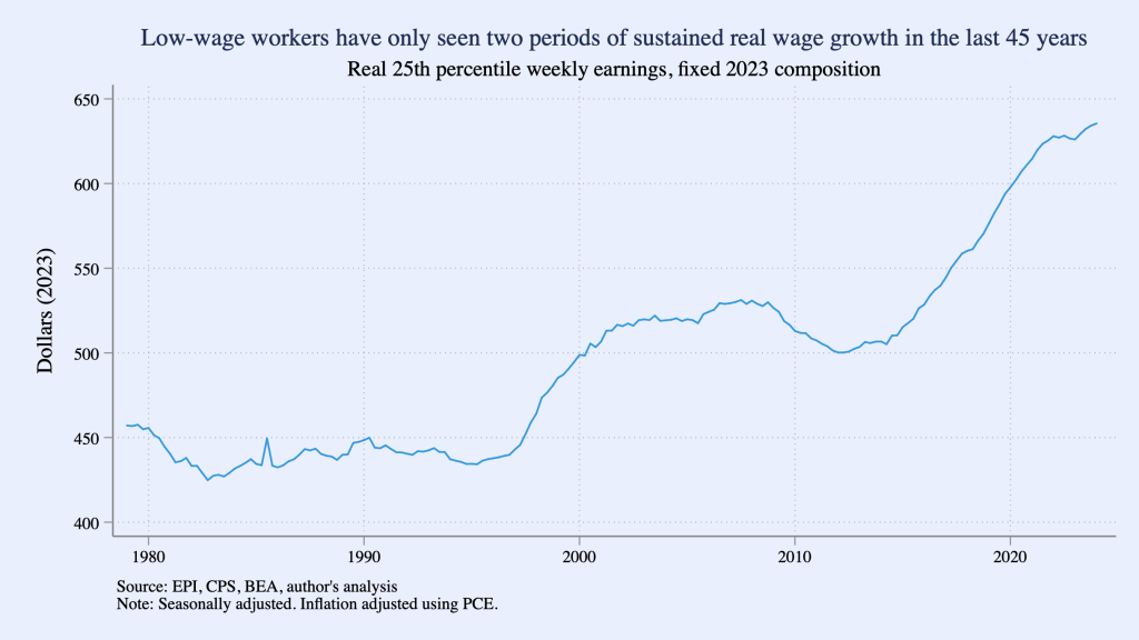
The following figure from Tedeschi’sSubstack post shows movements in his low-wage index during each quarter from the first quarter of 1979 to the first quarter of 2024, with “low wage” defined as workers at the 25th precentile of the distribution of wages. (That is, 24 percent of workers receive lower wages and 75 percent of workers receive higher wages than do these workers.) The index shows that a low-wage worker in 2024 has a much higher real wage than a low-wage worker in 1979, but the increase in the average real wage occurs mainly during two periods: 1997–2007 and 2014–2024. (Tedeschi uses the person consumption expenditures (PCE) price index to convert nominal wages to real wages.)
A more complete discussion of Tedeschi’s methods and results can be found in his blog post.
There’s a consensus among economists that increases in unemployment during a recession typically are larger for lower-income people than for higher-income people. Lower-income people are more likely to hold jobs requiring fewer skills and firms typically expect that when they lay off less-skilled workers during a recession they will be able to higher them—or other workers with similar skills—back after the recession ends. Because higher income have skills that may be difficult to replace, firms are more reluctant to lay them off.
For instance, in an earlier blog post (found here) we noted that during the period in 2020 when many restaurants were closed, the Cheesecake Factory continued to pay its 3,000 managers while it laid off most of its servers. That strategy made it easier for the restaurant chain to more easily expand its operations when the worst of government-ordered closures were over. More generally, Serdar Birinci and YiLi Chien of the Federal Reserve Bank of St. Louis found that workers in the lowest 20 percent (or quintile) of earnings experienced an increased unemployment rate from 4.4 percent in January 2020 to 23.4 percent in April 2020, whereas workers in the highest quintile of earnings experienced an increase only from 1.1 percent in January to 4.8 percent in April.
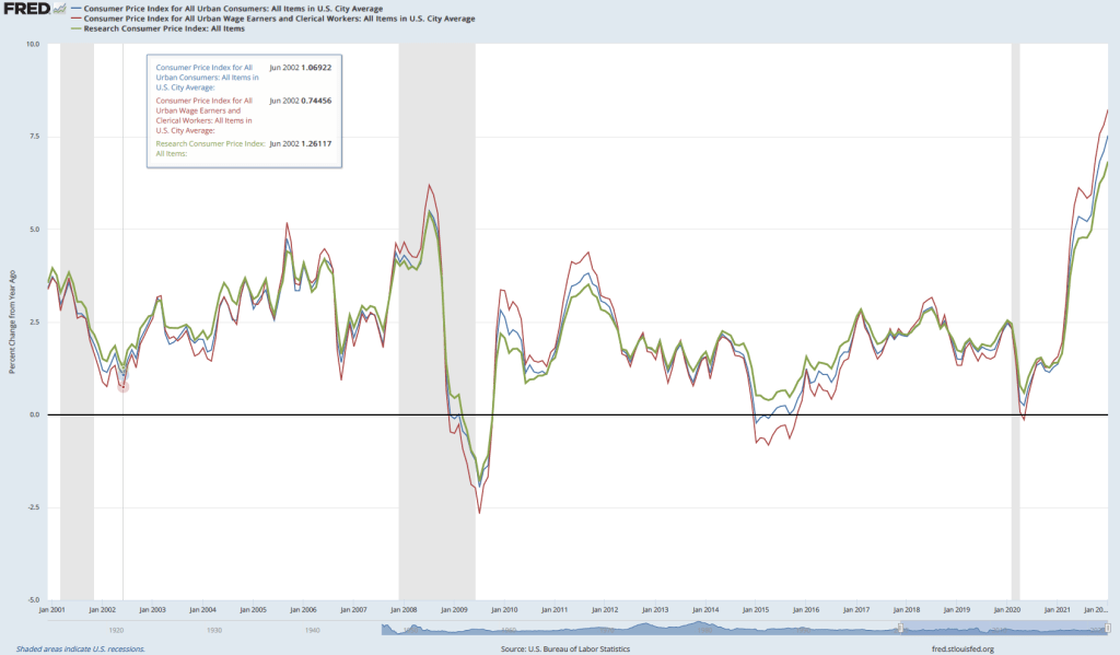
If lower-income people are hit harder by unemployment, are they also hit harder by inflation? Answering that question is difficult because the U.S. Bureau of Labor Statistics (BLS) doesn’t routinely release data on inflation in the prices of goods and services purchased by households at different income levels. The main measure of consumer price inflation compiled by the BLS represents changes in the consumer price index (CPI). The CPI is an index of the prices in a market basket of goods and services purchased by households living in urban areas. The information on consumer purchases comes from interviews the BLS conducts every three months with a sample of consumers and from weekly diaries in which a sample of consumers report their purchases. (We discuss the CPI in Macroeconomics, Chapter 9, Section 9.4 and in Economics, Chapter 19, Section 19.4.)
The BLS releases three measures of the CPI, the two most widely used of which are the CPI-U for all urban consumers and CPI-W for urban wage earners. CPI-W covers the subset of households that receive at least half their household income from clerical or wage occupations and who have at least one wage earner who worked for 37 weeks or more during the previous year. CPI-U represents about 93 percent of the U.S. population and CPI-W represents about 29 percent of the U.S. population. Finally, in 1988 Congress instructed the BLS to compile a consumer price index reflecting the purchases of people aged 62 and older. This version of the CPI is labeled R-CPI-E; the R indicates that it is a research series and the E indicates that it is intended to measure the prices of goods and services purchased by elderly people. Because the sample used to calculate the R-CPI-E is relatively small and because of some other difficulties that may reduce the accuracy of the index, the BLS considers it a series best suited for research and does not include the data in its monthly “Consumer Price Index” publication. In any event, as the following figure shows, inflation, measured as the percentage change in the CPI from the same month in the previous year, has been very similar for all three measures of the CPI.
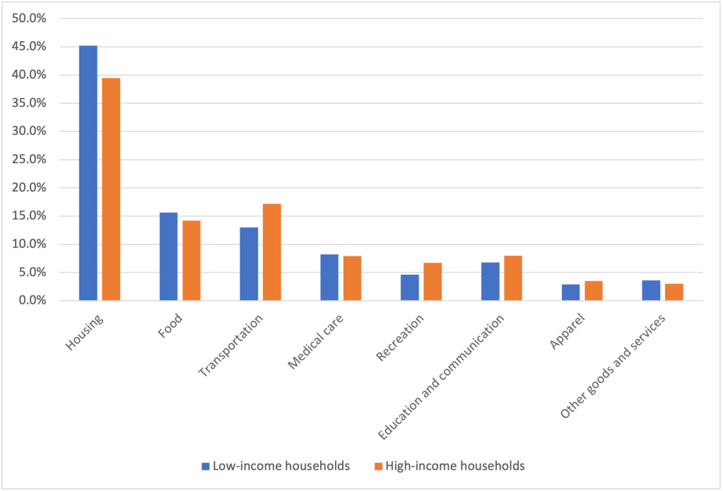
Because the market baskets of goods and services consumed by a mix of high and low-income households is included in all three versions of the CPI, none of the versions provides a way to measure the possibly different effects of inflation on low-income and on high-income households. A study by Josh Klick and Anya Stockburger of the BLS attempts to fill this gap by constructing measures of the CPI for low-income and for high-income households. They define low-income households as those in the bottom 25 percent (quartile) of the income distribution and high-income households as those in the top quartile of the income distribution. During the time period of their analysis—December 2003 to December 2018—the bottom quartile had average annual incomes of $12,705 and the top quartile had average annual incomes of $155,045.
The BLS researchers constructed market baskets for the two groups. The expenditure weights—representing the mix of products purchased—don’t differ too strikingly between lower-income and higher-income households, as the figure below shows. The largest differences are housing, with low-income households having a market basket weight of 45.2 percent and high-income households having a market basket weight of 39.5 percent, and transportation, with low-income households having a market basket weight of 13.0 percent and high-income households having a market basket weight of 17.2 percent.
The following table shows the inflation rate as measured by changes in different versions of the CPI over the period from December 2003 to December 2018. During this period, the CPI-U (the version of the CPI that is most frequently quoted in news stories) increased at an annual rate of 2.1 percent, which was the same rate as the CPI-W. The R-CPI-E increased at a slightly faster rate of 2.2 percent. Lower-income households experienced the highest inflation rate at 2.3 percent and higher-income households experienced the lowest inflation rate of 2.0 percent.
CPI-U
CPI-W
R-CPI-E
CPI for lowest income quartile
CPI for highest income quartile
2.1%
2.2%
2.1%
2.3%
2.0%
The differences in inflation rates across groups were fairly small. Can we conclude that the same was true during the recent period of much higher inflation rates? We won’t know with certainty until the BLS extends its analysis to cover at least the years 2021 and 2022. But we can make a couple of relevant observations. First, for many people the most important aspect of inflation is whether prices are increasing faster of slower than their wages. In other words, people are interested in what is happening to their real wage. (We discuss calculating real wage rates in Macroeconomics, Chapter 9, Section 9.5 and in Economics, Chapter 19, Section 19.5.)
The Federal Reserve Bank of Atlanta compiles data on wage growth, including wage growth by workers in different income quartiles. The following figure shows that workers in the top quartile have experienced more rapid wage growth in the months since the beginning of the Covid-19 pandemic than have workers in the other quartiles. This gap continues a trend that began in 2015. The bottom quartile has experienced the slowest rate of income growth. (Note that the researchers at the Atlanta Fed compute wage growth as a 12-month moving average rather than as the percentage from the same month in the previous year, as we have been doing when calculating inflation using the CPI.) For example, in January 2022, calculated this way, average wage growth in the top quartile was 5.8 percent as opposed to 2.9 percent in the bottom quartile.
As with any average, there is some variation in the experiences of different individuals. Although, as a group, lower-income workers have seen wage growth that lags behind other workers, in some industries that employ many lower-income people, wage growth has been strong. For instance, as measured by average hourly earnings, wages for all workers in the private sector increased by 5.7 percent between January 2021 and 2022. But average hourly earnings in the leisure and hospitality industry—which employs many lower-income workers—increased by 13.0 percent.
Overall, it seems likely that the real wages of higher-income workers have been increasing while the real wages of lower-income workers have been decreasing, although the experience of individual workers in both groups may be very different than the average experience.
Sources: Josh Klick and Anya Stockburger, “Experimental CPI for Lower and Higher Income Households Serdar,” U.S. Bureau of Labor Statistics, Working Paper 537, March 8, 2021; Birinci and YiLi Chien, “An Uneven Crisis for Lower-Income Households,” Federal Reserve Bank of St. Louis, Annual Report 2020, April 7, 2021; and Federal Reserve Bank of Atlanta, “Wage Growth Tracker,” https://www.atlantafed.org/chcs/wage-growth-tracker.
During 2020, Congress and President Donald Trump responded to the Covid-19 pandemic with very aggressive fiscal policy initiatives. First, in March 2020, Congress enacted the Coronavirus Aid, Relief, and Economic Security (CARES) Act. The CARES Act increased the federal government’s expenditures by $1.9 trillion. Then, in December 2020, in response to the continuing effects of the pandemic, Congress and President Trump included an additional $915 billion in expenditures related to Covid-19 in the Consolidated Appropriations Act. These two fiscal policy actions included payments directly to households and supplemental unemployment insurance payments. Higher income households were not eligible for the direct payments (often referred to as “stimulus payments”). Higher income households were also less likely to be unemployed and so were less likely to receive the supplemental unemployment insurance payments.
In Chapter 17, Section 17.4, we discuss the unequal distribution of income in the United States. Because the federal payments were targeted toward lower and middle income households, did the payments result in a decline in income inequality? Table 17.6 in Chapter 17, shows a common measure of the distribution of income: Households in the United States are divided into five income quintiles, from the 20 percent with the lowest incomes to the 20 percent with the highest incomes, along with the fraction of total income received by each of the five groups. The following table displays the distribution of income using this measure for 2019 and 2020. (We also include the data for the share of income received by the 5 percent of households with the highest incomes.) Note that the definition of income used in the table includes tax payments households make in that year in addition to payments—including the stimulus payments—received from the government. The income is also “equivalence adjusted,” which means that income is adjusted to account for how many adults and children are in a household.
Year
Lowest 20%
Second 20%
Middle 20%
Fourth 20%
Highest 20%
Highest 5%
2019
4.7%
10.4%
15.7%
22.6%
46.6%
19.9%
2020
5.1%
10.9%
16.0%
22.8%
45.2%
18.9%
Percentage change in income share
8.7%
4.8%
2.1%
0.8%
−3.0%
−5.1%
The table shows that the distribution of income in the United States became somewhat more equal during 2020, with the share of income going to each of the first four quintiles increasing, while the income of the highest quintile declined. The income share of the lowest quintile increased the most—by 8.7 percent—while the income share of the top 5 percent of households decreased by 5.1%. In that section of Chapter 17, we discuss the Gini coefficient, which is a measure of how unequal the distribution of income is. The Gini coefficient ranges between 0 and 1 with higher values indicating a more unequal distribution. Between 2019 and 2020, the Gini coefficient decline from 0.416 to 0.399, or by 4.1 percent, which measure the extent to which the income distribution became more equal.
Will the reduction in income inequality the United States experienced during 2020 persist? It seems likely to, at least through 2021, given that in March 2021, Congress and President Joe Biden enacted the American Rescue Plan, which included payments to households of up to $1,400 per eligible household member. As with the payments to households made during 2020, high-income households were not eligible. Congress also extended supplemental unemployment insurance payments through early September 2021 in states that were willing to accept the payments.
What about after federal stimulus payments to households end? (As of late 2021, it appeared unlikely that Congress and President Biden planned on enacting any further payments.) One indication that some of the reduction in inequality might be sustained comes from the sharp increases in the wages of many low-skilled workers. For instance, in October 2021, the wages (as measured by their average hourly earnings) of workers in the leisure and hospitality industry, which includes workers in restaurants and hotels, increased by nearly 12 percent over the previous year. For all workers in the private sector, wages increased by about 5 percent over the same period. Many of the workers in this industry have low incomes. So, the fact that their wages were increasing more than twice as fast as wages in the overall economy indicates that at least some low-income workers were closing the earnings gap with other workers.
Sources: Emily A. Shrider, Melissa Kollar, Frances Chen, and Jessica Semega, U.S. Census Bureau, Current Population Reports, P60-270, Income and Poverty in the United States: 2020, Washington, DC, U.S. Government Printing Office, September 2021, Table C-3; and U.S. Bureau of Labor Statistics.
The recession that resulted from the Covid-19 pandemic affected most sectors of the U.S. economy, but some sectors of the economy fared better than others. As a broad generalization, we can say that online retailers, such as Amazon; delivery firms, such as FedEx and DoorDash; many manufacturers, including GM, Tesla, and other automobile firms; and firms, such as Zoom, that facilitate online meetings and lessons, have done well. Again, generalizing broadly, firms that supply a service, particularly if doing so requires in-person contact, have done poorly. Examples are restaurants, movie theaters, hotels, hair salons, and gyms.
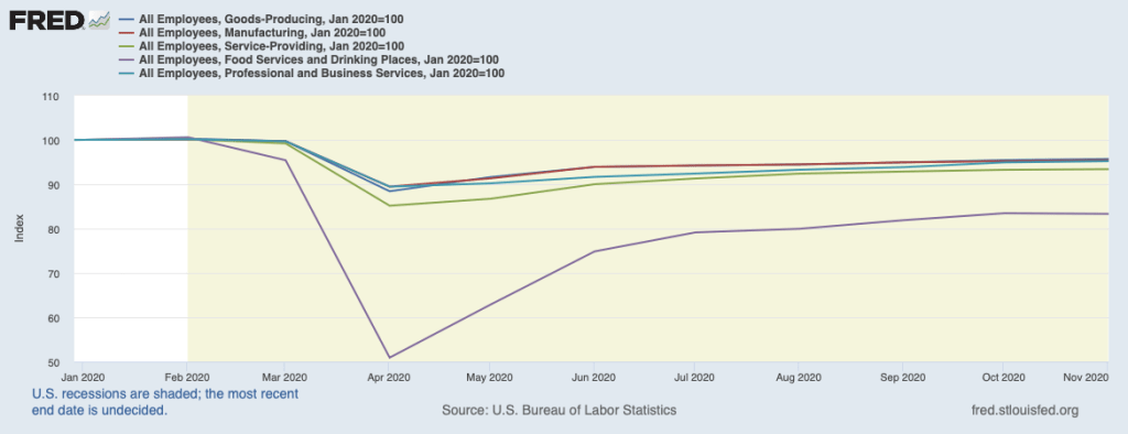
The following figure uses data from the Federal Reserve Economic Data (FRED) website (fred.stlouisfed.org) on employment in several business sectors—note that the sectors shown in the figure do not account for all employment in the U.S. economy. For ease of comparison, total employment in each sector in February 2020 has been set equal to 100.
Employment in each sector dropped sharply between February and April as the pandemic began to spread throughout the United States, leading governors and mayors to order many businesses and schools closed. Even in areas where most businesses remained open, many people became reluctant to shop in stores, eat in restaurants, or exercise in gyms. From April to November, there were substantial employment gains in each sector, with employment in all goods-producing industries and employment in manufacturing (a subcategory of goods-producing industries) in November being just 5 percent less than in February. Employment in professional and business services (firms in this sector include legal, accounting, engineering, legal, consulting, and business software firms), rose to about the same level, but employment in all service industries was still 7 percent below its February level and employment in restaurants and bars was 17 percent below its February level.
Raj Chetty of Harvard University and colleagues have created the Opportunity Insights website that brings together data on a number of economic indicators that reflect employment, income, spending, and production in geographic areas down to the county or, for some cities, the ZIP code level. The Opportunity Insights website can be found HERE.
In a paper using these data, Chetty and colleagues find that during the pandemic “spending fell primarily because high-income households started spending much less.… Spending reductions were concentrated in services that require in-person physical interaction, such as hotels and restaurants …. These findings suggest that high-income households reduced spending primarily because of health concerns rather than a reduction in income or wealth, perhaps because they were able to self-isolate more easily than lower-income individuals (e.g., by substituting to remote work).”
As a result, “Small business revenues in the highest-income and highest-rent ZIP codes (e.g., the Upper East Side of Manhattan) fell by more than 65% between March and mid-April, compared with 30% in the least affluent ZIP codes. These reductions in revenue resulted in a much higher rate of small business closure in affluent areas within a given county than in less affluent areas.” As the revenues of small businesses declined, the businesses laid off workers and sometimes reduced the wages of workers they continued to employ. The employees of these small businesses, were typically lower- wage workers. The authors conclude from the data that: “Employment for high- wage workers also rebounded much more quickly: employment levels for workers in the top wage quartile [the top 20 percent of wages] were almost back to pre-COVID levels by the end of May, but remained 20% below baseline for low-wage workers even as of October 2020.”
The paper, which goes into much greater detail than the brief summary just given, can be found HERE.
As we discuss in Chapter 17, there are several complications in accurately measuring changes in the distribution of income over time. First, people will not typically remain in the same place in the income distribution their whole lives. Instead, their incomes are likely to fluctuate, moving them up and down the income distribution. So comparing the distribution of income for the whole population at two points in time can give a misleading idea of how the incomes of particular individuals changed. Measuring income mobility can be difficult, however, because it entails tracking the incomes of individuals over time. Doing that requires specialized studies rather than relying on the more readily available government data we can use to track changes in the incomes of the whole population.
Second, we are more interested in the income people have available to spend rather than the income they earn. Because people pay taxes on the incomes they receive and because many people receive transfer payments from the government, including unemployment insurance payments and Social Security payments, the income distribution is more equal if we measure it after taking into account the taxes people pay and the transfer payments they receive.
Finally, people earn income from a variety of sources in addition to wages and salaries, including dividends they receive from owning stock, capital gains they earn from selling a financial or other asset, and income they earn from owning a business such as a restaurant or dry cleaners. The income people at the top of the income distribution earn from owning a business can be particularly hard to measure because it depends on how the income is reported to the Internal Revenue Service, which depends in turn on changes in laws affecting how businesses are organized and how they pay taxes. Dealing with these measurement issues is particular important in determining how much the share of income earned by the top 1% of the income distribution has changed over time—an issue that has been the subject of much political debate.
Wojciech Kopczuk of Columbia University and Eric Zwick of the University of Chicago address these measurement issues in a new article in the Journal of Economic Perspectives. Even skimming the article makes clear just how difficult the measurement issues are. Click HERE to read the article.
Note that the article is part of a symposium on income and wealth inequality that appears in that issue of the journal. The other articles in the symposium are also worth reading. Articles that appear in the Journal of Economic Perspectives are frequently (but not always!) nontechnical summaries of research that can be read without knowledge of economics beyond the principles course.