Soft Landing, Hard Landing … or No Landing?

During the recovery from the Covid–19 pandemic, inflation as measured by the personal consumption expenditures (PCEprice index, first rose above the Federal Reserve’s target annual inflation rate of 2 percent in March 2021. Many economists inside and outside of the Fed believed the increase in inflation would be transitory because it was thought to be mainly the result of supply chain problems and an initial burst of spending as business lockdowns were ended or mitigated in most areas.

Accordingly, the Federal Open Market Committee (FOMC) kept its target for the federal funds rate at effectively zero (a range of 0 to 0.25 percent) until March 2022 and continued its quantitative easing (QE) program of buying long-term Treasury bonds and mortgage-backed securities (MBS) until that same month.

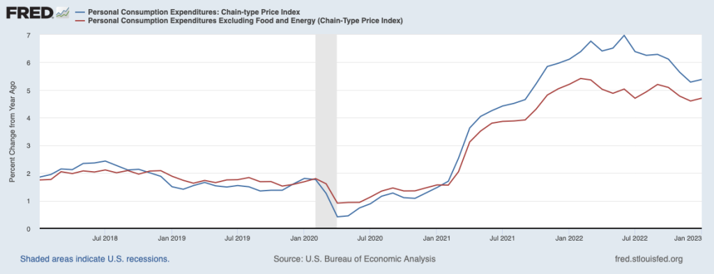
As the following figure shows, by March 2022 inflation had been well above the FOMC’s target for a year. The Fed responded by raising its target for the federal funds rate and switched from QE to quantitative tightening (QT). Although some supply chain problems were still contributing to the high inflation rate during the spring of 2022, the main driver appeared to be very expansionary monetary and fiscal policies. (This blog post from May 2021 has links to contributions to the debate over macro policy at the time. Glenn’s interview that month with the Financial Times can be found here. In November 2022, Glenn argued that overly expansionary fiscal policy was the main driver of inflation in this op-ed in the Financial Times (subscription or registration may be required).We discuss inconsistencies in the Fed’s forecasts of unemployment and inflation here. And in this post we discuss the question of whether the Fed made a mistake in not attempting to preempt inflation before it accelerated.)

Since March 2022, the FOMC has raised its target for the federal funds rate multiple times. In February 2023, the target was a range of 4.50 to 4.75 percent. Longer-term interest rates have also increased. In particular, the average interest rate on residential mortgage loans increased from 3 percent in March 2022 to 7 percent in November 2022, before falling back to around 6 percent in February 2023.  In the fall of 2022, there was optimism among some economists that the Fed had succeeded in slowing the economy enough to put inflation on a path back to its 2 percent target. Although many economists had expected that inflation would only return to the target if the U.S. economy experienced a recession—labeled a hard landing—the probability that inflation could be reduced without a recession—labeled a soft landing—appeared to be increasing. 

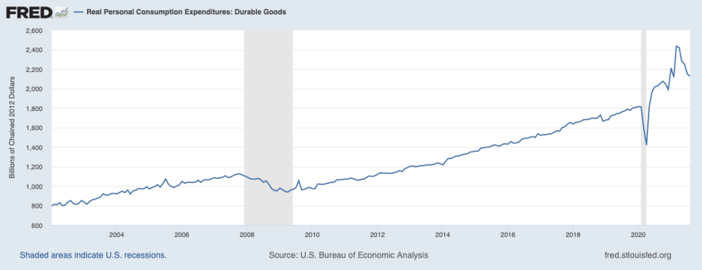
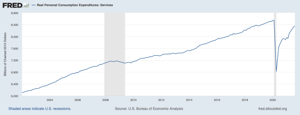
Economic data for January 2023 made a soft landing seem less likely. Consumer spending remained above its trend from before the pandemic, employment increases were unexpectedly high, and inflation reversed its downward trend. A continuation of low rates of unemployment and high rates of inflation wasn’t consistent with either a hard landing or a soft landing. Some observers, particularly in Wall Street financial firms, began describing the situation as no landing. But given the Fed’s strong commitment to returning to its 2 percent target, the no landing scenario couldn’t persist indefinitely.

Many investors had anticipated that the FOMC would end its increases in the federal funds target by mid-2023 and would have made one or more cuts to the target by the end of the year, but that outcome now seems unlikely. The FOMC had increased the federal funds target by only 0.25 percent at its February meeting but many economists now expected that it would announce a 0.50 percent increase at its next meeting on March 21 and 22. Unfortunately, the odds of a hard landing seem to be increasing.

A couple of notes: Although there are multiple ways of measuring inflation, the percentage increase in the PCE is the formal way in which the FOMC determines whether it is hitting its inflation target. To judge what the underlying inflation is—in other words, the inflation rate likely to persist in at least the near future—many economists look at core inflation. In the earlier figure we show movements in core inflation as measured by the PCE excluding prices of food and energy. Note that over the period shown PCE and core PCE follow the same pattern, although core PCE inflation begins to moderate earlier than does core PCE.

Some economists use other adjustments to PCE or to the consumer price index (CPI) in an attempt to better measure underlying inflation. For instance, housing rents and new and used car prices have been particularly volatile since early 2020, so some economists calculate PCE or CPI excluding those prices, as well as food and energy prices. As we discuss in this blog post from last September some economists prefer median CPI as the best measure of underlying inflation. (We discuss some of the alternative ways of measuring inflation in Macroeconomics, Chapter 15, Section 15.5 and Economics, Chapter 25, Section 25.5.) Nearly all these alternative measures of inflation indicated that the moderation in inflation that began in the summer of 2022 had ended in January 2023. So, choosing among measures of underlying inflation wasn’t critical to understanding the current path of inflation. 

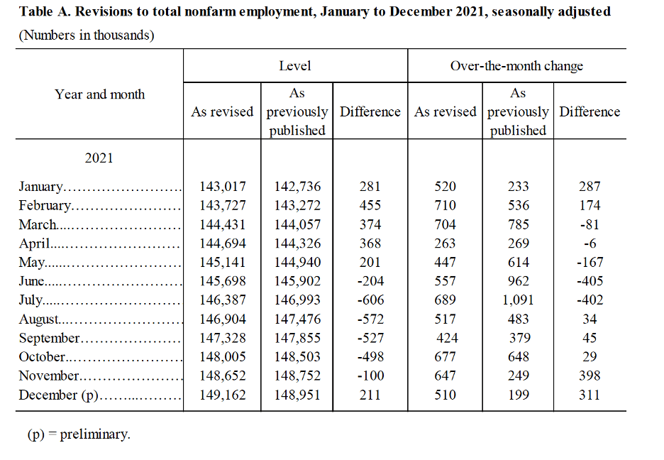
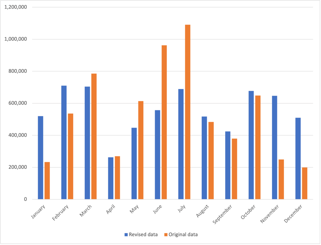
Finally, the inflation, employment, and output measures that in January seemed to show that the U.S. economy was still in a strong expansion and that the inflation rate may have ticked up are all seasonally adjusted. Seasonal adjustment factors are applied to the raw (unadjusted) data to account for regular seasonal fluctuations in the series. For instance, unadjusted employment declined in January as measured by both the household and establishment series. Applying the seasonal adjustment factors to the data resulted in the actual decline in employment from December to January turning into an adjusted increase. In other words, employment declined by less than it typically does, so on a seasonally adjusted basis, the Bureau of Labor Statistics reported that it had increased. Seasonal adjustments for the holiday season may be distorted, however, because the 2020–2021 and 2021–2022 holiday seasons occurred during upsurges in Covid. Whether the reported data for January 2023 will be subject to significant revisions when the seasonal adjustments factors are subsequently revised remains to be seen.  The latest BLS employment report, showing seasonally adjusted and not seasonally adjusted data, can be found here.

Harvard Professor Edward Glaeser on the Importance of Working on Site

Recently Tunku Varadarajan of the Wall Street Journal interviewed Edward Glaeser on whether the increases in working remotely due to the pandemic are likely to persist.

Glaeser notes that compared with the period before the pandemic, office attendance is still down 19% nationwide. In some large cities, it’s down considerably more, including being down more than 50% in San Francisco and 32% in New York and Boston.

Glaeser believes that a decline in working on site can be a particular problem for young workers:

“Cities—and face-to-face contact at work—have ‘this essential learning component that is valuable and crucial for workers who are young,’ [Glaeser] says. The acquisition of experience and improvement in productivity, ‘month by month, year by year,’ ensures that individual earnings are higher in cities than elsewhere.”

According to Glaeser, people who work remotely face a 50% reduction in the probably of being promoted.

Glaeser is not a fan of remote teaching:

“Delivering a lecture to 100 students on Zoom, he says, is ‘just a bad movie, a really bad movie. None of the magic that comes from live lecturing and live interaction with students is there when you’re doing it via Zoom.'”

There is much more in the article, which is well worth reading. It can be found here (a subscription may be required).

Are We at the Start of a Recession?

On Thursday morning, April 28, the Bureau of Economic Analysis (BEA) released its “advance” estimate for the change in real GDP during the first quarter of 2022. As shown in the first line of the following table, somewhat surprisingly, the estimate showed that real GDP had declined by 1.4 percent during the first quarter. The Federal Reserve Bank of Atlanta’s “GDP Now” forecast had indicated that real GDP would increase by 0.4 percent in the first quarter. Earlier in April, the Wall Street Journal’s panel of academic, business, and financial economists had forecast an increase of 1.2 percent. (A subscription may be required to access the forecast data from the Wall Street Journal’s panel.)

Do the data on real GDP from the first quarter of 2022 mean that U.S. economy may already be in recession? Not necessarily, for several reasons:

First, as we note in the Apply the Concept, “Trying to Hit a Moving Target: Making Policy with ‘Real-Time’ Data,” in Macroeconomics, Chapter 15, Section 15.3 (Economics, Chapter 25, Section 25.3): “The GDP data the BEA provides are frequently revised, and the revisions can be large enough that the actual state of the economy can be different for what it at first appears to be.”

Second, even though business writers often define a recession as being at least two consecutive quarters of declining real GDP, the National Bureau of Economic Research has a broader definition: “A recession is a significant decline in activity across the economy, lasting more than a few months, visible in industrial production, employment, real income, and wholesale-retail trade.” Particularly given the volatile movements in real GDP during and after the pandemic, it’s possible that even if real GDP declines during the second quarter of 2022, the NBER might not decide to label the period as being a recession.

Third, and most importantly, there are indications in the underlying data that the U.S. economy performed better during the first quarter of 2022 than the estimate of declining real GDP would indicate. In a blog post in January discussing the BEA’s advance estimate of real GDP during the fourth quarter of 2021, we noted that the majority of the 6.9 percent increase in real GDP that quarter was attributable to inventory accumulation. The earlier table indicates that the same was true during the first quarter of 2022: 60 percent of the decline in real GDP during the quarter was the result of a 0.84 decline in inventory investment.

We don’t know whether the decline in inventories indicates that firms had trouble meeting demand for goods from current inventories or whether they decided to reverse some of the increases in inventories from the previous quarter. With supply chain disruptions continuing as China grapples with another wave of Covid-19, firms may be having difficulty gauging how easily they can replace goods sold from their current inventories. Note the corresponding point that the decline in sales of domestic product (line 2 in the table) was smaller than the decline in real GDP.

The table below shows changes in the components of real GDP. Note the very large decline exports and in purchases of goods and services by the federal government. (Recall from Macroeconomics, Chapter 16, Section 16.1, the distinction between government purchases of goods and services and total government expenditures, which include transfer payments.) The decline in federal defense spending was particularly large. It seems likely from media reports that the escalation of Russia’s invasion of Ukraine will lead Congress and President Biden to increase defense spending.

Notice also that increases in the non-government components of aggregate demand remained fairly strong: personal consumption expenditures increased 2.7 percent, gross private domestic investment increased 2.3 percent, and imports surged by 17.7 percent. These data indicate that private demand in the U.S. economy remains strong.

So, should we conclude that the economy will shrug off the decline in real GDP during the first quarter and expand during the remainder of the year? Unfortunately, there are still clouds on the horizon. First, there are the difficult to predict effects of continuing supply chain problems and of the war in Ukraine. Second, the Federal Reserve has begun tightening monetary policy. Whether Fed Chair Jerome Powell will be able to bring about a soft landing, slowing inflation significantly while not causing a large jump in unemployment, remains the great unknown of economic policy. Finally, if high inflation rates persist, households and firms may respond in ways that are difficult to predict and, may, in particular decide to reduce their spending from the current strong levels.

In short, the macroeconomic forecast is cloudy!

Source: The BEA’s web site can be found here.

The Surprisingly Strong Employment Report for January 2022

Leisure and hospitality was one of the industries showing surprisingly strong job growth during January 2022. Photo from the New York Times.

The Bureau of Labor Statistics’ monthly report on the “Employment Situation” is generally considered the best source of information on the current state of the labor market. As we discuss in Macroeconomics, Chapter 9, Section 9.1 (and in Economics, Chapter 19, Section 19.1), economists, policymakers, and investors generally focus more on the establishment survey data on total payroll employment than on the household survey data on the unemployment rate. The initial data on employment from the establishment survey are subject to substantial revisions over time (we discuss this point further below). But the establishment survey has the advantage of being determined by data taken from actual payrolls rather than by unverified answers to survey questions, as is the case with the household survey data. 

The establishment survey data for January 2022 (released on February 4, 2022) showed a surprisingly large increase in employment of 467,000. The consensus forecast had been for a significantly smaller increase of 150,000, with many economists expecting that the data would show a decrease in employment. The establishment survey is collected for pay periods that include the 12th of the month. In January 2022, in many places in the United States that pay period coincided with the height of the wave of infections from the Omicron variant of Covid-19. And, in fact, according to the household survey, the number of people out of work because of illness was 3.6 million in January—the most during the Covid-19 pandemic. So it seemed likely that payroll employment would have declined in January. But despite the difficulties caused by the pandemic, payroll employment increased substantially, likely reflecting firms’ continuing high demand for workers—a demand reflected in the very high level of job openings.

The employment report includes the BLS’s annual data revisions, which are based on a comprehensive payroll count for a particular month in the previous year—in this case, March 2021. The revisions also incorporate changes to the BLS’s seasonal adjustment factors. Each month, the BLS adjusts the raw payroll employment data to reflect seasonal fluctuations such as occur during and after the end-of-year holiday period. For instance, the change from December 2020 to January 2021 in the raw employment data was −2,824,000, whereas the adjusted change was 467,000 (as noted earlier). Obviously this difference is very large and is attributable to the BLS’s seasonal adjustments removing the employment surge in December attributable to seasonal hiring by retail stores, delivery firms, and other businesses strongly affected by the holidays.

The changes to the seasonal adjustment factors made the revisions to the 2021 payroll employment numbers unusually large. For instance, the BLS initially reported that employment increased from June 2021 to July 2021 by 1,091,000, whereas the revision reduced the increase to 689,000. Table A below is reproduced from the BLS report; the figure below the table shows the changes in employment from the previous month as originally published and as revised in the January report. Overall, the BLS revisions now show that employment increased by 217,000 more from 2020 to 2021 than initially estimated. The BLS expressed the opinion that: “Going forward, the updated models should produce more reliable estimates of seasonal movements. [Because there are now] more monthly observations related to the historically large job losses and gains seen in the pandemic-driven recession and recovery, the models can better distinguish normal seasonal movements from underlying trends.”

Source: The BLS “Employment Situation” report can be found here.

The Remarkable Movement in Inventory Investment in the New GDP Numbers

The Bureau of Economic Analysis (BEA) released its “advance estimate” of real GDP for the fourth quarter of 2021 on January 27, 2022. (The BEA’s advance estimate is its first, or preliminary, estimate of real GDP for the period.) At an annual rate, real GDP grew by 6.9 percent in the fourth quarter, which was a rate well above what most economists had forecast.  It’s always worth bearing in mind that the advance estimate will be revised several times in future BEA reports, but at this point the growth rate is the highest since the second quarter of 2000. 

The following table shows the interesting fact that final sales of goods and services (line 2) grew only about 2 percent, higher than in the third quarter of 2021, but well below the growth in sales during the previous four quarters. In fact, more than 70 percent of the growth in real GDP during the quarter took the form of increases in inventories (line 3).

Is the fact that economic growth during the quarter mainly took the form of businesses accumulating inventories bad news for the economy? Most likely not. It is true that we often sees firms accumulate inventories at the beginning of a recession. This outcome occurs when firms are too optimistic about sales and end up adding goods to inventory that they had expected to be able to sell. In other words, actual investment expenditures turn out to be greater than plannedinvestment expenditures; the difference between planned and actual investment being equal to the value of unintended inventory accumulation. (We discuss the relationship among planned investment, actual investment, and unintended inventory accumulation in Economics, Chapter 22, Section 22.1 and in Macroeconomics, Chapter 12, Section 12.1.)

It’s possible that some of the inventories firms accumulated during the fourth quarter of 2021 were the result of sales being below the level that the firms had forecast. During the quarter, the Omicron variant of the Covid virus was spreading in several parts of the United States and some consumers cut back their purchases, partly because they were more reluctant to enter stores. It seems likely, though, that the majority of the inventory accumulation was voluntary—and therefore part of planned investment—as firms attempted to rebuild inventories they had drawn down earlier in the year. Some firms also may have decided to hold more inventories than they typically had prior to the pandemic because they wanted to avoid missing sales in case Omicron resulted in further disruptions to their supply chains. 

Source:  The BEA’s website can be found at this link.

President Biden Decides to Reappoint Jerome Powell as Fed Chair

Jerome Powell (photo from the New York Times)

When Congress established the Federal Reserve System in 1913, it intended to make the Fed independent of the rest of the federal government. (We discuss this point in the opener to Macroeconomics, Chapter 15 and to Economics, Chapter 25. We discuss the structure of the Federal Reserve System in Macroeconomics, Chapter 14, Section 14.4 and in Economics, Chapter 24, Section 24.4.) The ultimate responsibility for operating the Fed lies with the Board of Governors in Washington, DC. Members of the Board of Governors are nominated by the president and confirmed by the Senate to 14-year nonrenewable terms. Congress intentionally made the terms of Board members longer than the eight years that a president serves (if the president is reelected to a second term).

The president is still able to influence the Board of Governors in two ways:

  1. The terms of members of the Board of Governors are staggered so that one term expires on January 31 of each even-number year. Although this approach means that it’s unlikely that a president will be able to appoint all seven members during the president’s time in office, in practice, many members do not serve their full 14-year terms. So, a president who serves two terms will typically have an opportunity to appoint more than four members of the Board.
  2. The president nominates one member of the Board to serve a renewable four-year term as chair, subject to confirmation by the Senate.

The terms of Fed chairs end in the year after the year a president begins either the president’s first or second term. As a result, presidents are often faced with what is at times a difficult decision as to whether to reappoint a Fed chair who was first appointed by a president of the other party.

For example, after taking office in January 2009, President Barack Obama, a Democrat, faced the decision of whether to nominate Fed Chair Ben Bernanke to a second term to begin in 2010. Bernanke had originally been appointed by President George W. Bush, a Republican. Partly because the economy was still suffering the aftereffects of the financial crisis and the Great Recession, President Obama decided that it would potentially be disruptive to financial markets to replace Bernanke, so he nominated him for a second term.

After taking office in January 2017, President Donald Trump, a Republican, had to decide whether to nominate Fed Chair Janet Yellen, who had been appointed by Obama, to another term that would begin in 2018. He decided not to reappoint Yellen and instead nominated Jerome Powell, who was already serving on the Board of Governors. Although a Republican, Powell had been appointed to the Board in 2014 by Obama.

President Biden’s reasons for nominating Powell to a second term to begin in 2022 were similar to Obama’s reasons for nominating Bernanke to a second term: The U.S. economy was still recovering from the effects of the Covid-19 pandemic, including the strains the pandemic had inflicted on the financial system. He believed that replacing Powell with another nominee would have been potentially disruptive to the financial system.

There had been speculation that Biden would choose Lael Brainard, who has served on the Board of Governors since 2014 following her appointment by Obama, to succeed Powell as Fed chair. Instead, Biden appointed Brainard as vice chair of the Board. In announcing the appointments, Biden stated: “America needs steady, independent, and effective leadership at the Federal Reserve. That’s why I will nominate Jerome Powell for a second term as Chair of the Board of Governors of the Federal Reserve System and Dr. Lael Brainard to serve as Vice Chair of the Board of Governors.”

Sources: Nick Timiraos and Andrew Restuccia, “Biden Will Tap Jerome Powell for New Term as Fed Chairman,” wsj.com, November 22, 2021; and Jeff Cox and Thomas Franck, “Biden Picks Jerome Powell to Lead the Fed for a Second Term as the U.S. Battles Covid and Inflation,” cnbc.com, November 22, 2021.

The Effect of the Covid-19 Pandemic on Income Inequality

During 2020, Congress and President Donald Trump responded to the Covid-19 pandemic with very aggressive fiscal policy initiatives. First, in March 2020, Congress enacted the Coronavirus Aid, Relief, and Economic Security (CARES) Act. The CARES Act increased the federal government’s expenditures by $1.9 trillion. Then, in December 2020, in response to the continuing effects of the pandemic, Congress and President Trump included an additional $915 billion in expenditures related to Covid-19 in the Consolidated Appropriations Act.  These two fiscal policy actions included payments directly to households and supplemental unemployment insurance payments. Higher income households were not eligible for the direct payments (often referred to as “stimulus payments”). Higher income households were also less likely to be unemployed and so were less likely to receive the supplemental unemployment insurance payments.

In Chapter 17, Section 17.4, we discuss the unequal distribution of income in the United States. Because the federal payments were targeted toward lower and middle income households, did the payments result in a decline in income inequality? Table 17.6 in Chapter 17, shows a common measure of the distribution of income: Households in the United States are divided into five income quintiles, from the 20 percent with the lowest incomes to the 20 percent with the highest incomes, along with the fraction of total income received by each of the five groups. The following table displays the distribution of income using this measure for 2019 and 2020. (We also include the data for the share of income received by the 5 percent of households with the highest incomes.) Note that the definition of income used in the table includes tax payments households make in that year in addition to payments—including the stimulus payments—received from the government. The income is also “equivalence adjusted,” which means that income is adjusted to account for how many adults and children are in a household.

YearLowest 20%Second 20%Middle 20%Fourth 20% Highest 20%Highest 5%
20194.7%10.4%15.7%22.6%46.6%19.9%
20205.1%10.9%16.0%22.8%45.2%18.9%
Percentage change in income share8.7%4.8%2.1%0.8%−3.0%−5.1%

The table shows that the distribution of income in the United States became somewhat more equal during 2020, with the share of income going to each of the first four quintiles increasing, while the income of the highest quintile declined.  The income share of the lowest quintile increased the most—by 8.7 percent—while the income share of the top 5 percent of households decreased by 5.1%. In that section of Chapter 17, we discuss the Gini coefficient, which is a measure of how unequal the distribution of income is. The Gini coefficient ranges between 0 and 1 with higher values indicating a more unequal distribution. Between 2019 and 2020, the Gini coefficient decline from 0.416 to 0.399, or by 4.1 percent, which measure the extent to which the income distribution became more equal. 

Will the reduction in income inequality the United States experienced during 2020 persist? It seems likely to, at least through 2021, given that in March 2021, Congress and President Joe Biden enacted the American Rescue Plan, which included payments to households of up to $1,400 per eligible household member. As with the payments to households made during 2020, high-income households were not eligible. Congress also extended supplemental unemployment insurance payments through early September 2021 in states that were willing to accept the payments. 

What about after federal stimulus payments to households end? (As of late 2021, it appeared unlikely that Congress and President Biden planned on enacting any further payments.) One indication that some of the reduction in inequality might be sustained comes from the sharp increases in the wages of many low-skilled workers. For instance, in October 2021, the wages (as measured by their average hourly earnings) of workers in the leisure and hospitality industry, which includes workers in restaurants and hotels, increased by nearly 12 percent over the previous year. For all workers in the private sector, wages increased by about 5 percent over the same period. Many of the workers in this industry have low incomes. So, the fact that their wages were increasing more than twice as fast as wages in the overall economy indicates that at least some low-income workers were closing the earnings gap with other workers.

Sources: Emily A. Shrider, Melissa Kollar, Frances Chen, and Jessica Semega, U.S. Census Bureau, Current Population Reports, P60-270, Income and Poverty in the United States: 2020, Washington, DC, U.S. Government Printing Office, September 2021, Table C-3; and U.S. Bureau of Labor Statistics.

The Demographics of Covid-19 Mortality

Few diseases affect all demographic groups equally.  For example, the 1918–1919 influenza pandemic killed an unusually large number of young adults. Estimates are that half of deaths in the United States during that pandemic occurred among people aged 20 to 40. In recent flu seasons, the elderly have much higher mortality rates than do other age groups. For instance, during the 2018–2019 flu season, people 65 and older died at a rate more than 10 times greater than people 18 to 49 years old.  The very young also have comparatively high mortality rates from the flu. In 2018–2019, children 0 to 4 years-old died at a rate six times higher than children 5 to 17 years-old.

When the Covid-19 virus began to spread widely in the United States in the spring of 2020, some epidemiologists expected that it would affect different demographic groups in about the same way that the flu does. In fact, though, while people 65 and older were particularly at risk, young children were less affected by Covid-19 than they are by the flu. The following chart prepared by the Centers for Disease Control and Prevention (CDC) displays for the United States data on Covid deaths by age group as of early November 2021.

The blue bars show the percentage of total deaths from Covid since the beginning of the pandemic represented by that age group and the gray bars show the percentage that group makes up of the total U.S. population. Therefore, an age group that has a gray bar longer than its blue bar was proportionally less affected by the virus and an age group that has a blue bar longer its gray bar was proportionally more affected by the virus. The chart shows that people over age 65 experienced particularly high mortality rates. Strikingly, people over age 85 accounted for nearly 30 percent of all deaths in the United States, while making up only 2 percent of the U.S. population. 

The following chart displays data on Covid deaths by gender. Men account for about 49 percent of the U.S. population but have accounted for about 54 percent of Covid deaths.

Finally, the following chart displays data on Covid deaths by race or ethnicity. Hispanic, Black, and American Indian or Alaskan Native people have experienced proportionally higher Covid mortality rates than have Asian or white people.

What explains the disparity in mortality rates across demographic groups? With respect to age, we would expect older people to have weaker immune systems and therefore be more likely to die from any illness. In addition, early in the pandemic many older people in nursing homes died of Covid before it was widely understood that the disease spread through aerosols and that keeping people close together inside unmasked made it easy for the virus to spread. The very young have immature immune systems, which might have made them particularly susceptible to Covid, but for reasons not well understood, they turned not to be.

There continues to be debate over why men have experienced a higher mortality rate from Covid than have women. Vaccination rates among men are somewhat lower than among women, which may account for part of the difference. In an opinion column in the New York Times, Dr. Ezekiel  Emanuel of the University of Pennsylvania noted that researchers at Yale University have observed “that there are well-established differences in immune responses to infections between men and women.” But why this pattern should be reflected in Covid deaths is unclear at this point.

Medical researchers and epidemiologists have also not arrived at a consensus in explaining differences in mortality rates across racial or ethnic groups. Groups with higher mortality rates have had lower vaccination, which explains some of the difference. Groups with higher mortality rates are also more likely to suffer from other conditions, such as hypertension, that have been identified as contributing factors in some Covid deaths. These groups are also less likely to have access to health care than are the groups with lower mortality rates. The CDC notes that: “Race and ethnicity are risk markers for other underlying conditions that affect health, including socioeconomic status, access to health care, and exposure to the virus related to occupation, e.g., frontline, essential, and critical infrastructure workers.”

Sources: Ezekiel J. Emanuel, “An Unsolved Mystery: Why Do More Men Die of Covid-19?” nytimes.com, November 2, 2021; Daniela Hernandez, “Covid-19 Vaccinations Proceed Slowly Among Older Latino, Black People,” wsj.com, March 2, 2021; Anushree Dave, “Half-Million Excess U.S. Deaths in 2020 Hit Minorities Worse,” bloomberg.com, October 4, 2021; Centers for Disease Control and Prevention, “Hospitalization and Death by Race/Ethnicity,” cdc.gov, September 9, 2021; Centers for Disease Control and Prevention, “Demographic Trends of COVID-19 cases and deaths in the US reported to CDC,” cdc.gov, November 5, 2021 Centers for Disease Control and Prevention, “2018–2019 Flu Season Burden Estimates,” cdc.gov; and Jeffery K. Taubenberger and David M. Morens, “1918 Influenza: the Mother of All Pandemics,” Emerging Infectious Diseases, Vol. 12, No. 1, January 2006, pp. 15-22.

Can People be “Nudged” into Getting Vaccinated?

In Economics, Chapter 10, Section 10.4, when discussing behavioral economics, we mentioned Richard Thaler’s idea of nudges, which are small changes that government policymakers or business managers can make that may affect people’s behavior. Underlying the concept of nudges is the assumption that at least some of the time people may not be making fully rational decisions (We discuss in the chapter the reasons why people may not always make fully rational decisions.)  An example of a nudge is a business automatically enrolling employees into retirement savings plans to overcome the tendency of many people to be unrealistic about their future behavior. 

Once vaccines for the Covid-19 virus became widely available to the general adult population in 2021, some government policymakers were concerned that not enough people were being vaccinated to quickly curb the pandemic. Some people who declined to be vaccinated had carefully thought through the decision and declined the vaccine either because they believed they were at only a small risk of developing a severe case of Covid-19 or for other reasons. But some people who were not vaccinated intended eventually to receive the injection but for various reasons had not yet done so. The second group were potentially candidates for being nudged into becoming vaccinated.

A recent National Bureau of Economic Research working paper by Tom Chang of the University of Southern California and colleagues reports an experiment that measured the effect of nudges intended to increase the likelihood of someone becoming vaccinated.  The study was conducted in Contra Costa Country in northern California with 2,700 Medicaid (a state run system of health care offered to people with low incomes) recipients who agreed to participate. The study took place between May and July 2021 after all adults in the county had been eligible for several weeks to receive a vaccine. Half the people involved in the experiment received three nudges:  1) a video noting the positive effects of being vaccinated, 2) a financial incentive of either $10 or $50 if they received a vaccination within two weeks, and 3) “a highlighted convenient link to the county’s new public vaccination appointment scheduling system or just a message about getting vaccinated without a link.” The other half of the people involved in the experiment received none of these nudges.

The authors’ statistical analysis of the results of the experiment indicates that none of the nudges individually or in combination significantly raised vaccination rates. Do these results show conclusively that nudges are ineffective in increasing Covid-19 vaccination rates? The authors note that the people involved in this experiment were not representative of the U.S. population. All had low incomes (which made them eligible for Medicaid), they were relatively young, and were more likely to be Black or Hispanic than is true of the overall U.S. population. The study also took place just before the peak in the spread of the Delta variant of Covid-19 at a time when infection rates appeared to be declining. So, while for these reasons the study cannot be called a definitive, it does provide some evidence that nudges may not be effective in changing behavior towards vaccinations. 

Source: Tom Chang, Mireille Jacobson, Manisha Shah, Rajiv Pramanik, and Samir B. Shah, “Financial Incentives and other Nudges Do Not Increase Covid-19 Vaccinations among the Vaccine Hesitant,” National Bureau of Economic Research, Working Paper 29403, October 2021.

Elkhart County, Indiana Rides the Surge in Spending on Consumer Durables

More than 80 percent of the recreational vehicles (RV) sold in the United States are manufactured in Elkhart County, Indiana. As we discuss in the opener to Chapter 22 in Economics (Chapter 12 in Macroeconomics), being dependent on sales of expensive durable goods like RVs means that the county is particularly vulnerable to the business cycle, with local firms experiencing rising sales during economic expansions and sharply falling sales during economic recessions. Accordingly, the unemployment rate in the county fluctuates much more during the business cycle than is typical—as shown in the above graph.

For example, during the Great Recession of 2007-2009, the unemployment rate in the country rose from a low of 3.9 percent in May 2007 to a high of 20 percent in March 2009, before declining during the following economic recovery.  Just before the start of the Covid-19 recession of 2020, the unemployment rate in Elkhart was 2.8 percent. It then soared to 30.8 percent in April. 

But, as we discuss in the chapter, the recovery from the 2020 recession was unusually rapid, although uneven. Many services industries, such as restaurants, gyms, and movie theaters continued to struggle well into 2021 as firms had difficulty attracting workers and as some consumers remained reluctant to spend time inside in close contact with other people. In contrast, consumer spending on durable goods was far above its pre-pandemic level, as well as being above the rate at which it had been growing during the years before the pandemic. The two graphs below show real consumer spending on durables and on services up through August 2021.

During 2021, sales of RVs through August were 50 percent higher than in the same period in 2020 and were on a pace to reach record annual sales. The success of the RV industry has led to rising incomes in Elkhart County, which, in turn, has allowed the area to attract other industries, including a logistics center that when completed will be the largest industrial building in Indiana and an Amazon warehouse that when completed will provide 1,000 new jobs. Rising incomes have also supported other businesses, such as community theaters, art galleries, and a recently reopened 1920s-era hotel.

In October 2021, the Wall Street Journal ranked Elkhart County first in its rating of metropolitan areas as measured by the index it compiles with realtor.com. The index “identifies the top metro areas for home buyers seeking an appreciating housing market and appealing lifestyle amenities.” If consumers continue to buy more goods and fewer services, it could be bad news for restaurants and other service industries, but good news for places like Elkhart that depend on goods-producing industries. 

Sources: Nicole Friedman, “RV Capital of America Tops WSJ/Realtor.com Housing Index in Third Quarter,” wsj.com, October 19, 2021; Business Wire, “Amazon Announces New Robotics Fulfillment Center and Delivery Station in Elkhart County, Creating More Than 1,000 New, Full-Time Jobs,” businesswire.com, October 7, 2021; Construction Review Online, “Hotel Elkhart Grand Opening Celebrated in Elkhart, Indiana,” constructionreviewonline.com, October 4, 2021; Construction Review Online, “Elkhart County Logistics Facility to Bring about 1,000 jobs in Indiana,” constructionreviewonline.com, August 16, 2021; Federal Reserve Bank of St. Louis; and RV Industry Association.