How Should We Measure Inflation?

Image from the Wall Street Journal.

In the textbook, we discuss several measures of inflation. In Macroeconomics, Chapter 8, Section 8.4 (Economics, Chapter 18, Section 18.4) we discuss the GDP deflator as a measure of the price level and the percentage change in the GDP deflator as a measure of inflation. In Chapter 9, Section 9.4, we discuss the consumer price index (CPI) as a measure of the price level and the percentage change in the CPI as the most widely used measure of inflation. 

            In Chapter 15, Section 15.5 we examine the reasons that the Federal Reserve often looks at the core inflation rate—the inflation rate excluding the prices of food and energy—as a better measure of the underlying rate of inflation. Finally, in that section we note that the Fed uses the percentage change in the personal consumption expenditures (PCEprice index to assess  of whether it’s achieving its goal of a 2 percent inflation rate.

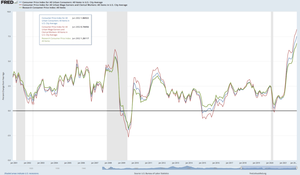
            In this blog post, we’ll discuss two other aspects of measuring inflation that we don’t cover in the textbook. First, the Bureau of Labor Statistics (BLS) publishes two versions of the CPI:  (1) The familiar CPI for all urban consumers (or CPI–U), which includes prices of goods and services purchased by households in urban areas, and (2) the less familiar CPI for urban wage earners and clerical workers (or CPI–W), which includes the same prices included in the CPI–U. The two versions of the CPI give slightly different measures of the inflation rate—despite including the same prices—because each version applies different weights to the prices when constructing the index.

            As we explain in Chapter 9, Section 9.4, the weights in the CPI–U (the only version of the CPI we discuss in the chapter) are determined by a survey of 36,000 households nationwide on their spending habits. The more the households surveyed spend on a good or service, the larger the weight the price of the good or service receives in the CPI–U. To calculate the weights in the CPI–W the BLS uses only expenditures by households in which at least half of the household’s income comes from a clerical or wage occupation and in which at least one member of the household has worked 37 or more weeks during the previous year.  The BLS estimates that the sample of households used in calculating the CPI–U includes about 93 percent of the population of the United States, while the households included in the CPI–W include only about 29 percent of the population. 

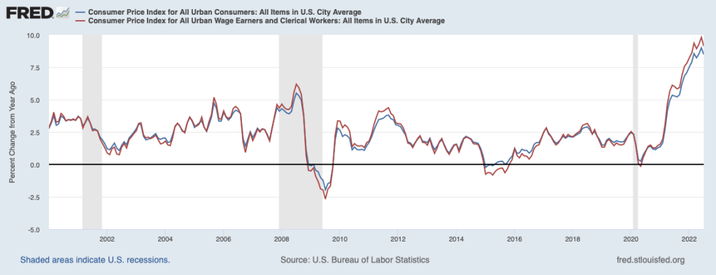
            Because the percentage of the population covered by the CPI–U is so much larger than the percentage of the population covered by the CPI–W, it’s not surprising that most media coverage of inflation focuses on the CPI–U. As the following figure shows, the measures of inflation from the two versions of the CPI aren’t greatly different, although inflation as measured by the CPI–W—the red line—tends to be higher during economic expansions and lower during economic recessions than inflation measured by the CPI–U—the blue line. 

One important use of the CPI–W is in calculating cost-of-living adjustments (COLAs) applied to Social Security payments retired and disabled people receive. Each year, the federal government’s Social Security Administration (SSA) calculates the average for the CPI–W during June, July, and August in the current year and in the previous year and then measures the inflation rate as the percentage increase between the two averages. The SSA then increases Social Security payments by that inflation rate. Because the increase in CPI–W is often—although not always—larger than the increase in CPI–U, using CPI–W to calculate Social Security COLAs increases the payments recipients of Social Security receive. 

            A second aspect of measuring inflation that we don’t mention in the textbook was the subject of discussion following the release of the July 2022 CPI data. In June 2022, the value for the CPI–U was 295.3. In July 2022, the value for the CPI–U was also 295.3. So, was there no inflation during July—an inflation rate of 0 percent? You can certainly make that argument, but typically, as we note in the textbook (for instance, see our display of the inflation rate in Chapter 10, Figure 10.7) we measure the inflation rate in a particular month as the percentage change in the CPI from the same month in the previous year. Using that approach to measuring inflation, the inflation rate in July 2022 was the percentage change in the CPI from its value in July 2021, or 8.5 percent.  Note that you could calculate an annual inflation rate using the increase in the CPI from one month to the next by compounding that rate over 12 months. In this case, because the CPI was unchanged from June to July 2022, the inflation rate calculated as a compound annual rate would be 0 percent.  

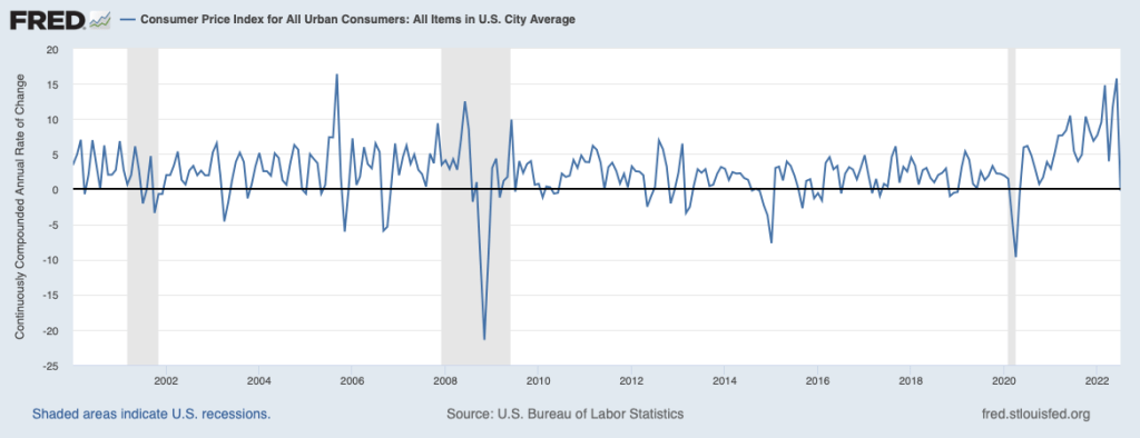
            During periods of moderate inflation rates—which includes most of the decades prior to 2021—the difference between inflation calculated in these two ways was typically much smaller. Focusing on just the change in the CPI for one month has the advantage that you are using only the most recent data. But if the CPI in that month turns out to be untypical of what is happening to inflation over a longer period, then focusing on that month can be misleading. Note also that inflation rate calculated as the compound annual change in the CPI each month results in very large fluctuations in the inflation rate, as shown in the following figure.

Sources: Anne Tergesen, “Social Security Benefits Are Heading for the Biggest Increase in 40 Years,” Wall Street Journal, August 10, 2022; Neil Irwin, “Inflation Drops to Zero in July Due to Falling Gas Prices,” axios.com, August 10, 2022; “Consumer Price Index Frequently Asked Questions,” bls.gov, March 23, 2022; Stephen B. Reed and Kenneth J. Stewart, “Why Does BLS Provide Both the CPI–W and CPI–U?” U.S. Bureau of Labor Statistics, Beyond the Numbers, Vol. 3, No. 5, February 2014; “Latest Cost of Living Adjustment,” ssa.gov; and Federal Reserve Bank of St. Louis.

Be Careful When Interpreting Macroeconomic Data at the Beginning of a Recession

On Friday, July 8, the Bureau of Labor Statistics (BLS) released its monthly “Employment Situation” report for June 2022. The BLS estimated that nonfarm employment had increased by 372,000 during the month. That number was well above what economic forecasters had expected and seemed inconsistent with other macroeconomic data that showed the U.S. economy slowing. (Note that the increase in employment is from the establishment survey, sometimes called the payroll survey, which we discuss in Macroeconomics, Chapter 9, Section 9.1 and Economics, Chapter 19, Section 19.1.)

Data indicating that the economy was slowing during the first half of 2022 include the Bureau of Economic Analysis’s (BEA) estimate that real GDP had declined by 1.6 percent in the first quarter of 2022. The BEA’s advance estimate—the agency’s first estimate for the quarter—for the change in real GDP during the second quarter of 2022 won’t be released until July 28, but there are indications that real GDP will have declined again during the second quarter.  For instance, the Federal Reserve Bank of Atlanta compiles a forecast of real GDP called GDPNow. The GDPNow forecast uses data that are released monthly on 13 components of GDP. This method allows economists at the Atlanta Fed to issue forecasts of real GDP well in advance of the BEA’s estimates. On July 8, the GDPNow forecast was that real GDP in the second quarter of 2022 would decline by 1.2 percent.

Two consecutive quarters of declining real GDP seems inconsistent with employment strongly growing. At a basic level, if firms are producing fewer goods and services—which is what causes a decline in real GDP—we would expect the firms to be reducing, rather than increasing, the number of people they employ. How can we reconcile the seeming contradiction between rising employment and falling output? One possibility is that either the real GDP data or the employment data—or, possibly, both—are inaccurate. Both GDP data and employment data from the establishment survey are subject to potentially substantial future revisions. (Note that because they are constructed from a survey of households, the employment data in the household survey aren’t revised. As we discuss in the text, economists and policymakers typically rely more on the establishment survey than on the household survey in gauging the current state of the labor market.) Substantial revisions are particularly likely for data released during the beginning of a recession. 

In Macroeconomics, Chapter 9, Section 9.1 (Economics, Chapter 19, Section 19.1), we give an example of substantial revisions in the employment data. Figure 9.5 (reproduced below) shows that the declines in employment during the 2007–2009 recession were initially greatly underestimated. For example, the BLS initially reported that employment declined by 159,000 during September 2008. But after additional data became available, the BLS revised its estimate to a much larger decline of 460,000.

Similarly, in Macroeconomics, Chapter 15, Section 15,3, in the Apply the Concept “Trying to Hit a Moving Target: Making Policy with ‘Real-Time Data’,” we show the BEA’s estimates of the change in real GDP during the first quarter of 2008 have been revised substantially over time. The BEA’s advance estimate of the change in real GDP during the first quarter of 2008 was an increase of 0.6 percent at an annual rate. But that estimate of real GDP growth has been revised a number of times over the years, mostly downward. Currently, BEA data indicate that real GDP actually declined by 1.6 percent at an annual rate during the first quarter of 2008. This swing of more than 2 percentage points from the advance estimate is a large difference, which changes the picture of what happened during the first quarter of 2008 from one of an economy experiencing slow growth to one of an economy suffering a sharp downturn as it fell into the worst recession since the Great Depression of the 1930s.

The changes to the estimates of both employment and real GDP during the beginning of the 2007–2009 recession are not surprising. The initial estimates of employment and real GDP rely on incomplete data. The estimates are revised as additional data are collected by government agencies. During the beginning of a recession, these additional data are likely to show lower levels of employment and output than were indicated by the initial estimates. If the U.S. economy is in a recession in the second quarter of 2022, we can expect that the BLS and BEA will revise their initial estimates of employment and real GDP downward, which—depending on the relative magnitudes of the revisions to the two series—may resolve the paradox of rising employment and falling output. 

Or it’s possible that the U.S. economy is not in a recession. In that case, the employment data may be correct in showing an increase in the number of people working, and the real GDP data may be revised upward to show that output has actually been expanding during the first six months of 2022. Economists and policymakers will have to wait to see which of these alternatives turns out to be the case.

A Day in the Life of a Price Checker for the Bureau of Labor Statistics

Emily Mascitis checks prices at an auto-repair shop in Philadelphia. (Photo from the Wall Street Journal.)

As we discuss in Macroeconomics, Chapter 9, Section 9.4, (Economics, Chapter 19, Section 19.4) in calculating the consumer price index (CPI) each month, the Bureau of Labor Statistics sends hundreds of employees to gather price data from stores and offices. A reporter for the Wall Street Journal followed a price checker as she visited an auto-repair shop, a grocery store, and other businesses.

The article provides an excellent discussion of the care with which prices are collected, particularly with respect to making sure that the prices are for the same good or service each month. For instance, while in a grocery, the price checker almost made the mistake of recording the price of a can of low sodium chicken noodle soup, rather than the price of regular chicken noodle soup as in previous months.

At one point, the price checker noted that the price of clementines had been increasing rapidly and remarked that when buying fruit for her own family “We need to pick a less expensive fruit.” Switching from buying a fruit, in this case clementines, with a price that is increasing rapidly to a fruit with a price that is increasing more slowly, say regular oranges, is an example of the substitution bias. That’s one of the four biases discussed in Section 9.4 that can cause the measured increase in the CPI to overstate the true rate of inflation.

The article can be found here. (A subscription may be required.)

Source: Rachel Wolfe, “How the Inflation Rate Is Measured: 477 Government Workers at Grocery Stores,” Wall Street Journal, May 10, 2022.

Does Inflation Affect Lower-Income People More than Higher-Income People?

There’s a consensus among economists that increases in unemployment during a recession typically are larger for lower-income people than for higher-income people. Lower-income people are more likely to hold jobs requiring fewer skills and firms typically expect that when they lay off less-skilled workers during a recession they will be able to higher them—or other workers with similar skills—back after the recession ends. Because higher income have skills that may be difficult to replace, firms are more reluctant to lay them off. 

For instance, in an earlier blog post (found here) we noted that during the period in 2020 when many restaurants were closed, the Cheesecake Factory continued to pay its 3,000 managers while it laid off most of its servers. That strategy made it easier for the restaurant chain to more easily expand its operations when the worst of government-ordered closures were over. More generally, Serdar Birinci and YiLi Chien of the Federal Reserve Bank of St. Louis found that workers in the lowest 20 percent (or quintile) of earnings experienced an increased unemployment rate from 4.4 percent in January 2020 to 23.4 percent in April 2020, whereas workers in the highest quintile of earnings experienced an increase only from 1.1 percent in January to 4.8 percent in April.

If lower-income people are hit harder by unemployment, are they also hit harder by inflation? Answering that question is difficult because the U.S. Bureau of Labor Statistics (BLS) doesn’t routinely release data on inflation in the prices of goods and services purchased by households at different income levels.  The main measure of consumer price inflation compiled by the BLS represents changes in the consumer price index (CPI). The CPI is an index of the prices in a market basket of goods and services purchased by households living in urban areas. The information on consumer purchases comes from interviews the BLS conducts every three months with a sample of consumers and from weekly diaries in which a sample of consumers report their purchases. (We discuss the CPI in Macroeconomics, Chapter 9,  Section 9.4 and in Economics, Chapter 19, Section 19.4.)

The BLS releases three measures of the CPI, the two most widely used of which are the CPI-U for all urban consumers and CPI-W for urban wage earners. CPI-W covers the subset of households that receive at least half their household income from clerical or wage occupations and who have at least one wage earner who worked for 37 weeks or more during the previous year. CPI-U represents about 93 percent of the U.S. population and CPI-W represents about 29 percent of the U.S. population. Finally, in 1988 Congress instructed the BLS to compile a consumer price index reflecting the purchases of people aged 62 and older. This version of the CPI is labeled R-CPI-E; the R indicates that it is a research series and the E indicates that it is intended to measure the prices of goods and services purchased by elderly people. Because the sample used to calculate the R-CPI-E is relatively small and because of some other difficulties that may reduce the accuracy of the index, the BLS considers it a series best suited for research and does not include the data in its monthly “Consumer Price Index” publication. In any event, as the following figure shows, inflation, measured as the percentage change in the CPI from the same month in the previous year, has been very similar for all three measures of the CPI.

Because the market baskets of goods and services consumed by a mix of high and low-income households is included in all three versions of the CPI, none of the versions provides a way to measure the possibly different effects of inflation on low-income and on high-income households. A study by Josh Klick and Anya Stockburger of the BLS attempts to fill this gap by constructing measures of the CPI for low-income and for high-income households. They define low-income households as those in the bottom 25 percent (quartile) of the income distribution and high-income households as those in the top quartile of the income distribution. During the time period of their analysis—December 2003 to December 2018—the bottom quartile had average annual incomes of $12,705 and the top quartile had average annual incomes of $155,045.

The BLS researchers constructed market baskets for the two groups. The expenditure weights—representing the mix of products purchased—don’t differ too strikingly between lower-income and higher-income households, as the figure below shows. The largest differences are housing, with low-income households having a market basket weight of 45.2 percent and high-income households having a market basket weight of 39.5 percent, and transportation, with low-income households having a market basket weight of 13.0 percent and high-income households having a market basket weight of 17.2 percent.

The following table shows the inflation rate as measured by changes in different versions of the CPI over the period from December 2003 to December 2018. During this period, the CPI-U (the version of the CPI that is most frequently quoted in news stories) increased at an annual rate of 2.1 percent, which was the same rate as the CPI-W. The R-CPI-E increased at a slightly faster rate of 2.2 percent. Lower-income households experienced the highest inflation rate at 2.3 percent and higher-income households experienced the lowest inflation rate of 2.0 percent.  

CPI-UCPI-WR-CPI-ECPI for lowest income quartileCPI for highest income quartile
2.1%2.2%2.1%2.3%2.0%

The differences in inflation rates across groups were fairly small. Can we conclude that the same was true during the recent period of much higher inflation rates? We won’t know with certainty until the BLS extends its analysis to cover at least the years 2021 and 2022. But we can make a couple of relevant observations. First, for many people the most important aspect of inflation is whether prices are increasing faster of slower than their wages. In other words, people are interested in what is happening to their real wage. (We discuss calculating real wage rates in Macroeconomics, Chapter 9, Section 9.5 and in Economics, Chapter 19, Section 19.5.)

The Federal Reserve Bank of Atlanta compiles data on wage growth, including wage growth by workers in different income quartiles. The following figure shows that workers in the top quartile have experienced more rapid wage growth in the months since the beginning of the Covid-19 pandemic than have workers in the other quartiles. This gap continues a trend that began in 2015. The bottom quartile has experienced the slowest rate of income growth. (Note that the researchers at the Atlanta Fed compute wage growth as a 12-month moving average rather than as the percentage from the same month in the previous year, as we have been doing when calculating inflation using the CPI.) For example, in January 2022, calculated this way, average wage growth in the top quartile was 5.8 percent as opposed to 2.9 percent in the bottom quartile.

As with any average, there is some variation in the experiences of different individuals. Although, as a group, lower-income workers have seen wage growth that lags behind other workers, in some industries that employ many lower-income people, wage growth has been strong. For instance, as measured by average hourly earnings, wages for all workers in the private sector increased by 5.7 percent between January 2021 and 2022. But average hourly earnings in the leisure and hospitality industry—which employs many lower-income workers—increased by 13.0 percent.

Overall, it seems likely that the real wages of higher-income workers have been increasing while the real wages of lower-income workers have been decreasing, although the experience of individual workers in both groups may be very different than the average experience. 

Sources: Josh Klick and Anya Stockburger, “Experimental CPI for Lower and Higher Income Households Serdar,” U.S. Bureau of Labor Statistics, Working Paper 537, March 8, 2021; Birinci and YiLi Chien, “An Uneven Crisis for Lower-Income Households,” Federal Reserve Bank of St. Louis, Annual Report 2020, April 7, 2021; and Federal Reserve Bank of Atlanta, “Wage Growth Tracker,” https://www.atlantafed.org/chcs/wage-growth-tracker.

The Surprisingly Strong Employment Report for January 2022

Leisure and hospitality was one of the industries showing surprisingly strong job growth during January 2022. Photo from the New York Times.

The Bureau of Labor Statistics’ monthly report on the “Employment Situation” is generally considered the best source of information on the current state of the labor market. As we discuss in Macroeconomics, Chapter 9, Section 9.1 (and in Economics, Chapter 19, Section 19.1), economists, policymakers, and investors generally focus more on the establishment survey data on total payroll employment than on the household survey data on the unemployment rate. The initial data on employment from the establishment survey are subject to substantial revisions over time (we discuss this point further below). But the establishment survey has the advantage of being determined by data taken from actual payrolls rather than by unverified answers to survey questions, as is the case with the household survey data. 

The establishment survey data for January 2022 (released on February 4, 2022) showed a surprisingly large increase in employment of 467,000. The consensus forecast had been for a significantly smaller increase of 150,000, with many economists expecting that the data would show a decrease in employment. The establishment survey is collected for pay periods that include the 12th of the month. In January 2022, in many places in the United States that pay period coincided with the height of the wave of infections from the Omicron variant of Covid-19. And, in fact, according to the household survey, the number of people out of work because of illness was 3.6 million in January—the most during the Covid-19 pandemic. So it seemed likely that payroll employment would have declined in January. But despite the difficulties caused by the pandemic, payroll employment increased substantially, likely reflecting firms’ continuing high demand for workers—a demand reflected in the very high level of job openings.

The employment report includes the BLS’s annual data revisions, which are based on a comprehensive payroll count for a particular month in the previous year—in this case, March 2021. The revisions also incorporate changes to the BLS’s seasonal adjustment factors. Each month, the BLS adjusts the raw payroll employment data to reflect seasonal fluctuations such as occur during and after the end-of-year holiday period. For instance, the change from December 2020 to January 2021 in the raw employment data was −2,824,000, whereas the adjusted change was 467,000 (as noted earlier). Obviously this difference is very large and is attributable to the BLS’s seasonal adjustments removing the employment surge in December attributable to seasonal hiring by retail stores, delivery firms, and other businesses strongly affected by the holidays.

The changes to the seasonal adjustment factors made the revisions to the 2021 payroll employment numbers unusually large. For instance, the BLS initially reported that employment increased from June 2021 to July 2021 by 1,091,000, whereas the revision reduced the increase to 689,000. Table A below is reproduced from the BLS report; the figure below the table shows the changes in employment from the previous month as originally published and as revised in the January report. Overall, the BLS revisions now show that employment increased by 217,000 more from 2020 to 2021 than initially estimated. The BLS expressed the opinion that: “Going forward, the updated models should produce more reliable estimates of seasonal movements. [Because there are now] more monthly observations related to the historically large job losses and gains seen in the pandemic-driven recession and recovery, the models can better distinguish normal seasonal movements from underlying trends.”

Source: The BLS “Employment Situation” report can be found here.