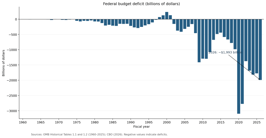
The federal government’s fiscal year runs from October 1 to September 30. The Congressional Budget Office (CBO) has released its estimate of the deficit for the 2026 fiscal year, which ended September 30, 2026. The deficit increased to $1,993 billion in 2026 from $1,775 billion in 2025. As the following figure shows, in the context of the period since 1960, the budget deficit in 2026 remains very large, particularly at a time when the U.S. economy is at or very close to full employment. The budget deficit in 2026 is well below the record deficit of $3,096 billion in 2020.
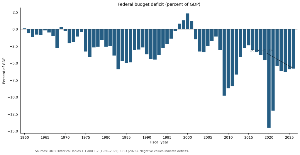
Economists typically focus more on the size of the budget deficit relative to the size of the economy, as measured by GDP. The following figure shows the federal budget deficit as a percentage of GDP was largest during and after the Great Recession of 2007–2009, and in 2020–2021, during and immediately after the Covid recession. In both those periods, federal tax revenues declined as production and employment fell. In addition, Congress passed legislation increasing government purchases and transfer payments. Although during the past few years the budget deficit as a percentage of GDP has declined from a high of 14.5 percent in 2020 (which was the largest deficit since World War II ended in 1945), it still remains very high for a period of close to full employment.
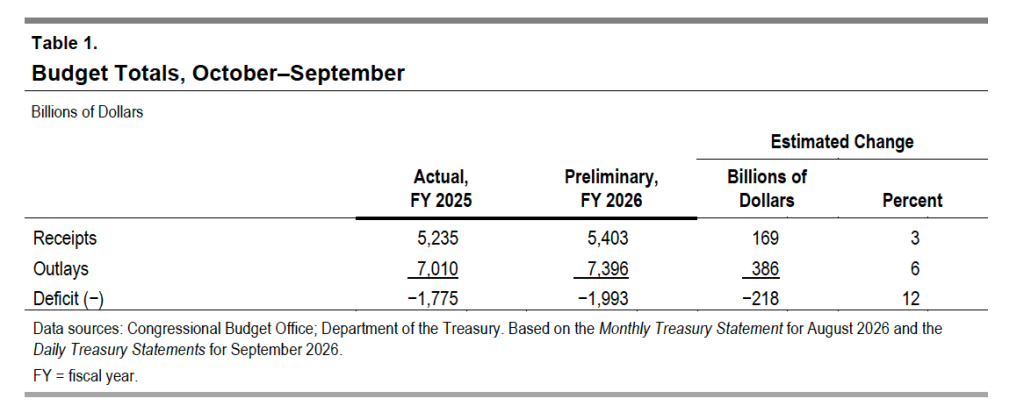
The following table from the CBO report shows that in 2026 federal receipts increased less than federal outlays, leading to a larger budget deficit.
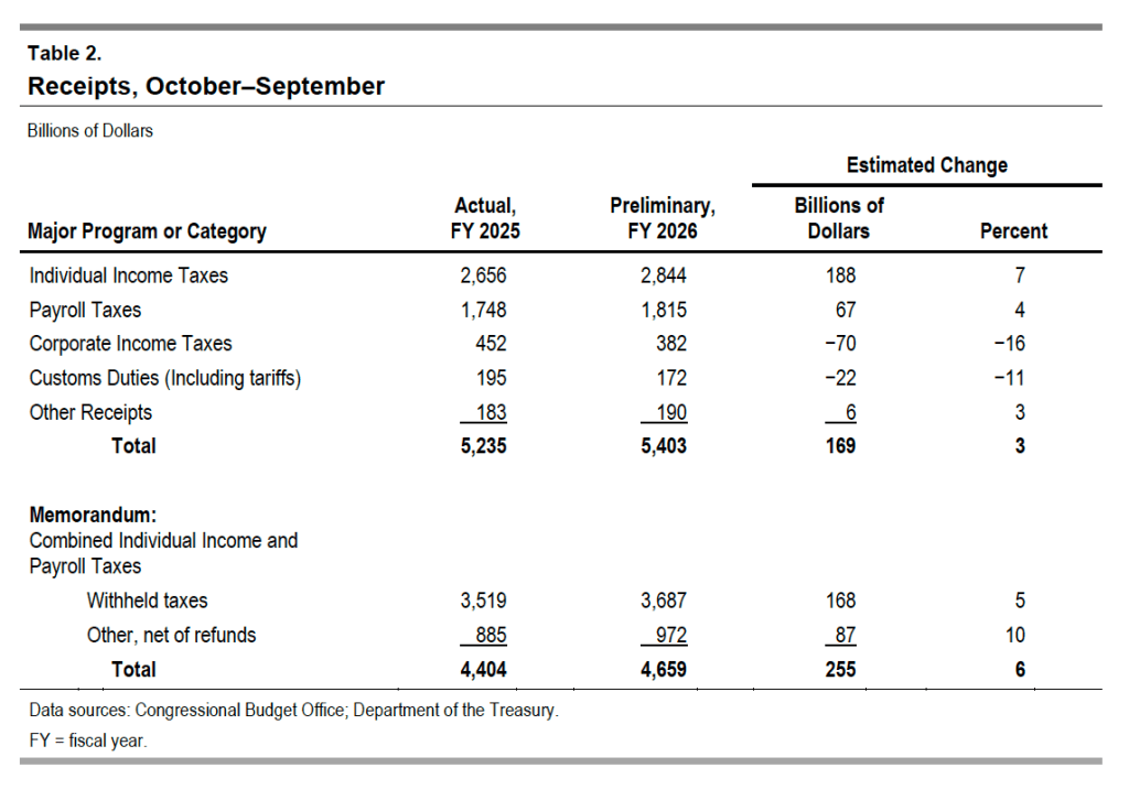
The next table shows the changes in the major categories of federal receipts. Individual income and payroll taxes—which fund the Social Security and Medicare programs, as well as the federal government’s contributions to state unemployment insurance plans—both increased, while corporate income tax receipts fell. Customs duties declined as the federal government refunded tariffs collected under higher tariff rates imposed by the Trump administration beginning in April 2025. The Supreme Court ruled in February 2026 that some of the tariff increases were not authorized by federal law.
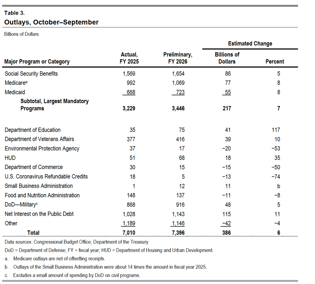
The next table shows the changes in the major categories of federal outlays. Spending on the Social Security, Medicare (health insurance for older people), and Medicaid (health insurance for lower-income people) programs continue to steadily increase. Spending on Medicare is now more than $150 billion greater than spending on defense. Interest on the public debt continues to increase as the debt grows and interest rates remain well above their pre-2021 levels.
After the Federal Open Market Committee (FOMC) increased its target for the federal funds rate at its September meeting, there was uncertainty as to whether it would raise its target again at its meeting on October 27–28. Today’s report from the Bureau of Labor Statistics (BLS) on the consumer price index (CPI) for September showed that inflation had risen more than expected, likely increase somewhat the probability of the committee raising its target range at its October meeting.
As we’ve noted before, and as we discuss in Macroeconomics, Chapter 15 (Economics, Chapter 25), monetary policy affects the economy with, in the words of Nobel laureate Milton Friedman, “long and variable lags.” As a result, most economists agree that the Federal Reserve should not attempt to “fine tune” the economy by responding to each government release of macroeconomic data. Nevertheless, in practice, it’s clear that during times when Fed policymakers are split over what course of action to take, a single data report can have a significant effect on their decision.
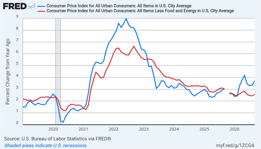
The following figure compares headline CPI inflation (the blue line) and core CPI inflation (the red line).
The headline inflation rate, which is measured by the percentage change in the CPI from the same month in the previous year, was 3.7 percent in September, up from 3.4 percent in August.
The core inflation rate,which excludes the prices of food and energy, was 2.6 percent in September, up from 2.4 percent in August.
Headline inflation and core inflation were both higher than the forecasts of economics surveyed by the Wall Street Journal. (Note that because of last year’s federal government shutdown, inflation data for October 2025 are not available.)
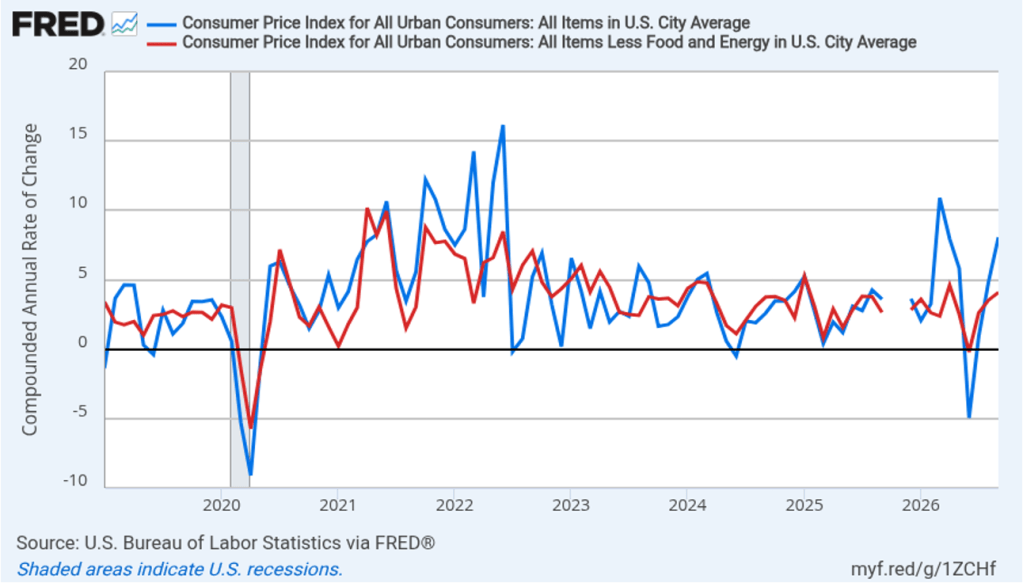
In the following figure, we look at the 1-month inflation rate for headline and core inflation—that is the annual inflation rate calculated by compounding the current month’s rate over an entire year. Calculated as the 1-month inflation rate, headline inflation (the blue line) soared to 8.1 percent in September, up from 4.9 percent in August. Core inflation (the red line) was 4.1 percent in September, up from 3.5 percent in August.
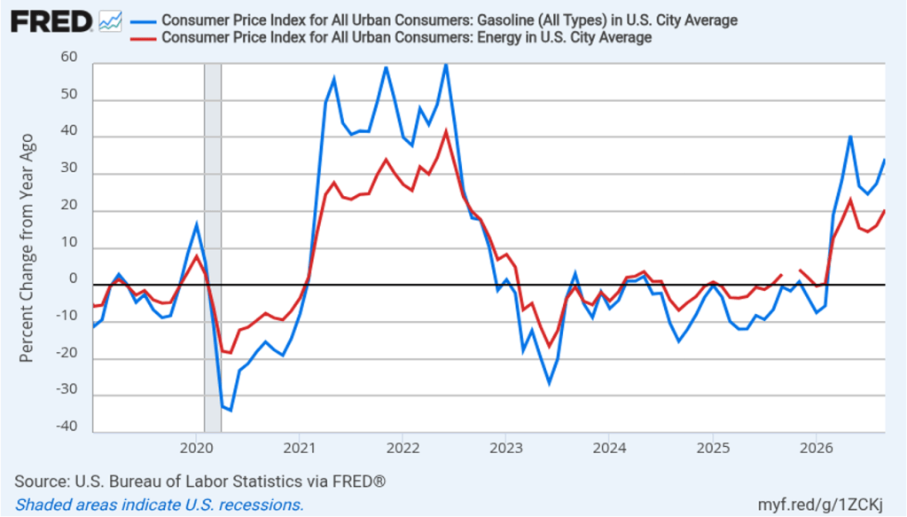
As the large gap between the headline and core 1-month inflation rates indicates, energy prices, particularly gasoline prices, rose sharply in September. In the following figure, the red line shows the 12-month inflation rate in all energy prices included in the CPI. Inflation in energy prices was 20.4 percent in September, up from 16.4 percent in August. The blue line shows the 12-month inflation rate in gasoline prices, which increased to 34.2 percent in September from 27.4 percent in August.
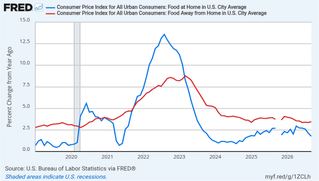
There has been a fear that the rise in energy prices that began in March will pass through to increases in food prices, which are a key concern for many consumers. The following figure shows 12-month inflation in the CPI category “food at home” (the blue bar)—primarily food purchased at grocery stores—and in the category “food away from home” (the red bar)—primarily food purchased at restaurants. Grocery prices increased 3.5 percent in September from a year ago, down from 3.7 percent in August. Restaurant prices increased 3.5 percent from a year ago, up slightly from 3.4 percent in August. To this point, increases in energy prices seem to have had some effect on grocery prices and restaurant prices, although the extent of the effect is unclear.
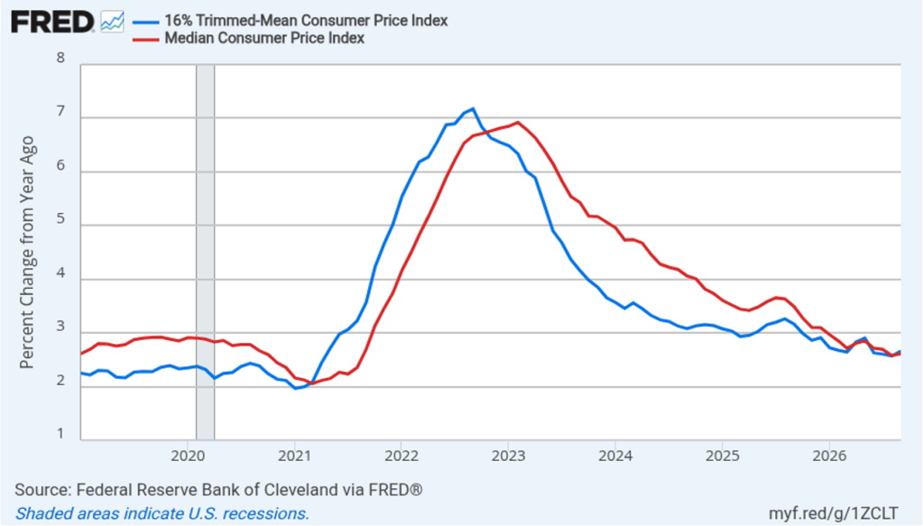
Fed Chair Kevin Warsh has indicated that he favors measures of the inflation rate that exclude particularly small or particularly large changes in the prices of some goods or services—so-called outliers. Median CPI, which is compiled monthly by economists at the Federal Reserve Bank of Cleveland, is calculated by ranking the price changes of every good or service in the index from the largest price change to the smallest price change, and then choosing the price change in the middle. The idea is to eliminate the effect on measured inflation of any short-lived events that cause the prices of some goods and services to be particularly high or particularly low. Economists at the Cleveland Fed have conducted research that shows that, in their words, “the median CPI provides a better signal of the underlying inflation trend than either the all-items CPI or the CPI excluding food and energy. The median CPI is even better at forecasting [personal consumption expenditures] PCE inflation in the near and longer term than the core PCE price index.”
Trimmed-mean inflation, also compiled by economists at the Cleveland Fed, excludes the highest 8 percent of price changes and the lowest 8 percent. The following figure shows 12-month trimmed mean (the blue line) and median (the red line) CPI inflation. Trimmed-mean inflation was 2.7 percent in September, up from 2.6 percent in August. Median inflation was 2.6 percent in September, unchanged from August. So these measures of inflation are both lower than the conventional headline and core CPI inflation measures, which indicates that the acceleration in inflation during September was not affecting all sectors of the economy.
Note that the Fed uses the 12-month change in the personal consumption expenditures (PCE) price index, not the change in the CPI, when gauging whether it is hitting its 2 percent annual inflation target. Historically, PCE inflation has been about 0.4 percentage points to 0.5 percentage points lower than CPI inflation. The Bureau of Economic Analysis (BEA) won’t release its estimate of September PCE inflation until October 29, one day after the next FOMC meeting.
Today’s report showing that inflation remains persistently above the Fed’s 2 percent annual target has likely raised the chance that Federal Reserve policymakers will increase their target range for the federal funds rate from the current 3.75 percent to 4.00 percent by o.25 percentage points (or 25 basis points) at the next meeting of the FOMC on October 27–28. Trading in the federal funds futures market this afternoon indicates that investors assign a 33.8 percent probability to the FOMC raising its target range at that meeting, which is up from a 22.1 percent probability yesterday. Trading indicated that investors assign a 89.7 percent probability to the committee increasing its target range by at least 25 basis points at its last meeting of the year on December 8–9. Some analysts have speculated that the committee will postpone its next rate increase until December to avoid raising the rate before the midterm election on November 3.
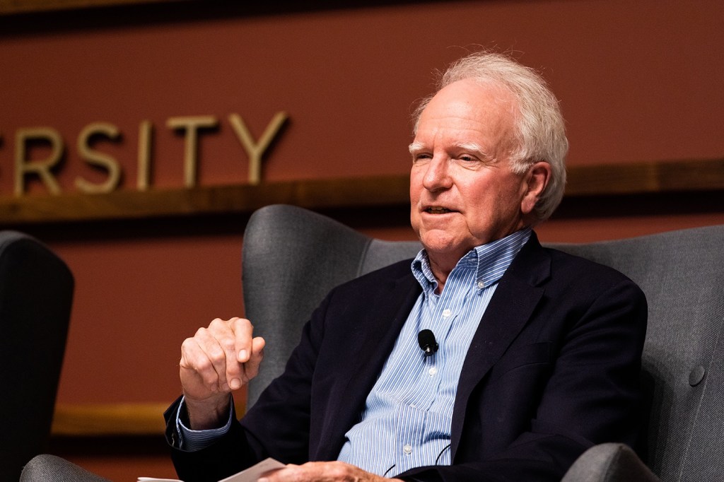
Photo of Michael Woodford from politicaleconomy.columbia.edu
Robert Hall of Stanford and Michael Woodford of Columbia have been awarded the 2026 Nobel Prize in Economics. Their careers have helped define the evolution of macroeconomics during the past 50 years.
Principles of economics is often taught as one semester of microeconomics and one semester of macroeconomics. In microeconomics we focus on analyzing the households’ decisions about which products to buy and on firms’ decisions about which products to sell and what prices to charge. In macroeconomics we switch the focus to the economy as a whole, analyzing what determines total production in the economy, as measured by GDP, and what determines the price level, as measured by the consumer price index (CPI) or the personal consumption expenditures (PCE) price index. An important part of macroeconomics is analyzing the effects of the federal government’s monetary and fiscal policies on production, employment, and prices.
Microeconomics and macroeconomics are connected because macroeconomic aggregates (like GDP, the unemployment rate, and the price level) ultimately depend on the decisions of households and firms. Similarly, the effects of fiscal and monetary policies on the economy depend on how households and firms react to the policies.
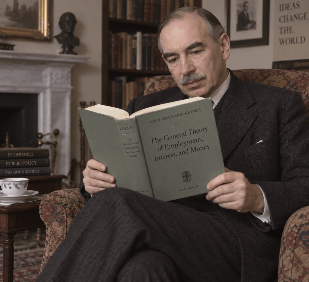
Image of John Maynard Keynes created by ChatGPT
The focus on economic aggregates in macroeconomics dates back to the publication of John Maynard Keynes’s General Theory of Employment, Interest, and Money in 1936. Keynes’s book was long and complicated, which led shorter, more straightforward, interpretations of his ideas by Nobel laureate John Hicks of Oxford and Alvin Hansen of Harvard to become widely accepted. The Hicks-Hansen interpretation was embodied in the IS-LM model, which focused on the relationships among a few macroeconomic variables. (We discuss the IS-LM model in the appendix to Chapter 18 of Money, Banking, and the Financial System.)
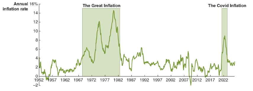
During the Great Inflation of the 1970s of the 1970s and early 1980s, many economists concluded that the basic IS-LM model was no longer a good guide to understanding events in the U.S. economy. That conclusion increased the interest in grounding macroeconomics in the basic decision making of households and firms. This approach became known as the microfoundations of macroeconomics.
This new focus on microeconomics led some economists to reject the idea that discretionary monetary and fiscal policy was able to stabilize the economy by reducing fluctuations in aggregate output and employment. This approach is called the New Classical Macroeconomics. (We discuss the New Classical Macroeconomics in the appendix to Macroeconomics, Chapter 13.) Other economists argue that discretionary policy can play a role in stabilizing the economy, which is a key argument advanced by Keynesians since the 1930s, but believe that policymakers need to take into account how households and firms react to policy. This approach is called the New Keynesian economics. The work of Hall and Woodford contributed to the development of New Keynesian economics.
Early in his career, Hall published an academic article making a major contribution to understanding the microfoundations of consumption spending. Hall’s work elaborated Milton Friedman’s permanent income hypothesis. As we discuss in Macroeconomics, Chapter 12, Section 12.2 and Chapter 16, Section 16.5, consumers are forward looking, which means their consumption decisions take into account not just their current income but also their expected future income—which Friedman called permanent income. For example, a real estate agent might have a high income in a year when she earns a commission on the sale of 15 houses and a much lower income in a year when the local housing market is weak and she earns a commission on only 2 houses. Most people like to smooth out their consumption over time, so the agent is likely to spend less of her current income in good sales years and more of her current income in the bad sales years.
Image created by ChatGPT
Hall formalized Friedman’s insight using the tools of dynamic optimization and also showed that the model fit the macroeconomic data well. One important implication of Hall’s work is that households are unlikely to significantly adjust their spending in response to temporary policy changes, such as a temporary cut in personal income taxes. Hall made a number of additional contributions to macroeconomics, including by analyzing why prices and wages don’t always respond quickly to changes in total spending. As we discuss in Macroeconomics, Chapter 10, Section 10.3, the federal government produces many statistics that make it possible to monitor the state of the economy, but the federal government does not officially decide when a recession begins or when it ends. Instead, most economists and policymakers accept the decisions of the Business Cycle Dating Committee of the National Bureau of Economic Research (NBER), a private research group located in Cambridge, Massachusetts. Hall served as chair of the committee for 46 years, from 1978 to 2024.
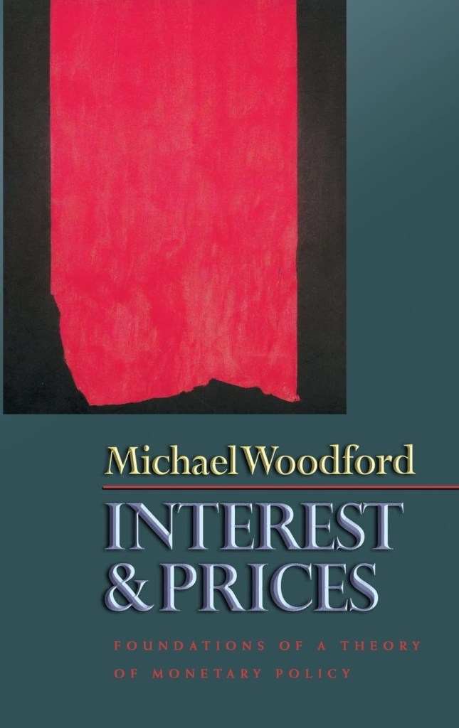
Woodford has made wide-ranging contributions to the development of New Keynesian economics. In particular, he developed a model that synthesized the contributions of a number of other economists to provide a general framework for understanding macroeconomics and for evaluating the effects of monetary policy. His 2003 book, Interest and Prices: Foundations of a Theory of Monetary Policy, has been particularly influential.
Image from amazon.com
The Nobel Committee’s announcement of the prize can be found here. A longer discussion of the Hall and Woodford’s work can be found here. The scope of their research can be seen by reviewing their curricula vitae, which can be found here and here. The amount of the prize this year is 12 million Swedish kronor (about $1.2 million).
In Macroeconomics, Chapter 16 (Economics, Chapter 26), we discuss the problems facing the Social Security system. In this opinion column, which first appeared on thewebsite of theEconomist, Glenn discusses a new approach to discovering the views of the public on possible reforms to the system.
America Needs a Citizens’ Assembly to Reform Social Security
Of the various fiscal challenges faced by America, the one the public feels most keenly is the looming crisis in Social Security. It also presents an opportunity for a bold reform process outside the polarised and dysfunctional electoral process, built around consulting a sample of voters directly in a citizens’ assembly. This would have the twin benefits of bypassing both voters’ mistrust of politicians and politicians’ incomplete understanding of voters’ attitudes towards reform.
Voters are clearly ready for reform. Recent polling of swing-state voters by the Peterson Foundation, an organisation launched to promote fiscal responsibility, revealed broad opposition to inaction and support for reforms including raising the earnings cap subject to the payroll tax and capping Social Security benefits for better-off households. Only 17% of voters said they were likely to support a candidate in the upcoming midterms who promised not to touch the current system.
Social Security pays retirement benefits to 62m Americans and disability benefits to another 8m. But the 2026 Social Security Trustees Report (sstr) predicts that the system’s trust funds will be exhausted in 2032, and if no action is taken by Congress, benefits will need to be cut across the board by 22% at that time.
Elected officials have responded in a now-familiar way, with a proposal for a 13-member commission of members of Congress and experts. Historically, a commission held promise: one assembled in 1981 and commonly known as the Greenspan Commission after its chairman, Alan Greenspan, offered a sensible roadmap for gradual reforms in 1983. Today, such an approach, however well intentioned, is likely to fail, given how out-of-balance the system is. According to the sstr, it faces an actuarial deficit of 4.4% of payroll annually for the next 75 years. Tackling that via a commission would have been extremely difficult in the 1980s. Doing so today, with public trust in government and experts a lot lower, looks impossible. According to the Pew Research Centre, just 17% of Americans trust the federal government to do “what is right” always or most of the time, down from around 40% in the early 1980s.
America needs to experiment more boldly this time by entrusting the big decisions to voters, via a citizens’ assembly tasked with presenting clear options to elected officials. Social Security reform offers a logical use case for such an approach because the areas where change is needed are clearly delineated: retirement age, benefit formulas and the level and structure of taxation. And it can give insight to politicians about voters’ real views about the thorny economic and political trade-offs that will need to be made.
Citizens’ assemblies date back to ancient Athens as a way to inform democracy. In the modern era they have been used in several countries, including Belgium, France and Ireland, to develop policy. In Ireland, for example, recent citizens’ assemblies illustrated to politicians that attitudes towards abortion and same-sex marriage had changed more than legislators had realised.
A citizens’ assembly can help to break through policy gridlock by allowing ideas to be developed and debated in a higher-trust environment than a commission drawn from politicians and experts in whom the public has declining faith. Moreover, the ideas emerging from an assembly can sometimes reveal the “Overton window”—the range of reforms that the public can live with at that particular time—better than elected leaders can alone, as seen in the Irish case.
Three steps are critical to the success of any citizens’ assembly. The first concerns its composition. Its members, typically 50-100, should be chosen by lot, as with candidates for a jury. It should be an electorate in miniature, representative of the nation’s social strata and demography. Towards this end, sampling should be random to avoid simply selecting volunteers with particular upfront points of view. Those selected should be compensated for their time and expenses. Structured in this way, the citizens’ assembly can channel mistrust of politicians towards a reclaimed populism of actual voters’ input, not slogans.
Second, per the advice of William McChesney Martin, a former chair of the Federal Reserve, experts should be on tap, not on top. In contrast to the typical commission, experts’ role would be to provide information, not to suggest prescriptions. That would allow an assembly to develop reform options that reveal genuine voter sentiment, while neutralising populist mistrust of experts.
Third, politicians and their existing institutions need to support the work of the assembly. Congress should signal strongly that it will give serious consideration to proposals coming out of an assembly—and commit to an up-or-down vote on them, as with the process for military-base closures in 1988. Elected officials should not need reminding about the large benefit reductions that will kick in as a result of a failure to act by 2032.
Selection, expert input and politicians’ commitment map well into Social Security reform. Over multiple sessions (the Irish deliberation on abortion unfolded over several weekends in a six-month period) the assembly would agree upon objectives and principles, a menu of reform options and a recommendation for formal consideration by Congress. Outside experts would provide background information on design choices (say, refining the current system or moving, for example, to a system with a flat benefit for all) and the budget and individual tax-and-benefit consequences of options (say, changes in the retirement age, payroll tax, and benefit level and structure). With this input, the assembly would evaluate options with both principles and political feasibility in mind.
Such an assembly offers an opportunity for meaningful action before the 2032 deadline. Were it successful, that would also provide momentum in related areas, such as the need for budget consolidation and policies towards artificial intelligence.
Social Security reform is stuck in deep political mud. A citizens’ assembly might just be the way to free it. It’s surely worth a tr
This morning (October 2), the Bureau of Labor Statistics (BLS) released its “Employment Situation” report (often called the “jobs report”) for September. The August jobs report had showed an unexpectedly large increase in employment, while the September report shows an unexpectedly small increase in employment.
The jobs report has two estimates of the change in employment during the month: one estimate from the establishment survey, often referred to as the payroll survey, and one from the household survey. As we discuss in Macroeconomics, Chapter 9, Section 9.1 (Economics, Chapter 19, Section 19.1), many economists and Federal Reserve policymakers believe that employment data from the establishment survey provide a more accurate indicator of the state of the labor market than do the household survey’s employment and unemployment data. (The groups included in the employment estimates from the two surveys are somewhat different, as we discuss in this post.)
The BLS is housed in the Suitland Federal Center in Maryland. (Image created by ChatGPT)
According to the establishment survey, there was a net increase of only 29,000 nonfarm jobs during September. Economists surveyed by the Wall Street Journal had forecast an increase of 90,000 jobs. Economists surveyed by FactSet had forecast a net increase of 95,000 jobs. The BLS revised downward its previous estimates of employment in July and August by a combined 60,000 jobs. The estimate of the net employment change in July was revised from an increase of 21,000 to a decrease of 10,000. (The BLS notes that: “Monthly revisions result from additional reports received from businesses and government agencies since the last published estimates and from the recalculation of seasonal factors.”)
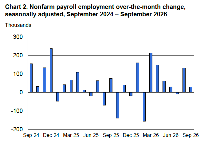
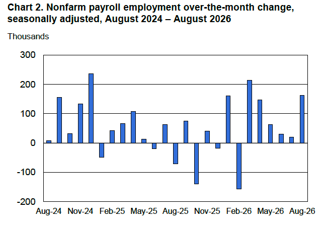
The following figure from the jobs report shows the net change in nonfarm payroll employment for each month in the last two years. The figure shows that since peaking in March with a net increase of 214,000 jobs, job growth slowed markedly over the following four months, then strongly rebounding in August, before returning to slower growth in September. In 2026, monthly net employment growth has averaged 68,000. That is much higher than the 2025 average monthly employment growth of only 10,000, but well below the 2024 average monthly employment growth of 122,000.
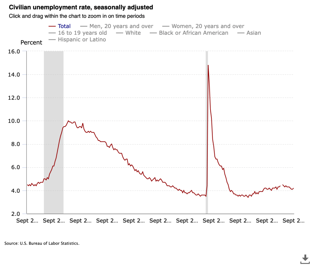
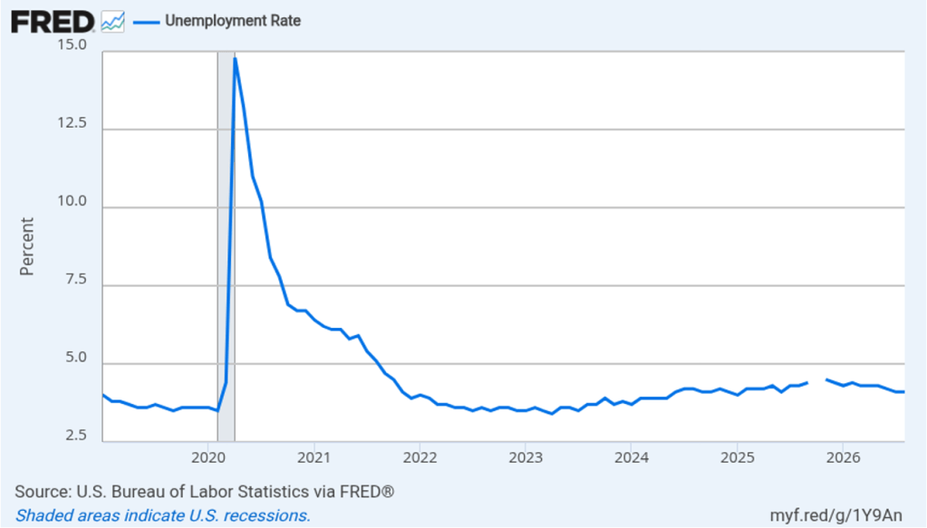
The unemployment rate, which is calculated from data in the household survey, was 4.2 percent in September, up slightly from 4.1 percent in August. The estimated size of the labor force, the number of workers employed, and the number of workers unemployed all increased in September. The following figure shows that the unemployment rate has been remarkably stable over the past year and a half, staying between 4.0 percent and 4.4 percent in each month since June 2024. The Federal Open Market Committee’s most recent estimate of the natural rate of unemployment—the normal rate of unemployment over the long run—is 4.2 percent. So, currently the unemployment rate is equal to that estimate of the natural rate. (We discuss the natural rate of unemployment in Macroeconomics, Chapter 9 and Economics, Chapter 19.)
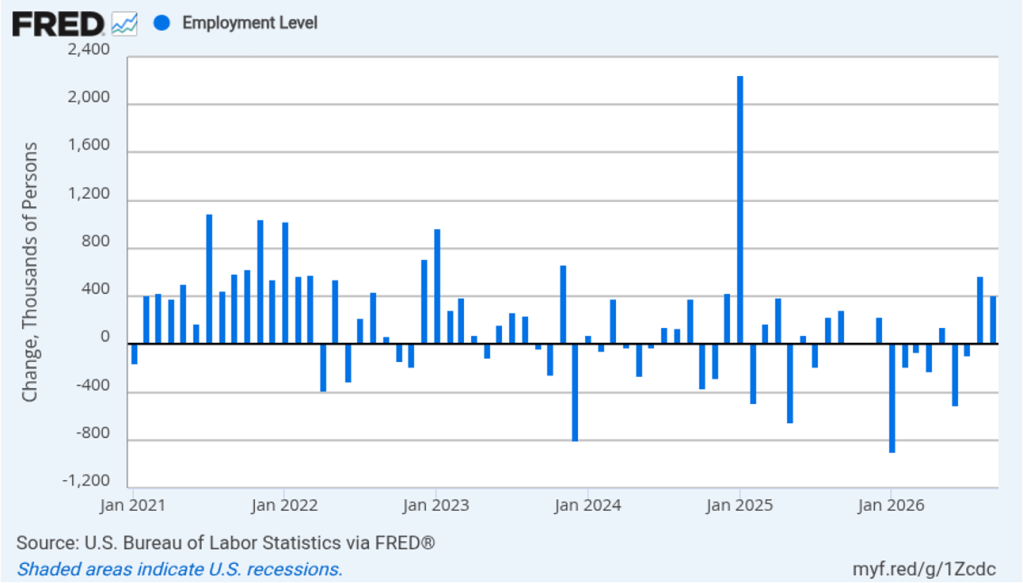
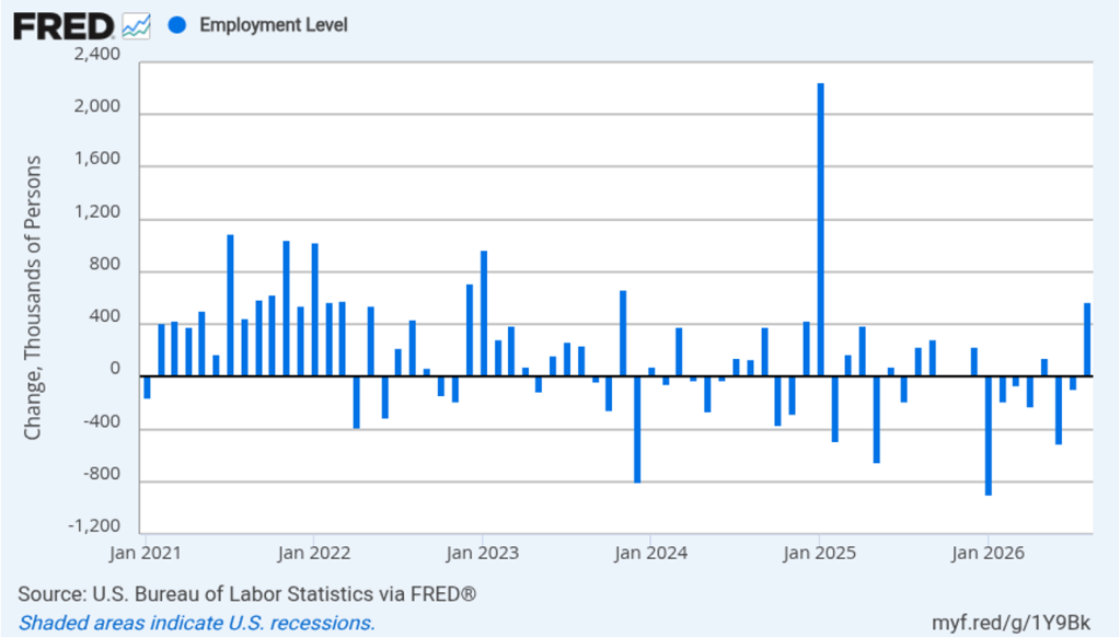
As the following figure shows, the monthly net change in jobs from the household survey moves much more erratically than does the net change in jobs from the establishment survey. As measured by the household survey, there was a net increase of 406,000 jobs in August, far larger than the net increase in employment shown in the establishment survey. Since January, the household survey has shown a net increase in jobs in only three months, with a total net decrease of 840,000 jobs over the period. In contrast, the establishment survey has shown a net increase of 612,000 jobs over the same period. (Note that because of last year’s shutdown of the federal government, there are no data for October or November.)
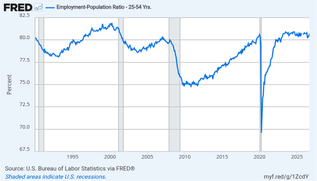
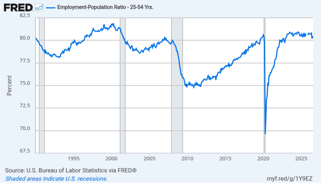
The household survey has another important labor market indicator: the employment-population ratio forprime age workers—those workers aged 25 to 54. In September, the ratio was 80.7 percent, up from 80.4 in August. The prime-age population ratio can show volatility from month to month but has remained above 80 percent every month since December 2022.
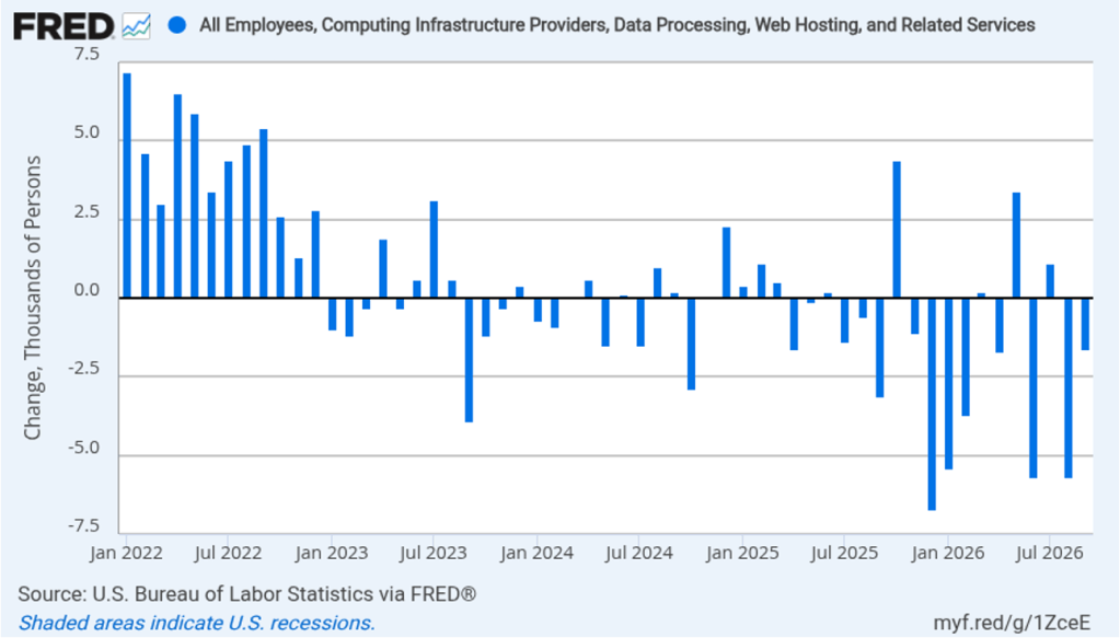
The rapid adoption of artificial intelligence (AI) by many firms has led to forecasts of substantial layoffs of workers in information systems. The following figure shows net employment changes in the BLS employment category of “computing infrastructure providers, data processing, web hosting, and related services.” Employment in this sector has been declining during most months since the beginning of 2023. In September, there was a net decrease of 1,600 jobs.
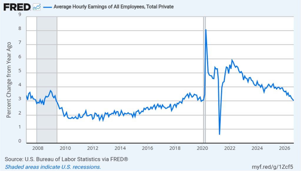
The establishment survey also includes data on average hourly earnings (AHE). As we noted in earlier posts, many economists and policymakers believe the employment cost index (ECI) is a better measure of wage pressures in the economy than is AHE. AHE does have the important advantage of being available monthly, whereas the ECI is only available quarterly. The following figure shows the percentage change in AHE from the same month in the previous year. AHE increased 3.0 percent in September, down from 3.1 percent in August. That was the smallest increase since May 2021. The rate of increase in AHE has been below 4.0 percent each month since August 2025, indicating that cost pressure from wage increases has not been a significant source of price inflation during the past year. Over this same period, wage increases have struggled to keep up with price increases, resulting in a decline in real wages.
With inflation having been above the Federal Reserve’s 2 percent annual target every month since March 2021, the Fed’s policymaking Federal Open Market Committee (FOMC) raised its target range for the federal funds rate at its September meeting. At that time, many analysts expected that the committee would raise its target again at its next meeting on October 27–28.
Trading in the federal funds futures market this morning indicates that investors no longer believe that the committee will increase its federal funds target at its October meeting. A week ago, trading in the federal funds futures market indicated that investors assigned a 64.2 percent to a rate increase at that meeting, while this morning the probability had declined to 21.6 percent. Investors still expect that the committee will increase its target for the federal funds rate at its meeting on December 8–9, although the probability has declined from 92.6 percent a week ago to 85.1 percent today.
The Bureau of Economic Analysis (BEA) released two reports this morning (September 30). One report indicated that economic growth was higher in the second quarter of 2026 than the BEA had previously estimated. The other report indicated that inflation as measured by the percentage increase in personal consumption expenditures (PCE) price index was lower than expected.
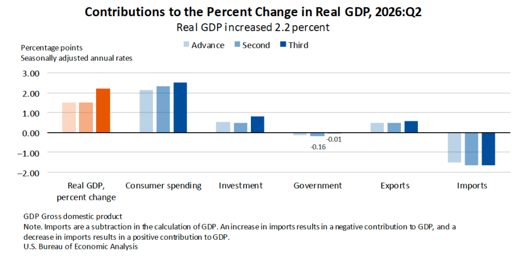
The BEA’s latest estimate is that real GDP increased at an annual rate of 2.2 percent in the second quarter (May, June, and July) of 2026. That is a sharp upward revision of the BEA’s previous estimate that real GDP had increased at an annual rate of 1.5 percent in the second quarter. The following figure from the report shows that upward revisions of investment, consumer spending, and government spending account for the upward revision of real GDP growth. The figure shows the BEA’s advance (original estimate) and two subsequent revised estimates. The BEA revises its estimates of real GDP growth as over time as it collects more complete and accurate data on growth in the components of GDP.
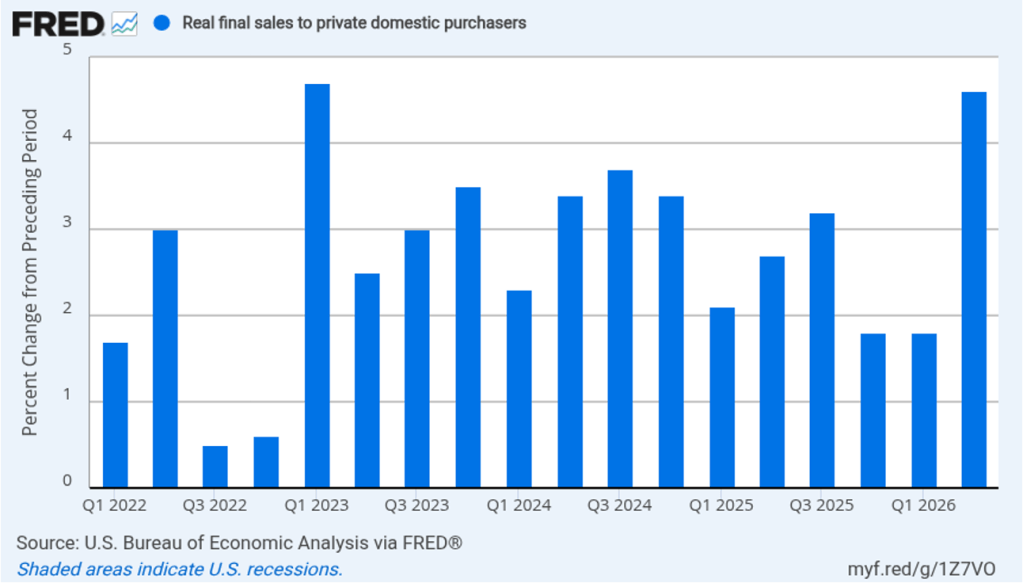
As we’ve discussed in previous blog posts, to better gauge the state of the economy, Federal Reserve policymakers often prefer to strip out the effects of imports, inventory investment, and government expenditures—which can be volatile—by looking at real final sales to private domestic purchasers, which includes only spending by U.S. households and firms on domestic production. As the following figure shows, real final sales to domestic purchasers increased at an annual rate of 4.6 percent in the second quarter, revised upward from 4.4 percent. The growth rate in real final sales to domestic purchasers was more than twice the growth rate of real GDP, as well as much higher than the U.S. economy’s expected long-run annual real growth rate of 1.8 percent. So estimated growth in real final sales to domestic purchasers indicates that the U.S. economy is expanding more rapidly than is indicated by estimated growth in real GDP. Typically, growth in real final sales to domestic purchasers is steadier than growth in real GDP and is likely a better indicator of the underlying growth rate in the economy.
The BEA’s “Personal Income and Outlays” report this morning included monthly data on the personal consumption expenditures (PCE) price index. The Fed relies on annual changes in the PCE price index to evaluate whether it’s meeting its 2 percent annual inflation target. As we noted in an earlier blog post, Fed Chair Kevin Warsh indicated in his press conference following the July meeting of the Federal Open Market Committee (FOMC) that the committee intended to continue using the PCE price index as its gauge of inflation, although that decision would be revisited early next year. Some analysts have interpreted Warsh’s statement that the decision would be revisited next year as an indication that he favored moving to a measure that would show lower rates of inflation than those shown by the PCE.
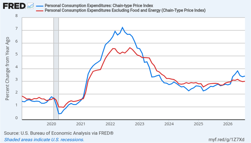
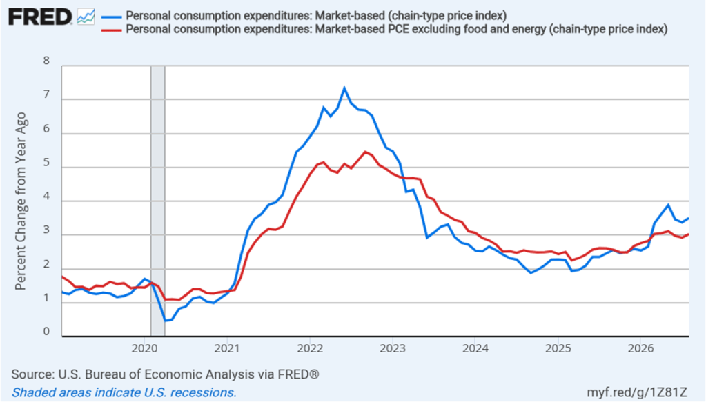
The following figure shows headline PCE inflation (the blue line) and core PCE inflation (the red line)—which excludes energy and food prices—for the period since January 2019, with inflation measured as the percentage change in the PCE from the same month in the previous year. In August, headline PCE inflation was 3.4 percent, unchanged from July. Core PCE inflation in August was 3.0 percent, also unchanged from July. Headline and core PCE inflation were both lower than forecast by economists surveyed by FactSet. Both headline PCE inflation and core PCE inflation remain well above the Fed’s 2 percent annual inflation target.
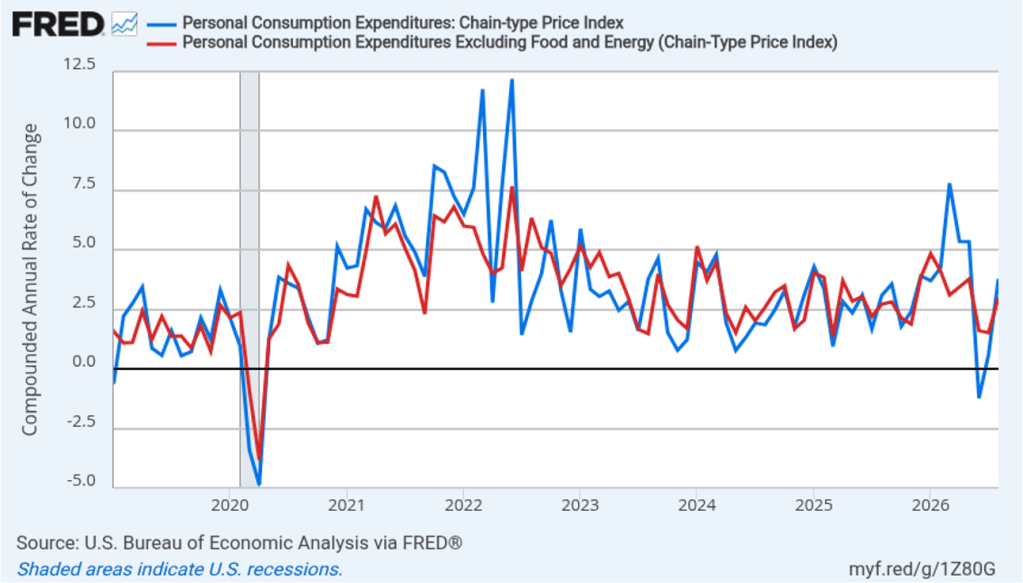
The following figure shows headline PCE inflation and core PCE inflation calculated by compounding the current month’s rate over an entire year. (Often referred to as 1-month inflation.) Measured this way, headline PCE inflation increased from 0.6 in July to 3.8 percent in August. Core PCE inflation increased from 1.5 percent in July to 3.0 percent in August. In contrast with the 12-month inflation rates, the 1-month inflation rates show noticeable acceleration in inflation during August. Of course, it’s important not to overinterpret the data from a single month.
Fed policymakers believe that inflation in non-market services can skew PCE inflation. Non-market services are services whose prices the BEA imputes rather than measures directly. For instance, the BEA assumes that prices of financial services—such as brokerage fees—vary with the prices of financial assets. So that if stock prices rise, the prices of financial services included in the PCE price index also rise. Former Fed Chair Jerome Powell has argued that these imputed prices “don’t really tell us much about … tightness in the economy. They don’t really reflect that.” The following figure shows 12-month headline inflation (the blue line) and 12-month core inflation (the red line) for market-based PCE. (The BEA explains the market-based PCE measure here.)
Headline market-based PCE inflation was 3.5 percent in August, up slightly from 3.4 percent July. Core market-based PCE inflation was 3.0 percent in August, up from 2.9 percent in July. So, both market-based measures show inflation in August remaining well above the Fed’s 2 percent target.
Fed Chair Kevin Warsh argued in testimony at his confirmation hearing before the Senate that the Fed should stop relying on headline PCE inflation: “The measures [of inflation] I prefer are looking at things that are called trimmed averages. We take out all of the tail-risks, all of the one-off items, and we ask ourselves whether the generalized change in prices is having second-order effects on the economy.”
Trimmed-mean PCE inflationdrops the 31 percent of goods and services with the highest inflation rates and the 24 percent of goods and services with the lowest inflation rates. A closely related measure, median PCE inflation, is calculated by listing the inflation rate in each individual good or service included in the PCE and identifying the inflation rate of the good or service that is in the middle of the list—that is, the inflation rate in the price of the good or service that has an equal number of higher and lower inflation rates.
The following figure shows 12-month headline PCE inflation the (blue line), core PCE inflation (the red line) and trimmed-mean PCE inflation (the green line). Trimmed-mean PCE inflation in August was 2.2 percent, well below both headline and core PCE inflation.
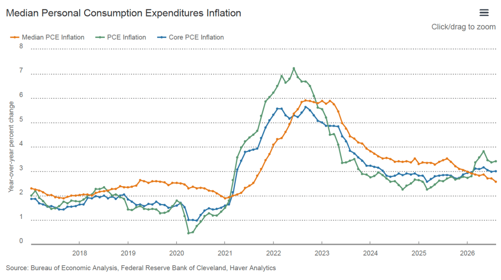
The following figure from the website of the Federal Reserve Bank of Cleveland shows headline PCE inflation (the green line), core PCE inflation (the blue line), and median PCE inflation (the brown line). In August, median PCE inflation was 2.6 percent, which was down from 2.7 percent in July. So Warsh has a point that these two measures of inflation, which are less affected by particularly high or low rates of inflation in some goods and services, indicate that inflation has been running below the Fed’s currently preferred measure. But these measures also show inflation still running well above the Fed’s 2 percent annual inflation target.
Today’s macro data releases appear to have caused of investors who buy and sell federal funds futures contracts to believe that the Federal Open Market Committee (FOMC) is now less likely to raise its target for the federal funds rate at the committee’s next meeting on October 27–28. Trading on the federal funds futures market this afternoon implies that the probability of a target rate increase at that meeting is 39.3 percent, down from a probability of 50.9 percent yesterday.
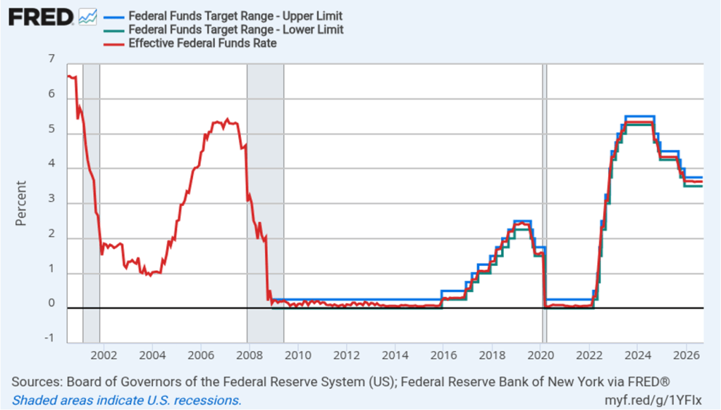
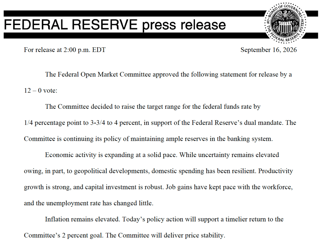
Today, the Federal Open Market Committee (FOMC) met expectation by raising its target range for the federal funds rate by 0.25 percentage points (25 basis points) from the range of 3.50 percent to 3.75 percent that had prevailed since December 10 of last year. As of yesterday, trading in the federal funds rate futures market had implied a 93.5 percent probability of a 25 basis point increase. Financial markets had been convinced that a rate increase was coming since Fed Chair Kevin Warsh’s speech at the Federal Reserve Bank of Kansas City’s economic policy symposium in Jackson Hole, Wyoming in late August. (We discussed Warsh’s speech in this blog post.) There had been some speculation in the business press that one or more committee members would dissent from a rate increase, but the vote turned out to be unanimous. Today was the first time the committee had increased the target range since July 2023.
The following figure shows for the period from 2001 through yesterday, the upper bound (the blue line) and the lower bound (the green line) for the FOMC’s target range for the federal funds rate, as well as the actual values for the federal funds rate (the red line). Before December 2008, the Fed announced a single numerical target for the federal funds rate, rather than a target range. Note that the Fed has been successful in keeping the value of the federal funds rate in its target range. (We discuss the monetary policy tools the FOMC uses to maintain the federal funds rate within its target range in Macroeconomics, Chapter 15, Section 15.2 (Economics, Chapter 25, Section 25.2).)
As with the policy statements issued following Warsh’s previous two FOMC meetings, today’s policy statement was short and did not include any discussion of the circumstances under which further target rate increases might occur—so-called forward guidance. We discuss forward guidance in Macroeconomics, Chapter 15 (Economics, Chapter 25).
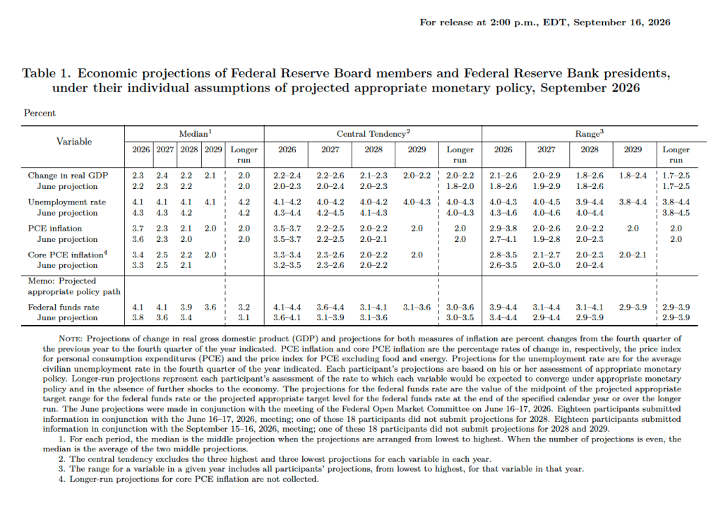
After the meeting, the committee also released a “Summary of Economic Projections” (SEP)—as it typically does at its March, June, September, and December meetings. The SEP presents median values of the, typically, 19 committee members’ forecasts of key economic variables. In a press conference following the meeting, Warsh indicated that he didn’t submit forecasts, just as he hadn’t submitted forecasts for the SEP released after the June meeting. He indicated that the future of the SEP is one of the issues to be considered by his new committee on Fed communications.
The forecasts of key economic variables from the SEP are summarized in the following table, reproduced from the release. (Note that only 5 of the district bank presidents vote at FOMC meetings, although all 12 presidents participate in the discussions and prepare forecasts for the SEP.)
There are several aspects of these forecasts worth noting:
Compared with the previous SEP in June, the committee members raised their forecast of real GDP growth in 2026 slightly from 2.2 percent to 2.3 percent. The committee members left unchanged their forecast of long-run growth in real GDP at 2.0 percent. The unchanged long-range forecast indicates that the committee members are not anticipating a large, sustained increase in economic growth caused by increased use of artificial intelligence (AI). Consistent with raising their forecast of real GDP growth in 2026, the committee lowered its forecast of the unemployment rate in the fourth quarter of 2026 from 4.3 percent to 4.1 percent. The committee members left their forecast of the long-run rate of unemployment, often called the natural rate of unemployment, unchanged at 4.2 percent.
Committee members raised their forecast of personal consumption expenditures (PCE) price inflation in 2026 to 3.7 percent from 3.6 percent in June. They left their forecast of inflation in 2027 unchanged at 2.3 percent and forecast that PCE inflation would not decline to the Fed’s 2.0 percent annual target until 2029.
The committee’s forecasts of the federal funds rate at the end of each year from 2026 through 2028 were increased, indicating that the committee sees the federal funds rate as likely to be “higher for longer.” The forecast for the long-run federal funds rate was raised from 3.1 percent to 3.2 percent.
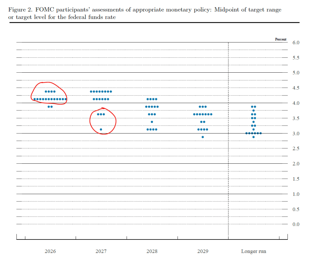
There is always much discussion in the business press and among investment analysts about the dot plot, shown below. Each dot in the plot represents the projection of an individual committee member. (The committee doesn’t disclose which member is associated with which dot.) Note that there are 18 dots, representing the 6 members of the Fed’s Board of Governors who provided forecasts and all 12 presidents of the Fed’s district banks.
The dots plotted on the far left of the figure represent the projections by the 18 members of the value of the federal funds rate at the end of 2026. The plots indicate that, at this point, 16 members of the committee (circled in red) forecast at least one additional 25 basis point increase in the target range for the federal funds rate before the end of the year, with only 2 members expecting that there will be no further increases this year. For 2027, four members (circled in red) expect that the target range will be cut during the year, with the rest expecting either that the rate increases made this year will be maintained or that there will be one additional 25 basis point increase. The dots plotted on the far right of the figure indicate that there is substantial disagreement among committee members as to what the long-run value of the federal funds rate—the so-called neutral rate—should be. Of course, the plots only represent the forecasts of the committee members and individual committee members are likely to adjust their forecasts as additional macroeconomic data become available in the coming months.
At his press conference following the meeting, Warsh resisted attempts by reporters to get him to expand on the circumstances under which the committee might implement further increases in the target range. He characterized today’s rate increase as removing “a dose of accommodation” from the economy, which reflected the committee’s belief that the economy was experiencing full employment with persistently high inflation. The closest he came to engaging in forward guidance was the statement that “We must be confident that underlying inflation is moving towards our objective. This has not been satisfied.”
Warsh was asked what had changed since the July meeting at which the committee had kept the target range unchanged. in reply, he indicated that the committee believed that since July the economy had strengthened, inflation had continued to above target, and “geopolitical” factors had contributed to higher prices.
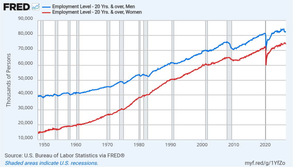
On this Labor Day, we look at an important issue: In recent years, women have been faring better than men in the job market. The following figure shows that, for workers 20 years and older, men still hold more jobs than women do, but the gap has been closing. For example, as measured by the household survey conducted by the Bureau of Labor Statistics (BLS), between January 2022 and August 2026, there was a net increase of 5,829,000 jobs in the United States. More than two thirds of those jobs were filled by women.
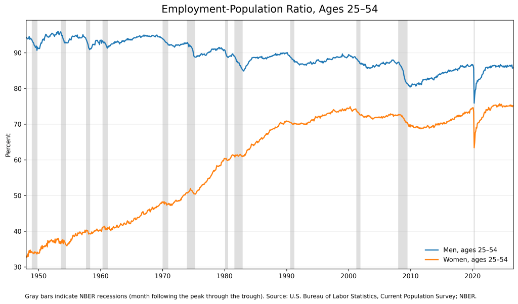
In recent months, the business press has begun to focus on this issue. Here are some recent headlines: “A Changing Job Market Leans Against Men,” “In This Job Market, Women Have the Upper Hand,” and “Young Men Are Abandoning the Workforce.” In Macroeconomics, Chapter 9 (Economics, Chapter 19), we discuss the employment-population ratio, which measures the fraction of the working-age population of a particular segment of the population that is employed. The following figure shows that the employment-population ratio for prime-age men—those aged 25 to 54—has been slowly trending downward for decades (the blue line), while that ratio has generally been increasing for women (the orange line).
In March 1953, the employment-population ratio for prime-age males reached a peak of 96.0 percent. In August 2026, the ratio was 85.8 percent. If prime-age males were working in 2026 at the rate that they did in 1953, 10 million more men would be working today than actually are.
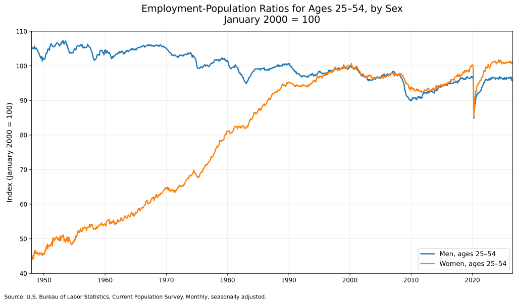
The following figure makes clearer the differing trends in men and women’s employment-population ratio in recent years. In this figure, the values for both ratios are set equal to 100 in January 2000. Since that time the employment-population ratio for prime-age women (the orange line) has increased by 1.1 percent, while the ratio for men (the blue line) has declined by 4.1 percent.
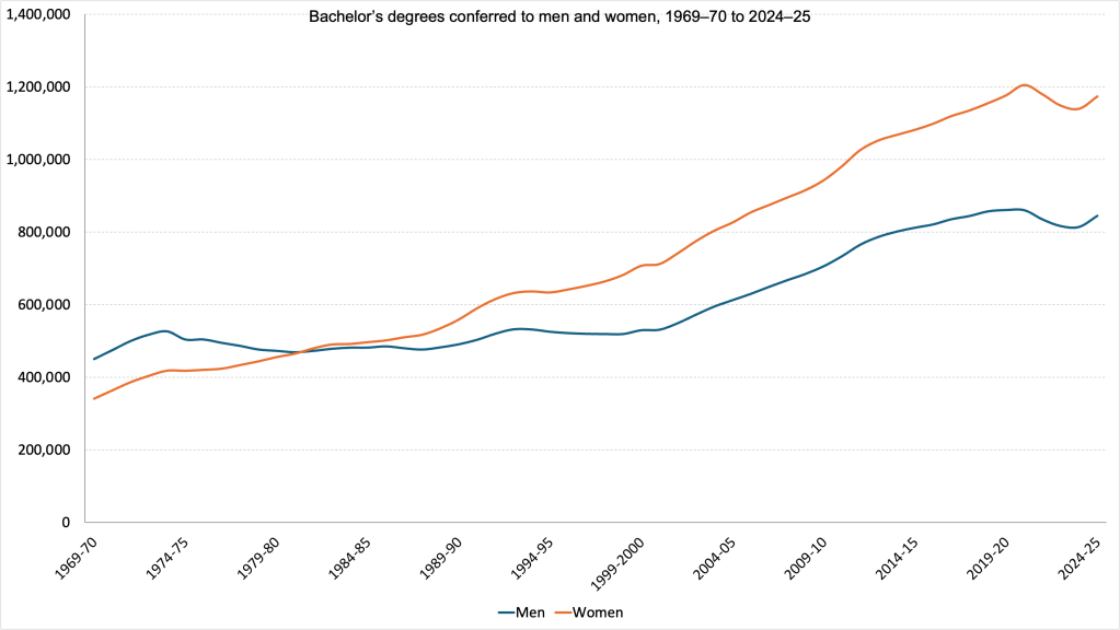
Why do a smaller fraction of prime-age men have jobs today than in the past? A large number of explanations have been offered, both in the business media and by academic economists. One key factor, as shown in the following figure, is that women (the orange line) are now more likely to earn a college degree than are men (the blue line).
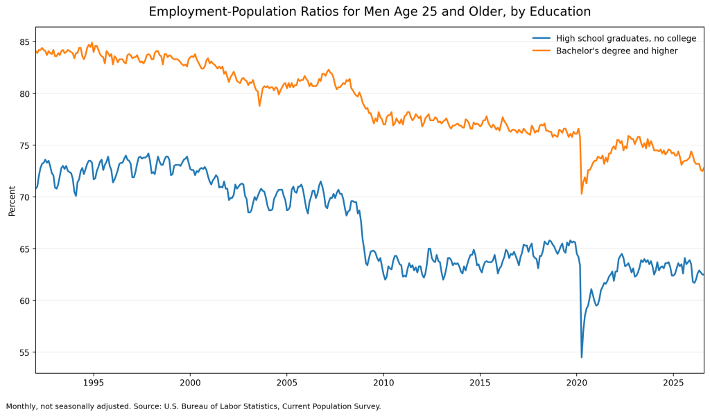
The fraction of jobs requiring a four-year degree has been increasing over time, a trend that the BLS projects will continue. As the following figure shows, men with a bachelor’s degree or more have a higher employment-population ratio than do men with only a high school degree. (Note that the data in this figure are for all men 25 years and older, not just for prime-age men. The average age of men has been rising, which lowers the employment-population ratio as an increasing fraction of men become of retirement age. These data are not available on a seasonally-adjusted basis, which accounts for the choppiness in the figure.) As men have fallen behind in earning college degrees, more men have found themselves unqualified to be hired in some jobs.
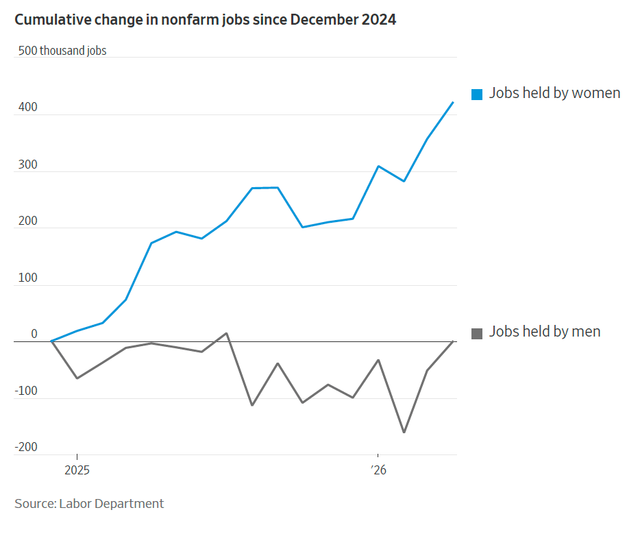
An article in the Wall Street Journal used BLS data to divide jobs primarily held by women and those primarily held by men. As the following figure from the article shows, jobs help primarily by women have been increasing faster than those held by men.
Image generated by ChatGPT
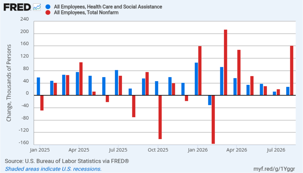
As we noted in a blog post earlier this year, health care jobs have come to dominate U.S. employment growth. The following figure shows monthly changes in health care and social assistance jobs (the blue bars) and monthly changes in total employment (the red bars) for each month since January 2025. During this time period, net employment in health care and social assitance increased by 1,027,300 jobs. All other job categories experienced a decrease of 268,300 jobs. Women account for 77.9 percent of health care and social assistance workers. In other words, the number of jobs in industries dominated by men have been declining.
Image generated by ChatGPT
If you look again at the graph showing changes in the employment-population ratio for prime-age men (the second graph in this blog post), you’ll notice that there seems to be a ratchet effect in the data: The employment-population ratio declines during each recession (shown by the gray bars in the figure) and then struggles to return to its pre-recession level. It’s unsurprising that the male employment-population falls sharply during recessions, because, as we discuss in Macroeconomics, Chapter 13 (Economics, Chapter 23) spending on residential construction and consumer durables, such as automobiles and appliances, falls sharply during a recession.In 2025, men were 86.8 percent of workers in construction and 77.9 percent of workers in manufacturing. (In fact, as we note in that chapter, the late Edward Leamer of the University of California, Los Angeles, went so far as to argue that “housing is the business cycle.”)
Image generated by ChatGPT
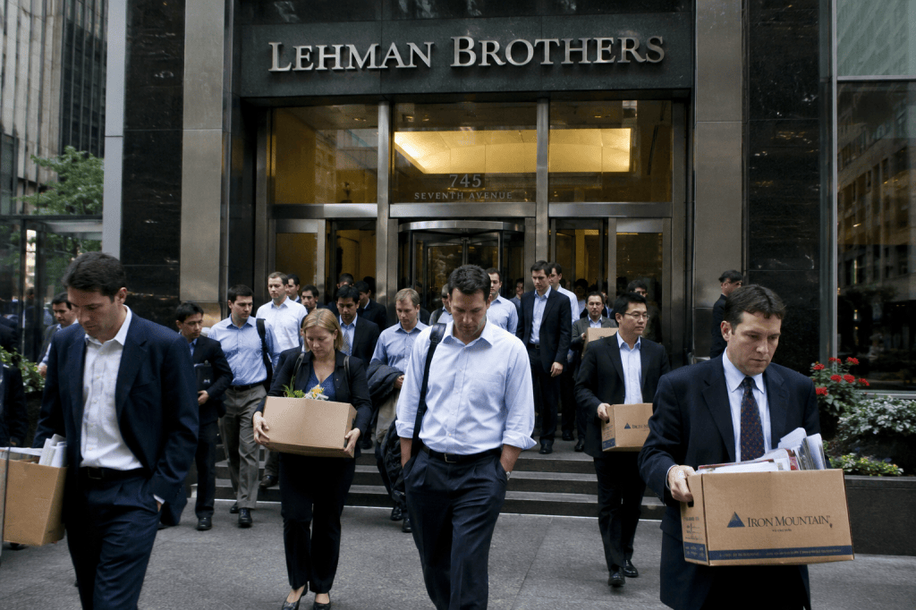
Just before the Great Recession and Global Financial Crisis of 2007–2009, the prime-age male employment-population ratio was 88.0 percent, a level it hasn’t attained since. (In a recent blog post, we discuss the role the bankruptcy of the Lehman Brothers investment bank played in the financial crisis.) The prolonged unemployment experienced by some male workers in construction and manufacturing may have led to their skills deteriorating, making it more difficult for them to find employment during the following economic recovery. Some of these workers may have dropped out of the labor force resulting in a decline in the employment-population ratio.
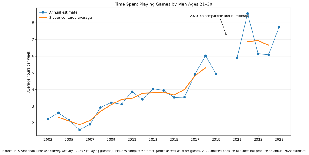
One explanation for the declining employment-population ratio for prime-age males that has received significant attention in the media is the increased appeal of video games. Or, as the headline of an article in the New York Times put it: “Why Some Men Don’t Work: Video Games Have Gotten Really Good.” The U.S. Census Bureau annually conducts the American Time Use Survey, which is published by the BLS. The following figure shows that young adult men have increased the time they spend playing games. In 2003, men aged 21 to 30 spent an average of 2.23 hours per week. In 2025, they spent an average of 7.75 hours per week, down from a peak of 8.56 hours per week in 2022.
Mark Aguiar, of Princeton University, and colleagues argue that the increase in time young men devote to playing video games and engaging in other “recreational computer activities” has significantly reduced the amount of hours that some young men work. There has, however, been an academic debate over this contention. First, it’s unclear which way the causality runs: Do young men work less because they find playing video games particularly attractive or has the ability of young men to find jobs declined, so they spend time playing video games that they would rather spend working? Second, older prime-age males, who have not increased their time playing video games by as much, have also experienced a falling employment-population ratio.
There have been a number of other changes in labor markets and in American society that may have contributed to the decline in employment of prime-age males. ChatGPT offers the following summary of the various factors:
“I would rank the explanations this way:
Most important: the disappearance of stable, comparatively well-paid routine and manual jobs available to men without college degrees, together with slow occupational and geographic adjustment.
Closely related: educational and skills differences, the concentration of new employment in female-heavy service sectors, and the difficulty men face moving into those jobs.
Important amplifiers: chronic health problems, mental illness, pain, opioids and other substance abuse, and the long-term effects of recessions and prolonged joblessness.
Important for particular groups: criminal records, incarceration, geographic isolation, and weak local labor markets.
Reinforcing social mechanisms: delayed marriage and parenthood, living with relatives, weaker social expectations concerning steady work, and reduced connection to employers and communities.
Real but often overstated: disability benefits, other public assistance, and video games.
The central academic message is therefore different from the most sensational press version. It is not principally that millions of otherwise successful men suddenly preferred video games or welfare to jobs. The decline began with a weakening of the kinds of labor-market opportunities historically available to noncollege men. Health, addiction, criminal records, family change, geographic immobility, and more attractive leisure then made the resulting withdrawal from employment more persistent.”
This morning (September 4), the Bureau of Labor Statistics (BLS) released its “Employment Situation” report (often called the “jobs report”) for August. The report showed an unexpectedly large increase in employment.
The jobs report has two estimates of the change in employment during the month: one estimate from the establishment survey, often referred to as the payroll survey, and one from the household survey. As we discuss in Macroeconomics, Chapter 9, Section 9.1 (Economics, Chapter 19, Section 19.1), many economists and Federal Reserve policymakers believe that employment data from the establishment survey provide a more accurate indicator of the state of the labor market than do the household survey’s employment and unemployment data. (The groups included in the employment estimates from the two surveys are somewhat different, as we discuss in this post.)
According to the establishment survey, there was a netincreaseof 162,000 nonfarm jobs during August. Economists surveyed by the Wall Street Journal had forecast an increase of only 55,000 jobs. Economists surveyed by FactSet had forecast a net increase of 65,000 jobs. The BLS revised upward its previous estimates of employment in June and July by a combined 55,000 jobs. The estimate of the net employment change in July was revised from a decrease of 23,000 to an increase of 21,000. (The BLS notes that: “Monthly revisions result from additional reports received from businesses and government agencies since the last published estimates and from the recalculation of seasonal factors.”)
The following figure from the jobs report shows the net change in nonfarm payroll employment for each month in the last two years. The figure shows that since peaking in March with a net increase of 214,000 jobs, job growth slowed markedly over the following four months until strongly rebounding in August. In 2026, monthly net employment growth has averaged 80,375. That is much higher than the 2025 average monthly employment growth of only 9,667, but well below the 2024 average monthly employment growth of 121,583.
The unemployment rate, which is calculated from data in the household survey, was 4.1 percent, unchanged from July. The estimated size of the labor force, the number of workers employed, and the number of workers unemployed all increased in August. The following figure shows that the unemployment rate has been remarkably stable over the past year and a half, staying between 4.0 percent and 4.4 percent in each month since June 2024. The Federal Open Market Committee’s most recent estimate of the natural rate of unemployment—the normal rate of unemployment over the long run—is 4.2 percent. So, currently the unemployment rate is slightly below that estimate of the natural rate. (We discuss the natural rate of unemployment in Macroeconomics, Chapter 9 and Economics, Chapter 19.)
As the following figure shows, the monthly net change in jobs from the household survey moves much more erratically than does the net change in jobs from the establishment survey. As measured by the household survey, there was a net increase of 569,000 jobs in August, far larger than the net increase in employment shown in the establishment survey. Since January, the household survey has shown a net increase in jobs in only two months, with a total net decrease of 326,000 jobs over the period. In contrast, the establishment survey has shown a net increase of 643,000 jobs over the same period. (Note that because of last year’s shutdown of the federal government, there are no data for October or November.)
The household survey has another important labor market indicator: the employment-population ratio forprime age workers—those workers aged 25 to 54. In August, the ratio was 80.4 percent, unchanged from July. The prime-age population ratio can show volatility from month to month but has remained above 80 percent every month since December 2022.
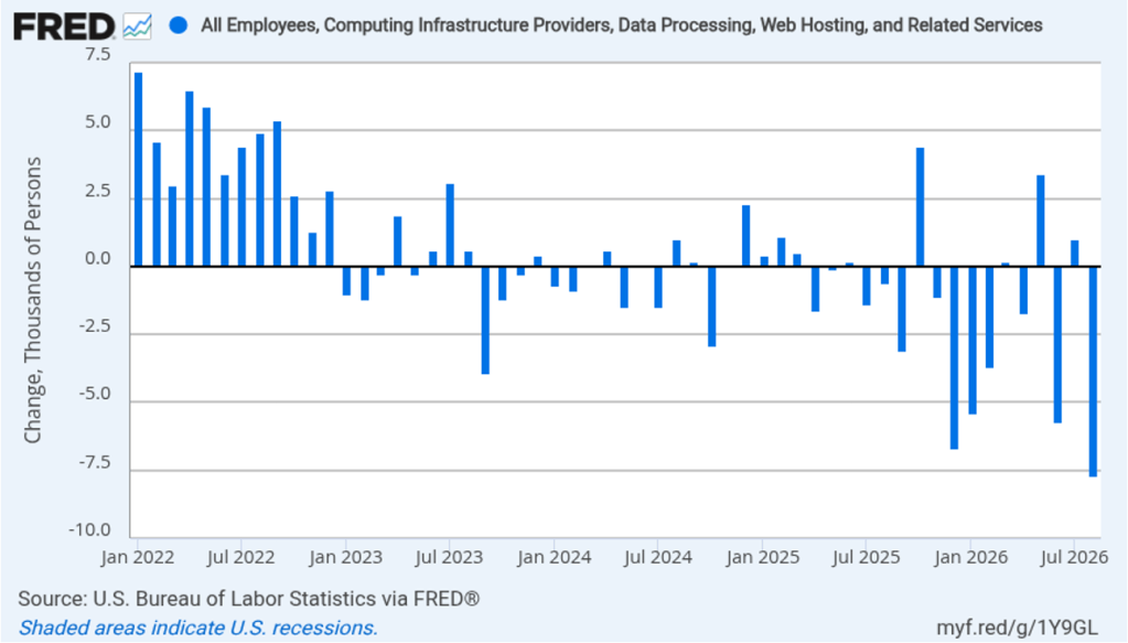
The rapid adoption of artificial intelligence (AI) by many firms has led to forecasts of substantial layoffs of workers in information systems. The following figure shows net employment changes in the BLS employment category of “computing infrastructure providers, data processing, web hosting, and related services.” Employment in this sector has been declining during most months since the beginning of 2023. In August, there was a net decrease of 7,700 jobs.
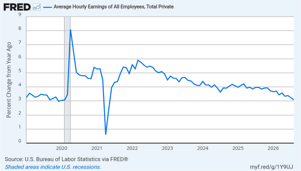
The establishment survey also includes data on average hourly earnings (AHE). As we noted in earlier posts, many economists and policymakers believe the employment cost index (ECI) is a better measure of wage pressures in the economy than is AHE. AHE does have the important advantage of being available monthly, whereas the ECI is only available quarterly. The following figure shows the percentage change in AHE from the same month in the previous year. AHE increased 3.1 percent in August, down from 3.2 percent in July. That was the smallest increase since May 2021. The rate of increase in AHE has been below 4.0 percent each month since August 2025, indicating that cost pressure from wage increases has not been a significant source of price inflation during the past year.
With inflation having been above the Federal Reserve’s 2 percent annual target every month since March 2021, there has been an expectation that the Fed’s policymaking Federal Open Market Committee (FOMC) would increase its target for the federal funds rate at least once before the end of 2026. At the FOMC’s last meeting in late July, three members of the committee voted to increase the target, an unusual amount of dissent from a committee decision.
Do today’s surprisingly strong employment data increase the chance that the FOMC will raise its target range for the federal funds rate at its next meeting on September 15–16? Investors in the federal funds futures market believe that the answer is “yes.” Yesterday, trading in the federal funds futures market indicated that investors assigned a 49.4 percent probability to the committee increasing its target range by 0.25 percentage points (25 basis points) at that meeting. This afternoon, that probability had increased to 58.4 percent. The probability that the committee will have increased its target range by at least 25 basis points from its current range of 3.50 percent to 3.75 percent after its meeting on October 27–28 increased from 62.8 percent yesterday to 69.4 percent this afternoon.
The BLS will release its estimate of inflation as measured by the consumer price index next Friday. That report will provide further evidence on the current state of inflation and may have a significant effect on the decision the FOMC makes at its meeting the following week.
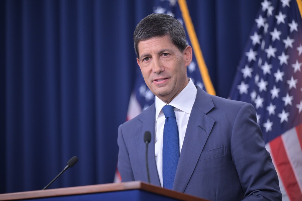
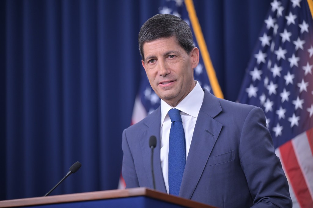
Federal Reserve Chair Kevin Warsh (Photo from federalreserve.com)
Each year since 1982, the Federal Reserve Bank of Kansas City has sponsored an economic policy symposium in Jackson Hole, Wyoming. (The site was supposedly first chosen in the hopes that Fed Chair Paul Volcker would attend because of the opportunities for fly fishing in the local area.)
In most years since 1989, the Fed chair has given the keynote address at the symposium. The address gives the Fed chair a chance to provide his or her assessment of the state of the U.S. economy and the outlook for inflation and employment—the two parts of the dual mandate Congress has given to the Fed.
Image created by ChatGPT
This year’s address by Fed Chair Kevin Warsh was highly anticipated. In his press conference following the last meeting of the Fed’s policymaking Federal Open Market Committee (FOMC), Warsh reiterated his determination to bring inflation back to the Fed’s 2 percent annual target. But he faced a number of questions from reporters as to why, with inflation running well above 2 percent, he wasn’t advocating an increase in the FOMC’s target for the federal funds rate. Warsh has stated that he wantesto steer the committee from using forward guidance to affect interest rates. Accordingly he was reluctant to state explicitly what direction Fed policy might take.
Investors in the bond market appear to have interpreted Warsh’s statements as “dovish”; that is, they believed that his reluctance to support rate increases indicated that inflation might remain above the Fed’s target for longer. As we discussed in earlier blog posts, when investors believe that inflation will be higher they require that bond yields rise enough to compensate them for the additional purchasing power. (As we discuss in Money, Banking, and the Financial System, Chapter 4, economists refer to the increase in nominal interest rates following an increase in the expected inflation rate as the Fisher effect.) The rise in the yield on the 30-year Treasury bond in the days following Warsh’s press conference likely reflected bond investors expecting somewhat higher inflation than they had previously.
In today’s address, Warsh attempted to counter the conclusion that he is reluctant to increase interest rates to slow the rate of inflation. First, though, he repeated his opposition to Fed chairs routinely engaging in forward guidance: “Oversharing policy deliberations and overcommitting to future decisions can lead markets, businesses, and households astray. And I believe when policymakers make quasi-commitments on interest rates through the cycle, we inhibit our own freedom to make the right calls when it’s time to decide.”
He again stated forcefully his commitment to the Fed’s inflation target: “The Fed’s price-stability objective of 2 percent, as measured by the personal consumption expenditures (PCE) price index, is a firm, fixed target. … It is the Fed’s job to deliver stable prices.” He noted that all measures of inflation “tell a similar story: Inflation is running above our 2 percent target. So the Fed’s predominant focus right now should be on prices.”
Warsh also observed that “progress over the past two years [toward the 2 percent target] has been modest.” He concluded that: “There is one signal nobody can miss: The responsibility for 65 months of sustained, elevated inflation sits squarely with the central bank. And that is where it belongs.”
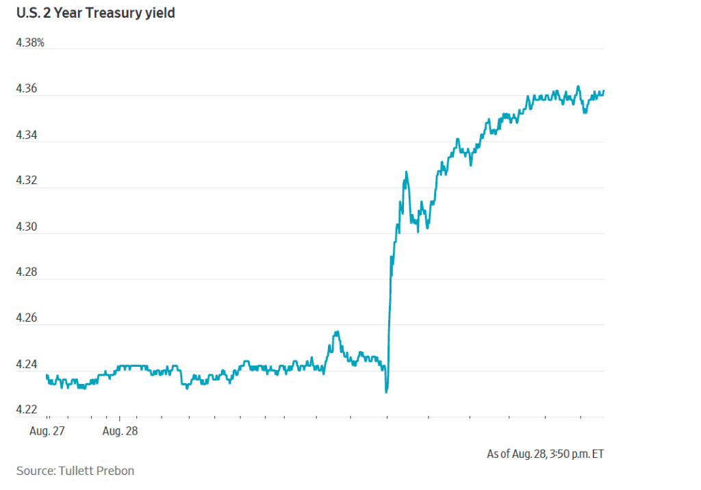
The following figure from the Wall Street Journal reflects the bond market’s immediate reaction when the text of Warsh’s address was released.
The two-year Treasury note is directly affected by investors’ expectations of the future path of the federal funds rate. (We discuss this link in Money, Banking, and the Financial System, Chapter 5.) Investors interpreted Warsh’s address as indicating he would take a more “hawkish” view of the need to raise the FOMC’s target for the federal funds rate than he had appeared to take in his earlier press conference.
Investors in the federal funds future market also quickly revised their expectations of the likelihood of the FOMC raising its target for the federal funds rate. Trading in the futures marker resulted in the probability increasing from 35.4 percent yesterday to 57.5 percent this afternoon of the committee raising its target range for the federal funds by 0.25 percentage points (25 basis points) at its next meeting on September 15–16. The probability that after the meeting on October 27–28, the committee will have raised its target range by at least 25 basis points increased from 52.6 percent yesterday to 70.7 percent this afternoon.



















.jpg)