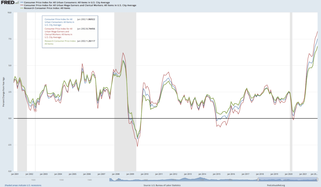
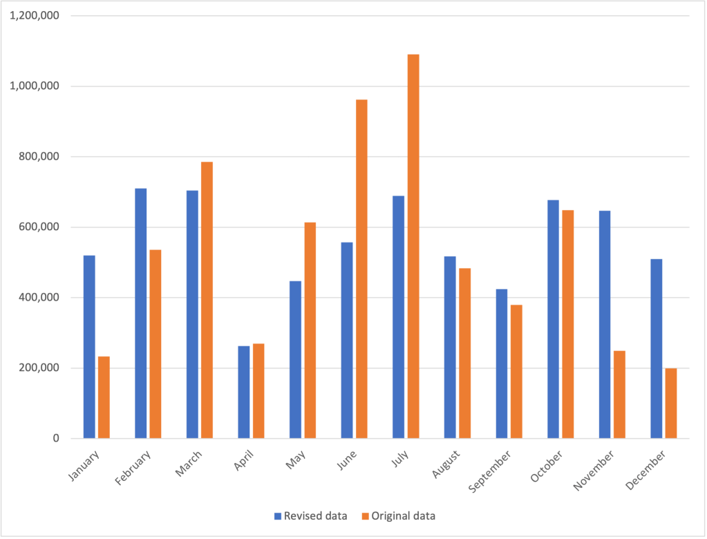
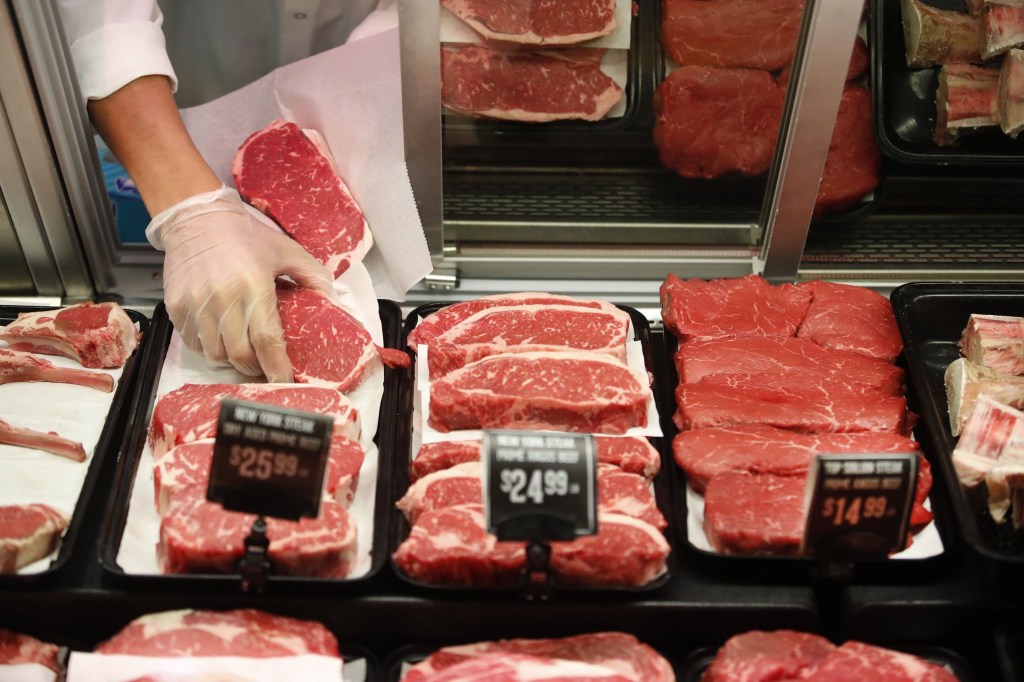
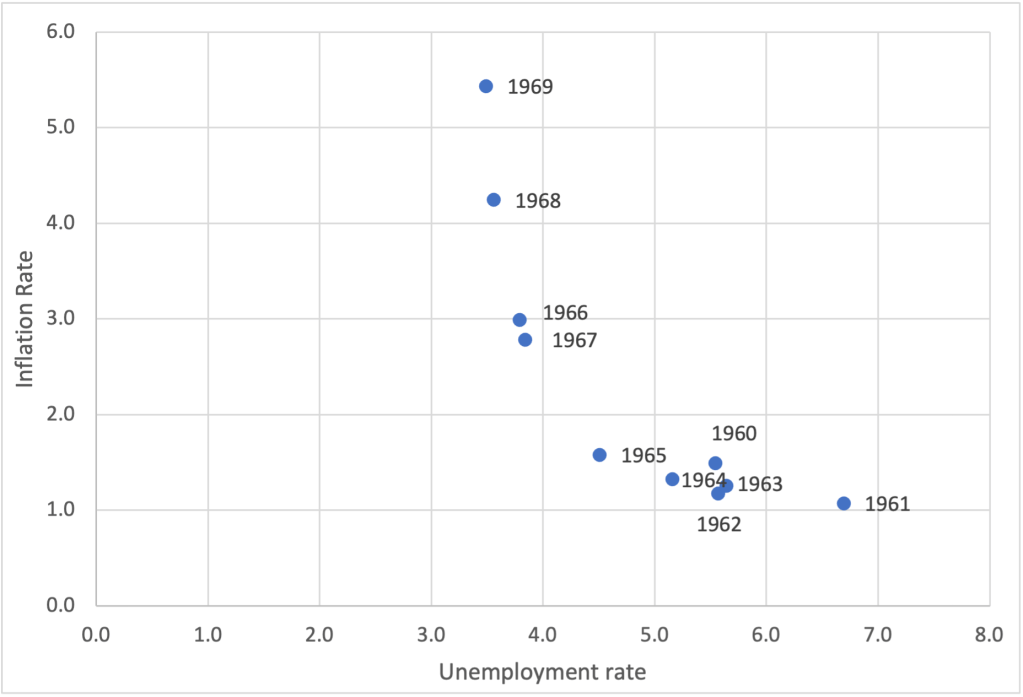
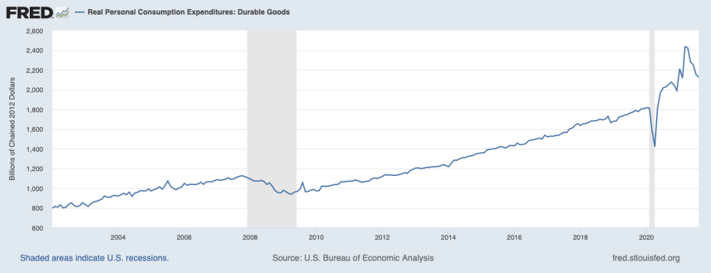
Are Economic Profits a Sign of Market Power?

Cecilia Rouse, chair of the Council of Economic Advisers. Photo from the Washington Post.

An article in the Washington Post discussed a debate among President Biden’s economic advisers. The debate was over “over whether the White House should blame corporate consolidation and monopoly power for price hikes.” Some members of the National Economic Council supported the view that the increase in inflation that began in the spring of 2021 was the result of a decline in competition in the U.S. economy.

Some Democratic members of Congress have also supported this view. For instance, Massachusetts Senator Elizabeth Warren argued on Twitter that: “One clear explanation for higher inflation? Giant corporations are exploiting their market power to further raise prices. And corporate executives are bragging about their higher profits.” Or, as Vermont Senator Bernie Sanders put it: “The problem is not inflation. The problem is corporate greed, collusion & profiteering.”

But according to the article, Cecilia Rouse, chair of the President’s Council of Economic Advisers (CEA), and other members of the CEA are skeptical that a lack of competition are the main reason for the increase in inflation, arguing that very expansionary monetary and fiscal policies, along with disruptions to supply chains, have been more important.

In an earlier blog post (found here), we noted that a large majority of more than 40 well-known academic economists surveyed by the Booth School of Business at the University of Chicago disagreed with the statement: “A significant factor behind today’s higher US inflation is dominant corporations in uncompetitive markets taking advantage of their market power to raise prices in order to increase their profit margins.”

One difficulty with the argument that the sharp increase in inflation since mid-2021 was due to corporate greed is that there is no particular reason to believe that corporations suddenly became more greedy than they had been when inflation was much lower. If inflation were mainly due to corporate greed, then greed must fluctuate over time, just as inflation does. Economic writer and blogger Noah Smith poked fun at this idea in the following graph

It’s worth noting that “greed” is one way of characterizing the self-interested behavior that underlies the assumption that firms maximize profits and individual maximize utility. (We discuss profit maximization in Microeconomics, Chapter 12, Section 12.2, and utility maximization in Chapter 10, Section 10.1.) When economists discuss self-interested behavior, they are not making a normative statement that it’s good for people to be self-interested. Instead, they are making a positive statement that economic models that assume that businesses maximize profit and consumers maximize utility have been successful in analyzing and predicting the behavior of businesses and households. 

Corporate profits increased from $1.95 trillion in the first quarter of 2021 to $2.40 trillion in third quarter of 2021 (the most recent quarter for which data are available). Using another measure of profit, during the same period, corporate profits increased from about 16 percent of value added by nonfinancial corporate businesses to about 18 percent. (Value added measures the market value a firm adds to a product. We discuss calculating value added in Macroeconomics, Chapter 8, Section 8.1.)

There have been mergers in some industries that may have contributed to an increase in profits—the Biden Administration has singled out mergers in the meatpacking industry as having led to higher beef and chicken prices. At this point, though, it’s not possible to gauge the extent to which mergers have been responsible for higher prices, even in the meatpacking industry.   

An increase in profit is not by itself an indication that firms have increased their market power. We would expect that even in a perfectly competitive industry, an increase in demand will lead in the short run to an increase in the economic profit earned by firms in the industry. But in the long run we expect economic profit to be competed away either by existing firms expanding their production or by new firms entering the industry.

In Chapter 12, we use Figure 12.8 to illustrate the effects of entry in the market for cage-free eggs. Panel (a) shows the market for cage-free eggs, made up of all the egg sellers and egg buyers. Panel (b) shows the situation facing one farmer producing cage-free eggs. (Note the very different scales of the horizontal axes in the two panels.) At $3 per dozen eggs, the typical egg farmer is earning an economic profit, shown by the green rectangle in panel (b). That economic profit attracts new entrants to the market—perhaps, in this case, egg farmers who convert to using cage-free methods. The result of entry is a movement down the demand curve to a new equilibrium price of $2 per dozen. At that price, the typical egg farmer is no longer earning an economic profit.

A few last observations:

  1. The recent increase in profits may also be short-lived if it reflects a temporary increase in demand for some durable goods, such as furniture and appliances, raising their prices and increasing the profits of firms that produce them. The increase in spending on goods, and reduced spending on services, appears to have resulted from:  (1) Households having additional funds to spend as a result of the payments they received from fiscal policy actions in 2020 and early 2021, and (2) a reluctance of households to spend on some services, such as restaurant meals and movie theater tickets, due to the effects of the Covid-19 pandemic.
  2. The increase in profits in some industries may also be due to a reduction in supply in those industries having forced up prices. For instance, a shortage of semiconductors has reduced the supply of automobiles, raising car prices and the profits of automobile manufacturers. Over time, supply in these industries should increase, bringing down both prices and profits.
  3. If some changes in consumer demand persist over time, we would expect that the  economic profits firms are earning in the affected industries will attract the entry of new firms—a process we illustrated above. In early 2022, this process is far from complete because it takes time for new firms to enter an industry.

Source:  Jeff Stein, “White House economists push back against pressure to blame corporations for inflation,” Washington Post, February 17, 2022; Mike Dorning, “Biden Launches Plan to Fight Meatpacker Giants on Inflation,” bloomberg.com, January 3, 2022; and U.S. Bureau of Economic Analysis.ec

Does Inflation Affect Lower-Income People More than Higher-Income People?

There’s a consensus among economists that increases in unemployment during a recession typically are larger for lower-income people than for higher-income people. Lower-income people are more likely to hold jobs requiring fewer skills and firms typically expect that when they lay off less-skilled workers during a recession they will be able to higher them—or other workers with similar skills—back after the recession ends. Because higher income have skills that may be difficult to replace, firms are more reluctant to lay them off. 

For instance, in an earlier blog post (found here) we noted that during the period in 2020 when many restaurants were closed, the Cheesecake Factory continued to pay its 3,000 managers while it laid off most of its servers. That strategy made it easier for the restaurant chain to more easily expand its operations when the worst of government-ordered closures were over. More generally, Serdar Birinci and YiLi Chien of the Federal Reserve Bank of St. Louis found that workers in the lowest 20 percent (or quintile) of earnings experienced an increased unemployment rate from 4.4 percent in January 2020 to 23.4 percent in April 2020, whereas workers in the highest quintile of earnings experienced an increase only from 1.1 percent in January to 4.8 percent in April.

If lower-income people are hit harder by unemployment, are they also hit harder by inflation? Answering that question is difficult because the U.S. Bureau of Labor Statistics (BLS) doesn’t routinely release data on inflation in the prices of goods and services purchased by households at different income levels.  The main measure of consumer price inflation compiled by the BLS represents changes in the consumer price index (CPI). The CPI is an index of the prices in a market basket of goods and services purchased by households living in urban areas. The information on consumer purchases comes from interviews the BLS conducts every three months with a sample of consumers and from weekly diaries in which a sample of consumers report their purchases. (We discuss the CPI in Macroeconomics, Chapter 9,  Section 9.4 and in Economics, Chapter 19, Section 19.4.)

The BLS releases three measures of the CPI, the two most widely used of which are the CPI-U for all urban consumers and CPI-W for urban wage earners. CPI-W covers the subset of households that receive at least half their household income from clerical or wage occupations and who have at least one wage earner who worked for 37 weeks or more during the previous year. CPI-U represents about 93 percent of the U.S. population and CPI-W represents about 29 percent of the U.S. population. Finally, in 1988 Congress instructed the BLS to compile a consumer price index reflecting the purchases of people aged 62 and older. This version of the CPI is labeled R-CPI-E; the R indicates that it is a research series and the E indicates that it is intended to measure the prices of goods and services purchased by elderly people. Because the sample used to calculate the R-CPI-E is relatively small and because of some other difficulties that may reduce the accuracy of the index, the BLS considers it a series best suited for research and does not include the data in its monthly “Consumer Price Index” publication. In any event, as the following figure shows, inflation, measured as the percentage change in the CPI from the same month in the previous year, has been very similar for all three measures of the CPI.

Because the market baskets of goods and services consumed by a mix of high and low-income households is included in all three versions of the CPI, none of the versions provides a way to measure the possibly different effects of inflation on low-income and on high-income households. A study by Josh Klick and Anya Stockburger of the BLS attempts to fill this gap by constructing measures of the CPI for low-income and for high-income households. They define low-income households as those in the bottom 25 percent (quartile) of the income distribution and high-income households as those in the top quartile of the income distribution. During the time period of their analysis—December 2003 to December 2018—the bottom quartile had average annual incomes of $12,705 and the top quartile had average annual incomes of $155,045.

The BLS researchers constructed market baskets for the two groups. The expenditure weights—representing the mix of products purchased—don’t differ too strikingly between lower-income and higher-income households, as the figure below shows. The largest differences are housing, with low-income households having a market basket weight of 45.2 percent and high-income households having a market basket weight of 39.5 percent, and transportation, with low-income households having a market basket weight of 13.0 percent and high-income households having a market basket weight of 17.2 percent.

The following table shows the inflation rate as measured by changes in different versions of the CPI over the period from December 2003 to December 2018. During this period, the CPI-U (the version of the CPI that is most frequently quoted in news stories) increased at an annual rate of 2.1 percent, which was the same rate as the CPI-W. The R-CPI-E increased at a slightly faster rate of 2.2 percent. Lower-income households experienced the highest inflation rate at 2.3 percent and higher-income households experienced the lowest inflation rate of 2.0 percent.  

CPI-UCPI-WR-CPI-ECPI for lowest income quartileCPI for highest income quartile
2.1%2.2%2.1%2.3%2.0%

The differences in inflation rates across groups were fairly small. Can we conclude that the same was true during the recent period of much higher inflation rates? We won’t know with certainty until the BLS extends its analysis to cover at least the years 2021 and 2022. But we can make a couple of relevant observations. First, for many people the most important aspect of inflation is whether prices are increasing faster of slower than their wages. In other words, people are interested in what is happening to their real wage. (We discuss calculating real wage rates in Macroeconomics, Chapter 9, Section 9.5 and in Economics, Chapter 19, Section 19.5.)

The Federal Reserve Bank of Atlanta compiles data on wage growth, including wage growth by workers in different income quartiles. The following figure shows that workers in the top quartile have experienced more rapid wage growth in the months since the beginning of the Covid-19 pandemic than have workers in the other quartiles. This gap continues a trend that began in 2015. The bottom quartile has experienced the slowest rate of income growth. (Note that the researchers at the Atlanta Fed compute wage growth as a 12-month moving average rather than as the percentage from the same month in the previous year, as we have been doing when calculating inflation using the CPI.) For example, in January 2022, calculated this way, average wage growth in the top quartile was 5.8 percent as opposed to 2.9 percent in the bottom quartile.

As with any average, there is some variation in the experiences of different individuals. Although, as a group, lower-income workers have seen wage growth that lags behind other workers, in some industries that employ many lower-income people, wage growth has been strong. For instance, as measured by average hourly earnings, wages for all workers in the private sector increased by 5.7 percent between January 2021 and 2022. But average hourly earnings in the leisure and hospitality industry—which employs many lower-income workers—increased by 13.0 percent.

Overall, it seems likely that the real wages of higher-income workers have been increasing while the real wages of lower-income workers have been decreasing, although the experience of individual workers in both groups may be very different than the average experience. 

Sources: Josh Klick and Anya Stockburger, “Experimental CPI for Lower and Higher Income Households Serdar,” U.S. Bureau of Labor Statistics, Working Paper 537, March 8, 2021; Birinci and YiLi Chien, “An Uneven Crisis for Lower-Income Households,” Federal Reserve Bank of St. Louis, Annual Report 2020, April 7, 2021; and Federal Reserve Bank of Atlanta, “Wage Growth Tracker,” https://www.atlantafed.org/chcs/wage-growth-tracker.

Inflation, Interest Rates, and Stock Prices

Caution: Long post!

An article in the Wall Street Journal quoted an economist at a financial services firm as noting that strong growth in wages could lead to sustained inflation. The article stated that as a result “the yield on the 10-year U.S. Treasury note [rose to] within reach of 2%” and that: “Rising [bond] yields this year have rattled markets and hurt tech stocks in particular ….”

What are the links between wage inflation and price inflation, inflation and bond yields, and bond yields and stock prices—particularly the prices of tech stocks?

The link between wage inflation and price inflation. The monthly “Employment Situation” reports from the Bureau of Labor Statistics (BLS), in addition to providing data on payroll employment and the unemployment rate, also provide data on average hourly earnings (AHE). AHE are the wages and salaries per hour worked that private, nonfarm business pay workers. AHE don’t include the value of benefits that firms provide workers, such as contributions to 401(k) retirement accounts or health insurance. The following figure shows changes in AHE from the same month in the previous year. The figure shows that since the Covid-19 pandemic first began to affect the U.S. economy in March 2020, AHE have moved erratically. But since the fall of 2021, growth in AHE has been consistently above the 2 percent to 4 percent range that prevailed in the years after the end of the Great Recession of 2007–2009.

Employee compensation is the largest cost for most firms.  For the economy as whole, employee compensation is about 80 percent of total costs. When firms pay higher wages per hour, their costs per unit of output don’t rise unless the wage increases are greater than the rate of growth of labor productivity, or output per hour worked. Increases in wages in the range of 5 percent to 6 percent are well above the rate of growth of labor productivity and, so, firms are likely to pass through the wage increases by raising prices. Note that the higher prices may prompt workers to push for higher wage increases to offset the decline in the real purchasing power of their wages, potentially setting off a wage-price spiral. (We discussed the possibility of a wage-price spiral in a recent post here.)

The link between inflation and bond yields.  When investors lend money by, for instance, buying a bond, they are concerned with the interest rate they will receive after correcting for the effects of inflation. In other words, they focus on the real interest rate, which is equal to the nominal interest rate, or the stated interest rate on the loan or bond, minus the expected inflation rate:

            Real interest rate = Nominal interest rate – Expected inflation rate.

We can rewrite this relationship as:

            Nominal interest rate = Real interest rate + Expected inflation rate.

The second equation indicates that if investors expect the inflation rate to increase, then, unless the real interest rate changes, the nominal interest rate will increase.  The Fisher effect is the idea associated with Yale economist Irving Fisher that the nominal interest rate rises or falls by the same number of percentage points as the expected inflation rate. So, for instance, if investors expect that the inflation rate will increase from 3 percent to 5 percent, then the nominal interest rate will also increase by two percentage points.

Because of real-world frictions, such as the broker fees that investors pay when buying and selling bonds and the taxes investors pay when they sell a bond that has increased in price, the Fisher effect doesn’t hold exactly. Still, most economists agree that an increase in the expected inflation rate will cause an increase in nominal interest rates. The following figure shows movements in the interest rate on 10-year Treasury notes (blue line) and in inflation (red line). Note that, roughly speaking, the interest rate on the 10-year Treasury note is higher when inflation is higher and lower when inflation is lower.  (We discuss real and nominal interest rates in Macroeconomics, Chapter 9, Section 9.6 and in Economics, Chapter 19, Section 19.6. We discuss the Fisher effect in Money, Banking, and the Financial System, Chapter 4, Section 4.3.)

The link between bond yields and stock prices. As wage inflation leads to price inflation and price inflation leads to higher interest rates on bonds—particularly U.S. Treasury bonds—why might stock prices be affected? First, investors consider U.S. Treasury bonds to be default risk free, which means that investors are certain that the Treasury will make the interest and principal payments on the bonds. Stock investments are much riskier because they depend on the future profits of the firms issuing the stocks and those profits may fluctuate in ways that are difficult for investors to anticipate. So as interest rates on Treasury bonds increase, some investors will decide to sell stocks and buy bonds, which will cause a decline in stock prices. 

Second, most people value funds they will receive now or soon more highly than funds they will receive in the more distant future. For instance, if someone offered to pay you $1,000 today or $1,000 one year from now, you will prefer to receive the money today.  In other words, the present value, or value today, of a payment you won’t receive until the future is worth less than the face value of the payment. For instance, the present value of $1,000 you won’t receive for a year is worth less than $1,000 in present value. The higher the interest rate is, the lower the present value of payments, such as dividends, that you will receive in the future. 

Economists believe that price of a financial investment, like a bond or a stock, is equal to the present value of the payments you will receive from owning the asset. If you own a bond, you will receive interest payments and payment of the bond’s principal when the bond matures. If you own a stock, you will receive dividends, which are the payments that firms make to shareholders from the firms’ profits. Therefore stock prices should reflect the present value of the dividends that investors expect to receive from owning the stock. (We discuss present value and the relationship between interest rates and stock and bond prices in Macroeconomics, Chapter 6, Appendix, in Economics, Chapter 8, Appendix, and, more completely, in Money, Banking, and the Financial System, Chapter 3, Section 3.2 and Chapter 6, Section 6.2.)

The Wall Street Journal article we quoted above notes that the rising interest rate on the 10-year Treasury note was causing price declines in tech stocks in particular. The explanation is that tech firms often go through an initial period in which they may make very low profits or even suffer losses. Investors may still be willing to buy stock in tech firms because they expect the firms eventually to increase their profits and the dividends they pay. But because those profits will be earned in the future—often after a period of losses that may stretch for years—the present value of the profits and, therefore, the price of the stock depends more on the interest rate than would be true of a firm making breakfast cereal or frozen pizza that will be steadily earning profits through the years. Therefore, we would expect, as the article indicates, that the prices of tech firms are more likely to decline—or to decline more—when interest rates rise than is true of other firms. 

The following figure shows the interest rate on the 10-year Treasury note (blue line with scale given on the left) and the values of the Nasdaq composite stock index (red line with the value for January 1, 2010 set equal to 100 and the scale given on the right). The Nasdaq includes the stocks of more tech firms than is true of the other widely followed stock market indexes—the S&P 500 and the Dow Jones Industrial Average. The figure shows that the declining interest rate on 10-year Treasury notes that began in late 2018 and continued through mid-2020 coincided with increases in the prices of the stocks in the Nasdaq index—apart from the spring of 2020 during the beginning of the Covid-19 pandemic.  The most recent period shows that increases in the interest rate on the 10-year Treasury note have corresponded with a decline in the Nasdaq, as noted in the article.

Source: Sam Goldfarb, “Elevated Bond Yields Approach Key Milestone,” Wall Street Journal, February 7, 2022; U.S. Bureau of Economic Analysis, “Prices, Costs, and Profit per Unit of Real Gross Value Added of Nonfinancial Domestic Corporate Business,” January 27, 2022; and Federal Reserve Bank of St. Louis.

The Surprisingly Strong Employment Report for January 2022

Leisure and hospitality was one of the industries showing surprisingly strong job growth during January 2022. Photo from the New York Times.

The Bureau of Labor Statistics’ monthly report on the “Employment Situation” is generally considered the best source of information on the current state of the labor market. As we discuss in Macroeconomics, Chapter 9, Section 9.1 (and in Economics, Chapter 19, Section 19.1), economists, policymakers, and investors generally focus more on the establishment survey data on total payroll employment than on the household survey data on the unemployment rate. The initial data on employment from the establishment survey are subject to substantial revisions over time (we discuss this point further below). But the establishment survey has the advantage of being determined by data taken from actual payrolls rather than by unverified answers to survey questions, as is the case with the household survey data. 

The establishment survey data for January 2022 (released on February 4, 2022) showed a surprisingly large increase in employment of 467,000. The consensus forecast had been for a significantly smaller increase of 150,000, with many economists expecting that the data would show a decrease in employment. The establishment survey is collected for pay periods that include the 12th of the month. In January 2022, in many places in the United States that pay period coincided with the height of the wave of infections from the Omicron variant of Covid-19. And, in fact, according to the household survey, the number of people out of work because of illness was 3.6 million in January—the most during the Covid-19 pandemic. So it seemed likely that payroll employment would have declined in January. But despite the difficulties caused by the pandemic, payroll employment increased substantially, likely reflecting firms’ continuing high demand for workers—a demand reflected in the very high level of job openings.

The employment report includes the BLS’s annual data revisions, which are based on a comprehensive payroll count for a particular month in the previous year—in this case, March 2021. The revisions also incorporate changes to the BLS’s seasonal adjustment factors. Each month, the BLS adjusts the raw payroll employment data to reflect seasonal fluctuations such as occur during and after the end-of-year holiday period. For instance, the change from December 2020 to January 2021 in the raw employment data was −2,824,000, whereas the adjusted change was 467,000 (as noted earlier). Obviously this difference is very large and is attributable to the BLS’s seasonal adjustments removing the employment surge in December attributable to seasonal hiring by retail stores, delivery firms, and other businesses strongly affected by the holidays.

The changes to the seasonal adjustment factors made the revisions to the 2021 payroll employment numbers unusually large. For instance, the BLS initially reported that employment increased from June 2021 to July 2021 by 1,091,000, whereas the revision reduced the increase to 689,000. Table A below is reproduced from the BLS report; the figure below the table shows the changes in employment from the previous month as originally published and as revised in the January report. Overall, the BLS revisions now show that employment increased by 217,000 more from 2020 to 2021 than initially estimated. The BLS expressed the opinion that: “Going forward, the updated models should produce more reliable estimates of seasonal movements. [Because there are now] more monthly observations related to the historically large job losses and gains seen in the pandemic-driven recession and recovery, the models can better distinguish normal seasonal movements from underlying trends.”

Source: The BLS “Employment Situation” report can be found here.

1/25/22 Podcast – Authors Glenn Hubbard & Tony O’Brien discuss inflation, inflation, inflation.

Authors Glenn Hubbard and Tony O’Brien as they talk about the leading economic issue of early 2022 – inflation! They discuss the resurgence of inflation to levels not seen in 40 years due to a combination of miscalculations in monetary and fiscal policy. The role of Quantitative Easing (QE) – and its future – is discussed in depth. Listen today to gain insights into the economic landscape.

Macroeconomics or Microeconomics? Is a Lack of Competition in Some Industries Behind the Increase in Inflation?

Photo from the Wall Street Journal

In January 2022, the Bureau of Labor Statistics (BLS) announced that inflation, measured as the percentage change in the consumer price index (CPI) from December 2020 to December 2021, was 7 percent. That was the highest rate since June 1982, which was near the end of the Great Inflation that lasted from 1968 to 1982. The following figure shows the inflation rate since the beginning of 1948. 

What explains the surge in inflation? Most economists believe that it is the result of the interaction of increases in aggregate demand resulting from very expansionary monetary and fiscal policy and disruptions to supply in some industries as a result of the Covid-19 pandemic. (We discuss movements in aggregate demand and aggregate supply during the pandemic in the updated editions of Economics, Chapter 23, Section 23.3 and Macroeconomics, Chapter 13, Section, 13.3.)

But President Joe Biden has suggested that mergers and acquisitions in some industries—he singled out meatpacking—have reduced competition and contributed to recent price increases. Massachusetts Senator Elizabeth Warren has made a broader claim about reduced competition being responsible for the surge in inflation: “Market concentration has allowed giant corporations to hide behind claims of increased costs to fatten their profit margins. [Corporations] are raising prices because they can.” And “Corporations are exploiting the pandemic to gouge consumers with higher prices on everyday essentials, from milk to gasoline.”

Do many economists agree that reduced competition explains inflation? The Booth School of Business at the University of Chicago periodically surveys a panel of more than 40 well-known academic economists for their opinions on significant policy issues. Recently, the panel was asked whether they agreed with these statements:

  1. A significant factor behind today’s higher US inflation is dominant corporations in uncompetitive markets taking advantage of their market power to raise prices in order to increase their profit margins.
  2. Antitrust interventions could successfully reduce US inflation over the next 12 months.
  3. Price controls as deployed in the 1970s could successfully reduce US inflation over the next 12 months.

Large majorities of the panel disagreed with statements 1. and 2.—that is, they don’t believe that a lack of competition explains the surge in inflation or that antitrust actions by the federal government would be likely to reduce inflation in the coming year. A smaller majority disagreed with statement 3., although even some of those who agreed that price controls would reduce inflation stated that they believed price controls were an undesirable policy. For instance, while he agreed with statement 3., Oliver Hart of Harvard noted that: “They could reduce inflation but the consequence would be shortages and rationing.”

One way to characterize the panel’s responses is that they agreed that the recent inflation was primarily a macroeconomic issue—involving movements in aggregate demand and aggregate supply—rather than a microeconomic issue—involving the extent of concentration in individual industries. 

The panels responses can be found here

Sources for Biden and Warren quotes: Greg Ip, “Is Inflation a Microeconomic Problem? That’s What Biden’s Competition Push Is Betting,” Wall Street Journal, January 12, 2022; and Patrick Thomas and Catherine Lucey, “Biden Promotes Plan Aimed at Tackling Meat Prices,” Wall Street Journal, January 3, 2022; and https://twitter.com/SenWarren/status/1464353269610954759?s=20

Lawrence Summers Remains Pessimistic about Inflation

By LHSummers – I had this photo taken of me for personal puposes. Previously published: My website, CC BY-SA 3.0, https://commons.wikimedia.org/w/index.php?curid=23123636

Lawrence Summers, professor of economics at Harvard University and secretary of the Treasury under President Bill Clinton, has been outspoken in arguing that monetary and fiscal have been too expansionary. In February 2021, just before Congress passed the American Rescure Plan, which increased federal government spending by $1.9 trillion, Summers cautioned that “there is a chance that macroeconomic stimulus on a scale closer to World War II levels than normal recession levels will set off inflationary pressures of a kind we have not seen in a generation, with consequences for the value of the dollar and financial stability.”

In a brief CNN interview found at this LINK, Summers indicates that he remains concerned that inflation may persist at high levels for a longer period than many other economists, including policymakers at the Federal Reserve, believe.

Source for quote: Lawrence H. Summers, “The Biden Stimulus Is Admirably Ambitious. But It Brings Some Big Risks, Too,” Washington Post, February 4, 2021.

Is the U.S. Economy Heading “Back to the ‘60s”?

A recent publication by economists Regis Barnichon, Luiz E. Oliveira, and Adam H. Shapiro at the Federal Reserve Bank of San Francisco asks that provocative question. “The ‘60s” is a reference to the events that led to the U.S. economy experiencing more than 10 years of high inflation rates. Below is a graph similar to Chapter 15, Figure 15.1 in Macroeconomics (Economics, Chapter 25, Figure 25.1) that shows the inflation rate in the United States as measured by the percentage change in the Consumer Price Index (CPI) for each year since 1952. Economists call the years from 1968 though 1982 the “Great Inflation” because inflation was greater during that period than during any other period in the history of the United States.

As we discuss in Macroeconomics, Chapter 17, Section 17.2 (Economics, Chapter 27, Section 27.2), many economists believe that the Great Inflation began as a result of the Federal Reserve attempting to keep the unemployment rate below the natural rate of unemployment for a period of several years. As predicted by the Phillips Curve, the inflation rate increased and, as Milton Friedman and Edmund Phelps had argued would likely happen, the expected inflation rate eventually increased. The inflation was made worse during the 1970s by two supply shocks resulting from sharp increases in oil prices.

Is the United States on the edge of repeating the experience of the Great Inflation? Earlier this year, Olivier Blanchard of the Peterson Institute for International Economics wrote a paper arguing that the U.S. economy was at significant risk of experiencing a significant acceleration in inflation. His paper included a figure similar to the one below showing the combinations of inflation and unemployment during each year of the 1960s. The figure shows a substantial acceleration in inflation over the course of the decade.

Blanchard notes that: 

“The history of the Phillips curve is one of shifts, largely due to the adjustment of expectations of inflation to actual inflation. True, expectations have [currently] been extremely sticky for a long time, apparently not reacting to movements in actual inflation. But, with such overheating, expectations might well deanchor. If they do, the increase in inflation could be much stronger.” 

….

“If inflation were to take off, there would be two scenarios: one in which the Fed would let inflation increase, perhaps substantially, and another—more likely—in which the Fed would tighten monetary policy, perhaps again substantially. Neither of these two scenarios is ideal. In the first, inflation expectations would likely become deanchored, cancelling one of the major accomplishments of monetary policy in the last 20 years and making monetary policy more difficult to use in the future. In the second, the increase in interest rates might have to be very large, leading to problems in financial markets.”

The authors of the San Francisco Fed publication are more optimistic. They begin their discussion by observing that because of the pandemic, the state of the labor market is more difficult to assess than in most years. They note that the unemployment rate of 4.8 percent in September 2021 was only slightly below the average unemployment rate over the past 30 years and well above the low unemployment rates of 2019 and early 2021. So, on the basis of the unemployment rate, policymakers at the Fed and in Congress might conclude that the inflation the U.S. economy is experiencing is not the result of overly tight labor markets such as those of the late 1960s. But the job openings rate(sometimes called the vacancy rate) is telling a different story. Job openings are positions that are both available to be filled within the next 30 days and for which firms are actively recruiting applicants from outside the firm. (According to the BLS: “The job openings rate is computed by dividing the number of job openings by the sum of employment and job openings and multiplying that quotient by 100.”)

The authors of the San Francisco Fed study note that “the vacancy rate is well above its 30-year average … and has surpassed its historic highs from the late 1960s … indicating that employers are having a difficult time filling positions. Confirming this high vacancy rate, the fraction of small businesses reporting that job openings are hard to fill is at historic highs ….” The figures below show the vacancy rate and the unemployment rate since January 2016.

The authors combine the unemployment rate and the vacancy rate into a statistic—the vacancy-to-unemployment ratio—that they demonstrate has historically done a better job of explaining movements in inflation than has the unemployment rate.  They expect that expansionary fiscal policy will result in an increase in vacancy-to-unemployment ratio and, therefore, an increase in the inflation rate. But they share the view of Blanchard and many other economists that a key issue is “the stability of longer-run inflation expectations.” 

We know that in the 1960s, several years of rising inflation made long-run inflation expectations unstable—in terms of the discussion in Chapter 17, the short-run Phillips curve shifted up. We don’t yet know what will happen to inflation expectations in late 2021 and in 2022, so we can’t yet tell how persistent current rates of inflation will be. 

Sources: Regis Barnichon, Luiz E. Oliveira, and Adam H. Shapiro, “Is the American Rescue Plan Taking Us Back to the ’60s?,” FRBSF Economic Letter, No. 2021-27, October 18, 2021; Olivier Blanchard, “In Defense of Concerns over the $1.9 Trillion relief Plan,” piie.com, February 18, 2021; and Federal Reserve Bank of St. Louis.

Elkhart County, Indiana Rides the Surge in Spending on Consumer Durables

More than 80 percent of the recreational vehicles (RV) sold in the United States are manufactured in Elkhart County, Indiana. As we discuss in the opener to Chapter 22 in Economics (Chapter 12 in Macroeconomics), being dependent on sales of expensive durable goods like RVs means that the county is particularly vulnerable to the business cycle, with local firms experiencing rising sales during economic expansions and sharply falling sales during economic recessions. Accordingly, the unemployment rate in the county fluctuates much more during the business cycle than is typical—as shown in the above graph.

For example, during the Great Recession of 2007-2009, the unemployment rate in the country rose from a low of 3.9 percent in May 2007 to a high of 20 percent in March 2009, before declining during the following economic recovery.  Just before the start of the Covid-19 recession of 2020, the unemployment rate in Elkhart was 2.8 percent. It then soared to 30.8 percent in April. 

But, as we discuss in the chapter, the recovery from the 2020 recession was unusually rapid, although uneven. Many services industries, such as restaurants, gyms, and movie theaters continued to struggle well into 2021 as firms had difficulty attracting workers and as some consumers remained reluctant to spend time inside in close contact with other people. In contrast, consumer spending on durable goods was far above its pre-pandemic level, as well as being above the rate at which it had been growing during the years before the pandemic. The two graphs below show real consumer spending on durables and on services up through August 2021.

During 2021, sales of RVs through August were 50 percent higher than in the same period in 2020 and were on a pace to reach record annual sales. The success of the RV industry has led to rising incomes in Elkhart County, which, in turn, has allowed the area to attract other industries, including a logistics center that when completed will be the largest industrial building in Indiana and an Amazon warehouse that when completed will provide 1,000 new jobs. Rising incomes have also supported other businesses, such as community theaters, art galleries, and a recently reopened 1920s-era hotel.

In October 2021, the Wall Street Journal ranked Elkhart County first in its rating of metropolitan areas as measured by the index it compiles with realtor.com. The index “identifies the top metro areas for home buyers seeking an appreciating housing market and appealing lifestyle amenities.” If consumers continue to buy more goods and fewer services, it could be bad news for restaurants and other service industries, but good news for places like Elkhart that depend on goods-producing industries. 

Sources: Nicole Friedman, “RV Capital of America Tops WSJ/Realtor.com Housing Index in Third Quarter,” wsj.com, October 19, 2021; Business Wire, “Amazon Announces New Robotics Fulfillment Center and Delivery Station in Elkhart County, Creating More Than 1,000 New, Full-Time Jobs,” businesswire.com, October 7, 2021; Construction Review Online, “Hotel Elkhart Grand Opening Celebrated in Elkhart, Indiana,” constructionreviewonline.com, October 4, 2021; Construction Review Online, “Elkhart County Logistics Facility to Bring about 1,000 jobs in Indiana,” constructionreviewonline.com, August 16, 2021; Federal Reserve Bank of St. Louis; and RV Industry Association.

The Pandemic and Hidden Inflation

If the price of your meal is the same, but the service is slow and the menu is limited you have experienced hidden inflation.

Each month, hundreds of employees of the Bureau of Labor Statistics gather data on prices of goods and services from stores in 87 cities and from websites. The BLS constructs the consumer price index (CPI) by giving each price a weight equal to the fraction of a typical family’s budget spent on that good or service. (We discuss the construction of the CPI in Chapter 9, Section 9.4 of Macroeconomics and Chapter 19, Section 19.4 of Economics.) Ideally, the BLS tracks prices of the same product over time. But sometimes a particular brand and style of shirt, for example, is discontinued. In that case, the BLS will use instead the price of a shirt that is a very close substitute.

A more difficult problem arises when the price of a good increases at the same time that the quality of the good improves. For instance, a new model iPhone may have both a higher price and a better battery than the model it replaces, so the higher price partly reflects the improvement in the quality of the phone.  The BLS has long been aware of this problem and has developed statistical techniques that attempt to identify that part of price increases that are due to increases in quality. Economists differ in their views on how successfully the BLS has dealt with this quality bias to the measured inflation rate. Because of this bias in constructing the CPI, it’s possible that the published values of inflation may overstate the actual annual rate of inflation by 0.5 percentage point. So, for instance, the BLS might report an inflation rate of 3.5 percent when the actual inflation rate—if the BLS could determine it—was 4.0 percent.

During 2021, a number of observers pointed to a hidden type of inflation occurring, particularly in some service industries. For example, because many restaurants were having difficulty hiring servers, it was often taking longer for customers to have their orders taken and to have their food brought to the table.  Because restaurants were also having difficulty hiring enough cooks, they also limited the items available on their menus. In other words, the service these restaurants were offering was not as good as it had been prior to the pandemic. So even if the restaurants kept their prices unchanged, their customers were paying the same price but receiving less. 

Alan Cole, who was formerly a senior economist with the Congressional Joint Economic Committee, noted on his blog that “goods and services are getting worse faster than the official statistics acknowledge, suggesting that our inflation problem has actually been bigger than the official statistics suggest.” As examples, he noted that “hotels clean rooms less frequently on multi-night stays,” “shipping delays are longer, and phone hold times at airlines are worse.” In a column in the New York Times, economics writer Neil Irwin made similar points: “Complaints have been frequent about the cleanliness of [restaurant] tables, floors and bathrooms.”  And: “People trying to buy appliances and other retail goods are waiting longer.”

A column in the Wall Street Journal on business travel by Scott McCartney was headlined “The Incredible Disappearing Hotel Breakfast.” McCartney noted that many hotels continue to advertise free hot breakfasts on their websites and apps but have stopped providing them. He also noted that hotels “have suffered from labor shortages that have made it difficult to supply services such as daily housekeeping or loyalty-group lounges,” in addition to hot breakfasts.

The BLS makes no attempt to adjust the CPI for these types of deterioration in the quality of services because doing so would be very difficult. As Irwin notes: “Customer service preferences—particularly how much good service is worth—varies highly among individuals and is hard to quantify. How much extra would you pay for a fast-food hamburger from a restaurant that cleans its restroom more frequently than the place across the street?”

As we noted earlier, most economists believe that the failure of the BLS to fully account for improvements in the quality of goods results in changes in the CPI overstating the true inflation rate.  This bias may have been more than offset since the beginning of the pandemic by deterioration in the quality of services resulting in the CPI understating the true inflation rate. As the dislocations caused by the pandemic gradually resolve themselves, it seems likely that the deterioration in services will be reversed. But it’s possible that the deterioration in the provision of some services may persist. Fortunately, unless the deterioration increases over time, it would not continue to distort the measurement of the inflation rate because the same lower level of service would be included in every period’s prices.

Sources: Alan Cole, “How I Reluctantly Became an Inflation Crank,” fullstackeconomics.com, September 8, 2021; Scott McCartney, “The Incredible Disappearing Hotel Breakfast—and Other Amenities Travelers Miss,” wsj.com, October 20, 2021; and Neil Irwin, “There Is Shadow Inflation Taking Place All Around Us,” nytimes.com, October 14, 2021.