Unraveling the Mysteries of the May 2023 Employment Situation Report

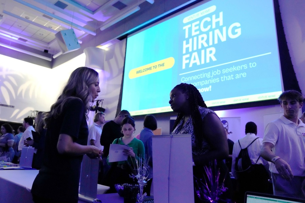
(Photo from the Associated Press via the Wall Street Journal.)

During most periods, the “Employment Situation” report that the Bureau of Labor Statistics issues on the first Friday of each month includes the most closely watched macroeconomic data. Since the spring of 2021, high inflation rates have made the BLS’s “Consumer Price Index Summary” at least a close second in interest to the employment report. The data in the CPI report is usually more readily comprehensible than the data in the employment report. So, we think it’s worth class time to go into some of the details of the employment report, as we do in Macroeconomics, Chapter 9, Section 9.1, Economics, Chapter 19, Section 19.1, and Essentials of Economics, Chapter 13, Section 13.1.

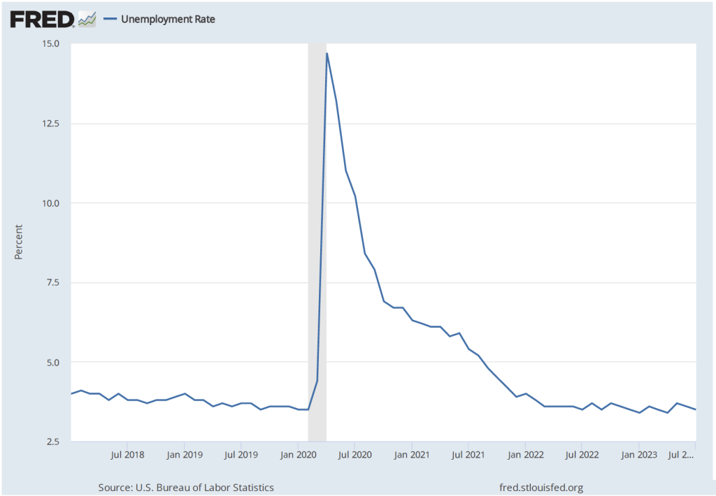
When the BLS released the May employment report, the Wall Street Journal noted that: “Employers added 339,000 jobs last month; unemployment rate rose to 3.7%.” Employment increased … but the unemployment rate also rose? How is that possible? One key to understanding media accounts of the report is to note that the report contains data from two separate surveys: 1) the household survey and 2) the employment or establishment survey. As in the statement just quoted from the Wall Street Journal, media accounts often mix data from the two surveys.  

The data showing an increase of 339,000 jobs in May are from the payroll survey, while the data showing that the unemployment rate rose are from the household survey. Below we reproduce part of the relevant table from the report showing some of the data from the household survey. Note that total employment in the household survey falls by 310,000, so there appears to be no contradiction to explain—the unemployment rate increased because the number of people employed fell and the number of people unemployed rose. But why, then, did employment rise in the payroll survey?

Employment can rise in one survey and fall in the other because: 1) the types of employment measured in the two series differ, 2) the periods during which the data are collected differ, and 3) because of measurement error. The household survey uses a broader measure of employment that includes several categories of workers who are not included in the payroll survey: agricultural workers, self-employed workers, unpaid workers in family businesses, workers employed in private households rather than in businsses, and workers on unpaid leave from their jobs. In addition, the payroll employment numbers are revised—sometimes substantially—as additional data are collected from firms, while the household employment numbers are subject to much smaller revisions because data in the household survey are collected during a single week. A detailed discussion of the differences between the employment measures in the two series can be found here.

Usefully, the BLS publishes a series labeled “Adjusted employment” that estimates what the value for household employment would be if the household survey was measuring the same categories of employment as the payroll survey. In this case, the adjusted employment series shows an increase in employment in May of 394,000—close to the payroll survey’s increase of 339,000.

To summarize, the May employment report indicates that payroll employment increased, while the non-payroll categories of household employment declined, and the unemployment rate rose. Note also in the table above that the number of people counted as not being in labor force rose slightly and the employment-population ratio fell slightly. Average weekly hours (not shown in the table above) decreased slightly from 34.4 hours per week to 34.3.

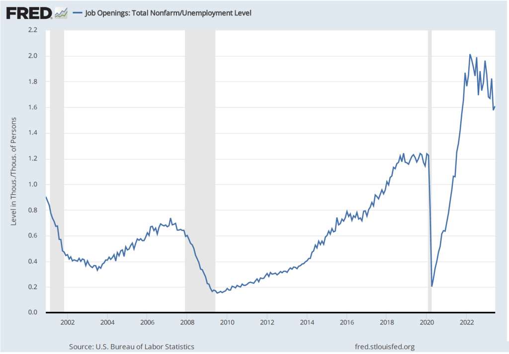
A reasonable conclusion from the report is that the labor market remains strong, although it may have weakened slightly. Prior to release of the report, there was much speculation in the business press about how the report might affect the deliberations of the Federal Reserve’s Federal Open Market Committe (FOMC) at its next meeting to be held on June 13th and 14th. The report showed stronger employment growth than economists surveyed by Dow Jones had expected, indicating that the FOMC was likely to remain concerned that a tight labor market might continue to put upward pressure on wages, which firms could pass through to higher prices. Members of the FOMC had been signalling that they were likely to keep their target for the federal funds rate unchanged in June. The reported employment increase was likely not large enough to cause the FOMC to change course.

Is a Soft Landing More Likely Now?

Photo from the Wall Street Journal.

The Federal Reserve’s goal has been to end the current period of high inflation by bringing the economy in for a soft landing—reducing the inflation rate to closer to the Fed’s 2 percent target while avoiding a recession. Although Fed Chair Jerome Powell has said repeatedly during the last year that he expected the Fed would achieve a soft landing, many economists have been much more doubtful.

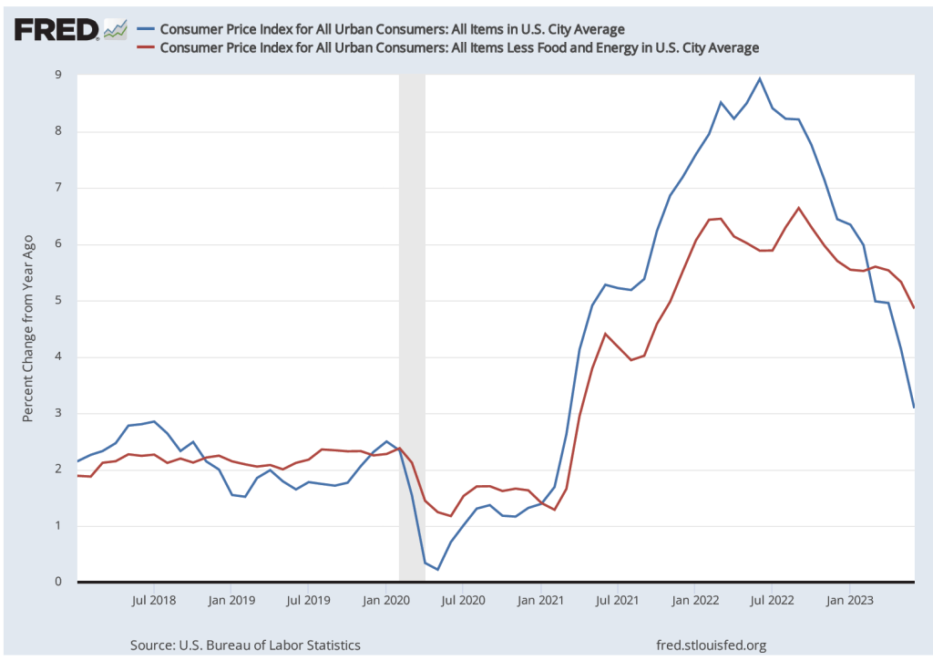
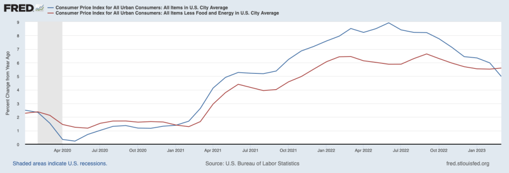
It’s possible to read recent economic data as indicating that it’s more likely that the economy is approaching a soft landing, but there is clearly still a great deal of uncertainty. On April 12, the Bureau of Labor Statistics released the latest CPI data. The figure below shows the inflation rate as measured by the CPI (blue line) and by core CPI—which excludes the prices of food and fuel (red line). In both cases the inflation rate is the percentage change from the same month in the previous year. 

The inflation rate as measured by the CPI has been trending down since it hit a peak of 8.9 percent in June 2022. The inflation rate as measured by core CPI has been trending down more gradually since it reached a peak of 6.6 percent in September 2022. In March, it was up slightly to 5.6 percent from 5.5 percent in February.

As the following figure shows, payroll employment while still increasing, has been increasing more slowly during the past three months—bearing in mind that the payroll employment data are often subject to substantial revisions. The slowing growth in payroll employment is what we would expect with a slowing economy. The goal of the Fed in slowing the economy is, of course, to bring down the inflation rate. That payroll employment is still growing indicates that the economy is likely not yet in a recession.

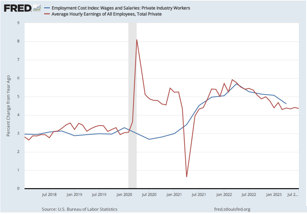
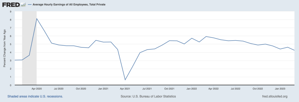
The slowing in employment growth has been matched by slowing wage growth, as measured by the percentage change in average hourly earnings. As the following figure shows, the rate of increase in average hourly earnings has declined from 5.9 percent in March 2022 to 4.2 percent in March 2023. This decline indicates that businesses are experiencing somewhat lower increases in their labor costs, which may pass through to lower increases in prices.

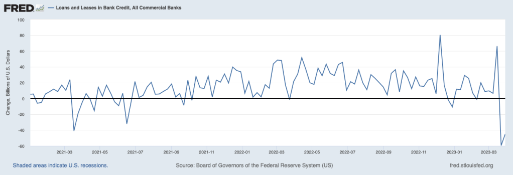
Credit conditions also indicate a slowing economy As the following figure shows, bank lending to businesses and consumers has declined sharply, partly because banks have experienced an outflow of deposits following the failure of Silicon Valley and Signature Banks and partly because some banks have raised their requirements for households and firms to qualify for loans in anticipation of the economy slowing. In a slowing economy, households and firms are more likely to default on loans. To the extent that consumers and businesses also anticipate the possibility of a recession, they may have reduced their demand for loans.

But such a sharp decline in bank lending may also be an indication that the economy is not just slowing, on its way to a making a soft landing, but is on the verge of a recession. The minutes of the March meeting of the Federal Open Market Committee (FOMC) included the information that the FOMC’s staff economists forceast “at the time of the March meeting included a mild recession starting later this year, with a recovery over the subsequent two years.” (The minutes can be found here.) The increased chance of a recession was attributed largely to “banking and financial conditions.”

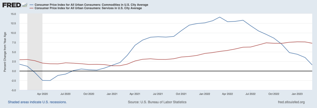
At its next meeting in May, the FOMC will have to decide whether to once more increase its target range for the federal funds rate. The target range is currently 4.75 percent to 5.00 percent. The FOMC will have to decide whether inflation is on a course to fall back to the Fed’s 2 percent target or whether the FOMC needs to further slow the economy by increasing its target range for the federal funds rate. One factor likely to be considered by the FOMC is, as the following figure shows, the sharp difference between the inflation rate in prices of goods (blue line) and the inflation rate in prices of services (red line).

During the period from January 2021 to November 2022, inflation in goods was higher—often much higher—than inflation in services. The high rates of inflation in goods were partly the result of disruptions to supply chains resulting from the Covid-19 pandemic and partly due to a surge in demand for goods as a result of very expansionary fiscal and monetary policies. Since November 2022, inflation in the prices of services has remained high, while inflation in the prices of goods has continued to decline. In March, goods inflation was only 1.6 percent, while services inflation was 7.2 percent. In his press conference following the last FOMC meeting, Fed Chair Jerome Powell stated that as long as services inflation remains high “it would be very premature to declare victory [over inflation] or to think that we’ve really got this.” (The transcript of Powell’s news conference can be found here.) This statement coupled with the latest data on service inflation would seem to indicate that Powell will be in favor of another 0.25 percentage point increase in the federal funds rate target range.

The Fed’s inflation target is stated in terms of the personal consumption expenditure (PCE) price index, not the CPI. The Bureau of Economic Analysis will release the March PCE on April 28, before the next FOMC meeting. If the Fed is as closely divided as it appears to be over whether additional increases in the federal funds rate target range are necessary, the latest PCE data may prove to have a significan effect on their decision.

So—as usual!—the macroeconomic picture is murky. The economy appears to be slowing and inflation seems to be declining but it’s still difficult to determine whether the Fed will be able to bring inflation back to its 2 percent target without causing a recession.

New York Fed Economists Analyze the Decline in the Labor Force Participation Rate

The ability of any economy to produce goods and services depends partly on the number of people working in the economy. The number of people working depends on the size of the population and the fraction of the population that is working. As we discuss in Macroeconomics, Chapter 9, Section 9.1 (Economics, Chapter 19, Section 9.1), the labor force participation rate (LFPR) is the fraction of the working-age population in the labor force. (Technically, the “working-age population” is the civilian, non-institutional population age 16 and older.)

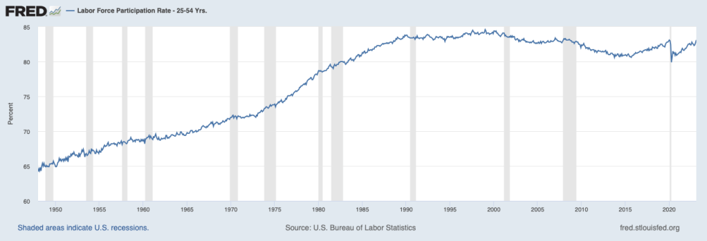
The figure above shows the values of the LFPR from January 1948 through February 2023. The steady increase in the LFPR beginning in the late 1960s and lasting until 2000 was caused by an increase in the number of women working outside of the home and the effects of the baby boom–the increase in birth rates between 1946 and 1964–which led to a decline in the average age of the U.S. population. The LFPR reached a peak of 67.3 percent in early 2000. The gradual decline in the following years reflects the aging of the population as birth rates fell and a small decline in the fraction of prime-age workers–those between ages 25 and 54–in the labor force.

The start of the Covid-19 pandemic in the United States in March 2020 led to an abrupt decline in the LFPR followed by a gradual recovery. In February 2020, the LFPR was 63.3 percent. In February 2023, it was 62.5 percent. The difference means that about 2.1 million fewer people were working in February 2023 than would have been working if the LFPR had regained its February 2020 level.

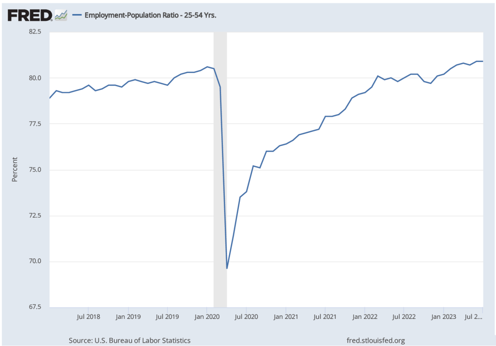
What explains the LFPR not regaining is pre-Covid level? The following figure shows that in February 2023, the LFPR for prime-age workers had reached its February 2020 level. The implication of the figure is that the decline in the LFPR for the whole working-age population is due to a decline in labor force participation by non-prime-age workers.

This conclusion is confirmed by the analys of economists Mary Amiti, Sebastian Heise, Giorgio Topa, and Julia Wu of the Federal Reserve Bank of New York. (Their paper can be found here.) They consider three possible explanations for the decline in the overall LFPR:

  1. The aging of the U.S. population
  2. An increase in fraction of people in different age groups who have retired
  3. An increase in the fraction of the population that is disabled, as result of suffering from “long Covid” or for other reasons

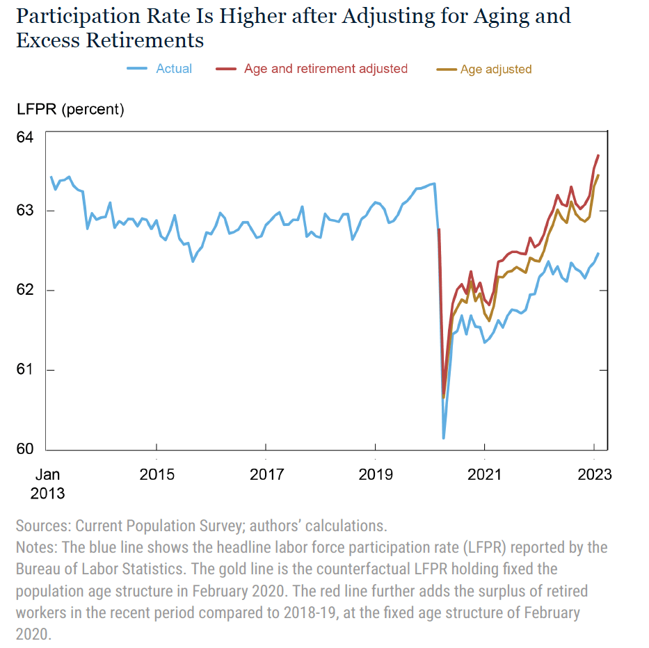
After analyzing the data they find that an increase in retirement rates (explanation 2), particularly for older people, has had only a small effect on LFPR. They find that “Once we adjust for aging, we find that the share of disabled individuals not in the labor force has, in fact, marginally declined.” So explanation 3 is not the key to the decline in the LFPR. They conclude that 1 is the most likely explanation: “Removing the effect of aging can explain the entire participation gap ….” The figure below summarizes their results. The gold line shows that if the United States had the same age structure in February 2023 as it had in February 2020 (that is, if the average age of the working population were lower, with fewer people older than 65), the LFPR would not have declined.


Soft Landing, Hard Landing … or No Landing?

During the recovery from the Covid–19 pandemic, inflation as measured by the personal consumption expenditures (PCE) price index, first rose above the Federal Reserve’s target annual inflation rate of 2 percent in March 2021. Many economists inside and outside of the Fed believed the increase in inflation would be transitory because it was thought to be mainly the result of supply chain problems and an initial burst of spending as business lockdowns were ended or mitigated in most areas.

Accordingly, the Federal Open Market Committee (FOMC) kept its target for the federal funds rate at effectively zero (a range of 0 to 0.25 percent) until March 2022 and continued its quantitative easing (QE) program of buying long-term Treasury bonds and mortgage-backed securities (MBS) until that same month.

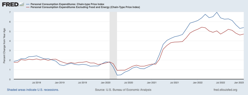
As the following figure shows, by March 2022 inflation had been well above the FOMC’s target for a year. The Fed responded by raising its target for the federal funds rate and switched from QE to quantitative tightening (QT). Although some supply chain problems were still contributing to the high inflation rate during the spring of 2022, the main driver appeared to be very expansionary monetary and fiscal policies. (This blog post from May 2021 has links to contributions to the debate over macro policy at the time. Glenn’s interview that month with the Financial Times can be found here. In November 2022, Glenn argued that overly expansionary fiscal policy was the main driver of inflation in this op-ed in the Financial Times (subscription or registration may be required).We discuss inconsistencies in the Fed’s forecasts of unemployment and inflation here. And in this post we discuss the question of whether the Fed made a mistake in not attempting to preempt inflation before it accelerated.)

Since March 2022, the FOMC has raised its target for the federal funds rate multiple times. In February 2023, the target was a range of 4.50 to 4.75 percent. Longer-term interest rates have also increased. In particular, the average interest rate on residential mortgage loans increased from 3 percent in March 2022 to 7 percent in November 2022, before falling back to around 6 percent in February 2023.  In the fall of 2022, there was optimism among some economists that the Fed had succeeded in slowing the economy enough to put inflation on a path back to its 2 percent target. Although many economists had expected that inflation would only return to the target if the U.S. economy experienced a recession—labeled a hard landing—the probability that inflation could be reduced without a recession—labeled a soft landing—appeared to be increasing. 

Economic data for January 2023 made a soft landing seem less likely. Consumer spending remained above its trend from before the pandemic, employment increases were unexpectedly high, and inflation reversed its downward trend. A continuation of low rates of unemployment and high rates of inflation wasn’t consistent with either a hard landing or a soft landing. Some observers, particularly in Wall Street financial firms, began describing the situation as no landing. But given the Fed’s strong commitment to returning to its 2 percent target, the no landing scenario couldn’t persist indefinitely.

Many investors had anticipated that the FOMC would end its increases in the federal funds target by mid-2023 and would have made one or more cuts to the target by the end of the year, but that outcome now seems unlikely. The FOMC had increased the federal funds target by only 0.25 percent at its February meeting but many economists now expected that it would announce a 0.50 percent increase at its next meeting on March 21 and 22. Unfortunately, the odds of a hard landing seem to be increasing.

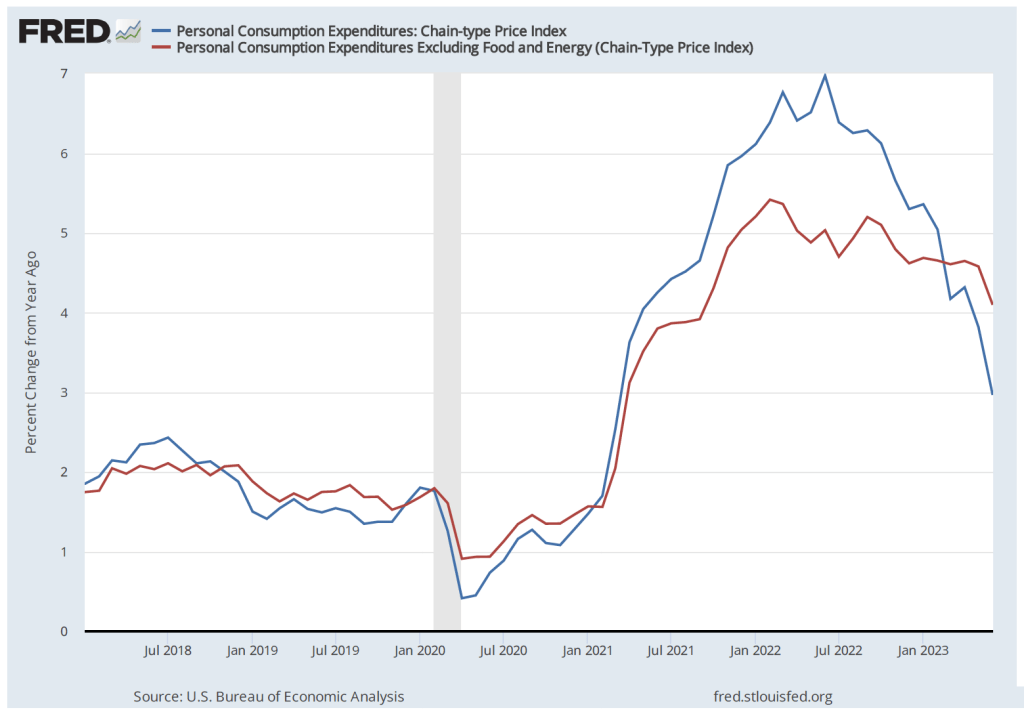
A couple of notes: Although there are multiple ways of measuring inflation, the percentage increase in the PCE is the formal way in which the FOMC determines whether it is hitting its inflation target. To judge what the underlying inflation is—in other words, the inflation rate likely to persist in at least the near future—many economists look at core inflation. In the earlier figure we show movements in core inflation as measured by the PCE excluding prices of food and energy. Note that over the period shown PCE and core PCE follow the same pattern, although core PCE inflation begins to moderate earlier than does core PCE.

Some economists use other adjustments to PCE or to the consumer price index (CPI) in an attempt to better measure underlying inflation. For instance, housing rents and new and used car prices have been particularly volatile since early 2020, so some economists calculate PCE or CPI excluding those prices, as well as food and energy prices. As we discuss in this blog post from last September some economists prefer median CPI as the best measure of underlying inflation. (We discuss some of the alternative ways of measuring inflation in Macroeconomics, Chapter 15, Section 15.5 and Economics, Chapter 25, Section 25.5.) Nearly all these alternative measures of inflation indicated that the moderation in inflation that began in the summer of 2022 had ended in January 2023. So, choosing among measures of underlying inflation wasn’t critical to understanding the current path of inflation. 

Finally, the inflation, employment, and output measures that in January seemed to show that the U.S. economy was still in a strong expansion and that the inflation rate may have ticked up are all seasonally adjusted. Seasonal adjustment factors are applied to the raw (unadjusted) data to account for regular seasonal fluctuations in the series. For instance, unadjusted employment declined in January as measured by both the household and establishment series. Applying the seasonal adjustment factors to the data resulted in the actual decline in employment from December to January turning into an adjusted increase. In other words, employment declined by less than it typically does, so on a seasonally adjusted basis, the Bureau of Labor Statistics reported that it had increased. Seasonal adjustments for the holiday season may be distorted, however, because the 2020–2021 and 2021–2022 holiday seasons occurred during upsurges in Covid. Whether the reported data for January 2023 will be subject to significant revisions when the seasonal adjustments factors are subsequently revised remains to be seen.  The latest BLS employment report, showing seasonally adjusted and not seasonally adjusted data, can be found here.

2/19/23 Podcast – Authors Glenn Hubbard & Tony O’Brien discuss the Fed’s response to economic conditions and their ability to execute a soft-landing.

Join author Glenn Hubbard & Tony O’Brien in their first Sprint 2023 podcast where they revisit inflation as the major topic facing our country, our economy, and our classrooms. Glenn & Tony discuss the Federal Reserve response and the outlook for the economy. While rates have continued to move up, is a soft-landing still possible?

11/17/22 Podcast – Authors Glenn Hubbard & Tony O’Brien discuss inflation, the Fed’s Response, FTX collapse, and also share thoughts on economics themes in holiday movies!

A Handy Way to Track Recession Indicators

The Bureau of Labor Statistics is housed in the U.S. Department of Labor. (Photo from don.gov site.)

In a blog post at the end of August, we noted that real GDP declined during the first two quarters of 2022. On September 29, the Bureau of Economic Analysis (BEA) slightly revised the real GDP data, but after the revisions the BEA’s estimates still showed real GDP declining during those quarters.

A popular definition of a recession is two consecutive quarters of declining real GDP. But, as we noted in the earlier blog post, most economists do not follow this definition. Instead, for most purposes, economists rely on the National Bureau of Economic Research’s business cycle dating, which is based on a number of macroeconomic data series. The NBER defines a recession as “a significant decline in activity spread across the economy, lasting more than a few months, visible in industrial production, employment, real income, and wholesale-retail trade.” The NBER discusses its approach to business cycle dating here.

The Federal Reserve Bank of St. Louis’s invaluable FRED economic data site has collected the data series that the NBER’s Business Cycle Dating Committee relies on when deciding when a recession began. The FRED page collecting these data can be found here. 

Note that although the Business Cycle Dating Committee analyzes a variety of data series, “In recent decades, the two measures we have put the most weight on are real personal income less transfers and nonfarm payroll employment.” The following figures show movements in those two data series. These data series don’t give a strong indication that the economy was in recession during the first half of 2022. Real personal income minus transfer payments did decline by 0.4 percent between January and June 2022 (before increasing during July and August), but nonfarm payroll employment increased by 1.4 percent during the same period (and increased further in July and August).

As we noted in our earlier blog post, the message from most data series other than real GDP seems to be that the U.S. economy was not in a recession during the first half of 2022.

Should the Fed Be Looking at the Median CPI?

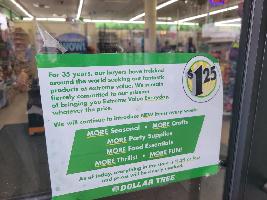
For years, all the products for sale in Dollar Tree stores had a price of $1.00 or less. But as inflation increased, the company had to raise its maxium prices to $1.25. (Thanks to Lena Buonanno for sending us the photo.)

There are multiple ways to measure inflation. Economists and policymakers use different measures of inflation depending on the use they intend to put the measure of inflation to. For example, as we discuss in Macroeconomics, Chapter 9, Section 9.4 (Economics, Chapter 19, Section 19.4), the Bureau of Labor Statistics (BLS) constructs the consumer price index (CPI) as measure of the cost of living of a typical urban household. So the BLS intends the percentage change in the CPI to measure inflation in the cost of living as experienced by the roughly 93 percent of the population that lives in an urban household. (We are referring here to what the BLS labels CPI–U. As we discuss in this blog post, the BLS also compiles a CPI for urban wage earners and clerical workers (or CPI–W).)

As we discuss in an Apply the Concept in Chapter 15, Section 15.5, because the Fed is charged by Congress with ensuring stability in the general price level, the Fed is interested in a broader measure of inflation than the CPI. So its preferred measure of inflation is the personal consumption expenditures (PCE) price index, which the Bureau of Economic Analysis (BEA) issues monthly. The PCE price index is a measure of the price level similar to the GDP deflator, except it includes only the prices of goods and services from the consumption category of GDP. Because the PCE price index includes more goods and services than the CPI, it is suits the Fed’s need for a broader measure of inflation. The Fed uses changes in the PCE to evaluate whether it’s meeting its target of a 2 percent annual inflation rate.

In using either the percentage change in the CPI or the percentage change in the PCE, we are looking at what inflation has been over the previous year. But economists and policymakers are also looking for indications of what inflation may be in the future. Prices of food and energy are particularly volatile, so the BLS issues data on the CPI excluding food and energy prices and the BEA does the same with respect to the PCE. These two measures help avoid the problem that, for example, a period of high gasoline prices might lead the inflation rate to temporarily increase. Note that inflation caclulated by excluding the prices of food and energy is called core inflation.

During the surge in inflation that began in the spring of 2021 and continued into the fall of 2022, some economists noted that supply chain problems and other effects of the pandemic on labor and product markets caused the prices of some goods and services to spike. For example, a shortage of computer chips led to a reduction in the supply of new cars and sharp increases in car prices. As with temporary spikes in prices of energy and food, spikes resulting from supply chain problems and other effects of the pandemic might lead the CPI and PCE—even excluding food and energy prices—to give a misleading measure of the underlying rate of inflation in the economy. 

To correct for this problem, some economists have been more attention to the measure of inflation calculated using the median CPI, which is compiled monthly by economists at the Federal Reserve Bank of Cleveland. The median CPI is calculated by ranking the price changes of every good or service in the index from the largest price change to the smallest price change, and then choosing the price change in the middle. The idea is to eliminate the effect on measured inflation of any short-lived events that cause the prices of some goods and services to be particularly high or particularly low. Economists at the Cleveland Fed have conducted research that shows that, in their words, “the median CPI provides a better signal of the underlying inflation trend than either the all-items CPI or the CPI excluding food and energy. The median CPI is even better at forecasting PCE inflation in the near and longer term than the core PCE price index.”

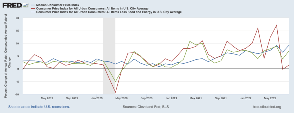
The following figure shows the three measures of inflation using the CPI for each month since January 2019. The red line shows the unadjusted CPI, the green line shows the CPI excluding food and energy prices, and the blue line shows median CPI. To focus on the inflation rate in a particular month, in this figure we calculate inflation as the percentage change in the index at an annual rate. That is, we calculate the annual inflation rate assuming that the inflation rate in that month continued for a year.

Note that for most of the period since early 2021, during which the inflation rate accelerated, median inflation was well below inflation measured by changes in the unadjusted CPI. That difference reflects some of the distortions in measuring inflation arising from the effects of the pandemic.

But the last two values—for July and August 2022—tell a different story. In those months, inflation measured by changes in the CPI excluding food and energy prices or by changes in median CPI were well above inflation measured by changes in the unadjusted CPI.  In August 2022, the unadjusted CPI shows a low rate of inflation—1.4 percent—whereas the CPI excluding food and energy prices shows an inflation rate of 7.0 percent and the median CPI shows an inflation rate of 9.2 percent. 

We should always be cautious when interpreting any economic data for a period as short as two months. But data for inflation measured by the change in median CPI may be sending a signal that the slowdown in inflation that many economists and policymakers had been predicting would occur in the summer of 2022 isn’t actually occurring. We’ll have to await the release of future data to draw a firmer conclusion.

Sources: Michael S. Derby, “Inflation Data Scrambles Fed Rate Outlook Again,” Wall Street Journal, September 14, 2022; Federal Reserve Bank of Cleveland, “Median CPI,” clevelandfed.org; and Federal Reserve Bank of St. Louis.

Podcasts Back for Fall 2022! – 9/9/22 Podcast – Authors Glenn Hubbard & Tony O’Brien discuss inflation, the Fed’s Response, cryptocurrency, and also briefly touch on labor markets.

Solved Problem: How Can Total Employment and the Unemployment Rate Both Increase?

Photo from the New York Times.

Supports: Macroeconomics, Chapter 9, Section 9.1, Economics Chapter 19, Section 19.1, and Essentials of Economics, Chapter 13, Section 13.1.

As it does on the first Friday of each month, on September 2, 2022, the U.S. Bureau of Labor Statistics (BLS) released its “Employment Situation” report for August 2022. According to the household survey data in the report, total employment in the U.S. economy increased in August by 442,000 compared with July. The unemployment rate rose from 3.5 percent in July to 3.7 percent in August. According to the establishment survey, the total number of workers on payrolls increased in August by 315,000 compared with July.

  1. How are the data in the household survey collected? How are the data in the establishment survey collected?
  2. Why are the estimated increases in employment from July to August 2022 in the two surveys different? 
  3. Briefly explain how it is possible for the household survey to report in a given month that both total employment and the unemployment rate increased.

Solving the Problem

Step 1: Review the chapter material. This problem is about how the BLS reports data on employment and unemployment, so you may want to review Chapter 9, Section 9.1, “Measuring the Unemployment Rate, the Labor Force Participation Rate, and the Employment–Population Ratio.” 

Step 2: Answer part a. by explaining how the data from the two surveys are collected. As discussed in Section 9.1, the data in the household survey is from interviews with a sample of 60,000 households, chosen to represent the U.S. population. The data in the establishment survey—sometimes called the payroll survey in media stories—is from a sample of 300,000 establishments (factories, stores, and offices).  

Step 3: Answer part b. by explaining why the estimated increase in employment is different in the two surveys.  First note that the BLS intends the surveys to estimate two different measures of employment. The household survey includes people working at jobs of all types, including people who are self-employed or who are unpaid family workers, whereas the establishment survey includes only people who appear on a non-agricultural firm’s payroll, so the self-employed, farm workers, and unpaid family workers aren’t counted. Second, the data are collected from surveys and so—like all estimates that rely on surveys—will have some measurement error.  That is, the actual increase in employment—either total employment in the household survey or payroll employment in the establishment survey—is likely to be larger or smaller than the reported estimates. The estimates in the establishment survey are revised in later months as the BLS receives additional data on payroll employment. In contrast, the estimates in household survey are ordinarily not revised because they are based only on a survey conducted once per month.  

Step 4: Answer part c. by explaining how in a given month the household survey may report an increase in both employment and the unemployment rate.  The BLS’s estimate of the unemployment is calculated from responses to the household survey. (The establishment survey doesn’t report an estimate of the unemployment rate.) The unemployment rate equals the total number of people unemployed divided by the labor force, multiplied by 100. The labor force equals the sum of the employed and the unemployed. If the number of people employed increases—thereby increasing the denominator in the unemployment rate equation—while the number of people unemployed remains the same or falls, as a matter of arithmetic the unemployment rate will have to fall. 

The BLS reported that the unemployment rate in August 2022 rose even though total employment increased. That outcome is possible only if the number of people who are unemployed also increased, resulting in a proportionally larger increase in the numerator in the unemployment equation relative to the denominator. In fact, the BLS estimated that the number of people unemployed increased by 344,000 from July to August 2022. Employment and unemployment both increasing during a month happens fairly often during an economic expansion as some people who had been out of the labor force—and, therefore, not counted by the BLS as being unemployed—begin to search for work during the month but don’t find jobs.

Source: U.S. Bureau of Labor Statistics, “The Employment Situation—August 2022,” bls.gov, September 2, 2022.