The following was the first sentence of an article yesterday on axios.com discussing the market for beef: “Beef sales are plunging, but processors continue to raise prices as a yearslong cattle shortage strains the industry.”
The sentence seems to be describing a paradox: Why would meat processors, such as Tyson, JBS, and Cargill, raise beef prices if their sales are falling? The key to resolving the apparent paradox is the reference to a “cattle shortage.” The number of cattle raised in the United States has been declining for several reasons, including severe drought in cattle-raising states—which has reduced the pasture that cattle forage on—and a reduction in beef imports from Mexico as the United States Department of Agriculture (USDA) tries to limit the spread of screwworm.
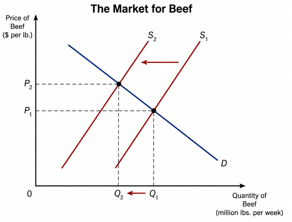
In other words, using the model of demand and supply we develop in Chapter 3 of Microeconomics, the supply curve for beef in the United States has shifted to the left. The result is shown in the following figure:
When the supply curve shifts to the left from S1 to S2, the price of beef rises from P1 to P2 and the equilibrium quantity of beef falls from Q1 to Q2. In other words, when a market experiences a decline in supply, we would expect to observe both higher prices and falling sales. So, the situation described in the first sentence of the article is not a paradox, but instead reflects the normal working of demand and supply in a market. You can explain a lot just by knowing that demand curves slope downward!
The article also observes with respect to Tyson Foods that: “In its most recent quarter, ended June 27, beef volumes declined by 15.9% from a year ago, while prices Tyson charged grocery stores, restaurants and other customers rose 12.1%.” The USDA estimates that the retail price elasticity of demand for beef is about –1. If we assume that no other factors affecting the demand for Tyson’s beef changed during this three-month period, then the price elasticity of demand for Tyson’s beef is –15.9%/12.1% = –1.3. (Note that the USDA elasticity estimates are for beef sold in supermarkets and other retail venues. So the estimates may not directly apply to sales to restaurants and “other customers.”)
We would expect that the price elasticity of demand for Tyson’s beef would be larger (in absolute value) than the price elasticity of demand for beef as a good. As we discuss in Chapter 6 of Microeconomics, if the price of one brand of a good increases, consumers can switch to another brand. In this case, if the price of Tyson’s beef increases, some consumers will switch to Cargill’s or some other firm’s beef. But if the price of beef as a good increases, consumers would have to eat a different protein to avoid the price increase.
This morning (July 2)—one day early because tomorrow is a federal holiday—the Bureau of Labor Statistics (BLS) released its “Employment Situation” report (often called the “jobs report”) for June. The report showed a smaller than expected increase in employment.
The jobs report has two estimates of the change in employment during the month: one estimate from the establishment survey, often referred to as the payroll survey, and one from the household survey. As we discuss in Macroeconomics, Chapter 9, Section 9.1 (Economics, Chapter 19, Section 19.1), many economists and Federal Reserve policymakers believe that employment data from the establishment survey provide a more accurate indicator of the state of the labor market than do the household survey’s employment and unemployment data. (The groups included in the employment estimates from the two surveys are somewhat different, as we discuss in this post.)
According to the establishment survey, there was a net increase of 57,000 nonfarm jobs during June. Economists surveyed by the Wall Street Journal had forecast an increase of 115,000 jobs. Economists surveyed by FactSet had a lower forecast of a net increase of 100,000 jobs. The BLS revised downward its previous estimates of employment in April and May by a combined 74,000 jobs. (The BLS notes that: “Monthly revisions result from additional reports received from businesses and government agencies since the last published estimates and from the recalculation of seasonal factors.”)
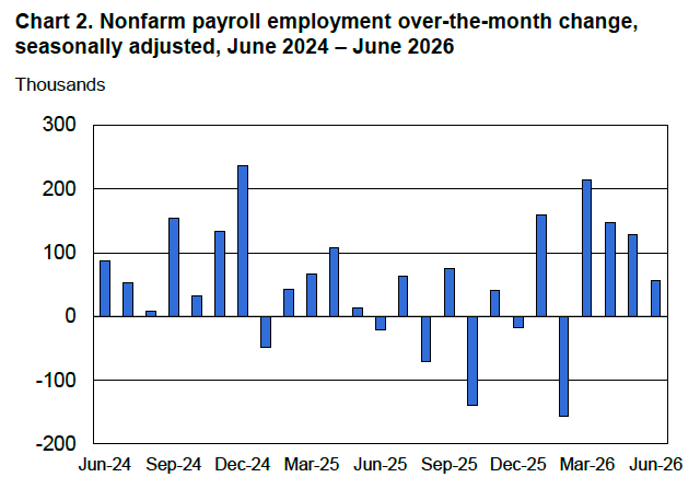
The following figure from the jobs report shows the net change in nonfarm payroll employment for each month in the last two years. The figure shows that the relatively strong 137,000 average net increase in jobs over the past four months represents a break from the unusual pattern in that began in the middle of 2025 in which months of declining employment and months of increasing employment had been alternating.
These employment gains conflict with a popular view among economists that slowing labor force growth has driven the break-even rate of employment growth—the rate required to keep the unemployment rate constant—down to nearly zero
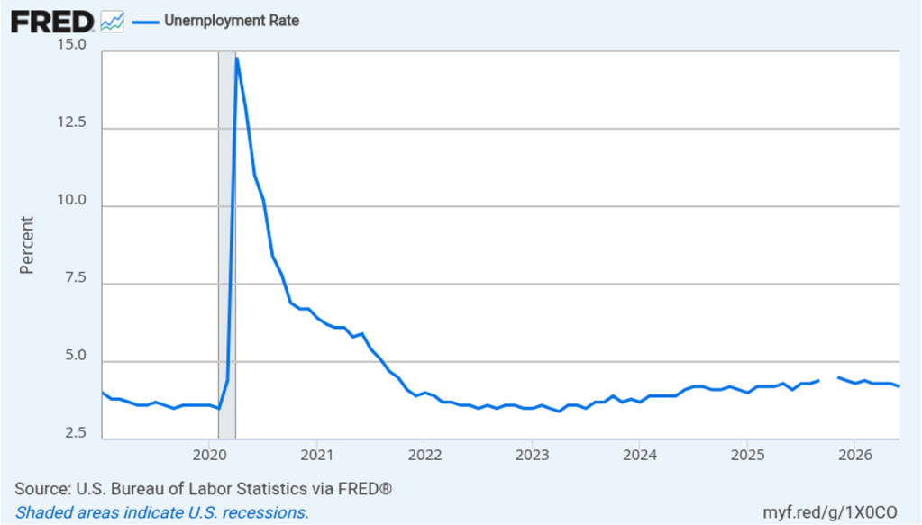
Despite the relatively small increase in employment in June, the unemployment rate, which is calculated from data in the household survey, declined to 4.2 percent from 4.3 percent in May at 4.3. The decline in the unemployment rate was due to a decline in the estimated size of the labor force, an estimate that fluctuates significantly from month to month. Despite that fact, as the following figure shows, the unemployment rate has been remarkably stable over the past year and a half, staying between 4.0 percent and 4.4 percent in each month since May 2024. The Federal Open Market Committee’s current estimate of the natural rate of unemployment—the normal rate of unemployment over the long run—is 4.2 percent. So, currently the unemployment rate is equal to that estimate of the natural rate. (We discuss the natural rate of unemployment in Macroeconomics, Chapter 9 and Economics, Chapter 19.)
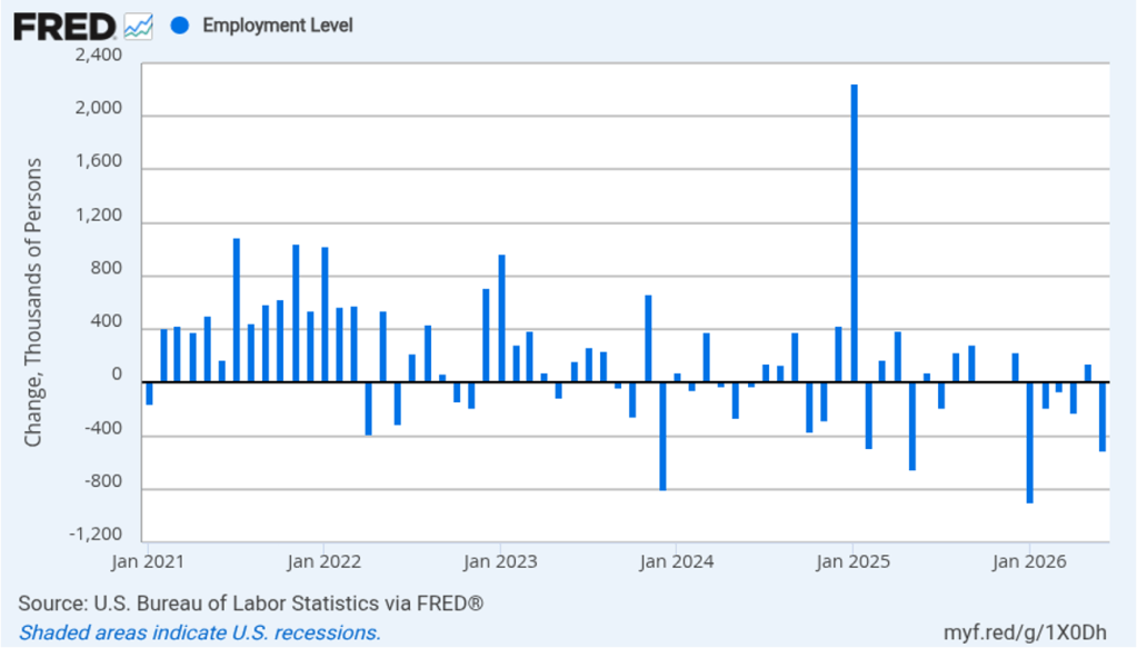
As the following figure shows, the monthly net change in jobs from the household survey moves much more erratically than does the net change in jobs from the establishment survey. As measured by the household survey, there was a net decrease of 507,000 jobs in June, as compared to the net increase in employment shown in the establishment survey. In addition, the household survey shows a significant net decline in jobs during the past six months, in contrast to the significant net increase in jobs shown in the establishment survey. (Note that because of last year’s shutdown of the federal government, there are no data for October or November.)
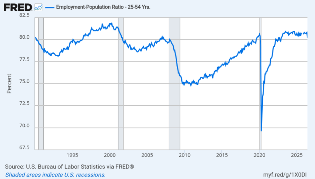
The household survey has another important labor market indicator: the employment-population ratio forprime age workers—those workers aged 25 to 54. In June. the ratio declined sharply to 80.2 percent from 80.8 percent in May, the lowest value since December 2022. The decline in the prime-age population ratio is difficult to reconcile with the net increase in employment shown in the payroll survey. The state of the labor market in June seemed significantly weaker in household survey data than in establishment survey data.
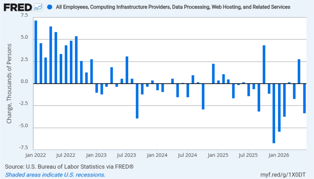
There have been media reports of firms, including Salesforce, Cloudflare, Coinbase, Cisco Systems, and Meta Platforms, laying off workers in information systems. The following figure shows net employment changes in the BLS employment category of “computing infrastructure providers, data processing, web hosting, and related services.” Employment in this sector has been declining during most months since the beginning of 2023. June was no exception with a net decrease of 3,300 jobs.
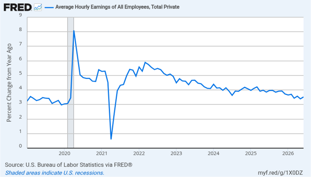
The establishment survey also includes data on average hourly earnings (AHE). As we noted in this post, many economists and policymakers believe the employment cost index (ECI) is a better measure of wage pressures in the economy than is the AHE. The AHE does have the important advantage of being available monthly, whereas the ECI is only available quarterly. The following figure shows the percentage change in the AHE from the same month in the previous year. The AHE increased 3.5 percent in June, up slightly from 3.4 percent in May.
What effect is this jobs report likely to have on the decisions of the Federal Reserve’s policymaking Federal Open Market Committee (FOMC) at its next meeting on July 28–19? The slowdown in employment growth reduces the chance that the FOMC will increase its target range for the federal funds rate. The probability that investors in the federal funds futures market assign to the FOMC increasing its target range at that meeting fell from 28.9 percent yesterday to 17.6 percent this morning. Investors still assign a 54.0 percent probability to the FOMC raising its target range at its September meeting, but that was down from 64.1 percent yesterday.
Supports: Microeconomics and Economics, Chapter 6, Section 6.3, and Essentialsof Economics, Chapter 7, Section 7.7.
Image created by ChatGPT
An article in the Wall Street Journal on June 25, noted that after Apple increased the prices of iPads and MacBooks, the price of its stock declined by 6.1 percent. That decline meant that the total value of Apple’s stock—its market cap—fell by $215 billion dollars that day. Investors were expecting that Apple would likely also increase the prices of iPhones. As we discuss in Microeconomics, Chapter 8 (Macroeconomics and Essentials of Economics, Chapter 6), the price of a firm’s stock reflects investors forecasts of the future profitability of the firm. Why would Apple increasing the prices of its products cause investors to believe that Apple’s profit would decline? Shouldn’t Apple become more profitable after increasing its prices?
Solving the Problem Step 1: Review the chapter material. This problem is about the effect on a firm’s profit of increasing the price of its product, so you may want to review Chapter 6, Section 6.3, “The Relationship between Price Elasticity of Demand and Total Revenue.”
Step 2: Answer the question by explaining under what circumstances a firm may reduce its profit by raising prices. It might make sense to think that any time a firm raises its price, it will increase its profit. But recall that because demand curves slope downward, an increase in price always results in a decrease in the quantity of the good sold. If the firm’s demand curve is elastic at the current price level, raising the price will decrease the firm’s revenue because the quantity sold will fall by proportionally more than the price increases. In this case, investors appear to have assumed that the revenue Apple would lose as a result of raising prices would be greater than the additional revenue it would earn on the quantities it would sell at the higher prices. Revenue isn’t the same as profit because Apple’s total cost will decrease as it sells a smaller quantity. Because the price of Apple’s stock declined substantially on the day the firm announced the price increases, investors must be expecting that the net effect of the price increases would be to reduce Apple’s profit.
People have collected sports cards for decades. For many years, the most sought-after and highest-priced example was a baseball card featuring Pittsburgh Pirates shortstop Honus Wagner. In the early twentieth century, baseball cards were often included in packs of cigarettes. In 1909, each pack of Sweet Caporal Cigarettes included a baseball card from what collectors call the T206 set. Although Wagner was a major star, relatively few of his cards were issued. That may have been because he was opposed to tobacco use and didn’t want his card to help sell cigarettes or because the tobacco company declined to pay him the fee he required.
There are probably only 50 to 60 Wagner cards in existence. In August 2022, the Wagner card shown below sold at auction for $7.25 million, which was at the time a record.
Image from goldin.co
This record was broken a few days later when the Topps rookie card for New York Yankees outfielder Mickey Mantle sold for $12.6 million.
Image from ha.com
A new record as the highest-priced sports card was set in August 2025, when a card featuring basketball stars Michael Jordan and Kobe Bryant sold for $12.932 million.
Image from ha.com
In recent years, collecting cards from trading card games (TCG) such as Magic: The Gathering, Yu-Gi-Oh!, and, especially, Pokémon has become increasingly popular. Collectors pay higher prices for cards that are in nicer condition. Accordingly, many collectors and dealers submit cards to grading companies that assign the cards a numerical grade, with 10 being the highest grade. The leading card grading company is Professional Sports Authenticator (PSA). Despite its name, PSA now grades more TCG cards than sports card. In 2025, PSA graded 11.5 million TCG cards and 7.7 million sports cards.
In February of this year, a rare PSA-graded 1998 Japanese Pikachu Illustrator Pokémon card with a perfect grade of 10 sold for $16.492 million.
Image from goldin.co
The increasing popularity of collecting TCG cards and the publicity from media reports of the high sales prices of some cards has led to a surge in submissions to card grading companies. PSA is the largest card grading company, grading nearly four times as many cards as its closest competitor. Card grading fees increase with the market value of the card being graded. PSA charges significantly higher prices than its competitors. Collectors are apparently willing to pay the higher prices because PSA-graded cards often sell for higher prices than do cards graded by competitors.
On May 28, PSA surprised many card collectors by announcing that its backlog of cards collectors had submitted but that the company had not yet graded had reached 10 million. As a result, the company stated it was no longer accepting new submissions of lower priced cards. (Cards submitted to its Value Bulk, Value, Value Plus, and Value Max tiers.) The company described the policy as a “temporary pause” that would remain in place until its backlog of ungraded cards had declined to 5 million. PSA estimated that it would take four months to reach that target.
Why did PSA allow its backlog of ungraded cards to grow to 10 million? The backlog is an indication that at the prices it was charging, the quantity of its grading services demanded was much greater than the quantity of grading services it could supply with its existing workforce and grading equipment. Why, then, didn’t it raise its prices to reduce the quantity of its grading services demanded?
In Microeconomics, Chapter 10, Section 10.3, we describe several examples of firms being a situation similar to the one PSA finds itself in. In these situations, firms choose not to raise their prices even though doing so would seem to increase their profits. As we discuss in that chapter, the key reason firms don’t raise prices is they believe their customers might see the price increases as being unfair.
We thought it would be interesting to ask ChatGPT to analyze why PSA didn’t raise its prices when faced with a rapidly expanding backlog of ungraded cards. Here’s ChatGPT’s—lengthy!—answer to this economic puzzle:
Image generated by ChatGPT
They probably could have raised price enough to slow submissions, but that would not have solved the whole problem PSA was trying to solve. In the current 2026 pause, PSA said Value Bulk, Value, Value Plus, and Value Max submissions were being paused because a surge added 1.6 million cards and pushed the active backlog toward 10 million; PSA’s stated goal is to reduce that backlog to 5 million before reopening those tiers. In other words, the target was not “new submissions = grading capacity.” The target was new submissions well below capacity so the existing queue could shrink.
The clean economic answer is:
1. A market-clearing price would only stop the backlog from getting worse. Suppose PSA can grade 90,000 cards per day, a capacity figure PSA itself recently gave for global output. If they priced submissions so exactly 90,000 new cards arrived per day, the backlog would not fall; it would stay stuck. To reduce a 10-million-card backlog to 5 million, they need throughput to exceed incoming volume by millions of cards over the pause period. That means they needed rationing that was stronger than ordinary price clearing.
2. They actually did use price rationing, just in a blunt tiered way. PSA did not close everything. It paused the lower-priced value tiers and left Regular, Express, Super Express, Walk-Through, and premium services open. PSA’s own pricing page shows Regular at $79.99/card, Express at $149/card, Super Express at $349/card, Walk-Through at $599/card, and premium tiers much higher. Baseball America summarized the effect as PSA temporarily pausing all card grading tiers under $80. So one way to read the move is: PSA effectively raised the minimum direct price for new card grading to the Regular tier, while refusing to call the paused Value tiers “available at a surge price.”
3. The demand curve was probably unstable and hard to estimate. A normal market-clearing price assumes the firm can predict how many units will arrive at each price. PSA’s demand was not behaving smoothly. In 2021, after a price increase, PSA still reported receiving more cards in three days than it had received in the prior three months. In 2026, PSA said updated turnaround/service announcements were followed by another rapid demand spike. In that environment, “raise the price until volume equals capacity” is not simple, because each price change can trigger a rush, panic submissions, dealer behavior, and speculation.
4. A huge price increase would damage the brand more than a pause. If PSA had said, “Value Bulk is still open, but now it costs $80, $120, or $200 per card,” many collectors would view that as gouging, especially because value-tier grading is used for lower-value cards. A pause lets PSA say, “we are protecting turnaround times and existing customers,” rather than “we are monetizing a bottleneck.” PSA explicitly framed the 2026 pause as a way to avoid compromising existing orders and to focus on cards already in its care.
5. Grading quality is part of the product. PSA is not just selling a slot in a queue; it is selling trust in the grade. If a backlog forces rushed hiring, rushed training, overloaded receiving, or inconsistent review, the long-term asset — confidence in PSA 10, PSA 9, etc. — can be worth more than the short-term revenue from accepting every card at a higher price. PSA’s own statement tied the pause to protecting the “integrity of the PSA standard.”
6. A pause is easier to reverse than a surge-price regime. A temporary stop says: “These tiers are closed until backlog conditions improve.” A giant price hike creates other problems: customers anchor to the new price, dealers renegotiate, memberships lose value, submitters complain when prices later fall, and competitors can market PSA as exploitative. PSA instead extended Collectors Club memberships during the pause, which suggests they were trying to preserve customer goodwill while reducing intake.
So the best answer is: because the bottleneck was a stock problem, not just a flow problem. Raising prices enough to make new submissions equal daily capacity would still leave the backlog in place. To drain the backlog, PSA needed submissions below capacity; pausing the cheapest/highest-volume tiers achieved that more predictably, while keeping high-value urgent tiers open and avoiding the optics of extreme surge pricing.
The period between the two World Wars—the 1920s and 1930s—is often called the Golden Age of Mystery Novels. Authors such as Agatha Christie and Dorothy Sayers in the United Kingdom, and Ellery Queen (pen name of cousins Frederic Dannay and Manfred B. Lee) and Mary Roberts Rinehart in the United States, topped the bestseller lists and are still read today.
One of the attractions of mystery stories from this period is the, often accidental, insights they give into life during those times. Some customs differ sharply from those of today. For instance, absolutely everyone—man or woman—both smokes and drinks alcohol. Racial attitudes were far from enlightened. For a particularly shocking example, search online for the original title of the Agatha Christie novel now published as And Then There Were None. Attitudes toward women were at least somewhat less problematic in part because some of the most widely read mystery writers were women.
But in some respects, the attitudes of characters in these novels could be surprisingly contemporary. British writer Freeman Wills Crofts wrote a series of mysteries featuring the Scotland Yard Chief Inspector Joseph French. The following appears in Crofts’s novel Fatal Venture, first published in 1939:
“Generally speaking, the deceased was not popular. … He was also a keen and successful businessman, and, as the Chief Inspector knew, one man’s gain meant another man’s loss and there must have been many financial casualties who had no cause to love him.”
As a side note, if you had to be a character in a Golden Age mystery, you absolutely didn’t want to be an unpleasant, older, wealthy man. The half-life of such characters was generally measured in hours. In this case, John Stott—the person Inspector French is referring to—is the wealthy victim whose murder French has to solve.
Image of the novel from Amazon.com
Inspector French’s view that “one man’s gain meant another man’s loss” echoes recent arguments that rich businesspeople don’t deserve the wealth their success brings. This view runs counter to the fundamental economic idea that if a transaction is freely entered into, the transaction must benefit both parties. Otherwise, why would the party who is made worse off have agreed to the transaction?
Even in the case where there is an imbalance in economic power—for instance, when a consumer is buying a product from a monopolist—the purchase must have made the buyer better off, or he or she wouldn’t have made it. In this case, though, we can argue that, by forming monopolies, sellers make themselves better off at the expense of consumers. In the United States, the antitrust laws are intended to deal with that situation by making illegal mergers and other business practices that make consumers worse off.
In general, though, entrepreneurs, by starting new businesses or introducing new products, make consumers better off even if the entrepreneurs become very wealthy. In a famous academic paper, Nobel laureate William Nordhaus of Yale University, estimated the “fraction of the benefits from new technologies that have been captured by innovators … as compared to the fraction that have been passed on in lower prices.” He found that innovators captured only 2.2 percent of the social returns to innovation. The remainder of the returns represent consumer surplus. (We discuss the role of entrepreneurs in a market system in Microeconomics, Chapter 2, Section 2.3. We discuss the concept of consumer surplus in Chapter 4.)
In an opinion column on bloomberg.com, Michael Strain of the American Enterprise Institute noted that “a back-of-the-envelope calculation [applying] Nordhaus’s result to Bezos suggests he has created $5.4 trillion in value for the rest of society.” As Strain’s reference to this calculation as being “back-of-the-envelope” indicates, it’s not clear that Nordhaus’s analysis, which is based on data for the U.S. nonfarm business sector, can be applied to the contribution of a single entrepreneur like Bezos. But most economists would agree with the general point that entrepreneurs generate benefits to consumers that are far greater than the return the entrepreneurs receive for their contributions—even if the entrepreneurs end up earning billions.
Inspector French solved the mystery of John Stott’s murder, proving himself to have been an excellent detective even if he wasn’t a very good economist.
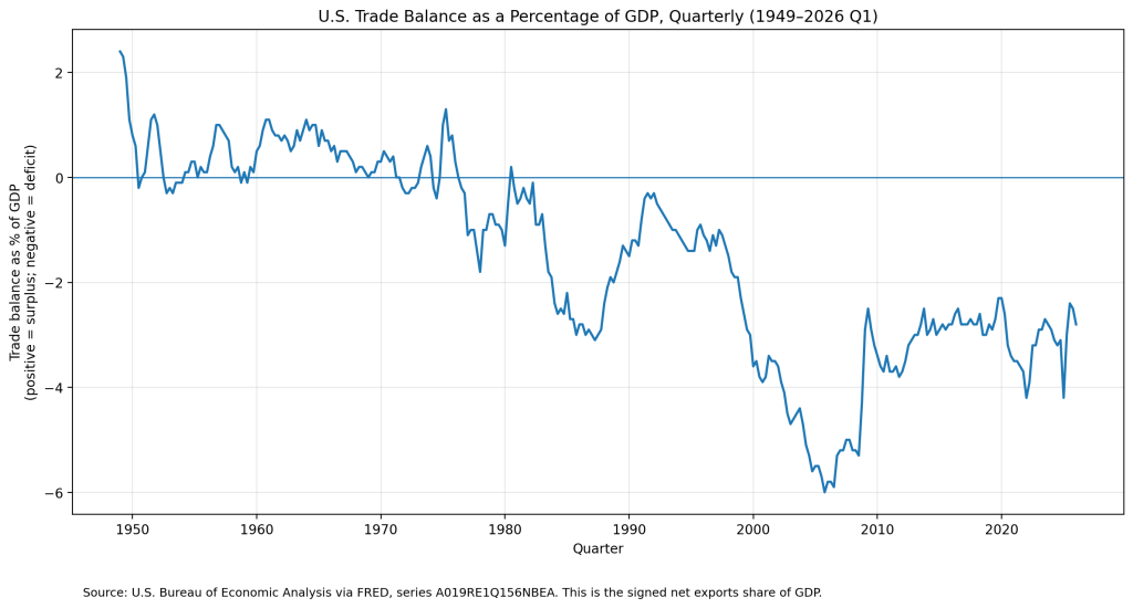
The United States hasn’t exported more goods and services than its imported since 1975. The following figure shows the U.S. trade deficits since 1949 as a percentage of GDP. (In this figure, we’re measuring the trade balance as net exports rather than the trade balance as reported in the balance of payment accounts. The two measures are highly correlated.)
As we discuss in Macroeconomics, Chapter 18 (Economics, Chapter 28), a trade deficit is driven by the relationship between a country’s national saving and domestic investment rather than by the competitiveness of a country’s exports or by the trade agreements a country has with its trading partners.
Clearly, though, many politicians see a trade deficit as a problem. Some politicians have argued that the U.S. trade deficit would shrink if more of the manufactured goods Americans consume were produced in the United States. Would it be possible, for example, to produce more consumer electronics in the United States? A few months ago, Apple stopped assembling units of the Mac Pro, its high-end, professional workstation computer, at a facility in Austin, Texas. More recently, Apple announced that it would begin assembling its Mac Mini, a compact desktop computer that lacks a keyboard and a monitor, in a new factory in Houston. These examples indicate that Apple can produce electronic products in the United States. But the number of Mac Pros or Mac Minis Apple sells each year is very small compared with the estimated 248 million iPhones it sold in 2025.
In March, Apple introduced the MacBook Neo. At a price of $599 ($499 if you are a college student or faculty member), the Neo is Apple’s first entry into the low-priced laptop market that had been dominated by the Google Chromebook. By the end of April, sales were running far above Apple’s initial forecasts and the firm was planning to double production of the Neo from 5 million units to 10 million—all of which would be assembled in China or Vietnam.
Why doesn’t Apple assemble the Neo in the United States? There are several reasons, but the most important is that the Neo is Apple’s first entry into the low-priced laptop market that is now dominated by Google’s Chromebook—all of which are assembled overseas. Apple is able to price the Neo at $599 only if it keeps its production costs very low. Workers who assemble electronic products like laptops require substantial training. Firms such as Foxconn and Quanta Computer have been assembling electronic products for many years in countries such as China and Vietnam. As a result, these countries have large numbers of workers experienced in assembling electronic products. U.S.-based firms have many fewer workers with this experience.
Assembly lines for electronic products need to be flexible to respond quickly when firms introduce new models like the Neo. So, in addition to hiring hundreds of thousands of workers to work on assembly lines, Foxconn, Quanta, and other firms operating in China, India, and Vietnam hire thousands of engineers. Typically, these engineers do not have college degrees, but they have sufficient training to rapidly redesign and reconfigure assembly lines to produce new models. In 2010, when President Barack Obama pressed Steve Jobs, the late Apple CEO, to produce iPhones in the United States, Jobs stated that he would need 30,000 such engineers if Apple were to make iPhones in the United States, but “you can’t find that many in America to hire.”
In addition, wages are much higher in the United States than in China or Vietnam. Workers assembling electronic products in China earn about $6 per hour. Workers doing the same jobs in Vietnam earn only about $2 per hour. In the United States, according to the Bureau of Labor Statistics, in April 2026, production workers in computer and electronic product manufacturing were earning $39.32 per hour.
The factories that assemble Apple products in Asia typically have many suppliers located near them—a so-called supplier ecosystem. Some suppliers make components of the products—although other components are produced outside of Asia, including in the United States—as well as providing repair, maintenance, and other services to the factories. The lack of such a supplier ecosystem would make assembling Neos in the United States very difficult. According to an article in the New York Times, when Apple started producing the Mac Pro in Austin, Texas, it had trouble finding a local firm to produce the custom screws needed in assembling the computers. According to the article, “In China, Apple relied on factories that can produce vast quantities of custom screws on short notice. In Texas, … [Apple had to rely on a] 20-employee machine shop that … could produce at most 1,000 screws a day.”
Production of some electronic goods—notably computer chips—has been expanding in the United States. In 2022, Congress passed the Creating Helpful Incentives to Produce Semiconductors (CHIPS) and Science Act. The Act authorized the federal government to pay subsidies to help firms increase chip production in the United States. Intel, TSMC, Samsung, and Micron have all constructed new chip factories in the United States. As we mentioned earlier, Apple intends to assemble its Mac Mini in a new factory in Houston.
But the United States lacks a comparative advantage in the assembly of high-volume electronic products like the iPhone or MacBook Neo. So it’s unlikely that the expansion of U.S. chip production will be followed by a similar expansion in the assembly of smartphones and computers.
What happens when the Fed chair’s seat is about to change hands—and inflation still won’t behave? In this episode of the Hubbard & O’Brien Economics Podcast, Tony O’Brien and Glenn Hubbard break down the looming transition from Jerome Powell to Kevin Warsh, what the latest inflation and energy-price pressures mean for interest rates, and why navigating the FOMC could be Warsh’s toughest test yet. They also unpack the Fed’s massive balance sheet, the regulatory constraints around shrinking it, and a surprising new risk on the horizon: AI-driven security threats that could expose vulnerabilities across the financial system. If you want a clear, candid take on where monetary policy may be headed next, this is the listen.
Recently, Rustam Jamilov of the University of Oxford posted the following figure to X, noting that: “A new paper shows that the release of Pirates of the Caribbean was associated with a 38% decline in real-world piracy incidents. The lives saved by Disney are staggering.”
A recent article in the New York Times had the headline “Get a Dog, Live Longer.” The article stated that: “Research dating back decades has found that people who own pets, especially dogs, tend to be healthier than people who don’t.” A “large review of studies published in 2019 found that owning a dog was associated with a 24 percent lower risk of dying from all causes over the course of 10 years.”
An article in the Washington Post had the headline “Drink Coffee to Prevent Dementia? It’s Not So Far-Fetched.” The article reports on a study in which “The researchers analyzed data from more than 131,000 people over multiple decades.” The key finding of the study was that “Those who regularly drank caffeinated coffee had an 18 percent lower risk [of developing dementia] compared to people who drank little or none. Regular coffee drinkers also performed better on some cognitive tests and were less likely to report mental decline.”
All three of these cases involve observational studies, rather than experiments. In experiments, researchers assign some randomly selected people to a treatment group and other people to a control group. If you wanted to test the effect of having a dog on a person’s health, you could give a dog to a randomly selected group of people—the treatment group—and assign another randomly selected group of people to remain without a dog—the control group. Then you would follow both groups for a period of years and see if there was any difference in health outcomes between the people with a dog and those without a dog.
As this example indicates, experiments can be an impractical way to test a hypothesis. So instead, researchers often follow a group of people over time and then look for correlations between their activities—having a dog or drinking coffee, for example—and their life outcomes: Are people who engage in these activities healthier, happier, more likely to be married, have higher incomes, and so on. Observational studies can generate correlations between two variables, but it’s not clear if they establish causation—does owning a dog cause you to be healthier.
Some correlations are obvious nonsense. Rustam Jamilov is joking when he pretends that, because a decline in piracy in the real world followed the release of the first Pirates of the Caribbean movie, releasing the movie reduced piracy. In Chapter 6 of Money, Banking, and the Financial System we discuss the nonsense correlation discovered by Leonard Koppett when he noticed that—for a period of 11 years—which conference the winner of the National Football League’s Super Bowl was from was correlated with the performance of the stock market in the following year.
The claims that owning a dog or drinking coffee might improve your health seem more plausible because you can think of reasonable causal mechanisms. For instance, if you own a dog you might be more likely to take long walks, which may improve your health. And there may be some attribute of caffeine that makes coffee drinkers less likely to suffer from dementia.
The problem is that because people in an observational study aren’t randomly assigned to engage in the activity being studied—owning a dog or drinking coffee—we can’t be sure if people engaging in these activities differ systematically from those who don’t. As the article on the health benefits of dogs points out: “Dog owners tend to be younger and richer than non-owners, characteristics that correspond with better health.” Observational studies generally fail to control for these confounding factors, making it more difficult to determine if the correlations they find are causal.
Image created by ChatGPT
A famous example of concluding that a correlation was causal when it likely wasn’t comes from the Nurses’ Health Study (NHS), which followed more than 30,000 postmenopausal nurses beginning in 1976. The nurses who used hormone therapies were more than 40 percent less likely to develop coronary heart disease. This correlation was believed to be causal, which resulted in many more postmenopausal women being proscribed hormone therapies.
This conclusion was reversed by the Women’s Health Initiative (WHI), which was conducted in the 1990s and randomly assigned women to receive hormone therapy or a placebo. The women receiving the hormone therapy turned out to be more likely to experience coronary problems. Part of the explanation appears to be that the nurses in the NHS who used the hormone therapy were already healthier in some respects, such as having lower weight and lower blood pressure, than the nurses who did not use the hormone therapy. (Note: The findings in this area complex and are still being debated, so don’t take our brief summary as a definitive account!)
Image created by ChatGTP
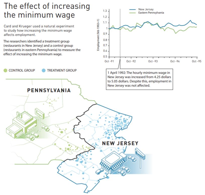
In recent years, economists have often used natural experiments to attempt to identify causal results from observational studies. With a natural experiment, economists identify some variable of interest—say, an increase in the minimum wage—that has changed for one group of people—say, fast-food workers in one state—while remaining unchanged for another similar group of people—say, fast-food workers in a neighboring state. Researchers can draw an inference about the effects of the change by looking at the difference between the outcomes for the two groups. In this example, the difference between changes in employment at fast-food restaurants in the two states can be used to measure the effect of an increase in the minimum wage.
In a famous study of the effect of the minimum wage on employment in the fast food industry published in 1994 in the American Economic Review, David Card of the University of California, Berkeley and the late Alan Krueger of Princeton University pioneered the use of natural experiments. In that study, Card and Krueger analyzed the effect of the minimum wage on employment in fast-food restaurants by comparing what happened to employment in New Jersey when it raised the state minimum wage from $4.25 to $5.05 per hour with employment in eastern Pennsylvania where the minimum wage remained unchanged. They found that, contrary to the usual analysis that increases in the minimum wage lead to decreases in the employment of unskilled workers, employment of fast-food workers in New Jersey actually increased relative to employment of fast-food workers in Pennsylvania. Card shared the 2021 Nobel Prize in Economics with Joshua Angrist of the Massachusetts Institute of Technology; and Guido Imbens of Stanford University in part for his work using natural experiments.
The following graphic from Nobel Prize website summarizes the study. (Note that not all economists have accepted the results of Card and Krueger’s study. We briefly summarize the debate over the effects of the minimum wage in Microeconomics and Economics, Chapter 4, Section 4.3.)
So, attempting to draw causal inferences from observational studies is hard. Having a dog or drinking coffee may not actually improve your health.
Join authors Glenn Hubbard and Tony O’Brien as they discuss how core economic principles illuminate two of the most pressing policy debates facing the economy today: tariffs and artificial intelligence. Drawing on a recent Supreme Court decision striking down broad tariff increases, Hubbard and O’Brien explain why economists view tariffs as taxes, who ultimately bears their burden, and how trade policy uncertainty shapes business decisions, inflation, and economic growth—bringing textbook concepts like tax incidence, intermediate goods, and GDP measurement vividly to life. The conversation then turns to AI, where they cut through market hype and dire predictions to place generative AI in historical context as a general‑purpose technology, comparing it to past innovations that transformed jobs without eliminating work. Along the way, they explore how AI can both substitute for and complement labor, why fears of mass unemployment are likely overstated, and what economists can—and cannot yet—say about AI’s long‑run effects on productivity, profits, and the labor market.