Supports: Macroeconomics, Chapter 18, Economics, Chapter 28, and Essentials of Economics, Chapter 19.
In a recent post, economics blogger Noah Smith discussed the effects on the Japanese economy of a “weaker yen”: “A weaker yen is making Japanese people feel suddenly poorer ….” But “let’s remember that a ‘weaker’ exchange rate isn’t always a bad thing.”
- When the yen becomes weaker, does one yen exchange for more or fewer U.S. dollars?
- Why might a weaker yen make Japanese people feel poorer?
- Are there any ways that a weaker yen might help the Japanese economy? Briefly explain.
- Considering your answers to parts b. and c., can you determine whether a weak yen is good or bad for the Japanese economy? Briefly explain.
Solving the Problem
Step 1: Review the chapter material. This problem is about the effect of changes in a country’s exchange rate on the country’s economy, so you may want to review Macroeconomics, Chapter 18, Section 18.2, “The Foreign Exchange Market and Exchange Rates,” (Economics, Chapter 28, Section 18.2, and Essentials of Economics, Chapter 19, Section 19.6.
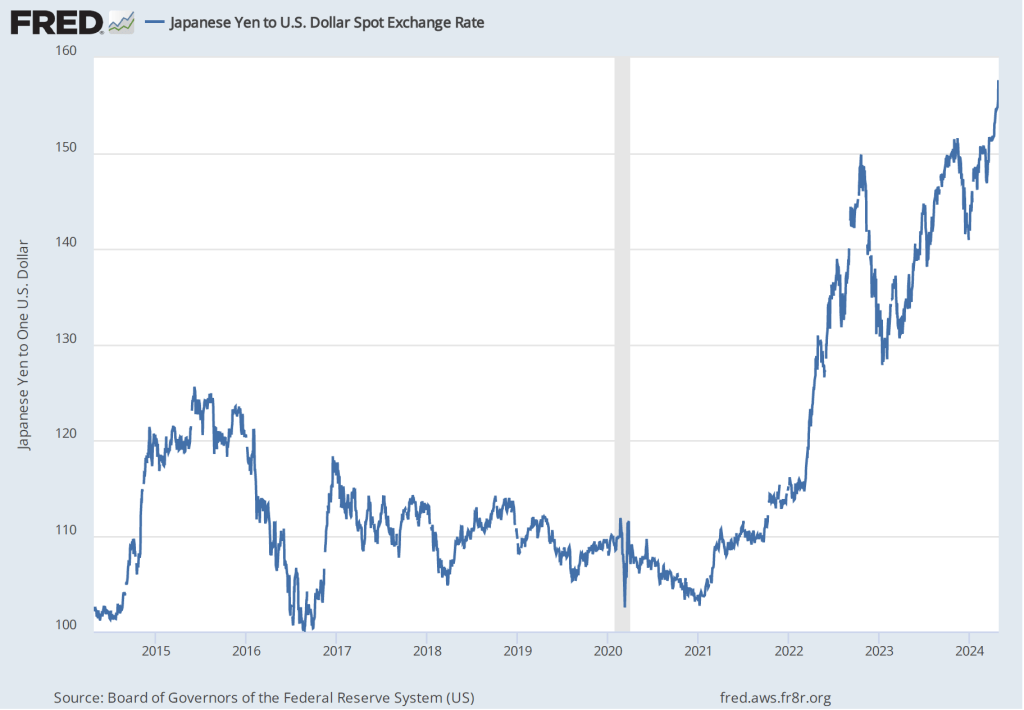
Step 2: Answer part a. by explaining what a “weaker” yen means. A weaker yen will exchange for fewer U.S. dollars (or other currencies), or, equivalently, more yen will be required in exchange for a U.S. dollar. (This situation is illustrated in the figure at the top of this post, which shows the substantial weakening of yen against the dollar in the period since the end of the 2020 recession.)
Step 3: Answer part b. by explaining why a weaker yen might make people in Japan feel poorer. A weaker yen raises the yen price of imported goods. For example at an exchange rate of ¥100 = $1, a $1 Hershey candy bar imported from the United States will sell in Japan for ¥100. But if the yen becomes weaker and the exchange rate moves to ¥120 = $1, then the imported candy bar will have increased in price to ¥120. (Note that this discussion is simplified because a change in the exchange rate won’t necessarily be fully passed through to the prices of imported goods, particularly in the short run. But we would still expect that a weaker yen will result in higher yen prices of imports.) A weaker yen will require people in Japan to pay more for imports, leaving them with less to spend on other goods. Because they will be able to consume less, people in Japan will feel poorer. (As we note in Section 18.3, many goods traded internally are priced in U.S. dollars—oil being an important example. Because Japan imports nearly all of its oil and more than half of its food, a decline in the value of the yen in exchange for the dollar will increase the yen price of key consumer goods.)
Step 4: Answer part c. by explaining how a weaker yen might help the Japanese economy. A weaker yen increases the yen price of Japanese imports but it also decreases the foreign currency price of Japanese exports. This effect would be the main way in which a weaker yen might help the Japanese economy but we can also note that Japanese businesses that compete with foreign imports will also be helped by the increase in import prices.
Step 5: Answer part d. by explaining that a weaker yen isn’t all bad or all good for the Japanese economy. As the answers to parts b. and c. indicate, a weaker yen creates both winners and losers in the Japanese economy. Japanese consumers lose as a result of a weaker yen but Japanese firms that export or that compete against foreign imports will be helped.