The Roman Emperor Vespasian Fell Prey to the Lump-of-Labor Fallacy

Bust of the Roman Emperor Vespasian. (Photo from en.wikipedia.org.)

Some people worry that advances in artificial intelligence (AI), particularly the development of chatbots will permanently reduce the number of jobs available in the United States. Technological change is often disruptive, eliminating jobs and sometimes whole industries, but it also creates new industries and new jobs. For example, the development of mass-produced, low-priced automobiles in the early 1900s wiped out many jobs dependent on horse-drawn transportation, including wagon building and blacksmithing. But automobiles created many new jobs not only on automobile assembly lines, but in related industries, including repair shops and gas stations.

Over the long run, total employment in the United States has increased steadily with population growth, indicating that technological change doesn’t decrease the total amount of jobs available. As we discuss in Microeconomics, Chapter 16 (also Economics, Chapter 16), fears that firms will permanently reduce their demand for labor as they increase their use of the capital that embodies technological breakthroughs, date back at least to the late 1700s in England, when textile workers known as Luddites—after their leader Ned Ludd—smashed machinery in an attempt to save their jobs. Since that time, the term Luddite has described people who oppose firms increasing their use of machinery and other capital because they fear the increases will result in permanent job losses.

Economists believe that these fears often stem from the lump-of-labor fallacy, which holds that there is only a fixed amount of work to be performed in the economy. So the more work that machines perform, the less work that will be available for people to perform. As we’ve noted, though, machines are substitutes for labor in some uses—such as when chatbot software replace employees who currently write technical manuals or computer code—they are also complements to labor in other jobs—such as advising firms on how best to use chatbots. 

The lump-of-labor fallacy has a long history, probably because it seems like common sense to many people who see the existing jobs that a new technology destroys, without always being aware of the new jobs that the technology creates. There are historical examples of the lump-of-labor fallacy that predate even the original Luddites.

For instance, in his new book Pax: War and Peace in Rome’s Golden Age, the British historian Tom Holland (not to be confused with the actor of the same name, best known for portraying Spider-Man!), discusses an account by the ancient historian Suetonius of an event during the reign of Vespasian who was Roman emperor from 79 A.D. to 89 A.D. (p. 201):

“An engineer, so it was claimed, had invented a device that would enable columns to be transported to the summit of the [Roman] Capitol at minimal cost; but Vespasian, although intrigued by the invention, refused to employ it. His explanation was a telling one. ‘I have a duty to keep the masses fed.’”

Vespasian had fallen prey to the lump-of-labor fallacy by assuming that eliminating some of the jobs hauling construction materials would reduce the total number of jobs available in Rome. As a result, it would be harder for Roman workers to earn the income required to feed themselves.

Note that, as we discuss in Macroeconomics, Chapters 10 and 11 (also Economics, Chapter 20 and 21), over the long-run, in any economy technological change is the main source of rising incomes. Technological change increases the productivity of workers and the only way for the average worker to consume more output is for the average worker to produce more output. In other words, most economists agree that the main reason that the wages—and, therefore, the standard of living—of the average worker today are much higher than they were in the past is that workers today are much more productive because they have more and better capital to work with.

Although the Roman Empire controlled most of Southern and Western Europe, the Near East, and North Africa for more than 400 years, the living standard of the average citizen of the Empire was no higher at the end of the Empire than it had been at the beginning. Efforts by emperors such as Vespasian to stifle technological progress may be part of the reason why. 
10/21/23 Podcast – Authors Glenn Hubbard & Tony O’Brien reflect on the Fed’s efforts to execute the soft-landing.

Join authors Glenn Hubbard & Tony O’Brien as they reflect on the Fed’s efforts to execute the soft landing, ponder if the effect will stick, and wonder if future economies will be tethered to an anchor point above two percent.

9/16/23 Podcast – Authors Glenn Hubbard & Tony O’Brien discuss inflation, the current status of a soft-landing, and the green economy.

Join authors Glenn Hubbard & Tony O’Brien as they discuss the economic landscape of inflation, soft-landings, and the green economy. This conversation occurred on Saturday, 9/16/23, prior to the FOMC meeting on September 19th-20th.

How Did the United States Reduce the Debt-to-GDP Ratio after World War II?

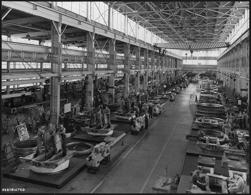
Main Gun Mount Assembly Plant, Northern Pump Co. Plant, Fridley, Minnesota, 1942. (Photo from the Franklin D. Roosevelt Presidential Library & Museum.)

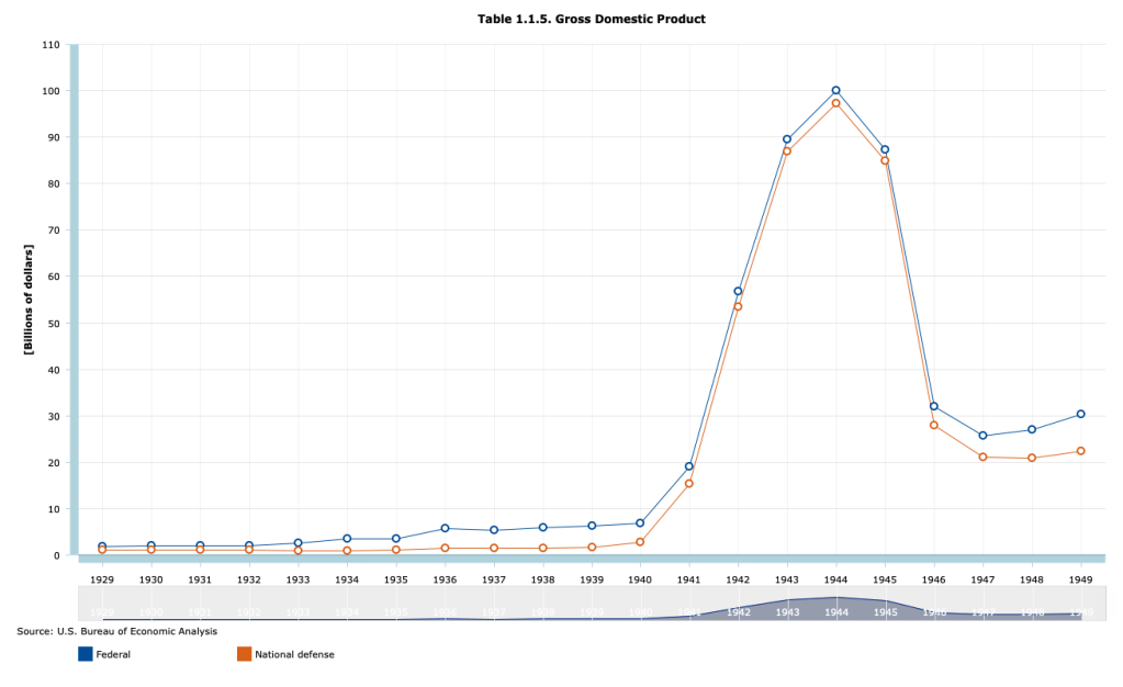
To fight World War II, the federal government had to dramatically increase spending. As the following figure shows, total federal spending rose from $6.8 billion in 1940 to a peak of $100.1 billion in 1944. National defense spending made up most of the increase, rising from $2.8 billion in 1940 to $97.3 billion in 1944.

Part of the increased spending was paid for by increases in taxes. Total federal tax receipts rose from $6.2 billion in 1940 to $35.8 billion in 1945. Individual income taxes rose from $1.0 billion in 1940 to 18.6 billion in 1945. Tax rates were raised and the minimum income at which people had to pay tax on their income was reduced. From the introduction of the federal individual income tax in 1913 until 1940, only people who had at least upper middle class incomes paid any federal income taxes. Following the passage by Congress of the Revenue Act of 1942, most workers had to pay federal income taxes. In 1940, 7.4 million people had to pay federal individual income taxes. In 1945, 42.7 million people had to. For the first time, the federal government withheld taxes from workers paychecks. Previously, all taxes were due on March 15th of the year following the year being taxed. Milton Friedman, who in the 1970s won the Nobel Prize in Economics, was part of the team at the U.S. Treasury that designed and implemented the system of withholding income taxes. Withholding of individual income taxes has continued to the present day.

Although large, the increases in federal taxes were insufficient to fund the massive military spending required to win the war. As a result, the U.S. Treasury had to greatly increase its sales of Treasury bonds. Recall from Macroeconomics, Chapter 16, Section 16.6 (Economics, Chapter 26, Section 26.6 and Essentials of Economics, Chapter 18, Section 18.6) that the total value of outstanding Treasury bonds is called the federal government debt, sometimes called the national debt. The part of federal government debt held by the public rather than by government agencies, such as the Social Security Trust Funds, is call the public debt. In order to gauge the effects of the debt on the economy, economists typically look at the size of the public debt relative to GDP. The following figure shows the public debt as a percentage of GDP for the years from 1929 to 2022.

The figure shows that the ratio of debt to GDP increased sharply from 1929 to the mid-1930s, reflecting the federal budget deficits resulting from the Great Depression, and then soared beginning in 1940. Debt peaked at 113 percent of GDP in 1945 and then began a long decline that lasted until 1974, when debt had fallen to 23 percent of GDP. The ratio of debt to GDP then fluctuated until the Great Recession of 2007-2009 when it began a steady increase that turned into a surge during and after the Covid-19 pandemic. (We discuss the causes of the recent surge in debt in this blog post.)

What caused the long decline in the ratio of debt to GDP that began in 1946 and continued until 1974? The usual explanation is that the decline was not primarily due to the federal government paying off a signficiant portion of the debt. The public debt did decline from a peak of $241.9 billion in 1946 to $214.3 billion in 1949 but there were no significant declines in the level of the public debt after 1949. Instead the ratio of debt to GDP declined because GDP grew faster than did the debt.

Recently in a National Bureau of Economic Research Working Paper, “Did the U.S. Really Grow Out of Its World War II Debt?” Julien Acalin and Laurence M. Ball of Johns Hopkins University have analyzed the issue more closely. They conclude that economic growth played a smaller role in reducing the debt-to-GDP ratio than has previously been thought. In particular, they highlight the fact that for significant periods through the 1970s, the Treasury was able to pay a real interest rate on the debt that was lower than market rates. Lower real interest rates reduced the amount by which the debt might otherwise have grown.

As we discuss in Money, Banking, and the Financial System, Chapter 13, Section 13.2, in April 1942, to support the war effort, the Federal Reserve announced that it would fix interest rates on Treasury securities at low levels: 0.375 percent on Treasury bills and 2.5 percent on Tresaury bonds. This policy continued after the end of the war in 1945 until the Fed was allowed to abandon the policy of pegging the interest rates on Treasury securities following the March 1951 Treasury-Federal Reserve Accord. Acalin and Ball also note that even after the Accord, there were periods in which actual inflation was well above expected inflation, causing the real interest rate the Treasury was paying on debt to be below the expected real interest rate. In other words, part of the falling debt-to-GDP ratio was financed by investors receiving lower returns on their purchases of Treasury securities than they had expected to.

Acalin and Ball conclude that if the Treasury had not done the relatively small amount of debt repayment mentioned earlier and if it had had to pay market real interest rates on the debt, debt would have declined to only 74 percent of GDP in 1974, rather than to 23 percent.

Sources: The debt and GDP data are from the Congressional Budget Office, which can be found here, and from the Office of Management and the Budget, which can be found here.

4/29/23 Podcast – Authors Glenn Hubbard & Tony O’Brien discuss a hard vs. soft landing, the debt ceiling, and an economics view of the CHIPS act passed in 2022.

Join authors Glenn Hubbard & Tony O’Brien as they discuss the state of the landing the economy will achieve – hard vs. soft – or “no landing”. Also, they address the debt ceiling and the barriers it might present to a recovery. We also delve into the Chips Act and what economics has to say about the subsidy of a particular industry. Gain insights into today’s economy through our final podcast of the 2022-2023 academic year! Our discussion covers these points but you can also check for updates on our blog post that can be found HERE .

Bad News from the Congressional Budget Office

In 1974, Congress created the Congressional Budget Office (CBO). The CBO was given the responsibility of providing Congress with impartial economic analysis as it makes decisions about the federal government’s budget.  One of the most widely discussed reports the CBO issues is the Budget and Economic Outlook. The report provides forecasts of future federal budget deficits and changes in the federal government’s debt that the budget deficits will cause. The CBO’s budget and debt forecasts rely on the agency’s forecasts of future economic conditions and assumes that Congress will make no changes to current laws regarding taxing and spending. (We discuss this assumption further below.)

 On February 15, the CBO issued its latest forecasts. The forecasts showed a deterioration in the federal government’s financial situation compared with the forecasts the CBO had issued in May 2022. (You can find the full report here.) Last year, the CBO forecast that the federal government’s cumulative budget deficit from 2023 through 2032 would be $15.7 trillion. The CBO is now forecasting the cumulative deficit over the same period will be $18.8 trillion. The three main reason for the increase in the forecast deficits are:

1. Congress has increased spending—particularly on benefits for military veterans.

2) Cost-of-living adjustments for Social Security and other government programs have increased as a result of higher inflation.

3) Interest rates on Treasury debt have increased as a result of higher inflation.

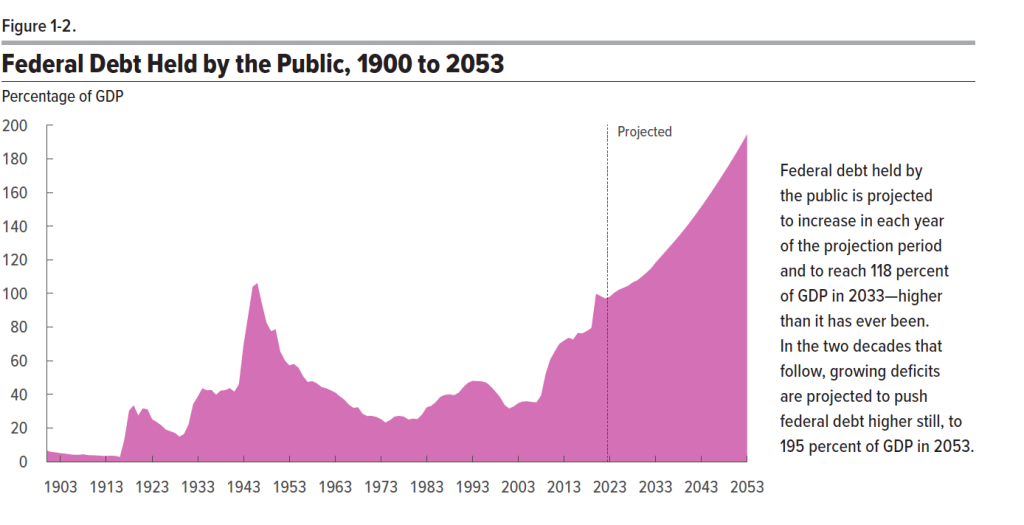
 The CBO forecasts that federal debt held by the public will increase from 98 percent of GDP in 2023 to 118 percent in 2033 and eventually to 198 percent in 2053. Note that economists prefer to measure the size of the debt relative to GDP rather than in as absolute dollar amounts for two main reasons: First, measuring debt relative to GDP makes it easier to see how debt has changed over time in relation to the growth of the economy. Second, the size of debt relative to GDP makes it easier to gauge the burden that the debt imposes on the economy. When debt grows more slowly than the economy, as measured by GDP, crowding effects are likely to be relatively small. We discuss crowding out in Macroeconomics, Chapter 10, Section 10.2 and Chapter 16, Section 16. 5 (Economics, Chapter 20, Section 20.2 and Chapter 26, Section 26.5).  The two most important factors driving increases in the ratio of debt to GDP are increased spending on Social Security, Medicare, and Medicaid, and increased interest payments on the debt.

 The following figure is reproduced from the CBO report. It shows the ratio of debt to GDP with actual values for the period 1900-2022 and projected values for the period 2023-2053. Note that the only other time the ratio of debt to GDP rose above 100 percent was in 1945 and 1946 as a result of the large increases in federal government spending required to fight World War II.

The increased deficits and debt over the next 10 years are being driven by government spending increasing as a percentage of GDP, while government revenues (which are mainly taxes) are roughly stable as a percentage of GDP. The following figure from the report shows actual federal outlays and revenues as a percentage of GDP for the period 1973-2022 and projected outlays and revenues for the period 2023-2033. Note that from 1973 to 2022, outlays averaged 21.0 percent of GDP and revenues averaged 17.4 percent of GDP, resulting in an average deficit of 3.6 percent of GDP. By 2033, outlays are forecast to rise to 24.9 percent of GDP–well above the 1973-2022 average–whereas revenues are forecast to be only 18.1 percent, for a forecast deficit of 6.8 percent of GDP.

The increase in outlays is driven primarily by increases in mandatory spending, mainly spending on Social Security, Medicare, Medicaid, and veterans’ benefits and increases in interest payments on the debt. The CBO’s forecast assumes that discretionary spending will gradually decline over the next 10 years as percentage of GDP. Discretionary spending includes federal spending on defense and all other government programs apart from those, like Social Security, where spending is mandated by law.

To avoid the persistent deficits, and increasing debt that results, Congress would need to do one (or a combination) of the following:

1. Reduce the currently scheduled increases in mandatory spending (in political discussions this alternative is referred to as entitlement reform because entitlements is another name for manadatory spending).

2. Decrease discretionary spending, the largest component of which is defense spending.

3. Increases taxes.

There doesn’t appear to be majority support in Congress for taking any of these steps.

The CBO’s latest forecast seems gloomy, but may actually understate the likely future increases in the federal budget deficit and federal debt. The CBO’s forecast assumes that future outlays and taxes will occur as indicated in current law. For example, the forecast assumes that many of the tax cuts Congress passed in 2017 will expire in 2025 as stated in current law. Many political observers doubt that Congress will allow the tax cuts to expire as scheduled because to do so would result in increases in individual income taxes for most people. (Here is a recent article in the Washington Post that discusses this point. A subscription may be required to access the full article.) The CBO also assumes that defense spending will not increase beyond what is indicated by current law. Many political observers believe that, in fact, Congress may feel compelled to substantially increase defense spending as a result of Russia’s invasion of Ukraine in February 2022 and the potential military threat posed by China.

The CBO forecast also assumes that the U.S. economy won’t experience a recession between 2023 and 2033, which is possible but unlikely. If the economy does experience a recession, federal outlays for unemployment insurance and other programs will increase and federal personal and corporate income tax revenues will fall. The CBO’s forecast also assumes that the interest rate on the 10-year Treasury note will be under 4 percent and that the federal funds rate will be under 3 percent (interest rates on short-term Treasury debt move closely with changes in the federal funds rate). If interest rates turn out to be higher than these forecasts, the federal government’s interest payments will increase, further increasing the deficit and the debt.

In short, the federal government is clearly facing the most difficult budgetary situation since World War II.

A Handy Way to Track Recession Indicators

The Bureau of Labor Statistics is housed in the U.S. Department of Labor. (Photo from don.gov site.)

In a blog post at the end of August, we noted that real GDP declined during the first two quarters of 2022. On September 29, the Bureau of Economic Analysis (BEA) slightly revised the real GDP data, but after the revisions the BEA’s estimates still showed real GDP declining during those quarters.

A popular definition of a recession is two consecutive quarters of declining real GDP. But, as we noted in the earlier blog post, most economists do not follow this definition. Instead, for most purposes, economists rely on the National Bureau of Economic Research’s business cycle dating, which is based on a number of macroeconomic data series. The NBER defines a recession as “a significant decline in activity spread across the economy, lasting more than a few months, visible in industrial production, employment, real income, and wholesale-retail trade.” The NBER discusses its approach to business cycle dating here.

The Federal Reserve Bank of St. Louis’s invaluable FRED economic data site has collected the data series that the NBER’s Business Cycle Dating Committee relies on when deciding when a recession began. The FRED page collecting these data can be found here. 

Note that although the Business Cycle Dating Committee analyzes a variety of data series, “In recent decades, the two measures we have put the most weight on are real personal income less transfers and nonfarm payroll employment.” The following figures show movements in those two data series. These data series don’t give a strong indication that the economy was in recession during the first half of 2022. Real personal income minus transfer payments did decline by 0.4 percent between January and June 2022 (before increasing during July and August), but nonfarm payroll employment increased by 1.4 percent during the same period (and increased further in July and August).

As we noted in our earlier blog post, the message from most data series other than real GDP seems to be that the U.S. economy was not in a recession during the first half of 2022.

The Return of the FedEx Indicator?

Image from the Wall Street Journal.

On September 16, 2022 an article in the Wall Street Journal had the headline: “Economic Worries, Weak FedEx Results Push Stocks Lower.” Another article in the Wall Street Journal noted that: “The company’s downbeat forecasts, announced Thursday, intensified investors’ macroeconomic worries.”

Why would the news that FedEx had lower revenues than expected during the preceding weeks cause a decline in stock market indexes like the Dow Jones Industrial Average and the S&P 500? As the article explained: “Delivery companies [such as FedEx and its rival UPS) are the proverbial canary in the coal mine for the economy.” In other words, investors were using FedEx’s decline in revenue as a leading indicator of the business cycle.  A leading indicator is an economic data series—in this case FedEx’s revenue—that starts to decline before real GDP and employment in the months before a recession and starts to increase before real GDP and employment in the months before a recession reaches a trough and turns into an expansion. 

So, investors were afraid that FedEx’s falling revenue was a signal that the U.S. economy would soon enter a recession. And, in fact, FedEx CEO Raj Subramaniam was quoted as believing that the global economy would fall into a recession. As firms’ profits decline during a recession so, typically, do the prices of the firms’ stock. (As we discuss in Macroeconomics, Chapter 6, Section 6.2 and in Economics, Chapter 8, Section 8.2, stock prices reflect investors’ expectations of the future profitability of the firms issuing the stock.)

Monitoring fluctuations in FedEx’s revenue for indications of the future course of the economy is nothing new. When Alan Greenspan was chair of the Federal Reserve from 1987 to 2006, he spoke regularly with Fred Smith, the founder of FedEx and at the time CEO of the firm. Greenspan believed that changes in the number of packages FedEx shipped gave a good indication of the overall state of the economy. FedEx plays such a large role in moving packages around the country that most economists agree that there is a close relationship between fluctuations in FedEx’s business and fluctuations in GDP. Some Wall Street analysts refer to this relationship as the “FedEx Indicator” of how the economy is doing.

In September 2022, the FedEx indicator was blinking red. But the U.S. economy is complex and fluctuations in any indicator can sometimes provide an inaccurate forecast of when a recession will begin or end. And, in fact, some investment analysts believed that problems at FedEx may have been due as much to mistakes the firms’ managers had made as to general problems in the economy. As one analyst put it: “We believe a meaningful portion of FedEx’s missteps here are company-specific.” 

At this point, Fed Chair Jerome Powell and the other members of the Federal Open Market Committee are still hoping that they can bring the economy in for a soft landing—bringing inflation down closer to the Fed’s 2 percent target, without bringing on a recession—despite some signals, like those being given by the FedEx indicator, that the probability of the United States entering a recession was increasing. 

Sources: Will Feuer, “FedEx Stock Tumbles More Than 20% After Warning on Economic Trends,” Wall Street Journal, September 16, 2022; Alex Frangos and Hannah Miao, “ FedExt Stock Hit by Profit Warning; Rivals Also Drop Amid Recession Fears,” Wall Street Journal, September 16, 2022; Richard Clough, “FedEx has Biggest Drop in Over 40 Years After Pulling Forecast,” bloomberg.com, September 16, 2022; and David Gaffen, “The FedEx Indicator,” Wall Street Journal, February 20, 2007.

Is the U.S. Economy in a Recession? Real GDP versus Real GDI

Photo from the Wall Street Journal.

The Bureau of Economic Analysis (BEA) publishes data on gross domestic product (GDP) each quarter. Economists and media reports typically focus on changes in real GDP as the best measure of the overall state of the U.S. economy. But, as we discuss in Macroeconomics, Chapter 8, Section 8.4 (Economics, Chapter 18, Section 18.4), the BEA also publishes quarterly data on gross domestic income (GDI). As we discuss in Chapter 8, Section 8.1 when discussing the circular-flow diagram, the value of every final good and services produced in the economy (GDP) should equal the value of all the income in the economy resulting from that production (GDI). The BEA has designed the two measures to be identical by including in GDI some non-income items, such as sales taxes and depreciation. But as we discuss in the Apply the Concept, “Should We Pay More Attention to Gross Domestic Income?” GDP and GDI are compiled by the BEA from different data sources and can sometimes significantly diverge. 

A large divergence between the two measures occurred in the first half of 2022. During this period real GDP declined—as shown by the blue line in the following figure—after which some stories in the media indicated that the U.S. economy was in a recession.  But real GDI—as shown by the red line in the figure—increased during the same two quarters. So, was the U.S. economy still in the expansion that began in the third quarter of 2020, rather than in a recession?  Or, as an article in the Wall Street Journal put it: “A Different Take on the U.S. Economy: Maybe It Isn’t Really Shrinking.”

In fact, most economists do not follow the popular definition of a recession as being two consecutive quarters of declining real GDP. Instead, as we discuss in Chapter 10, Section 10.3, economists typically follow the definition of a recession used by the National Bureau of Economic Research: “A recession is a significant decline in activity spread across the economy, lasting more than a few months, visible in industrial production, employment, real income, and wholesale-retail trade.” 

During the first half of 2022, most measures of economic activity were expanding, rather than contracting. For example, the first of the following figures shows payroll employment increasing in each month in the first half of 2022. The second figure shows industrial production also increasing during most months in the first half of 2022, apart from a very slight decline from April to May after which it continued to increase. 

Taken together, these data indicate that the U.S. economy was likely not in a recession during the first half of 2022. The BEA revises the data on real GDP and real GDI over time as various government agencies gather more information on the different production and income measures included in the series. Jeremy Nalewaik of the Federal Reserve Board of Governors has analyzed the BEA’s adjustments to its initial estimates of real GDP and real GDI. He has found that when there are significant differences between the two series, the BEA revisions usually result in the GDP values being revised to be closer to the GDI values. Put another way, the initial GDI estimates may be more accurate than the initial GDP estimates.

If that generalization holds true in 2022, then the BEA may eventually revise its estimates of GDP upward, which would show that the U.S. economy was not in a recession in the first of half of 2022 because economic activity was increasing rather than decreasing. 

Sources: Jon Hilsenrath, “A Different Take on the U.S. Economy: Maybe It Isn’t Really Shrinking,” Wall Street Journal, August 28, 2022; Reade Pickert, “Key US Growth Measures Diverge, Complicating Recession Debate,” bloomberg.com, August 25, 2022; Jeremy L. Nalewaik, “The Income- and Expenditure-Side Estimates of U.S. Output Growth,” Brookings Papers on Economic Activity, Spring 2010, pp. 71-127; and Federal Reserve Bank of St. Louis.

How Should We Measure Inflation?

Image from the Wall Street Journal.

In the textbook, we discuss several measures of inflation. In Macroeconomics, Chapter 8, Section 8.4 (Economics, Chapter 18, Section 18.4) we discuss the GDP deflator as a measure of the price level and the percentage change in the GDP deflator as a measure of inflation. In Chapter 9, Section 9.4, we discuss the consumer price index (CPI) as a measure of the price level and the percentage change in the CPI as the most widely used measure of inflation. 

            In Chapter 15, Section 15.5 we examine the reasons that the Federal Reserve often looks at the core inflation rate—the inflation rate excluding the prices of food and energy—as a better measure of the underlying rate of inflation. Finally, in that section we note that the Fed uses the percentage change in the personal consumption expenditures (PCE) price index to assess  of whether it’s achieving its goal of a 2 percent inflation rate.

            In this blog post, we’ll discuss two other aspects of measuring inflation that we don’t cover in the textbook. First, the Bureau of Labor Statistics (BLS) publishes two versions of the CPI:  (1) The familiar CPI for all urban consumers (or CPI–U), which includes prices of goods and services purchased by households in urban areas, and (2) the less familiar CPI for urban wage earners and clerical workers (or CPI–W), which includes the same prices included in the CPI–U. The two versions of the CPI give slightly different measures of the inflation rate—despite including the same prices—because each version applies different weights to the prices when constructing the index.

            As we explain in Chapter 9, Section 9.4, the weights in the CPI–U (the only version of the CPI we discuss in the chapter) are determined by a survey of 36,000 households nationwide on their spending habits. The more the households surveyed spend on a good or service, the larger the weight the price of the good or service receives in the CPI–U. To calculate the weights in the CPI–W the BLS uses only expenditures by households in which at least half of the household’s income comes from a clerical or wage occupation and in which at least one member of the household has worked 37 or more weeks during the previous year.  The BLS estimates that the sample of households used in calculating the CPI–U includes about 93 percent of the population of the United States, while the households included in the CPI–W include only about 29 percent of the population. 

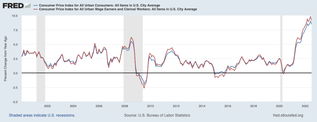
            Because the percentage of the population covered by the CPI–U is so much larger than the percentage of the population covered by the CPI–W, it’s not surprising that most media coverage of inflation focuses on the CPI–U. As the following figure shows, the measures of inflation from the two versions of the CPI aren’t greatly different, although inflation as measured by the CPI–W—the red line—tends to be higher during economic expansions and lower during economic recessions than inflation measured by the CPI–U—the blue line. 

One important use of the CPI–W is in calculating cost-of-living adjustments (COLAs) applied to Social Security payments retired and disabled people receive. Each year, the federal government’s Social Security Administration (SSA) calculates the average for the CPI–W during June, July, and August in the current year and in the previous year and then measures the inflation rate as the percentage increase between the two averages. The SSA then increases Social Security payments by that inflation rate. Because the increase in CPI–W is often—although not always—larger than the increase in CPI–U, using CPI–W to calculate Social Security COLAs increases the payments recipients of Social Security receive. 

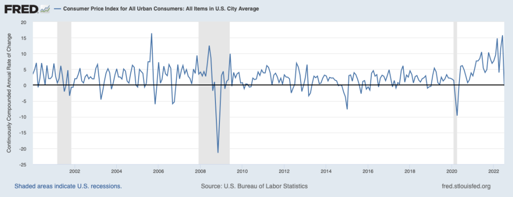
            A second aspect of measuring inflation that we don’t mention in the textbook was the subject of discussion following the release of the July 2022 CPI data. In June 2022, the value for the CPI–U was 295.3. In July 2022, the value for the CPI–U was also 295.3. So, was there no inflation during July—an inflation rate of 0 percent? You can certainly make that argument, but typically, as we note in the textbook (for instance, see our display of the inflation rate in Chapter 10, Figure 10.7) we measure the inflation rate in a particular month as the percentage change in the CPI from the same month in the previous year. Using that approach to measuring inflation, the inflation rate in July 2022 was the percentage change in the CPI from its value in July 2021, or 8.5 percent.  Note that you could calculate an annual inflation rate using the increase in the CPI from one month to the next by compounding that rate over 12 months. In this case, because the CPI was unchanged from June to July 2022, the inflation rate calculated as a compound annual rate would be 0 percent.  

            During periods of moderate inflation rates—which includes most of the decades prior to 2021—the difference between inflation calculated in these two ways was typically much smaller. Focusing on just the change in the CPI for one month has the advantage that you are using only the most recent data. But if the CPI in that month turns out to be untypical of what is happening to inflation over a longer period, then focusing on that month can be misleading. Note also that inflation rate calculated as the compound annual change in the CPI each month results in very large fluctuations in the inflation rate, as shown in the following figure.

Sources: Anne Tergesen, “Social Security Benefits Are Heading for the Biggest Increase in 40 Years,” Wall Street Journal, August 10, 2022; Neil Irwin, “Inflation Drops to Zero in July Due to Falling Gas Prices,” axios.com, August 10, 2022; “Consumer Price Index Frequently Asked Questions,” bls.gov, March 23, 2022; Stephen B. Reed and Kenneth J. Stewart, “Why Does BLS Provide Both the CPI–W and CPI–U?” U.S. Bureau of Labor Statistics, Beyond the Numbers, Vol. 3, No. 5, February 2014; “Latest Cost of Living Adjustment,” ssa.gov; and Federal Reserve Bank of St. Louis.