The latest significant piece of macroeconomic data that will be available to the Federal Reserve’s policy-making Federal Open Market Committee (FOMC) before it concludes its meeting tomorrow is the report on the Employment Cost Index (ECI), released this morning by the Bureau of Labor Statistics (BLS). As we’ve noted in earlier posts, as a measure of the rate of increase in labor costs, the FOMC prefers the ECI to average hourly earnings (AHE) .
The AHE is calculated by adding all of the wages and salaries workers are paid—including overtime and bonus pay—and dividing by the total number of hours worked. As a measure of how wages are increasing or decreasing during a particular period, AHE can suffer from composition effects because AHE data aren’t adjusted for changes in the mix of occupations workers are employed in. For example, during a period in which there is a decline in the number of people working in occupations with higher-than-average wages, perhaps because of a downturn in some technology industries, AHE may show wages falling even though the wages of workers who are still employed have risen. In contrast, the ECI holds constant the mix of occupations in which people are employed. The ECI does have the drawback, that it is only available quarterly whereas the AHE is available monthly.
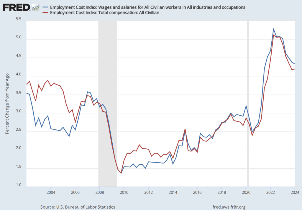
The data released this morning indicate that labor costs continue to increase at a rate that is higher than the rate that is likely needed for the Fed to hit its 2 percent price inflation target. The following figure shows the percentage change in the employment cost index for all civilian workers from the same quarter in 2023. The blue line looks only at wages and salaries while the red line is for total compensation, including non-wage benefits like employer contributions to health insurance. The rate of increase in the wage and salary measure decreased slightly from 4.4 percent in the fourth quarter of 2023 to 4.3 percent in the first quarter of 2024. The rate of increase in compensation was unchanged at 4.2 percent in both quarters.
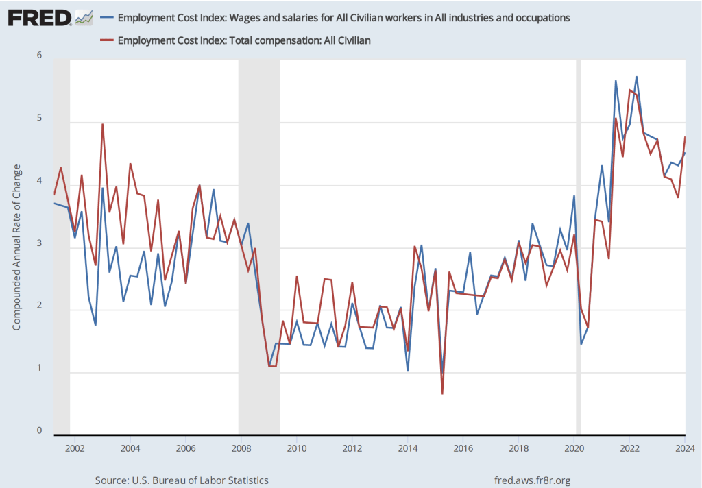
If we look at the compound annual growth rate of the ECI—the annual rate of increase assuming that the rate of growth in the quarter continued for an entire year—we find that the rate of increase in wages and salaries increased from 4.3 percent in the fourth quarter of 2023 to 4.5 percent in the first quarter of 2024. Similarly, the rate of increase in compensation increased from 3.8 percent in the third quarter of 2023 to 4.5 percent in the first quarter of 2024.
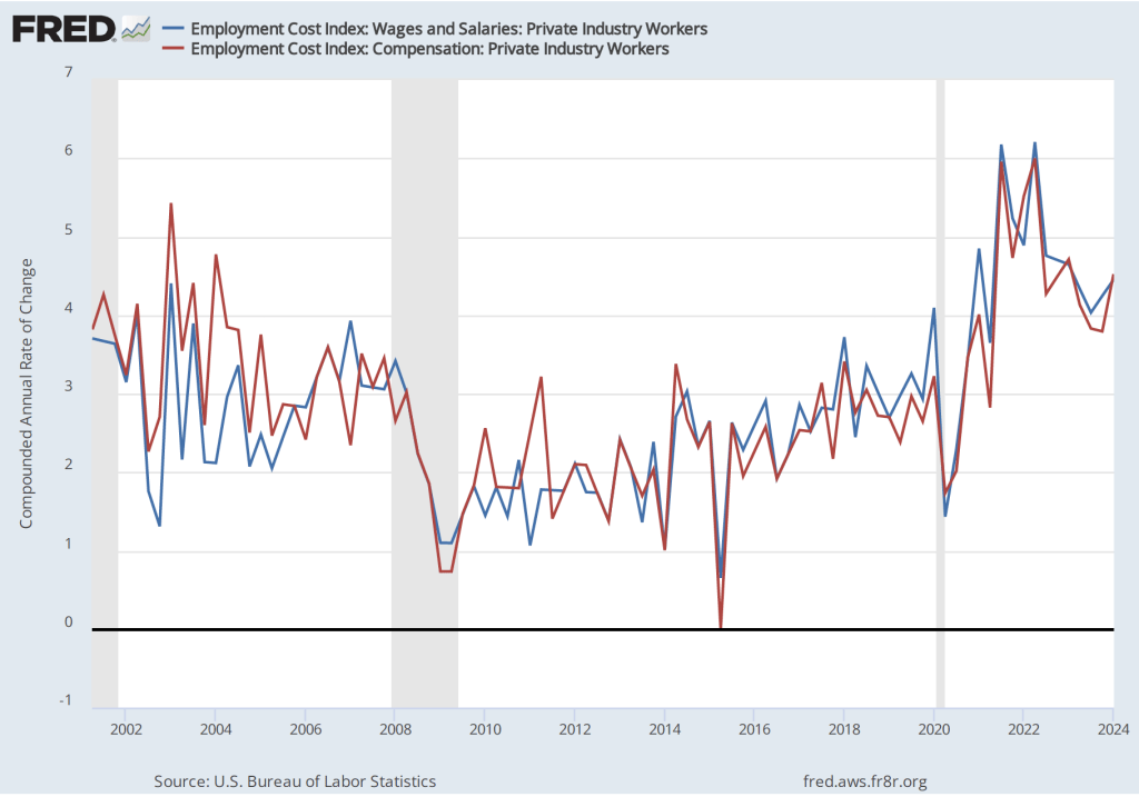
Some economists and policymakers prefer to look at the rate of increase in ECI for private industry workers rather than for all civilian workers because the wages of government workers are less likely to respond to inflationary pressure in the labor market. The first of the following figures shows the rate of increase of wages and salaries and in total compensation for private industry workers measured as the percentage increase from the same quarter in the previous year. The second figure shows the rate of increase calculated as a compound growth rate.
The first figure shows a slight decrease in the rate of growth of labor costs from the fourth quarter of 2023 to the first quarter of 2024, while the second figure shows a fairly sharp increase in the rate of growth.
Taken together, these four figures indicate that there is little sign that the rate of increase in employment costs is falling to a level consistent with a 2 percent inflation rate. At his press conference tomorrow afternoon, following the conclusion of the FOMC’s meeting, Fed Chair Jerome Powell will give his thoughts on the implications for future monetary policy 0f recent macroeconomic data.
On Friday, April 5—the first Friday of the month—the Bureau of labor Statistics (BLS) released its “Employment Situation” report with data on the state of the labor market in March. The BLS reported a net increase in employment during March of 303,000, which was well above the increase that economists had been expecting. The previous estimates of employment in January and February were revised upward by 22,000 jobs. (We also discuss the employment report in this podcast.)
Employment increases during the second half of 2023 had slowed compared with the first half of the year. But, as the following figure from the BLS report shows, since December 2023, employment has increased by more than 250,000 in each month. These increases are far above the estimated increases of 70,000 to 100,000 new jobs needed to keep up with population growth. (But note our later discussion of this point.)
The unemployment rate had been expected to stay steady at 3.9 percent, but declined slightly to 3.8 percent. As the following figure shows, the unemployment rate has been remarkably stable for more than two years and has been below 4.0 percent each month since December 2021. The members of the Federal Open Market Committee (FOMC) expect that the unemployment rate for 2024 will be 4.0 percent, a forcast that is beginning to seem too high.
The monthly employment number most commonly reported in media accounts is from the establishment survey (sometimes referred to as the payroll survey), whereas the unemployment rate is taken from the household survey. The results of both surveys are included in the BLS’s monthly “Employment Situation” report. As we discuss in Macroeconomics, Chapter 9, Section 9.1 (Economics, Chapter 19, Section 19.1), many economists and policymakers at the Federal Reserve believe that employment data from the establishment survey provides a more accurate indicator of the state of the labor market than do either the employment data or the unemployment data from the household survey.
As we noted in a previous post, whereas employment as measured by the establishment survey has been increasing each month, employment as measured by the household surve declined each month from December 2023 through February 2024. But, as the following figure shows, this trend was reversed in March, with employment as measured by the household survey increasing 498,000—far more than the 303,000 increase in employment in establishment survey. This reversal may be another indication of the underlying strength of the labor market.
As the following figure shows, despite the substantial increases in employment, wages, as measured by the percentage change in average hourly earnings from the same month in the previous year, have been trending down. The increase in average hourly earnings declined from 4.3 percent February in to 4.1 percent in March.
The following figure shows wage inflation calculated by compounding the current month’s rate over an entire year. (The figure above shows what is sometimes called 12-month wage inflation, whereas this figure shows 1-month wage inflation.) One-month wage inflation is much more volatile than 12-month inflation—note the very large swings in 1-month wage inflation in April and May 2020 during the business closures caused by the Covid pandemic.
Wages increased by 6.1 percent in January 2024, 2.1 percent in February, and 4.2 percent in March. So, the 1-month rate of wage inflation did show an increase in March, although it’s unclear whether the increase was a result of the strength of the labor market or reflected the greater volatility in wage inflation when calculated this way.
Some economists and policymakers are surprised that low levels of unemployment and large monthly increases in employment have not resulted in greater upward pressure on wages. One possibility is that the supply of labor has been increasing more rapidly than is indicated by census data. In a January report, the Congressional Budget Office (CBO) argued that the Census Bureau’s estimate of the population of the United States is too low by about 6 million people. This undercount is attributable, according to the CBO, largely the Census Bureau having underestimated the amount of immigration that has occurred. If the CBO is correct, then the economy may need to generate about 200,000 net new jobs each month to accommodate the growth of the labor force, rather than the 80,000 to 100,000 we mentioned earlier in this post.
Federal Reserve Chair Jerome Powell noted in a press conference following the most recent meeing of the FOMC that: “Strong job creation has been accompanied by an increase in the supply of workers, reflecting increases in participation among individuals aged 25 to 54 years and a continued strong pace of immigration.” As a result:
“what you would have is potentially kind of what you had last year, which is a bigger economy where inflationary pressures are not increasing. In fact, they were decreasing. So you can have that if you have a continued supply-side activity that we had last year with—both with supply chains and also with, with growth in the size of the labor force.”
If Powell is correct, in the coming months the U.S. economy may be able to sustain rapid increases in employment without those increases leading to an increase in the rate of inflation.
On the first Friday of each month, the Bureau of Labor Statistics (BLS) releases its “Employment Sitution” report for the previous month. The data for February in today’s report at first glance seem contradictory: The BLS reported that the net increase in employment in February was 275,000, which was above the increase of 200,000 that economists participating in media surveys had expected (see here and here). But the unemployment rate, which had been expected to remain constant at 3.7 percent, rose to 3.9 percent.
The apparent paradox of employment and the unemployment rate both increasing in the same month is (partly) attributable to the two numbers being from different surveys. The employment number most commonly reported in media accounts is from the establishment survey (sometimes referred to as the payroll survey), whereas the unemployment rate is taken from the household survey. The results of both surveys are included in the BLS’s monthly “Employment Situation” report. As we discuss in Macroeconomics, Chapter 9, Section 9.1 (Economics, Chapter 19, Section 19.1), many economists and policymakers at the Federal Reserve believe that employment data from the establishment survey provides a more accurate indicator of the state of the labor market than do either the employment data or the unemployment data from the household survey. Accordingly, most media accounts interpreted the data released today as indicating continuing strength in the labor market.
However, it can be worth looking more closely at the differences between the measures of employment in the two series because it’s possible that the household survey data is signalling that the labor market is weaker than it appears from the establishment survey data. The following table shows the data on employment from the two surveys for January and February.
Establishment Survey
Household Survey
January
157,533,000
161,152,000
February
157,808,000
160,968,000
Change
+275,000
-184,000
Note that in addition to the fact that employment as measured by the household survey is falling, while employment as measured by the establishment survey is increasing, household survey employment is significantly higher in both months. Household survey employment is always higher than establishment survey employment because the household survey includes employment of three groups that are not included in the establishment survey:
Self-employed workers
Unpaid family workers
Agricultural workers
(A more complete discuss of the differences in employment in the two surveys can be found here.) The BLS also publishes a useful data series in which it attempts to adjust the household survey data to more closely mirror the establishment survey data by, among other adjustments, removing from the household survey categories of workers who aren’t included in the payroll survey. The following figure shows three series—the establishment series (gray line), the reported household series (orange line), and the adjusted household series (blue line)—for the months since 2021. For ease of comparison the three series have been converted to index numbers with January 2021 set equal to 100.
Note that for most of this period, the adjusted household survey series tracks the establishment survey series fairly closely. But in November 2023, both household survey measures of employment begin to fall, while the establishment survey measure of employment continues to increase. Falling employment in the household survey may be signalling weakness in the labor market that employment in the establishment survey may be missing, but it might also be attributed to the greater noisiness in the household survey’s employment data.
There are three other things to note in this month’s employment report. First, the BLS revised the initially reported increase in December establishement survey employment downward by 35,000 jobs and the January increase downward by 124,000 jobs. The January adjustment was large—amounting to more than 35 percent of the initially reported increase of 353,000. It’s normal for the BLS to revise its initial estimates of employment from the establishment survey but a series of negative revisions is typical of periods just before or at the beginning of a recession. It’s important to note, though, that several months of negative revisions to establishment employment are far from an infallible predictor of recessions.
Second, as shown in the following figure, the increase in average hourly earnings slowed from the high rate of 6.8 percent in January to 1.7 percent in February—the smallest increase since early 2022.. (These increases are measured at a compounded annual rate, which is the rate wages would increase if they increased at that month’s rate for an entire year.) A slowing in wage growth may be another sign that the labor market is weakening, although the data are noisy on a month-to-month basis.
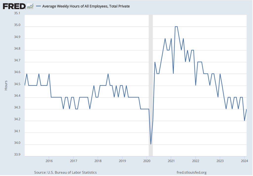
Finally, one positive indicator of the state of the labor market is that average weekly hours worked increased. As shown in the following figure, average hours worked had been slowly, if irregularly, trending downward since early 2021. In February, average hours worked increased slightly to 34.3 hours per week from 34.2 hours per week in January. But, again, it’s difficult to draw strong conclusions from one month’s data.
In testifying before Congress earlier this week, Fed Chair Jerome Powell noted that:
“We believe that our policy rate [the federal funds rate] is likely at its peak for this tightening cycle. If the economy evolves broadly as expected, it will likely be appropriate to begin dialing back policy restraint at some point this year. But the economic outlook is uncertain, and ongoing progress toward our 2 percent inflation objective is not assured.”
It seems unlikely that today’s employment report will change how Powell and the other memebers of the Fed’s Federal Open Market Committee evaluate the current economic situation.
Wall Street Journal columnist Justin Lahart notes that when the Bureau of Labor Statistics (BLS) releases its monthly report on the consumer price index (CPI), the report “generates headlines, features in politicians’ speeches and moves markets.” When the Bureau of Economic Analysis (BEA) releases its monthly report “Personal Income and Outlays,” which includes data on the personal consumption expenditures (PCE) price index, there is much less notice in the business press or, often, less effect on financial markets. (You can see the difference in press coverage by comparing the front page of today’s online edition of the Wall Street Journal after the BEA released the latest PCE data with the paper’s front page on February 13 when the BLS released the latest CPI data.)
This difference in the weight given to the two inflation reports seems curious because the Federal Reserve uses the PCE, not the CPI, to determine whether it is achieving its 2 percent annual inflation target. When a new monthly measure of inflation is released much of the discussion in the media is about the effect the new data will have on the Federal Open Market Committee’s (FOMC) decision on whether to change its target for the federal funds rate. You might think the result would be greater media coverage of the PCE than the CPI. (The PCE includes the prices of all the goods and services included in the consumption component of GDP. Because the PCE includes the prices of more goods and services than does the CPI, it’s a broader measure of inflation, which is the key reason that the Fed prefers it.)
That CPI inflation data receive more media discussion than PCE inflation data is likely due to three factors:
The CPI is more familiar to most people than the PCE. It is also the measure that politicians and political commentators tend to focus on. The media are more likely to highlight a measure of inflation that the average reader easily understands rather than a less familiar measure that would require an explanation.
The monthly report on the CPI is typically released about two weeks before the monthly report on the PCE. Therefore, if the CPI measure of inflation turns out to be higher or lower than expected, the stock and bond markets will react to this new information on the value of inflation in the previous month. If the PCE measure is roughly consistent with the CPI measure, then the release of new data on the PCE measure contains less new information and, therefore, has a smaller effect on stock and bond prices.
Over longer periods, the two measures of inflation often move fairly closely together as the following figure shows, although CPI inflation tends to be somewhat higher than PCE inflation. The values of both series are the percentage change in the index from the same month in the previous year.
Turning to the PCE data for January released in the BEA’s latest “Personal Income and Outlays” report, the PCE inflation data were broadly consistent with the CPI data: Inflation in January increased somewhat from December. The first of the following figures shows PCE inflation and core PCE inflation—which excludes energy and food prices—for the period since January 2015 with inflation measured as the change in PCE from the same month in the previous year. The second figure shows PCE inflation and core PCE inflation measured as the inflation rate calculated by compounding the current month’s rate over an entire year. (The first figure shows what is sometimes called 12-month inflation and the second figure shows 1-month inflation.)
The two inflation measures are telling markedly different stories: 12-month inflation shows a continuation in the decline in inflation that began in 2022. Twelve-month PCE inflation fell from 2.6 percent in December to 2.4 percent in January. Twelve-month core PCE inflation fell from 2.9 percent in December to 2.8 percent in December. So, by this measure, inflation continues to approach the Fed’s 2 percent inflation target.
One-month PCE and core PCE inflation both show sharp increases from December to January: From 1.4 percent in December to 4.2 percent for 1-month PCE inflation and from 1.8 percent in December to 5.1 percent in January for 1-month core PCE inflation.
The one-month inflation data are bad news in that they may indicate that inflation accelerated in January and that the Fed is, therefore, further away than it seemed in December from hitting its 2 percent inflation target. But it’s important not to overinterpret a single month’s data. Although 1-month inflation is more volatile than 12-month inflation, the broad trend in 1-month inflation had been downwards from mid-2022 through December 2023. It will take at least a more months of data to assess whether this trend has been broken.
Fed officials didn’t appear to be particularly concerned by the news. For instance, according to an article on bloomberg.com, Federal Reserve Bank of Atlanta President Raphael Bostic noted that: “The last few inflation readings—one came out today—have shown that this is not going to be an inexorable march that gets you immediately to 2%, but that rather there are going to be some bumps along the way.” Investors appear to continue to expect that the Fed will cut its target for the federal funds rate at its meeting on June 11-12.
Recent articles in the business press have discussed the possibility that the U.S. economy is entering a period of higher growth in labor productivity:
“US Productivity Is on the Upswing Again. Will AI Supercharge It?” (link)
“Can America Turn a Productivity Boomlet Into a Boom?” (link)
In Macroeconomics, Chapter 16, Section 16.7 (Economics, Chapter 26, Section 26.7), we highlighted the role of growth in labor productivity in explaining the growth rate of real GDP using the following equations. First, an identity:
Real GDP = Number of hours worked x (Real GDP/Number of hours worked),
where (Real GDP/Number of hours worked) is labor productivity.
And because an equation in which variables are multiplied together is equal to an equation in which the growth rates of these variables are added together, we have:
Growth rate of real GDP = Growth rate of hours worked + Growth rate of labor productivity
From 1950 to 2023, real GDP grew at annual average rate of 3.1 percent. In recent years, real GDP has been growing more slowly. For example, it grew at a rate of only 2.0 percent from 2000 to 2023. In February 2024, the Congressional Budget Office (CBO) forecasts that real GDP would grow at 2.0 percent from 2024 to 2034. Although the difference between a growth rate of 3.1 percent and a growth rate of 2.0 percent may seem small, if real GDP were to return to growing at 3.1 percent per year, it would be $3.3 trillion larger in 2034 than if it grows at 2.0 percent per year. The additional $3.3 trillion in real GDP would result in higher incomes for U.S. residents and would make it easier for the federal government to reduce the size of the federal budget deficit and to better fund programs such as Social Security and Medicare. (We discuss the issues concerning the federal government’s budget deficit in this earlier blog post.)
Why has growth in real GDP slowed from a 3.1 percent rate to a 2.0 percent rate? The two expressions on the right-hand side of the equation for growth in real GDP—the growth in hours worked and the growth in labor productivity—have both slowed. Slowing population growth and a decline in the average number of hours worked per worker have resulted in the growth rate of hours worked to slow substantially from a rate of 2.0 percent per year from 1950 to 2023 to a forecast rate of only 0.4 percent per year from 2024 to 2034.
Falling birthrates explains most of the decline in population growth. Although lower birthrates have been partially offset by higher levels of immigration in recent years, it seems unlikely that birthrates will increase much even in the long run and levels of immigration also seem unlikely to increase substantially in the future. Therefore, for the growth rate of real GDP to increase significantly requires increases in the rate of growth of labor productivity.
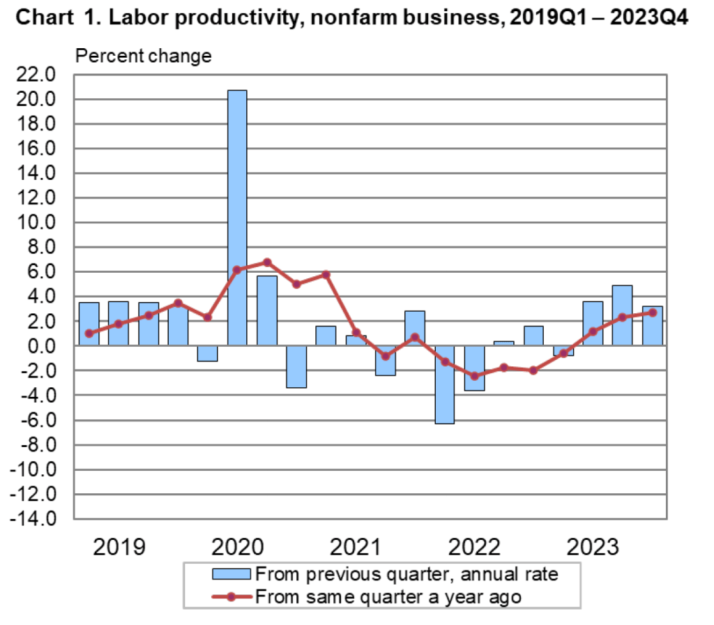
The Bureau of Labor Statistics (BLS) publishes quarterly data on labor productivity. (Note that the BLS series is for labor productivity in the nonfarm business sector rather than for the whole economy. Output of the nonfarm business sector excludes output by government, nonprofit businesses, and households. Over long periods, growth in real GDP per hour worked and growth in real output of the nonfarm business sector per hour worked have similar trends.) The following figure is taken from the BLS report “Productivty and Costs,” which was released on February 1, 2024.
Note that the growth in labor productivity increased during the last three quarters of 2023, whether we measure the growth rate as the percentage change from the same quarter in the previous year or as growth in a particular quarter expressed as anual rate. It’s this increase in labor productivity during 2023 that has led to speculation that labor productivity might be entering a period of higher growth. The following figure shows labor productivity growth, measured as the percentage change from the same quarter in the previous year for the whole period from 1950 to 2023.
The figure indicates that labor productivity has fluctuated substantially over this period. We can note, in particular, productivity growth during two periods: First, from 2011 to 2018, labor productivity grew at the very slow rate of 0.9 percent per year. Some of this slowdown reflected the slow recovery of the U.S. economy from the Great Recession of 2007-2009, but the slowdown persisted long enough to cause concern that the U.S. economy might be entering a period of stagnation or very slow growth.
Second, from 2019 through 2023, labor productivity went through very large swings. Labor productivity experienced strong growth during 2019, then, as the Covid-19 pandemic began affecting the U.S. economy, labor productivity soared through the first half of 2021 before declining for five consecutive quarters from the first quarter of 2022 through the first quarter of 2023—the first time productivity had fallen for that long a period since the BLS first began collecting the data. Although these swings were particularly large, the figure shows that during and in the immediate aftermath of recessions labor productivity typically fluctuates dramatically. The reason for the fluctuations is that firms can be slow to lay workers off at the beginning of a recession—which causes labor productivity to fall—and slow to hire workers back during the beginning of an economy recovery—which causes labor productivity to rise.
Does the recent increase in labor productivity growth represent a trend? Labor productivity, measured as the percentage change since the same quarter in the previous year, was 2.7 percent during the fourth quarter of 2023—higher than in any quarter since the first quarter of 2021. Measured as the percentage change from the previous quarter at an annual rate, labor productivity grew at a very high average rate of 3.9 during the last three quarters of 2023. It’s this high rate that some observers are pointing to when they wonder whether growth in labor productivity is on an upward trend.
As with any other economic data, you should use caution in interpreting changes in labor productivity over a short period. The productivity data may be subject to large revisions as the two underlying series—real output and hours worked—are revised in coming months. In addition, it’s not clear why the growth rate of labor productivity would be increasing in the long run. The most common reasons advanced are: 1) the productivity gains from the increase in the number of people working from home since the pandemic, 2) businesses’ increased use of artificial intelligence (AI), and 3) potential efficiencies that businesses discovered as they were forced to operate with a shortage of workers during and after the pandemic.
To this point it’s difficult to evaluate the long-run effects of any of these factors. Wconomists and business managers haven’t yet reached a consensus on whether working from home increases or decreases productivity. (The debate is summarized in this National Bureau of Economic Research Working Paper, written by Jose Maria Barrero of Instituto Tecnologico Autonomo de Mexico, and Steven Davis and Nicholas Bloom of Stanford. You may need to access the paper through your university library.)
Many economists believe that AI is a general purpose technology (GPT), which means that it may have broad effects throughout the economy. But to this point, AI hasn’t been adopted widely enough to be a plausible cause of an increase in labor productivity. In addition, as Erik Brynjolfsson and Daniel Rock of MIT and Chad Syverson of the University of Chicago argue in this paper, the introduction of a GPT may initially cause productivity to fall as firms attempt to use an unfamiliar technology. The third reason—efficiency gains resulting from the pandemic—is to this point mainly anecdotal. There are many cases of businesses that discovered efficiencies during and immediately after Covid as they struggled to operate with a smaller workforce, but we don’t yet know whether these cases are sufficiently common to have had a noticeable effect on labor productivity.
So, we’re left with the conclusion that if the high labor productivity growth rates of 2023 can be maintained, the growth rate of real GDP will correspondingly increase more than most economists are expecting. But it’s too early to know whether recent high rates of labor productivty growth are sustainable.
As we’ve discussed in several blog posts (for instance, here and here), recent macro data have been consistent with the Federal Reserve being close to achieving a soft landing. The Fed’s increases in its target for the federal funds rate have slowed the growth of aggregate demand sufficiently to bring inflation closer to the Fed’s 2 percent target, but haven’t, to this point, slowed the growth of aggregate demand so much that the U.S. economy has been pushed into a recession.
By January 2024, many investors in financial markets and some economists were expecting that at its meeting on March 19-20, the Fed’s Federal Open Market Committee would be cutting its target for the federal funds. However, members of the committee—notably, Chair Jerome Powell—have been cautious about assuming prematurely that inflation had, in fact, been brought under control. In fact, in his press conference on January 31, following the committee’s most recent meeting, Powell made clear that the committee was unlikely to reduce its target for the federal funds rate at its March meeting. Powell noted that “inflation is still too high, ongoing progress in bringing it down is not assured, and the path forward is uncertain.”
Powell’s caution seemed justified when, on February 2, the Bureau of Labor Statistics (BLS) released its most recent “Employment Situation Report” (discussed in this post). The report’s data on growth in employment and growth in wages, as measured by the change in average hourly earnings, might be indicating that aggregate demand is growing too rapidly for inflation to continue to decline.
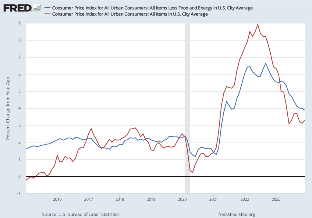
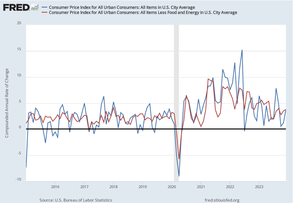
The BLS’s release today (February 13) of its report on the consumer price index (CPI) (found here) for January provided additional evidence that the Fed may not yet have put inflation on a firm path back to its 2 percent target. The average forecast of economists surveyed before the release of the report was that the increase in the version of the CPI that includes the prices of all goods and services in the market basket—often called headline inflation—would be 2.9 percent. (We discuss how the BLS constructs the CPI in Macroeconomics, Chapter 9, Section 19.4, Economics, Chapter 19, Section 19.4, and Essentials of Economics, Chapter 3, Section 13.4.) As the following figure shows, headline inflation for January was higher than expected at 3.1 percent (measured by the percentage change from the same month in the previous year), while core inflation—which excludes the prices of food and energy—was 3.9 percent. Headline inflation was lower than in December 2023, while core inflation was almost unchanged.
Although the values for January might seem consistent with a gradual decline in inflation, that conclusion may be misleading. Headline inflation in January 2023 had been surprisingly high at 6.4 percent. Hence, the comparision between the value of the CPI in January 2024 with the value in January 2023 may be making the annual CPI inflation rate seem artificially low. If we look at the 1-month inflation rate for headline and core inflation—that is the annual inflation rate calculated by compounding the current month’s rate over an entire year—the values are more concerning, as indicated in the following figure. Headline CPI inflation is 3.7 percent and core CPI inflation is 4.8 percent.
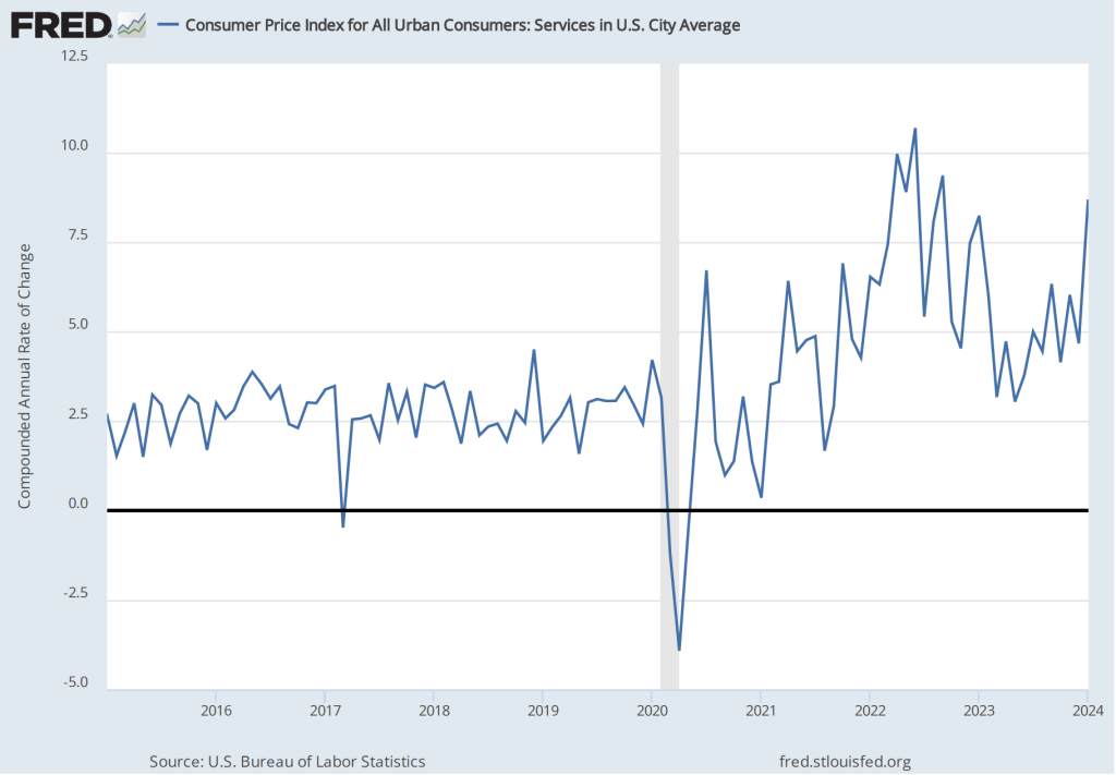
Even more concerning is the path of inflation in the prices of services. Chair Powell has emphasized that as supply chain problems have gradually been resolved, inflation in the prices of goods has been rapidly declining. But inflaion in services hasn’t declined nearly as much. Last summer he stated the point this way:
“Part of the reason for the modest decline of nonhousing services inflation so far is that many of these services were less affected by global supply chain bottlenecks and are generally thought to be less interest sensitive than other sectors such as housing or durable goods. Production of these services is also relatively labor intensive, and the labor market remains tight. Given the size of this sector, some further progress here will be essential to restoring price stability.”
The following figure shows the 1-month inflation rate in services prices. The figure shows that inflation in services has been above 4 percent in every month since July 2023. Inflation in services was a very high 8.7 percent in January. Clearly such large increases in the prices of services aren’t consistent with the Fed meeting its 2 percent inflation target.
How should we interpret the latest CPI report? First, it’s worth bearing in mind that a single month’s report shouldn’t be relied on too heavily. There can be a lot of volatility in the data month-to-month. For instance, inflation in the prices of services jumped from 4.7 percent in December to 8.7 percent in January. It seems unlikely that inflation in the prices of services will continue to be over 8 percent.
Second, housing prices are a large component of service prices and housing prices can be difficult to measure accurately. Notably, the BLS includes in its measure the implicit rental price that someone who owns his or her own home pays. The BLS calculates that implict rental price by asking consumers who own their own homes the following question: “If someone were to rent your home today, how much do you think it would rent for monthly, unfurnished and without utilities?” (The BLS discusses how it measures the price of housing services here.) In practice, it may be difficult for consumers to accurately answer the question if very few houses similar to theirs are currently for rent in their neighborhood.
Third, the Fed uses the personal consumption expenditures (PCE) price index, not the CPI, to gauge whether it is achieving its 2 percent inflation target. The Bureau of Economic Analysis (BEA) includes the prices of more goods and services in the PCE than the BLS includes in the CPI and measures housing services using a different approach than that used by the BLS. Although inflation as measured by changes in the CPI and as measured by changes in the PCE move roughly together over long periods, the two measures can differ significantly over a period of a few months. The difference between the two inflation measures is another reason not to rely too heavily on a single month’s CPI data.
Despite these points, investors on Wall Street clearly interpreted the CPI report as bad news. Investors have been expecting that the Fed will soon cut its target for the federal funds rate, which should lead to declines in other key interest rates. If inflation continues to run well above the Fed’s 2 percent target, it seems likely that the Fed will keep its federal funds target at its current level for longer, thereby slowing the growth of aggregate demand and raising the risk of a recession later this year. Accordingly, the Dow Jones Industrial Average declined by more than 500 points today (February 13) and the interest rate on the 10-year Treasury note rose above 4.3 percent.
The FOMC has more than a month before its next meeting to consider the implications of the latest CPI report and the additional macro data that will be released in the meantime.
This morning of Friday, February 2, the Bureau of Labor Statistics (BLS) issued its “Employment Situation Report” for January 2024. Economists and policymakers—notably including the members of the Fed’s Federal Open Market Committee (FOMC)—typically focus on the change in total nonfarm payroll employment as recorded in the establishment, or payroll, survey. That number gives what is generally considered to be the best gauge of the current state of the labor market.
Economists surveyed in the past few days by business news outlets had expected that growth in payroll employment would slow to an increase of between 180,000 and 190,000 from the increase in December, which the BLS had an initially estimated as 216,00. (For examples of employment forecasts, see here and here.) Instead, the report indicated that net employment had increased by 353,000—nearly twice the expected amount. (The full report can be found here.)
In this previous blog post on the December employment report, we noted that although the net increase in employment in that month was still well above the increase of 70,000 to 100,000 new jobs needed to keep up with population growth, employment increases had slowed significantly in the second half of 2023 when compared with the first.
That slowing trend in employment growth did not persist in the latest monthly report. In addition, to the strong January increase of 353,000 jobs, the November 2023 estimate was revised upward from 173,000 jobs to 182,000 jobs, and the December estimate was substantially revised from 216,000 to 333,000. As the following figure from the report shows, the net increase in jobs now appears to have trended upward during the last three months of 2023.
Economists surveyed were also expecting that the unemployment rate—calculated by the BLS from data gathered in the household survey—would increase slightly to 3.8 percent. Instead, it remained constant at 3.7 percent. As the following figure shows, the unemployment rate has been remarkably stable for more than two years and has been below 4.0 percent each month since December 2021. The members of the FOMC expect that the unemployment rate during 2024 will be 4.1 percent, a forcast that will be correct only if the demand for labor declines significantly over the rest of the year.
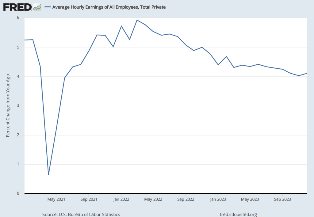
The “Employment Situation Report” also presents data on wages, as measured by average hourly earnings. The growth rate of average hourly earnings, measured as the percentage change from the same month in the previous year, had been slowly declining from March 2022 to October 2023, but has trended upward during the past few months. The growth of average hourly earnings in January 2024 was 4.5 percent, which represents a rise in firms’ labor costs that is likely too high to be consistent with the Fed succeeding in hitting its goal of 2 percent inflation. (Keep in mind, though, as we note in this blog post, changes in average hourly earnings have shortcomings as a measure of changes in the costs of labor to businesses.)
Taken together, the data in today’s “Employment Situation Report” indicate that the U.S. labor market remains very strong. One implication is that the FOMC will almost certainly not cut its target for the federal funds rate at its next meeting on March 19-20. As Fed Chair Jerome Powell noted in a statement to reporters after the FOMC earlier this week: “The Committee does not expect it will be appropriate to reduce the target range until it has gained greater confidence that inflation is moving sustainably toward 2 percent. We will continue to make our decisions meeting by meeting.” (A transcript of Powell’s press conference can be found here.) Today’s employment report indicates that conditions in the labor market may not be consistent with a further decline in price inflation.
It’s worth keeping several things in mind when interpreting today’s report.
The payroll employment data and the data on average hourly earnings are subject to substantial revisions. This fact was shown in today’s report by the large upward revision in net employment creation in December, as noted earlier in this post.
A related point: The data reported in this post are all seasonally adjusted, which means that the BLS has revised the raw (non-seasonally adjusted) data to take into account normal fluctuations due to seasonal factors. In particular, employment typically increases substantially during November and December in advance of the holiday season and then declines in January. The BLS attempts to take into account this pattern so that it reports data that show changes in employment during these months holding constant the normal seasonal changes. So, for instance, the raw (non-seasonally adjusted) data show a decrease in payroll employment during January of 2,635,000 as opposed to the seasonally adjusted increase of 353,000. Over time, the BLS revises these seasonal adjustment factors, thereby also revising the seasonally adjusted data. In other words, the BLS’s initial estimates of changes in payroll employment for these months at the end of one year and the beginning of the next should be treated with particular caution.
The establishment survey data on average weekly hours worked show a slow decline since November 2023. Typically, a decline in hours worked is an indication of a weakening labor market rather than the strong labor market indicated by the increase in employment. But as the following figure shows, the data on average weekly hours are noisy in that the fluctuations are relatively large, as are the revisons the BLS makes to these data over time.
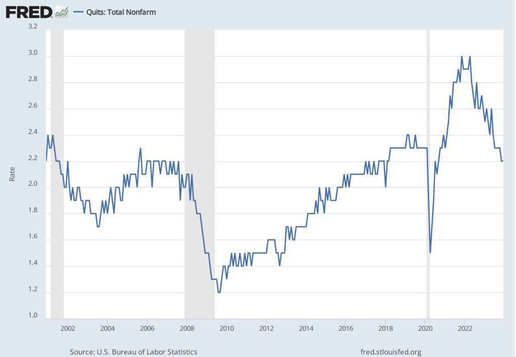
4. In contrast to today’s jobs report, other labor market data seem to indicate that the demand for labor is slowing. For instance, quit rates—or the number of people voluntarily leaving their jobs as a percentage of the total number of people employed—have been declining. As shown in the following figure, the quit rate peaked at 3.0 percent in November 2021 and March 2022, and has declined to 2.2 percent in December 2023—a rate lower than just before the beginning of the Covid–19 pandemic.
Similarly, as the following figure shows, the number of job openings per unemployed person has declined from a high of 2.0 in March 2022 to 1.4 in December 2023. This value is still somewhat higher than just before the beginning of the Covid–19 pandemic.
To summarize, recent data on conditions in the labor market have been somewhat mixed. The strong increases in net employment and in average hourly earnings in recent months are in contrast with declining average number of hours worked, a declining quit rate, and a falling number of job openings per unemployed person. Taken together, these data make it likely that the FOMC will be in no hurry to cut its target for the federal funds rate. As a result, long-term interest rates are also likely to remain high in the coming months. The following figure from the Wall Street Journal provides a striking illustration of the effect of today’s jobs report on the bond market, as the interest rate on the 10-year Treasury note rose above 4.0 percent for the first time in more than a month. The interest rate on the 10-year Treasury note plays an important role in the financial system, influencing interest rates on mortgages and corporate bonds.
Federal Reserve Chair Jerome Powell (Photo from the New York Times.)
This afternoon, Wednesday, January 31, the Federal Reserve’s Federal Open Market Committee (FOMC) held the first of its eight scheduled meetings during 2024. As we noted in a recent post, macroeconomic data have been indicating that the Fed is close to achieving its goal of bringing the U.S. economy in for a soft landing—reducing inflation down to the Fed’s 2 percent target without pushing the economy into a recession. But as we also noted in that post, it was unlikely that at this meeting Fed Chair Jerome Powell and the other members of the FOMC would declare victory in their fight to reduce inflation from the high levels it reached during 2022.
In fact, in Powell’s press conference following the meeting, when asked directly by a reporter whether he believed that the economy had made a safe landing, Powell said that he wasn’t yet willing to draw that conclusion. Accordingly, the committee kept its target range for the federal funds rate unchanged at 5.25 percent to 5.50 percent. This was the fifth meeting in a row at which the FOMC had left the target unchanged. Although some policy analysts expect that the FOMC might reduce its federal funds rate target at its next meeting in March, the committee’s policy statement made that seem unlikely:
“In considering any adjustments to the target range for the federal funds rate, the Committee will carefully assess incoming data, the evolving outlook, and the balance of risks. The Committee does not expect it will be appropriate to reduce the target range until it has gained greater confidence that inflation is moving sustainably toward 2 percent.”
Powell reinforced the point during his press conference by stating it was unlikely that the committee would cut the target rate at the next meeting. He noted that:
“The economy has surprised forecasters in many ways since the pandemic, and ongoing progress toward our 2 percent inflation objective is not assured. The economic outlook is uncertain, and we remain highly attentive to inflation risks. We are prepared to maintain the current target range for the federal funds rate for longer, if appropriate.”
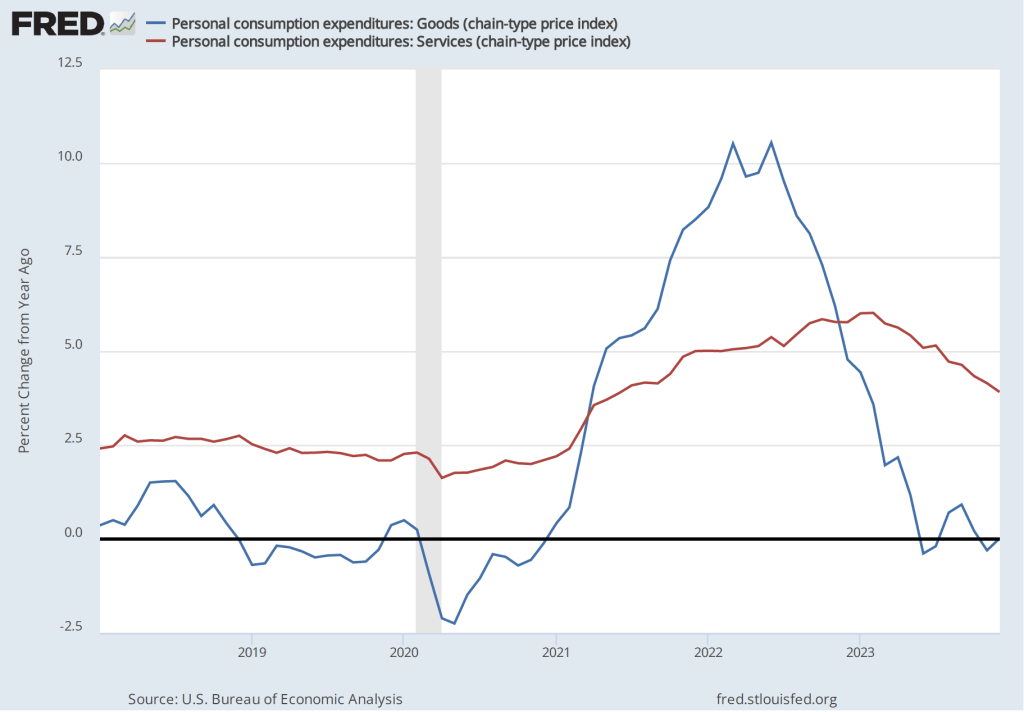
Powell highlighted a couple of areas of potential concern. The Fed gauges its progress towards achieving its 2 percent inflation goal using the percentage change in the personal consumption expenditures (PCE) price index. As we noted in a recent post, PCE inflation has declined from a high of 7.1 percent in June 2022 to 2.9 percent in December 2023. But Powell noted that PCE inflation in goods has followed a different path from PCE inflation in services, as the following figure shows.
Inflation during 2022 was much greater in the prices of goods than in the prices of services, reflecting the fact that supply chain disruptions caused by the pandemic had a greater effect on goods than on services. Inflation in goods has been less than 1 percent every month since June 2023 and has been negative in three of those months. Inflation in services peaked in February 2023 at 6.0 percent and has been declining since, but was still 3.9 percent in December. Powell noted that the very low rates of inflation in the prices of goods probably aren’t sustainable. If inflation in the prices of goods increases, the Fed may have difficulty achieving its 2 percent inflation target unless inflation in the prices of services slows.
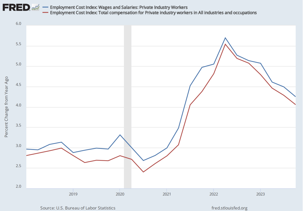
Powell also noted that the most recent data on the employment cost index (ECI) had been released the morning of the meeting. The ECI is compiled by the Bureau of Labor Statistics and is published quarterly. It measures the cost to employers per employee hour worked. The BLS publishes data that includes only wages and salaries and data that includes, in addition to wages and salaries, non-wage benefits—such as contributions to retirement accounts or health insurance—that firms pay workers. The figure below shows the percentage change from the same month in the previous year for the ECI including just wages and salaries (blue line) and for the ECI including all compensation (red line). Although ECI inflation has declined significantly from its peak in he second quarter of 2022, in the fourth quarter of 2023, both measures of ECI inflation were above 4 percent. Wages increasing at that pace may not be consistent with a 2 percent rate of price inflation.
Powell’s tone at his news conference (which can be watched here) was one of cautious optimism. He and the other committee members expect to be able to cut the target for the federal funds rate later this year but remain on guard for any indications that the inflation rate is increasing again.
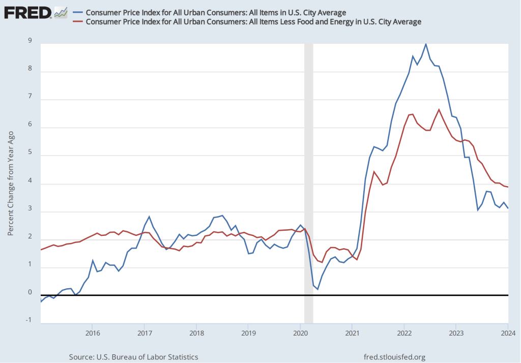
On the morning of January 11, 2024, the Bureau of Labor Statistics released its report on changes in consumer prices during December 2023. The report indicated that over the period from December 2022 to December 2023, the Consumer Price Index (CPI) increased by 3.4 percent (often referred to as year-over-year inflation). “Core” CPI, which excludes prices for food and energy, increased by 3.9 percent. The following figure shows the year-over-year inflation rate since Januar 2015, as measured using the CPI and core CPI.
This report was consistent with other recent reports on the CPI and on the personal consumption expenditures (PCE) price index—the measure the Fed uses to gauge whether it is achieving its target of 2 percent annual inflation—in showing that inflation has declined substantially from its peak in mid-2022 but is still above the Fed’s target.
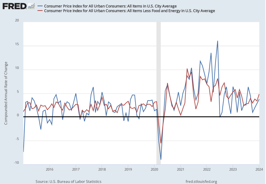
We get a similar result if we look at the 1-month inflation rate—that is the annual inflation rate calculated by compounding the current month’s rate over an entire year—as the following figure shows. The 1-month CPI inflation rate has moved erratically but has generally trended down. The 1-month core CPi inflation rate has moved less erratically, making the downward trend since mid-2022 clearer.
The headline on the Wall Street Journalarticle discussing this BLS report was: “Inflation Edged Up in December After Rapid Cooling Most of 2023.” The headline reflected the reaction of Wall Street investors who had hoped that the report would unambiguously show further slowing in inflation.
Overall, the report was middling: It didn’t show a significant acceleration in inflation at the end of 2023 but neither did it show a signficant slowing of inflation. At its next meeting on January 30-31, the Fed’s Federal Open Market Committee (FOMC) is expected to keep its target for the federal funds rate unchanged. There doesn’t appear to be anything in this inflation report that would be likely to affect the committee’s decision.
During the last few months of 2023, the macroeconomic data has generally been consistent with the Federal Reserve successfully bringing about a soft landing: Inflation returning to the Fed’s 2 percent target without the economy entering a recession. On the morning of Friday, January 5, the Bureau of Labor Statistics (BLS) issued its latest “Employment Situation Report” for December 2023. The report was generally consistent with the economy still being on course for a soft landing, but because both employment growth and wage growth were stronger than expected, the report makes it somewhat less likely that the Federal Reserve’s Federal Open Market Committee (FOMC) will soon begin reducing its target for the federal funds rate. (The full report can be found here.)
Economists and policymakers—notably including the members of the FOMC—typically focus on the change in total nonfarm payroll employment as recorded in the establishment, or payroll, survey. That number gives what is generally considered to be the best gauge of the current state of the labor market.
The report indicated that during December there had been a net increase of 216,000 jobs. This number was well above the expected gain of 160,000 to 170,000 jobs that several surveys of economists had forecast (see here, here, and here). The BLS revised downward by a total of 71,000 jobs its previous estimates for October and November, somewhat offsetting the surprisingly strong estimated increase in net jobs for December.
The following figure from the report shows the net increase in jobs each month since December 2021. Although the net number of jobs created has trended up from September to December, the longer run trend has been toward slower growth in employment. In the first half of 2023, an average of 257,000 net jobs were created per month, whereas in the second half of 2023, an average of 193,000 net jobs were created per month. Average weekly hours worked have also been slowly trending down, from 34.6 hours per week in January to 34.3 hours per week in December.
Economists surveyed were also expecting that the unemployment rate—calculated by the BLS from data gathered in the household survey—would increase slightly. Instead, it remained constant at 3.7 percent. As the following figure shows, the unemployment rate has been below 4.0 percent each month since December 2021. The members of the FOMC expect that the unemployment rate during 2024 will be 4.1 percent. (The most recent economic projections of the members of the FOMC can be found here.)
Although the employment data indicate that conditions in the labor market are easing in a way that may be consistent with inflation returning to the Fed’s 2 percent target, the data on wage growth are so far sending a different message. Average hourly earnings—data on which are collected in the establishment survey—increased by 4.1 percent in December compared with the same month in 2022. This rate of increase was slightly higher than the 4.0 percent increase in November. The following figure shows movements in the rate of increase in average hourly earnings since January 2021.
In his press conference following the FOMC’s December 13, 2023 meeting, Fed Chair Jerome Powell noted that increases in wages at 4 percent or higher were unlikely to result in inflation declining to the Fed’s 2 percent goal:
“So wages are still running a bit above what would be consistent with 2 percent inflation over a long period of time. They’ve been gradually cooling off. But if wages are running around 4 percent, that’s still a bit above, I would say.”
The FOMC’s next meeting is on January 30-31. At this point it seems likely that the committee will maintain its current target for the federal funds. The data in the latest employment report make it somewhat less likely that the committee will begin reducing its target at its meeting on March 19-20, as some economists and some Wall Street analysts had been expecting. (The calendar of the FOMC’s 2024 meetings can be found here.)