Fed Chair Jerome Powell (left) and Vice Chair Philip Jefferson (photo from federalreserve.gov)
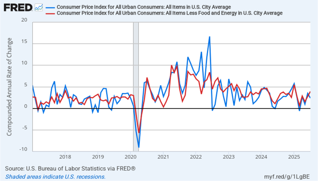
Today (August 12), the Bureau of Labor Statistics (BLS) released its report on the consumer price index (CPI) for July. The following figure compares headline CPI inflation (the blue line) and core CPI inflation (the red line).
- The headline inflation rate, which is measured by the percentage change in the CPI from the same month in the previous year, was 2.7 percent in July, unchanged from June.
- The core inflation rate, which excludes the prices of food and energy, was 3.0 percent in July, up slightly from 2.9 percent in June. (Note that there was some inconsistency in how the core inflation rate is reported. The BLS, and some news outlets, give the value as 3.1 percent. The unrounded value is 3.0486 percent.)
Headline inflation and core inflation were slightly lower than what economists surveyed had expected.

In the following figure, we look at the 1-month inflation rate for headline and core inflation—that is the annual inflation rate calculated by compounding the current month’s rate over an entire year. Calculated as the 1-month inflation rate, headline inflation (the blue line) declined from 3.5 percent in June to 2.4 percent in July. Core inflation (the red line) increased from 2.8 percent in June to 3.9 percent in July.
The 1-month and 12-month inflation rates are telling somewhat different stories, with 12-month inflation indicating that inflation is stable, although moderately above the Fed’s 2 percent inflation target. The 1-month core inflation rate indicates that inflation may have increased during July.
Of course, it’s important not to overinterpret the data from a single month. The figure shows that the 1-month inflation rate is particularly volatile. Also note that the Fed uses the personal consumption expenditures (PCE) price index, rather than the CPI, to evaluate whether it is hitting its 2 percent annual inflation target.
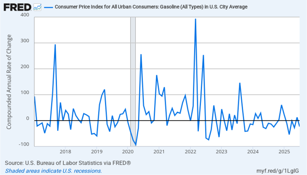
A key reason for core inflation being significantly higher than headline inflation is that gasoline prices declined by 23.1 percent at an annual rate in June. As shown in the following figure, 1-month inflation in gasoline prices moves erratically—which is the main reason that gasoline prices aren’t included in core inflation.
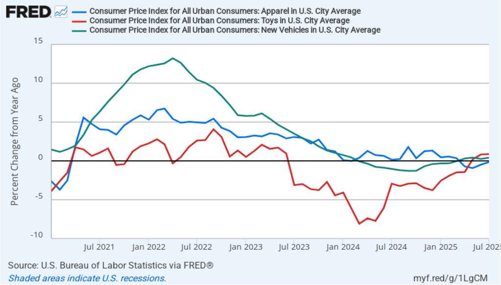
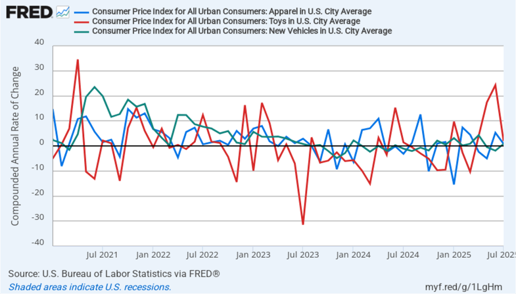
Does the increase in inflation represent the effects of the increases in tariffs that the Trump administration announced on April 2? (Note that many of the tariff increases announced on April 2 have since been reduced) The following figure shows 12-month inflation in three categories of products whose prices are thought to be particularly vulnerable to the effects of tariffs: apparel (the blue line), toys (the red line), and motor vehicles (the green line). To make recent changes clearer, we look only at the months since January 2021. In July, prices of apparel fell, while the prices of toys and motor vehicles rose by less than 1.0 percent.
The following figure shows 1-month inflation in these prices of these products. In July, motor vehicles prices and apparel prices increased by less than 1 percent, while toy prices increased by 1.9 percent after having soared soared by 24.3 percent in June. At least for these three products, it’s difficult to see tariffs as having had a significant effect on inflation in July.
To better estimate the underlying trend in inflation, some economists look at median inflation and trimmed mean inflation.
- Median inflation is calculated by economists at the Federal Reserve Bank of Cleveland and Ohio State University. If we listed the inflation rate in each individual good or service in the CPI, median inflation is the inflation rate of the good or service that is in the middle of the list—that is, the inflation rate in the price of the good or service that has an equal number of higher and lower inflation rates.
- Trimmed-mean inflation drops the 8 percent of goods and services with the highest inflation rates and the 8 percent of goods and services with the lowest inflation rates.
The following figure shows that 12-month trimmed-mean inflation (the blue line) was 3.2 percent in July, unchanged from June. Twelve-month median inflation (the red line) 3.6 percent in July, unchanged from June.
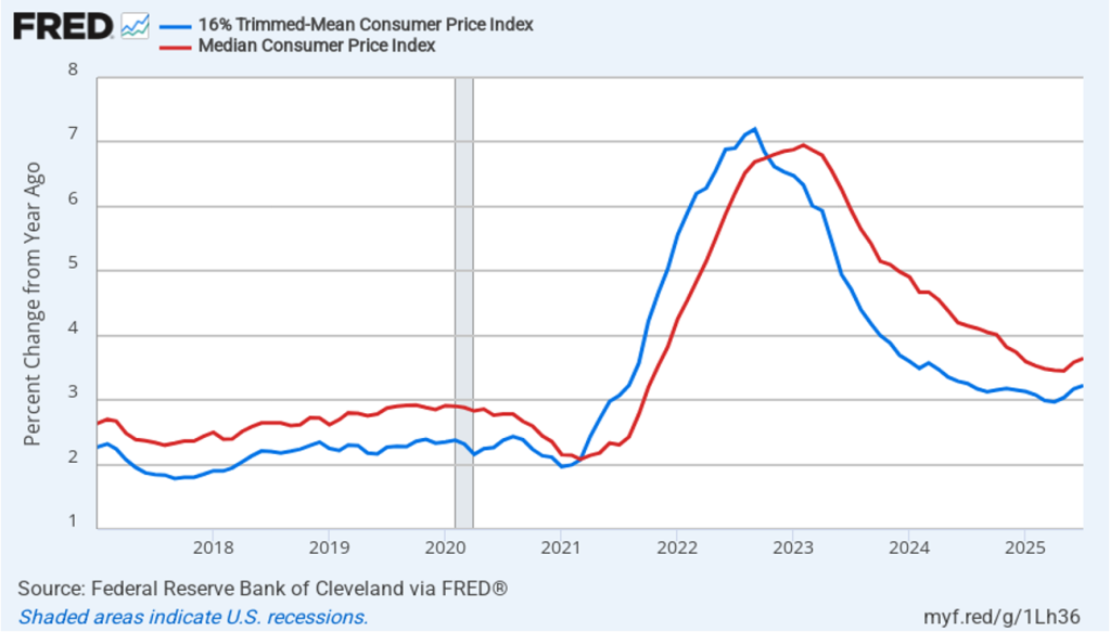
The following figure shows 1-month trimmed-mean and median inflation. One-month trimmed-mean inflation declined from 3.9 percent in June to 2.9 percent in July. One-month median inflation also declined from 4.1 percent in June to 3.7 percent in July. These data indicate that inflation may have slowed in July (the opposite conclusion we noted earlier when discussing 1-month core inflation), while remaining above the Fed’s 2 percent target.

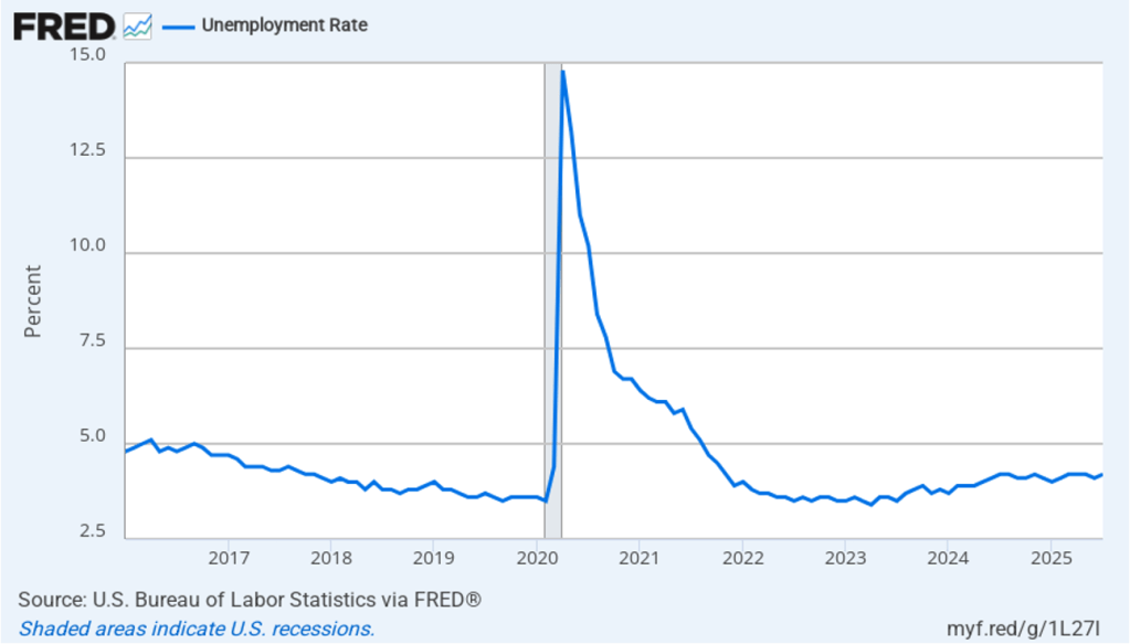
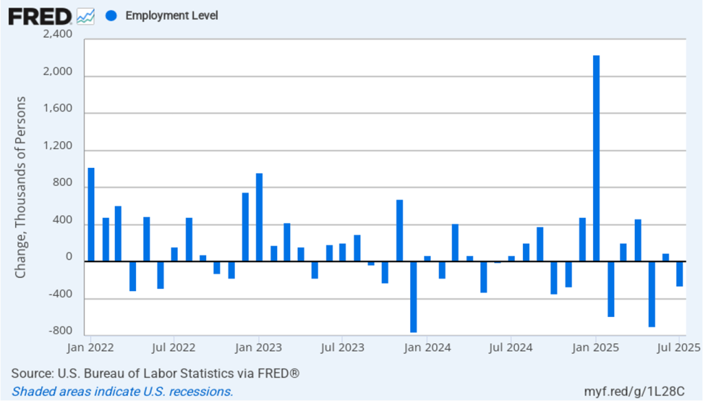
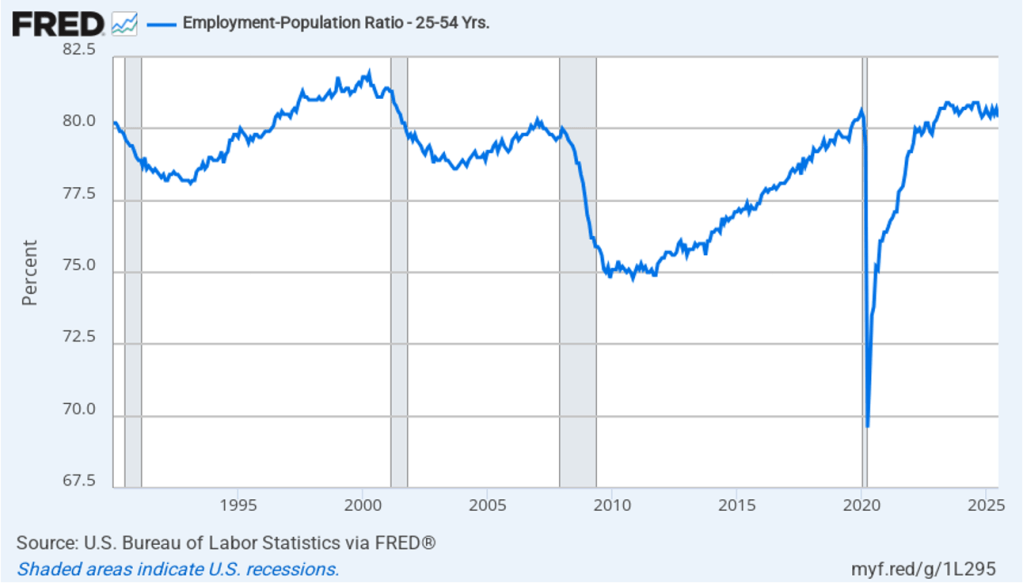
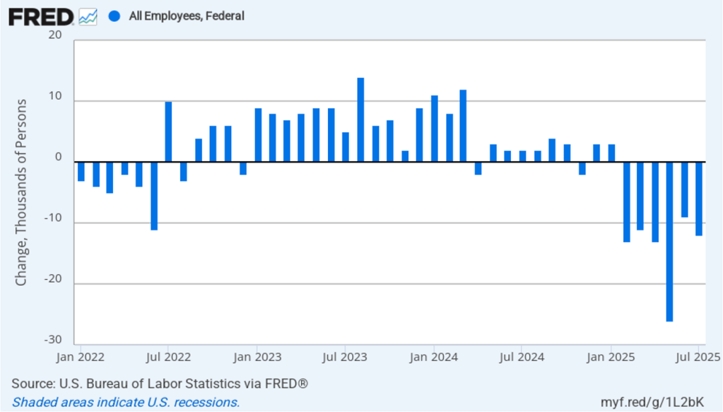
What are the implications of this CPI report for the actions the Federal Reserve’s policymaking Federal Open Market Committee (FOMC) may take at its next meetings? Even before today’s relatively favorable, if mixed, inflation report, the unexpectedly weak jobs report at the beginning of the month (which we discuss in this blog post) made it likely that the FOMC would soon begin cutting its target for the federal funds rate.
Investors who buy and sell federal funds futures contracts assign a probability of 94.3 percent to FOMC cutting its target for the federal funds rate at its September 16–17 meeting by 0.25 (25 basis points) from its current target range of 4.25 percent to 4.50 percent. That probability increased from 85.9 percent yesterday. (We discuss the futures market for federal funds in this blog post.) Investors assign a probability of 61.5 percent to the FOMC cutting its target again by 25 basis points at its October 28–29 meeting, and a probability of 50.3 percent to a third 25 basis point cut at the committee’s December 9–10 meeting.