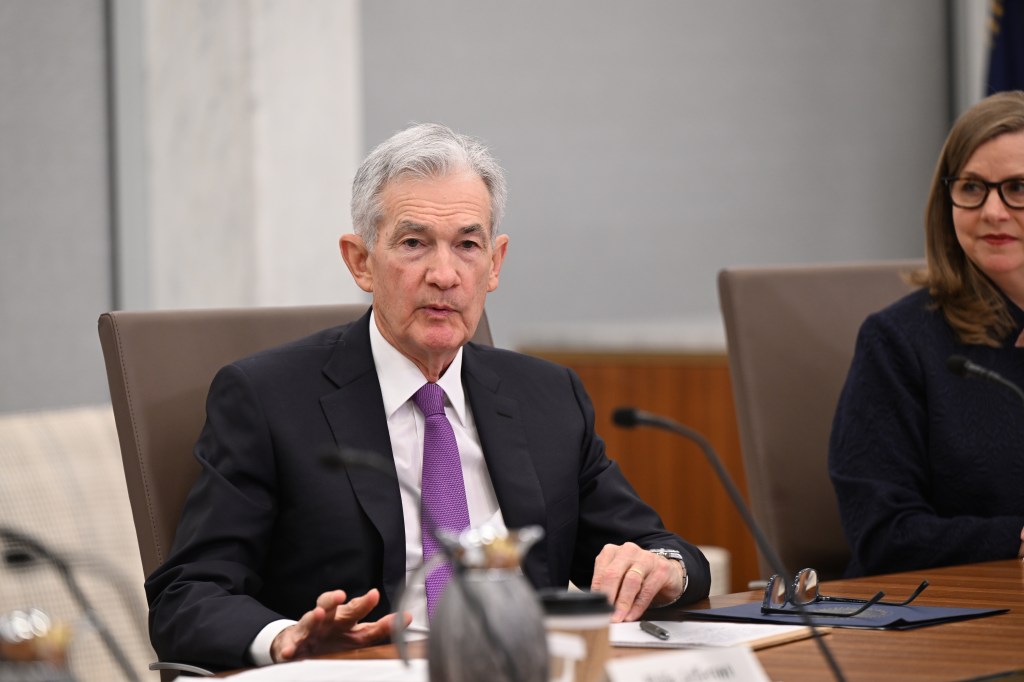
A meeting of the Federal Open Market Committee (Photo from federalreserve.gov)
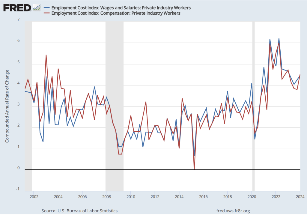
On Friday, May 31, the Bureau of Eeconomic Analysis (BEA) released its “Personal Income and Outlays” report for April, which includes monthly data on the personal consumption expenditures (PCE) price index. Inflation as measured by changes in the consumer price index (CPI) receives the most attention in the media, but the Federal Reserve looks instead to inflation as measured by changes in the PCE price index to evaluate whether it’s meeting its 2 percent annual inflation target.
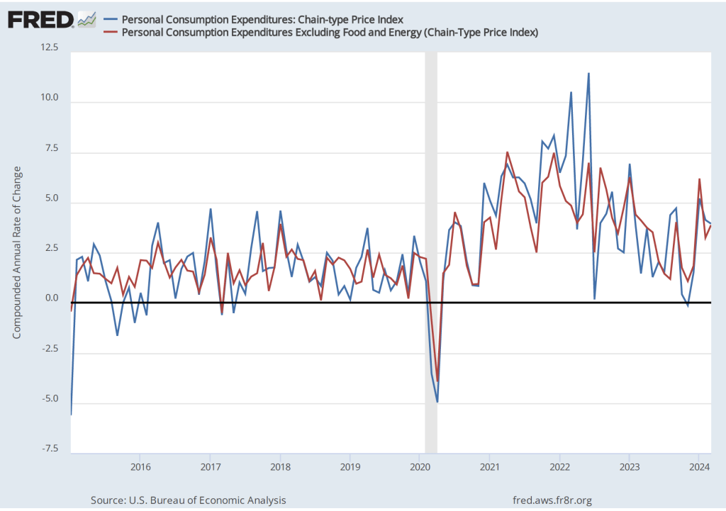
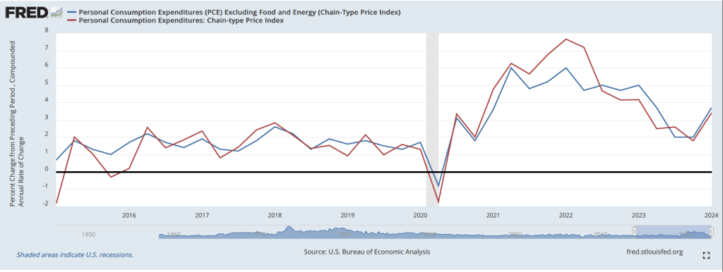
The following figure shows PCE inflation (blue line) and core PCE inflation (red line)—which excludes energy and food prices—for the period since January 2015 with inflation measured as the change in the PCE from the same month in the previous year. Measured this way, PCE inflation in April was 2.7 percent, which was unchanged since March. Core PCE inflation was also unchanged in April at 2.8 percent. (Note that carried to two digits past the decimal place, both measures decreased slightly in April.)

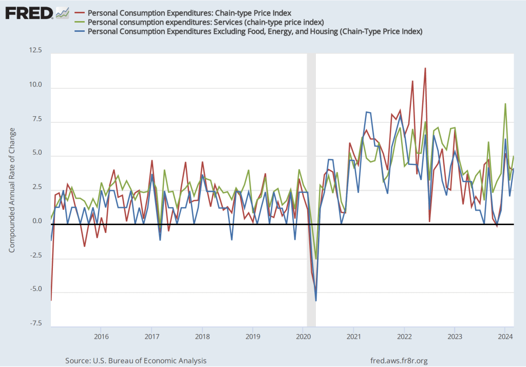
The following figure shows PCE inflation and core PCE inflation calculated by compounding the current month’s rate over an entire year. (The figure above shows what is sometimes called 12-month inflation, while this figure shows 1-month inflation.) Measured this way, PCE inflation declined from 4.1 percent in March to 3.1 percent in April. Core PCE inflation declined from 4.1 percent in March to 3.0 percent in April. This decline may indicate that inflation is slowing, but data for a single month should be interpreted with caution and, even with this decline, inflation is still above the Fed’s 2 percent target.

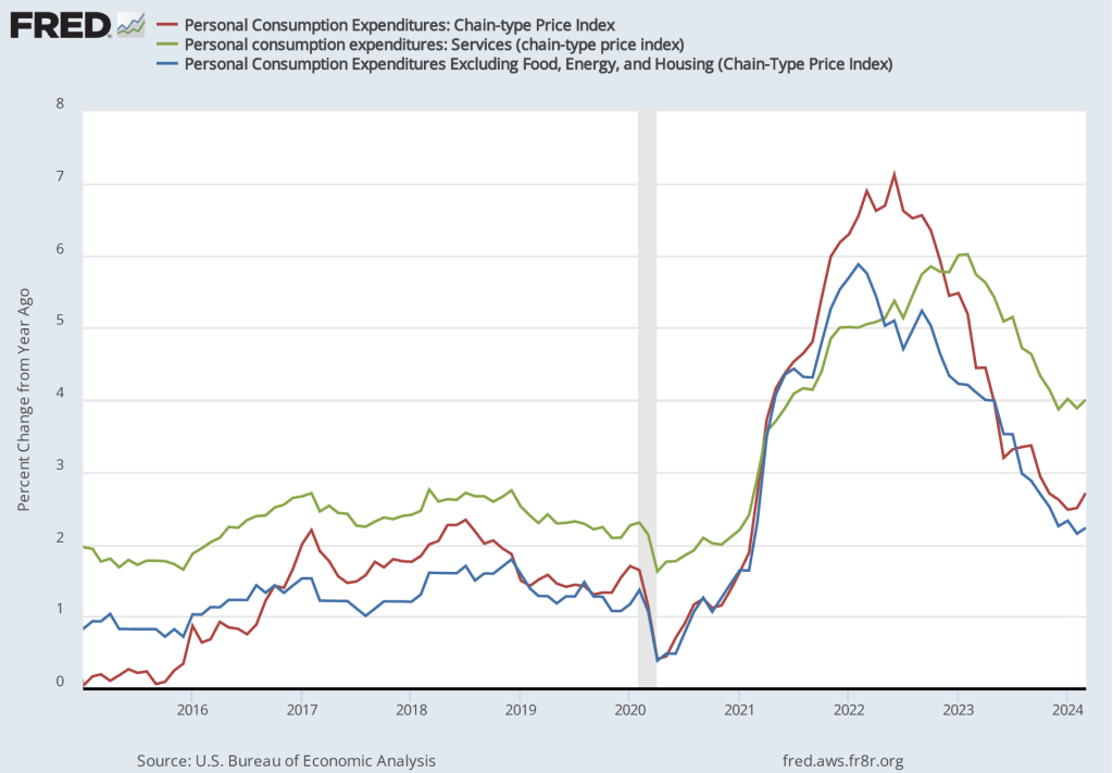
The following figure shows another way of gauging inflation by including the 12-month inflation rate in the PCE (the same as shown in the figure above—although note that PCE inflation is now the red line rather than the blue line), inflation as measured using only the prices of the services included in the PCE (the green line), and the trimmed mean rate of PCE inflation (the blue line). Fed Chair Jerome Powell has said that he is particularly concerned by elevated rates of inflation in services. The trimmed mean measure is compiled by economists at the Federal Reserve Bank of Dallas by dropping from the PCE the goods and services that have the highest and lowest rates of inflation. It can be thought of as another way of looking at core inflation by excluding the prices of goods and services that had particularly high or particularly low rates of inflation during the month.

Inflation using the trimmed mean measure was 2.9 percent in April, down from 3.0 percent in March. Inflation in services remained high, although it declined slightly from 4.0 percent in March to 3.9 percent in April.
It seems unlikely that this month’s PCE data will have much effect on when the members of the Fed’s policy-making Federal Open Market Committee (FOMC) will decide to lower the target for the federal funds rate. The next meeting of the FOMC is June 11-12. That meeting is one of the four during the year at which the committee publishes a Summary of Economic Projections (SEP). The SEP should provide greater insight into what committee members expect will happen with inflation during the remained of the year and whether it’s likely that the committee will lower its target for the federal funds rate this year.