Photo of Fed Chair Jerome Powell from federalreserve.gov
Today’s meeting of the Federal Reserve’s policymaking Federal Open Market Committee (FOMC) had the expected result with the committee deciding to keep its target range for the federal funds rate unchanged at 3.50 percent to 3.75 percent. Fed Governors Stephen Miran and Christopher Waller voted against the action, preferring to lower the target range for the federal funds rate by 0.25 percentage point or 25 basis points.
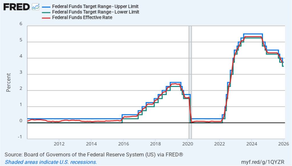
The following figure shows for the period since January 2010, the upper limit (the blue line) and the lower limit (the green line) for the FOMC’s target range for the federal funds rate, as well as the actual values for the federal funds rate (the red line). Note that the Fed has been successful in keeping the value of the federal funds rate in its target range. (We discuss the monetary policy tools the FOMC uses to maintain the federal funds rate within its target range in Macroeconomics, Chapter 15, Section 15.2 (Economics, Chapter 25, Section 25.2).)
Powell’s press conference following the meeting was his first opportunity to discuss the Department of Justice having served the Federal Reserve with grand jury subpoenas, which indicted that Powell might face a criminal indictment related to his testimony before the Senate Banking Committee in June concerning expenditures on renovating Federal Reserve buildings in Washington DC. It was also his first opportunity to discuss his attendance at the Supreme Court during oral arguments in the case that Fed Governor Lisa Cook brought attempting to block President Trump’s attempt to remove her from the Fed’s Board of Governors.
Powell stated that he had attended the Supreme Court hearing because he believed the case to be the most important in the Fed’s history. He noted that there was a precedent for his attendance in that Fed Chair Paul Volcker had attended a Supreme Court during his term. Powell declined to say anything further with respect to the Department of Justice subpoenas or with respect to whether he would stay on the Board of Governors after his term as chair ends in May. (Powell’s term as chair ends on May 15; his term as a Fed governor ends on January 31, 2028.)
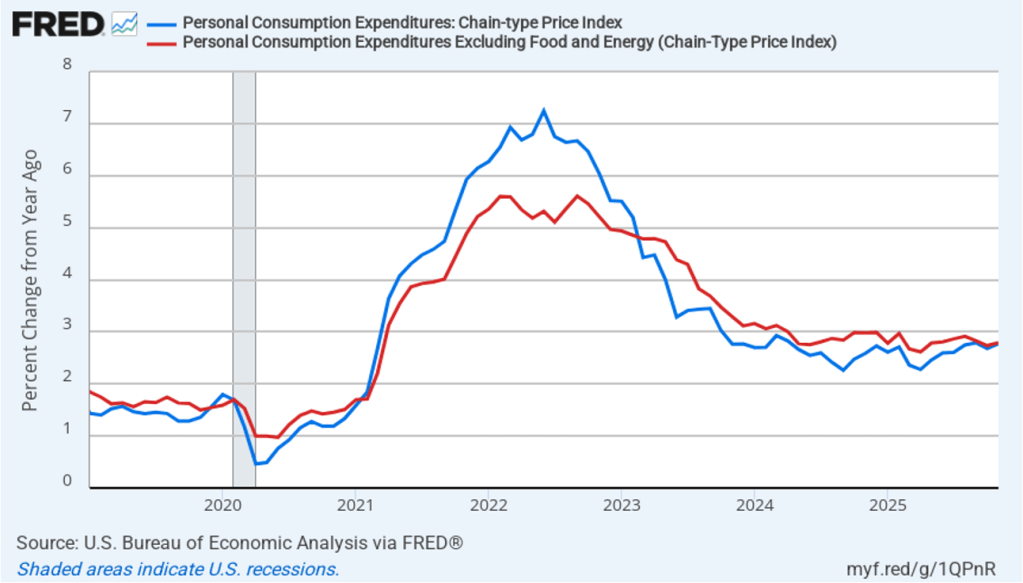
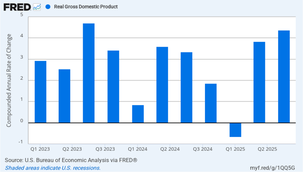
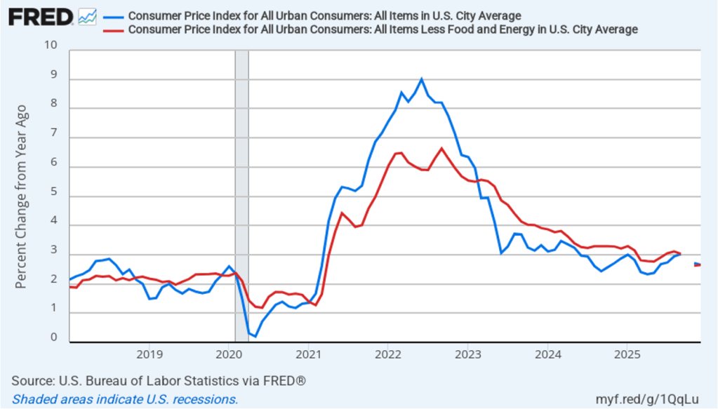
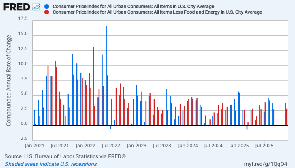
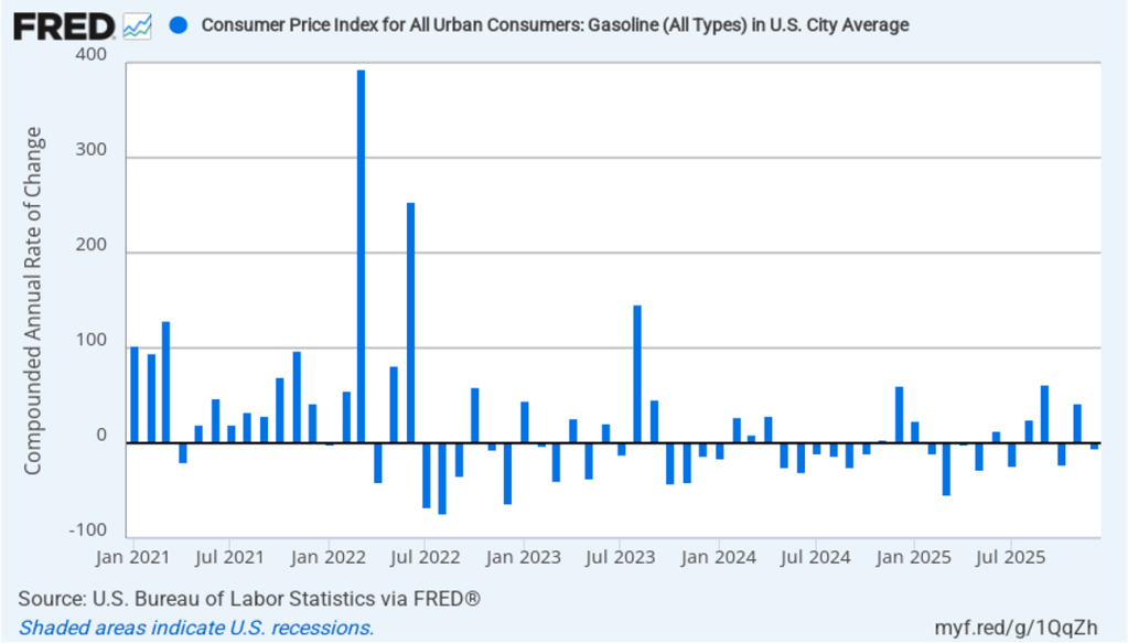
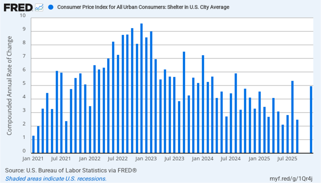
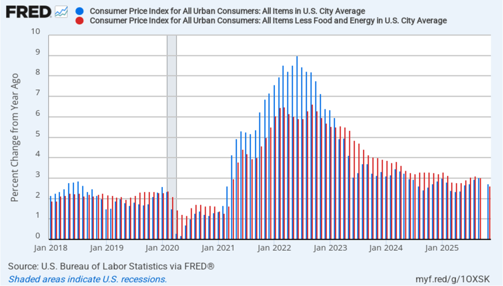
With respect to the economy, Powell stated that he saw the risks to the two parts of the Fed’s dual mandate for price stability and maximum employment to be roughly balanced. Although inflation continues to be above the Fed’s annual target of 2 percent, committee members believe that inflation is elevated because of one-time price increases resulting from tariffs. The committee’s staff economists believe that most of the effects of tariffs on the price level were likely to have passed through the economy sometime in the middle of the year.
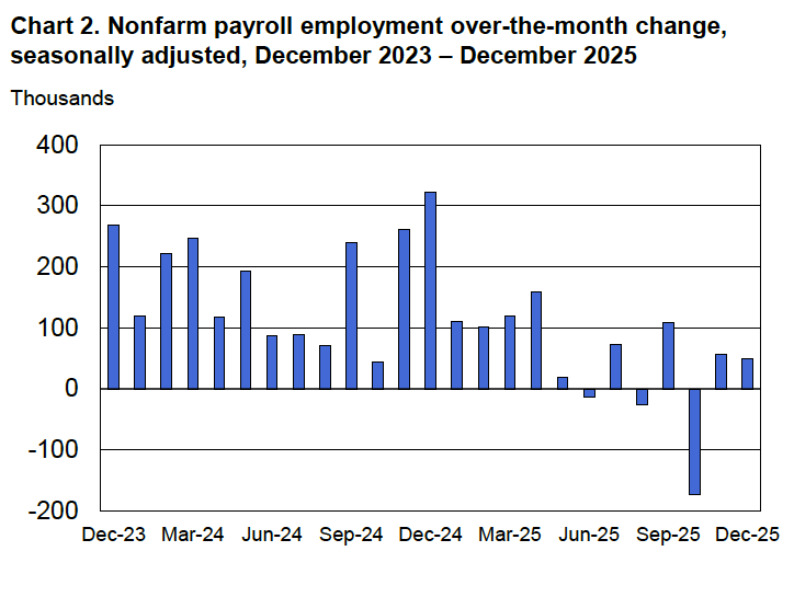
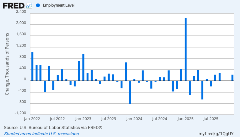
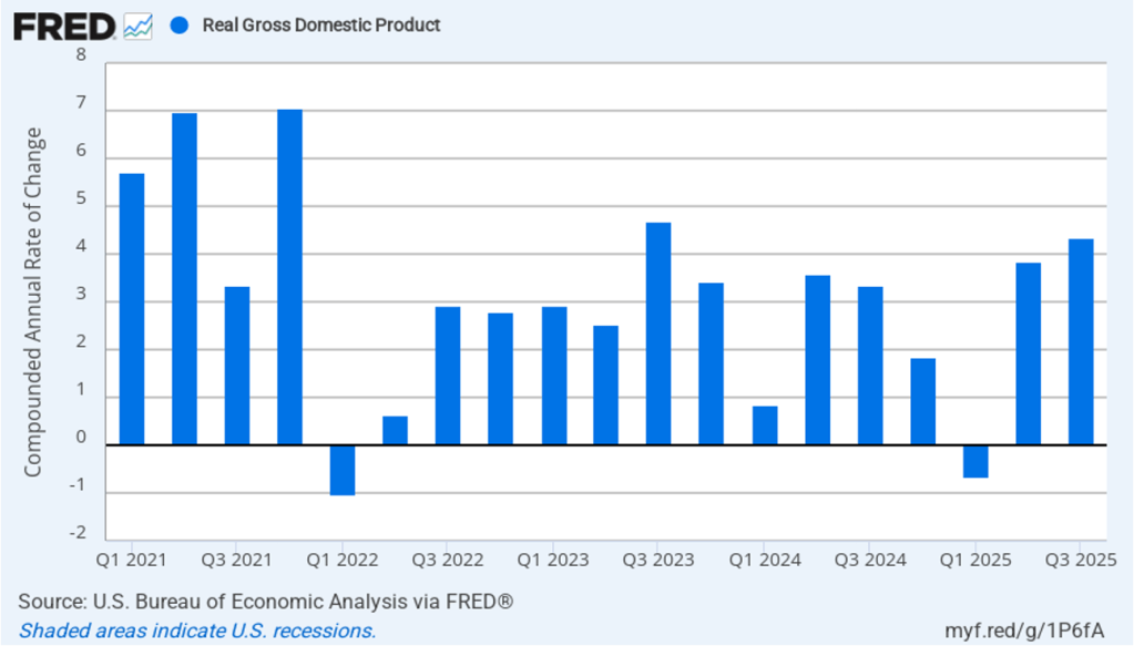
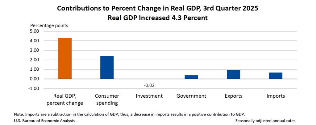
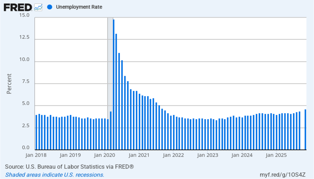
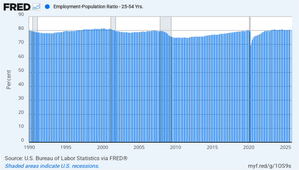
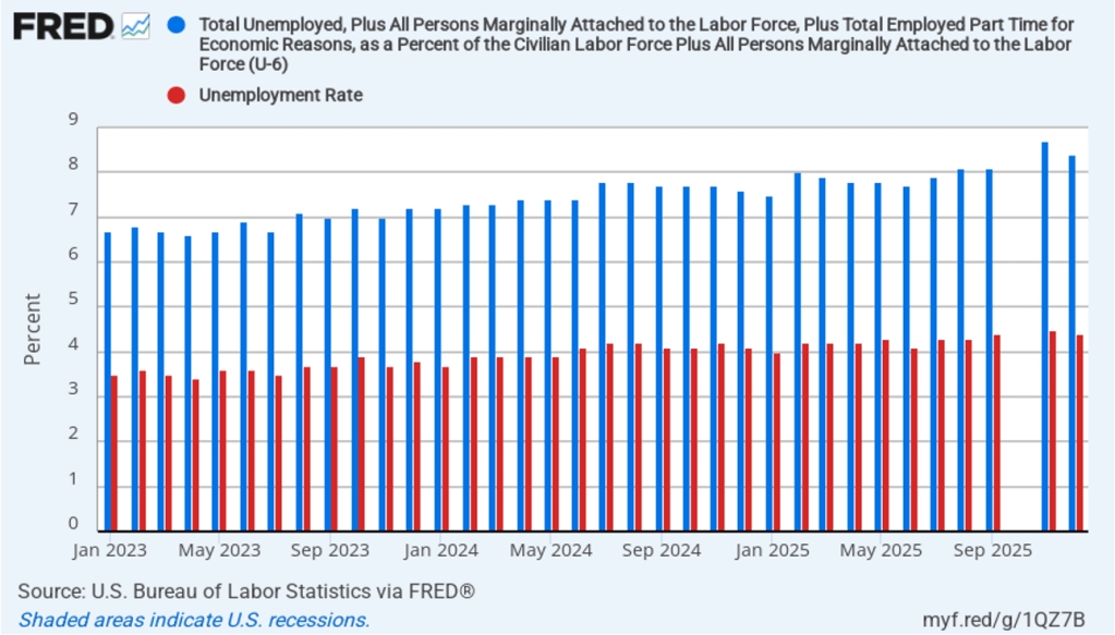
Powell noted that the economy had surprised the committee with its strength and that the outlook for further growth in output was good. He noted that there continued to be signs of slight weakening of the labor market. In particular, he cited increases in the broadest measure of the unemployment rate released by the Bureau of Labor Statistics (BLS).
The following figure shows the U-6 measure of the unemployment rate (the blue bars). This measure differs from the more familiar (U-3) measure of the unemployment rate (the red bars) in that it includes people who are working part time for economic reasons and people who are marginally attached to the labor force. The BLS counts people as marginally attached to the labor force if they “indicate that they have searched for work during the prior 12 months (or since their last job if it ended within the last 12 months), but not in the most recent 4 weeks. Because they did not actively search for work in the last 4 weeks, they are not classified as unemployed [according to the U-3 measure].” Between June 2025 and December 2025, the U-3 meaure of unemployment increased by 0.3 percentage point, while the U-6 measure increased by 0.7 percentage point.
When asked whether he had advice for his successor as Fed chair, Powell said the Fed chairs should not get pulled into commenting on elective politics and should earn their democratic legitimacy through their interactions with Congress.
Looking forward, Powell repeated the sentiment included in the committee’s statement that: “In assessing the appropriate stance of monetary policy, the Committee will continue to monitor the implications of incoming information for the economic outlook. The Committee would be prepared to adjust the stance of monetary policy as appropriate if risks emerge that could impede the attainment of the Committee’s goals.”
The next FOMC meeting is on March 17–18. One indication of expectations of future changes in the FOMC’s target for the federal funds rate comes from investors who buy and sell federal funds futures contracts. (We discuss the futures market for federal funds in this blog post.)
As of this afternoon, investors assigned a 86.5 percent probability to the committee keeping its target range for the federal funds rate unchanged at 3.50 percent to 3.75 percent at its March meeting. That expectation reflects the view that a solid majority of the committee believes, as Powell indicated in today’s press conference, that the unemployment rate is unlikely to rise significantly in coming months, while the inflation rate is likely to decline as the effects of the tariff increases finish passing through the economy.