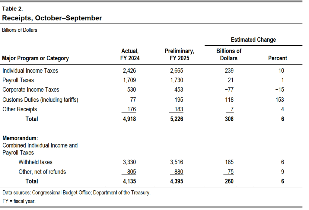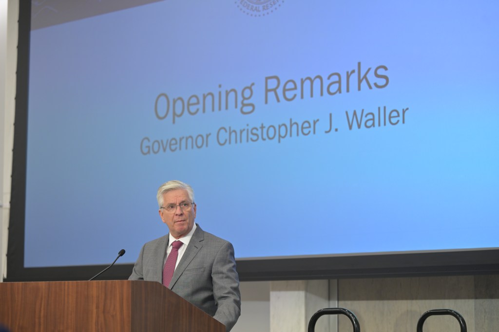
Fed Governor Christopher Wallace on October 21, 2025 at the Fed’s Payment Innovation Conference (photo from federalreserve.gov)
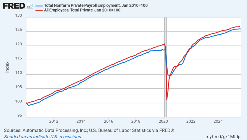
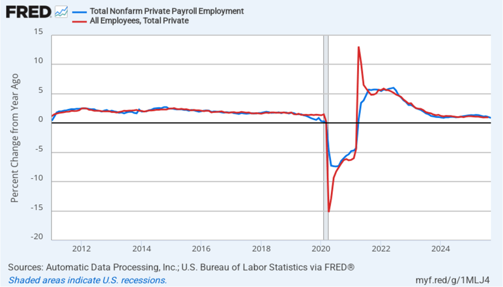
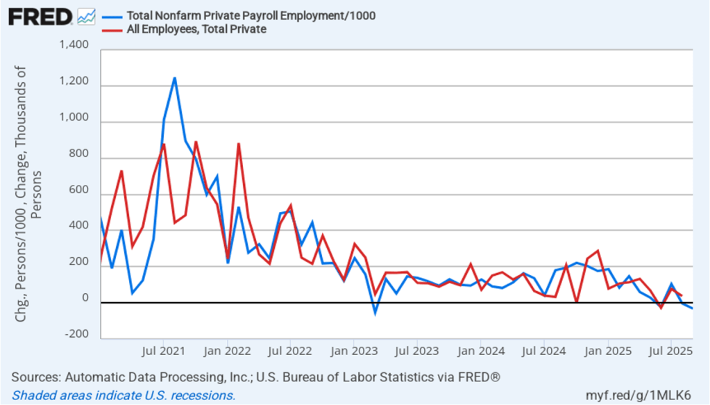
The current partial shutdown of the federal government has delayed the release by the Bureau of Labor Statistics (BLS) of its “Employment Situation” report (often called the “jobs report”). The report had originally been scheduled to be released on October 3. In a recent blog post we discussed how well the employment data collected by the private payroll processing firm Automatic Data Processing (ADP) serves as an alternative measure of the state of the labor market. In that post we showed that ADP data on total private payroll employment tracks fairly well the BLS data on total private employment from its establishment survey (often called the payroll survey) .
An article in today’s Wall Street Journal reports that ADP has stopped providing the Fed with early access to its data. Apparently, as a public service ADP had been providing its data to the Fed a week before the data was publicly released. The article notes that ADP stopped providing the data soon after this speech delievered by Fed Governor Christopher Wallace in late August. In a footnote to the speech Wallace refers to “data that Federal Reserve staff maintains in collaboration with the employment services firm ADP.” The article points out, though, that Waller’s speech was only one of several times since 2019 that a Fed official has publicly mentioned receiving data from ADP.
Losing early access to the ADP data comes at a difficult time for the Fed, given that the BLS employment data are not available. In addition, the labor market has shown signs of weakening even though growth has remained strong in measures of output. If payroll employment has been falling, rather than growing slowly as it was in the August jobs report, that knowledge would affect the deliberations of the Fed’s policymaking Federal Open Market Committee (FOMC) at its next meeting on October 28–29. Serious deterioration in the labor market could lead the FOMC to cut its target for the federal funds rate by more than the expected 0.25 percentage point (25 basis points).
In a speech in 2019, Fed Chair Jerome Powell noted that the Fed staff had used ADP data to develop a new measure of payroll employment. Had that measure been available in 2008, Powell argued, the FOMC would have realized earlier than it did that employment was being severely affected by the deepening of the financial crisis:
“[I]n the first eight months of 2008, as the Great Recession was getting underway, the official monthly employment data showed total job losses of about 750,000. A later benchmark revision told a much bleaker story, with declines of about 1.5 million. Our new measure, had it been available in 2008, would have been much closer to the revised data, alerting us that the job situation might be considerably worse than the official data suggested.”
The Wall Street Journal article notes that Powell has urged ADP to resume sharing its employment data with the Fed.