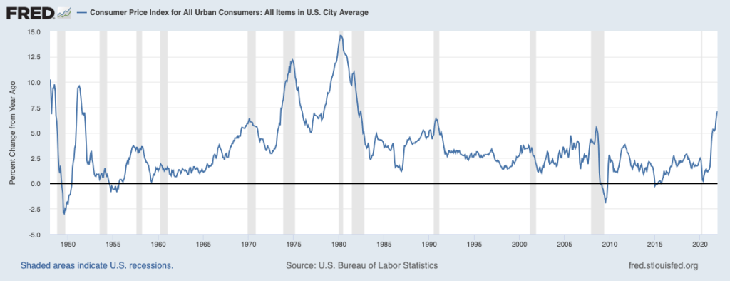
In January 2022, the Bureau of Labor Statistics (BLS) announced that inflation, measured as the percentage change in the consumer price index (CPI) from December 2020 to December 2021, was 7 percent. That was the highest rate since June 1982, which was near the end of the Great Inflation that lasted from 1968 to 1982. The following figure shows the inflation rate since the beginning of 1948.
What explains the surge in inflation? Most economists believe that it is the result of the interaction of increases in aggregate demand resulting from very expansionary monetary and fiscal policy and disruptions to supply in some industries as a result of the Covid-19 pandemic. (We discuss movements in aggregate demand and aggregate supply during the pandemic in the updated editions of Economics, Chapter 23, Section 23.3 and Macroeconomics, Chapter 13, Section, 13.3.)
But President Joe Biden has suggested that mergers and acquisitions in some industries—he singled out meatpacking—have reduced competition and contributed to recent price increases. Massachusetts Senator Elizabeth Warren has made a broader claim about reduced competition being responsible for the surge in inflation: “Market concentration has allowed giant corporations to hide behind claims of increased costs to fatten their profit margins. [Corporations] are raising prices because they can.” And “Corporations are exploiting the pandemic to gouge consumers with higher prices on everyday essentials, from milk to gasoline.”
Do many economists agree that reduced competition explains inflation? The Booth School of Business at the University of Chicago periodically surveys a panel of more than 40 well-known academic economists for their opinions on significant policy issues. Recently, the panel was asked whether they agreed with these statements:
A significant factor behind today’s higher US inflation is dominant corporations in uncompetitive markets taking advantage of their market power to raise prices in order to increase their profit margins.
Antitrust interventions could successfully reduce US inflation over the next 12 months.
Price controls as deployed in the 1970s could successfully reduce US inflation over the next 12 months.
Large majorities of the panel disagreed with statements 1. and 2.—that is, they don’t believe that a lack of competition explains the surge in inflation or that antitrust actions by the federal government would be likely to reduce inflation in the coming year. A smaller majority disagreed with statement 3., although even some of those who agreed that price controls would reduce inflation stated that they believed price controls were an undesirable policy. For instance, while he agreed with statement 3., Oliver Hart of Harvard noted that: “They could reduce inflation but the consequence would be shortages and rationing.”
One way to characterize the panel’s responses is that they agreed that the recent inflation was primarily a macroeconomic issue—involving movements in aggregate demand and aggregate supply—rather than a microeconomic issue—involving the extent of concentration in individual industries.
Sources for Biden and Warren quotes: Greg Ip, “Is Inflation a Microeconomic Problem? That’s What Biden’s Competition Push Is Betting,” Wall Street Journal, January 12, 2022; and Patrick Thomas and Catherine Lucey, “Biden Promotes Plan Aimed at Tackling Meat Prices,” Wall Street Journal, January 3, 2022; and https://twitter.com/SenWarren/status/1464353269610954759?s=20
Lawrence Summers, professor of economics at Harvard University and secretary of the Treasury under President Bill Clinton, has been outspoken in arguing that monetary and fiscal have been too expansionary. In February 2021, just before Congress passed the American Rescure Plan, which increased federal government spending by $1.9 trillion, Summers cautioned that “there is a chance that macroeconomic stimulus on a scale closer to World War II levels than normal recession levels will set off inflationary pressures of a kind we have not seen in a generation, with consequences for the value of the dollar and financial stability.”
In a brief CNN interview found at this LINK, Summers indicates that he remains concerned that inflation may persist at high levels for a longer period than many other economists, including policymakers at the Federal Reserve, believe.
Source for quote: Lawrence H. Summers, “The Biden Stimulus Is Admirably Ambitious. But It Brings Some Big Risks, Too,” Washington Post, February 4, 2021.
During a lecture in my Modern Political Economy class this fall, I explained—as I have to many students over the course of four decades in academia—that capitalism’s adaptation to globalization and technological change had produced gains for all of society. I went on to say that capitalism has been an engine of wealth creation and that corporations seeking to maximize their long-term shareholder value had made the whole economy more efficient. But several students in the crowded classroom pushed back. “Capitalism leaves many people and communities behind,” one student said. “Adam Smith’s invisible hand seems invisible because it’s not there,” declared another.
I know what you’re thinking: For undergraduates to express such ideas is hardly news. But these were M.B.A. students in a class that I teach at Columbia Business School. For me, those reactions took some getting used to. Over the years, most of my students have eagerly embraced the creative destruction that capitalism inevitably brings. Innovation and openness to new technologies and global markets have brought new goods and services, new firms, new wealth—and a lot of prosperity on average. Many master’s students come to Columbia after working in tech, finance, and other exemplars of American capitalism. If past statistics are any guide, most of our M.B.A. students will end up back in the business world in leadership roles.
The more I thought about it, the more I could see where my students were coming from. Their formative years were shaped by the turbulence after 9/11, the global financial crisis, the Great Recession, and years of debate about the unevenness of capitalism’s benefits across individuals. They are now witnessing a pandemic that caused mass unemployment and a breakdown in global supply chains. Corporate recruiters are trying to win over hesitant students by talking up their company’s “mission” or “purpose”—such as bringing people together or meeting one of society’s big needs. But these gauzy assertions that companies care about more than their own bottom line are not easing students’ discontent.
Over the past four decades, many economists—certainly including me—have championed capitalism’s openness to change, stressed the importance of economic efficiency, and urged the government to regulate the private sector with a light touch. This economic vision has yielded gains in corporate efficiency and profitability and lifted average American incomes as well. That’s why American presidents from Ronald Reagan to Barack Obama have mostly embraced it.
Yet even they have made exceptions. Early in George W. Bush’s presidency, when I chaired his Council of Economic Advisers, he summoned me and other advisers to discuss whether the federal government should place tariffs on steel imports. My recommendation against tariffs was a no-brainer for an economist. I reminded the president of the value of openness and trade; the tariffs would hurt the economy as a whole. But I lost the argument. My wife had previously joked that individuals fall into two groups—economists and real people. Real people are in charge. Bush proudly defined himself as a real person. This was the political point that he understood: Disruptive forces of technological change and globalization have left many individuals and some entire geographical areas adrift.
In the years since, the political consequences of that disruption have become all the more striking—in the form of disaffection, populism, and calls to protect individuals and industries from change. Both President Donald Trump and President Joe Biden have moved away from what had been mainstream economists’ preferred approach to trade, budget deficits, and other issues.
Economic ideas do not arise in a vacuum; they are influenced by the times in which they are conceived. The “let it rip” model, in which the private sector has the leeway to advance disruptive change, whatever the consequences, drew strong support from such economists as Friedrich Hayek and Milton Friedman, whose influential writings showed a deep antipathy to big government, which had grown enormously during World War II and the ensuing decades. Hayek and Friedman were deep thinkers and Nobel laureates who believed that a government large enough for top-down economic direction can and inevitably will limit individual liberty. Instead, they and their intellectual allies argued, government should step back and accommodate the dynamism of global markets and advancing technologies.
But that does not require society to ignore the trouble that befalls individuals as the economy changes around them. In 1776, Adam Smith, the prophet of classical liberalism, famously praised open competition in his book The Wealth of Nations. But there was more to Smith’s economic and moral thinking. An earlier treatise, The Theory of Moral Sentiments, called for “mutual sympathy”—what we today would describe as empathy. A modern version of Smith’s ideas would suggest that government should play a specific role in a capitalist society—a role centered on boosting America’s productive potential(by building and maintaining broad infrastructure to support an open economy) and on advancing opportunity (by pushing not just competition but also the ability of individual citizens and communities to compete as change occurs).
The U.S. government’s failure to play such a role is one thing some M.B.A. students cite when I press them on their misgivings about capitalism. Promoting higher average incomes alone isn’t enough. A lack of “mutual sympathy” for people whose career and community have been disrupted undermines social support for economic openness, innovation, and even the capitalist economic system itself.
The United States need not look back as far as Smith for models of what to do. Visionary leaders have taken action at major economic turning points; Abraham Lincoln’s land-grant colleges and Franklin Roosevelt’s G.I. Bill, for example, both had salutary economic and political effects. The global financial crisis and the coronavirus pandemic alike deepen the need for the U.S. government to play a more constructive role in the modern economy. In my experience, business leaders do not necessarily oppose government efforts to give individual Americans more skills and opportunities. But business groups generally are wary of expanding government too far—and of the higher tax levels that doing so would likely produce.
My students’ concern is that business leaders, like many economists, are too removed from the lives of people and communities affected by forces of change and companies’ actions. That executives would focus on general business and economic concerns is neither surprising nor bad. But some business leaders come across as proverbial “anywheres”—geographically mobile economic actors untethered to actual people and places—rather than “somewheres,” who are rooted in real communities.
This charge is not completely fair. But it raises concerns that broad social support for business may not be as firm as it once was. That is a problem if you believe, as I do, in the centrality of businesses in delivering innovation and prosperity in a capitalist system. Business leaders wanting to secure society’s continuing support for enterprise don’t need to walk away from Hayek’s and Friedman’s recounting of the benefits of openness, competition, and markets. But they do need to remember more of what Adam Smith said.
As my Columbia economics colleague Edmund Phelps, another Nobel laureate, has emphasized, the goal of the economic system Smith described is not just higher incomes on average, but mass flourishing. Raising the economy’s potential should be a much higher priority for business leaders and the organizations that represent them. The Business Roundtable and the Chamber of Commerce should strongly support federally funded basic research that shifts the scientific and technological frontier and applied-research centers that spread the benefits of those advances throughout the economy. Land-grant colleges do just that, as do agricultural-extension services and defense-research applications. Promoting more such initiatives is good for business—and will generate public support for business. After World War II, American business groups understood that the Marshall Plan to rebuild Europe would benefit the United States diplomatically and commercially. They should similarly champion high-impact investment at home now.
To address individual opportunity, companies could work with local educational institutions and commit their own funds for job-training initiatives. But the U.S. as a whole should do more to help people compete in the changing economy—by offering block grants to community colleges, creating individualized reemployment accounts to support reentry into work, and enhancing support for lower-wage, entry-level work more generally through an expanded version of the earned-income tax credit. These proposals are not cheap, but they are much less costly and more tightly focused on helping individuals adapt than the social-spending increases being championed in Biden’s Build Back Better legislation are. The steps I’m describing could be financed by a modestly higher corporate tax rate if necessary.
My M.B.A. students who doubt the benefits of capitalism see the various ways in which government policy has ensured the system’s survival. For instance, limits on monopoly power have preserved competition, they argue, and government spending during economic crises has forestalled greater catastrophe.
They also see that something is missing. These young people, who have grown up amid considerable pessimism, are looking for evidence that the system can do more than generate prosperity in the aggregate. They need proof that it can work without leaving people and communities to their fate. Businesses will—I hope—keep pushing for greater globalization and promoting openness to technological change. But if they want even M.B.A. students to go along, they’ll also need to embrace a much bolder agenda that maximizes opportunities for everyone in the economy.
According to the Federal Reserve Act, the Fed must conduct monetary policy “so as to promote effectively the goals of maximum employment, stable prices, and moderate long-term interest rates.” Neither “maximum employment” nor “stable prices” are defined in the act.
The Fed has interpreted “stable prices” to mean a low rate of inflation. Since 2012, the Fed has had an explicit inflation target of 2 percent. When the Fed announced its new monetary policy strategy in August 2020, it modified its inflation target by stating that it would attempt to achieve an average inflation rate of 2 percent over time. As Fed Chair Jerome Powell stated: “Our approach can be described as a flexible form of average inflation targeting.” (Note that although the consumer price index (CPI) is the focus of many media stories on inflation, the Fed’s preferred measure of inflation is changes in the core personal consumption expenditures (PCE) price index. The PCE is a broader measure of the price level than is the CPI because it includes the prices of all the goods and services included in consumption category of GDP. “Core” means that the index excludes food and energy prices. For a further discussion see, Economics, Chapter 25, Section 15.5 and Macroeconomics, Chapter 15, Section 15.5.)
There is more ambiguity about how to determine whether the economy is at maximum employment. For many years, a majority of members of the Federal Open Market Committee (FOMC) focused on the natural rate of unemployment (also called the non-accelerating rate of unemployment (NAIRU)) as the best gauge of when the U.S. economy had attained maximum employment. The lesson many economists and policymakers had taken from the experience of the Great Inflation that lasted from the late 1960s to the early 1980s was if the unemployment rate was persistently below the natural rate of unemployment, inflation would begin to accelerate. Because monetary policy affects the economy with a lag, many policymakers believed it was important for the Fed to react before inflation begins to significantly increase and a higher inflation rate becomes embedded in the economy.
At least until the end of 2018, speeches and other statements by some members of the FOMC indicated that they continued to believe that the Fed should pay close attention to the relationship between the natural rate of unemployment and the actual rate of unemployment. But by that time some members of the FOMC had concluded that their decision to begin raising the target for the federal funds rate in December 2015 and continuing raising it through December 2018 may have been a mistake because their forecasts of the natural rate of unemployment may have been too high. For instance, Atlanta Fed President Raphael Bostic noted in a speech that: “If estimates of the NAIRU are actually too conservative, as many would argue they have been … unemployment could have averaged one to two percentage points lower” than it actually did.
Accordingly, when the Fed announced its new monetary policy strategy in August 2020, it indicated that it would consider a wider range of data—such as the employment-population ratio—when determining whether the labor market had reached maximum employment. At the time, Fed Chair Powell noted that: “the maximum level of employment is not directly measurable and [it] changes over time for reasons unrelated to monetary policy. The significant shifts in estimates of the natural rate of unemployment over the past decade reinforce this point.”
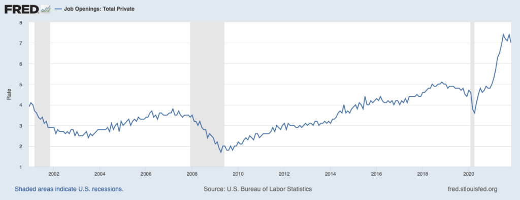
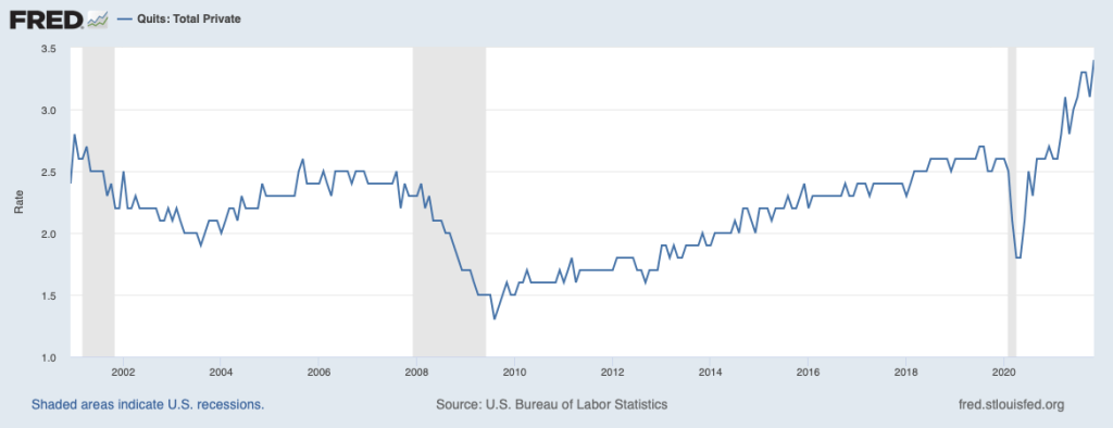
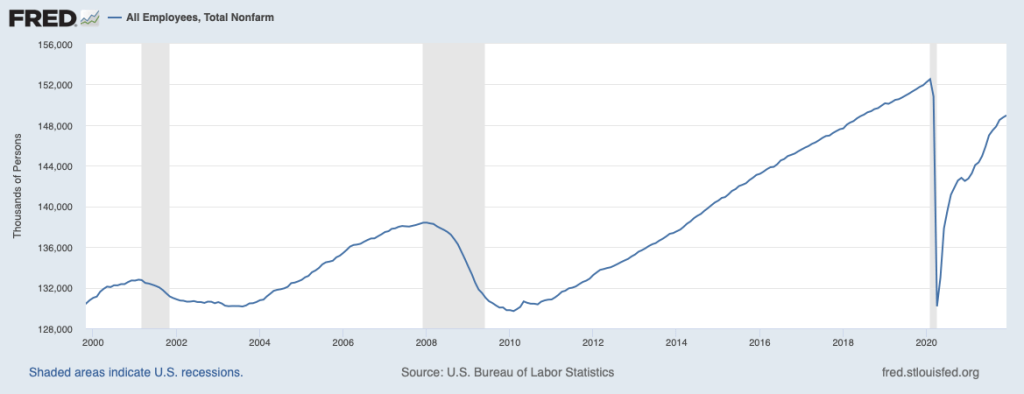
As the economy recovered from the effects of the Covid-19 pandemic, the Fed faced particular difficulty in assessing the state of the labor market. Some labor market indicators appeared to show that the economy was close to maximum employment while other indicators showed that the labor market recovery was not complete. For instance, in December 2021, the unemployment rate was 3.9 percent, slightly below the average of the FOMC members estimates of the natural rate of unemployment, which was 4.0 percent. Similarly, as the first figure below shows, job vacancy rates were very high at the end of 2021. (The BLS calculates job vacancy rates, also called job opening rates, by dividing the number of unfilled job openings by the sum of total employment plus job openings.) As the second figure below shows, job quit rates were also unusually high, indicating that workers saw the job market as being tight enough that if they quit their current job they could find easily another job. (The BLS calculates job quit rates by dividing the number of people quitting jobs by total employment.) By those measures, the labor market seemed close to maximum employment.
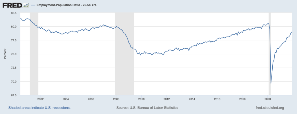
But as the first figure below shows, total employment in December 2021 was still 3.5 million below its level of early 2020, just before the U.S. economy began to experience the effects of the pandemic. Some of the decline in employment can be accounted for by older workers retiring, but as the second figure below indicates, employment of prime-age workers (those between the ages of 25 and 54), had not recovered to pre-pandemic levels.
How to reconcile these conflicting labor market indicators? In January 2022, Fed Chair Powell testified before the Senate Banking Committee as the Senate considered his nomination for a second four-year term as chair. In discussing the state of the economy he offered the opinion that: “We’re very rapidly approaching or at maximum employment.” He noted that inflation as measured by changes in the CPI had been running above 5 percent since June 2021: “If these high levels of inflation get entrenched in our economy, and in people’s thinking, then inevitably that will lead to much tighter monetary policy from us, and it could lead to a recession.” In that sense, “high inflation is a severe threat to the achievement of maximum employment.”
At the time of Powell’s testimony, the FOMC had already announced that it was moving to a less expansionary monetary policy by reducing its purchases of Treasury bonds and mortgage-backed securities and by increasing its target for the federal funds rate in the near future. He argued that these actions would help the Fed achieve its dual mandate by reducing the inflation rate, thereby heading off the need for larger increases in the federal funds rate that might trigger a recession. Avoiding a recession would help achieve the goal of maximum employment.
Powell’s remarks did not make explicit which labor market indicators the Fed would focus on in determining whether the goal of maximum employment had been obtained. It did make clear that the Fed’s new policy of average inflation targeting did not mean that the Fed would accept inflation rates as high as those of the second half of 2021 without raising its target for the federal funds rate. In that sense, the Fed’s monetary policy of 2022 seemed consistent with its decades-long commitment to heading off increases in inflation before they lead to a significant increase in the inflation rate expected by households, businesses, and investors.
Note: For a discussion of the background to Fed policy, see Economics, Chapter 25, Section 25.5 and Chapter 27, Section 17.4, and Macroeconomics, Chapter 15, Section 15.5 and Chapter 17, Section 17.4.
Sources: Jeanna Smialek, “Jerome Powell Says the Fed is Prepared to Raise Rates to Tame Inflation,” New York Times, January 11, 2022; Nick Timiraos, “Fed’s Powell Says Economy No Longer Needs Aggressive Stimulus,” Wall Street Journal, January 11, 2022; and Federal Open Market Committee, “Meeting Calendars, Statements, and Minutes,” federalreserve.gov, January 5, 2022.
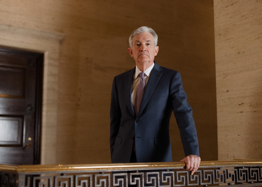
Jerome Powell (photo from the Wall Street Journal)
Most economists believe that monetary policy actions, such as changes in the Fed’s pace of buying bonds or in its target for the federal funds rate, affect real GDP and employment only with a lag of several months or longer. But monetary policy actions can have a more immediate effect on the prices of financial assets like stocks and bonds.
Investors in financial markets are forward looking because the prices of financial assets are determined by investors’ expectations of the future. (We discuss this point in Economics and Microeconomics, Chapter 8, Section 8.2, Macroeconomics, Chapter 6, Section 6.2, and Money, Banking and the Financial System, Chapter 6.) For instance, stock prices depend on the future profitability of firms, so if investors come to believe that future economic growth is likely to be slower, thereby reducing firms’ profits, the investors will sell stocks causing stock prices to decline.
Similarly, holders of existing bonds will suffer losses if the interest rates on newly issued bonds are higher than the interest rates on existing bonds. Therefore, if investors come to believe that future interest rates are likely to be higher than they had previously expected them to be, they will sell bonds, thereby causing their prices to decline and the interest rates on them to rise. (Recall that the prices of bonds and the interest rates (or yields) on them move in opposite directions: If the price of a bond falls, the interest rate on the bond will increase; if the price of a bond rises, the interest rate on the bond will decrease. To review this concept, see the Appendix to Economics and Microeconomics Chapter 8, the Appendix to Macroeconomics Chapter 6, and Money, Banking, and the Financial System, Chapter 3.)
Because monetary policy actions can affect future interest rates and future levels of real GDP, investors are alert for any new information that would throw light on the Fed’s intentions. When new information appears, the result can be a rapid change in the prices of financial assets. We saw this outcome on January 5, 2022, when the Fed released the minutes of the Federal Open Market Committee meeting held on December 14 and 15, 2021. At the conclusion of the meeting, the FOMC announced that it would be reducing its purchases of long-term Treasury bonds and mortgage-backed securities. These purchases are intended to aid the expansion of real GDP and employment by keeping long-term interest rates from rising. The FOMC also announced that it intended to increase its target for the federal funds rate when “labor market conditions have reached levels consistent with the Committee’s assessments of maximum employment.”
When the minutes of this FOMC meeting were released at 2 pm on January 5, 2022, many investors realized that the Fed might increase its target for the federal funds rate in March 2022—earlier than most had expected. In this sense, the release of the FOMC minutes represented new information about future Fed policy and the markets quickly reacted. Selling of stocks caused the S&P 500 to decline by nearly 100 points (or about 2 percent) and the Nasdaq to decline by more than 500 points (or more than 3 percent). Similarly, the price of Treasury securities fell and, therefore, their interest rates rose.
Investors had concluded from the FOMC minutes that economic growth was likely to be slower during 2022 and interest rates were likely to be higher than they had previously expected. This change in investors’ expectations was quickly reflected in falling prices of stocks and bonds.
Sources: An Associated Press article on the reaction to the release of the FOMC minutes can be found HERE; the FOMC’s statement following its December 2021 meeting can be found HERE; and the minutes of the FOMC meeting can be found HERE.
When Congress established the Federal Reserve System in 1913, it intended to make the Fed independent of the rest of the federal government. (We discuss this point in the opener to Macroeconomics, Chapter 15 and to Economics, Chapter 25. We discuss the structure of the Federal Reserve System in Macroeconomics, Chapter 14, Section 14.4 and in Economics, Chapter 24, Section 24.4.) The ultimate responsibility for operating the Fed lies with the Board of Governors in Washington, DC. Members of the Board of Governors are nominated by the president and confirmed by the Senate to 14-year nonrenewable terms. Congress intentionally made the terms of Board members longer than the eight years that a president serves (if the president is reelected to a second term).
The president is still able to influence the Board of Governors in two ways:
The terms of members of the Board of Governors are staggered so that one term expires on January 31 of each even-number year. Although this approach means that it’s unlikely that a president will be able to appoint all seven members during the president’s time in office, in practice, many members do not serve their full 14-year terms. So, a president who serves two terms will typically have an opportunity to appoint more than four members of the Board.
The president nominates one member of the Board to serve a renewable four-year term as chair, subject to confirmation by the Senate.
The terms of Fed chairs end in the year after the year a president begins either the president’s first or second term. As a result, presidents are often faced with what is at times a difficult decision as to whether to reappoint a Fed chair who was first appointed by a president of the other party.
For example, after taking office in January 2009, President Barack Obama, a Democrat, faced the decision of whether to nominate Fed Chair Ben Bernanke to a second term to begin in 2010. Bernanke had originally been appointed by President George W. Bush, a Republican. Partly because the economy was still suffering the aftereffects of the financial crisis and the Great Recession, President Obama decided that it would potentially be disruptive to financial markets to replace Bernanke, so he nominated him for a second term.
After taking office in January 2017, President Donald Trump, a Republican, had to decide whether to nominate Fed Chair Janet Yellen, who had been appointed by Obama, to another term that would begin in 2018. He decided not to reappoint Yellen and instead nominated Jerome Powell, who was already serving on the Board of Governors. Although a Republican, Powell had been appointed to the Board in 2014 by Obama.
President Biden’s reasons for nominating Powell to a second term to begin in 2022 were similar to Obama’s reasons for nominating Bernanke to a second term: The U.S. economy was still recovering from the effects of the Covid-19 pandemic, including the strains the pandemic had inflicted on the financial system. He believed that replacing Powell with another nominee would have been potentially disruptive to the financial system.
There had been speculation that Biden would choose Lael Brainard, who has served on the Board of Governors since 2014 following her appointment by Obama, to succeed Powell as Fed chair. Instead, Biden appointed Brainard as vice chair of the Board. In announcing the appointments, Biden stated: “America needs steady, independent, and effective leadership at the Federal Reserve. That’s why I will nominate Jerome Powell for a second term as Chair of the Board of Governors of the Federal Reserve System and Dr. Lael Brainard to serve as Vice Chair of the Board of Governors.”
Sources: Nick Timiraos and Andrew Restuccia, “Biden Will Tap Jerome Powell for New Term as Fed Chairman,” wsj.com, November 22, 2021; and Jeff Cox and Thomas Franck, “Biden Picks Jerome Powell to Lead the Fed for a Second Term as the U.S. Battles Covid and Inflation,” cnbc.com, November 22, 2021.
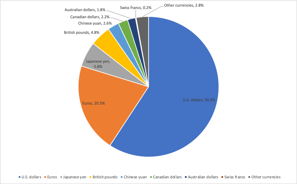
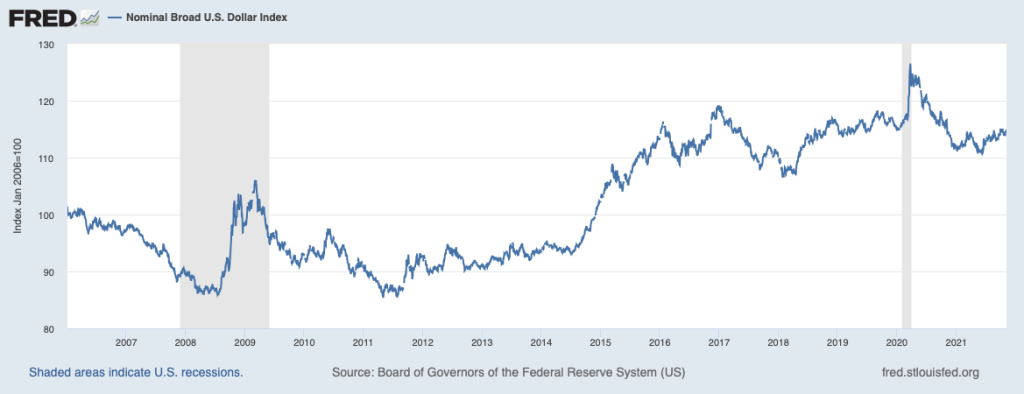
The U.S. dollar is the most important currency in the world economy. The funds that governments and central banks hold to carry out international transactions are called their official foreign exchange reserves. (See Macroeconomics, Chapter 18, Section 18.1 and Economics, Chapter 28, Section 28.1.) There are 180 national currencies in the world and foreign exchange reserves can be held in any of them. In practice, international transactions are conducted in only a few currencies. Because the U.S. dollar is used most frequently in international transactions, the majority of foreign exchange reserves are held in U.S. dollars. The following figure shows the composition of official foreign exchange reserves by currency as of mid-2021.
Over time, the percentage of foreign exchange reserves in U.S. dollars has been gradually declining, although the dollar seems likely to remain the dominant foreign reserve currency for a considerable period. Does the United States gain an advantage from being the most important foreign reserve currency? Economists and policymakers are divided in their views. At the most basic level, dollars are claims on U.S. goods and services and U.S. financial assets. When foreign governments, banks, corporations, and investors hold U.S. dollars rather than spending them, they are, in effect, providing the United States with interest-free loans. U.S. households and firms also benefit from often being able to use U.S. currency around the world when buying and selling goods and services and when borrowing, rather than first having to exchange dollars for other currencies.
But there are also disadvantages to the dollar being the dominant reserve currency. Because the dollar plays this role, the demand for the dollar is higher than it would otherwise be, which increases the exchange rate between the dollar and other currencies. If the dollar lost its status as the key foreign reserve currency, the exchange rate might decline by as much as 30 percent. A decline in the value of the dollar by that much would substantially increase exports of U.S. goods. Barry Eichengreen of the University of California, Berkeley, has noted that the result might be “a shift in the composition of what America exports from Treasury [bonds and other financial securities] … toward John Deere earthmoving equipment, Boeing Dreamliners, and—who knows—maybe even motor vehicles and parts.”
As shown in the following figure, the importance of the U.S. dollar in the world economy is also indicated by the sharp increase in the demand for dollars and, therefore, in the exchange rate during the financial crisis in the fall of 2008 and during the spread of Covid-19 in the spring of 2020. (The exchange rate in the figure is a weighted average of the exchange rates between the dollar and the currencies of the major trading partners of the United States.) As an article in the Economist put it: “Last March, when suddenly the priority was to have cash, the cash that people wanted was dollars.”
Sources: International Monetary Fund, “Currency Composition of Official Foreign Exchange Reserves,” data.imf.org; Alina Iancu, Neil Meads, Martin Mühleisen, and Yiqun Wu, “Glaciers of Global Finance: The Currency Composition of Central Banks’ Reserve Holdings,” blogs.imf.org, December 16, 2020; Barry Eichengreen, Exorbitant Privilege: The Rise and Fall of the Dollar and the Future of the International Monetary System, New York: Oxford University Press, 2001, p. 173; “How America’s Blockbuster Stimulus Affects the Dollar,” economist.com, March 13, 2021; and Federal Reserve Bank of St. Louis.
In November 2021, Congress passed and President Joe Biden signed the trillion dollar Infrastructure Investment and Jobs Act, often referred to as the Bipartisan Infrastructure Bill (BIF). The bill included funds for:
Highways and bridges
Buses, subways, and other mass transit systems
Amtrak, the federally sponsored corporation that provides most intercity railroad service in the United States, to modernize and expand its service
A network of charging stations for electric cars
Maintenance and modernization of ports and airports
Securing infrastructure against cyberattacks and climate change
Increasing access to clean drinking water
Expansion of broadband internet, particularly in rural areas
Treating soil and groundwater pollution
As with other infrastructure bills, although the federal government provides funding, much of the actual work—and some of the funding—is the responsibility of state and local governments. For instance, nearly all highway construction in the United States is carried out by state highway or transportation departments. These state government agencies design new highways and bridges and contract primarily with private construction firms to do the work.
Because state and local governments carry out most highway and bridge construction, Congress doesn’t always achieve the results they intended when providing the funding. Bill Dupor, an economist at the Federal Reserve Bank of St. Louis, has discovered a striking example of this outcome. In 2009, in response to the Great Recession of 2007–2009, Congress passed and President Barack Obama signed the American Recovery and Reinvestment Act (ARRA). (We discuss the ARRA in Macroeconomics, Chapter 16, Section 16.5 and Economics, Chapter 26, Section 26.5.) Included in the act was $27.5 billion in new spending on highways. This amount represented a 76 percent increase on previous levels of federal spending on highways. As Dupor puts it, Congress and the president had “great hopes for the potential of these new grants to create and save construction jobs as well as improve highways.”
Surprisingly, though, Dupor’s analysis of data on the condition of bridges, on miles of highways constructed, and on the number of workers employed in highway construction shows that the billions of dollars Congress directed to infrastructure spending under ARRA had little effect on the nation’s highways and bridges and did not increase employment on highway construction.
What happened to the $27.5 billion Congress had appropriated? Dupor concludes that after receiving the federal funds most state governments:”cut their own contributions to highway capital spending which, in turn, … [freed] up those funds for other uses. Since states were facing budget stress from declining tax revenues resulting from the recession, it stands to reason that states had the incentive to do so.”
He finds that following passage of ARRA many states cut their spending on highway infrastructure while at the same time increasing their spending on other things. For instance, Maryland cut its spending on highways by $73 per person while increasing its spending on education by $129 per person.
Can we conclude that that Congressional infrastructure spending under ARRA was a failure and the funds were wasted? To answer this question, first keep in mind that when it authorizes an increase in infrastructure spending, Congress often has two goals in mind:
To maintain and expand the country’s infrastructure
To engage in countercyclical fiscal policy
The first goal is obvious but the second can be important as well. Typically, Congress is most likely to authorize a large increase in infrastructure spending during a recession. When the ARRA was passed in the spring of 2009, Congress and President Obama were clear that they hoped that the increased spending authorized in the bill would reduce unemployment from the very high levels at that time. (Economists and policymakers debated whether additional countercyclical fiscal policy was needed at the time Congress passed the BIF in late 2021. Although the Biden administration argued that the spending was needed to increase employment, some economists argued that the BIF did little to deal with the supply problems then plaguing the economy.)
We discuss in Macroeconomics, Chapter 16, Section 16.2 (Economics, Chapter 26, Section 26.2), how expansionary fiscal policy can increase real GDP and employment during a recession. If Dupor’s analysis is correct, Congress failed to achieve its first goal of improving the country’s infrastructure. But Dupor’s findings that states, in effect, used the federal infrastructure funds for other types of spending, such as on education, means that Congress did meet its second goal. That conclusion holds if in the absence of receiving the $27.5 billion in funds from ARRA, state governments would have had to cut their spending elsewhere, which would have reduced overall government expenditures and reduced aggregate demand.
As this discussion indicates, the details of how fiscal policy affects the economy can be complex.
Sources: Gabriel T. Rubin and Eliza Collins, “What’s in the Bipartisan Infrastructure Bill? From Amtrak to Roads to Water Systems,” wsj.com, November 6, 2021; Bill Dupor, “So Why Didn’t the 2009 Recovery Act Improve the Nation’s Highways and Bridges?” Federal Reserve Bank of St. Louis Review, Vol. 99, No. 2, Second Quarter 2017, pp. 169-182; Greg Ip, “President Biden’s Economic Agenda Wasn’t Designed for Shortages and Inflation,” wsj.com, November 10, 2021; and Executive Office of the President, “Updated Fact Sheet: Bipartisan Infrastructure Investment and Jobs Act,” whitehouse.gov, August 2, 2021.
When Deng Xiaoping assumed control of China following the death of Mao Zedong in 1976, he was in charge of one of the poorest countries in the world. The average person in China survived on the equivalent of $3 per day and the bulk of the population worked on government-run collective farms. Deng’s response to this dismal situation was a series of economic reforms that led China away from Mao’s socialist regime toward a free market economy. The results have been spectacular.
Since 1978, when Deng’s reforms began, real GDP per capita in China has increased from $381 (in 2010 prices) to $10,431 in 2020. Today, China is a solidly middle-income country on a par with Mexico or Indonesia. According to World Bank data, in 1981 more than 875 million people in China lived in extreme poverty. By 2019, fewer than 1 million did. The world has never seen such a high economic growth rate sustained over such a long period or as dramatic a reduction in poverty in such a short period. Deng brought about an increase in the material well-being of his people unrivaled in history.
But, as we discuss in the Apply the Concept in Section 11.5 of Chapter 11 in Macroeconomics (Section 21.5 in Chapter 21 of Economics), despite Deng’s success he failed to resolve a conflict at the heart of the Chinese system: Deng and the other party leaders saw their economic reforms as strengthening socialism and not as replacing socialism with capitalism. They had no intention of undermining the role of the Communist Party in Chinese society or of introducing democracy. The result is the peculiar situation China now finds itself in under current leader Xi Jinping: A country that extensively relies on free markets ruled by an autocratic regime that justifies its dictatorship as necessary for the preservation of socialism.
In 2022, at the 20th Congress of the Chinese Communist Party, Xi seems likely to be elected to a third term as leader of the Communist Party, breaking with the tradition since Deng of leaders serving only two terms. Like Mao, Xi’s apparent intention is to retain his office indefinitely. Xi’s speeches indicate that he believes that China is following a path like the one that Karl Marx, writing in the 1800s, believed countries would follow, which would culminate in a socialist economy. He sees Mao as having reasserted China’s independence from Europe and the United States, although at his death China remained largely rural and agricultural with very little scope for market activity. Deng continued the evolution of the economy by establishing a market system that raised incomes and allowed for industrial development. Xi sees himself as finishing the process by leading China to become a “modern socialist nation” by 2035.
As we discuss in the Apply the Concept, there are a number of obstacles to China’s continued economic growth, obstacles that appear to have increased during 2021 as Xi’s plans have become clearer.
As part of his plan to transition China to being a socialist nation, Xi has increased government regulation of China’s economy. He has imposed large fines on technology firms such as Alibaba and Tencent and on the ride-hailing firm Didi. A government proclamation effectively ended the for-profit school tutoring industry, which seven of ten Chinese students had been using. This government action raised concern among the owners of some small and medium-sized businesses that their investments in their firms could be wiped out arbitrarily without notice. Wealthy Chinese entrepreneurs were also being pressured to devote more funds to charity. Whether increased government regulation will result in entrepreneurs pulling back from the investment needed to sustain economic growth remains to be seen.
Over the decades since market reforms began, the Chinese economy had been cutting reliance on production by state-owned enterprises (SOEs) in favor of production by private firms. Recently, some observers have concluded that Xi plans to increase the share of the economy controlled by SOEs, although his public statements have emphasized the need for SOEs to become more efficient and for the government to reduce its subsidies to these firms. Many of China’s trading partners, including the United States, have objected to these subsidies. If the importance of SOEs in the Chinese economy should increase, it would likely further slow economic growth and increase the frictions between China and its trading partners.
Economic growth has been slowing down. Between 1978 and 2011, per capita real GDP grew at an annual average rate of 8.9 percent. Between 2012 and 2020 that growth rate slowed to 6.0 percent. Although compared with most other countries, a 6 percent growth rate is quite high, some economists believe that the Chinese government has been overstating the true growth rate. As an article in the Wall Street Journal put it, “real growth has long been one of the ways officials are evaluated in China, and so there is a strong incentive to inflate it—and substantial evidence that has happened.”
China’s population is rapidly aging. Its birthrate of 1.3 children born per woman during her lifetime is well below the rate of 2.1 needed to maintain the population. The working age population has been declining since 2011, as the fraction of the population over 65 has been increasing. Although the populations of Europe, the United States, and other high-income countries have also been aging, those countries have more resources than does China to provide support to retired people, as with the Social Security and Medicare programs in the United States. Because China’s average retirement age is only 54, while its average life expectancy is 77 years, an increasing number of retirees is being supported by a decreasing number of workers. The Chinese government has announced plans to raise the official retirement age but the government has abandoned past attempts to do so in the face of public protests.
The economy’s excessive reliance on investment in real estate. Particularly during the past five years, real estate investment has been an important contributor to the growth of the Chinese economy, accounting for as much as 25 percent of GDP (as opposed to only about 7 percent in the United States). But the difficulties that the Evergrande real estate development firm encountered during 2021 seemed to be an indication that what has been the largest real estate boom in history may be ending. In some cities as many as 40 percent of apartments are empty, making it difficult for Evergrande and other developers to make the interest payments on their loans and bonds. The Chinese government has issued regulations that limit borrowing by real estate developers in an attempt to reduce what the government sees as speculative building of apartments. Whether the government can reduce the importance of real investment in the economy without causing a significant reduction in the economy’s growth rate is uncertain.
Increasing political problems with other countries. The Chinese government has drawn sharp international criticism for a number of actions: Its repression of the more than one million members of a Muslim minority in western China; its ending the political independence of Hong Kong; the expansion of its military and its threatening actions towards Taiwan (which the Chinese government believes is part of China); and its failure to be forthcoming with information about the origins of the Covid-19 virus. An additional source of disagreements with other governments has been disputes over international trade. Both the Trump and Biden administrations, as well as governments in Europe, have been critical of the Chinese government forcing foreign firms that operate in China to transfer intellectual property to Chinese firms, an action that is in violation of the World Trade Organization’s (WTO) rules. The growth of Chinese exports has been greatly helped by China’s membership in the WTO, which may be threatened by what other governments see as China’s violations of WTO rules.
The actions that Xi Jinping takes in the coming years are likely to have a large effect on not just the Chinese economy, but on the world economy.
Sources: Stella Yifan Xie, “China’s Economy Faces Risk of Yearslong Real-Estate Hangover,” wsj.com, November 8, 2021; “Xi Jinping Is Rewriting History to Justify His Rule for Years to Come,” economist.com, November 6, 2021; Sofia Horta e Costa, “Chinese Developer Controlled by Government Is Latest to Plunge,” bloomberg.com, November 8, 2021; Kevin Rudd, “What Explains Xi’s Pivot to the State?” wsj.com, September 19, 2021; “At 54, China’s Average Retirement Age Is Too Low,” economist.com, June 26, 2021; Nathaniel Taplin, “China’s Economic Data: A Guide for the Dazed and Confused,” wsj.com, January 4, 2021; Stella Yifan Xie and Mike Bird, “The $52 Trillion Bubble: China Grapples With Epic Property Boom,” wsj.com, July 16, 2020; the World Bank; and the Federal Reserve Bank of St. Louis.
There are many macroeconomic forecasts. Some forecasts are made by private economists, including those who work for Wall Street Investment firms. Other forecasts are made by economists who work for the government. Perhaps the most widely used macroeconomic forecasts are those published by economists who work for the Congressional Budget Office (CBO). The CBO is a nonpartisan agency within the federal government that provides estimates of the economic effects of government policies as part of the process by which Congress prepares the federal budget. One important aspect of the CBO’s work is to estimate future federal government budget deficits.
To forecast the size of future deficits, the CBO needs to forecast growth in key macroeconomic variables, including GDP. Faster growth in the U.S. economy should result in faster growth in federal tax revenues and slower growth in federal government transfer payments, including payments the federal government makes under the unemployment insurance system, the Temporary Assistance for Needy Families program, and the Supplemental Nutrition Assistance Program. When revenues grow faster than expenditures, the federal budget deficit shrinks.
The CBO’s forecasts of potential GDP provide perhaps the most best known projections of the future economic growth of the U.S. economy. The CBO calculates its forecasts of potential GDP by forecasting the variables that potential GDP depends on. As we’ve seen in Macroeconomics, Chapters 10 (Economics, Chapters 20), the two key variables in determining the growth in real GDP are the growth in labor productivity—the ratio of real GDP to the quantity of labor—and the growth of the labor force.
How well has the CBO forecast future U.S. economic growth? Or, equivalently, how well has the CBO forecast potential GDP. Each year the CBO publishes forecasts of potential GDP for the following 10 years and for longer periods—typically 40 or 50 years. Claudia Sahm, an economic consultant and opinion writer and formerly an economist at the Federal Reserve and the White House, has noted that the CBO’s 10-year forecasts of potential GDP have not been good forecasts of the actual growth of real GDP. Over the past 15 years, the CBO has also carried out surprisingly large downward revisions of its forecasts of potential GDP.
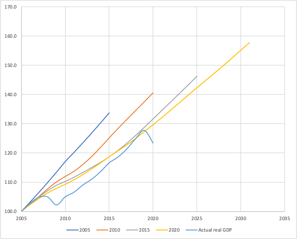
The figure below is similar to one prepared by Sahm and shows the forecasts of potential GDP the CBO published in 2005, 2010, 2015, and 2020 for the following 10 years. (For Sahm’s Twitter thread discussing her figure, click HERE.) That is, in 2005, the CBO issued a forecast of potential GDP for the years 2005–2015. In 2010, the CBO issued a forecast of potential GDP for the years 2010–2020, and so on. Note that for ease of comparison, all GDP values in the figure are set equal to a value of 100 in 2005.
Each straight line on the chart represents the CBO’s forecast of potential GDP over the 10 years following the year in which the forecast was published. For example, the top blue line represents the forecasts the CBO made in 2005 of the values of potential GDP for the years 2005 to 2015. The bottom blue line shows the actual values of real GDP for the years from 2005 to 2020. Note how at each five year interval, the CBO’s forecasts of potential GDP shifted down.
We can look at a few examples of how far off the CBO’s projections were. For instance, if the economy had grown as rapidly between 2005 and 2015 as the CBO forecast it would in 2005, real GDP would have been about 15 percent higher than it actually was. In other words, the U.S. economy would have produced about $2.5 trillion more in goods and services than it actually did. Similarly, if the economy had grown as rapidly between 2010 and 2019 as the CBO forecast it would in 2010, real GDP in 2019 would have been about 7.5 percent (or about $1.5 trillion) higher than it actually was.
Why has the CBO persistently overestimated the future growth rate of the U.S. economy? The main source of error has been the CBO’s overestimation of the growth in labor force productivity. They have also slightly overestimated the growth of the labor force. Claudia Sahm has a more basic criticism of the CBO’s approach to estimating potential GDP. She argues that if real GDP grows slowly during a period, perhaps because monetary and fiscal policies are insufficiently expansionary, the CBO will incorporate the lower actual real GDP values when it updates its forecasts of potential GDP. This approach can raise questions as to whether the CBO is actually measuring potential GDP as most economist’s define it (and as we define it in the textbook): The level real GDP attains when all firms are producing at capacity. Other economists share these concerns. For instance, Daan Struyven, Jan Hatzius, and Sid Bhushan of the Goldman Sachs investment bank, argue that the CBO’s estimate of potential GDP understates the true capacity of the U.S. economy by 3 to 4 percent.
The CBO’s substantial adjustments to its forecasts of potential GDP are another indication of how volatile the U.S. economy has been since the beginning of the 2007–2009 recession.
Sources: Tyler Powell, Louise Sheiner, and David Wessel, “What Is Potential GDP, and Why Is It So Controversial Right Now,” brookings.edu, February 22, 2021; and Congressional Budget Office, “Budget and Economic Data,” various years.