How Many Manufacturing Workers Are There in the United States?

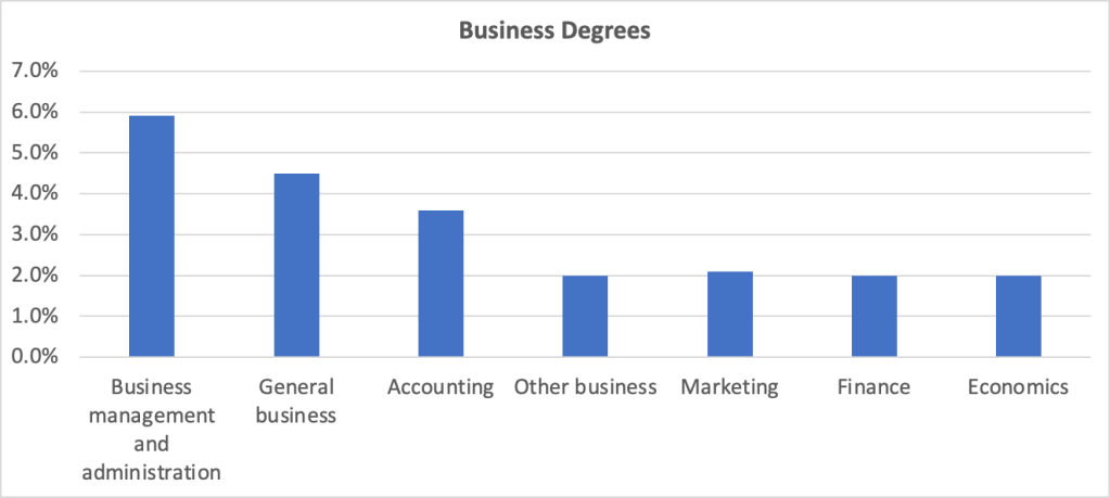
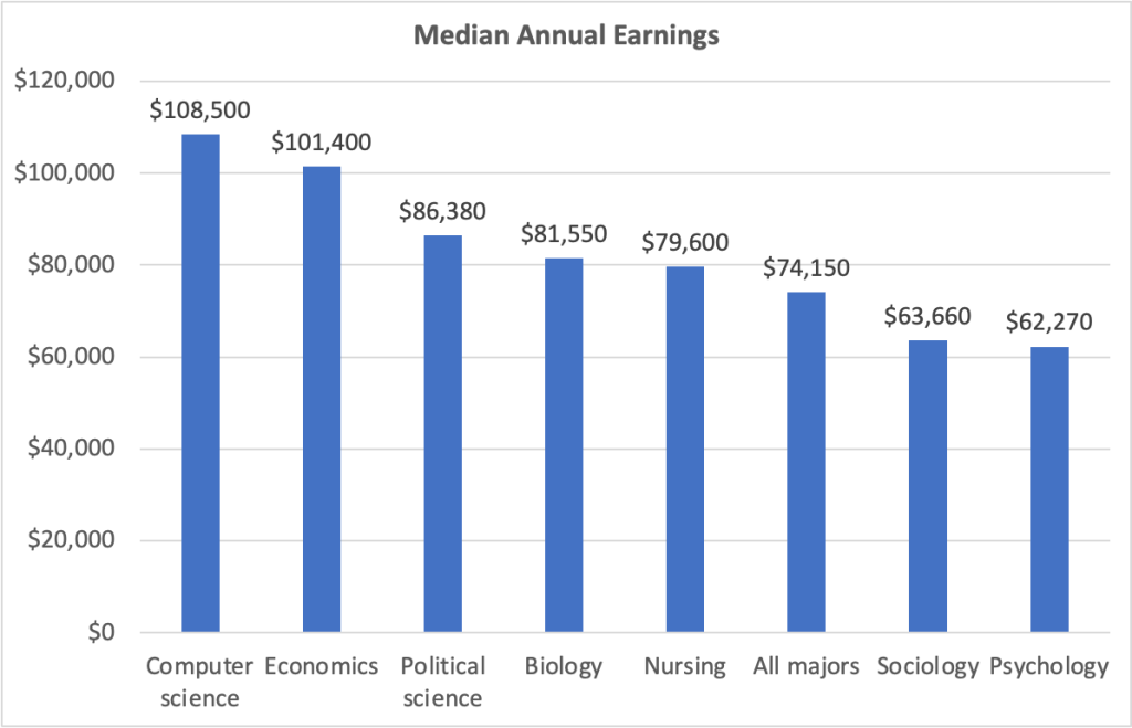
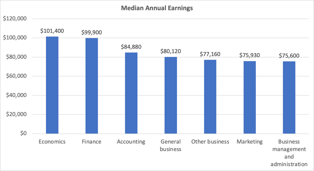
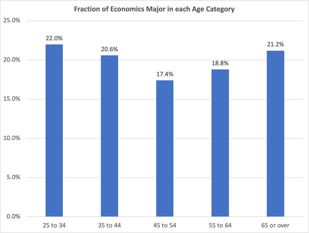
Image created by ChatGPT

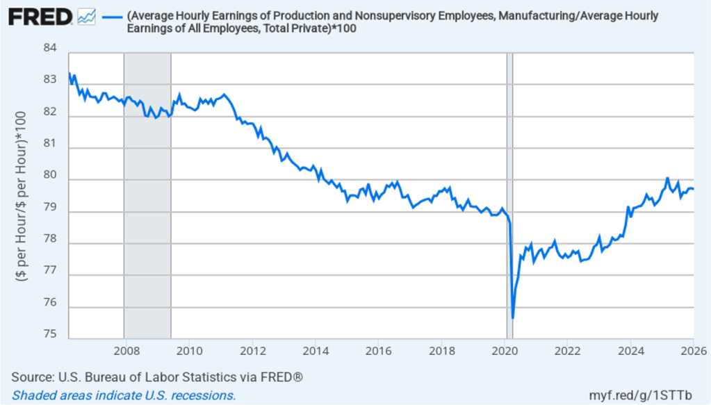
Every president dating back to at least Ronald Reagan, who took office in January 1981, has promised to increase manufacturing employment. Manufacturing jobs are often seen as making it possible for workers without a college degree to earn a middle-class income. As the following figure shows, though, since 2018, average hourly earnings of workers in manufacturing have actually been less than average hourly earnings of all workers.

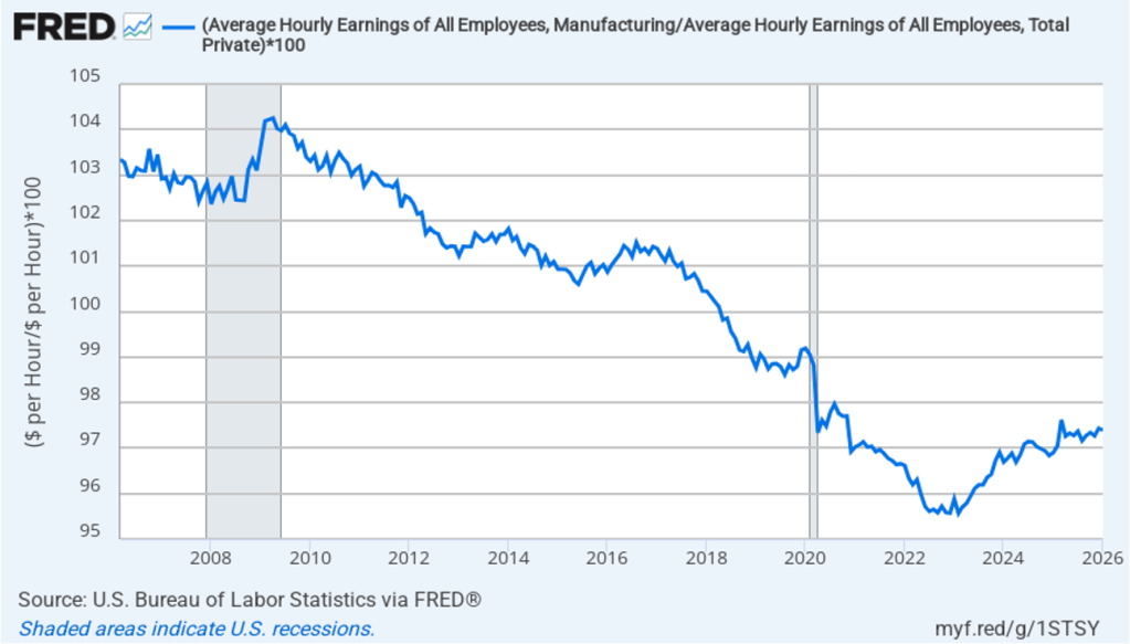
If we look at just the wages of production and nonsupervisory workers in manufacturing—like the workers shown in the image above—during the past 20 years, the average hourly earnings of production workers in manufacturing have generally been about 20 percent less than the average hourly earnings of all workers.

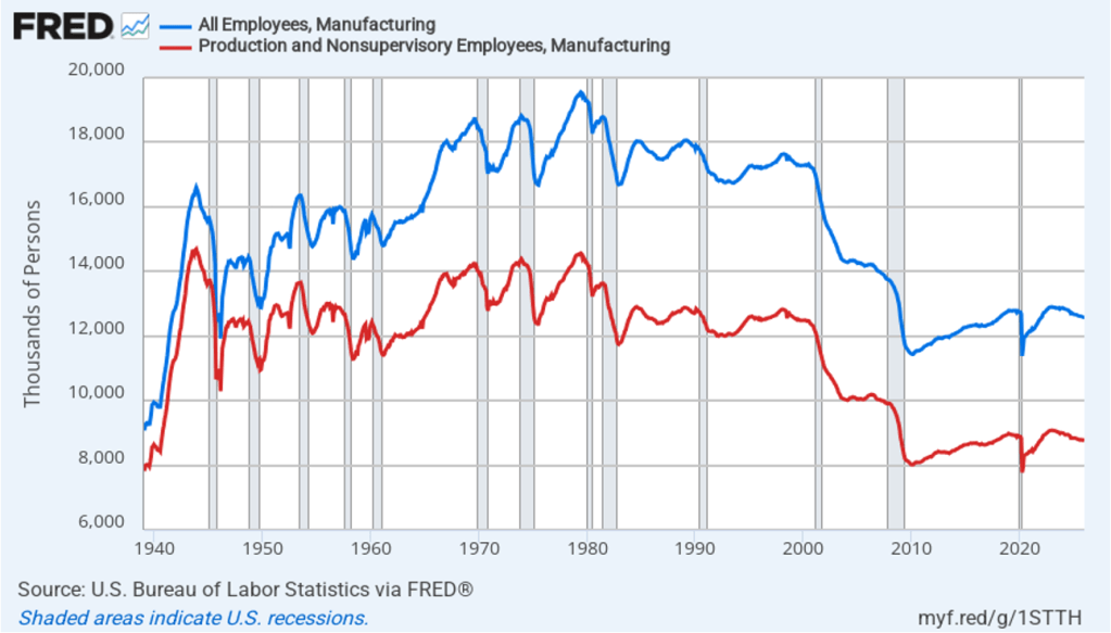
The following figure shows the absolute number of all employees in manufacturing (the blue line) and production and nonsupervisory employees in manufacturing monthly since 1939. Employment of production workers peaked in 1943, during World War II. Employment of all employees in manufacturing peaked in 1979. (All employees in manufacturing include, in addition to production workers, managers and other employees with administrative duties, accountants, lawyers, salespeople, and all other employees not directly concerned with production.) The trend in manufacturing employment has generally been downward since 1979 and has been below 13 million every month since December 2008. In January 2026, there were 12.6 million total employees in manufacturing of whom 8.8 million were production workers.

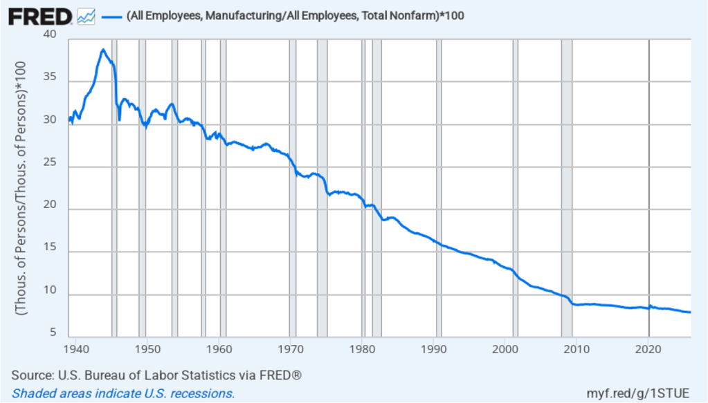
The following figure shows manufacturing employment as a percentage of total employment for each month since 1939. Manufacturing employment peaked as percentage of total employment at 38.7 percent in 1943. It has slowly trended down since that time, being below 10 percent every month since September 2007. In January 2026, manufacturing employment was 7.9 percent of total employment.

All of the data in the figurs shown so far are from the establishment survey (formally, the Current Employment Statistics (CES)). Recently, Adam Ozimek, Benjamin Glasner, and Jiaxin He of the Economic Innovation Group have examined the discrepancy between the number of manufacturing workers as reported in establishment survey and the larger number of manufacturing workers reported in the household survey (formally, the Current Population Survey (CPS).) Each month when the Bureau of Labor Statistics (BLS) releases its “Employment Situation” report, usually referred to as the “jobs report,” attention focuses on two numbers: The change in total employment as calculated from the establishment survey and the unemployment rate as calculated from the household survey.

In addition to the unemployment rate, the BLS releases monthly data on total employment and on employment by industry from the household survey. Most economists, policymakers, and investment analysts pay little attention to the data on employment by industry from the household survey because the employment by industry data from the establishment survey is considered more reliable. In fact, the employment by industry data from the household survey isn’t included among the many macro series available on the FRED site. The following figure reproduces the two establishment survey (CES) data (the blue and red lines) shown in the third figure above along with the household survey (CPS) data (the green line) from the BLS site. (Note that the household survey data is choppier than the data in the other two series because it is not seasonally adjusted.)

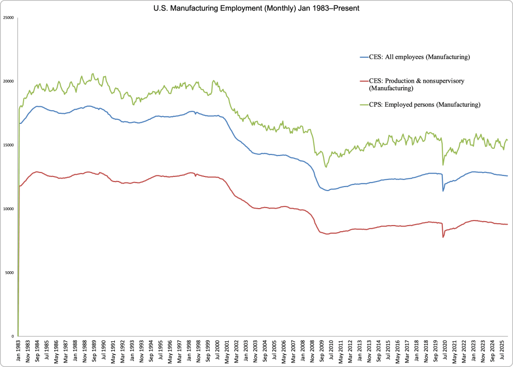
Manufacturing employment is consistently larger in the household survey data than in the establishment survey data. For example, in January 2026, total manufacturing employment according to the establishment survey was 12.6 million, whereas total manufacturing employment according to the household survey was 15.4 million—a difference of 2.7 million. Put another way, if the household survey is accurate, manufacturing employment is actually 20 percent higher than it appears from the widely-used establishment survey data.

The establishment survey data is collected by surveying firms, whereas the household survey data is collected from surveying workers. In other words, in January, 2.7 million more workers considered themselves to be in manufacturing than firms reported were actually working in manufacturing. Typically, economists and policymakers consider results from the establishment survey to be more reliable because firms are legally obliged to keep accurate accounts of the number of their employees, whereas the answers from workers responding to surveys are accepted without additional checking.

Ozimek, Glasner, and He note that the persistence of a gap between the establishment and household data on manufacturing employment indicates that there are some establishments that the census considers to be engaged in some activity other than manufacturing but whose workers consider themselves to be in manufacturing. The authors present a careful discussion of the issues involved and the entire piece (linked to above) is worth reading carefully by anyone who is concerned about this issue, but we can mention here one particularly interesting point.

The authors link to a paper by Andrew Bernard and Theresa Fort of Dartmouth College discussing “factoryless goods producing firms,” which are “manufacturing-like as they perform many of the tasks and activities found in manufacturing firms” but that don’t actually manufacture goods. Ozimek, Glasner, and He give as one example Apple’s Elk Grove, California site. They note that at one time Apple assembled computers at that site but that currently “there is no assembly at that location, but thousands of Apple employees work there on logistics, distribution, repair, and customer support.” In other words, the site contributes to manufacturing Apple’s products and, if surveyed, many of its employees might respond that they work in manufacturing, but because no products are actually assembled at the site, the site won’t be considered as engaged in manufacturing by the establishment survey. They conclude that: “These sorts of employees—who work adjacent to manufacturing, but not in categorized establishments—make up a big chunk of the 2.2 to 2.8 million missing manufacturing workers.”

Clearly, an important issue in an accurate count of manufacturing workers is a definition of what we mean by manufacturing. Should a particular site—establishment—be considered as engaged in manufacturing only if products are assembled at that site? Or should a site be considered as engaged in manufacturing if its purpose is to support assembly that is done elsewhere?

Because the number of manufacturing workers and the fraction of the labor force engaged in manufacturing have been important political issues for decades, it’s somewhat surprising how little attention has been devoted to ensuring that we’re actually correctly measuring manufacturing employment.

Has AI Damaged the Tech Job Market for Recent College Grads?

Image generated by ChatGPT 5

“Artificial intelligence is profoundly limiting some young Americans’ employment prospects, new research shows.” That’s the opening sentence of a recent opinion column in the Wall Street Journal. The columnist was reacting to a new academic paper by economists Erik Brynjolfsson, Bharat Chandar, and Ruyu Chen of Stanford University. (See also this Substack post by Chandar that summarizes the results of their paper.) The authors find that:

“[S]ince the widespread adoption of generative AI, early-career workers (ages 22-25) in the most AI-exposed occupations have experienced a 13 percent relative decline in employment … In contrast, employment for workers in less exposed fields and more experienced workers in the same occupations has remained stable or continued to grow. Furthermore, employment declines are concentrated in occupations where AI is more likely to automate, rather than augment, human labor.”

The authors conclude that “our results are consistent with the hypothesis that generative AI has begun to significantly affect entry-level employment.”

About a month ago, we wrote a blog post looking at whether unemployment among young college graduates has been abnormally high in recent months.  The following figure from that post shows that over time, the unemployment rates for the youngest college graduates (the red line) is nearly always above the unemployment rate for the population as a whole (the green line), while the unemployment rate for college graduates 25 to 34 years old (the blue line) is nearly always below the unemployment rate for the population as a whole. In July of this year, the unemployment rate for the population as a whole was 4.2 percent, while the unemployment for college graduates 20 to 24 years old was 8.5 percent, and the unemployment rate for college graduates 25 to 34 years old was 3.8 percent.

As the following figure (also reproduced from that blog post) shows, the increase in unemployment among young college graduates has been concentrated among males. Does higher male unemployment indicate that AI is eliminating jobs, such as software coding, that are disproportionately male? Data journalist John Burn-Murdoch argues against this conclusion, noting that data shows that “early-career coding employment is now tracking ahead of the [U.S.] economy.”

Another recent paper written by Sarah Eckhardt and Nathan Goldschlag of the Economic Innovation Group is also skeptical of the view that firms adopting generative AI programs is reducing employment in certain types of jobs. They use a measure developed by Edward Felton on Princeton University, and Manav Raj and Robert Seamans of New York University of how exposed particular jobs are to AI (AI Occupational Exposure (AIOE)). The following table from Eckhardt and Goldschlag’s paper shows the five most AI exposed jobs and the five least AI exposed jobs.

They divide all occupations into quintiles based on the exposure of the occupations to AI. Their key results are given in the following table, which shows that the occupations that are most exposed to the effects of AI—quintiles 4 and 5—have lower unemployment rates and higher wages than do the occupations that are least exposed to AI. 

The Brynjolfsson, Chandar, and Chen paper mentioned at the beginning of this post uses a larger data set of workers by occupation from ADP, a private firm that processes payroll data for about 25 percent of U.S. workers. Figure 1 from their paper, reproduced here, shows that employment of workers in two occupations—software developers and customer service—representative of those occupations most exposted to AI declined sharply after generative AI programs became widely available in late 2022.

They don’t find this pattern for all occupations, as shown in the following figure from their paper.

Finally, they show results by occupational quintiles, with workers ages aged 22 to 25 being hard hit in the two occupational quintiles (4 and 5) most exposted to AI. The data show total employment growth from October 2022 to July 2025 by age group and exposure to AI.

Economics blogger Noah Smith has raised an interesting issue about Brynjolfsson, Chandar, and Chen’s results. Why would we expect that the negative effect of AI on employment to be so highly concentrated among younger workers? Why would employment in the most AI exposed occupations be growing rapidly among workers aged 35 and above? Smith wonders “why companies would be rushing to hire new 40-year-old workers in those AI-exposed occupations.” He continues:

“Think about it. Suppose you’re a manager at a software company, and you realize that the coming of AI coding tools means that you don’t need as many software engineers. Yes, you would probably decide to hire fewer 22-year-old engineers. But would you run out and hire a ton of new 40-year-old engineers?

Both the papers discussed here are worth reading for their insights on how the labor market is evolving in the generative AI era. But taken together, they indicate that it is probably too early to arrive at firm conclusions about the effects of generative AI on the job market for young college graduates or other groups.

How Well Are Recent College Graduates Doing in the Labor Market?

Image generated by ChatGTP-40

A number of news stories have highlighted the struggles some recent college graduates have had in finding a job. A report earlier this year by economists Jaison Abel and Richard Deitz at the Federal Reserve Bank of New York noted that: “The labor market for recent college graduates deteriorated noticeably in the first quarter of 2025. The unemployment rate jumped to 5.8 percent—the highest reading since 2021—and the underemployment rate rose sharply to 41.2 percent.”  The authors define “underemployment” as “A college graduate working in a job that typically does not require a college degree is considered underemployed.”

The following figure shows data on the unemployment rate for people ages 20 to 24 years (red line) with a bachelor’s degree, the unemployment rate for people ages 25 to 34 years (blue line) with a bachelor’s degree, and the unemployment rate for the whole population (green line) whatever their age and level of education. (Note that the values for college graduates are for those people who have a bachelor’s degree but no advanced degree, such as a Ph.D. or an M.D.)

The figure shows that unemployment rates are more volatile for both categories of college graduates than the unemployment rate for the population as a whole. The same is true for the unemployment rates for nearly any sub-category of the unemployed lagely because the number of people included the sub-categories in the Bureau of Labor Statistics (BLS) household survey is much smaller than for the population as a whole. The figure shows that, over time, the unemployment rates for the youngest college graduates is nearly always above the unemployment rate for the population as a whole, while the unemployment rate for college graduates 25 to 34 years old is nearly always below the unemployment rate for the population as a whole. In June of this year, the unemployment rate for the population as a whole was 4.1 percent, while the unemployment for the youngest college graduates was 7.3 percent.

Why is the unemployment rate for the youngest college graduates so high? An article in the Wall Street Journal offers one explanation: “The culprit, economists say, is a general slowdown in hiring. That hasn’t really hurt people who already have jobs, because layoffs, too, have remained low, but it has made it much harder for people who don’t have work to find employment.” The following figure shows that the hiring rate—defined as the number of hires during a month divided by total employment in that month—has been falling. The hiring rate in June was 3.4 per cent, which—apart from two months at the beginning of the Covid pandemic—is the lowest rate since February 2014.

Abel and Deitz, of the New York Fed, have calculated the underemployment for new college graduates and for all college graduates. These data are shown in the following figure from the New York Fed site. The definitions used are somewhat different from the ones in the earlier figures. The definition of college graduates includes people who have advanced degrees and the definition of young college graduates includes people aged 22 years to 27 years. The data are three-month moving averages.

The data show that the underemployment rate for both recent graduates and all graduates are relatively high for the whole period shown. Typically, more than 30 percent of all college graduates and more than 40 percent of recent college graduates work in jobs in which more than 50 percent of employees don’t have college degrees. The latest underemployment rate for recent graduates is the highest since March 2022. It’s lower, though, than the rate for most of the period between the Great Recession of 2007–2009 and the Covid recession of 2020.

In a recent article, John Burn-Murdoch, a data journalist for the Financial Times, has made the point that the high unemployment rates of recent college graduates are concentrated among males. As the following figure shows, in recent months, unemployment rates among male college graduates 20 to 24 years old have been significantly higher than the unemployment rates among female college graduates. In June 2025, the unemployment rate for male recent college graduates was 9.8 percent, well above the 5.4 percent unemployment for female recent college graduates.

What explains the rise in male unemployment relative to female unemployment? Burn-Murdoch notes that, contrary to some media reports, the answer doesn’t seem to be that AI has resulted in a contraction in entry-level software coding jobs that have traditionally been held disproportionately by males. He presents data showing that “early-career coding employment is now tracking ahead of the [U.S.] economy.”

Instead he believes that the key is the continuing strong growth in healthcare jobs, which have traditionally been held disproportionately by females. The availability of these jobs has allowed women to fare better than men in an economy in which hiring rates have been relatively low.

Like most short-run trends, it’s possible that the relatively high unemployment rates experienced by recent college graduates may not continue in the long run.

Data on the Economics Major

Image generated by ChatGTP-4o.

How does the number of people who majored in economics in college compare with the number of people who pursued other majors? How do the earnings of economics majors compare with the earnings of other majors? Recent data released by the Census Bureau provides some interesting answers to these and other questions about the economics major.

Each year the Census Bureau conducts the American Community Survey (ACS) by mailing a questionnaire to about 3.5 million households. The questionnaire contains 100 questions that ask about, among other things, the race, sex, age, educational attainment, employment, earnings, and health status of each person in the household.  Responses are collected online, by mail, by telephone, or by a personal visit from a census employee.

Although the Census Bureau releases some data about 1 year after the data is collected, it typically takes longer to publish detailed studies of specific topics. The ACS report on Field of Bachelor’s Degree in the United States: 2022 was released this month, although it’s based on data collected during 2022. Anyone interested in the subject will find the whole report to be worthwhile reading, but we can summarize a few of the results.

According to the census, in 2022, there were 81.9 million people in the United States aged 25 and older who had graduated from college with a bachelor’s degree. The report includes economics, along with several other social sciences—psychology, political science, and sociology—in the category of “Engineering and Science Degrees.” The following figure shows the leading majors in this category ranked by the percentage of all holders of a bachelor’s degree. (Sociology is included for comparison with the other three social sciences listed.) Psychology has the largest share of majors at 4.6 percent. Economics accounts for 2.0 percent of majors.

We can conclude that among social science majors, economics is less than half as popular as psychology, slightly less popular than political science, and significantly more popular than sociology.

Economics departments are sometimes located in undergraduate business colleges. The following figure compares economics to other majors listed in the “Business Degrees” category of the report. At nearly 6 percent of all majors, “business management and administration” is the most popular of business majors, followed by general business and accounting. “Other business,” marketing, finance, and economics are all about equally popular with around 2 percent of all majors.

The figure below shows the median annual earnings for people aged 25 years to 64 years—prime-age workers—who majored in each of fields used in the first figure above, as well as for all holders of a bachelor’s degree. People who majored in economics earn significantly more than people who majored in the other social sciences listed and 35 percent more than people in all majors.

 The next figure shows median annual earnings for economics majors compared with majors in other business fields. Perhaps surprisingly—although not to people who know the many benefits from majoring in economics!—economics majors earn more on average than do majors in other business fields.

The following figure shows how many people with bacherlor’s degrees in economics majors fall into each age group. People aged 25 years to 34 years make up 22 percent of all economics majors, the most of any of the age groups. This result indicates that the economics major has gained in popularity (although note that the age groups don’t have equal numbers of people in them).

Finally, we can look at the demographic characteristics of economics majors. The next figure shows the percentage of degree holders in some popular majors who are women. Although women hold 53 percent of all bachelor’s degrees, they hold only 33 percent of bachelor’s degrees in economics. The share for economics is lower than for the other social sciences shown, the same as for finance majors, and more than for computer science and mechanical engineering majors.

The next figure shows bachelor’s degrees in economics by race and Hispanic origin. Non-Hispanic whites and non-Hispanic Asians are overrepresented among economics majors compared with the percentages they make up of all bachelor’s degree holders. Non-Hispanic Blacks and Hispanics are underrepresented among economics majors compared with the percentages they make up of all bachelor’s degree holders. People who are multiracial or of another race hold the same percentage of economics degrees as of degrees in other subjects.

Is Caitlin Clark Being Paid What She’s Worth?

Photo of Caitlin Clark when she played for the University of Iowa from Reuters via the Wall Street Journal.

Caitlin Clark’s ability to hit three-point shots made her a star at the University of Iowa. Since she joined the Indiana Fever of the Women’s National Basketball Association (WNBA) in 2024, she’s been, arguably, the league’s biggest star. An article on theathletic.com discussing Clark’s effect on the league includes the following chart:

Clark’s popularity has resulted in substantially increased revenue for her team and for the WNBA. Should that fact affect the salary she receives from the Indiana Fever? The article states that: “Clark will almost assuredly never receive in salary what she is worth to the WNBA. In that regard, she’s a lot like [former men’s basketball star Michael] Jordan, and other all-time greats across sports.” Why won’t Clark be paid a salary equal to her worth to the WNBA?

In Microeconomics, Chapter 16, we show that in a competitive labor market, workers receive the value of their maginal products. The value of a basketball player’s marginal product is the additional revenue the player’s team earns from employing the player. We note that the marginal product of an athlete is the additional number of games the athlete’s team wins by employing the player. The value of a player’s marginal product is the additional revenue the team earns from those additional wins. Teams that win more games attract more fans to watch the teams play—both in person and on television or online. Teams earn revenue from selling tickets, as well as concessions and souvenirs sold in the area. Teams are paid for the rights to broadcast or stream their games. And, as the chart above shows, a player as popular as Clark will increase the game jerseys and other merchandise a team can sell.

We note in Chapter 16 that, once their inital contracts with their teams expire, the best professional athletes tend to sign contracts with teams in larger cities. Although an athlete’s marginal product may be no larger in a big city than in a smaller city, the revenue a team earns from the additional games the team wins from employing a star athlete depends in part on the population of the city the team plays in. Clark’s 2025 salary is only $78,066, far below the value of her marginal product, which is likely at least several million dollars. Her current contract with the Fever lasts through the 2027 season. But even after the contract expires, by league rules, she can’t be paid more than $294,244 by whichever team signs her. (It’s possible that amount may have increased by the time her current contract expires.)

The ceiling on WBNA salaries is far below the average salary in most U.S. men’s professional leagues. For instance, the average salary in the men’s National Basketball Association (NBA) during the 2024–2025 year was nearly $12 million. A low salary cap is common in leagues that are relatively new or that aren’t popular enough to receive large payments for the rights to broadcast or stream their games. For example, men’s Major League Soccer (MLS) has a salary limit of about $6 million per team. The WNBA was founded in 1996 (the NBA was founded in 1946) and, although the broadcast and online viewership for its games has increased, its viewership remains well below the NBA’s viewership.

Clark has been earning millions of dollars from endorisng Nike, Gatoade, and other products. But unless the factors just discussed change, it seems unlikely that she will receive a salary equal to the value of her marginal product to the Fever or any WNBA team she might play for in the future. The excerpt from theathletic.com article that we quoted above, though, compares her salary not to the value of her marginal product to the Fever but to the WNBA as a whole. Are there any circumstances under which we might expect a major sports star to be paid a salary equal to the additional revenue he or she is generating for a league as a whole?

The quotation from the article notes that no “all-time great” players, inclduing Michael Jordan of the NBA, have received salaries equal to the value of their marginal product to the leagues they played in. This outcome shouldn’t be surprising. Returns that entrepreneurs or workers earn in a market system are typically well below the total value they provide to society. For example, in a classic academic paper Nobel laureate William Nordhaus of Yale University estimated that entrepreneurs keep just 2.2 percent of the economic surplus they create by founding new firms. (We discuss the concept of economic surplus in Microeconomics, Chapter 4.) Leaving aside the monetary value of Clark to her team and her league, she has provided substantial consumer surplus to viewers of her games that is not captured by arena ticket prices or cable or streaming subscriptions. As we discuss in Chapter 4, the same is true of most goods and services in competitive markets.

Caitlin Clark, like Amazon founder Jeff Bezos, has only received a small fraction of the economic surplus she has created. (Photo from the Wall Street Journal)

So, although Caitlin Clark is a millionaire as a result of the money she has been paid to endorse products, the actual additional value she has created for her team, her league, and the economy is far greater than the income she earns.

“Clark will almost assuredly never receive in salary what she is worth to the WNBA. In that regard, she’s a lot like [Michael] Jordan, and other all-time greats across sports.”

The Strikingly Large Role of Foreign-Born Workers in the Growth of the U.S. Labor Force

As we noted in a recent post on the latest jobs report, the Bureau of Labor Statistics (BLS) has updated the population estimates in its household employment survey to reflect the revised population estimates from the Census Bureau. The census now estimates that the civilian noninstitutional population was about 2.9 million larger in December 2024 than it had previously estimated. The original undercount was significantly driven by an underestimate of the increase in the immigrant population.

The following figure shows the more rapid growth of foreign-born workers in recent years in comparison with the growth in native-born workers. In the figure, we set the number of native-born workers and the number of foreign-born workers both equal to 100 in January 2007. Between January 2007 and January 2025, the number of foreign-born workers increased by 40 percent, while the number of native-born workers increased by only 6 percent.

As the following figure shows, although foreign-born workers are an increasingly larger percentage of the total labor force, native-born workers are still a large majority of the labor force. Foreign-born workers were 15.3 percent of the labor force in January 2007 and 19.5 percent of the labor force in January 2025. Foreign-born workers accounted for about 56 percent of the increase in the total labor force over the period from January 2007 to January 2025.

H/T to Jason Furman for pointing us to the BLS data.

1/17/25 Podcast – Authors Glenn Hubbard & Tony O’Brien discuss the pros/cons of tariffs and the impact of AI on the economy.

Welcome to the first podcast for the Spring 2025 semester from the Hubbard/O’Brien Economics author team. Check back for Blog updates & future podcasts which will happen every few weeks throughout the semester.

Join authors Glenn Hubbard & Tony O’Brien as they offer thoughts on tariffs in advance of the beginning of the new administration. They discuss the positive and negative impacts of tariffs -and some of the intended consequences. They also look at the AI landscape and how its reshaping the US economy. Is AI responsible for recent increased productivity – or maybe just the impact of other factors. It should be looked at closely as AI becomes more ingrained in our economy.

https://on.soundcloud.com/8ePL8SkHeSZGwEbm8

Want a Raise? Get a New Job

Image generated by GTP-4o of someone searching online for a job

It’s become clear during the past few years that most people really, really, really don’t like inflation. Dating as far back as the 1930s, when very high unemployment rates persisted for years, many economists have assumed that unemployment is viewed by most people as a bigger economic problem than inflation. Bu the economic pain from unemployment is concentrated among those people who lose their jobs—and their families—although some people also have their hours reduced by their employers and in severe recessions even people who retain their jobs can be afraid of being laid off.

Although nearly everyone is affected by an increase in the inflation rate, the economic losses are lower than those suffered by people who lose their jobs during a period in which it may difficult to find another one. In addition, as we note in Macroeconomics, Chapter 9, Section 9.7 (Economics, Chapter 19, Section 19.7), that:

“An expected inflation rate of 10 percent will raise the average price of goods and services by 10 percent, but it will also raise average incomes by 10 percent. Goods and services will be as affordable to an average consumer as they would be if there were no inflation.”

In other words, inflation affects nominal variables, but over the long run inflation won’t affect real variables such as the real wage, employment, or the real value of output. The following figure shows movements in real wages from January 2010 through September 2024. Real wages are calculated as nominal average hourly earnings deflated by the consumer price index, with the value for February 2020—the last month before the effects of the Covid pandemic began affecting the United States—set equal to 100. Measured this way, real wages were 2 percent higher in September 2024 than in February 2020. (Although note that real wages were below where they would have been if the trend from 2013 to 2020 had continued.)

Although increases in wages do keep up with increases in prices, many people doubt this point. In Chapter 17, Section 17.1, we discuss a survey Nobel Laurete Rober Shiller of Yale conducted of the general public’s views on inflation. He asked in the survey how “the effect of general inflation on wages or salary relates to your own experience or your own job.” The most populat response was: “The price increase will create extra profifs for my employer, who can now sell output for more; there will be no increase in my pay. My employer will see no reason to raise my pay.”

Recently, Stefanie Stantcheva of Harvard conducted a survey similar to Schiller’s and received similar responses:

“If there is a single and simple answer to the question ‘Why do we dislike inflation,’ it is because many individuals feel that it systematically erodes their purchasing power. Many people do not perceive their wage increases sufficiently to keep up with inflation rates, and they often believe that wages tend to rise at a much slower rate compared to prices.”

A recent working paper by Joao Guerreiro of UCLA, Jonathon Hazell of the London School of Economics, Chen Lian of UC Berkeley, and Christina Patterson of the University of Chicago throws additional light on the reasons that people are skeptical that once the market adjusts, their wages will keep up with inflation. Economists typically think of the real wage as adjusting to clear the labor market. If inflation temporarily reduces the real wage, the nominal wage will increase to restore the market-clearing value of the real wage.

But the authors of thei paper note that, in practice, to receive an increase in your nominal wage you need to either 1)ask your employer to increase your wage, or 2) find another job that pays a higher nominal wage. They note that both of these approachs result in “conflict”: “We argue that workers must take costly actions (‘conflict’) to have nominal wages catch up with inflation, meaning there are welfare costs even if real wages do not fall as inflation rises.” The results of a survey they undertook revealed that:

“A significant portion of workers say they took costly actions—that is, they engaged in conflict—to achieve higher wage growth than their employer offered. These actions include having tough conversations with employers about pay, partaking in union activity, or soliciting job offers.”

Their result is consistent with data showing that workers who switch jobs receive larger wage increases than do workers who remain in their jobs. The following figure is from the Federal Reserve Bank of Cleveland and shows the increase in the median nominal hourly wage over the previous year for workers who stayed in their job over that period (brown line) and for workers who switched jobs (gray line).

Job switchers consistently earn larger wage increases than do job stayers with the difference being particularly large during the high inflation period of 2022 and 2023. For instance, in July 2022, job switchers earned average wage increases of 8.5 percent compared with average increases of 5.9 percent for job stayers.

The fact that to keep up with inflation workers have to either change jobs or have a potentially contentious negotiation with their employer provides another reason why the recent period of high inflation led to widespread discontent with the state of the U.S. economy.

How Well Have Low-Wage Workers Done over the Years?

Image of servers in a restaurant generated by ChatGTP-4o.

How should you track over time the real wagees of low-wage workers? If you are interested in income mobility, you would want to track the experience over the course of their working lives of individuals who began their careers in low-wage occupations. Doing so would allow you to measure how well (or poorly) the U.S. economy succeeds in providing individuals with opportunities to improve their incomes over time.

You might also be interested in how the real wages of people who earn low wages has changed over time. In this case, rather than tracing the wages over time of individuals who earn low wages when they first enter the labor market, you would look at the real wages of people who earn low wages at any given time. The simplest way to do that analysis would be using data on the average nominal wage earned by, say, the lowest 20 percent of wage earners, and deflate the average nominal wage by a price index to determine the average real wage of these workers. How the average real wage of low-wage workers varies over time provides some insight into the changing standard of living of low-wage workers.

In a recent Substack post, Ernie Tedeschi, Director of Economics at the Budget Lab research center at Yale University, has carried out a careful analysis of movements over time in the average real wage of low-wage workers. Tedeschi points out a complicating factor in this analysis: “The population has gotten older over time and more educated. The workforce looks different too, with more workers in services and fewer in manufacturing. Shifting populations means that comparisons of workers aren’t apples-to-apples over time.”

To correct for these confounding factors, Tedeschi constructs a low-wage index that makes it possible to examine the real wage of low-wage workers, holding constant the composition of low-wage workers with respect to “sex, age, race, college education, and broad industry and occupation” at the values of these characteristics in 2023. Using this approach, makes it possible to separate changes in wages of workers with given characteristics from changes in wages that occur because the average characteristics of workers has changed. For example, on average, workers who are older or who have more years of education will be more productive and, therefore, on average will earn higher wages than will workers who are younger or have fewer years of education.

The following figure from Tedeschi’sSubstack post shows movements in his low-wage index during each quarter from the first quarter of 1979 to the first quarter of 2024, with “low wage” defined as workers at the 25th precentile of the distribution of wages. (That is, 24 percent of workers receive lower wages and 75 percent of workers receive higher wages than do these workers.) The index shows that a low-wage worker in 2024 has a much higher real wage than a low-wage worker in 1979, but the increase in the average real wage occurs mainly during two periods: 1997–2007 and 2014–2024. (Tedeschi uses the person consumption expenditures (PCE) price index to convert nominal wages to real wages.)

A more complete discussion of Tedeschi’s methods and results can be found in his blog post.

Would Caleb Williams Be Better Off Playing for the Jacksonville Jaguars Instead of the Chicago Bears?

USC quarterback Caleb Williams is shown with NFL Commissioner Roger Goodell at the NFL college draft in Detroit. (Photo from Reuters via the Wall Street Journal)

In late April, the National Football League (NFL) held its annual draft of eligible college players. NFL teams choose players through seven rounds in reverse order of how the teams finished in the previous year: The team with the worst record picks first and the winner of the Super Bowl picks last. Teams are allowed to trade picks with each other. This year, although the Carolina Panthers finished with the worst record during the 2023 season, they had traded their first round pick to the Chicago Bears, who picked first.

The Bears choose University of Southern California (USC) quarterback Caleb Williams with the first pick in the draft. Drafted players usually have no choice but to sign contracts with the team that chose them. A player can refuse to sign with the team that drafted him and not play that year, hoping that the next year a team they like better will draft them. Very few players have chosen that option.

When football fans and sportswriters discuss whether a team is a good match for a player they usually focus on factors such as whether a player’s skills are well suited to the team’s style of play and on how many other good players are on the team. One other factor that is seldom discussed is whether a player will benefit more financially by playing for the team that drafted him rather than for another team. Players chosen in the college draft are paid an amount fixed as a result of bargaining between the NFL and the National Football League Players Association (NFLPA), which is the labor union that represents NFL players.

As the first pick in the draft, Caleb Williams’s contract will pay him $39.4 million in total over the next four seasons. A sizeable fraction of that amount—probably $25.5 million—will be in the form of a lump-sum bonus that the Bears will pay Williams in full when he signs his contract. The dollar amount Williams is paid as the first pick in the draft would be the same whichever of the 32 NFL teams had drafted him. However, football players—like everyone else—are interested in their after-tax income and state and local income tax rates vary widely. Football players pay state and local income taxes based on where their teams’ games are played. In the 17-game NFL schedule, teams play either 8 or 9 games in their home city and the rest (road games) in the home cities of their opponents.

Jared Walczak of the Tax Foundation has compiled a table showing the tax rate each NFL team’s players will pay in 2024 based on the state and local taxes levied in their home city and the state and local taxes levied by the cities where the team’s road games will be played. To keep the numbers simple, let’s look at how the much in taxes Williams will owe on a $20 million bonus, which the Bears will pay him as soon as he signs his contract. (Note that, as indicated earlier, Williams’s bonus is likely to be greater than $20 million and he will also receive a salary during his first season of about $3.75 million.)

Given the income tax rate levied by the state of Illinois (the city of Chicago doesn’t levy a tax on income) and the state and local taxes levied by the cities and states in which the Bears will play their road games this year, Williams will owe a tax of $1,079,075 on his bonus. (Note that we are ignoring the substantial federal income tax that Williams will owe on the bonus because the federal tax won’t change no matter which city he plays in.) The lowest tax that Williams would pay on the bonus is $120,421, which would be his tax if he played for the Jacksonville Jaguars. Neither the city of Jacksonville nor the state of Florida levies a personal income tax, so Williams would only owe state and local income taxes on what he earns playing in cities where the Jaguars play their road games. The largest tax Williams would pay is $1,301,028, which would be his tax if he had been drafted by any of the three teams that play in California: the Los Angeles Rams, the Los Angeles Chargers, or the San Francisco ’49ers.

Although college players who are drafted are obliged to play for the team that drafted them, after players have completed their contracts they have the option of signing with a different team. At that stage of their careers, players—and their agents—can take into account state and local income taxes when deciding which team to sign a new contract with.