Why Were the Data Revisions to Payroll Employment in May and June So Large?

Image generated by ChatTP-4o

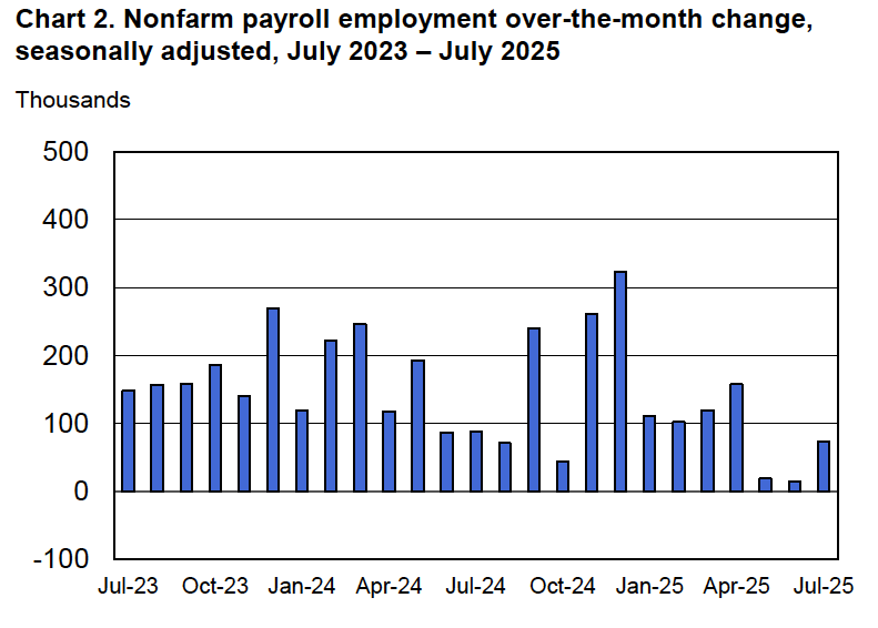
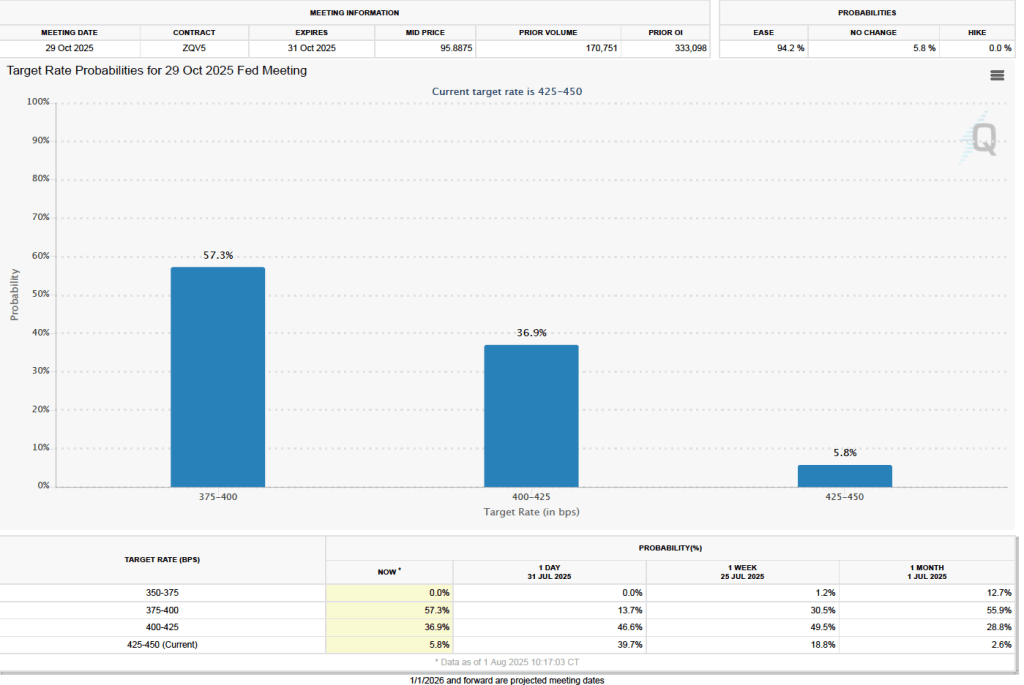
As we noted in yesterday’s blog post, the latest “Employment Situation” report from the Bureau of Labor Statistics (BLS) included very substantial downward revisions of the preliminary estimates of net employment increases for May and June. The previous estimates of net employment increases in these months were reduced by a combined 258,000 jobs. As a result, the BLS now estimates that employment increases for May and June totaled only 33,000, rather than the initially reported 291,000. According to Ernie Tedeschi, director of economics at the Budget Lab at Yale University, apart from April 2020, these were the largest downward revisions since at least 1979.

The size of the revisions combined with the estimate of an unexpectedly low net increase of only 73,000 jobs in June prompted President Donald Trump to take the unprecedented step of firing BLS Commissioner Erika McEntarfer. It’s worth noting that the BLS employment estimates are prepared by professional statisticians and economists and are presented to the commissioner only after they have been finalized. There is no evidence that political bias affects the employment estimates or other economic data prepared by federal statistical agencies.

Why were the revisions to the intial May and June estimates so large? The BLS states in each jobs report that: “Monthly revisions result from additional reports received from businesses and government agencies since the last published estimates and from the recalculation of seasonal factors.” An article in the Wall Street Journal notes that: “Much of the revision to May and June payroll numbers was due to public schools, which employed 109,100 fewer people in June than BLS believed at the time.” The article also quotes Claire Mersol, an economist at the BLS as stating that: “Typically, the monthly revisions have offsetting movements within industries—one goes up, one goes down. In June, most revisions were negative.” In other words, the size of the revisions may have been due to chance.

Is it possible, though, that there was a more systematic error? As a number of people have commented, the initial response rate to the Current Employment Statistics (CES) survey has been declining over time. Can the declining response rate be the cause of larger errors in the preliminary job estimates?

In an article published earlier this year, economists Sylvain Leduc, Luiz Oliveira, and Caroline Paulson of the Federal Reserve Bank of San Francisco assessed this possibility. Figure 1 from their article illustrates the declining response rate by firms to the CES monthly survey. The figure shows that the response rate, which had been about 64 percent during 2013–2015, fell significantly during Covid, and has yet to return to its earlier levels. In March 2025, the response rate was only 42.6 percent.

The authors find, however, that at least through the end of 2024, the falling response rate doesn’t seem to have resulted in larger than normal revisions of the preliminary employment estimates. The following figure shows their calculation of the average monthly revision for each year beginning with 1990. (It’s important to note that they are showing the absolute values of the changes; that is, negative change are shown as positive changes.) Depite lower response rates, the revisions for the years 2022, 2023, and 2024 were close to the average for the earlier period from 1990 to 2019 when response rates to the CES were higher.

The weak employment numbers correspond to the period after the Trump administration announced large tariff increases on April 2. Larger firms tend to respond to the CES in a timely manner, while responses from smaller firms lag. We might expect that smaller firms would have been more likely to hesitate to expand employment following the tariff announcement. In that sense, it may be unsurprising that we have seen downward revisions of the prelimanary employment estimates for May and June as the BLS received more survey responses. In addition, as noted earlier, an overestimate of employment in local public schools alone accounts for about 40 percent of the downward revisions for those months. Finally, to consider another possibility, downward revisions of employment estimates are more likely when the economy is heading into, or has already entered, a recession. The following figure shows the very large revisisons to the establishment survey employment estimates during the 2007–2010 period.

At this point, we don’t fully know the reasons for the downward employment revisions announced yesterday, although it’s fair to say that they may have been politically the most consequential revisions in the history of the establishment survey.

Weaker Than Expected Jobs Report Shakes Up Investors’ Expectations of FOMC Rate Cuts

This morning (August 1), the Bureau of Labor Statistics (BLS) released its “Employment Situation” report (often called the “jobs report”) for July. The data in the report show that the labor market was weaker than expected in July. There have been many stories in the media about firms becoming cautious in hiring as a result of the Trump administration’s tariff increases. Some large firms—including Microsoft, Walt Disney, Walmart, and Proctor and Gamble—have announced layoffs. In addition, real GDP growth slowed during the first half of the year. Nevertheless, until today it appeared that employment growth remained strong.

The jobs report has two estimates of the change in employment during the month: one estimate from the establishment survey, often referred to as the payroll survey, and one from the household survey. As we discuss in Macroeconomics, Chapter 9, Section 9.1 (Economics, Chapter 19, Section 19.1), many economists and Federal Reserve policymakers believe that employment data from the establishment survey provide a more accurate indicator of the state of the labor market than do the household survey’s employment data and unemployment data. (The groups included in the employment estimates from the two surveys are somewhat different, as we discuss in this post.)

According to the establishment survey, there was a net increase of only 73,000 nonfarm jobs during July. This increase was below the increase of 1115,000 that economists surveyed by Factset had forecast. In addition, the BLS revised downward its previous estimates of employment in May and June by a combined 258,000 jobs. (The BLS notes that: “Monthly revisions result from additional reports received from businesses and government agencies since the last published estimates and from the recalculation of seasonal factors.”) The following figure from the jobs report shows the net change in nonfarm payroll employment for each month in the last two years. The figure shows the striking deceleration in job growth during the second quarter of this year.

The unemployment rate increased from 4.1 percent in June to 4.2 percent in July, which is the same rate as economists surveyed had forecast. As the following figure shows, the unemployment rate has been remarkably stable over the past year, staying between 4.0 percent and 4.2 percent in each month since May 2024. In June, the members of the Federal Open Market Committee (FOMC) forecast that the unemployment rate for 2025 would average 4.5 percent. The unemployment rate would have to rise significantly in the second half of the year for that forecast to be accurate.

Each month, the Federal Reserve Bank of Atlanta estimates how many net new jobs are required to keep the unemployment rate stable. Given a slowing in the growth of the working-age population due to the aging of the U.S. population and a sharp decline in immigration, the Atlanta Fed currently estimates that the economy would have to create 111,573 net new jobs each month to keep the unemployment rate stable at 4.2 percent. If this estimate is accurate, continuing monthly net job increases of 73,000 would result in a slowly rising unemployment rate.

As the following figure shows, the monthly net change in jobs from the household survey moves much more erratically than does the net change in jobs from the establishment survey. As measured by the household survey, there was a net decrease of 260,000 jobs in July, following an increase of 93,000 jobs in June. As an indication of the volatility in the employment changes in the household survey note the very large swings in net new jobs in January and February. In any particular month, the story told by the two surveys can be inconsistent with employment increasing in one survey while falling in the other, which was the case this month. (In this blog post, we discuss the differences between the employment estimates in the two surveys.)

The household survey has another important labor market indicator: the employment-population ratio for prime age workers—those aged 25 to 54. In July the ratio declined to 80.4 percent from 80.7 percent in June. The prime-age employment-population ratio is somewhat below the high of 80.9 percent in mid-2024, but is still above what the ratio was in any month during the period from January 2008 to November 2019. Further declines in the prime-age employment-population ratio would be a strong indication of a softening labor market.

It is still unclear how many federal workers have been laid off since the Trump Administration took office. The establishment survey shows a decline in federal government employment of 12,000 in June and a total decline of 84,000 since the beginning of February 2025. However, the BLS notes that: “Employees on paid leave or receiving ongoing severance pay are counted as employed in the establishment survey.” It’s possible that as more federal employees end their period of receiving severance pay, future jobs reports may report a larger decline in federal employment. To this point, the decline in federal employment has been too small to have a significant effect on the overall labor market.

The establishment survey also includes data on average hourly earnings (AHE). As we noted in this post, many economists and policymakers believe the employment cost index (ECI) is a better measure of wage pressures in the economy than is the AHE. The AHE does have the important advantage of being available monthly, whereas the ECI is only available quarterly. The following figure shows the percentage change in the AHE from the same month in the previous year. The AHE increased 3.9 percent in July, up from an increase of 3.8 percent in June.

The following figure shows wage inflation calculated by compounding the current month’s rate over an entire year. (The figure above shows what is sometimes called 12-month wage inflation, whereas this figure shows 1-month wage inflation.) One-month wage inflation is much more volatile than 12-month wage inflation—note the very large swings in 1-month wage inflation in April and May 2020 during the business closures caused by the Covid pandemic. In July, the 1-month rate of wage inflation was 4.0 percent, up from 3.0 percent in June. If the July rate of wage inflation is sustained, it would complicate the Fed’s task of achieving its 2 percent target rate of price inflation. But one month’s data from such a volatile series may not accurately reflect longer-run trends in wage inflation.

What effect might today’s jobs report have on the decisions of the Federal Reserve’s policymaking Federal Open Market Committee (FOMC) with respect to setting its target for the federal funds rate? One indication of expectations of future changes in the FOMC’s target for the federal funds rate comes from investors who buy and sell federal funds futures contracts. (We discuss the futures market for federal funds in this blog post.) Yesterday, as we noted in a blog post, investors assigned a 60.8 percent probability to the committee keeping its target unchanged at 4.25 percent to 4.50 percent at its September 16–17 meeting. As the following figure shows, there has been a sharp change in investors’ expectations. As of this morning, investors are assigning a 78.9 percent probability to the committee cutting its target by 0.25 percentage point (25 basis points) to a range of 4.00 percent to 4.25 percent.

There is a similarly dramatic change in investors’ expectations of the target range for the federal funds rate following the FOMC’s October 28–29 meeting. As the following figure shows, investors now assign a probability of 57.3 percent to the committee lowering its target range to 3.75 percent to 4.00 percent at that meeting. Yesterday, investors assigned a probability of only 13.7 percent to that outcome.

PCE Inflation Comes in Higher Than Expected

Image generated by ChatGTP-4o

Yesterday, in this blog post, we discussed the quarterly data on inflation as measured by changes in the personal consumption expenditures (PCE) price index. Today (July 31), the Bureau of Economic Analysis (BEA) released monthly data on the PCE price index as part of its “Personal Income and Outlays” report. The Fed relies on annual changes in the PCE price index to evaluate whether it’s meeting its 2 percent annual inflation target.

The following figure shows headline PCE inflation (the blue line) and core PCE inflation (the red line)—which excludes energy and food prices—for the period since January 2017, with inflation measured as the percentage change in the PCE from the same month in the previous year. In June, headline PCE inflation was 2.6 percent, up from 2.4 percent in May. Core PCE inflation in June was 2.8 percent, unchanged from May. Headline PCE inflation was higher than the forecast of economists surveyed, while core PCE inflation was the same as forecast.

The following figure shows headline PCE inflation and core PCE inflation calculated by compounding the current month’s rate over an entire year. (The figure above shows what is sometimes called 12-month inflation, while this figure shows 1-month inflation.) Measured this way, headline PCE inflation jumped from 2.0 percent in May to 3.4 percent in June. Core PCE inflation increased from 2.6 percent in May to 3.1 percent in June. So, both 1-month PCE inflation estimates are well above the Fed’s 2 percent target. The usual caution applies that 1-month inflation figures are volatile (as can be seen in the figure), so we shouldn’t attempt to draw wider conclusions from one month’s data. In addition, these data likely don’t capture fully the higher prices likely to result from the tariff increases the Trump administration has implemented, including those in trade agreements that have only been announced in the past few days.

Fed Chair Jerome Powell has frequently noted that inflation in non-market services can skew PCE inflation. Non-market services are services whose prices the BEA imputes rather than measures directly. For instance, the BEA assumes that prices of financial services—such as brokerage fees—vary with the prices of financial assets. So that if stock prices fall, the prices of financial services included in the PCE price index also fall. Powell has argued that these imputed prices “don’t really tell us much about … tightness in the economy. They don’t really reflect that.” The following figure shows 12-month headline inflation (the blue line) and 12-month core inflation (the red line) for market-based PCE. (The BEA explains the market-based PCE measure here.)

Headline market-based PCE inflation was 2.3 percent in June, up from 2.1 percent in May. Core market-based PCE inflation was 2.6 percent in June, up from 2.4 percent in May. So, both market-based measures show similar rates of inflation in June as the total measures do. In the following figure, we look at 1-month inflation using these measures. The 1-month inflation rates are both higher than the 12-month rates. One-month headline market-based inflation soared to 3.9 percent in June from 1.6 percent in May. One-month core market-based inflation also increased sharply to 3.6 percent in June from 2.2 percent in May. As the figure shows, the 1-month inflation rates are more volatile than the 12-month rates, which is why the Fed relies on the 12-month rates when gauging how close it is coming to hitting its target inflation rate. Still, looking at 1-month inflation gives us a better look at current trends in inflation, which these data indicate is rising significantly.

Is the increase in inflation attributable to the effects of tariffs? At this point, it’s too early to tell, particularly since, as noted earlier, all tariff increases have not yet been implemented. We can note, though, that the effect of tariffs are typically seen in goods prices, rather than in service prices because tariffs are levied primarily on imports of goods. As the following figure shows, one-month inflation in goods prices jumped from 0.9 percent in May to 4.8 percent in June, while one-month inflation in services prices increased only from 2.5 percent in May to 2.8 percent in June.

Finally, we noted in a blog post yesterday that investors trading federal funds rate futures assigned a 55.0 percent probability to the Federal Open Market Committee leaving its target for the federal funds rate unchanged at its meeting on September 16–17. With today’s PCE report showing higher than expected inflation, that probability has increased to 60.8 percent.

The FOMC Leaves Its Target for the Federal Funds Rate Unchanged; Two B of G Members Dissent

Photo of President Trump and Fed Chair Powell from Reuters via the Wall Street Journal

Today’s meeting of the Federal Reserve’s policymaking Federal Open Market Committee (FOMC) occurred against a backdrop of President Trump pressuring the committee to reduce its target for the federal funds rate and two members of the Board of Governors signalling that they were likely to dissent if the committee voted to hold its target constant.

Last week President Trump made an unusual visit to the Fed’s headquarters in Washington, DC to discuss what he had said was the Fed’s excessive spending on renovating three buildings. As we discuss in this blog post, the Supreme Court is unlikely to allow a president to remove a Fed chair because of disagreements over monetary policy. A president would likely be allowed to remove a Fed chair “for cause.” Some members of the Trump administration have argued that excessive spending on renovating buildings might be sufficient cause for the president to remove Fed Chair Jerome Powell. President Trump has indicated that, in fact, he doesn’t intend to replace Powell before his term as chair ends in May 2026, but President Trump still urged Powell to make substantial cuts in the federal funds rate target.

As most observers had expected, the committee decided today to keep its target range for the federal funds rate unchanged at 4.25 percent to 4.50 percent. Board of Governors members Michelle Bowman and Christopher Waller dissented, preferring “to lower the target range for the federal funds rate by 1/4 percentage point at this meeting.” It was the first time since 1993 that two members of the Board of Governors have voted against an FOMC decision.

The following figure shows, for the period since January 2010, the upper bound (the blue line) and lower bound (the green line) for the FOMC’s target range for the federal funds rate and the actual values of the federal funds rate (the red line) during that time. Note that the Fed has been successful in keeping the value of the federal funds rate in its target range. (We discuss the monetary policy tools the FOMC uses to maintain the federal funds rate in its target range in Macroeconomics, Chapter 15, Section 15.2 (Economics, Chapter 25, Section 25.2).)

In his press conference following the meeting, Chair Powell indicated that a majority of the committee believed that: “Inflation is above target, maximum employment is at target, so policy should be slightly restrictive.” Policy is restrictive in the sense that the current range for the federal funds rate is higher than the long-run equilibrium rate. Powell noted that: “There are many uncertainties left to resolve. There is much more to come looking ahead.” Jn particular, with respect to the effect of tariffs, he stated that it’s “still quite early days …. [We’ve] seen substantial increases in tariff revenue collections … [but we] have to see how much of tariffs are passed through to consumers. A long way to go to know what has happened.”

One reason that President Trump has urged the FOMC to lower its target for the federal funds rate is that lower interest rates will reduce the amount the federal government has to pay on the $25 trillion in U.S. Treasury debt owned by private investors. At his press conference, Chair Powell was asked whether the committee discussed interest payments on the national debt during its deliberations. He responded that the committee considers only the dual mandate of price stability and maximum employment given to the Fed by Congress. Therefore, “We don’t consider the fiscal needs of the federal government.”

The FOMC’s next meeting is on September 16–17. Powell noted that before that meeting, the committee will have seen two more employment reports and two more inflation reports. The data in those reports may clarify the state of the economy. There has been a general expectation that the committee would cut its target for the federal funds rate at that meting

One indication of expectations of future changes in the FOMC’s target for the federal funds rate comes from investors who buy and sell federal funds futures contracts. (We discuss the futures market for federal funds in this blog post.) The data from the futures market indicate that one month ago investors assigned a 75.4 percent probability to the committee cutting its target range by 0.25 percentage point (25 basis points) to 4.00 percent to 4.25 percent at the September meeting. Today, however, sentiment has changed, perhaps because investors now believe that inflation in coming months will be higher than they had previously expected. As the following figure shows, investors now assign a 55.0 percent probability to the committee leaving its target for the federal funds rate unchanged at that meeting and only a 45 percent probability of the committee cutting its target range by 25 basis points.


Real GDP Growth in the Second Quarter Comes in Higher than Expected

Image generated by ChatGTP-4o

This morning (July 30), the Bureau of Economic Analysis (BEA) released its advance estimate of real GDP for the first quarter of 2025. (The report can be found here.) The BEA estimates that real GDP increased by 3.0 percent, measured at an annual rate, in the second quarter—April through June. Economists surveyed had expected a 2.4 percent increase. Real GDP declined by an estimated 0.5 percent in the first quarter of 2025, so the increase in the second quarter represents a strong rebound in economic growth. The following figure shows the estimated rates of GDP growth in each quarter beginning with the first quarter of 2021.

As the following figure—taken from the BEA report—shows, the decrease in imports in the second quarter was the most important factor contributing to the increase in real GDP. During the first quarter, imports had soared as businesses tried to stay ahead of what were expected to be large tariff increases implement by the Trump Administration. Consumption spending increased in the second quarter, while investment spending and exports decreased.

It’s notable that real private inventories declined by $29.6 billion in the second quarter after having increased by $2070 billion in the first quarter. Again, it’s likely that the large swings in inventories represented firms stockpiling goods in the first quarter in anticipation of the tariff increases and then drawing down those stockpiles in the second quarter.

One way to strip out the effects of imports, inventory investment, and government purchases—which can also be volatile—is to look at real final sales to domestic purchasers, which includes only spending by U.S. households and firms on domestic production. As the following figure shows, real final sales to domestic purchasers increased by 1.2 percent in the second quarter of 2025, which was a decrease from the 1.9 percent increase in the first quarter. The large difference between the change in real GDP and the change in real final sales to domestic purchasers is an indication of how strongly the data on national income in the first two quarters of 2025 were affected by businesses anticipating tariff increases. Compared with data on real GDP, data on real final sales to domestic purchasers shows the economy doing significantly better in the first quarter and significantly worse in the second quarter.

The BEA report this morning included quarterly data on the personal consumption expenditures (PCE) price index. The Fed relies on annual changes in the PCE price index to evaluate whether it’s meeting its 2 percent annual inflation target. The following figure shows headline PCE inflation (the blue line) and core PCE inflation (the red line)—which excludes energy and food prices—for the period since the first quarter of 2018, with inflation measured as the percentage change in the PCE from the same quarter in the previous year. In the second quarter, headline PCE inflation was 2.4 percent, down slightly from 2.5 percent in the first quarter. Core PCE inflation in the second quarter was 2.7 percent, down from 2.8 percent in the first quarter. Both headline PCE inflation and core PCE inflation remained above the Fed’s 2 percent annual inflation target.

The following figure shows quarterly PCE inflation and quarterly core PCE inflation calculated by compounding the current quarter’s rate over an entire year. Measured this way, headline PCE inflation decreased from 3.7 percent in the first quarter of 2025 to 2.1 percent in the second quarter. Core PCE inflation decreased from 3.5 percent in the first quarter of 2025 to 2.5 percent in the secondt quarter. Measured this way, headline PCE inflation in the second quarter was close to the Fed’s target, while core PCE was well above the target. As we discuss in this blog post, tariff increases result in an aggregate supply shock to the economy. As a result, we may see a significant increase in inflation in the coming months as the higher tariff rates that have been negotiated recently begin to be implemented.

Solved Problem: Why Do U.S. Airlines Charge Solo Travelers Higher Ticket Prices?

Supports: Microeconomics and Economics, Chapter 15, Section 15.5, and Essentials of Economics, Chapter 10, Section 10.5

Image generated by ChatGTP 03

According to a recent article in the Economist, some U.S. airlines have “started charging higher per-person fares for single-passenger bookings than for identical itineraries with two people.” However, the difference in fares held only for round-trip tickets that included a weekday return flight. For round-trip tickets with a return flight on Saturday, the per-ticket price was the same whether booking for two people or for one person. Briefly explain why an airline might expect to increase its profit using this pricing strategy.

Step 1: Review the chapter material. This problem is about firms using price discrimination, so you may want to review Chapter 15, Sections 15.5 

Step 2: Answer the question by explaining why an airline might expect to increase its profit by charging people traveling alone a higher ticket price than the price it charges per ticket to two people traveling together. The airline is attempting to increase its profit by using price discrimination. Price discrimination involves charging different prices to different customers for the same good or service when the price difference isn’t due to differences in cost. Firms who able to price discriminate increase their profits by doing so.

In Chapter 15, Section 15.5, we call the airlines the “kings of price discrimination” because they often charge many different prices for tickets on the same flight. One key way that airlines practice price discrimination is by charging higher prices to business travelers—who are likely to have a lower price elasticity of demand—than to leisure travelers—who are likely to have a higher price elasticity of demand. To employ this strategy, airlines have to successfully identify which flyers are business travelers. Someone flying alone is more likely than someone flying in a group of two or more people to be a business traveler. In addition, business travelers often attempt to complete their trips before the weekend. Therefore, people returning from a trip on a Saturday or Sunday are more likely to be leisure travelers.

We can conclude that an airline can expect to increase its profit using the pricing strategy discussed in the Economist article because the strategy helps the airline to better identify business travelers.

How Well Are Recent College Graduates Doing in the Labor Market?

Image generated by ChatGTP-40

A number of news stories have highlighted the struggles some recent college graduates have had in finding a job. A report earlier this year by economists Jaison Abel and Richard Deitz at the Federal Reserve Bank of New York noted that: “The labor market for recent college graduates deteriorated noticeably in the first quarter of 2025. The unemployment rate jumped to 5.8 percent—the highest reading since 2021—and the underemployment rate rose sharply to 41.2 percent.”  The authors define “underemployment” as “A college graduate working in a job that typically does not require a college degree is considered underemployed.”

The following figure shows data on the unemployment rate for people ages 20 to 24 years (red line) with a bachelor’s degree, the unemployment rate for people ages 25 to 34 years (blue line) with a bachelor’s degree, and the unemployment rate for the whole population (green line) whatever their age and level of education. (Note that the values for college graduates are for those people who have a bachelor’s degree but no advanced degree, such as a Ph.D. or an M.D.)

The figure shows that unemployment rates are more volatile for both categories of college graduates than the unemployment rate for the population as a whole. The same is true for the unemployment rates for nearly any sub-category of the unemployed lagely because the number of people included the sub-categories in the Bureau of Labor Statistics (BLS) household survey is much smaller than for the population as a whole. The figure shows that, over time, the unemployment rates for the youngest college graduates is nearly always above the unemployment rate for the population as a whole, while the unemployment rate for college graduates 25 to 34 years old is nearly always below the unemployment rate for the population as a whole. In June of this year, the unemployment rate for the population as a whole was 4.1 percent, while the unemployment for the youngest college graduates was 7.3 percent.

Why is the unemployment rate for the youngest college graduates so high? An article in the Wall Street Journal offers one explanation: “The culprit, economists say, is a general slowdown in hiring. That hasn’t really hurt people who already have jobs, because layoffs, too, have remained low, but it has made it much harder for people who don’t have work to find employment.” The following figure shows that the hiring rate—defined as the number of hires during a month divided by total employment in that month—has been falling. The hiring rate in June was 3.4 per cent, which—apart from two months at the beginning of the Covid pandemic—is the lowest rate since February 2014.

Abel and Deitz, of the New York Fed, have calculated the underemployment for new college graduates and for all college graduates. These data are shown in the following figure from the New York Fed site. The definitions used are somewhat different from the ones in the earlier figures. The definition of college graduates includes people who have advanced degrees and the definition of young college graduates includes people aged 22 years to 27 years. The data are three-month moving averages.

The data show that the underemployment rate for both recent graduates and all graduates are relatively high for the whole period shown. Typically, more than 30 percent of all college graduates and more than 40 percent of recent college graduates work in jobs in which more than 50 percent of employees don’t have college degrees. The latest underemployment rate for recent graduates is the highest since March 2022. It’s lower, though, than the rate for most of the period between the Great Recession of 2007–2009 and the Covid recession of 2020.

In a recent article, John Burn-Murdoch, a data journalist for the Financial Times, has made the point that the high unemployment rates of recent college graduates are concentrated among males. As the following figure shows, in recent months, unemployment rates among male college graduates 20 to 24 years old have been significantly higher than the unemployment rates among female college graduates. In June 2025, the unemployment rate for male recent college graduates was 9.8 percent, well above the 5.4 percent unemployment for female recent college graduates.

What explains the rise in male unemployment relative to female unemployment? Burn-Murdoch notes that, contrary to some media reports, the answer doesn’t seem to be that AI has resulted in a contraction in entry-level software coding jobs that have traditionally been held disproportionately by males. He presents data showing that “early-career coding employment is now tracking ahead of the [U.S.] economy.”

Instead he believes that the key is the continuing strong growth in healthcare jobs, which have traditionally been held disproportionately by females. The availability of these jobs has allowed women to fare better than men in an economy in which hiring rates have been relatively low.

Like most short-run trends, it’s possible that the relatively high unemployment rates experienced by recent college graduates may not continue in the long run.

Solved Problem: Rent Control in Holland

Supports: Microeconomics, MacroeconomicsEconomics, and Essentials of Economics, Chapter 4, Section 4.3

Image generated by ChatGTP-40 of a street in a Dutch city.

An article on bloomberg.com has the headline “How Rent Controls Are Deepening the Dutch Housing Crisis.” The article’s subheadline states that: “A law designed to make homes more affordable ended up aggravating an apartment shortage.” According to the article, the Dutch government passed a law that increased the number of apartments subject to rent control from 80% of all apartments to 96%.

  1. Why might the Dutch government have seen expanding rent control as a way to make apartments more affordable? 
  2. Why might the law have aggravated the shortage of apartments in Holland?

Solving the Problem
Step 1: Review the chapter material. This problem is about the effects of rent control, so you may want to review Chapter 4, Section 4.3, “Government Intervention in the Market: Price Floors and Price Ceilings.”

Step 2: Answer part a. by explaining why the Dutch government may have seen expanding rent control as a way to make apartments more affordable. Figure 4.10 from the textbook shows the effects of rent control. In the example illustrated in the figure, after the government imposes rent control, the 1,900,000 people who are still able to rent an apartment pay $1,500 per month rather than $2,500 per month. For these people, rent control has made apartments more affordable.

Step 3: Answer part b. by explaining why rent control laws can make an apartment shortage worse. As Figure 4.10 shows, rent control laws impose a price ceiling below the equilibrium market rent. The result is that the quantity of apartments supplied is less than the quantity of apartments demanded, causing a shortage of apartments. In the case of the Dutch law discussed in the article, existing rent controls were expanded to cover more apartments, forcing the rents charged by landlords for these apartments to fall below what had been the equilibrium market rent, thereby adding to the shortage of apartments in Holland.

Extra credit: The article notes that as a result of the law, some owners of apartments that had previously not been subject to rent control had decided to sell their apartments, taking them off the rental market. That result is common when governments impose rent control or expand the scope of an existing rent control law. One important aspect of rent control is that a shortage of apartments gives landlords a greater opportunity to pick and choose the tenants they prefer. The article notes that a provision of the new law requires that rental contracts be open-ended, rather than for only one or two years, as is more common. As a result, landlords have more difficulty evicting tenants who might be noisy or causing other problems. The law thereby gives landlords an incentive to rent to foreign tenants who would be more likely to give up their apartments voluntarily after a year or two. The result is even fewer apartments available for Dutch residents to rent.

A recent article on bloomberg.com notes that the negative consequences of the law expanding rent control has led the Dutch government to propose modifying the law to allow landlords to charge higher rents on at least some apartments. If passed by the Dutch parliment, the changes would go into effect January 1, 2026.

Solved Problem: Do Some Cable Companies Engage in Price Discrimination?

Supports: Microeconomics and Economics, Chapter 15, Section 15.5, and Essentials of Economics, Chapter 10, Section 10.5

Image generated by ChatGTP-4o

A national provider of cable television and internet service has been frequently criticized by customers on social media for using the following business strategy: The company raises its prices every six to nine months. Any subscriber who calls to complain is offered a discount off of the price increase. Analyze how this strategy can be profit mazimizing for the company.

Step 1: Review the chapter material. This problem is about firms using price discrimination, so you may want to review Chapter 15, Sections 15.5 

Step 2: Answer the question by explaining how the cable company is using price discrimination to increase its profit. Price discrimination involves charging different prices to different customers for the same good or service when the price difference isn’t due to differences in cost. Firms who able to price discriminate increase their profits by doing so.

We’ve seen that there are three requirements for a firm to practice price discrimination: 1) The firm must possess market power, 2) some of the firm’s customers much have a greater willingness to pay for the product than do other customers, and 3) the firm must be able to segment the market to keep customers who buy the product at the low price from reselling it. Cable companies can meet all three requirements. Cable firms possess market power—they  aren’t perfect competitors. Some customers have a higher willingness than other customers to pay for cable service. In fact, many people have become cable cutters and prefer to stream content rather than watch programs on cable. Finally, someone who receives a lower-priced cable subscription can’t resell it.

To increase profit by price discrimination, a firm needs to charger a higher price to customers with a lower price elasticity of demand, and a lower price to customers with a higher price elasticity of demand. People who call up to complain about an increase in the price of a cable subscription are likely to be more price sensitive—and, therefore, more likely to switch to a competing cable company or to cut the cable and switch to streaming—than are people who don’t complain about the increase in the price of a subscription. In other words, the complainers have a higher price elasticity of demand than do the non-complainers and receive a lower price. We can conclude that this business strategy is an example of price discrimination and will increase the profit of the cable company that uses it.

Effect of Tariffs May Have Pushed Up CPI Inflation in June

Image generated by ChatGTP-4o

Today (July 15), the Bureau of Labor Statistics (BLS) released its report on the consumer price index (CPI) for June. The following figure compares headline CPI inflation (the blue line) and core CPI inflation (the red line).

  • The headline inflation rate, which is measured by the percentage change in the CPI from the same month in the previous year, was 2.7 percent in June—up from 2.4 percent in May. 
  • The core inflation rate, which excludes the prices of food and energy, was 2.9 percent in June—up slightly from 2.8 percent in May. 

Headline inflation was slightly higher and core inflation was slightly lower than what economists surveyed had expected.

In the following figure, we look at the 1-month inflation rate for headline and core inflation—that is the annual inflation rate calculated by compounding the current month’s rate over an entire year. Calculated as the 1-month inflation rate, headline inflation (the blue line) surged from 1.0 percent in May to 3.5 percent in June. Core inflation (the red line) also increased sharply from 1.6 percent in May to 2.8 percent in June.

The 1-month and 12-month inflation rates are telling different stories, with 12-month inflation indicating that the rate of price increase is running moderately above the Fed’s 2 percent inflation target. The 1-month inflation rate indicates more clearly that inflation increased significantly during June. 

Of course, it’s important not to overinterpret the data from a single month. The figure shows that the 1-month inflation rate is particularly volatile. Also note that the Fed uses the personal consumption expenditures (PCE) price index, rather than the CPI, to evaluate whether it is hitting its 2 percent annual inflation target.

Does the increase in inflation represent the effects of the increases in tariffs that the Trump administration announced on April 2? (Note that some of the tariff increases announced on April 2 have since been reduced) The following figure shows 12-month inflation in three categories of products whose prices are thought to be particularly vulnerable to the effects of tariffs: apparel (the blue line), toys (the red line), and motor vehicles (the green line). To make recent changes clearer, we look only at the months since January 2021. In June, prices of apparel fell, while the prices of toys and motor vehicles rose by less than 1.0 percent.

The following figure shows 1-month inflation in these prices of these products. In June, the motor vehicles prices fell, while apparel prices increased 5.3 percent and the prices of toys soared by 24.3 percent, which was the second month in a row of very large increases in toy prices.

The 1-month inflation data for these three products are a mixed bag with two of the products showing significant increases and one showing a decline. It’s likely that some of the effects of the tariffs are still being cushioned by firms increasing their inventories earlier in the year in anticipation of price increases resulting from the tariffs. As firms draw down their inventories, we may see tariff-related increases in the prices of more goods later in the year.

To better estimate the underlying trend in inflation, some economists look at median inflation and trimmed mean inflation.

  • Median inflation is calculated by economists at the Federal Reserve Bank of Cleveland and Ohio State University. If we listed the inflation rate in each individual good or service in the CPI, median inflation is the inflation rate of the good or service that is in the middle of the list—that is, the inflation rate in the price of the good or service that has an equal number of higher and lower inflation rates. 
  • Trimmed-mean inflation drops the 8 percent of goods and services with the highest inflation rates and the 8 percent of goods and services with the lowest inflation rates. 

The following figure shows that 12-month trimmed-mean inflation (the blue line) was 3.2 percent in June, up from 3.0 percent in May. Twelve-month median inflation (the red line) 3.6 percent in June, up from 3.5 percent in May.

The following figure shows 1-month trimmed-mean and median inflation. One-month trimmed-mean inflation rose sharply from 2.2 percent in May to 3.9 percent in June. One-month median inflation also rose sharply from 2.7 percent in May to 4.1 percent in June. These data provide some confirmation that inflation likely rose from May to June.

What are the implications of this CPI report for the actions the Federal Reserve’s policymaking Federal Open Market Committee (FOMC) may take at its next meetings? Investors who buy and sell federal funds futures contracts still expect that the FOMC will leave its target for the federal funds rate unchanged at its July 29–30 meeting before cutting its target by 0.25 (25 basis points) from its current target range of 4.25 percent to 4.50 percent at its September 16–17 meeting. (We discuss the futures market for federal funds in this blog post.) The FOMC’s actions will likely depend in part on the effect of the tariff increases on the inflation rate during the coming months. If inflation were to increase significantly, it’s possible that the committee would decide to raise, rather than lower, its target range.