Chair Jerome Powell at a meeting of the Federal Open Market Committee (photo from federalreserve.gov)
At the beginning of the year, there was an expectation among some economists and policymakers that the Fed’s policy-making Federal Open Market Committee (FOMC) would begin cutting its target range for the federal funds rate at the meeting that ended today (May 1). The Fed appeared to be bringing the U.S. economy in for a soft landing—inflation returning to the Fed’s 2 percent target without a recession occurring.
During the first quarter of 2024, production and employment have been expanding more rapidly than had been expected and inflation has been higher than expected. As a result, the nearly universal expectation prior to this meeting was that the FOMC would leave its target for the federal funds rate unchanged. Some economists and investment analysts have begun discussing the possiblity that the committee might not cut its target at all during 2024. The view that interest rates will be higher for longer than had been expected at the beginning of the year has contributed to increases in long-term interest rates, including the interest rates on the 10-year Treasury Note and on residential mortgage loans.
The statement that the FOMC issued after the meeting confirmed the consensus view:
“Recent indicators suggest that economic activity has continued to expand at a solid pace. Job gains have remained strong, and the unemployment rate has remained low. Inflation has eased over the past year but remains elevated. In recent months, there has been a lack of further progress toward the Committee’s 2 percent inflation objective.”
In his press conference after the meeting, Fed Chair Jerome Powell emphasized that the FOMC was unlikely to cut its target for the federal funds rate until data indicated that the inflation rate had resumed falling towards the Fed’s 2 percent target. At one point in the press conference Powell noted that although it was taking longer than expected for the inflation rate to decline he still expected that the pace of economic actitivity was likely to slow sufficiently to allow the decline to take place. He indicated that—contrary to what some economists and investment analysts had suggested—it was unlikely that the FOMC would raise its target for the federal funds rate at a future meeting. He noted that the possibility of raising the target was not discussed at this meeting.
Was there any news in the FOMC statement or in Powell’s remarks at the press conference? One way to judge whether the outcome of an FOMC meeting is consistent with the expectations of investors in financial markets prior to the meeting is to look at movements in stock prices during the time between the release of the FOMC statement at 2 pm and the conclusion of Powell’s press conference at about 3:15 pm. The following figure from the Wall Street Journal, shows movements in the three most widely followed stock indexes—the Dow Jones Industrial Average, the S&P 500, and the Nasdaq composite. (We discuss movements in stock market indexes in Macroeconomics and Essentials of Economics, Chapter 6, Section 6.2 and in Economics, Chapter 8, Section 8.2.)
If either the FOMC statement or the Powell’s remarks during his press conference had raised the possibility that the committee was considering raising its target for the federal funds rate, stock prices would likely have declined. The decline would reflect investors’ concern that higher interest rates would slow the economy, reducing future corporate profits. If, on the other hand, the statement and Powell’s remarks indicated that the committee would likely cut its target for the federal funds rate relatively soon, stock prices would likely have risen. The figure shows that stock prices began to rise after the 2 pm release of the FOMC statement. Prices rose further as Powell seemed to rule out an increase in the target at a future meeting and expressed confidence that inflation would resume declining toward the 2 percent target. But, as often happens in the market, this sentiment reversed towards the end of Powell’s press conference and two of the three stock indexes ended up lower at the close of trading at 4 pm. Presumably, investors decided that on reflection there was no news in the statement or press conference that would change the consensus on when the FOMC might begin lowering its target for the federal funds rate.
The next signficant release of macroeconomic data will come on Friday when the Bureau of Labor Statistics issues its employment report for April.
The latest significant piece of macroeconomic data that will be available to the Federal Reserve’s policy-making Federal Open Market Committee (FOMC) before it concludes its meeting tomorrow is the report on the Employment Cost Index (ECI), released this morning by the Bureau of Labor Statistics (BLS). As we’ve noted in earlier posts, as a measure of the rate of increase in labor costs, the FOMC prefers the ECI to average hourly earnings (AHE) .
The AHE is calculated by adding all of the wages and salaries workers are paid—including overtime and bonus pay—and dividing by the total number of hours worked. As a measure of how wages are increasing or decreasing during a particular period, AHE can suffer from composition effects because AHE data aren’t adjusted for changes in the mix of occupations workers are employed in. For example, during a period in which there is a decline in the number of people working in occupations with higher-than-average wages, perhaps because of a downturn in some technology industries, AHE may show wages falling even though the wages of workers who are still employed have risen. In contrast, the ECI holds constant the mix of occupations in which people are employed. The ECI does have the drawback, that it is only available quarterly whereas the AHE is available monthly.
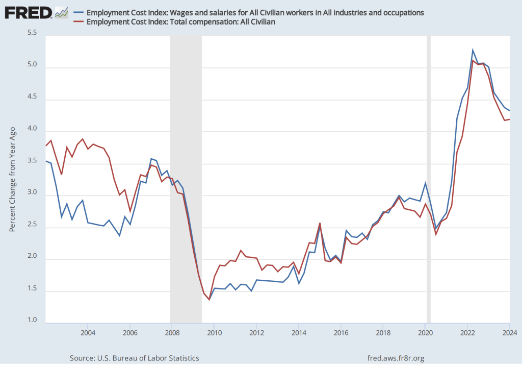
The data released this morning indicate that labor costs continue to increase at a rate that is higher than the rate that is likely needed for the Fed to hit its 2 percent price inflation target. The following figure shows the percentage change in the employment cost index for all civilian workers from the same quarter in 2023. The blue line looks only at wages and salaries while the red line is for total compensation, including non-wage benefits like employer contributions to health insurance. The rate of increase in the wage and salary measure decreased slightly from 4.4 percent in the fourth quarter of 2023 to 4.3 percent in the first quarter of 2024. The rate of increase in compensation was unchanged at 4.2 percent in both quarters.
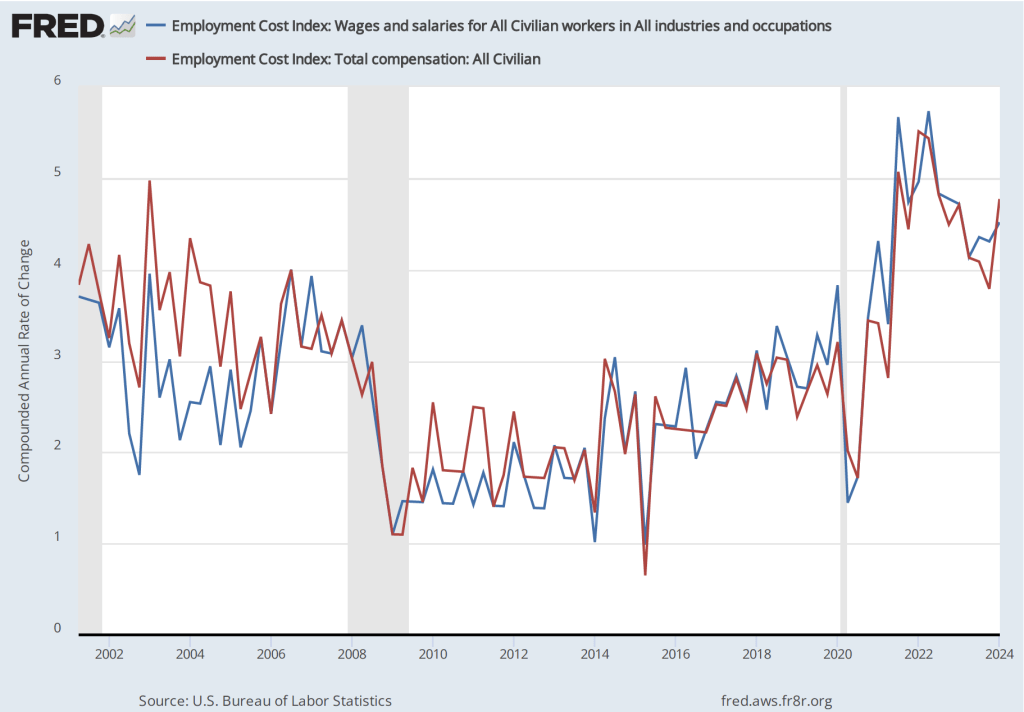
If we look at the compound annual growth rate of the ECI—the annual rate of increase assuming that the rate of growth in the quarter continued for an entire year—we find that the rate of increase in wages and salaries increased from 4.3 percent in the fourth quarter of 2023 to 4.5 percent in the first quarter of 2024. Similarly, the rate of increase in compensation increased from 3.8 percent in the third quarter of 2023 to 4.5 percent in the first quarter of 2024.
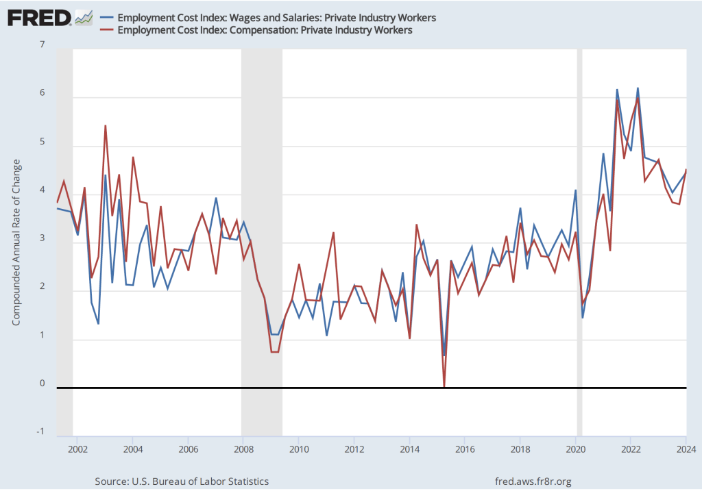
Some economists and policymakers prefer to look at the rate of increase in ECI for private industry workers rather than for all civilian workers because the wages of government workers are less likely to respond to inflationary pressure in the labor market. The first of the following figures shows the rate of increase of wages and salaries and in total compensation for private industry workers measured as the percentage increase from the same quarter in the previous year. The second figure shows the rate of increase calculated as a compound growth rate.
The first figure shows a slight decrease in the rate of growth of labor costs from the fourth quarter of 2023 to the first quarter of 2024, while the second figure shows a fairly sharp increase in the rate of growth.
Taken together, these four figures indicate that there is little sign that the rate of increase in employment costs is falling to a level consistent with a 2 percent inflation rate. At his press conference tomorrow afternoon, following the conclusion of the FOMC’s meeting, Fed Chair Jerome Powell will give his thoughts on the implications for future monetary policy 0f recent macroeconomic data.
Federal Reserve Chair Jerome Powell (Photo from federalreserve.gov)
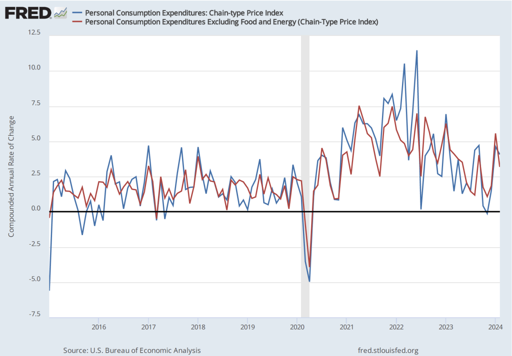
In a post yesterday, we noted that the quarterly data on the personal consumption expenditures (PCE) price index in the latest GDP report released by the Bureau of Economic Analysis (BEA) indicated that inflation was running higher than expected. Today (April 26), the BEA released its “Personal Income and Outlays” report for March, which includes monthly data on the PCE. The monthly data are consistent with the quarterly data in showing that PCE inflation remains higher than the Federal Reserve’s 2 percent annual inflation target. (A reminder that PCE inflation is particularly important because it’s the inflation measure the Fed uses to gauge whether it’s hitting its inflation target.)
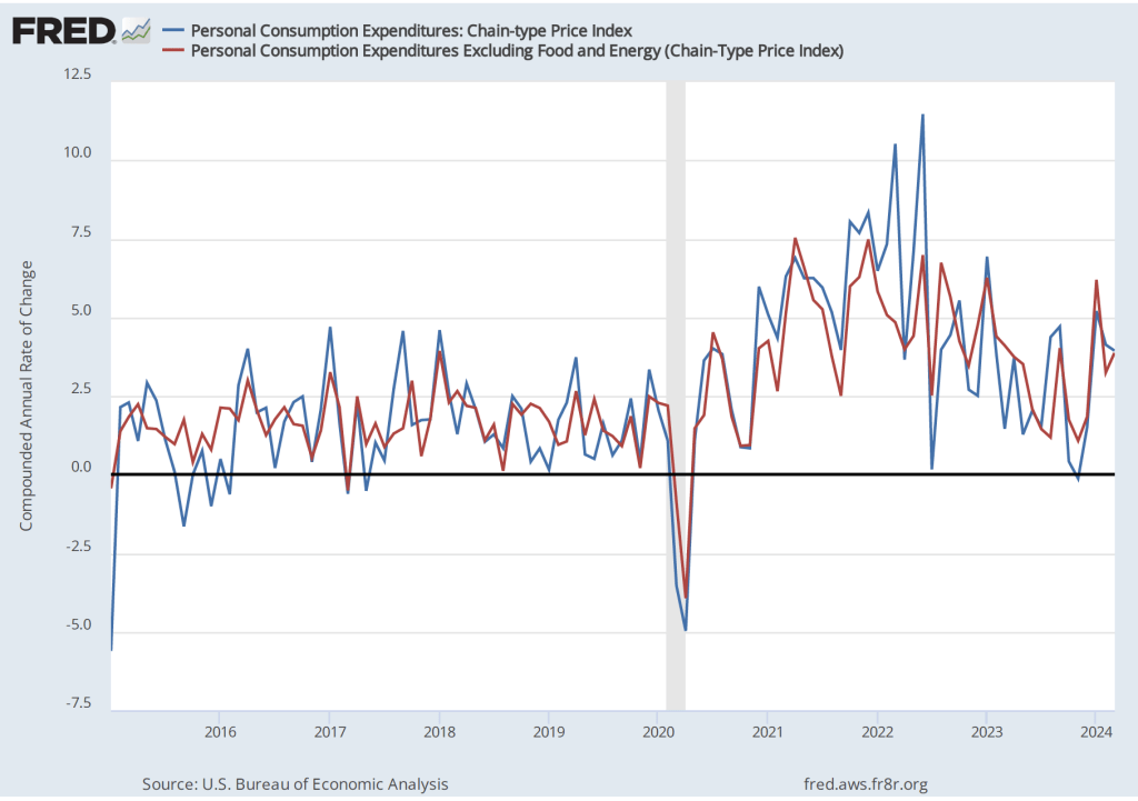
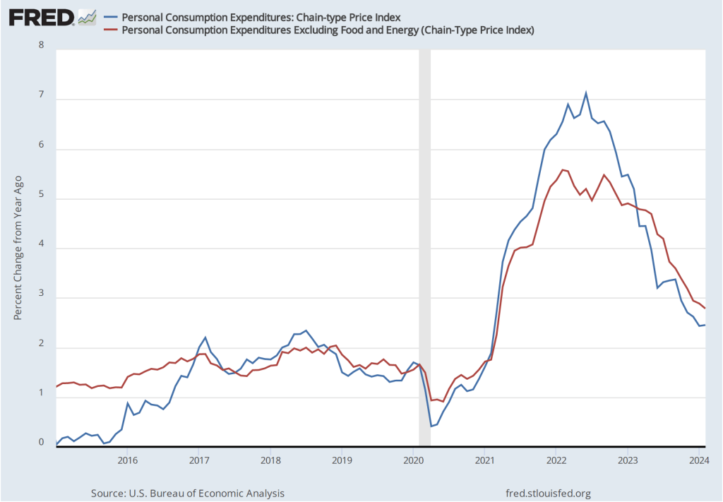
The following figure shows PCE inflation (blue line) and core PCE inflation (red line)—which excludes energy and food prices—with inflation measured as the percentage change in the PCE from the same month in the previous year. Many economists believe that core inflation gives a better gauge of the underlying inflation rate. Measured this way, PCE inflation increased from 2.5 percent in February to 2.7 percent in March. Core PCE inflation remained unchanged at 2.8 percent.
The following figure shows PCE inflation and core PCE inflation calculated by compounding the current month’s rate over an entire year. (The figure above shows what is sometimes called 12-month inflation, while this figure shows 1-month inflation.) Measured this way, PCE inflation declined from 4.1 percent in February to 3.9 percent in March. Core PCE inflation increased from 3.2 percent in February to 3.9 in March. So, March was another month in which both PCE inflation and core PCE inflation remained well above the Fed’s 2 percent inflation target.
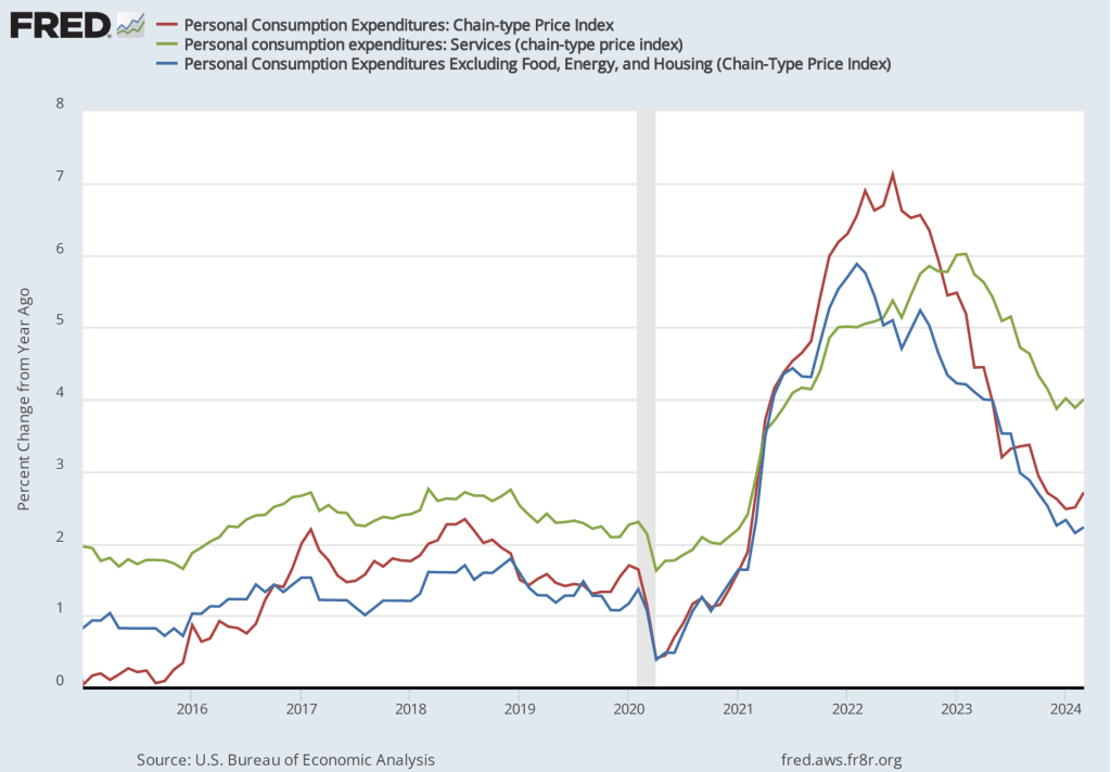
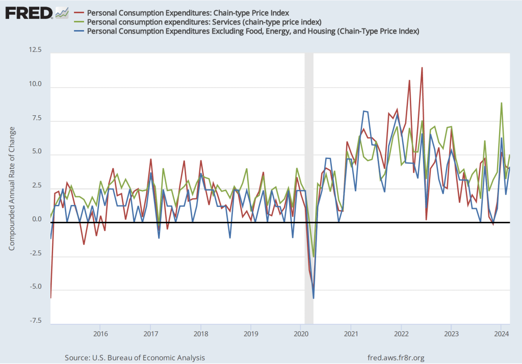
The following figure shows other ways of gauging inflation by including the 12-month inflation rate in the PCE (the same as shown in the figure above—although note that PCE inflation is now the red line rather than the blue line), inflation as measured using only the prices of the services included in the PCE (the green line), and the rate of inflation (the blue line) excluding the prices of housing, food, and energy. Fed Chair Jerome Powell has said that he is particularly concerned by elevated rates of inflation in services. Some economists believe that the price of housing isn’t accurately measured in the PCE, which makes it interesting to see if excluding the price of housing makes much difference in calculating the inflation rate. All three measures of inflation increased from February to March, with inflation in services remaining well above overall inflation and inflation excluding the prices of housing, food, and energy being somewhat lower than overall inflation.
The following figure uses the same three inflation measures as the figure above, but shows the 1-month inflation rate rather than the 12-month inflation rate. Measured this way, inflation in services increased sharply from 3.2 percent in February to 5.0 percent in March. Inflation excluding the prices of housing, food, and energy doubled from 2.0 percent in February to 4.1 percent in March.
Overall, the data in this report indicate that the decline in inflation during the second half of 2023 hasn’t continued in the first three months of 2024. In fact, the inflation rate may be slightly increasing. As a result, it no longer seems clear that the Fed’s policy-making Federal Open Market Committee (FOMC) will cut its target for the federal funds rate this year. (We discuss the possibility that the FOMC will keep its target unchanged through the end of the year in this blog post.) At the press conference following the FOMC’s next meeting on April 30-May 1, Fed Chair Jerome Powell may explain what effect the most recent data have had on the FOMC’s planned actions during the remainder of the year.
Federal Reserve Vice Chair Philip Jefferson (photo from the Federal Reserve)
Federal Reserve Chair Jerome Powell (photo from the Federal Reserve)
At the beginning of 2024, investors were expecting that during the year the Fed’s policy-making Federal Open Market Committee (FOMC) would cut its target range for the federal funds rate six or seven times. At its meeting on March 19-20 the economic projections of the members of the FOMC indicated that they were expecting to cut the target range three times from its current 5.25 percent to 5.50 percent. But, as we noted in this recent post and in this podcast, macroeconomic data during the first three months of this year indicated that the U.S. economy was growing more rapidly than the Fed had expected and the reductions in inflation that occurred during the second half of 2023 had not persisted into the beginning of 2024.
The unexpected strength of the economy and the persistence of inflation above the Fed’s 2 percent target have raised the issue of whether the FOMC will cut its target range for the federal funds rate at all this year. Earlier this month, Neel Kashkari, president of the Federal Reserve Bank of Minneapolis raised the possibility that the FOMC would not cut its target range this year.
Today (April 16) both Fed Vice Chair Philip Jefferson and Fed Chair Jerome Powell addressed the issue of monetary policy. They gave what appeared to be somewhat different signals about the likely path of the federal funds target during the remainder of this year—bearing in mind that Fed officials never commit to any specific policy when making a speech. Adressing the International Research Forum on Monetary Policy, Vice Chair Jefferson stated that:
“My baseline outlook continues to be that inflation will decline further, with the policy rate held steady at its current level, and that the labor market will remain strong, with labor demand and supply continuing to rebalance. Of course, the outlook is still quite uncertain, and if incoming data suggest that inflation is more persistent than I currently expect it to be, it will be appropriate to hold in place the current restrictive stance of policy for longer.”
One interpretation of his point here is that he is still expecting that the FOMC will cut its target for the federal funds rate sometime this year unless inflation remains persistently higher than the Fed’s target—which he doesn’t expect.
Chair Powell, speaking at a panel discussion at the Wilson Center in Washington, D.C., seemed to indicate that he believed it was less likely that the FOMC would reduce its federal funds rate target in the near future. The Wall Street Journal summarized his remarks this way:
“Federal Reserve Chair Jerome Powell said firm inflation during the first quarter had introduced new uncertainty over whether the central bank would be able to lower interest rates this year without signs of an economic slowdown. His remarks indicated a clear shift in the Fed’s outlook following a third consecutive month of stronger-than-anticipated inflation readings ….”
An article on bloomberg.com had a similar interpretation of Powell’s remarks: “Federal Reserve Chair Jerome Powell signaled policymakers will wait longer than previously anticipated to cut interest rates following a series of surprisingly high inflation readings.”
Politics may also play a role in the FOMC’s decisions. As we discuss in Macroeconomics, Chapter 17, Section 17.4 (Economics, Chapter 27, Section 27.4), the Federal Reserve Act, which Congress passed in 1913 and has amended several times since, puts the Federal Reserve in an unusal position in the federal government. Although the members of the Board of Governors are appointed by the president and confirmed by the Senate, the Fed was intended to act independently of Congress and the president. Over the years, Fed Chairs have protected that independence by, for the most part, avoiding taking actions beyond the narrow responsibilites Congress has given to the Fed by Congress and by avoiding actions that could be interpreted as political.
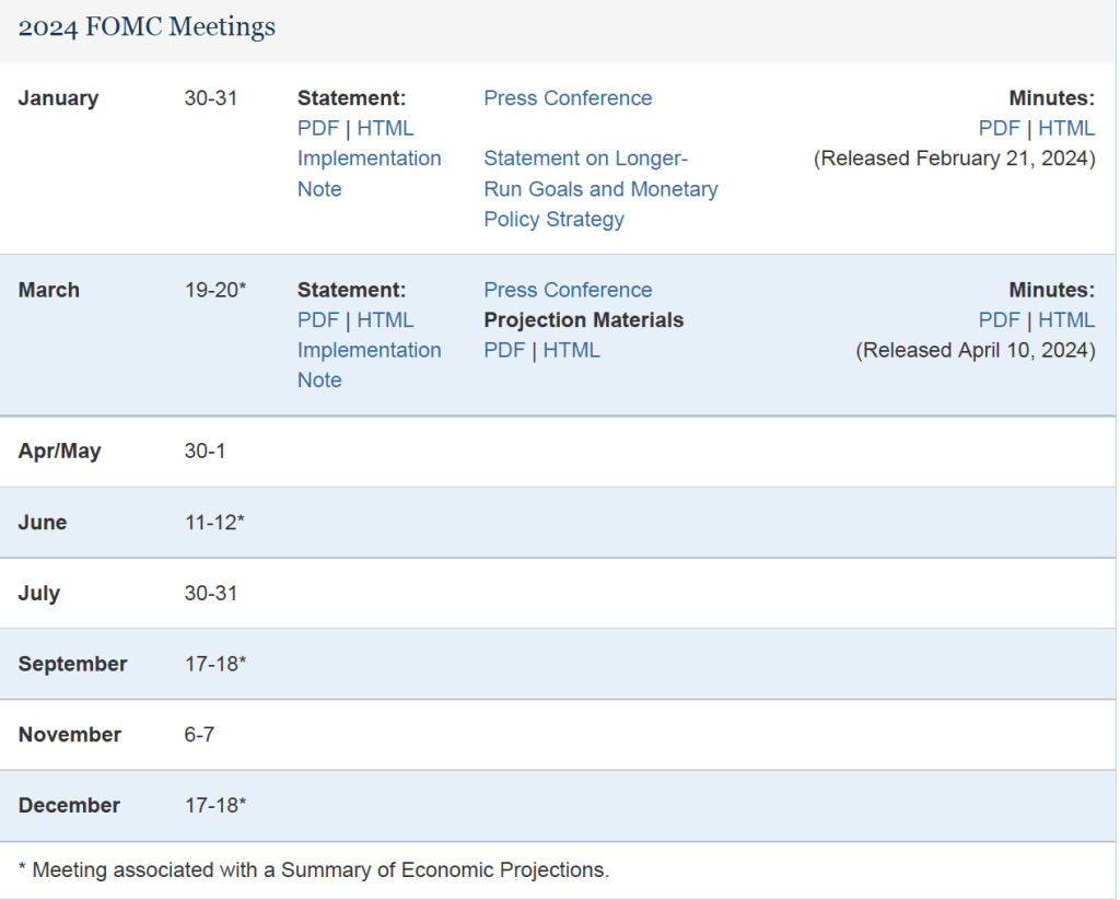
This year is, of course, a presidential election year. The following table from the Fed’s web site lists the FOMC meetings this year. The presidential election will occur on November 5. There are four scheduled FOMC meetings before then. Given that inflation has been running well above the Fed’s target during the first three months of the year, it would likely take at least two months of lower inflation data—or a weakening of the economy as indicated by a rising unemployment rate—before the FOMC would consider lowering its federal funds rate target. If so, the meeting on July 30-31 might be the first meeting at which a rate reduction would occur. If the FOMC doesn’t act at its July meeting, it might be reluctant to cut its target at the September 17-18 meeting because acting close to the election might be interpreted as an attempt to aid President Joe Biden’s reelection.
Although we don’t know whether avoiding the appearance of intervening in politics is an important consideration for the members of the FOMC, some discussion in the business press raises the possibility. For instance, a recent article in the Wall Street Journal noted that:
“The longer that officials wait, the less likely there will be cuts this year, some analysts said. That is because officials will likely resist starting to lower rates in the midst of this year’s presidential election campaign to avoid political entanglements.”
These are clearly not the easiest times to be a Fed policymaker!
In a recent podcast we discussed what actions the Fed may take if inflation continues to run well above the Fed’s 2 percent target. We are likely a step closer to finding out with the release this morning (April 10) by the Bureau of Labor Statistics (BLS) of data on the consumer price index (CPI) for March. The inflation rate measured by the percentage change in the CPI from the same month in the previous month—headline inflation—was 3.5 percent, slightly higher than expected (as indicated here and here). As the following figure shows, core inflation—which excludes the prices of food and energy—was 3.8 percent, the same as in January.
If we look at the 1-month inflation rate for headline and core inflation—that is the annual inflation rate calculated by compounding the current month’s rate over an entire year—the values seem to confirm that inflation, while still far below its peak in mid-2022, has been running somewhat higher than it did during the last months of 2023. Headline CPI inflation in March was 4.6 percent (down from 5.4 percent in February) and core CPI inflation was 4.4 percent (unchanged from February). It’s worth bearing in mind that the Fed’s inflation target is measured using the personal consumption expenditures (PCE) price index, not the CPI. But CPI inflation at these levels is not consistent with PCE inflation of only 2 percent.
As has been true in recent months, the path of inflation in the prices of services has been concerning. As we’ve noted in earlier posts, Federal Reserve Chair Jerome Powell has emphasized that as supply chain problems have gradually been resolved, inflation in the prices of goods has been rapidly declining. But inflaion in services hasn’t declined nearly as much. Last summer he stated the point this way:
“Part of the reason for the modest decline of nonhousing services inflation so far is that many of these services were less affected by global supply chain bottlenecks and are generally thought to be less interest sensitive than other sectors such as housing or durable goods. Production of these services is also relatively labor intensive, and the labor market remains tight. Given the size of this sector, some further progress here will be essential to restoring price stability.”
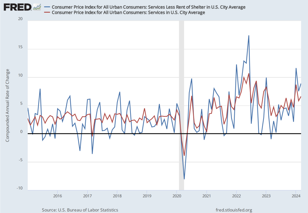
The following figure shows the 1-month inflation rate in services prices and in services prices not included including housing rent. Some economists believe that the rent component of the CPI isn’t well measured and can be volatile, so it’s worthwhile to look at inflation in service prices not including rent. The figure shows that inflation in all service prices has been above 4 percent in every month since July 2023. Inflation in service prices increased from 5.8 percent in February to 6.6 percent in March . Inflation in service prices not including housing rent was even higher, increasing from 7.5 percent in February to 8.9 percent in March. Such large increases in the prices of services, if they were to continue, wouldn’t be consistent with the Fed meeting its 2 percent inflation target.
Finally, some economists and policymakers look at median inflation to gain insight into the underlying trend in the inflation rate. If we listed the inflation rate in each individual good or service in the CPI, median inflation is the inflation rate of the good or service that is in the middle of the list—that is, the inflation rate in the price of the good or service that has an equal number of higher and lower inflation rates. As the following figure shows, although median inflation declined in March, it was still high at 4.3 percent. Median inflation is volatile, but the trend has been generally upward since July 2023.
Financial investors, who had been expecting that this CPI report would show inflation slowing, reacted strongly to the news that, in fact, inflation had ticked up. As of late morning, the Dow Jones Industrial Average had decline by nearly 500 points and the S&P 5o0 had declined by 59 points. (We discuss the stock market indexes in Macroeconomics, Chapter 6, Section 6.2 and in Microeconomics and Economics, Chapter 8, Section 8.2.) The following figure from the Wall Street Journal shows the sharp reaction in the bond market as the interest rate on the 10-year Treasury note rose sharply following the release of the CPI report.
Lower stock prices and higher long-term interest rates reflect the fact that investors have changed their views concerning when the Fed’s Federal Open Market Committee (FOMC) will cut its target for the federal funds and how many rate cuts there may be this year. At the start of 2024, the consensus among investors was for six or seven rate cuts, starting as early as the FOMC’s meeting on March 19-20. But with inflation remaining persistently high, investors had recently been expecting only two or three rate cuts, with the first cut occurring at the FOMC’s meeting on June 11-12. Two days ago, Neel Kashkari, president of the Federal Reserve Bank of Minneapolis raised the possibility that the FOMC might not cut its target for the federal funds rate during 2024. Some economists have even begun to speculate that the FOMC might feel obliged to increase its target in the coming months.
After the FOMC’s next meeting on April 30-May 1 first, Chair Powell may provide some additional information on the committee’s current thinking.
On Friday, April 5—the first Friday of the month—the Bureau of labor Statistics (BLS) released its “Employment Situation” report with data on the state of the labor market in March. The BLS reported a net increase in employment during March of 303,000, which was well above the increase that economists had been expecting. The previous estimates of employment in January and February were revised upward by 22,000 jobs. (We also discuss the employment report in this podcast.)
Employment increases during the second half of 2023 had slowed compared with the first half of the year. But, as the following figure from the BLS report shows, since December 2023, employment has increased by more than 250,000 in each month. These increases are far above the estimated increases of 70,000 to 100,000 new jobs needed to keep up with population growth. (But note our later discussion of this point.)
The unemployment rate had been expected to stay steady at 3.9 percent, but declined slightly to 3.8 percent. As the following figure shows, the unemployment rate has been remarkably stable for more than two years and has been below 4.0 percent each month since December 2021. The members of the Federal Open Market Committee (FOMC) expect that the unemployment rate for 2024 will be 4.0 percent, a forcast that is beginning to seem too high.
The monthly employment number most commonly reported in media accounts is from the establishment survey (sometimes referred to as the payroll survey), whereas the unemployment rate is taken from the household survey. The results of both surveys are included in the BLS’s monthly “Employment Situation” report. As we discuss in Macroeconomics, Chapter 9, Section 9.1 (Economics, Chapter 19, Section 19.1), many economists and policymakers at the Federal Reserve believe that employment data from the establishment survey provides a more accurate indicator of the state of the labor market than do either the employment data or the unemployment data from the household survey.
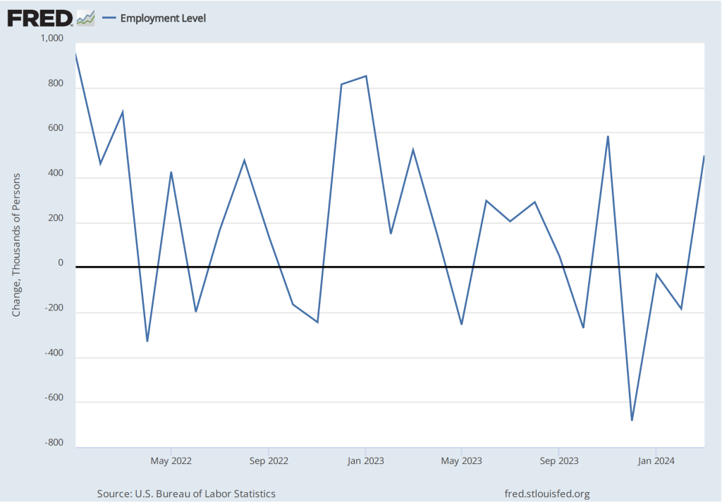
As we noted in a previous post, whereas employment as measured by the establishment survey has been increasing each month, employment as measured by the household surve declined each month from December 2023 through February 2024. But, as the following figure shows, this trend was reversed in March, with employment as measured by the household survey increasing 498,000—far more than the 303,000 increase in employment in establishment survey. This reversal may be another indication of the underlying strength of the labor market.
As the following figure shows, despite the substantial increases in employment, wages, as measured by the percentage change in average hourly earnings from the same month in the previous year, have been trending down. The increase in average hourly earnings declined from 4.3 percent February in to 4.1 percent in March.
The following figure shows wage inflation calculated by compounding the current month’s rate over an entire year. (The figure above shows what is sometimes called 12-month wage inflation, whereas this figure shows 1-month wage inflation.) One-month wage inflation is much more volatile than 12-month inflation—note the very large swings in 1-month wage inflation in April and May 2020 during the business closures caused by the Covid pandemic.
Wages increased by 6.1 percent in January 2024, 2.1 percent in February, and 4.2 percent in March. So, the 1-month rate of wage inflation did show an increase in March, although it’s unclear whether the increase was a result of the strength of the labor market or reflected the greater volatility in wage inflation when calculated this way.
Some economists and policymakers are surprised that low levels of unemployment and large monthly increases in employment have not resulted in greater upward pressure on wages. One possibility is that the supply of labor has been increasing more rapidly than is indicated by census data. In a January report, the Congressional Budget Office (CBO) argued that the Census Bureau’s estimate of the population of the United States is too low by about 6 million people. This undercount is attributable, according to the CBO, largely the Census Bureau having underestimated the amount of immigration that has occurred. If the CBO is correct, then the economy may need to generate about 200,000 net new jobs each month to accommodate the growth of the labor force, rather than the 80,000 to 100,000 we mentioned earlier in this post.
Federal Reserve Chair Jerome Powell noted in a press conference following the most recent meeing of the FOMC that: “Strong job creation has been accompanied by an increase in the supply of workers, reflecting increases in participation among individuals aged 25 to 54 years and a continued strong pace of immigration.” As a result:
“what you would have is potentially kind of what you had last year, which is a bigger economy where inflationary pressures are not increasing. In fact, they were decreasing. So you can have that if you have a continued supply-side activity that we had last year with—both with supply chains and also with, with growth in the size of the labor force.”
If Powell is correct, in the coming months the U.S. economy may be able to sustain rapid increases in employment without those increases leading to an increase in the rate of inflation.
Join authors Glenn Hubbard & Tony O’Brien as they react to the jobs report of over 300K jobs created which was way over expectations of about 200K. They consider the impact of this report as the Fed considers the next steps for the economy. Are we on a glide path for a soft landing at 2% inflation or will the Fed reconsider its long-standing target by adopting a higher 3% target? Glenn and Tony offer interesting viewpoints on where this is headed.
McDonald’s raising the price of its burgers by 10 percent in 2023 led to a decline in sales. (Photo from mcdonalds.com)
Inflation as measured by changes in the consumer price index (CPI) receives the most attention in the media, but the Federal Reserve looks instead to inflation as measured by changes in personal consumption expenditures (PCE) price index when evaluating whether it is meeting its 2 percent inflation target. The Bureau of Economic Analysis (BEA) released PCE data for February as part of its “Personal Income and Outlays” report on March 29.
The following figure shows PCE inflation (blue line) and core PCE inflation (red line)—which excludes energy and food prices—for the period since January 2015 with inflation measured as the change in PCE from the same month in the previous year. Measured this way, PCE inflation increased slightly from 2.4 percent in January to 2.5 percent in February. Core PCE inflation decreased slightly from 2.9 percent to 2.8 percent.
The following figure shows PCE inflation and core PCE inflation calculated by compounding the current month’s rate over an entire year. (The figure above shows what is sometimes called 12-month inflation, while this figure shows 1-month inflation.) Measured this way, both PCE inflation and core PCE inflation declined in February, but the decline only partly offset the sharp increases in December and January. Both PCE inflation—at 4.1 percent—and core PCE inflation—at 3.2 percent—remained well above the Fed’s 2 percent target.
The following figure shows another way of gauging inflation by including the 12-month inflation rate in the PCE (the same as shown in the figure above—although note that PCE inflation is now the red line rather than the blue line), inflation as measured using only the prices of the services included in the PCE (the green line), and the trimmed mean rate of PCE inflation (the blue line). Fed Chair Jerome Powell has said that he is particularly concerned by elevated rates of inflation in services. The trimmed mean measure is compiled by economists at the Federal Reserve Bank of Dallas by dropping from the PCE the goods and services that have the highest and lowest rates of inflation. It can be thought of as another way of looking at core inflation.
In February, 12-month trimmed mean PCE inflation was 3.1 percent, a little below core inflation of 3.3 percent. Twelve-month inflation in services was 3.8 percent, a slight decrease from 3.9 percent in January. Trimmed mean and services inflation tell the same story as PCE and PCE core inflation: Inflation has decline significantly from its highs of mid-2022, but remains stubbornly above the Fed’s 2 percent target.
It seems unlikely that this month’s PCE data will have much effect on when the members of the Federal Open Market Committee will decide to lower the target for the federal funds rate.
The Bureau of Economic Analysis (BEA) has issued its third estimate of real GDP for the fourth quarter of 2023. The BEA now estimates that real GDP increased in the fourth quarter of 2023 at an annual rate of 3.4 percent, an increase from the BEA’s second estimate of 3.2 percent. The BEA noted that: “The update primarily reflected upward revisions to consumer spending and nonresidential fixed investment that were partly offset by a downward revision to private inventory investment.”
As the blue line in the following figure shows, despite the upward revision, fourth quarter growth in real GDP decline significantly from the very high growth rate of 4.9 percent in the third quarter. In addition, two widely followed “nowcast” estimates of real GDP growth in the first quarter of 2024 show a futher slowdown. The nowcast from the Federal Reserve Bank of Atlanta estimates that real GDP will have grown at an annualized rate of 2.1 percent in the first quarter and the nowcast from the Federal Reserve Bank of New York estimates a growth rate of 1.9 percent. (The Atlanta Fed describes its nowcast as “a running estimate of real GDP growth based on available economic data for the current measured quarter.” The New York Fed explains: “Our model reads the flow of information from a wide range of macroeconomic data as they become available, evaluating their implications for current economic conditions; the result is a ‘nowcast’ of GDP growth ….”)
Data on growth in real gross domestic income (GDI), on the other hand, show an upward trend, as indicated by the red line in the figure. As we discuss in Macroeconomics, Chapter 8, Section 8.4 (Economics, Chapter 18, Section 18.4), gross domestic product measures the economy’s output from the production side, while gross domestic income does so from the income side. The two measures are designed to be equal, but they can differ because each measure uses different data series and the errors in data on production can differ from the errors in data on income. Economists differ on whether data on growth in real GDP or data on growth in real GDI do a better job of forecasting future changes in the economy. Accordingly, economists and policymakers will differ on how much weight to put on the fact that while the growth in real GDI had been well below growth in real GDP from the fourth quarter of 2022 to the fourth quarter of 2023, during the fourth quarter of 2023, growth in real GDI was 1.5 percentage points higher than growth in real GDP.
On balance, it seems likely that these data will reinforce the views of those members of the Fed’s policy-making Federal Open Market Committee (FOMC) who were cautious about reducing the target for the federal funds rate until the macroeconomic data indicate more clearly that the economy is slowing sufficiently to ensure that inflation is returning to the Fed’s 2 percent target. In a speech on March 27 (before the latest GDP revisions became available), Fed Governor Christopher Waller reviewed the most recent macro data and concluded that:
“Adding this new data to what we saw earlier in the year reinforces my view that there is no rush to cut the [federal funds] rate. Indeed, it tells me that it is prudent to hold this rate at its current restrictive stance perhaps for longer than previously thought to help keep inflation on a sustainable trajectory toward 2 percent.”
Most other members of the FOMC appear to share Waller’s view.
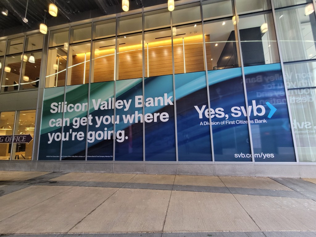
In March 2023, First Citizens Bank agreed to buy SVB after SVB had been taken over by the FDIC. (Photo courtesy of Lena Buonanno.)
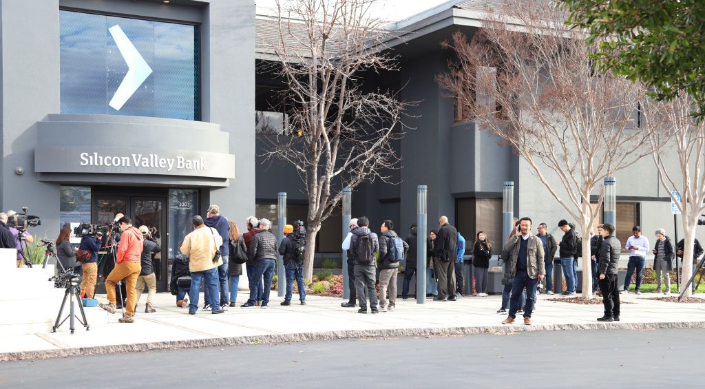
On Wednesday, March 8, 2023, Silicon Valley Bank (SVB), headquartered in Santa Clara in the heart of California’s Silicon Valley surprised its depositors and Wall Street investors by announcing that in order to raise funds it had sold $21 billion in securities at a loss of $1.8 billion. The announcement raised concerns about the bank’s solvency—that is, there were questions as to whether the value of the bank’s assets, including bonds and other securities, was greater than the value of the bank’s liabilities, primarily deposits. The result was a run on the bank as depositors withdrew most of their funds. On Friday, March 10, 2023, the Federal Deposit Insurance Corporation (FDIC) took control of SVB before the bank could open for business that day.
Mandatory Credit: Photo by GEORGE NIKITIN/EPA-EFE/Shutterstock (13817875h)
The run on SVB in 2023 resembled …
bank runs during the 1930s.
In this blog post, we discuss the economics of bank runs and go into detail on what happened to SVB. In response to the failure of SVB, the FDIC declared that selling the bank’s assets and forcing depositors above the $250,000 deposit limit to suffer losses would pose a systemic risk to the financial system. As a result, with concurrence of the FDIC’s Board of Directors, two-thirds of the Fed’s Board of Governors, and Treasury Secretary Janet Yellen, the FDIC announced that all deposits in SVB—including deposits above the normal $250,000 dollar limit—would be insured. The waiving of the deposit insurance limit was also applied to Signature Bank, which failed a few days later. The run on SVB had been set off by the loses the bank had experienced on its long-term Treasury bonds. To reassure depositors in other banks that also held long-term debt, the Fed announced that it was establishing the Bank Term Funding Program (BTFP). Banks and other depository institutions, such as savings and loans and credit unions, can use the BTFP to borrow against their holdings of Treasury and mortgage-backed securities.
Maturity Mismatch and Moral Hazard
The failure of SVB highlighted two problems in commercial banking.
Maturity mismatch. Banks use short-term deposits to fund long-term investments, such as mortgage loans and purchases of Treasury bonds. In other words, banks fund investments in long maturity assets using short maturity liabilities. The resulting maturity mismatch causes two problems: 1) If, as happened at SVB, the bank experiences a run and needs to pay off depositors, it may only be able to do so by selling assets at a loss, which may push the bank to insolvency; and 2) bonds with long maturities are subject to greater interest rate risk than are bonds with shorter maturities: If market interest rates rise, the prices of long-term bonds fall by more than do the prices of short-term bonds. To compensate investors for this greater interest rate risk, long-term bonds typically have higher interest rates than do short-term bonds. (We explain these points in Money, Banking, and the Financial System, Chapter 5, Section 5.2.) The higher interest rates can lead a bank’s managers to invest deposits in long-term bonds in order to earn higher interest rates and boost the bank’s profits, even though they are taking on greater risk by doing so. The decision of SVB’s managers to hold a large number of long-term bonds greatly contributed to the failure of the bank.
Moral hazard. Why might bank managers take on more risk by buying long-term bonds and potentially making other risking investments, such as making commercial real estate loans? For instance, recently, New York Community Bancorp suffered losses on loans made to buyers of office buildings and apartments. A key to the explanation is the extent of moral hazard in banking. In the financial system—including banking—moral hazard is the problem investors experience in verifying that borrowers are using their funds as intended. Although we don’t usually think of bank depositors as being investors who lend their money to banks, in effect, that is the relationship depositors and banks are in. Banks borrow depositors money and use these funds to make a profit. Bank managers are typically rewarded on the basis of how profitable the bank is. As a result, bank managers may make riskier investments than depositors would make if depositors were deciding which investments to make.
In principle, depositors could monitor which investments a bank’s managers are making and withdraw their deposits if the investments are too risky. In practice, depositors rarely monitor bank managers for two key reasons: 1) Depositors often lack the information to accurately gauge the risk of an investment; and 2) Depositors are insured by the FDIC for up to $250,000 per deposit per bank. When a bank fails, the FDIC typically makes insured depositors funds available with no delay, often by establishing a “bridge bank” to continue the failed banks operations, including keeping ATMs open and stocked with cash. Deposit insurance increases the extent of moral hazard in the banking system. If depositors come to believe that in practice even deposits above the $250,000 are insured because of the actions bank regulators took the following the failures of SVB and Signature Bank, moral hazard is further increased. Still, reason 1. above gives reason to believe that, even in the absence of deposit insurance, depositors are unlikely to closely monitor bank managers. If depositors suddenly receive new information on a bank’s health—as happened when SVB suffered a loss on its sale of Treasury bonds—the likely result is a run. Runs potentially can lead other bank managers to become more cautious in their investments, but it will be too late to change the behavior of the managers of a bank that closes because of a run.
Bank Leverage
Because banks are highly leveraged, they are less able to withstand declines in the prices of their assets without becoming insolvent. A business is insolvent if the value of its assets is less than the value of its liabilities. Ordinarily, the FDIC will close an insolvent bank. A bank’s leverage is the ratio of the value of a bank’s assets to the value of its capital. A bank’s capital equals the funds contributed by the bank’s shareholders through their purchases of the bank’s stock plus the bank’s accumulated earnings. Put another way, a bank’s capital represents the value of the bank’s shareholders’ investment in the bank.
Shareholders focus on the return on their investment (ROI). Because banks are highly leveraged, a relatively small return on the banks assets—such as loans and mortgages—can result in a large return on the shareholders’ investment. This relationship holds because the shareholders’ investment (the bank’s capital) is much smaller than the bank’s assets. But just as high leverage increases a bank’s profits if the bank earns a positive return on its assets, it also increases a bank’s losses if the bank suffers a negative return on its assets. Banks would have a greater ability to absorb losses on their investments without becoming insolvent if the banks had more capital. But the more capital banks hold relative to the value of their assets—in other words, the less leveraged a bank is—the smaller the profit banks earn for a given return on their assets. Just as moral hazard can lead bank managers to make riskier investments than their depositors would prefer, it can also lead bank managers to become more leveraged than their depositors would prefer.
Regulatory Responses to the Failure of SVB
As we’ve noted, the problems that led to the failure of SVB were rooted in the problems that all commercial banks are subject to. (The reasons why SVB turned out to be particularly vulnerable to a bank run are discussed in this earlier blog post.) Although there have been extensive discussions among federal regulators, including the Federal Reserve and the FDIC, about steps to increase the stability of the U.S. banking sector, as of now no significant regulatory changes have occurred. However, there have been a number of proposals that regulators have been considering.
Increased capital. As we noted, banks hold relatively little capital relative to their assets. On average, U.S. commercial banks hold capital equal to about 9.5 percent of the value of their assets. Holding more capital would reduce bank leverage, making banks less vulnerable to declines in the value of their assets. More capital would also mean that banks have more funds available to pay out to depositors making withdrawals during a run. In regulating bank capital, the United States has largely followed the Basel accord, which was established by the Bank for International Settlements (BIS). We discuss the Basil accord in Money, Banking, and the Financial System, Chapter 12, Section 12.4. Here we can note that the most recent proposed capital regulations are Basel III, sometimes called the “Basel III Endgame.”
Basel III would require large banks to hold more capital. The proposal has been heavily criticized by the banking industry. Some economists strongly support banks holding more capital to increase the stability of the banking system, but other economists are more skeptical. These economists argue that even if banks held twice as much capital as they currently do, it would likely prove insufficient to meet depositor withdrawals in bank run similar to the one SVB experienced. Holding more capital is also likely to reduce the volume of loans that banks will be able to make. Finally, the problems in the banking system in recent years have typically involved mid-sized regional banks rather than the large banks—those holding more than $100 billion in assets—that are the focus of Basel III. In any event, in testimony before Congress earlier this month, Fed Chair Jerome Powell stated that: “I do expect that there will be broad and material changes to the proposal.” His statement makes it likely that the United States won’t fully adopt the proposed Basel III regulations in their current form.
2. Revising deposit insurance. The establishment of the FDIC in 1934 stopped the bank runs that had seriously damaged the U.S. economy during the early 1930s. Because of deposit insurance, people knew that they didn’t have to quickly withdraw their funds from a bank experiencing losses because even if the bank failed, deposits were insured. But, as we noted earlier, deposit insurance also increases moral hazard in banking by reducing the incentive of depositors to monitor the investments bank managers make. One proposed reform would increase deposit insurance for accounts held by households and small and mid-sized firms because these deposits are less likely to be quickly withdrawn if a banks experiences difficulties and because these depositors are less likely to be able to monitor bank managers. Large firms, investors, and financial firms would not be eligible for the increased deposit insurance. (Under Basel III, banks might be required to hold additional liquid assets so that they would be able to have funds available to meet sudden withdrawals by large firms, investors, and financial firms. It was withdrawals by those types of depositors that led to SVB’s failure.)
3. Increased use of the Fed’s discount window. Congress established the Federal Reserve in 1914 partly in response to the bank panics that plagued the U.S. financial system during the 19th and early 20th centuries. The Federal Reserve Act was intended to allow the Fed to serve as a lender of last resort by making discount loans to banks having temporary liquidity problems as a result of deposit withdrawals. In practice, however, banks were often reluctant to borrow at the Fed’s discount window because they were afraid that discount borrowing came with a stigma indicating that the bank was in trouble. As a result, discount lending has not played a significant role in stopping bank runs. For instance, SVB had not prepared to request discount loans and so weren’t able to use discount loans to provide the funds needed to meet deposit withdrawals. Some economists and policymakers have proposed requiring banks to provide the Fed with enough collateral, primarily in the form of business and consumer loans, to meet their liquidity needs in the event of a run. By identifying sufficien collateral ahead of time, banks would be able to immediately receive discount loans in an emergency. If SVB had provided collateral equal to the value of its uninsured deposits, it might have been able to withstand the run that occurred.
4. Require more securities to be marked to market. Banking regulations allow banks to keep bonds and other securities on their balance sheets at face value even if the market value of the securities has declined, provided the securities are identified as being held to maturity. When a bank experiences liquidity problems it may be forced to sell securities that it previously designated as being held to maturity, which is the situation SVB found itself in. Some economists and policymakers have proposed that more—possibly all—of a bank’s holdings of securities be “marked to market,” which means that the securities’ current market values rather than their face values would be used on the bank’s balance sheet. Economists and policymakers are divided in their opinions on this proposals. Marking more securities to market may give depositors and investors a clearer idea of the true financial health of a bank. But doing so might also be misleading because banks will not take losses on those securities that they actually hold until maturity.
5. Bank examiners become more focused on emerging threats. Some economists and policymakers argue that in practice bank examiners from the FDIC, the Fed, and the Office of the Comptroller of the Currency (which regulates larger banks) are in the best position to determine whether bank managers are taking on too much risk, particularly as economic conditions change. For example, as the Federal Reserve began to increase its target for the federal funds rate in the spring of 2022, other interest rates also rose, causing the prices of long-term bonds to fall. In retrospect, bank examiners overseeing SVB and other banks were slow to question the managers of these banks about the degree of risk involved in their investments in long-term bonds. Similarly, bank examiners were slow to realize the risk that banks like SVB were taking in relying on deposits above the $250,000 insurance limit. These depositors are likely to be the first to withdraw funds in the event of a bank encountering a problem. In principle, if bank examiners were more alert to the effect changing economic condidtions have on the riskiness of bank investments, the examiners might be able to prod bank managers to reduce their risky investments before a crisis occurs.
6. Further consolidation of the banking system. As we discuss in Money, Banking, and the Financial System, Chapter 10, Section 10.4, for many years restrictions on banks operating in more than one state resulted in the United States having many more banks than is true of other high-income countries. In the mid-1990s, after Congress authorized interstate banking, a wave of consolidation in the banking industry resulted in some banks operating nationwide. However, the United States still has many small and mid-size, or regional, banks. The largest banks have typically not encountered liquity problems or experienced runs. Some economists and policymakers have argued that further consolidation could lead to a banking system in which nearly all banks had the financial resources to withstand bank runs. Other economists and policymakers argue, however, that small businesses often rely for credit on smaller community banks. These banks engage in relationship banking, which means that they have long-term relationships with borrowers. These relationships enable the banks to accurately assess the creditworthiness of borrowers because the banks possess private information on the borrowers. Larger banks are more likely to use standard algorithms to assess the creditworthiness of borrowers. In doing so a larger bank may refuse to make loans that a community bank would have made. As a result, further signficant consolidation in the banking system might make it more difficult for small businesses to access the credit they need to operate and to expand.
Finally, as we note in Chapter 12 of Money, Banking, and the Financial System, government regulation of banking has followed a familiar pattern dating back decades. When banks or another part of the financial system, experience a crisis, Congress, the president, and the regulatory agencies respond with new regulations. The regulations, though, can lead financial firms to innovate in ways that undermine the effects of the regulation. If these financial innovations result in a crisis, the government reponds with additional regulations, which lead to new financial innovations. And so on. The nature of banking and the many other channels through which funds flow from savers and investors to borrowers are sufficiently varied and evolve so quickly that it’s unlikely that any particular regulations will be capable of permanently stabilizing the financial system.