Image created by ChatGPT
On January 22, the Bureau of Economic Analysis (BEA) released monthly data on the personal consumption expenditures (PCE) price index and on real personal consumption spending for October and November as part of its “Personal Income and Outlays” report. Because of the federal government shutdown, two months of data were released together with some of the price data for October being imputed because the Bureau of Labor Statistics was unable to collect some consumer price data in that month. The release of data for December has been delayed.
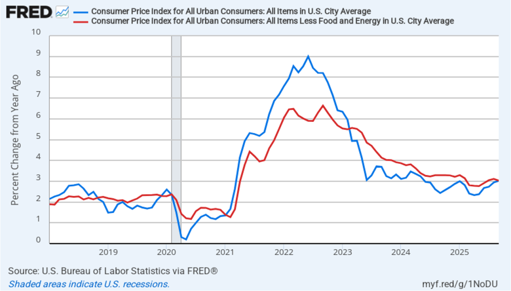
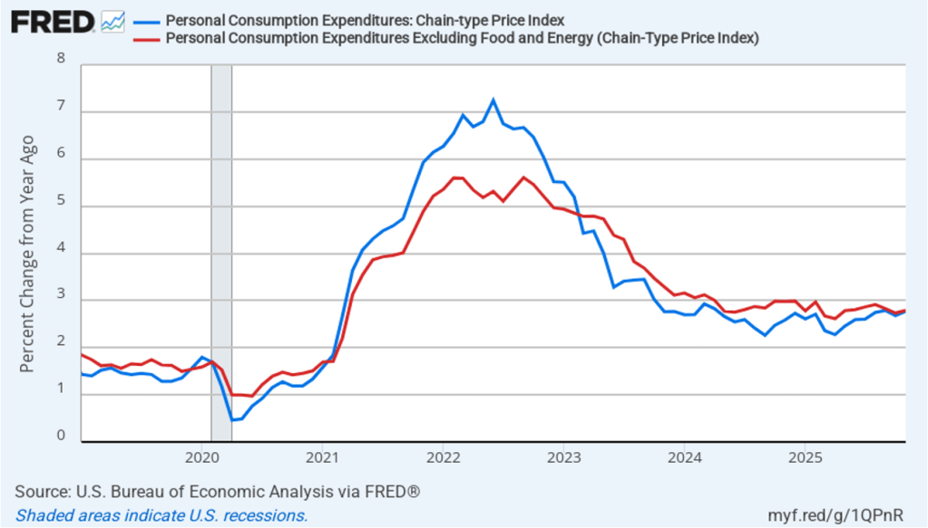
The following figure shows headline PCE inflation (the blue line) and core PCE inflation (the red line)—which excludes energy and food prices—with inflation measured as the percentage change in the PCE from the same month in the previous year. In November, headline PCE inflation was 2.8 percent, up slightly from 2.7 percent in October. Core PCE inflation in November was also 2.8 percent, up slightly from 2.7 percent in November. Both headline and core PCE inflation for November were equal to the forecast of economists surveyed by the Wall Street Journal.
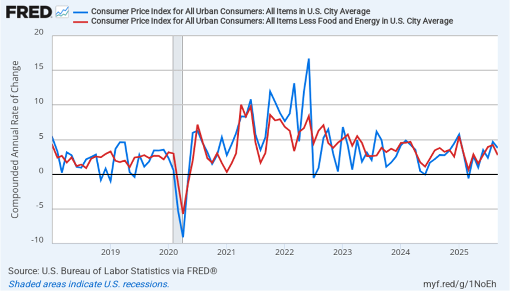
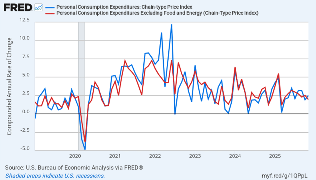
The following figure shows headline PCE inflation and core PCE inflation calculated by compounding the current month’s rate over an entire year. (The figure above shows what is sometimes called 12-month inflation, while the figure below shows 1-month inflation.) Measured this way, headline PCE inflation increased from 1.9 percent in October to 2.5 percent in November. Core PCE inflation declined from 2.5 percent in October to 1.9 percent in November. So, both 1-month and 12-month PCE inflation are telling the same story of inflation somewhat above the Fed’s target. The usual caution applies that 1-month inflation figures are volatile (as can be seen in the figure).
Fed Chair Jerome Powell has frequently mentioned that inflation in non-market services can skew PCE inflation. Non-market services are services whose prices the BEA imputes rather than measures directly. For instance, the BEA assumes that prices of financial services—such as brokerage fees—vary with the prices of financial assets. So that if stock prices rise, the prices of financial services included in the PCE price index also rise. Powell has argued that these imputed prices “don’t really tell us much about … tightness in the economy. They don’t really reflect that.” The following figure shows 12-month headline inflation (the blue line) and 12-month core inflation (the red line) for market-based PCE. (The BEA explains the market-based PCE measure here.)
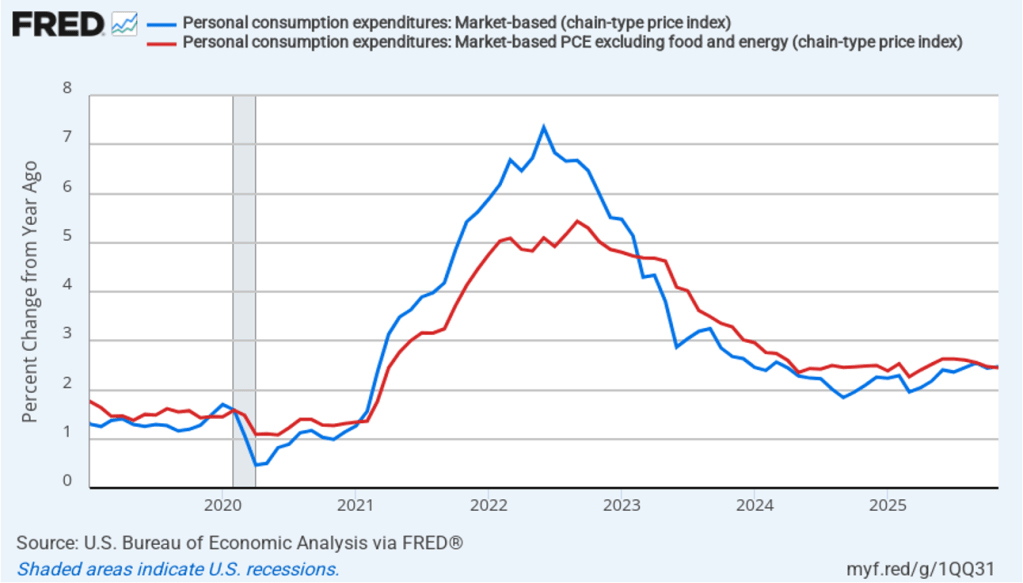
Headline market-based PCE inflation was 2.5 percent in November, up slightly from 2.4 percent in October. Core market-based PCE inflation was 2.4 percent in November, down slightly from 2.5 percent in October. So, both market-based measures show inflation as stable but above the Fed’s 2 percent target.
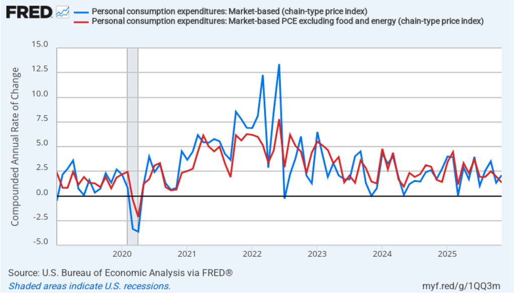
In the following figure, we look at 1-month inflation using these measures. One-month headline market-based inflation increased to 2.1 percent in November from 1.3 percent in October. One-month core market-based inflation fell to 1.3 percent in November from 2.0 percent in October. So, in November, 1-month market-based inflation was at or below the Fed’s annual inflation target. As the figure shows, the 1-month inflation rates are more volatile than the 12-month rates, which is why the Fed relies on the 12-month rates when gauging how close it is coming to hitting its target inflation rate.
Data on real personal consumption expenditures were also included in this report. The following figure shows compound annual rates of growth of real personal consumptions expenditures for each month since January 2023. Measured this way, the growth in real personal consumptions expenditures rebounded from 1.3 percent in September to 3.7 percent in both October and October and November.

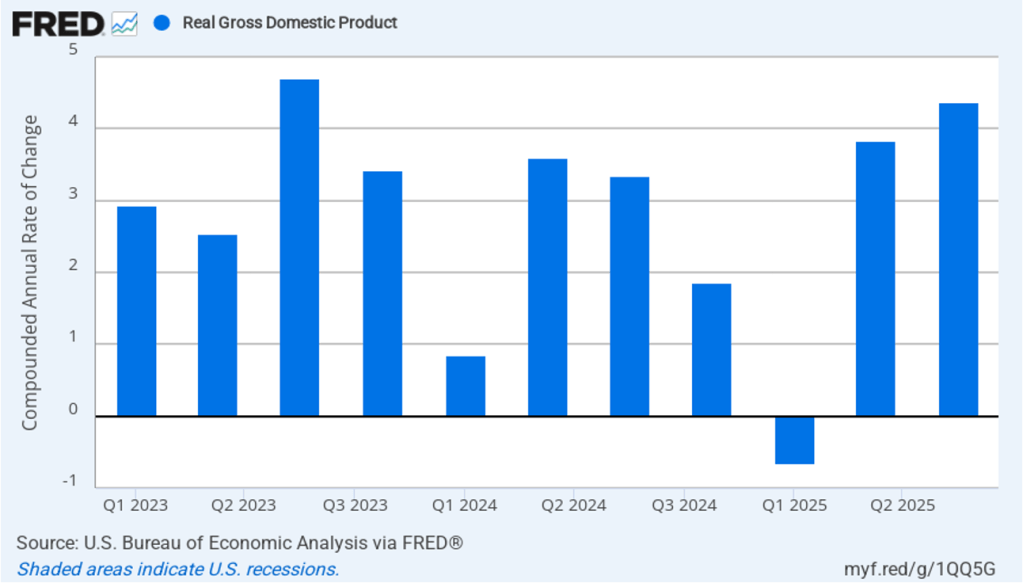
Strong growth in real personal consumption is consistent with the strong growth in real GDP in the third quarter of 2025 shown in the following figure, which reflects revised data that the BEA released yesterday. Real GDP grew at a compound annual rate of 3.8 percent in October and 4.4 percent in November. indicating a strong rebound in output growth following a 0.6 percent decrease in real GDP in the first quarter of 2025.
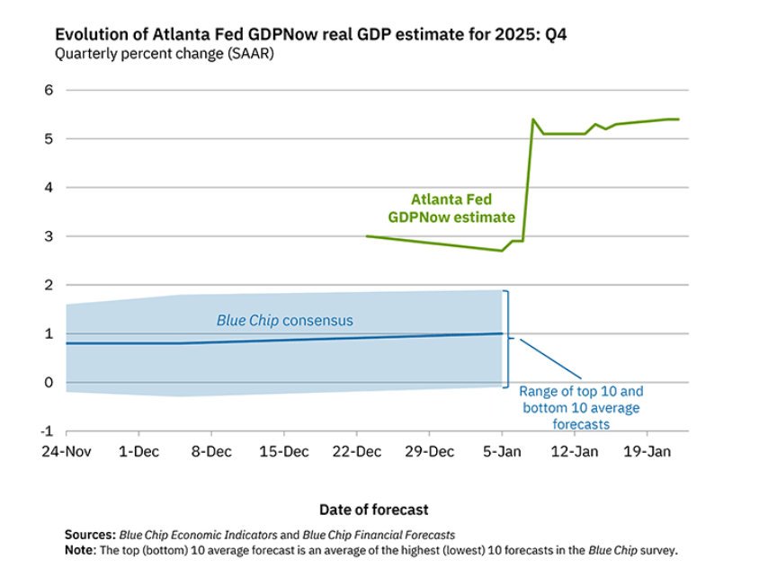
Is it likely that real GDP continued its strong growth in the fourth quarter of 2025? Economists at the Federal Reserve Bank of Atlanta prepare nowcasts of real GDP. A nowcast is a forecast that incorporates all the information available on a certain date about the components of spending that are included in GDP. The Atlanta Fed calls its nowcast GDPNow. As the following figure from the Atlanta Fed website shows, today the GDPNow estimate—taking into account this week’s macroeconomic data—is that real GDP grew at an annual rate of 5.4 percent in the fourth quarter of 2025.
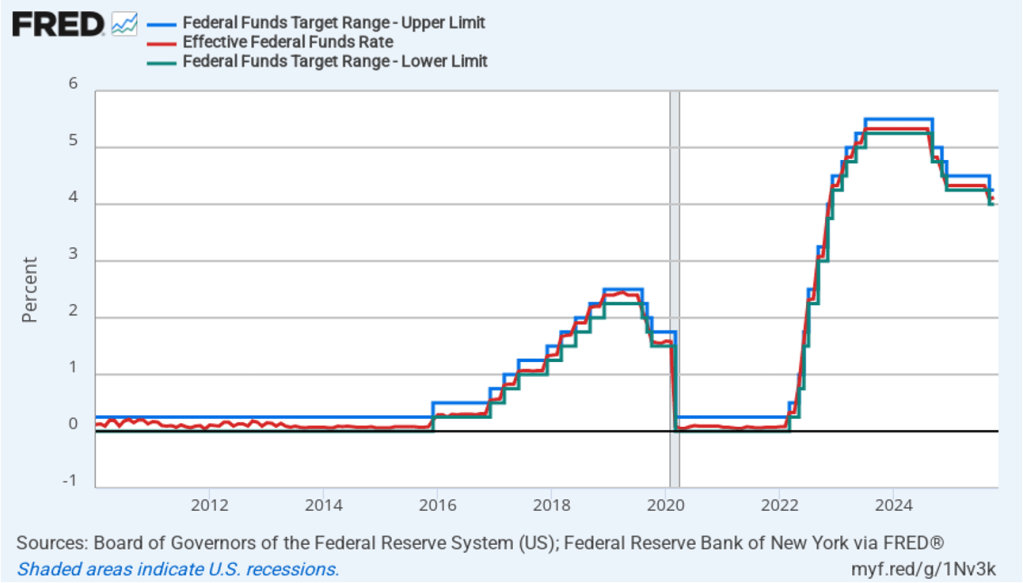
These data confirm the widely-held view among economists and investors that the Federal Reserve’s policy-making Federal Open Market committee will keep its target for the federal funds rate unchanged at is next meeting on January 27–28.