In March 2023, First Citizens Bank agreed to buy SVB after SVB had been taken over by the FDIC. (Photo courtesy of Lena Buonanno.)
On Wednesday, March 8, 2023, Silicon Valley Bank (SVB), headquartered in Santa Clara in the heart of California’s Silicon Valley surprised its depositors and Wall Street investors by announcing that in order to raise funds it had sold $21 billion in securities at a loss of $1.8 billion. The announcement raised concerns about the bank’s solvency—that is, there were questions as to whether the value of the bank’s assets, including bonds and other securities, was greater than the value of the bank’s liabilities, primarily deposits. The result was a run on the bank as depositors withdrew most of their funds. On Friday, March 10, 2023, the Federal Deposit Insurance Corporation (FDIC) took control of SVB before the bank could open for business that day.

The run on SVB in 2023 resembled …

bank runs during the 1930s.
In this blog post, we discuss the economics of bank runs and go into detail on what happened to SVB. In response to the failure of SVB, the FDIC declared that selling the bank’s assets and forcing depositors above the $250,000 deposit limit to suffer losses would pose a systemic risk to the financial system. As a result, with concurrence of the FDIC’s Board of Directors, two-thirds of the Fed’s Board of Governors, and Treasury Secretary Janet Yellen, the FDIC announced that all deposits in SVB—including deposits above the normal $250,000 dollar limit—would be insured. The waiving of the deposit insurance limit was also applied to Signature Bank, which failed a few days later. The run on SVB had been set off by the loses the bank had experienced on its long-term Treasury bonds. To reassure depositors in other banks that also held long-term debt, the Fed announced that it was establishing the Bank Term Funding Program (BTFP). Banks and other depository institutions, such as savings and loans and credit unions, can use the BTFP to borrow against their holdings of Treasury and mortgage-backed securities.
Maturity Mismatch and Moral Hazard
The failure of SVB highlighted two problems in commercial banking.
- Maturity mismatch. Banks use short-term deposits to fund long-term investments, such as mortgage loans and purchases of Treasury bonds. In other words, banks fund investments in long maturity assets using short maturity liabilities. The resulting maturity mismatch causes two problems: 1) If, as happened at SVB, the bank experiences a run and needs to pay off depositors, it may only be able to do so by selling assets at a loss, which may push the bank to insolvency; and 2) bonds with long maturities are subject to greater interest rate risk than are bonds with shorter maturities: If market interest rates rise, the prices of long-term bonds fall by more than do the prices of short-term bonds. To compensate investors for this greater interest rate risk, long-term bonds typically have higher interest rates than do short-term bonds. (We explain these points in Money, Banking, and the Financial System, Chapter 5, Section 5.2.) The higher interest rates can lead a bank’s managers to invest deposits in long-term bonds in order to earn higher interest rates and boost the bank’s profits, even though they are taking on greater risk by doing so. The decision of SVB’s managers to hold a large number of long-term bonds greatly contributed to the failure of the bank.
- Moral hazard. Why might bank managers take on more risk by buying long-term bonds and potentially making other risking investments, such as making commercial real estate loans? For instance, recently, New York Community Bancorp suffered losses on loans made to buyers of office buildings and apartments. A key to the explanation is the extent of moral hazard in banking. In the financial system—including banking—moral hazard is the problem investors experience in verifying that borrowers are using their funds as intended. Although we don’t usually think of bank depositors as being investors who lend their money to banks, in effect, that is the relationship depositors and banks are in. Banks borrow depositors money and use these funds to make a profit. Bank managers are typically rewarded on the basis of how profitable the bank is. As a result, bank managers may make riskier investments than depositors would make if depositors were deciding which investments to make.
In principle, depositors could monitor which investments a bank’s managers are making and withdraw their deposits if the investments are too risky. In practice, depositors rarely monitor bank managers for two key reasons: 1) Depositors often lack the information to accurately gauge the risk of an investment; and 2) Depositors are insured by the FDIC for up to $250,000 per deposit per bank. When a bank fails, the FDIC typically makes insured depositors funds available with no delay, often by establishing a “bridge bank” to continue the failed banks operations, including keeping ATMs open and stocked with cash. Deposit insurance increases the extent of moral hazard in the banking system. If depositors come to believe that in practice even deposits above the $250,000 are insured because of the actions bank regulators took the following the failures of SVB and Signature Bank, moral hazard is further increased. Still, reason 1. above gives reason to believe that, even in the absence of deposit insurance, depositors are unlikely to closely monitor bank managers. If depositors suddenly receive new information on a bank’s health—as happened when SVB suffered a loss on its sale of Treasury bonds—the likely result is a run. Runs potentially can lead other bank managers to become more cautious in their investments, but it will be too late to change the behavior of the managers of a bank that closes because of a run.
Bank Leverage
Because banks are highly leveraged, they are less able to withstand declines in the prices of their assets without becoming insolvent. A business is insolvent if the value of its assets is less than the value of its liabilities. Ordinarily, the FDIC will close an insolvent bank. A bank’s leverage is the ratio of the value of a bank’s assets to the value of its capital. A bank’s capital equals the funds contributed by the bank’s shareholders through their purchases of the bank’s stock plus the bank’s accumulated earnings. Put another way, a bank’s capital represents the value of the bank’s shareholders’ investment in the bank.
Shareholders focus on the return on their investment (ROI). Because banks are highly leveraged, a relatively small return on the banks assets—such as loans and mortgages—can result in a large return on the shareholders’ investment. This relationship holds because the shareholders’ investment (the bank’s capital) is much smaller than the bank’s assets. But just as high leverage increases a bank’s profits if the bank earns a positive return on its assets, it also increases a bank’s losses if the bank suffers a negative return on its assets. Banks would have a greater ability to absorb losses on their investments without becoming insolvent if the banks had more capital. But the more capital banks hold relative to the value of their assets—in other words, the less leveraged a bank is—the smaller the profit banks earn for a given return on their assets. Just as moral hazard can lead bank managers to make riskier investments than their depositors would prefer, it can also lead bank managers to become more leveraged than their depositors would prefer.
Regulatory Responses to the Failure of SVB
As we’ve noted, the problems that led to the failure of SVB were rooted in the problems that all commercial banks are subject to. (The reasons why SVB turned out to be particularly vulnerable to a bank run are discussed in this earlier blog post.) Although there have been extensive discussions among federal regulators, including the Federal Reserve and the FDIC, about steps to increase the stability of the U.S. banking sector, as of now no significant regulatory changes have occurred. However, there have been a number of proposals that regulators have been considering.
- Increased capital. As we noted, banks hold relatively little capital relative to their assets. On average, U.S. commercial banks hold capital equal to about 9.5 percent of the value of their assets. Holding more capital would reduce bank leverage, making banks less vulnerable to declines in the value of their assets. More capital would also mean that banks have more funds available to pay out to depositors making withdrawals during a run. In regulating bank capital, the United States has largely followed the Basel accord, which was established by the Bank for International Settlements (BIS). We discuss the Basil accord in Money, Banking, and the Financial System, Chapter 12, Section 12.4. Here we can note that the most recent proposed capital regulations are Basel III, sometimes called the “Basel III Endgame.”
Basel III would require large banks to hold more capital. The proposal has been heavily criticized by the banking industry. Some economists strongly support banks holding more capital to increase the stability of the banking system, but other economists are more skeptical. These economists argue that even if banks held twice as much capital as they currently do, it would likely prove insufficient to meet depositor withdrawals in bank run similar to the one SVB experienced. Holding more capital is also likely to reduce the volume of loans that banks will be able to make. Finally, the problems in the banking system in recent years have typically involved mid-sized regional banks rather than the large banks—those holding more than $100 billion in assets—that are the focus of Basel III. In any event, in testimony before Congress earlier this month, Fed Chair Jerome Powell stated that: “I do expect that there will be broad and material changes to the proposal.” His statement makes it likely that the United States won’t fully adopt the proposed Basel III regulations in their current form.
2. Revising deposit insurance. The establishment of the FDIC in 1934 stopped the bank runs that had seriously damaged the U.S. economy during the early 1930s. Because of deposit insurance, people knew that they didn’t have to quickly withdraw their funds from a bank experiencing losses because even if the bank failed, deposits were insured. But, as we noted earlier, deposit insurance also increases moral hazard in banking by reducing the incentive of depositors to monitor the investments bank managers make. One proposed reform would increase deposit insurance for accounts held by households and small and mid-sized firms because these deposits are less likely to be quickly withdrawn if a banks experiences difficulties and because these depositors are less likely to be able to monitor bank managers. Large firms, investors, and financial firms would not be eligible for the increased deposit insurance. (Under Basel III, banks might be required to hold additional liquid assets so that they would be able to have funds available to meet sudden withdrawals by large firms, investors, and financial firms. It was withdrawals by those types of depositors that led to SVB’s failure.)
3. Increased use of the Fed’s discount window. Congress established the Federal Reserve in 1914 partly in response to the bank panics that plagued the U.S. financial system during the 19th and early 20th centuries. The Federal Reserve Act was intended to allow the Fed to serve as a lender of last resort by making discount loans to banks having temporary liquidity problems as a result of deposit withdrawals. In practice, however, banks were often reluctant to borrow at the Fed’s discount window because they were afraid that discount borrowing came with a stigma indicating that the bank was in trouble. As a result, discount lending has not played a significant role in stopping bank runs. For instance, SVB had not prepared to request discount loans and so weren’t able to use discount loans to provide the funds needed to meet deposit withdrawals. Some economists and policymakers have proposed requiring banks to provide the Fed with enough collateral, primarily in the form of business and consumer loans, to meet their liquidity needs in the event of a run. By identifying sufficien collateral ahead of time, banks would be able to immediately receive discount loans in an emergency. If SVB had provided collateral equal to the value of its uninsured deposits, it might have been able to withstand the run that occurred.
4. Require more securities to be marked to market. Banking regulations allow banks to keep bonds and other securities on their balance sheets at face value even if the market value of the securities has declined, provided the securities are identified as being held to maturity. When a bank experiences liquidity problems it may be forced to sell securities that it previously designated as being held to maturity, which is the situation SVB found itself in. Some economists and policymakers have proposed that more—possibly all—of a bank’s holdings of securities be “marked to market,” which means that the securities’ current market values rather than their face values would be used on the bank’s balance sheet. Economists and policymakers are divided in their opinions on this proposals. Marking more securities to market may give depositors and investors a clearer idea of the true financial health of a bank. But doing so might also be misleading because banks will not take losses on those securities that they actually hold until maturity.
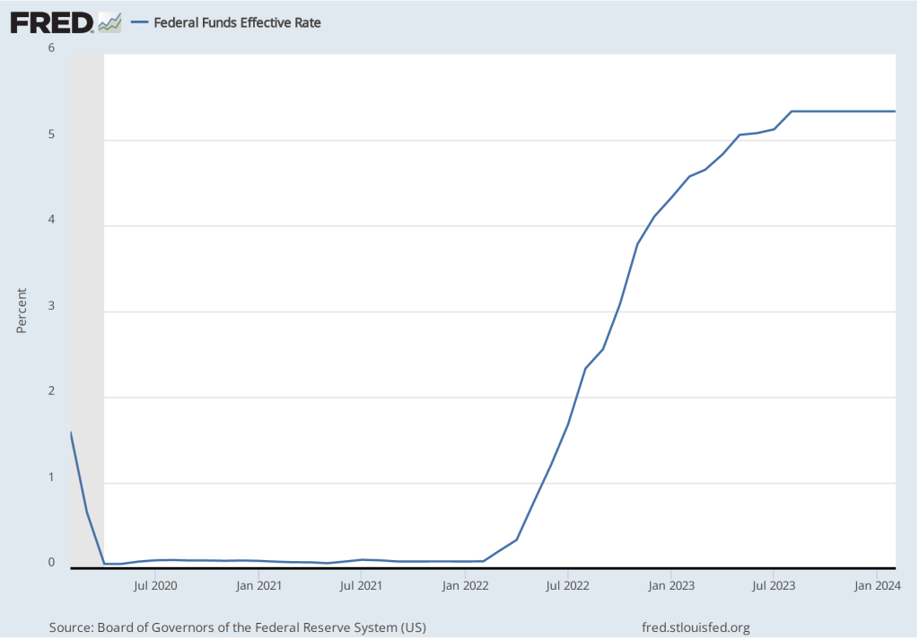
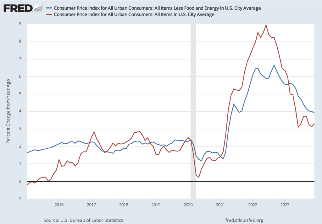
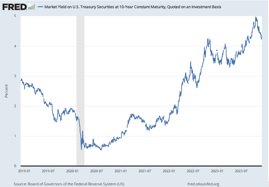
5. Bank examiners become more focused on emerging threats. Some economists and policymakers argue that in practice bank examiners from the FDIC, the Fed, and the Office of the Comptroller of the Currency (which regulates larger banks) are in the best position to determine whether bank managers are taking on too much risk, particularly as economic conditions change. For example, as the Federal Reserve began to increase its target for the federal funds rate in the spring of 2022, other interest rates also rose, causing the prices of long-term bonds to fall. In retrospect, bank examiners overseeing SVB and other banks were slow to question the managers of these banks about the degree of risk involved in their investments in long-term bonds. Similarly, bank examiners were slow to realize the risk that banks like SVB were taking in relying on deposits above the $250,000 insurance limit. These depositors are likely to be the first to withdraw funds in the event of a bank encountering a problem. In principle, if bank examiners were more alert to the effect changing economic condidtions have on the riskiness of bank investments, the examiners might be able to prod bank managers to reduce their risky investments before a crisis occurs.
6. Further consolidation of the banking system. As we discuss in Money, Banking, and the Financial System, Chapter 10, Section 10.4, for many years restrictions on banks operating in more than one state resulted in the United States having many more banks than is true of other high-income countries. In the mid-1990s, after Congress authorized interstate banking, a wave of consolidation in the banking industry resulted in some banks operating nationwide. However, the United States still has many small and mid-size, or regional, banks. The largest banks have typically not encountered liquity problems or experienced runs. Some economists and policymakers have argued that further consolidation could lead to a banking system in which nearly all banks had the financial resources to withstand bank runs. Other economists and policymakers argue, however, that small businesses often rely for credit on smaller community banks. These banks engage in relationship banking, which means that they have long-term relationships with borrowers. These relationships enable the banks to accurately assess the creditworthiness of borrowers because the banks possess private information on the borrowers. Larger banks are more likely to use standard algorithms to assess the creditworthiness of borrowers. In doing so a larger bank may refuse to make loans that a community bank would have made. As a result, further signficant consolidation in the banking system might make it more difficult for small businesses to access the credit they need to operate and to expand.
Finally, as we note in Chapter 12 of Money, Banking, and the Financial System, government regulation of banking has followed a familiar pattern dating back decades. When banks or another part of the financial system, experience a crisis, Congress, the president, and the regulatory agencies respond with new regulations. The regulations, though, can lead financial firms to innovate in ways that undermine the effects of the regulation. If these financial innovations result in a crisis, the government reponds with additional regulations, which lead to new financial innovations. And so on. The nature of banking and the many other channels through which funds flow from savers and investors to borrowers are sufficiently varied and evolve so quickly that it’s unlikely that any particular regulations will be capable of permanently stabilizing the financial system.