A meeting of the Federal Open Market Committee (Photo from federalreserve.gov)
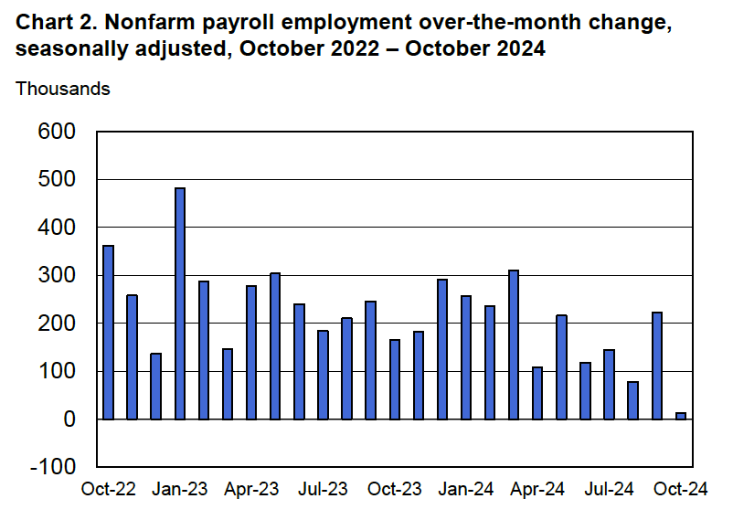
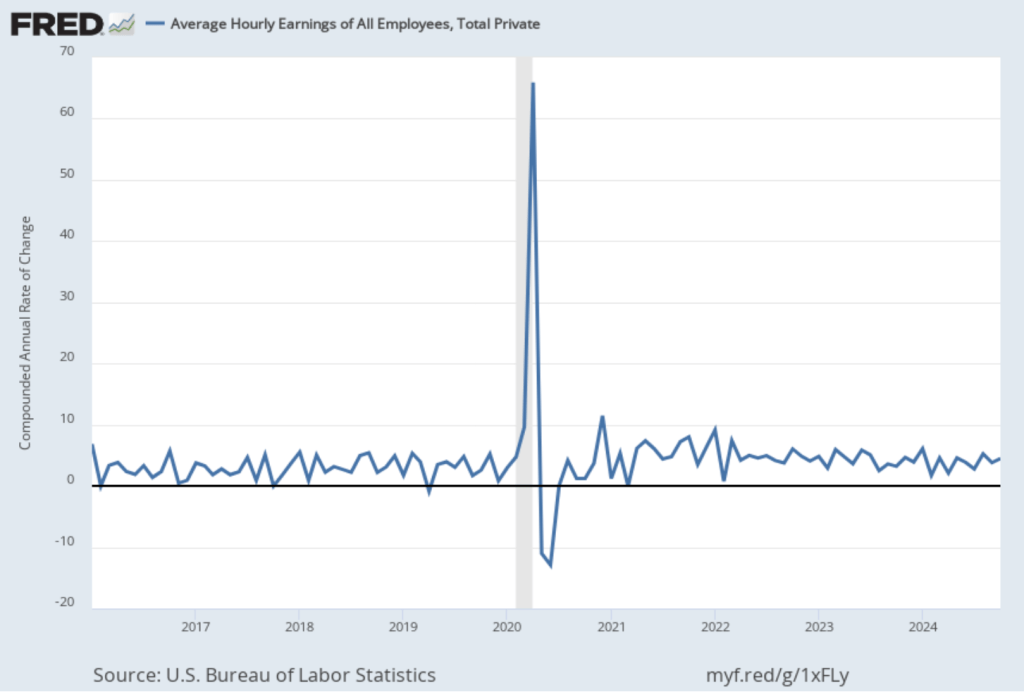
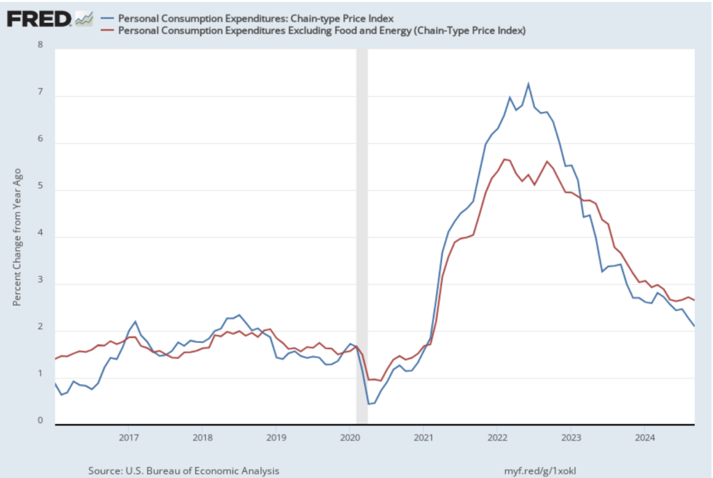
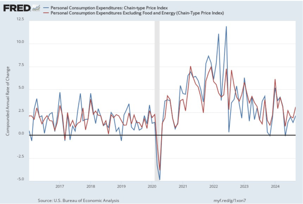
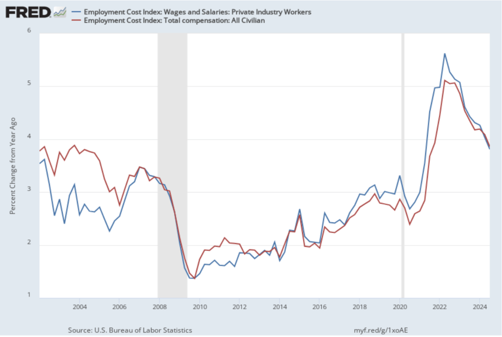
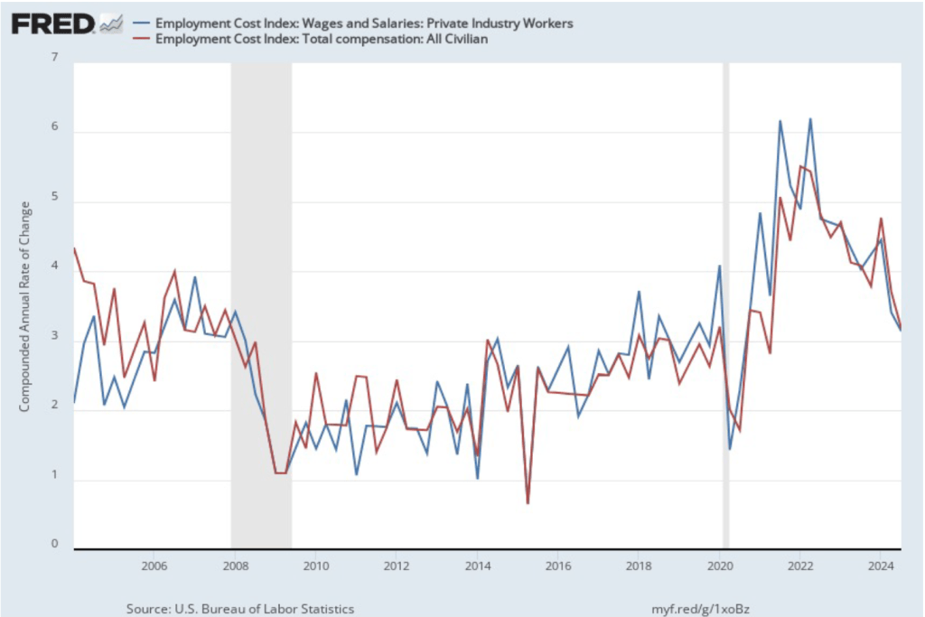
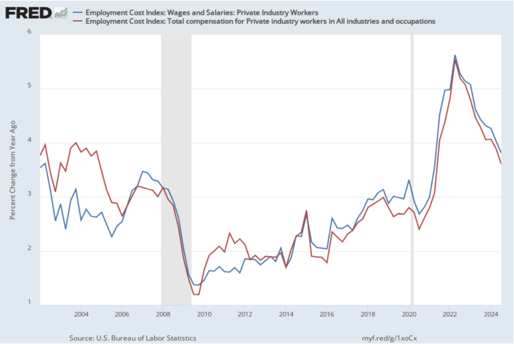
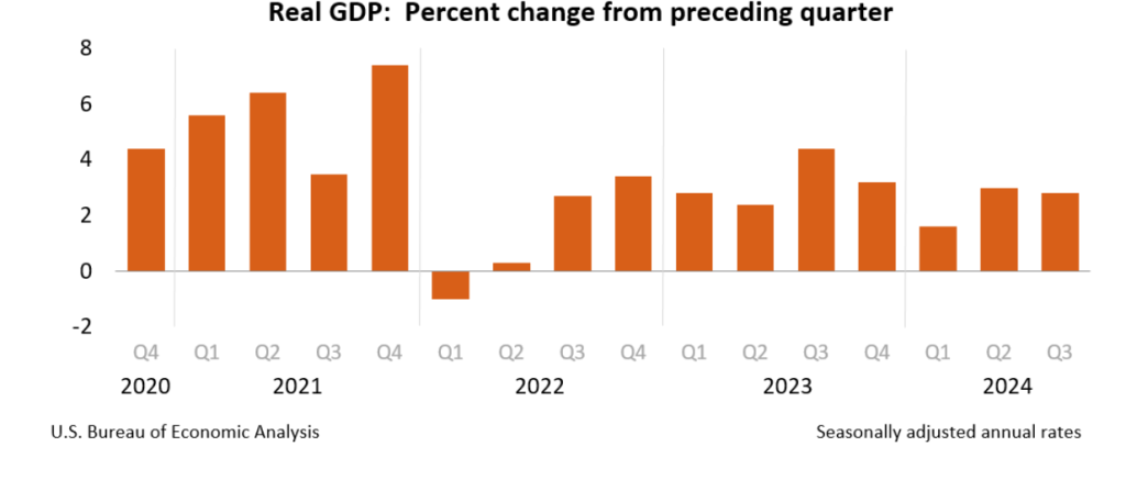
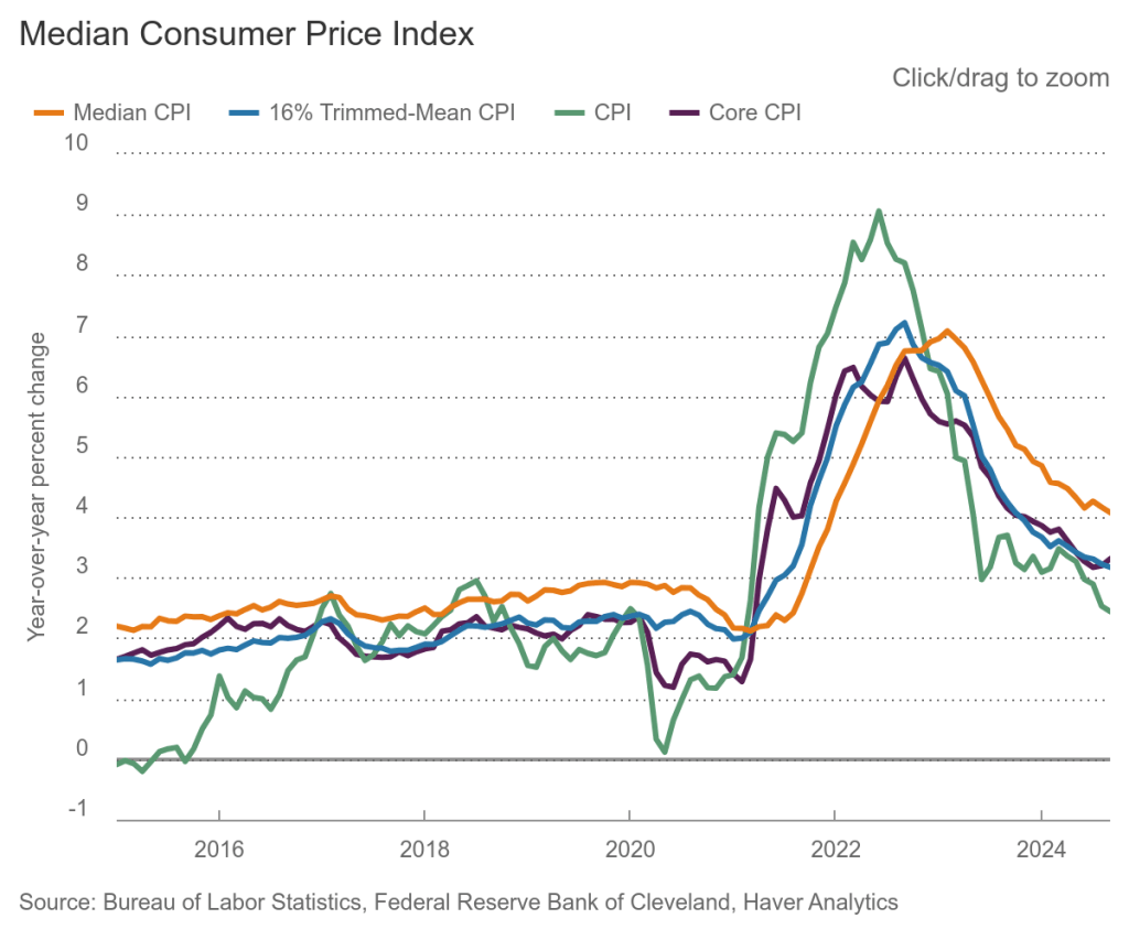
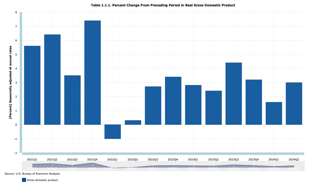
The Federal Reserve’s policymaking Federal Open Market Committee (FOMC) concluded its meeting today (November 7) after considering a mixed batch of macroeconomic data. As we noted in this blog post, the most recent jobs report showed a much smaller increase in payroll employment than had been expected. However, the effects of hurricanes and strikes on the labor market made the data in the report difficult to interpret. Real GDP growth during the third quarter of 2024, while relatively strong, was slower than expected. Finally, as we discuss in this post, inflation has been running above the Fed’s 2 percent annual target with wages also growing faster than is consistent with 2 percent price inflation.
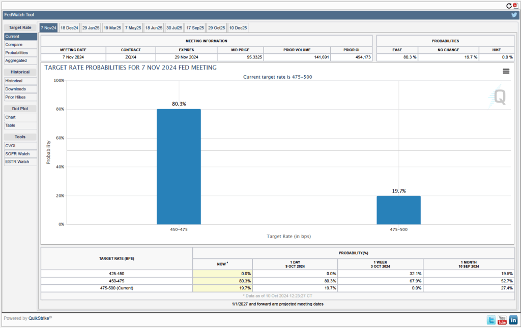
Congress has given the Fed a dual mandate of achieving maximum employment and price stability. If FOMC members had been most concerned about lower-than-expected real GDP growth and some weakening in the labor market, the likely course would have been to cut the target range for the federal funds rate by 0.50 percentage point (50 basis points) from its current range of 4.75 percent to 5.00 percent to a range of 4.25 percent to 4.50 percent.
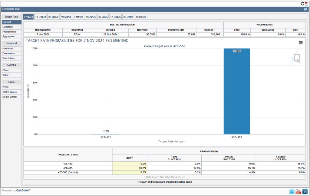
If the committee had been most concerned about inflation remaining above target, the likely course would have been to leave the target range for the federal funds rate unchanged. Instead, the committee split the difference by reducing the target range by 25 basis points. As we noted near the end of this blog post, financial markets had been expecting a 25 basis point cut. At the conclusion of each meeting, the committee holds a formal vote on its target for the federal funds rate. The vote today was unanimous.
In a press conference following the meeting, Fed Chair Jerome Powell noted that: “We see the risks to achieving our employment and inflation goals as being roughly in balance, and we are attentive to the risks to both sides of our mandate.” Powell also indicated his confidence that the committee would succeed in staying on what he labeled the “middle path” that monetary policy needs to follow: “We know that reducing policy restraint too quickly could hinder progress on inflation. At the same time, reducing policy restraint too slowly could unduly weaken economic activity and employment …. Policy is well positioned to deal with the risks and uncertainties that we face in pursuing both sides of our dual mandate.”
With respect to the effect of the macroeconomic policies of the incoming Trump Administration, Powell noted that the Fed doesn’t comment on fiscal policy nor did he consider it appropriate to comment in any way on the recent election. He stated that the committee would wait to see new policies enacted before considering their consequences for monetary policy. When asked by a reporter whether he would leave the position of Fed chair if asked to do so by someone in the Trump Administration, Powell answered “no.” When asked whether he believes the president has the power to remove a Fed chair before the end of the chair’s term, Powell again answered “no.” (Most legal scholars believe that, according to the Federal Reserve Act, a president can’t remove a Fed chair because of policy disagreements, but only “for cause.” See Macroeconomics, Chapter 17, Section 17.4/Economics, Chapter 27, Section 27.4 for more on this topic.)