Older People Have Become Relatively Wealthier While Younger People Have Become Relatively Less Wealthy

Image created by ChatGPT

There has been an ongoing debate about whether Millennials and people in Generation Z are better off or worse off economically than are Baby Boomers. Edward Wolff of New York University recently published a National Bureau of Economic Research (NBER) working paper that focuses on one aspect of this debate—how the wealth of households headed by someone 75 years and older changed relative to the wealth of households headed by someone 35 years and younger during the period from 1983 to 2022.  

Wolff uses data from the Federal Reserve’s Survey of Consumer Finances to measure the wealth, or net worth, of people in these age groups—the market value of their financial assets minus the market value of their financial liabilities. He includes in his measure of assets the market value of people’s real estate holdings—including their homes—stocks and bonds, bank deposits, contributions to defined contribution pension funds, unincorporated businesses, and trust funds. He includes in his measure of liabilities people’s mortgage debt, consumer debt—including credit card balances—and other debt, such as educational loans.  Because Wolff wants to focus on that part of wealth that is available to be spent on consumption, he refers to it as financial resources, and he excludes from his wealth measure the present value of future Social Security payments and the present value of future defined contribution pension benefits.

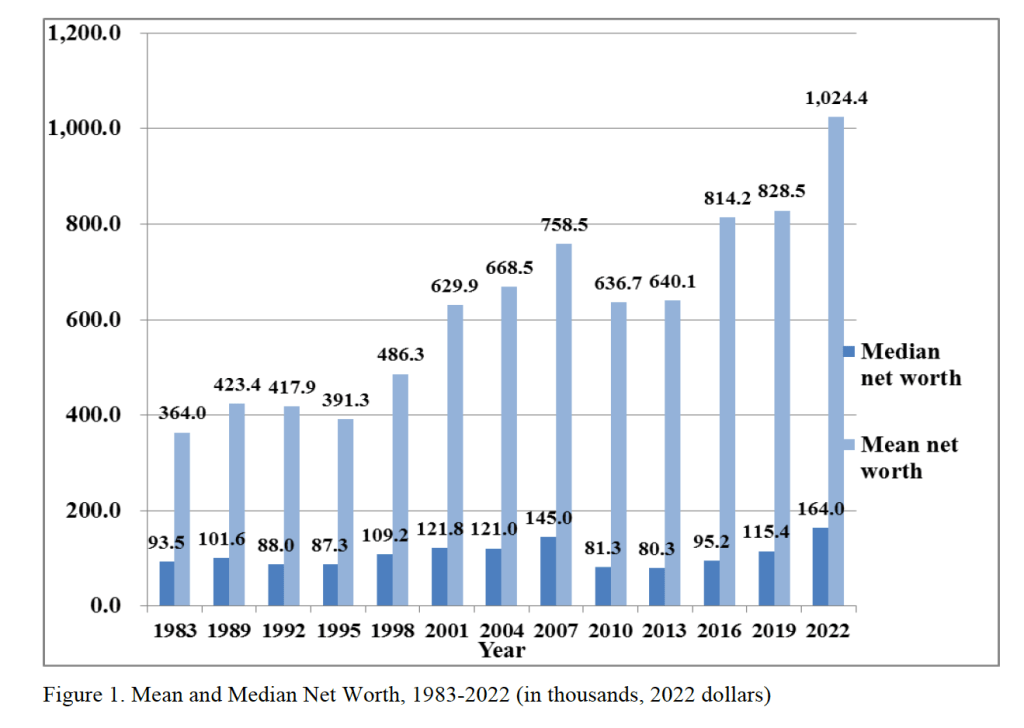
The following figure from Wolff’s paper shows that, using his definition, both median and mean wealth have increased substantially from 1987 to 2o22. Note that both measures of average wealth declined during the Great Recession and Global Financial Crisis of 2007–2009. Median wealth declined by nearly 44 percent between 2007 and 2010. That median wealth grew much faster than mean wealth over the whole period indicates that wealth inequality.

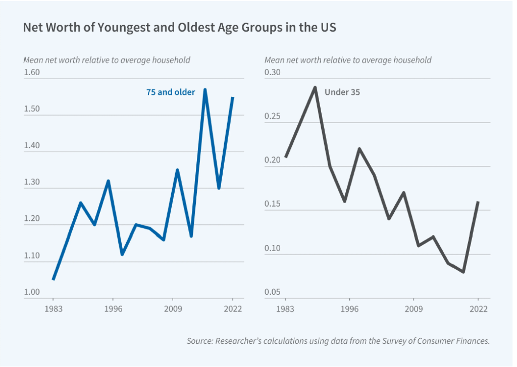
Although the average wealth of all age groups increased over this period, the relative wealth of households 75 years and older rose and the relative wealth of households 35 years and younger fell. The following figure from the NBER Digest illustrates this shift. The 75 and over age group increased its mean net worth from 5 percent greater than the mean net worth of the average household in 1983 to 55 percent of the mean net worth of the average household in 2022. In contrast, the 35 and under age group saw its mean new worth relative to the average household fall from 21 percent in 1983 to 16 percent in 2022. Note, though, that there is significant volatility over time in the relative wealth shares of the two age groups.

What explains the relative increase in wealth among households 75 and over and the relative decrease in wealth among households 35 and under? Wolff identifies three key factors:

“[T]he homeownership rate, total stocks directly and indirectly owned, and home mortgage debt. The homeownership rate is the same in the two years for the youngest group but falls relative to the overall rate, whereas it shoots up for the oldest group both in actual level and relative to the overall average. The value of stock holdings rises for both age groups but vastly more for the oldest households compared to the youngest ones and accounts for a substantial portion of the elderly’s relative wealth gains. Mortgage debt rises in dollar terms for both groups but considerably more in relative terms for the youngest group.”

Perhaps surprisingly, Wolff finds that “despite dire press reports, educational loans fail to appear as a significant factor” in explaining the decline in the relative wealth of younger households. 


Are We in a Recession? Depends on Which Forecast You Believe

Image generated by GTP-4o of people engaging in economic forecasting

How do we know when we’re in a recession? Most economists and policymakers accept the decisions of the National Bureau of Economic Research (NBER), a private research group located in Cambridge, Massachusetts (see Macroeconomics, Chapter 10, Section 10.3). Typically, the NBER is slow in announcing that a recession has begun because it takes time to gather and analyze economic data. The NBER didn’t announce that a recession had begun in December 2007 until 11 months later in November 2008. When the NBER announced in June 2020 that a recession had begun in February 2020, it was considered to be an unusually fast decision.

On its website, the NBER notes that: “The NBER’s traditional definition of a recession is that it is a significant decline in economic activity that is spread across the economy and that lasts more than a few months.” The NBER lists the data it considers when determining whether a recession has begun (or ended), including: “real personal income less transfers (PILT), nonfarm payroll employment, real personal consumption expenditures, manufacturing and trade sales adjusted for price changes, employment as measured by the household survey, and industrial production.” In practice, it is normally the case that an NBER business cycle peak coincides with the peak in nonfarm payroll employment and an NBER business cycle trough coincides with a trough in the same employment series.

Of course, policymakers at the Fed don’t wait until the NBER announces that a recession has begun when formulating monetary policy. Members of the Fed’s policymaking Federal Open Market Committee (FOMC) monitor a wide range of data series as the series become available. The broadest measure of the state of the economy is real GDP, which is only available quarterly, and the data are released with a lag. For instance, the Bureau of Economic Analysis’s “advance” (first) estimate of real GDP in the first quarter of 2025 won’t be released until April 30.

Given the importance of GDP, there are several groups that attempt to nowcast GDP. A nowcast is a forecast that incorporates all the information available on a certain date about the components of spending that are included in GDP. The Federal Reserve Bank of New York and the Federal Reserve Bank of Atlanta both release nowcasts of GDP. They use different methodologies, so their forecasts are not identical. Today (March 3), the two estimates are surprisingly far apart. First, here is the nowcast from the NY Fed:

This nowcast indicates that real GDP will grow in the first quarter of 2025 at a 2.94 percent annual rate. That would be an increase from growth of 2.3 percent in the fourth quarter of 2024.

The nowcast from the Atlanta Fed—which they call GDPNow—is strikingly different:

The Atlanta Fed nowcast indicates that real GDP in the first quarter of 2025 will decline by 2.8 percent at an annual rate. If accurate, this forecast indicates that—far from the solid expansion in economic activity that the NY Fed is forecasting—the U.S. economy in the first quarter of 2025 will contract at the fastest rate since the first quarter of 2009, near the end of the severe 2007–2009 downturn (leaving aside the highly unusual declines in the first three quarters of 2020 during the Covid pandemic).

What explains such a large difference between these two forecasts? First, note that the Atlanta Fed includes in its graphic the range of forecasts from Blue Chip Indicators. These forecasts are collected from 50 or more economists who work in the private sector at banks, brokerages, manufacturers, and other firms. The graphic shows that the Blue Chip forecasters do not expect that the economy grew as much as the NY Fed’s nowcast indicates, but the forecasters do expect solid growth rate of 2 percent or more. So, the Atlanta Fed’s forecast appears to be an outlier.

Second, the NY Fed updates its nowcast only once per week, whereas the Atlanta Fed updates its forecast after the release of each data series that enters its model. So, the NY Fed nowcast was last updated on February 28, while the Atlanta Fed nowcast was updated today. Since February 28, the Atlanta Fed has incorporated into its nowcast data on the Institute for Supply Management (ISM) manufacturing index and data on construction spending from the Census Bureau. Incorporating these data resulted in the Atlanta Fed’s nowcast of first quarter real GDP growth declining from –1.5 percent on February 28 to –2.8 percent on March 3.

But incorporating more data explains only part of the discrepancy between the two forecasts because even as of February 28 the forecasts were far apart. The remaining discrepancy is due to the different methodologies employed by the economists at the two regional Feds in building their nowcasting models.

Which forecast is more accurate? We’ll get some indication on Friday (March 7) when the Bureau of Labor Statistics (BLS) releases its “Employment Situation” report for February. Economists surveyed are expecting that the payroll survey will estimate that there was a net increase of 160,000 jobs in February, up from a net increase of 143,000 jobs in January. If that expectation is accurate, it would seem unlikely that production declined in the first quarter to the extent that the Atlanta Fed nowcast is indicating. But, as we discuss in this blog post from 2022, macro data can be unreliable at the beginning of a recession. If we are currently in a recession, then even an initial estimate of a solid net increase in jobs in February could later be revised sharply downward.

(Probably) the Final Word on the Non-Recession of 2022

Image generated by GTP-4o to illustrate GDP.

About one month after a calendar quarter ends, the Bureau of Economic Analyis (BEA) releases its advanced estimate of real GDP. In July 2022, the BEA’s advance estimates indicated that real GDP had declined in both the first and second quarters. A common definition of a recession is two consecutive quarters of declining real GDP. Accordingly, in mid-2022 there were a number of articles in the media suggesting that the U.S. economy was in a recession.

But, as we discussed at the time in this blog post, most economists don’t follow the popular definition of a recession as being two consecutive quarters of declining real GDP. Instead, as we discuss in Macroeconomics, Chapter 10, Section 10.3 (Economics, Chapter 20, Section 20.3), economists typically follow the definition of a recession used by the National Bureau of Economic Research (NBER): “A recession is a significant decline in activity spread across the economy, lasting more than a few months, visible in industrial production, employment, real income, and wholesale-retail trade.” 

During the first half of 2022, the other data that the NBER tracks were all expanding rather than contracting. So, it seemed safe to conclude that despite the declines in real GDP in those quarters, the U.S. economy was not, in fact, in a recession.

That conclusion was confirmed by the BEA in September 2024 when it released its most recent revisions of real GDP . As the following table shows, although the BEA still estimates that real GDP fell during the first quarter of 2022, it now estimates that it increased during the second quarter.

In the earlier post from 2022, we also noted that the BEA publishes data on gross domestic income (GDI), as well as on GDP. As we discuss in Chapter 8, Section 8.1, when considering the circular-flow diagram, the value of every final good and service produced in the economy (GDP) should equal the value of all the income in the economy resulting from that production (GDI). The BEA has designed the two measures to be identical by including in GDI some non-income items, such as sales taxes and depreciation. But as we discuss in the Apply the Concept, “Should We Pay More Attention to Gross Domestic Income?” GDP and GDI are compiled by the BEA from different data sources and can sometimes significantly diverge. 

We noted that although, according to the BEA’s advance estimates, real GDP declined during the first two quarters of 2022, real GDI increased. The following figure shows movements in real GDP and real GDI using the current estimates from the BEA. The revised estimates now show real GDP falling the first quarter of 2021 and increasing in the second quarter while real GDI is still estimated as rising in both quarters. The revisions closed some of the gap between real GDP and real GDI during this period by increasing the estimate for real GDP, which indicates that the advance estimate of real GDI was giving a more accurate measure of what was happening in the U.S. economy.

The figure shows that the revised estimates indicate that real GDP and real GDI moved closely together during 2021, differed somewhat during 2022—with real GDI being greater than real GDP—and differed more substantially during 2023 and 2024—with real GDP now being greater than real GDI. Because the two measures should be the same, we can expect that further revisions by the BEA will bring the two measures closer together.

It’s even possible, but unlikely, that further revisions of the data for 2022 could again present us with the paradox of real GDP declining for two quarters despite other measures of economic activity expanding.

Is the U.S Labor Market Weaker Than It Seems?

The monthly “Employment Situation” report from the Bureau of Labor Statistics (BLS) is closely watched by economists, investment analysts, and Federal Reserve policymakers. Many economists believe that the payroll employment data from the report is the best single indicator of the current state of the economy.

Most economists, inside and outside of the government, accept the dates determined by the Business Cycle Dating Committee of the National Bureau of Economic Research (NBER) for when a recession begins and ends. Although that committee takes into account a variety of macroeconomic data series, the peak of a business cycle as determined by the committee almost always corresponds to the peak in payroll employment and the trough of a business cycle almost always corresponds to the trough in payroll employment.

One drawback to relying too heavily on payroll employment data in gauging the state of the economy is that the data are subject to—sometimes substantial—revisions. As the BLS explains: “Monthly revisions result from additional reports received from businesses and government agencies since the last published estimates and from the recalculation of seasonal factors.” The revisions can be particularly large at the beginning of a recession.

For example, the following figure shows revisions the BLS made to its initial estimates of the change in payroll employment during the months around the 2007–2009  recession. The green bars show months for which the BLS revised its preliminary estimates to show that fewer jobs were lost (or that more jobs were created), and the red bars show months for which the BLS revised its preliminary estimates to show that more jobs were lost (or that fewer jobs were created).

For example, the BLS initially reported that employment declined by 159,000 jobs during September 2008. In fact, after additional data became available, the BLS revised its estimate to show that employment had declined by 460,000 jobs during the month—a difference of 300,000 more jobs lost. As the recession deepened between April 2008 and April 2009, the BLS’s initial reports underestimated the number of jobs lost by 2.3 million. In other words, the recession of 2007–2009 turned out to be much more severe than economists and policymakers realized at the time.

The BLS also made substantial revisions to its initial estimates of payroll employment for 2020 and 2021 during the Covid pandemic, as the following figure shows. (Note that this figure appears in our new 9th edition of Macroeconomics, Chapter 9, Section 9.1 (Economics, Chapter 19, Section 19.1 and Essentials of Economics, Chapter 13, Section 13.1).)

The BLS initially estimated that employment in March 2020 declined by about 700,000. After gathering more data, the BLS revised its estimate to indicate that employment declined by twice as much. Similarly, the BLS’s initial estimates substantially understated the actual growth in employment from August to December 2021. After gathering more data, the BLS revised its estimate to indicate that nearly 2 million more jobs had been created during those months than it had originally estimated.

Just as the initial estimates for total payroll employment are often revised by sutbstantial amounts up or down, the same is true of the initial estimates of payroll employment in individual industries. Because the number of establishments surveyed in any particular industry can be small, the initial estimates can be highly inaccurate. For instance, Justin Fox, a columnist for bloomberg.com recently noted what appears to be a surge in employment in the “sports teams and clubs” industry. As the following figure shows, employment in this industry seems to have increased by an improbably large 75 percent. Was there a sudden increase in the United States in the number of new sports teams? Certainly not over just a few months. It’s more likely that most of the increase in employment in this industry will disappear when the initial employment estimates are revised.

One source of data for the BLS revisions to the monthly payroll employment data is the BLS’s “Quarterly Census of Employment and Wages.” The QCEW is based on the reports required of all firms that participate in the state and federal unemployment insurance program. The BLS estimates that 95 percent of all jobs in the United States are included in the QCEW data. As a result, the QCEW surveys about 11.9 million establishments as opposed to the 666,000 establishments included in the establishment survey.

The BLS uses the QCEW to benchmark the payroll employment data, which reconciles the two series. The BLS makes the revisions with a lag. For instance, the payroll employment data for 2023 won’t be revised using the QCEW data until August 2024. Looking at the 2023 employment data from the two series shows a large discrepancy, as seen in the following figure.

The blue line shows the employment data from the establishment survey and the orange line shows the data from the QCEW survey. (Both series are of nonseasonally adjusted data.) The values on the vertical axis are thousands of workers. In December 2023, the establishment survey indicated that a total of 158,347,000 people were employed in the nonfarm sector in the United States. The QCEW series shows a total of 154,956,133 people were employed in the nonfarm sector—about 3.4 million fewer.

How can we interpret the discrepancy between the employment totals from the two series? The most straightforward interpretation is that the QCEW data, which uses a larger sample, is more accurate and payroll employment has been significantly overstating the level of employment in the U.S. economy. In other words, the labor market was weaker in 2023 than it seemed, which may help to explain why inflation slowed as much as it did, particularly in the second half of the year.

However, this interpretation is not clear cut because the QCEW data are also subject to revision. As Ernie Tedeschi, director of economics at the Budget Lab at Yale and former chief economist for the Council of Economic Advisers, has pointed out, the QCEW data are typically revised upwards, which would close some of the gap between the two series. So, although it seems likely that the closely watched payroll employment data have overstated the strength of the labor market, we won’t get a clearer indication of how large the overstatement is until August when the BLS will use the QCEW data to benchmark the payroll employment data.

A Handy Way to Track Recession Indicators

The Bureau of Labor Statistics is housed in the U.S. Department of Labor. (Photo from don.gov site.)

In a blog post at the end of August, we noted that real GDP declined during the first two quarters of 2022. On September 29, the Bureau of Economic Analysis (BEA) slightly revised the real GDP data, but after the revisions the BEA’s estimates still showed real GDP declining during those quarters.

A popular definition of a recession is two consecutive quarters of declining real GDP. But, as we noted in the earlier blog post, most economists do not follow this definition. Instead, for most purposes, economists rely on the National Bureau of Economic Research’s business cycle dating, which is based on a number of macroeconomic data series. The NBER defines a recession as “a significant decline in activity spread across the economy, lasting more than a few months, visible in industrial production, employment, real income, and wholesale-retail trade.” The NBER discusses its approach to business cycle dating here.

The Federal Reserve Bank of St. Louis’s invaluable FRED economic data site has collected the data series that the NBER’s Business Cycle Dating Committee relies on when deciding when a recession began. The FRED page collecting these data can be found here

Note that although the Business Cycle Dating Committee analyzes a variety of data series, “In recent decades, the two measures we have put the most weight on are real personal income less transfers and nonfarm payroll employment.” The following figures show movements in those two data series. These data series don’t give a strong indication that the economy was in recession during the first half of 2022. Real personal income minus transfer payments did decline by 0.4 percent between January and June 2022 (before increasing during July and August), but nonfarm payroll employment increased by 1.4 percent during the same period (and increased further in July and August).

As we noted in our earlier blog post, the message from most data series other than real GDP seems to be that the U.S. economy was not in a recession during the first half of 2022.