

Happy Thanksgiving from Hubbard and O’Brien Economics!

Image generated by ChatGPT
A perennial media story this time of year looks at whether a Thanksgiving turkey dinner costs more or less than last year. Not too surprisingly, the answer depends on what side dishes you serve with the turkey. Deloitte provides tax, consulting, and other services to businesses. Their calculation of the cost of a Thanksgiving dinner over the past three years can be found here.
The following image shows the food that they include in their cost calculation. For that particular Thanksgiving dinner, the cost is slightly higher than in 2024, although slightly lower than in 2023.

Image from deloitte.com
The following image from the American Farm Bureau Federation, a lobbying organization for U.S. farmers, shows the food they include in their calculation of the cost of a Thanksgiving dinner.
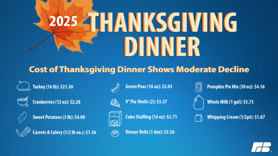
Image from fb.org
For a Thanksgiving dinner with those side dishes, the price is about 5 percent lower this year than last year.
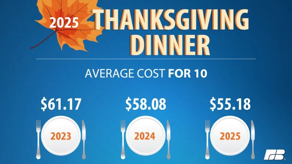
Image from fb.org
Note that the two estimates differ in the cost of the turkey. It’s not clear whether the difference is due to the size of the turkey or to differences in the price of the turkey. Related point: The Bureau of Labor Statistics (BLS) stopped collecting data on retail turkey prices in February 2020, at the start of the pandemic, and never resumed collecting them. Here’s the link to the BLS retail turkey price series on FRED. The series begins in January 1980 and ends in February 2020.
Justin Fox, in a column on bloomberg.com, notes that demand for turkey has been declining in recent years. The following figure uses data on turkey consumption per capita from the U.S. Department of Agriculture.
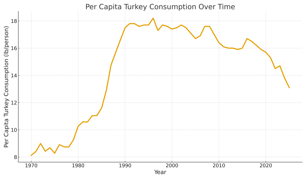
Turkey consumption peaked at 18.2 pounds per person in 1996 and has fallen to an estimated 13.1 pounds per person in 2025—a decline of about 28 percent. Is this decline an indication that people have moved away from eating turkey for Thanksgiving? Fox argues that it likely doesn’t. Note the rapid rise of turkey consumption between 1980 and 1990. Fox believes the surge in consumption was due to “both chicken and turkey [consumption increasing] as health concerns led many Americans to shun red meat starting in the late 1970s ….” In recent years, though, “red-meat consumption has steadied … chicken consumption has continued to rise, and turkey is losing out. Maybe people just don’t like how it tastes.” Glenn and Tony agree that, alas, turkey is often dry—although, admittedly, skilled cooks claim that it isn’t dry when prepared properly.
So, turkey may be holding its own at the heart of Thanksgiving dinners, but seems to be struggling to get on the menu during the rest of the year.

Photo of Federal Reserve Bank of New York President John Williams from newyorkfed.org
Many economists consider the three most influential people at the Federal Reserve to be the chair of the Board of Governors, the vice-chair of the Board of Governors, and the president of the Federal Reserve Bank of New York. The influence of the New York Fed president is attributable in part to being the only president of a District Bank to be a voting member of the Federal Open Market Committee (FOMC) every year and to the New York Fed being the location of the Open Market Desk, which is charged with implementing monetary policy. The Open Market Desk undertakes open market operations—buying and selling Treasury securities—and conducts repurchase agreements (repos) and reverse repurchase agreements (reverse repos) with the aim of keeping the federal funds rate within the target range specified by the FOMC. (We discuss the mechanics of how monetary policy is conducted in Macroeconomics, Chapter 15, Economics, Chapter 25, and Money, Banking, and the Financial System, Chapter 15.)
John Williams has served as president of the New York Fed since 2018. Given his important role in the formulation and execution of monetary policy, investors pay close attention to his speeches and other public remarks looking for clues about the likely future path of monetary policy. As we noted yesterday in a post discussing the latest jobs report, Fed watchers were uncertain as to whether the FOMC would cut its target for the federal funds rate at its next meeting on December 9–10.
Yesterday morning, investors who buy and sell federal funds futures contracts assigned a probability of 39.6 percent to the FOMC cutting its target range for the federal funds rate by 0.25 percentage point (25 basis points) from 3.75 percent to 4.00 to 3.50 percent to 3.75 percent. Today in a speech delivered at the Central Bank of Chile, John Williams stated that:”I still see room for a further adjustment in the near term to the target range for the federal funds rate to move the stance of policy closer to the range of neutral, thereby maintaining the balance between the achievement of our two goals” of maximum employment and price stability.
Investors interpreted this statement as indicating that Williams would support cutting the target range for the federal funds rate at the December FOMC meeting. Given his position on the committee, it seemed unlikely that Williams would have publicly supported a rate cut unless he believed that a majority of the committee would also support it. As the following figure shows, after the text of Williams’s speech was released this morning, investors in the federal funds futures market increased the probability they assigned to a rate cut to 69.4 percent. That movement in the federal funds futures market was a recognition of the important role the president of the New York Fed plays in formulating monetary policy.
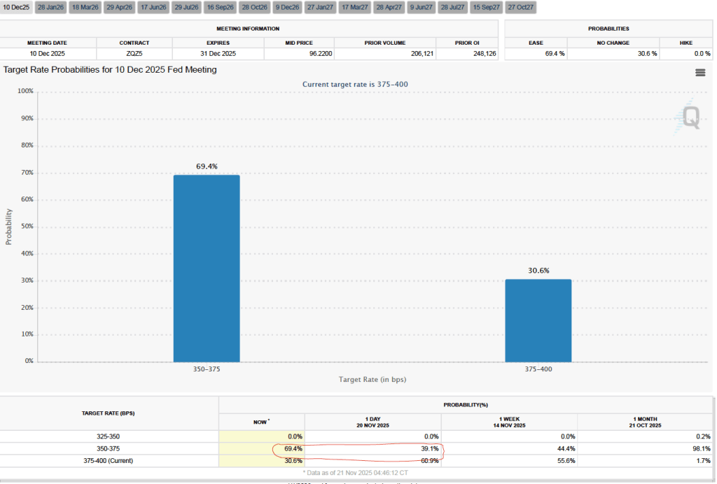

Photo from federalreserve.gov of the Pace University Fed Challenge team and their faculty advisers
Each year the Federal Reserve sponsors a competition among college student teams. As desribed on the Fed’s website, in the competition “Teams analyze economic and financial conditions and formulate a monetary policy recommendation, modeling the Federal Open Market Committee.”
This year’s winner is Pace University, representing the New York Federal Reserve District. Harvard College took second place and the University of California, Los Angeles took third place. The University of Pennsylvania, the University of Chicago, and Davidson College received honorable mentions. In 2024, the competition was won by the team from Princeton University, representing the Philadelphia Federal Reserve District.
This year, 139 colleges in 36 states participated in the competition. The rules of the competition are described here. After the competition, Federal Reserve Chair Jerome Powell noted that: “Fed Challenge offers undergraduate students an opportunity to learn firsthand about monetary policy and the work of the Federal Reserve. I thank these students for the dedication, creativity, and analytical skills they demonstrated as they grappled with real-world economic challenges.”

Image created by ChatGPT
If not for the shutdown of the federal government, the Bureau of Labor Statistics (BLS) would have already released its “Employment Situation” report (often called the “jobs report”) for September and October by now. The September jobs report was released today based largely on data collected before the shutdown.
The jobs report has two estimates of the change in employment during the month: one estimate from the establishment survey, often referred to as the payroll survey, and one from the household survey. As we discuss in Macroeconomics, Chapter 9, Section 9.1 (Economics, Chapter 19, Section 19.1), many economists and Federal Reserve policymakers believe that employment data from the establishment survey provide a more accurate indicator of the state of the labor market than do the household survey’s employment data and unemployment data. (The groups included in the employment estimates from the two surveys are somewhat different, as we discuss in this post.)
Because the household survey wasn’t conducted in October, the data in the October report that relies on the household survey won’t be included when the BLS releases establishment employment data for October on December 16. The data for September released today showed the labor market was stronger than expected in that month.
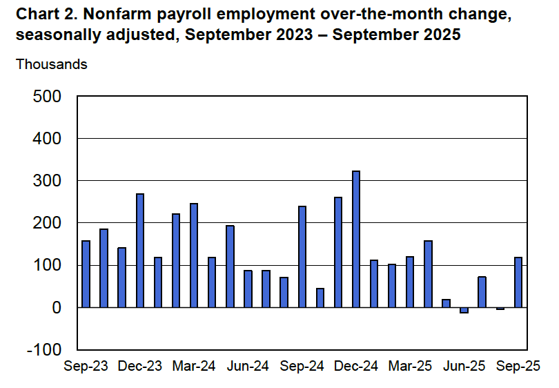
According to the establishment survey, there was a net increase of 119,00 nonfarm jobs during September. This increase was well above the increase of 50,000 that economists surveyed by FactSet had forecast. Economists surveyed by the Wall Street Journal had also forecast a net increase of 50,000 jobs. The relatively large increase in employment in September was partially offset by the BLS revising downward by a combined 33,000 jobs its previous estimates of employment in July and August. The estimate for August was revised from a net gain of 22,000 to a net loss of 4,000. (The BLS notes that: “Monthly revisions result from additional reports received from businesses and government agencies since the last published estimates and from the recalculation of seasonal factors.”)
The following figure from the jobs report shows the net change in nonfarm payroll employment for each month in the last two years. The figure makes clear the striking deceleration in job growth beginning in May. The Trump administration announced sharp increases in U.S. tariffs on April 2. Media reports indicate that some firms have slowed hiring due to the effects of the tariffs or in anticipation of those effects.
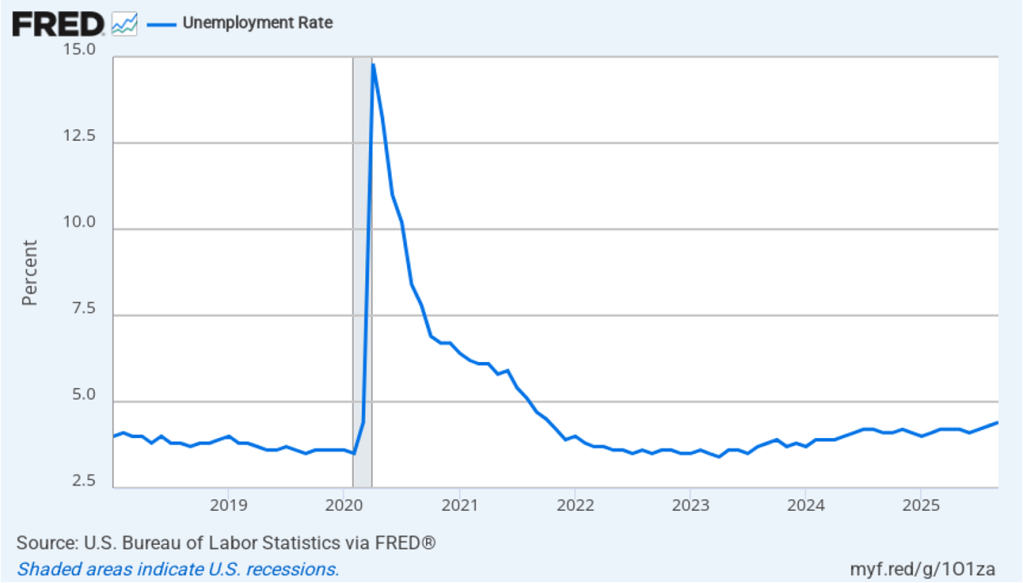
As shown in the following figure, the unemployment rate increased from 4.3 percent in August to 4.4 percent in September, the highest rate since October 2021. The unemployment rate is above the 4.3 percent rate economists surveyed by FactSet had forecast. The unemployment rate had been remarkably stable, staying between 4.0 percent and 4.2 percent in each month from May 2024 to July 2025, before breaking out of that range in August. In September, the members of the Federal Open Market Committee (FOMC) forecast that the unemployment rate during the fourth quarter of 2025 would average 4.5 percent. The FOMC’s current estimate of the natural rate of unemployment—the normal rate of unemployment over the long run—is 4.2 percent. (We discuss the natural rate of unemployment in Macroeconomics, Chapter 9 and Economics, Chapter 19.)
Each month, the Federal Reserve Bank of Atlanta estimates how many net new jobs are required to keep the unemployment rate stable. Given slower growth in the working-age population due to the aging of the U.S. population and a sharp decline in immigration, the Atlanta Fed currently estimates that the economy would have to create 111,878 net new jobs each month to keep the unemployment rate stable at 4.4 percent. If this estimate is accurate, if the average monthly net job increase from May through September of 38,600 were to continue, the result would be a rising unemployment rate.
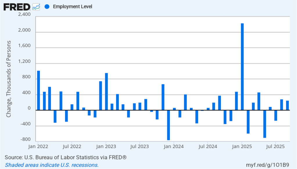
As the following figure shows, the monthly net change in jobs from the household survey moves much more erratically than does the net change in jobs from the establishment survey. As measured by the household survey, there was a net increase of 251,000 jobs in September, following a net increase of 288,000 jobs in August. As an indication of the volatility in the employment changes in the household survey note the very large swings in net new jobs in January and February. In any particular month, the story told by the two surveys can be inconsistent. as was the case in September with employment increasing much more in the household survey than in the employment survey. (In this blog post, we discuss the differences between the employment estimates in the two surveys.)
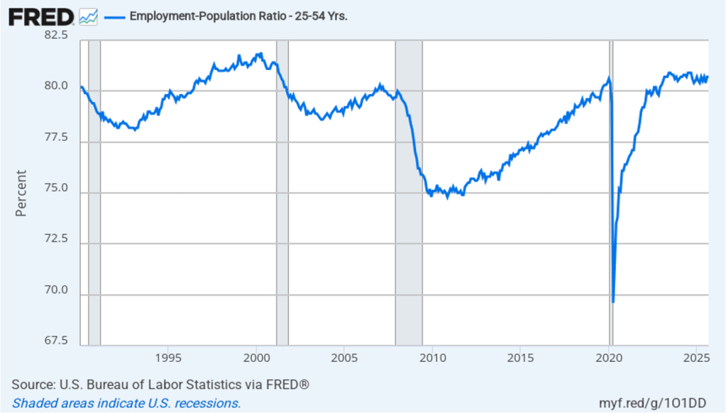
The household survey has another important labor market indicator: the employment-population ratio for prime age workers—those aged 25 to 54. In September the ratio was 80.7 percent, the same as in August. The prime-age employment-population ratio is somewhat below the high of 80.9 percent in mid-2024, but is still above what the ratio was in any month during the period from January 2008 to February 2020. The continued high levels of the prime-age employment-population ratio indicates strength in the labor market.
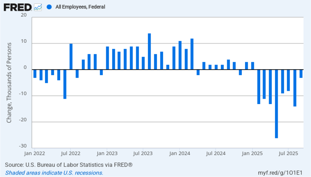
It is still unclear how many federal workers have been laid off since the Trump Administration took office. The establishment survey shows a decline in federal government employment of 3,000 in September and a total decline of 97,000 since the beginning of February 2025. However, the BLS notes that: “Employees on paid leave or receiving ongoing severance pay are counted as employed in the establishment survey.” It’s possible that as more federal employees end their period of receiving severance pay, future jobs reports may report a larger decline in federal employment. To this point, the decline in federal employment has had only a small effect on the overall labor market.
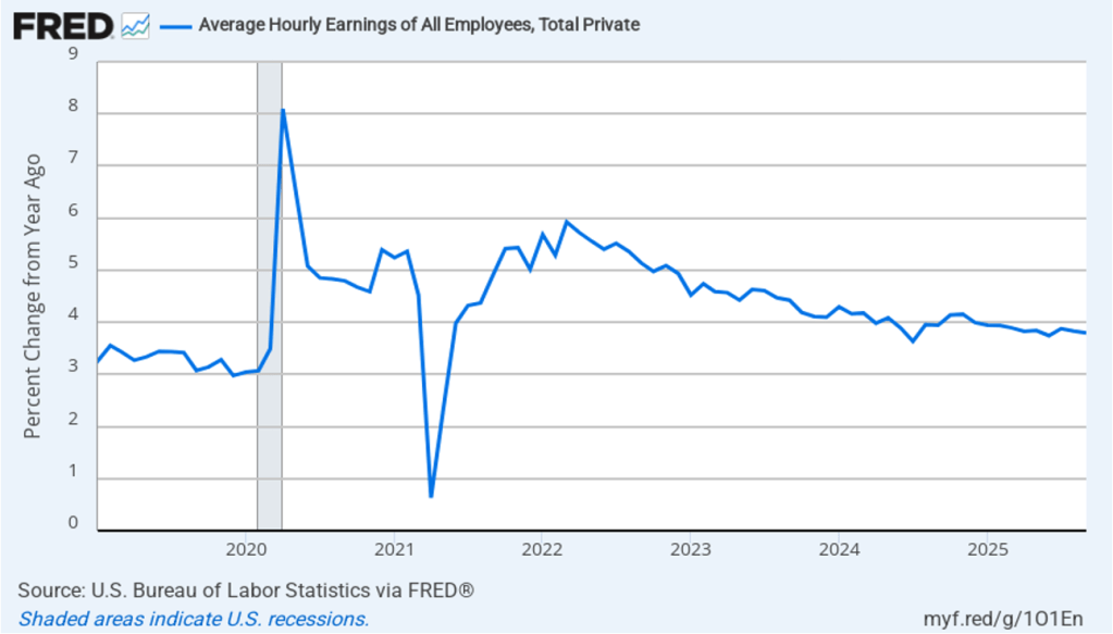
The establishment survey also includes data on average hourly earnings (AHE). As we noted in this post, many economists and policymakers believe the employment cost index (ECI) is a better measure of wage pressures in the economy than is the AHE. The AHE does have the important advantage of being available monthly, whereas the ECI is only available quarterly. The following figure shows the percentage change in the AHE from the same month in the previous year. The AHE increased 3.8 percent in September, the same as in August.
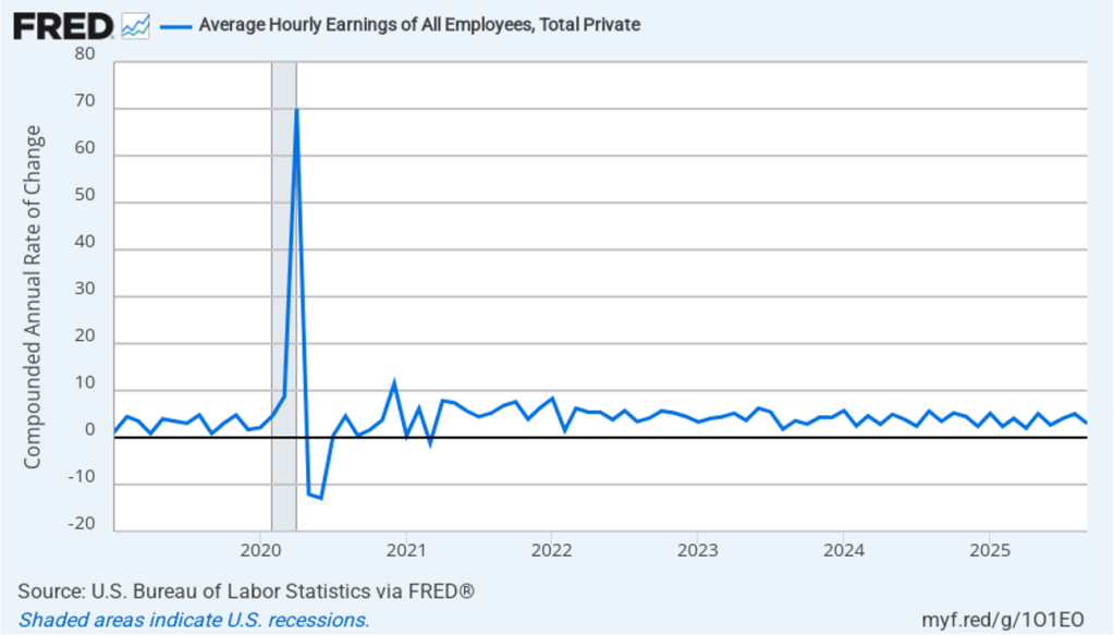
The following figure shows wage inflation calculated by compounding the current month’s rate over an entire year. (The figure above shows what is sometimes called 12-month wage inflation, whereas this figure shows 1-month wage inflation.) One-month wage inflation is much more volatile than 12-month wage inflation—note the very large swings in 1-month wage inflation in April and May 2020 during the business closures caused by the Covid pandemic. In September, the 1-month rate of wage inflation was 3.0 percent, down from 5.1 percent in August. This slowdown in wage growth may be an indication of a weakening labor market. But one month’s data from such a volatile series may not accurately reflect longer-run trends in wage inflation.
What effect might today’s jobs report have on the decisions of the Federal Reserve’s policymaking Federal Open Market Committee (FOMC) with respect to setting its target range for the federal funds rate? The minutes from the FOMC’s last meeting on October 28–29 indicate that committee members had “strongly differing views” over whether to cut the target range by 0.25 percentage point (25 basis points) at its next meeting on December 9–10 or to leave the target range unchanged.
One indication of expectations of future changes in the FOMC’s target for the federal funds rate comes from investors who buy and sell federal funds futures contracts. (We discuss the futures market for federal funds in this blog post.) A month ago, investors assigned a 98.8 percent probability of the committee cutting its target range to 3.50 percent to 3.75 percent at its December meeting. Since that time indications have increased that output and employment growth have continued to be relatively strong and that inflation is stuck above the Fed’s 2 percent annual target. This morning, as the following figure shows, investors assign a probability of 60. 4 percent to the committee keeping its target unchanged at 3.75 percent to 4.00 percent at the December meeting. Committee members will also release their Summary of Economic Projections (SEP) at that meeting. The SEP, along with Fed Chair Powell’s remarks at his press conference following the meeting, should provide additional information on the monetary policy path the committee intends to follow in the coming months.
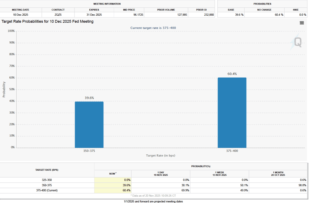

Image created by GPT
Most large firms selling consumer goods continually evaluate which new products they should introduce. Managers of these firms are aware that if they fail to fill a market niche, their competitors or a new firm may develop a product to fill the niche. Similarly, firms search for ways to improve their existing products.
For example, Ferrara Candy, had introduced Nerds in 1983. Although Nerds experienced steady sales over the following years, company managers decided to devote resources to improving the brand. In 2020, they introduced Nerds Gummy Clusters, which an article in the Wall Street Journal describes as being “crunchy outside and gummy inside.” Over five years, sales of Nerds increased from $50 millions to $500 million. Although the company’s market research “suggested that Nerds Gummy Clusters would be a dud … executives at Ferrara Candy went with their guts—and the product became a smash.”

Image of Nerds Gummy Clusters from nerdscandy.com
Firms differ on the extent to which they rely on market research—such as focus groups or polls of consumers—when introducing a new product or overhauling an existing product. Henry Ford became the richest man in the United States by introducing the Model T, the first low-priced and reliable mass-produced automobile. But Ford once remarked that if before introducing the Model T he had asked people the best way to improve transportation they would probably have told him to develop a faster horse. (Note that there’s a debate as to whether Ford ever actually made this observation.) Apple co-founder Steve Jobs took a similar view, once remaking in an interview that “it’s really hard to design products by focus groups. A lot of times, people don’t know what they want until you show it to them.” In another interview, Jobs stated: “We do no market research. We don’t hire consultants.”
Unsurprisingly, not all new products large firms introduce are successful—whether the products were developed as a result of market research or relied on the hunches of a company’s managers. To take two famous examples, consider the products shown in image at the beginning of this post—“New Coke” and the Ford Edsel.
Pepsi and Coke have been in an intense rivalry for decades. In the 1980s, Pepsi began to gain market share at Coke’s expense as a result of television commercials showcasing the “Pepsi Challenge.” The Pepsi Challenge had consumers choose from colas in two unlabeled cups. Consumers overwhelming chose the cup containing Pepsi. Coke’s management came to believe that Pepsi was winning the blind taste tests because Pepsi was sweeter than Coke and consumers tend to favor sweeter colas. In 1985, Coke’s managers decided to replace the existing Coke formula—which had been largely unchanged for almost 100 years—with New Coke, which had a sweeter taste. Unfortunately for Coke’s managers, consumers’ reaction to New Coke was strongly negative. Less than three months later, the company reintroduced the original Coke, now labeled “Coke Classic.” Although Coke produced both versions of the cola for a number of years, eventually they stopped selling New Coke.
Through the 1920s, the Ford Motor Company produced only two car models—the low-priced Model T and the high-priced Lincoln. That strategy left an opening for General Motors during the 1920s to introduce a variety of car models at a number of price levels. Ford scrambled during the 1930s and after the end of World War II in 1945 to add new models that would compete directly with some of GM’s models. After a major investment in new capacity and an elaborate marketing campaign, Ford introduced the Edsel in September 1957 to compete against GM’s mid-priced models: Pontiac, Oldsmobile, and Buick.
Unfortunately, the Edsel was introduced during a sharp, although relatively short, economic recession. As we discuss in Macroeconomics, Chapter 13 (Economics, Chapter 23), consumers typically cut back on purchases of consumer durables like automobiles during a recession. In addition, the Edsel suffered from reliability problems and many consumers disliked the unusual design, particularly of the front of the car. Consumers were also puzzled by the name Edsel. Ford CEO Henry Ford II was the grandson of Henry Ford and the son of Edsel Ford, who had died in 1943. Henry Ford II named in the car in honor of his father but the unusual name didn’t appeal to consumers. Ford ceased production of the car in November 1959 after losing $250 million, which was one of the largest losses in business history to that point. The name “Edsel” has lived on as a synonym for a disastrous product launch.

Image of iPhone Air from apple.com
Apple earns about half of its revenue and more than half of its profit from iPhone sales. Making sure that it is able to match or exceed the smartphone features offered by competitors is a top priority for CEO Tim Cook and other Apple managers. Because Apple’s iPhones are higher-priced than many other smartphones, Apple has tried various approaches to competing in the market for lower-priced smartphones.
In 2013, Apple was successful in introducing the iPad Air, a thinner, lower-priced version of its popular iPad. Apple introduced the iPhone Air in September 2025, hoping to duplicate the success of the iPad Air. The iPhone Air has a titanium frame and is lighter than the regular iPhone model. The Air is also thinner, which means that its camera, speaker, and its battery are all a step down from the regular iPhone 17 model. In addition, while the iPhone Air’s price is $100 lower than the iPhone 17 Pro, it’s $200 higher than the base model iPhone 17.
Unlike with the iPad Air, Apple doesn’t seem to have aimed the iPhone Air at consumers looking for a lower-priced alternative. Instead, Apple appears to have targeted consumers who value a thinner, lighter phone that appears more stylish, because of its titanium frame, and who are willing to sacrifice some camera and sound quality, as well as battery life. An article in the Wall Street Journal declared that: “The Air is the company’s most innovative smartphone design since the iPhone X in 2017.” As it has turned out, there are apparently fewer consumers who value this mix of features in a smartphone than Apple had expected.
Sales were sufficiently disappointing that within a month of its introduction, Apple ordered suppliers to cut back production of iPhone Air components by more than 80 percent. Apple was expected to produce 1 million fewer iPhone Airs during 2025 than the company had initially planned. An article in the Wall Street Journal labeled the iPhone Air “a marketing win and a sales flop.” According to a survey by the KeyBanc investment firm there was “virtually no demand for [the] iPhone Air.”
Was Apple having its New Coke moment? There seems little doubt that the iPhone Air has been a very disappointing new product launch. But its very slow sales haven’t inflicted nearly the damage that New Coke caused Coca-Cola or that the Edsel caused Ford. A particularly damaging aspect of New Coke was that was meant as a replacement for the existing Coke, which was being pulled from production. The result was a larger decline in sales than if New Coke had been offered for sale alongside the existing Coke. Similarly, Ford set up a whole new division of the company to produce and sell the Edsel. When Edsel production had to be stopped after only two years, the losses were much greater than they would have been if Edsel production hadn’t been planned to be such a large fraction of Ford’s total production of automobiles.
Although very slow iPhone Air sales have caused Apple to incur losses on the model, the Air was meant to be one of several iPhone models and not the only iPhone model. Clearly investors don’t believe that problems with the Air will matter much to Apple’s profits in the long run. The following graphic from the Wall Street Journal shows that Apple’s stock price has kept rising even after news of serious problems with Air sales became public in late October.

So, while the iPhone Air will likely go down as a failed product launch, it won’t achieve the legendary status of New Coke or the Edsel.
Supports: Microeconomics, Macroeconomics, Economics, and Essentials of Economics, Chapter 4, Section 4.4

Image generated by ChapGPT
The model of demand and supply is useful in analyzing the effects of tariffs. In Chapter 9, Section 9.4 (Macroeconomics, Chapter 7, Section 7.4) we analyze the situation—for instance, the market for sugar—when U.S. demand is a small fraction of total world demand and when the U.S. both produces the good and imports it.
In this problem, we look at the television market and assume that no domestic firms make televisions. (A few U.S. firms assemble limited numbers of televisions from imported components.) As a result, the supply of televisions consists entirely of imports. Beginning in April, the Trump administration increased tariff rates on imports of televisions from Japan, South Korea, China, and other countries. Tariffs are effectively a tax on imports, so we can use the analysis in Chapter 4, Section 4.4, “The Economic Effect of Taxes” to analyze the effect of tariffs on the market for televisions.
Solving the Problem
Step 1: Review the chapter material. This problem is about the effect of a tariff on an imported good on the domestic market for the good. Because a tariff is a like a tax, you may want to review Chapter 4, Section 4.4, “The Economic Effect of Taxes.”
Step 2: Answer part a. by drawing a demand and supply graph of the market for televisions in the United States that illustrates the effect of an increased tariff on imported televisions. The following figure shows that a tariff causes the supply curve of televisions to shift up from S1 to S2. As a result, the equilibrium price increases from P1 to P2, while the equilibrium quantity falls from Q1 to Q2.
Step 2: Answer part b. by drawing a demand and supply graph of the market for used televisions in the United States that illustrates the effect on that market of an increased tariff on imports of new televisions. Although the tariff on imported televisions doesn’t directly affect the market for used televisions, it does so indirectly. As the article from the Wall Street Journal notes, “Today, in the tariff era, demand for used goods is surging.” Because used televisions are substitutes for new televisions, we would expect that an increase in the price of new televisions would cause the demand curve for used televisions to shift to the right, as shown in the following figure. The result will be that the equilibrium price of used televisions will increase from P1 to P2, while the equilibrium quantity of used televisions will increase from Q1 to Q2.
To summarize: A tariff on imports of new televisions increases the price of both new and used televisions. It decreases the quantity of new televisions sold but increases the quantity of used televisions sold.
Glenn Hubbard and Tony O’Brien begin by examining the challenges facing the Federal Reserve due to incomplete economic data, a result of federal agency shutdowns. Despite limited information, they note that growth remains steady but inflation is above target, creating a conundrum for policymakers. The discussion turns to the upcoming appointment of a new Fed chair and the broader questions of central bank independence and the evolving role of monetary policy. They also address the uncertainty surrounding AI-driven layoffs, referencing contrasting academic views on whether artificial intelligence will complement existing jobs or lead to significant displacement. Both agree that the full impact of AI on productivity and employment will take time to materialize, drawing parallels to the slow adoption of the internet in the 1990s.
The podcast further explores the recent volatility in stock prices of AI-related firms, comparing the current environment to the dot-com bubble and questioning the sustainability of high valuations. Hubbard and O’Brien discuss the effects of tariffs, noting that price increases have been less dramatic than expected due to factors like inventory buffers and contractual delays. They highlight the tension between tariffs as tools for protection and revenue, and the broader implications for manufacturing, agriculture, and consumer prices. The episode concludes with reflections on the importance of ongoing observation and analysis as these economic trends evolve.
Pearson Economics · Hubbard OBrien Economics Podcast – 11-06-25 – Economy, AI, & Tariffs

Image created by ChatGPT
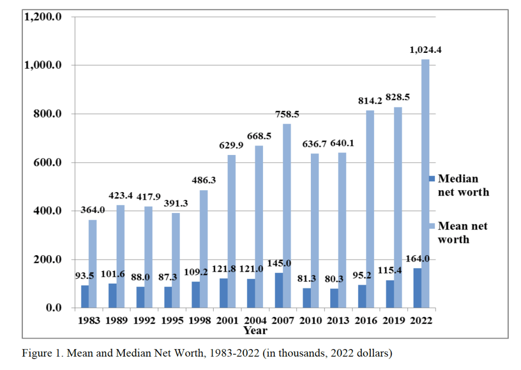
There has been an ongoing debate about whether Millennials and people in Generation Z are better off or worse off economically than are Baby Boomers. Edward Wolff of New York University recently published a National Bureau of Economic Research (NBER) working paper that focuses on one aspect of this debate—how the wealth of households headed by someone 75 years and older changed relative to the wealth of households headed by someone 35 years and younger during the period from 1983 to 2022.
Wolff uses data from the Federal Reserve’s Survey of Consumer Finances to measure the wealth, or net worth, of people in these age groups—the market value of their financial assets minus the market value of their financial liabilities. He includes in his measure of assets the market value of people’s real estate holdings—including their homes—stocks and bonds, bank deposits, contributions to defined contribution pension funds, unincorporated businesses, and trust funds. He includes in his measure of liabilities people’s mortgage debt, consumer debt—including credit card balances—and other debt, such as educational loans. Because Wolff wants to focus on that part of wealth that is available to be spent on consumption, he refers to it as financial resources, and he excludes from his wealth measure the present value of future Social Security payments and the present value of future defined contribution pension benefits.
The following figure from Wolff’s paper shows that, using his definition, both median and mean wealth have increased substantially from 1987 to 2o22. Note that both measures of average wealth declined during the Great Recession and Global Financial Crisis of 2007–2009. Median wealth declined by nearly 44 percent between 2007 and 2010. That median wealth grew much faster than mean wealth over the whole period indicates that wealth inequality.
Although the average wealth of all age groups increased over this period, the relative wealth of households 75 years and older rose and the relative wealth of households 35 years and younger fell. The following figure from the NBER Digest illustrates this shift. The 75 and over age group increased its mean net worth from 5 percent greater than the mean net worth of the average household in 1983 to 55 percent of the mean net worth of the average household in 2022. In contrast, the 35 and under age group saw its mean new worth relative to the average household fall from 21 percent in 1983 to 16 percent in 2022. Note, though, that there is significant volatility over time in the relative wealth shares of the two age groups.
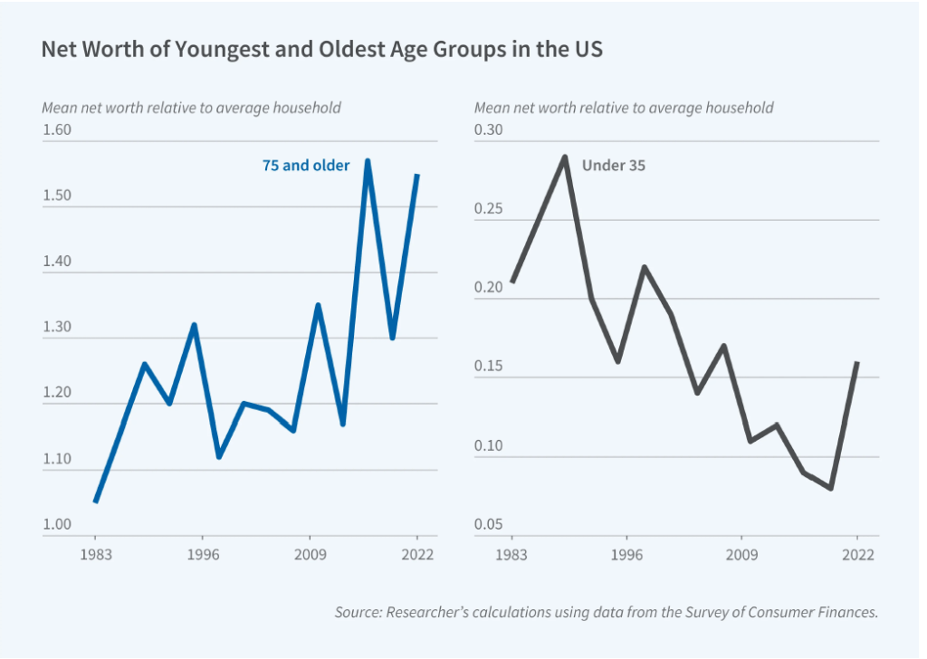
What explains the relative increase in wealth among households 75 and over and the relative decrease in wealth among households 35 and under? Wolff identifies three key factors:
“[T]he homeownership rate, total stocks directly and indirectly owned, and home mortgage debt. The homeownership rate is the same in the two years for the youngest group but falls relative to the overall rate, whereas it shoots up for the oldest group both in actual level and relative to the overall average. The value of stock holdings rises for both age groups but vastly more for the oldest households compared to the youngest ones and accounts for a substantial portion of the elderly’s relative wealth gains. Mortgage debt rises in dollar terms for both groups but considerably more in relative terms for the youngest group.”
Perhaps surprisingly, Wolff finds that “despite dire press reports, educational loans fail to appear as a significant factor” in explaining the decline in the relative wealth of younger households.
Photo of Federal Reserve Chair Jerome Powell from federalreserve.gov
Today’s meeting of the Federal Reserve’s policymaking Federal Open Market Committee (FOMC) occurred against a backdrop of a shutdown of the federal government that has delayed release of most government economic data. (We discuss the government shutdown here, here, and here.)
As most observers had expected, the committee decided today to lower its target for the federal funds rate from a range of 4.00 percent to 4.25 percent to a range of 3.75 percent to 4.oo percent—a cut of 0.25 percentage point, or 25 basis points. The members of the committee voted 10 to 2 for the 25 basis point cut with Governor Stephen Miran dissenting because he preferred a 50 basis point cut and Jeffrey Schmid, president of the Federal Reserve Bank of Kansas City, dissenting because he preferred that the target range be left unchanged at this meeting.
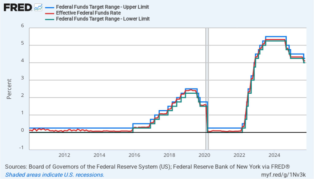
The following figure shows, for the period since January 2010, the upper bound (the blue line) and the lower bound (the green line) for the FOMC’s target range for the federal funds rate, as well as the actual values of the federal funds rate (the red line). Note that the Fed has been successful in keeping the value of the federal funds rate in its target range. (We discuss the monetary policy tools the FOMC uses to maintain the federal funds rate in its target range in Macroeconomics, Chapter 15, Section 15.2 (Economics, Chapter 25, Section 25.2).)
During his press conference following the meeting, Fed Chair Jerome Powell made news by stating that a further cut in the target rate at the FOMC’s meeting on December 9–10 is not a foregone conclusion. This statement came as a surprise to investors who buy and sell federal funds futures contracts. (We discuss the futures market for federal funds in this blog post.) As of yesterday, investors has assigned a probability of 90.5 percent to the committee cutting its target range by another 25 basis points at the December meeting. Today that probability dropped to zero. Instead investors now assign a probability of 67.8 percent to the target remaining unchanged at that meeting, and a probability of 32.2 percent of the committee raising its target by 25 basis points.
Powell also indicated that he believes that the recent increase in inflation was largely due to the effects of the increase in tariff rates that the Trump administration began implementing in April. (We discuss the recent data on inflation in this post.) Powell indicated that committee members expect that the tariff increases will cause a one-time increase in the price level, rather than a long-term increase in the inflation rate. As a result, he said that the shift in the “balance of risks” caused the committee to believe that cutting the target for the federal funds rate was warranted to avoid the possibility of a significant rise in the unemployment rate.
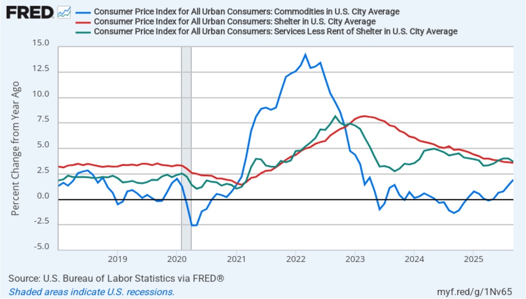
In discussing inflation, Powell highlighted three aspects of the recent CPI report: inflation in goods, inflation in shelter, and inflation in services not including shelter. (The BLS explains is measurement of shelter here.) The following figure shows inflation in each of those categories, measured as the percentage increase from the same month in the previous year. Inflation in goods (the blue line) has been trending up, reflecting the effect of increased tariffs rates. Inlation in shelter (the red line) and in services minus shelter (the green line) have generally been trending downward. Powell noted that the decline in inflation in shelter has been slower than most members of the committee had expected.
Still, Powell argued that with the downward trend in services, once the temporary inflation in goods due to the effects of tariffs had passed through the economy, inflation was likely to be close the Fed’s 2 percent annual target. He thought this was particularly likely to be true because even after today’s cut, the federal funds rate was “restrictive” because it remained above its long-run nominal and real values. A restrictive monetary policy will slow spending and inflation.
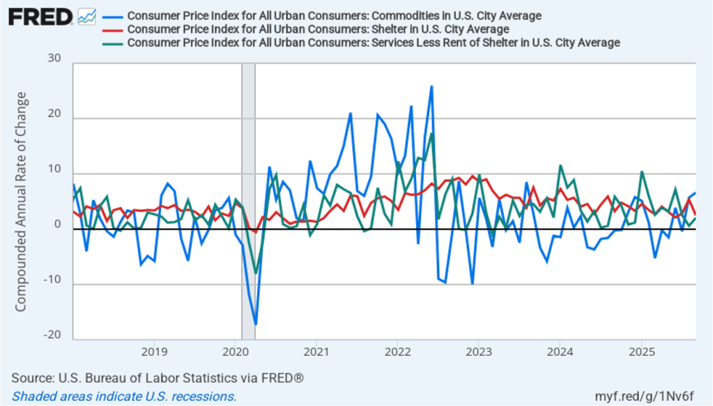
In the following figure, we look at the 1-month inflation rates—that is, the annual inflation rates calculated by compounding the current month’s rates over an entire year—for the same three categories. Calculated as the 1-month inflation rate, goods inflation (the blue line) was running at a very high 6.6 percent in September. inflation in shelter (the red line) had declined to 2.5 per cent in September. Inflation in services minus shelter rose slightly in September to 2.1 percent.
Assuming that the shutdown of the federal government ends within the next few weeks, members of the FOMC will have a great deal of data on inflation, real GDP growth, and employment to consider before their next meeting in December.
