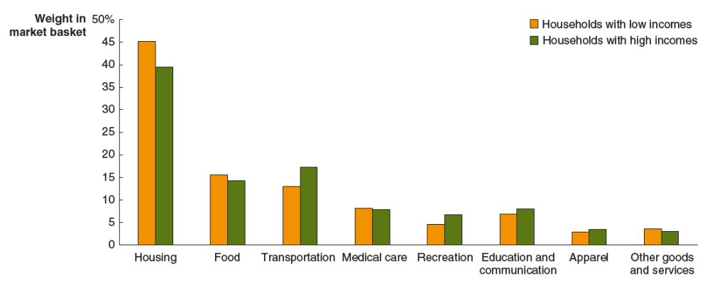
Solved Problem: How Much Did Using a Ticket to a Taylor Swift Concert Cost You?

SupportsMicroeconomics, Macroeconomics, Economics, and Essentials of Economics, Chapter 1.

Photo of Taylor Swift from the Wall Street Journal.

Suppose that as a “verified fan” of Taylor Swift, you are able to buy a ticket to one of her concerts for $215. The price of the ticket isn’t refundable. (We discuss how Taylor Swift handles the sale of tickets to her concerts in the Apply the Concept “Taylor Swift Tries to Please Fans and Make Money” in Microeconomics and in Economics, Chapter 10, and in Essentials of Economics, Chapter 7.) You had been hoping to work a few hours of overtime at your job to earn some extra money. The day of the concert, your boss tells you that the only overtime available for the next month is that night from 6 pm to 10 pm—the same time as the concert. Working those hours of overtime will earn you $100 (after taxes). You check StubHub and find that you can resell your ticket for $1,000 (afer paying StubHub’s fee).

Given that information, briefly explain which of the following statements is correct:

  1. If you attend the concert, the cost of using your ticket is $215—the price that you paid for it.
  2. If you attend the concert, the cost of using your ticket is $1,000—the amount you can resell your ticket for.
  3. If you attend the concert, the cost of using your ticket is $1,000 + $100 = $1,100—the amount you can resell your ticket for plus the amount you would have earned from working overtime rather than attending the concert.
  4. If you attend the concert, the cost of using your ticket is $1,000 + $100 – $215 = $885—the amount you can resell your ticket for plus the amount you would have earned from working overtime rather than attending the concert minus the price you paid to buy the ticket. 

Solving the Problem

Step 1: Review the chapter material. This problem is about the concept of opportunity cost, so you may want to review Chapter 1, Section 1.2.

Step 2: Solve the problem by using the concept of opportunity cost to determine which of the four statements is correct. Economists measure the cost of engaging in an activity as an opportunity cost—the value of what you have to give up to engage in the activity. Using this definition, only statement c. is correct; if you decide to use your ticket to attend the concert you will give up the $1,000 you could have received from selling the ticket plus the $100 you fail to earn as a result of attending the concert rather than working overtime. Note that the price you paid for the ticket isn’t relevant to your decision whether to attend the concert because the price of the ticket is nonrefundable. (The amount you paid for the ticket is a sunk cost because it can’t recovered. We discuss the role of sunk costs in decision making in Microeconomics and Economics, Chapter 10, Section 10.4, and in Essentials of Economics, Chapter 7, Section 7.4.)

More Data on the Progressivity of the U.S. Income Tax

Photo from the Associated Press via the Wall Street Journal.

A tax is progressive if people with lower incomes pay a lower percentage of their income in tax than do people with higher incomes. (We discuss the U.S. tax system in Microeconomics and Economics, Chapter 17, Section 17.2.) Recently, the Joint Committee on Taxation (JCT) of the U.S. Congress released a report, “Overview of the Federal Tax System as in Effect for 2024,” that provides data on the progressivity of the U.S. tax system. (An overview of the role of the JCT can be found here.)

The progressivity of the federal individual income tax is shown in the following figure from the JCT report. The column on the right shows that for each category of taxpayers shown—single people, heads of households (who are unmarried people who financially support at least one other person), and married people—the marginal income tax rate increases with a taxpayer’s income. The marginal tax rate is the rate that someone pays on additional income that they earn. So, for instance, the table shows that an individual who has taxable income of $80,000 faces a marginal tax rate of 22 percent because that is the rate the person pays on the income they earn between $47,150 and $80,000. An individual who has a taxable income of $700,000 faces a marginal tax rate of 37 percent because that is the rate the person pays on the income they earn between $609,350 and $700,000.

In Chapter 17, we use data from the Tax Policy Center to show the average income tax rate paid by different income groups. The average tax rate is computed as the total tax paid divided by taxable income. The marginal tax rate is a better indicator than the average tax rate of how a change in a tax will affect a person’s willingness to work, save, and invest. For instance, if you are considering working more hours in your job or taking on a second job, such driving part time for Uber or Lyft, you want to know what your tax rate is on the additional income you will earn. For that purpose, you should ignore your average tax rate and instead focus on your marginal tax rate.

The following table from the JCT report is similar to the table in Chapter 17, which was based on data from the Tax Policy Center. The JCT report has the advantage of direct access to government tax data, which, as a private group, the Tax Policy Center doesn’t have. In addition, the JCT reports on an income group—the top 0.1 percent of income earners—compiled from government data not available to the Tax Policy Center. (Much political discussion has focused on the income earned and taxes paid by the top 1 percent of earners, which is a much larger group than the top 0.1 percent. We discuss the top 1 percent in the Apply the Concept, “Who Are the 1 Percent, and How Do They Earn Their Incomes,” in Microeconomics and Economics, Chaper 17, Section 17.4.)

The table shows data for the first four quntiles (or groups of 20 percent of taxpayers), with the highest quintile divided further. The table shows that the federal individual income tax is highly progressive, with the two lowest income quintiles having negative average tax rates because they receive more in tax credits than they pay in taxes. Employment taxes—primarily the payroll tax used to fund the Social Security and Medicare Systems—are regressive, with the lowest deciles paying a larger percentage of their income in these taxes than do the higher deciles. The regressivity of employment taxes is the result of both payroll taxes being levied on the first dollar of wages and salaries individuals earn and the part of the payroll tax used to fund the Social Security system dropping to zero for incomes above a certain level—$168,600 in 2024. Because income taxes are much larger in total than employment taxes or excise taxes—such as the federal taxes on gasoline, airline tickets, and alcoholic beverages—the total of these three types of federal taxes is progressive, as shown by the fact that the average tax rate rises with income. (Although note that the top 0.1 percent pay taxes at a slightly lower rate than do the other taxpayers included in the top 1 percent.)

Would Caleb Williams Be Better Off Playing for the Jacksonville Jaguars Instead of the Chicago Bears?

USC quarterback Caleb Williams is shown with NFL Commissioner Roger Goodell at the NFL college draft in Detroit. (Photo from Reuters via the Wall Street Journal)

In late April, the National Football League (NFL) held its annual draft of eligible college players. NFL teams choose players through seven rounds in reverse order of how the teams finished in the previous year: The team with the worst record picks first and the winner of the Super Bowl picks last. Teams are allowed to trade picks with each other. This year, although the Carolina Panthers finished with the worst record during the 2023 season, they had traded their first round pick to the Chicago Bears, who picked first.

The Bears choose University of Southern California (USC) quarterback Caleb Williams with the first pick in the draft. Drafted players usually have no choice but to sign contracts with the team that chose them. A player can refuse to sign with the team that drafted him and not play that year, hoping that the next year a team they like better will draft them. Very few players have chosen that option.

When football fans and sportswriters discuss whether a team is a good match for a player they usually focus on factors such as whether a player’s skills are well suited to the team’s style of play and on how many other good players are on the team. One other factor that is seldom discussed is whether a player will benefit more financially by playing for the team that drafted him rather than for another team. Players chosen in the college draft are paid an amount fixed as a result of bargaining between the NFL and the National Football League Players Association (NFLPA), which is the labor union that represents NFL players.

As the first pick in the draft, Caleb Williams’s contract will pay him $39.4 million in total over the next four seasons. A sizeable fraction of that amount—probably $25.5 million—will be in the form of a lump-sum bonus that the Bears will pay Williams in full when he signs his contract. The dollar amount Williams is paid as the first pick in the draft would be the same whichever of the 32 NFL teams had drafted him. However, football players—like everyone else—are interested in their after-tax income and state and local income tax rates vary widely. Football players pay state and local income taxes based on where their teams’ games are played. In the 17-game NFL schedule, teams play either 8 or 9 games in their home city and the rest (road games) in the home cities of their opponents.

Jared Walczak of the Tax Foundation has compiled a table showing the tax rate each NFL team’s players will pay in 2024 based on the state and local taxes levied in their home city and the state and local taxes levied by the cities where the team’s road games will be played. To keep the numbers simple, let’s look at how the much in taxes Williams will owe on a $20 million bonus, which the Bears will pay him as soon as he signs his contract. (Note that, as indicated earlier, Williams’s bonus is likely to be greater than $20 million and he will also receive a salary during his first season of about $3.75 million.)

Given the income tax rate levied by the state of Illinois (the city of Chicago doesn’t levy a tax on income) and the state and local taxes levied by the cities and states in which the Bears will play their road games this year, Williams will owe a tax of $1,079,075 on his bonus. (Note that we are ignoring the substantial federal income tax that Williams will owe on the bonus because the federal tax won’t change no matter which city he plays in.) The lowest tax that Williams would pay on the bonus is $120,421, which would be his tax if he played for the Jacksonville Jaguars. Neither the city of Jacksonville nor the state of Florida levies a personal income tax, so Williams would only owe state and local income taxes on what he earns playing in cities where the Jaguars play their road games. The largest tax Williams would pay is $1,301,028, which would be his tax if he had been drafted by any of the three teams that play in California: the Los Angeles Rams, the Los Angeles Chargers, or the San Francisco ’49ers.

Although college players who are drafted are obliged to play for the team that drafted them, after players have completed their contracts they have the option of signing with a different team. At that stage of their careers, players—and their agents—can take into account state and local income taxes when deciding which team to sign a new contract with.

Solved Problem: When to Close a Sandwich Shop

SupportsMicroeconomics and Economics, Chapter 12, and Essentials of Economics, Chapter 9.

Photo from the Wall Street Journal.

A recent article in the Los Angeles Times discussed the problems faced by the owners of a sandwich shop in the Chinatown neighborhood of Los Angeles.  The owners had closed the shop and then decided to reopen it. The article quoted one of the owners as saying: “After closing [the shop] we realized we still have our lease, we still have our loans from the [federal government’s Small Business Association], from COVID, the bills are still coming in. We can’t even afford to close. We can’t afford to be open, we can’t afford to be closed.”

a. What does the owner of the sandwich shop mean by saying they can’t afford to be open but they also can’t afford to be closed? Answer by explaining what the likely relationship is between the revenue the owners were earning from the shop and the shop’s fixed, variable, and total costs . 

b. Are the owners likely to keep the sandwich shop open in the long run? Briefly explain.

Solving the Problem

Step 1: Review the chapter material. This problem is about when a firm should decide to shut down in the short run, so you may want to review the section “Deciding Whether to Produce or to Shut Down in the Shortrun” in Microeconomics (and Economics), Chapter 12, Section 12.4, (Essentials of Economics, Chapter 9, Section 9.4).

Step 2: Answer part a. by explaining what the sandwich shop’s owner meant by her statement, using the likely relationship between the shop’s revenue and its fixed, variable, and total cost in your explanation. That the owner states that “we can’t afford to be open” indicates that the firm is incurring a loss, so the revenue from the shop is less than the toal cost of operating it. But after closing the shop, the owners reopened it because “we can’t afford to be closed.” That statement indicates that the owners will incur a smaller loss by operating the shop than by keeping it closed. If the shop is closed, the owners still have to pay the shop’s fixed costs, such as the rent on the shop and the payments the owners must make on loans. We can infer that the loss from remaining open is less than the loss from being closed. In that situation, the shop’s revenue must be enough to cover the variable cost of operating it, although not enough to cover the total cost.

Step 3: Answer part b. by explaining whether the owners are likely to keep the sandwich shop open in the long run. By definition, in the long run, the owners will no longer have any fixed costs because the period of its lease will have ended and it will have paid off its loans—or possibly defaulted on them. If the revenue from operating the shop remains less than the total cost of operating it in the long run, the owners will permanenly close the shop.

Inflation Cools Slightly in Latest CPI Report

Inflation was running higher than expected during the first three months of 2024, indicating that the trend in late 2023 of declining inflation had been interrupted. At the beginning of the year, many economists and analysts had expected that the Federal Reserve’s policy-making Federal Open Market Committee (FOMC) would begin cutting its target for the federal funds rate sometime in the middle of the year. But with inflation persisting above the Fed’s 2 percent inflation target, it has become likely that the FOMC will wait until later in the year to start cutting its target and might decide to leave the target unchanged through the remainder of 2024.

Accordingly, economists and policymakers were intently awaiting the report from the Bureau of Labor Statistics (BLS) on the consumer price index (CPI) for April. The report released this morning showed a slight decrease in inflation, although the inflation rate remains well above the Fed’s 2 percent target. (Note that, as we discuss in Macroeconomics, Chapter 15, Section 15.5 (Economics, Chapter 25, Section 25.5), the Fed uses the personal consumption expenditures (PCE) price index, rather than the CPI in evaluating whether it is hitting its 2 percent inflation target.)

The inflation rate for April measured by the percentage change in the CPI from the same month in the previous month—headline inflation—was 3.4 percent—about the same as economists had expected—down from 3.5 percent in March. As the following figure shows, core inflation—which excludes the prices of food and energy—was 3.6 percent in April, down from 3.8 percent in March.

If we look at the 1-month inflation rate for headline and core inflation—that is the annual inflation rate calculated by compounding the current month’s rate over an entire year—the declines in the inflation rate are larger. Headline inflation declined from 4.6 percent in March to 3.8 percent in April. Core inflation declined from 4.4 percent in March to 3.6 percent in April. Note that the value for core inflation is the same whether we measure over 12 months or over 1 month. Overall, we can say that inflation seems to have cooled in April, but it still remains well above the Fed’s 2 percent target.

As has been true in recent months, the path of inflation in the prices of services has been concerning. As we’ve noted in earlier posts, Federal Reserve Chair Jerome Powell has emphasized that as supply chain problems have gradually been resolved, inflation in the prices of goods has been rapidly declining. But inflaion in services hasn’t declined nearly as much. Powell has been particularly concernd about how slowly the price of housing has been declining, a point he made again in the press conference that followed the most recent FOMC meeting.

The following figure shows the 1-month inflation rate in service prices and in service prices not included including housing rent. The figure shows that inflation in all service prices has been above 4 percent in every month since July 2023, but inflation in service prices slowed markedly from 6.6 percent in March to 4.4 percent in April. Inflation in service prices not including housing rent declined more than 50 percent, from 8.9 percent in March to 3.4 percent in April. But, again, even though inflation in service prices declined in April, as the figure shows, the 1-month inflation in services is volatile and even these smaller increases aren’t yet consistent with the Fed meeting its 2 percent inflation target.

Finally, in order to get a better estimate of the underlying trend in inflation, some economists look at median inflation, which is calculated by economists at the Federal Reserve Bank of Cleveland and Ohio State University. If we listed the inflation rate in each individual good or service in the CPI, median inflation is the inflation rate of the good or service that is in the middle of the list—that is, the inflation rate in the price of the good or service that has an equal number of higher and lower inflation rates. As the following figure shows, at 4.3 percent, median inflation in April was unchanged from its value in March.

Today’s report was good news for the Fed in its attempts to reduce the inflation rate to its 2 percent target without pushing the U.S. economy into a recession. But Fed Chair Jerome Powell and other members of the FOMC have made clear that they are unlikely to begin cutting the target for the federal funds rate until they receive several months worth of data indicating that inflation has clearly resumed the downward path it was on during the last months of 2023. The unexpectedly high inflation data for the first three months of 2024 has clearly had a significant effect on Fed policy. Powell was quoted yesterday as noting that: “We did not expect this to be a smooth road, but these [inflation readings] were higher than I think anybody expected,”

How Has Inflation Affected People at Different Income Levels?

Photo courtesy of Lena Buonanno

In the new 9th edition of Macroeconomics, in Chapter 9, Section 9.7 (Economics, Chapter 19, Section 19.7 and Essentials of Economics, Chapter 13, Section 13.7), we have an Apply the Concept feature that looks at research conducted by economists at the U.S. Bureau of Labor Statistics into the effects of inflation on households at different income levels. That research involved looking at the differences between the mix of goods that households at different income levels consume and at differences in increases in the wages they earn. The following figure, reproduced from this feature shows that as a percentage of their total consumption expenditures households with low incomes spend more on housing and food, and less on transportation and recreation than do households with high incomes.

During the three-year period from March 2020 to April 2023, wages increased faster than did prices for households with low incomes, while wages increased at a slower than did prices for households with high incomes. We concluded from this research that: “during this period, workers with lower incomes were hurt less by the effects of inflation than were workers with higher incomes.”

The Congressional Budget Office (CBO) has just released a new study that uses different data to arrive at a similar conclusion. The CBO divided households into five equal groups, or quintiles, from the 20 percent with the lowest incomes to the 20 percent with the highest incomes. The following table shows how income quintiles divide their consumption across different broad categories of goods and services. For example, compared with households in the highest income quintile, households in the lowest income quintile spend a much larger fraction of their budget on rent and a significantly larger fraction on food eaten at home. Households in the lowest quintile spent significantly less on “other services,” which include spending on hotels and on car maintenance and repair.

The CBO study measures the effect of inflation over the past four years on different income quintiles by comparing the change in the fraction of their incomes households needed to buy the same bundle of goods and services in 2024 that they bought in 2019. The first figure below shows the result when household income includes only market income—primarily wages and salaries. The second figure shows that result when transfer payments—such as Social Security benefits received by retired workers and unemployment benefits received by unemployed workers—are added to market income. (The values along the vertical axis are percentage points.)

The fact that, in both figures, the fraction of each quintiles’ income required to buy the same bundle of goods and services is negative means that between 2019 and 2023 income increased faster than prices for all income quintiles. Looking at the bottom figure, households in the highest income quintile could spend 6.3 percentage points less of their income in 2024 to buy the same bundle of goods and services they had bought in 2019. Households in the lowest income quintile could spend 2.0 percentage points less. Households in the middle income quintile had the smallest reduction—0.3 percentage point—of their income to buy the same bundle of goods and services.

It’s worth keeping mind that the CBO data represent averages within each quintile. There were certainly many households, particularly in the lower income quintiles, that needed to spend a larger precentage of their income in 2024 to buy the same bundle of goods and services that they had bought in 2019, even though, as a group, the quintile they were in needed a smaller percentage.


Solved Problem: The Price Elasticity of Demand for iPhones in China

SupportsMicroeconomics and Economics, Chapter 6, and Essentials of Economics, Chapter 7.

Photo from from Reuters via the Wall Street Journal.

An article on bloomberg.com noted that in China after Apple cut by 10 percent the price of its iPhone 15 Pro Max—the most expensive iPhone model—sales of this model increased by 12 percent.

a. Based on this information, is the demand in China for this model iPhone price elastic or price inelastic? Briefly explain.

b. Do you have enough information to be confident in your answer to part a.? Briefly explain.

c. Assuming that the price elasticity you calculated in part a. is accurate, should managers at Apple be confident that if they cut the price of this iPhone model by an additional 10 percent they would sell 12 percent more? Briefly explain.

Solving the Problem

Step 1: Review the chapter material. This problem is about the price elasticity of demand, so you may want to review Microeconomics (and Economics), Chapter 6, Sections 6.1, 6.2 and 6.3 (Essentials of Economics, Chapter 7, Sections 7.5, 7.6, and 7.7)

Step 2: Answer part a. by using the information provided to determine whether the demand for this iPhone model in China is price elastic or price inelastic. In Section 6.1, we define the price elasticity of demand as being equal to (Percentage change in quantity demanded)/(Percentage change in price). From the information given, the price elasticity of demand for this iPhone model in China equals 12%/–10% = –1.2. Because this value is greater than 1 in absolute value, we can conclude that demand for this iPhone model in China is price elastic.

Step 3: Answer part b. by discussing whether you have enough information to be confident in your answer to part a. If we have values for the change in price and the change in the quantity demanded, we can calculate the price elasticity of demand provided that nothing that would affect the willingness of consumers to buy the good—other than the price of the good—has changed. In this case, if other factors that are relevant to consumers in making their decision about buying that iPhone model have changed, then the demand curve will have shifted and the 12 percent increase in iPhones sold will be a mixture of the effect of the price having decreased and the effects of other factors having changed. For example, if the prices of smartphones sold by Vivo and Huawei—two Chinese firms whose smartphones compete with the iPhone—had increased, then the demand curve for the iPhone 15 Pro Max will have shifted to the right and our calculation in part a. will not give us an accurate value for the price elasticity of demand for the iPhone 15 Pro Max.

Step 4: Answer part c. by explaining whether, assuming that the price elasiticity you calculated in part a. is accurate, Apple’s managers can be confident that if they if they cut the price of this iPhone model by an additional 10 percent they would sell 12 percent more of this model. The first price cut for this iPhone model caused a movement down the demand curve. For Apple’s managers to be confident that that the same percentage price cut would result in the same percentage increase in the quantity sold, the price elasticity would have to be constant along the demand curve for this model. As we show explicitly for a linear demand curve in Section 6.3, the price elasticity of demand is unlikely to be constant along the demand curve (although in an unusual case it would be). In general, we expect that in moving further down the demand curve the price elasticity of demand will decline in absolute value. If that result holds in this case, then an additional 10 percent cut in price is likely to result in less than a 12 percent increase in the quantity demanded.

Is Sugar All You Need?

Dylan’s Candy Bar in New York City (Photo from the New York Times)

Can prices of one type of good track inflation accurately? As we’ve discussed in a number of blog posts (for instance, here, here, and here), there is a debate among economists about which of the data series on the price level does the best job of tracking the underlying rate of inflation.

The most familiar data series on the price level is the consumer price index (CPI). Core CPI excludes the—typically volatile—food and energy prices. In gauging whether it is achieving its goal of 2 percent annual inflation, the Federal Reserve uses the personal consumption expenditures (PCE) price index. The PCE price index includes the prices of all the goods and services included in the consumption category of GDP, which makes it a broader measure of inflation than the CPI. To understand the underlying rate of inflation, the Fed often focuses on movements in core PCE.

With the increase in inflation that started in the spring of 2021, some economists noted that the prices of particular goods and services—such as new and used cars and housing—were increasing much more rapidly than other prices. So some economists concentrated on calculating inflation rates that excluded these or other prices from either the CPI or the PCE.

For example, the following figure shows the inflation rate measured by the percentage change from the same month in the previous year using the median CPI and using the trimmed mean PCE. If we list the inflation rate in each individual good or service in the CPI, median inflation is the inflation rate of the good or service that is in the middle of the list—that is, the inflation rate in the price of the good or service that has an equal number of higher and lower inflation rates. The trimmed mean measure of PCE inflation is compiled by economists at the Federal Reserve Bank of Dallas by dropping from the PCE the goods and services that have the highest and lowest rates of inflation. During the period when the inflation rate was increasing rapidly during 2021 and 2022, CPI inflation increased more and was more volatile than PCE inflation. That difference between movements in the two price level series is heightened when comparing median inflation in the CPI with trimmed mean inflation in the PCE. In particular, using trimmed mean PCE, the inflation of late 2021 and 2022 seems significantly milder than it does using median CPI.

The United States last experienced high inflation rates in the 1970s, when few people used personal computers and easily downloading macroeconomic data from the internet wasn’t yet possible. Today, it’s comparatively easy to download data on the CPI and PCE and manipulate them to investigate how the inflation rate would be affected by dropping the prices of various goods and services. It’s not clear, though, that this approach is always helpful in determining the underlying inflation rate. In a market system, the prices of many goods and services will be affected in a given month by shifts in demand and supply that aren’t related to general macroeconomic conditions.

In a recent blog post, economists B. Ravikumar and Amy Smaldone of the Federal Reserve Bank of St. Louis note that there is a strong correlation between movements in the prices of the “Sugar and Sweets” component of the CPI and movements in the overall CPI. Their post includes the following two figures. The first shows the price level since 1947 calculated using the prices of all the goods and services in the CPI (blue line) and the price level calculated just using the prices of goods included in the “Sugar and Sweets” category (red line). The data are adjusted to an index where the value for each series in January 1990 equals 100. The second figure shows the percentage change from the previous month for both series for the months since January 2000.

The two figures show an interesting—and perhaps surprising—correlation between sugar and sweets prices and all prices included in the CPI. The St. Louis Fed economists note that although the CPI is only published once per month, prices on sugar and sweets are available weekly. Does that mean that we could use prices on sugar and sweets to predict the CPI? That seems unlikely. First, consider that the sugar and sweets category of the CPI consists of three sub-categories:

  1. White, brown, and raw sugar and natural and artificial sweetners
  2. Chocolate and other types of candy, fruit flavored rolls, chewing gum and breath mints
  3. Other sweets, including jelly and jams, honey, pancake syrup, marshmallows, and chocolate syrup

Taken together these products are less than 3 percent of the products included in the CPI. In addition, the prices of the goods in this category can be heavily dependent on movements in sugar and cocoa prices, which are determined in world wide markets. For instance, the following figure shows the world price of raw cocoa, which soared in 2024 due to bad weather in West Africa, where most cocoa is grown. There’s no particular reason to think that factors affecting the markets for sugar and cocoa will also affect the markets in the United States for automobiles, gasoline, furniture, or most other products.

In fact, as the first figure below shows, if we look at the inflation rate calculated as the percentage change from the same month in the previous year, movements in sugar and sweets prices don’t track very closely movements in the overall CPI. Beginning in the summer of 2022—an important period when the inflation that began in the spring of 2021 peaked—inflation in sugar and sweets was much higher than overall CPI inflation. Anyone using prices of sugar and sweets to forecast what was happening to overal CPI inflation would have made very poor predictions. We get the same conclusion from comparing inflation calculated by compounding the current month’s rate over an entire year: Inflation in sugar and sweets prices is much more volatile than is overall CPI inflation. That conclusion is unsurprising given that food prices are generally more volatile than are the prices of most other goods.

It can be interesting to experiment with excluding various prices from the CPI or the PCE or with focusing on subcategories of these series. But it’s not clear at this point whether any of these adjustments to the CPI and the PCE, apart from excluding all food and energy prices, gives an improved estimate of the underlying rate of inflation.

What Can We Conclude from a Weaker than Expected Employment Report?

(AP Photo/Lynne Sladky, File)

This morning (May 3), the Bureau of Labor Statistics (BLS) released its “Employment Situation” report for April. The report has two estimates of the change in employment during the month: one estimate from the establishment survey, often referred to as the payroll survey, and one from the household survey. As we discuss in Macroeconomics, Chapter 9, Section 9.1 (Economics, Chapter 19, Section 19.1), many economists and policymakers at the Federal Reserve believe that employment data from the establishment survey provides a more accurate indicator of the state of the labor market than do either the employment data or the unemployment data from the household survey. (The groups included in the employment estimates from the two surveys are somewhat different, as we discuss in this post.)

According to the establishment survey, there was a net increase of 175,000 jobs during April. This increase was well below the increase of 240,000 that economists had forecast in a survey by the Wall Street Journal and well below the net increase of 315,000 during March. The following figure, taken from the BLS report, shows the monthly net changes in employment for each month during the past to years.

As the following figure shows, the net change in jobs from the household survey moves much more erratically than does the net change in jobs in the establishment survey. The net increase in jobs as measured by the household survey fell from 498,000 in March to 25,000 in April.

The unemployment rate, which is also reported in the household survey, ticked up slightly from 3.8 percent to 3.9 percent. It has been below 4 percent every month since February 2022.

The establishment survey also includes data on average hourly earnings (AHE). As we note in this recent post, many economists and policymakers believe the employment cost index (ECI) is a better measure of wage pressures in the economy than is the AHE. The AHE does have the important advantage that it is available monthly, whereas the ECI is only available quarterly. The following figure show the percentage change in the AHE from the same month in the previous year. The 3.9 percent value for April continues a downward trend that began in February.

The following figure shows wage inflation calculated by compounding the current month’s rate over an entire year. (The figure above shows what is sometimes called 12-month wage inflation, whereas this figure shows 1-month wage inflation.) One-month wage inflation is much more volatile than 12-month inflation—note the very large swings in 1-month wage inflation in April and May 2020 during the business closures caused by the Covid pandemic.

The 1-month rate of wage inflation of 2.4 percent in April is a significant decrease from the 4.2 percent rate in March, although it’s unclear whether the decline was a sign that the labor market is weakening or reflected the greater volatility in wage inflation when calculated this way.

The macrodata released during the first three months of the year had, by and large, indicated strong economic growth, with the pace of employment increases being particularly rapid. Wages were also increasing at a pace above that during the pre-Covid period. Inflation appeared to be stuck in the range of 3 percent to 3.5 percent, above the Fed’s target inflation rate of 2 percent.

Today’s “Employment Situation” report may be a first indication that growth is slowing sufficiently to allow the inflation rate to fall back to 2 percent. This is the outcome that Fed Chair Jerome Powell indicated in his press conference on Wednesday that he expected to occur at some point during 2024. Financial markets reacted favorably to the release of the report with stock prices jumping and the interest rate on the 10-year Treasury note falling. Many economists and Wall Street analysts had concluded that the Fed’s policy-making Federal Open Market Committee (FOMC) was likely to keep its target for the federal funds rate unchanged until late in the year and might not institute a cut in the target at all this year. Today’s report caused some Wall Street analysts to conclude, as the headline of an article in the Wall Street Journal put it, “Jobs Data Boost Hopes of a Late-Summer Rate Cut.”

This reaction may be premature. Data on employment from the establishment survey can be subject to very large revisions, which reinforces the general caution against putting too great a weight one month’s data. Its most likely that the FOMC would need to see several months of data indicating a slowing in economic growth and in the inflation rate before reconsidering whether to cut the target for the federal funds rate earlier than had been expected.

The FOMC Follows the Expected Course in Its Latest Meeting

Chair Jerome Powell at a meeting of the Federal Open Market Committee (photo from federalreserve.gov)

At the beginning of the year, there was an expectation among some economists and policymakers that the Fed’s policy-making Federal Open Market Committee (FOMC) would begin cutting its target range for the federal funds rate at the meeting that ended today (May 1). The Fed appeared to be bringing the U.S. economy in for a soft landing—inflation returning to the Fed’s 2 percent target without a recession occurring. 

During the first quarter of 2024, production and employment have been expanding more rapidly than had been expected and inflation has been higher than expected. As a result, the nearly universal expectation prior to this meeting was that the FOMC would leave its target for the federal funds rate unchanged. Some economists and investment analysts have begun discussing the possiblity that the committee might not cut its target at all during 2024. The view that interest rates will be higher for longer than had been expected at the beginning of the year has contributed to increases in long-term interest rates, including the interest rates on the 10-year Treasury Note and on residential mortgage loans.

The statement that the FOMC issued after the meeting confirmed the consensus view:

“Recent indicators suggest that economic activity has continued to expand at a solid pace. Job gains have remained strong, and the unemployment rate has remained low. Inflation has eased over the past year but remains elevated. In recent months, there has been a lack of further progress toward the Committee’s 2 percent inflation objective.”

In his press conference after the meeting, Fed Chair Jerome Powell emphasized that the FOMC was unlikely to cut its target for the federal funds rate until data indicated that the inflation rate had resumed falling towards the Fed’s 2 percent target. At one point in the press conference Powell noted that although it was taking longer than expected for the inflation rate to decline he still expected that the pace of economic actitivity was likely to slow sufficiently to allow the decline to take place. He indicated that—contrary to what some economists and investment analysts had suggested—it was unlikely that the FOMC would raise its target for the federal funds rate at a future meeting. He noted that the possibility of raising the target was not discussed at this meeting.

Was there any news in the FOMC statement or in Powell’s remarks at the press conference? One way to judge whether the outcome of an FOMC meeting is consistent with the expectations of investors in financial markets prior to the meeting is to look at movements in stock prices during the time between the release of the FOMC statement at 2 pm and the conclusion of Powell’s press conference at about 3:15 pm. The following figure from the Wall Street Journal, shows movements in the three most widely followed stock indexes—the Dow Jones Industrial Average, the S&P 500, and the Nasdaq composite. (We discuss movements in stock market indexes in Macroeconomics and Essentials of Economics, Chapter 6, Section 6.2 and in Economics, Chapter 8, Section 8.2.)

If either the FOMC statement or the Powell’s remarks during his press conference had raised the possibility that the committee was considering raising its target for the federal funds rate, stock prices would likely have declined. The decline would reflect investors’ concern that higher interest rates would slow the economy, reducing future corporate profits. If, on the other hand, the statement and Powell’s remarks indicated that the committee would likely cut its target for the federal funds rate relatively soon, stock prices would likely have risen. The figure shows that stock prices began to rise after the 2 pm release of the FOMC statement. Prices rose further as Powell seemed to rule out an increase in the target at a future meeting and expressed confidence that inflation would resume declining toward the 2 percent target. But, as often happens in the market, this sentiment reversed towards the end of Powell’s press conference and two of the three stock indexes ended up lower at the close of trading at 4 pm. Presumably, investors decided that on reflection there was no news in the statement or press conference that would change the consensus on when the FOMC might begin lowering its target for the federal funds rate.

The next signficant release of macroeconomic data will come on Friday when the Bureau of Labor Statistics issues its employment report for April.