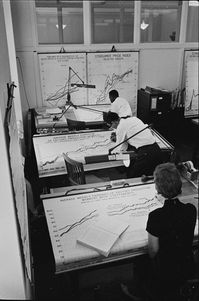
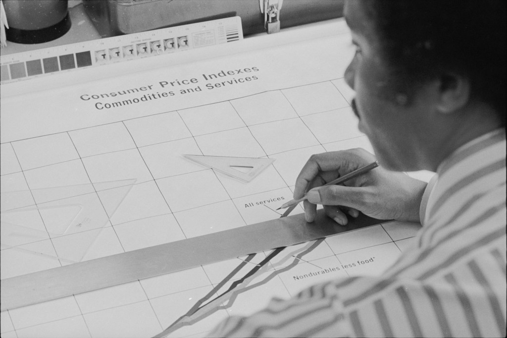
… there were artists in government agencies drawing time series graphs. As we discuss in this recent blog post, the Bureau of Labor Statistics (BLS) has been in the news lately—undoubtedly much more than the people who work there would like.
This post is not about the current controversy but steps back to make a bigger point: The availability of data has increased tremendously from the time when Glenn and Tony began their academic careers. In the 1980s, personal computers were becoming widespread, but the internet had not yet developed to the point where government statistics were available to download. To gather data usually required a trip to the university library to make photocopies of tables in the print publications of the BLS and other government agencies. You then had to enter the data by hand into very crude—by current standards—spreadsheet and statistical software. The software generally had limited graphing capabilities.
How were the time series figures in print government publications generated? The two photos shown above (both from the website of the Library of Congress) show that the figures were hand drawn by artists. The upper photo is from 1962 and the lower photo is from 1971.
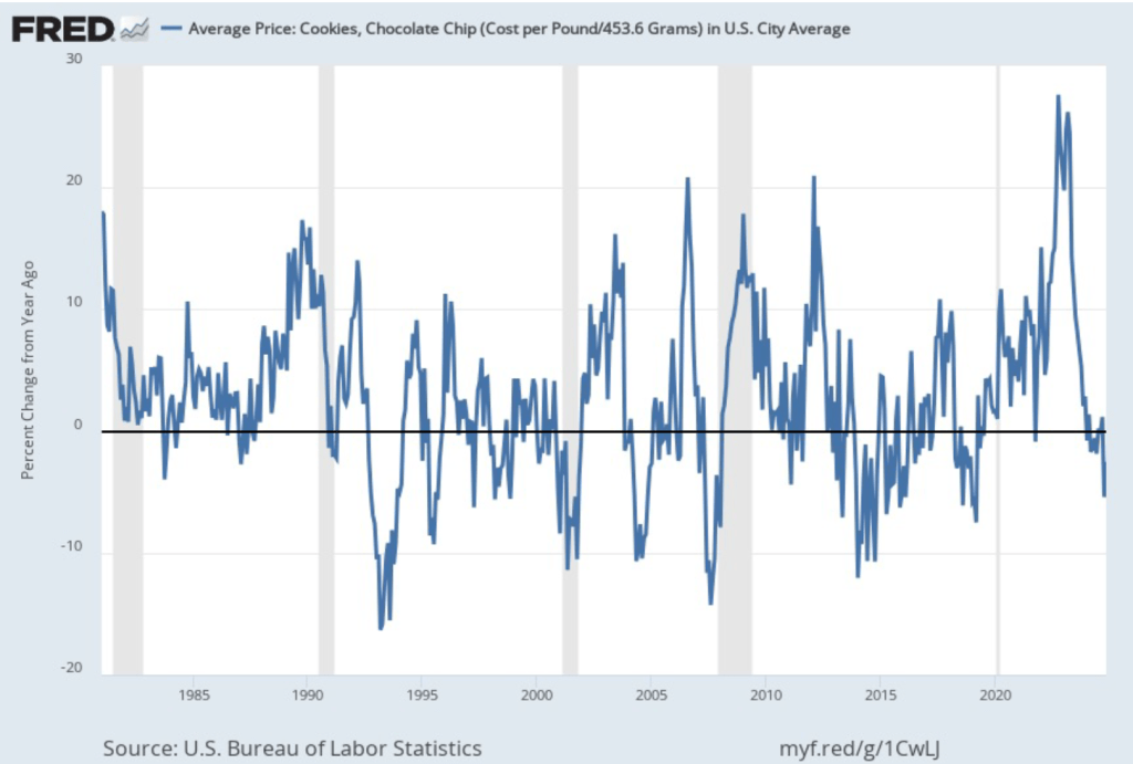
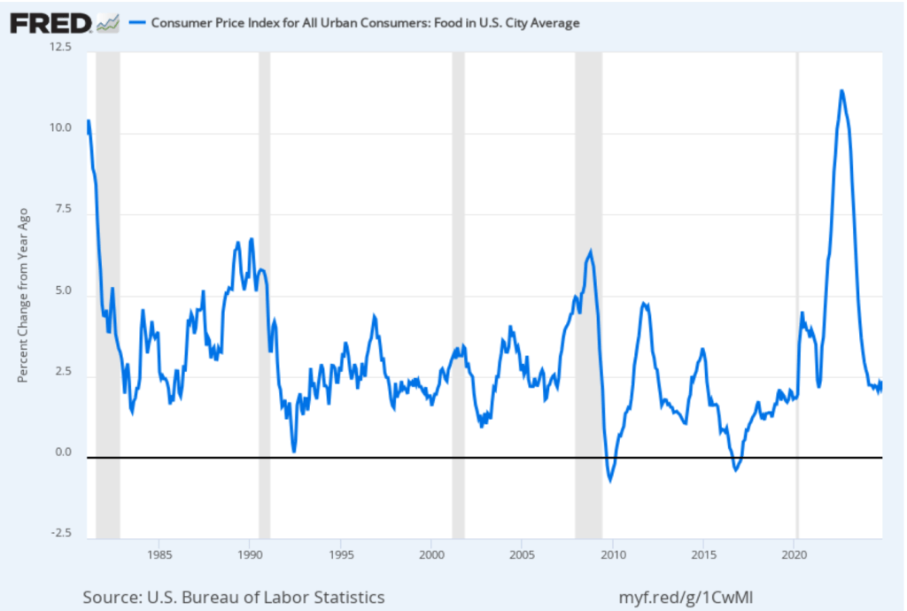
Today, most government data is readily available online. The FRED (Federal Reserve Economic Data) site, hosted by economists at the Federal Reserve Bank of St. Louis makes available thousands of data series. We make use of these series in the Data Exercises included in the end-of-chapter problems in our textbooks. The FRED site makes it easy (we hope!) to do these exercises, including by combining or otherwise transforming data series and by graphing them—no artistic ability required!