Image generated by ChatGTP-40
A number of news stories have highlighted the struggles some recent college graduates have had in finding a job. A report earlier this year by economists Jaison Abel and Richard Deitz at the Federal Reserve Bank of New York noted that: “The labor market for recent college graduates deteriorated noticeably in the first quarter of 2025. The unemployment rate jumped to 5.8 percent—the highest reading since 2021—and the underemployment rate rose sharply to 41.2 percent.” The authors define “underemployment” as “A college graduate working in a job that typically does not require a college degree is considered underemployed.”
The following figure shows data on the unemployment rate for people ages 20 to 24 years (red line) with a bachelor’s degree, the unemployment rate for people ages 25 to 34 years (blue line) with a bachelor’s degree, and the unemployment rate for the whole population (green line) whatever their age and level of education. (Note that the values for college graduates are for those people who have a bachelor’s degree but no advanced degree, such as a Ph.D. or an M.D.)

The figure shows that unemployment rates are more volatile for both categories of college graduates than the unemployment rate for the population as a whole. The same is true for the unemployment rates for nearly any sub-category of the unemployed lagely because the number of people included the sub-categories in the Bureau of Labor Statistics (BLS) household survey is much smaller than for the population as a whole. The figure shows that, over time, the unemployment rates for the youngest college graduates is nearly always above the unemployment rate for the population as a whole, while the unemployment rate for college graduates 25 to 34 years old is nearly always below the unemployment rate for the population as a whole. In June of this year, the unemployment rate for the population as a whole was 4.1 percent, while the unemployment for the youngest college graduates was 7.3 percent.
Why is the unemployment rate for the youngest college graduates so high? An article in the Wall Street Journal offers one explanation: “The culprit, economists say, is a general slowdown in hiring. That hasn’t really hurt people who already have jobs, because layoffs, too, have remained low, but it has made it much harder for people who don’t have work to find employment.” The following figure shows that the hiring rate—defined as the number of hires during a month divided by total employment in that month—has been falling. The hiring rate in June was 3.4 per cent, which—apart from two months at the beginning of the Covid pandemic—is the lowest rate since February 2014.

Abel and Deitz, of the New York Fed, have calculated the underemployment for new college graduates and for all college graduates. These data are shown in the following figure from the New York Fed site. The definitions used are somewhat different from the ones in the earlier figures. The definition of college graduates includes people who have advanced degrees and the definition of young college graduates includes people aged 22 years to 27 years. The data are three-month moving averages.
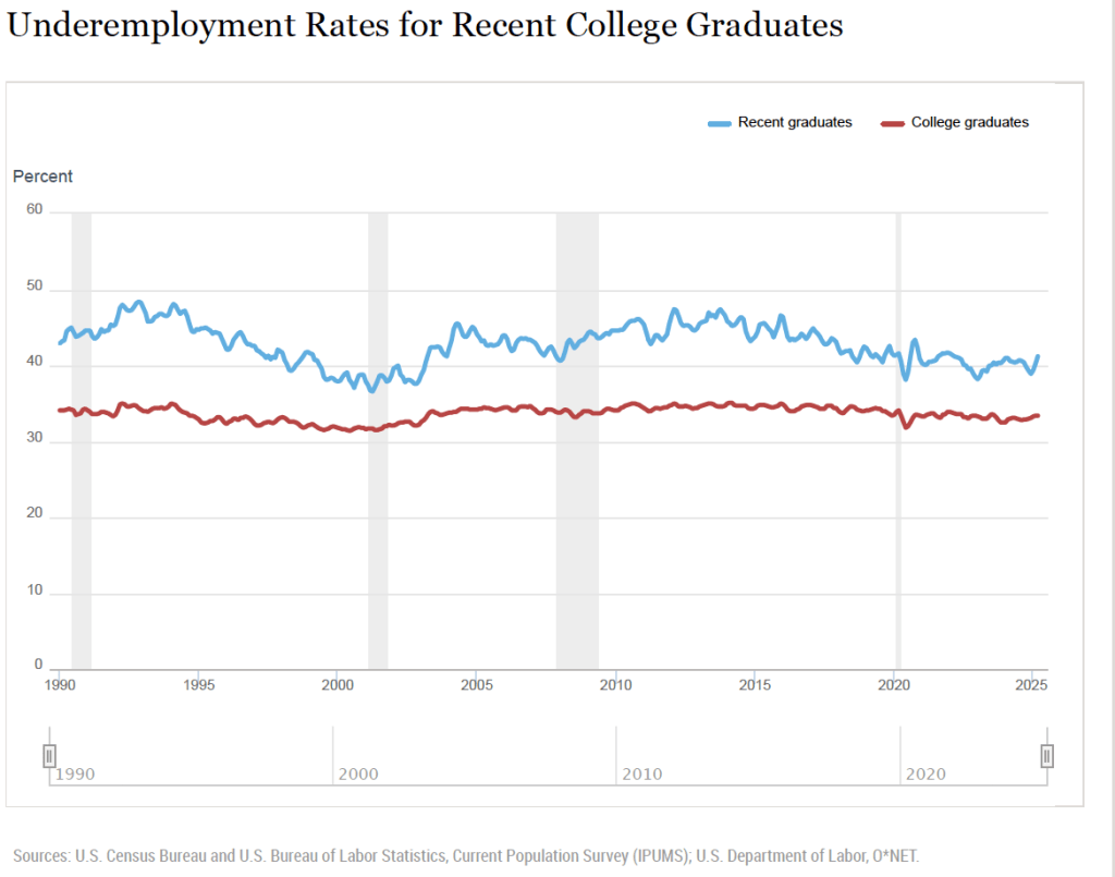
The data show that the underemployment rate for both recent graduates and all graduates are relatively high for the whole period shown. Typically, more than 30 percent of all college graduates and more than 40 percent of recent college graduates work in jobs in which more than 50 percent of employees don’t have college degrees. The latest underemployment rate for recent graduates is the highest since March 2022. It’s lower, though, than the rate for most of the period between the Great Recession of 2007–2009 and the Covid recession of 2020.
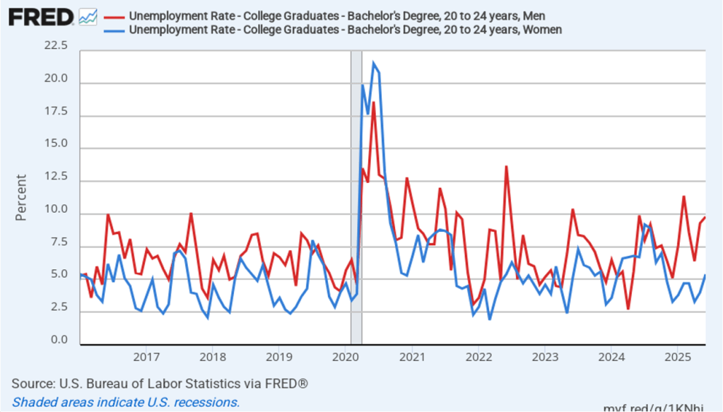
In a recent article, John Burn-Murdoch, a data journalist for the Financial Times, has made the point that the high unemployment rates of recent college graduates are concentrated among males. As the following figure shows, in recent months, unemployment rates among male college graduates 20 to 24 years old have been significantly higher than the unemployment rates among female college graduates. In June 2025, the unemployment rate for male recent college graduates was 9.8 percent, well above the 5.4 percent unemployment for female recent college graduates.
What explains the rise in male unemployment relative to female unemployment? Burn-Murdoch notes that, contrary to some media reports, the answer doesn’t seem to be that AI has resulted in a contraction in entry-level software coding jobs that have traditionally been held disproportionately by males. He presents data showing that “early-career coding employment is now tracking ahead of the [U.S.] economy.”
Instead he believes that the key is the continuing strong growth in healthcare jobs, which have traditionally been held disproportionately by females. The availability of these jobs has allowed women to fare better than men in an economy in which hiring rates have been relatively low.
Like most short-run trends, it’s possible that the relatively high unemployment rates experienced by recent college graduates may not continue in the long run.