Image created by ChatGTP=4o of workers on an automobile assembly line.
We noted in a blog post earlier this week that although the preliminary estimate from the Bureau of Economic Analysis (BEA) indicated that real GDP had declined during the first quarter of 2025, the report didn’t provide a clear indication that the U.S. economy was in recession. This morning (May 2), the Bureau of Labor Statistics (BLS) released its “Employment Situation” report (often called the “jobs report”) for April. The data in the report also show no sign that the U.S. economy is in a recession. Although there have been many stories in the media about businesspeople becoming increasingly pessimistic, we don’t yet see it in the employment data. We should add two caveats, however: 1. The effects of the large tariff increases the Trump Administration announced on April 2 are likely not reflected in the data from this report, and 2. at the beginning of a recession the data in the jobs report can be subject to large revisions.
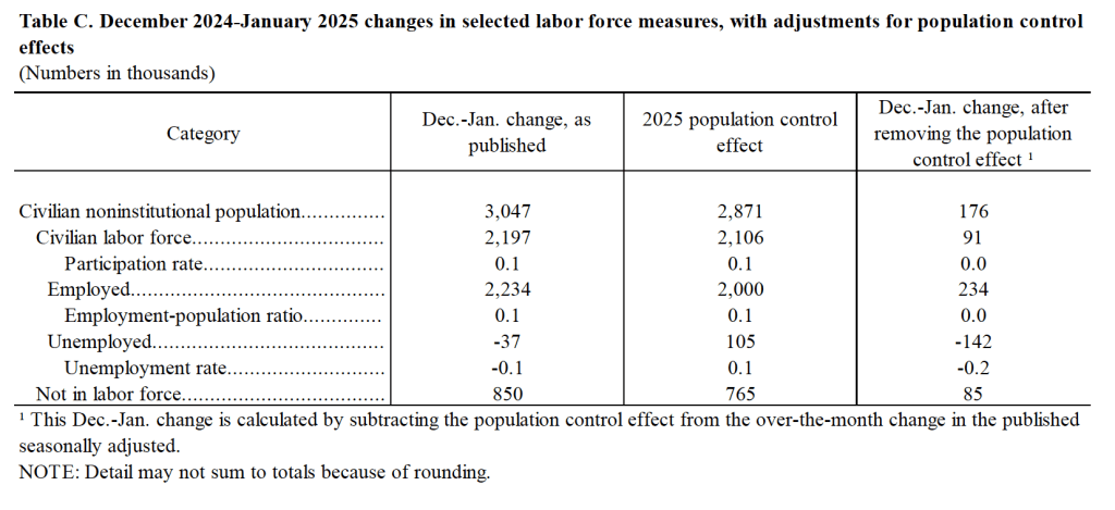
The jobs report has two estimates of the change in employment during the month: one estimate from the establishment survey, often referred to as the payroll survey, and one from the household survey. As we discuss in Macroeconomics, Chapter 9, Section 9.1 (Economics, Chapter 19, Section 19.1), many economists and Federal Reserve policymakers believe that employment data from the establishment survey provide a more accurate indicator of the state of the labor market than do the household survey’s employment data and unemployment data. (The groups included in the employment estimates from the two surveys are somewhat different, as we discuss in this post.)
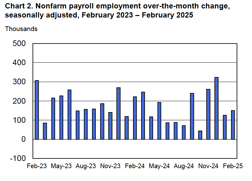
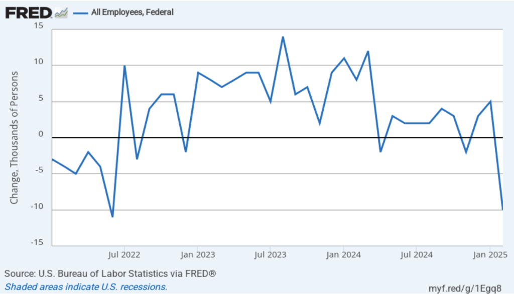
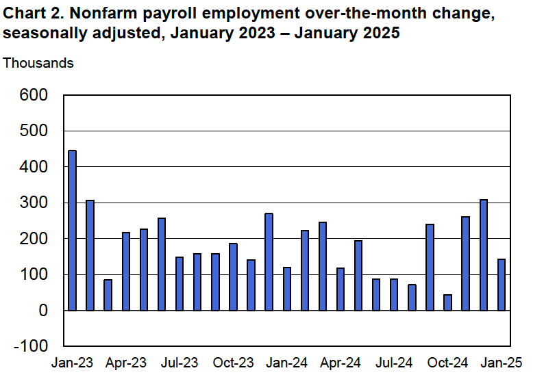
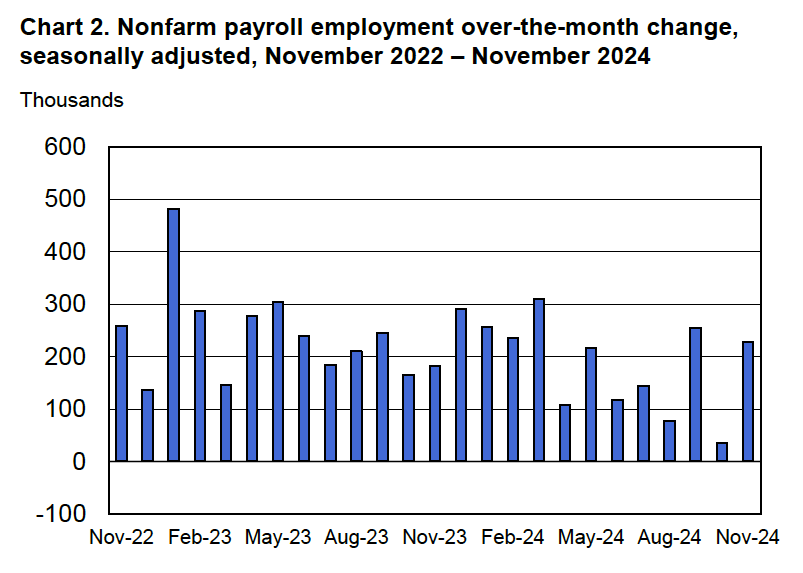
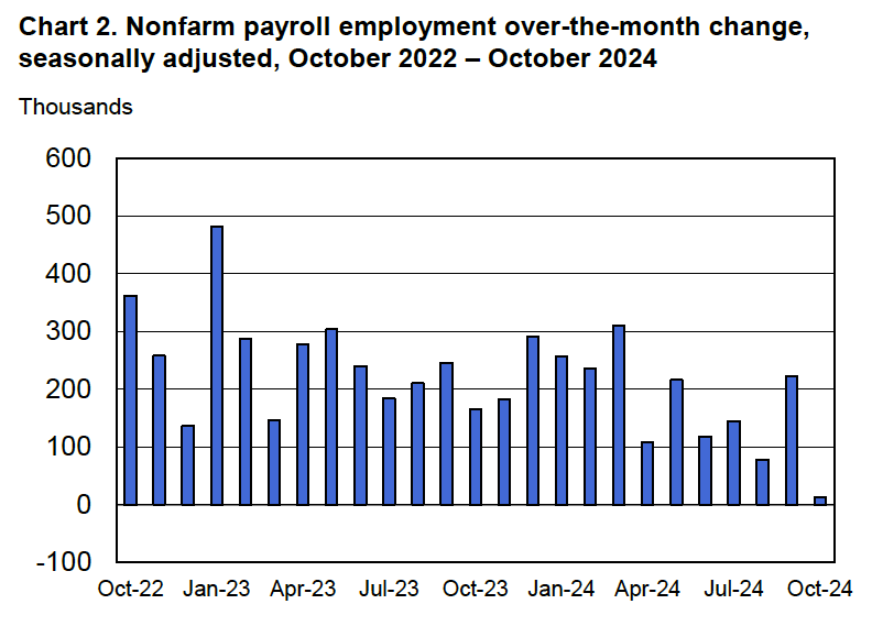
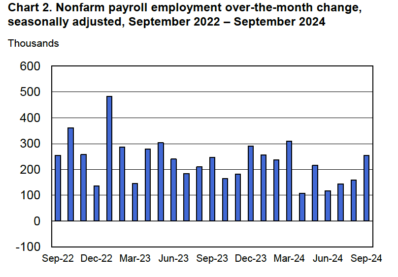
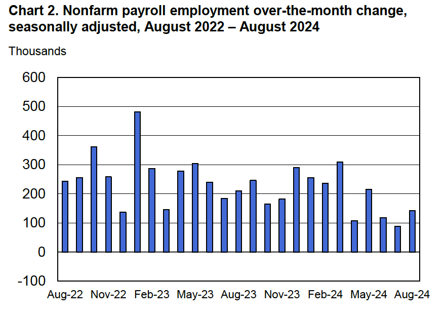
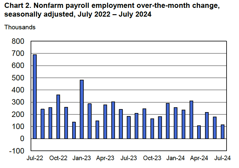
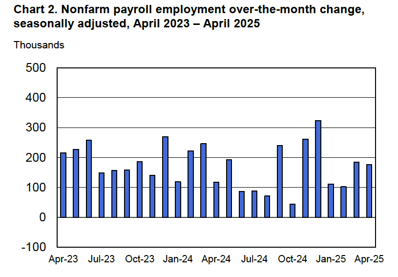
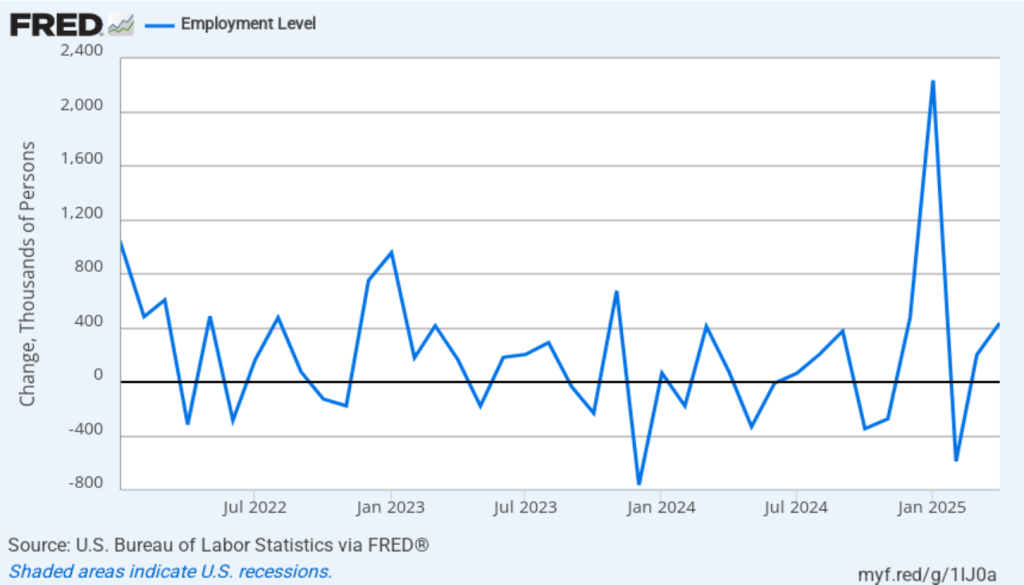
According to the establishment survey, there was a net increase of 177,000 jobs during April. This increase was well above the increase of 135,000 that economists surveyed had forecast. Somewhat offsetting this unexpectedly large increase was the BLS revising downward its previous estimates of employment in February and March by a combined 58,000 jobs. (The BLS notes that: “Monthly revisions result from additional reports received from businesses and government agencies since the last published estimates and from the recalculation of seasonal factors.”) The following figure from the jobs report shows the net change in payroll employment for each month in the last two years.
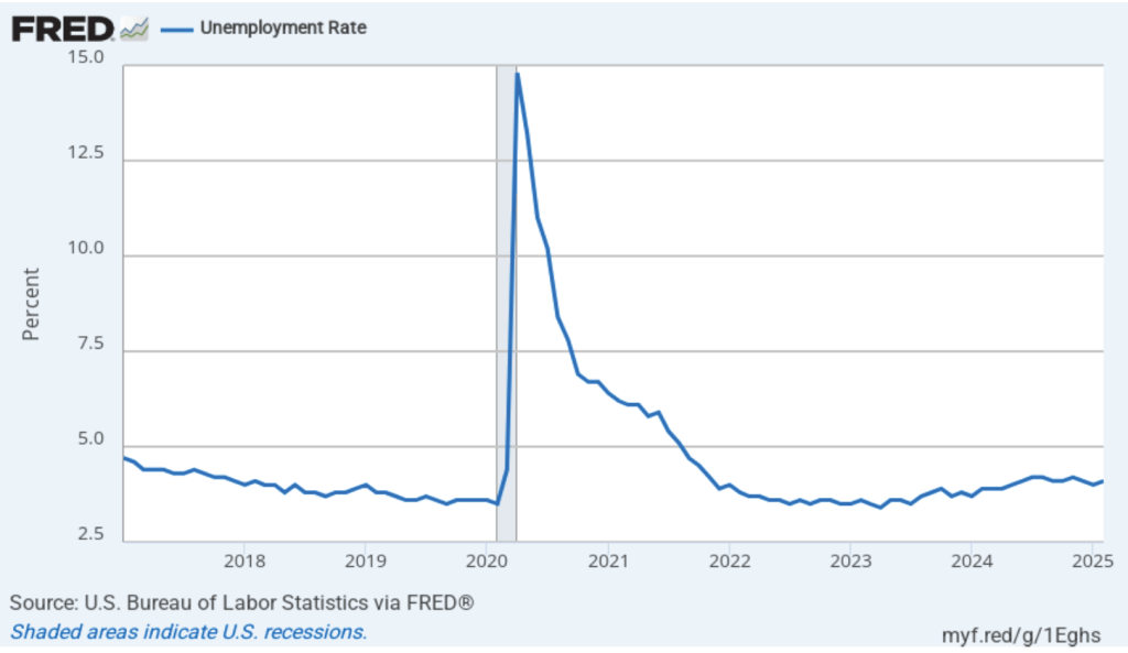
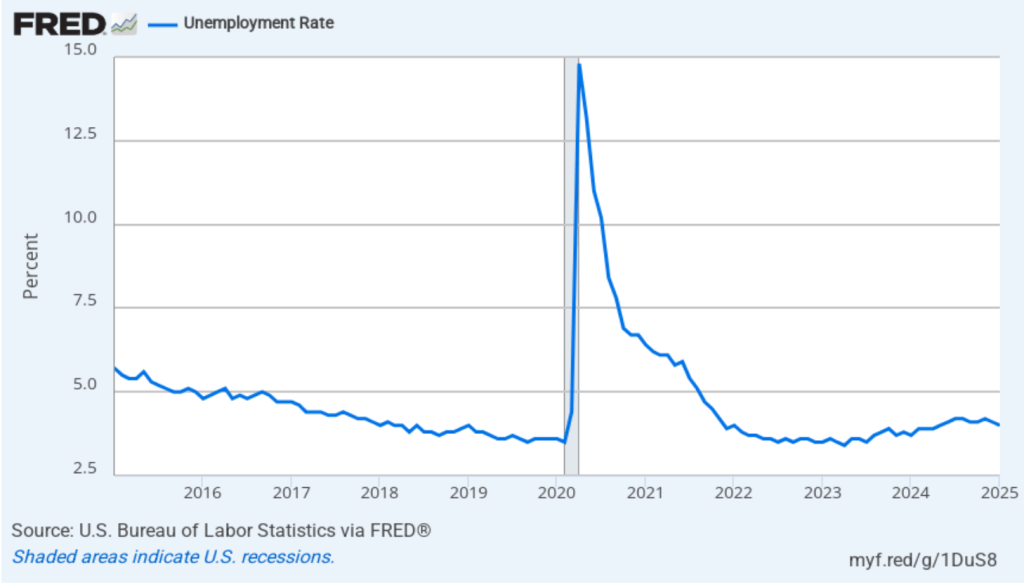
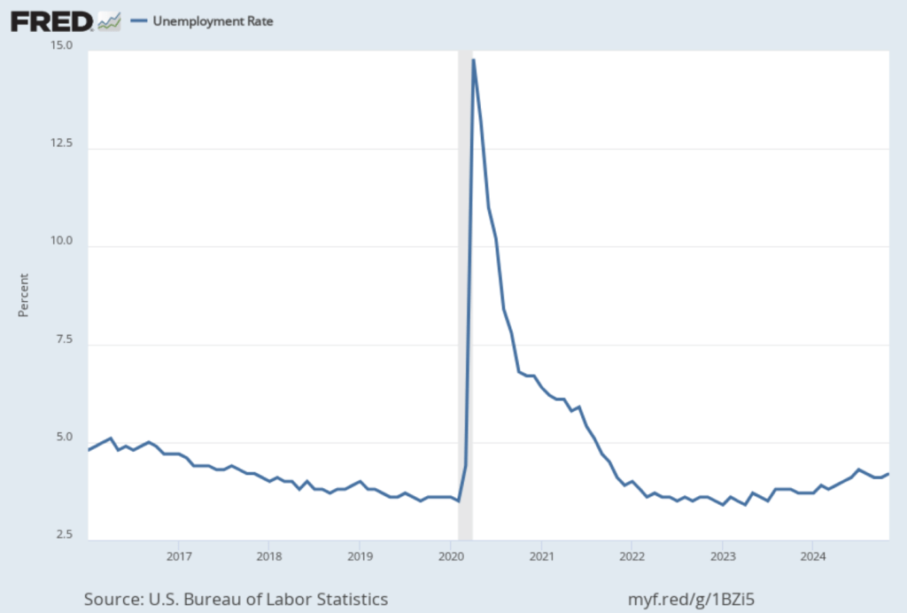
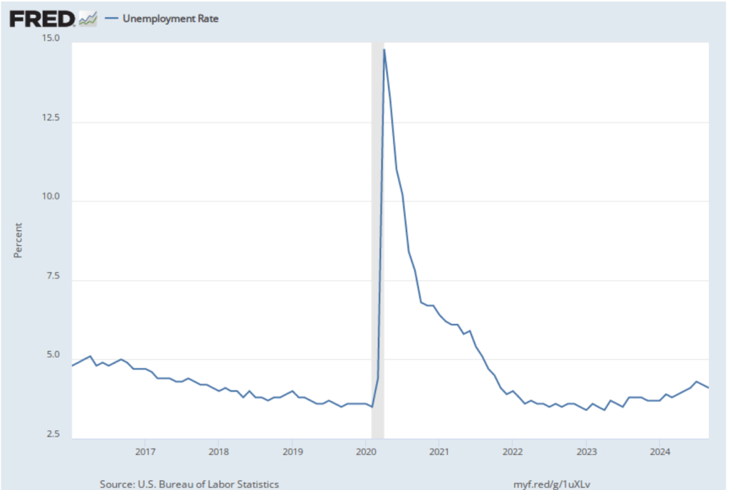
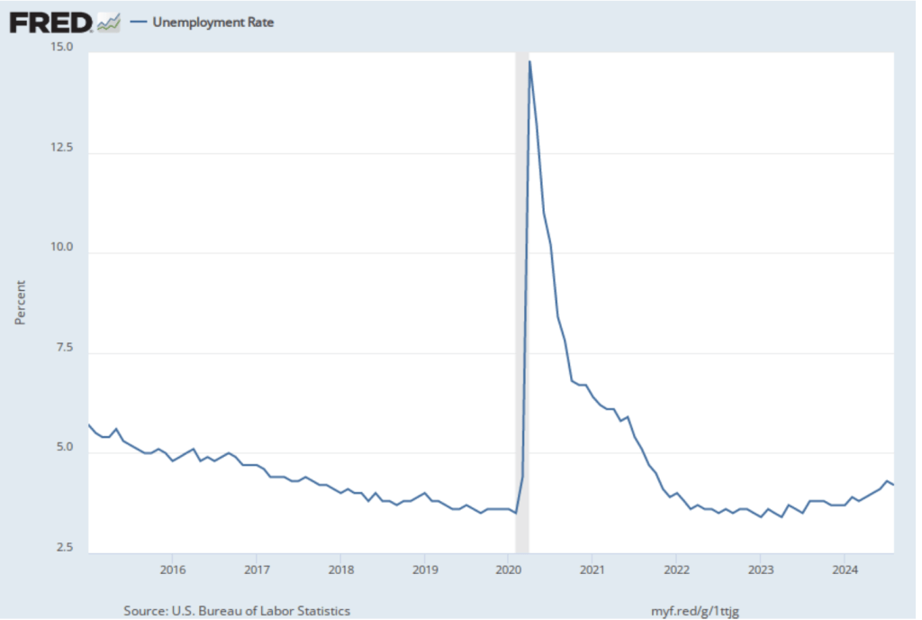
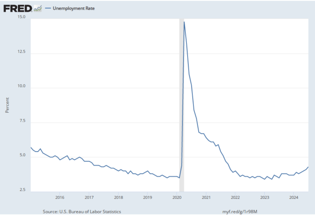
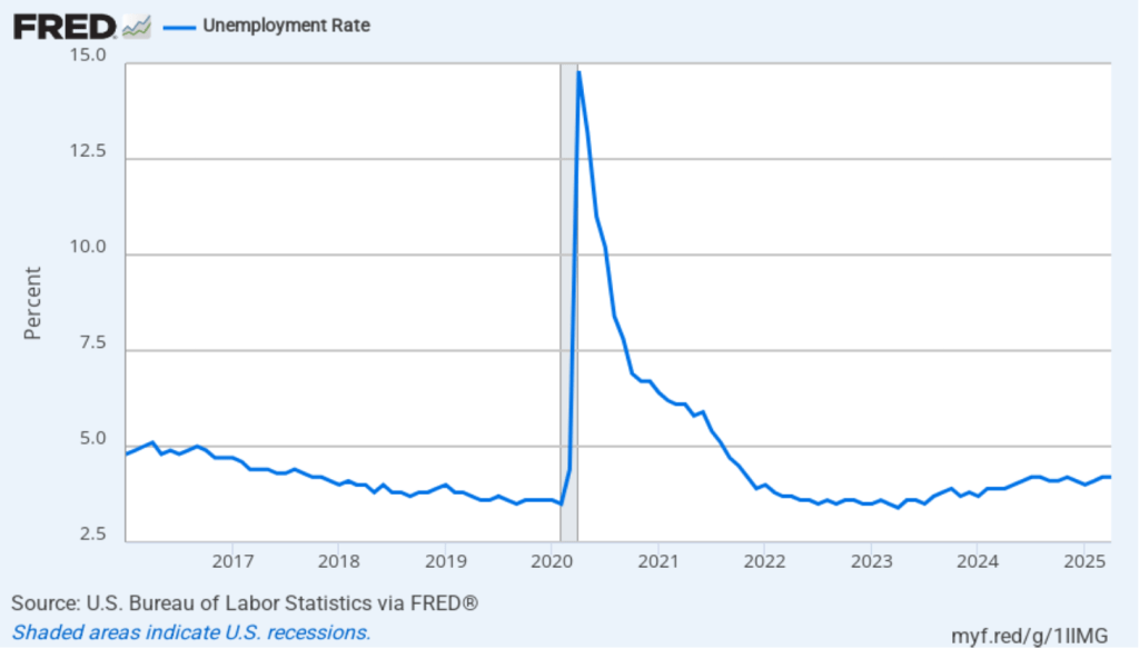
The unemployment rate was unchanged to 4.2 percent in April. As the following figure shows, the unemployment rate has been remarkably stable over the past year, staying between 4.0 percent and 4.2 percent in each month since May 2024. In March, the members of the Federal Open Market Committee (FOMC) forecast that the unemployment rate for 2025 would average 4.4 percent.
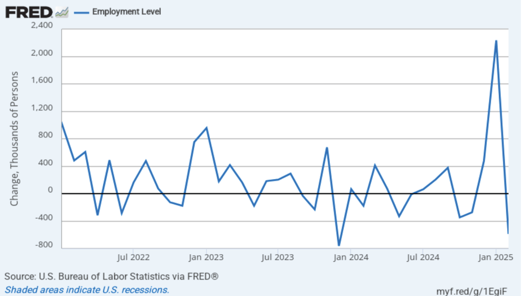
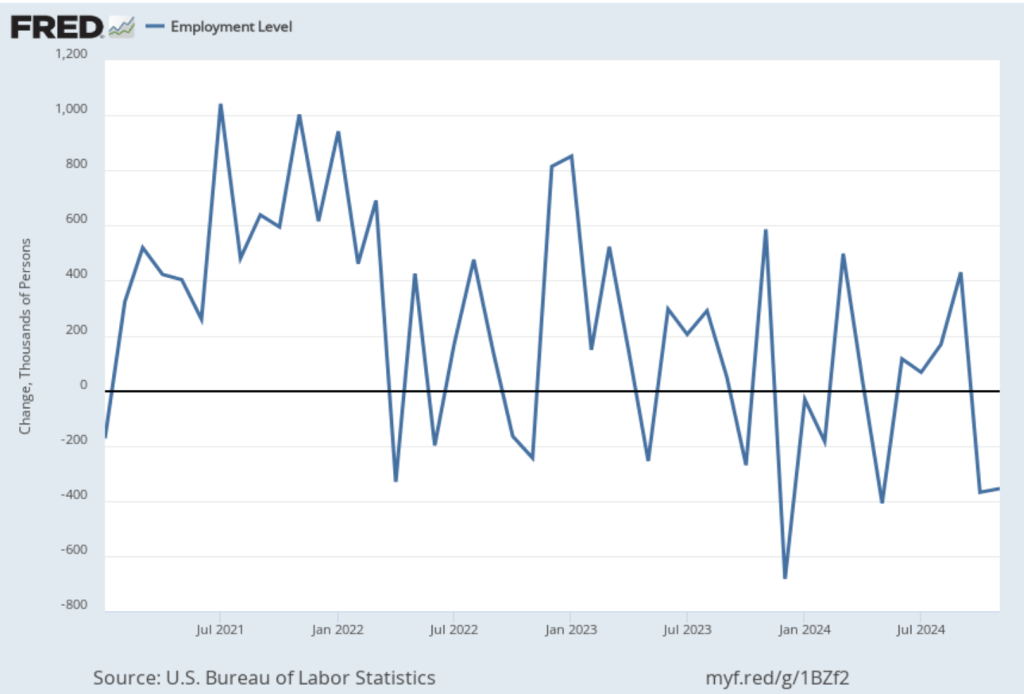
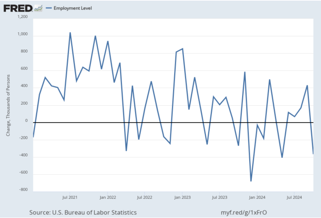
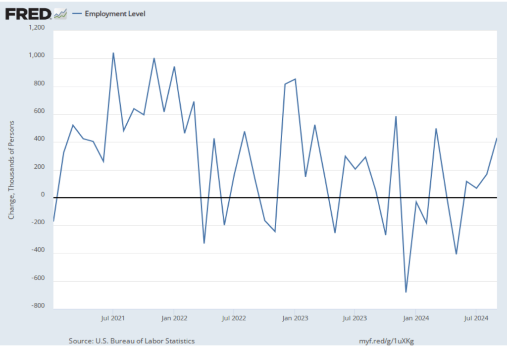
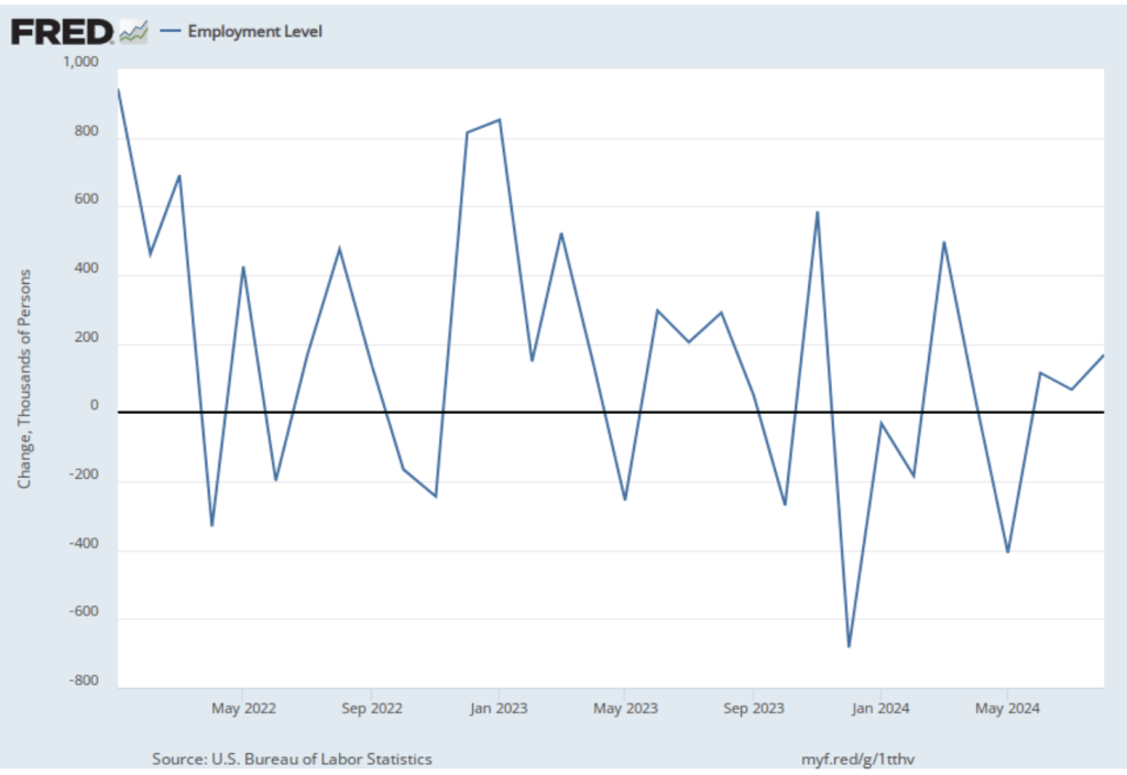
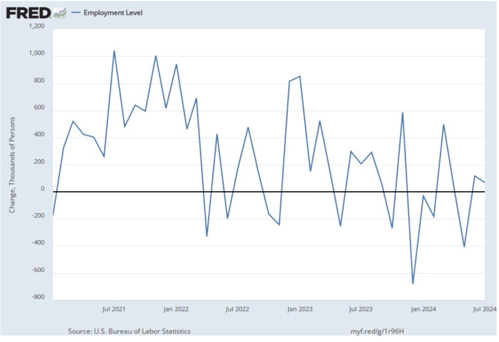
As the following figure shows, the monthly net change in jobs from the household survey moves much more erratically than does the net change in jobs from the establishment survey. As measured by the household survey, there was a net increase of 436,000 jobs in April, following an increase of 201,000 jobs in March. As an indication of the volatility in the employment changes in the household survey note the very large swings in net new jobs in January and February. In any particular month, the story told by the two surveys can be inconsistent with employment increasing in one survey while falling in the other. This month, however, both surveys showed net jobs increasing. (In this blog post, we discuss the differences between the employment estimates in the two surveys.)
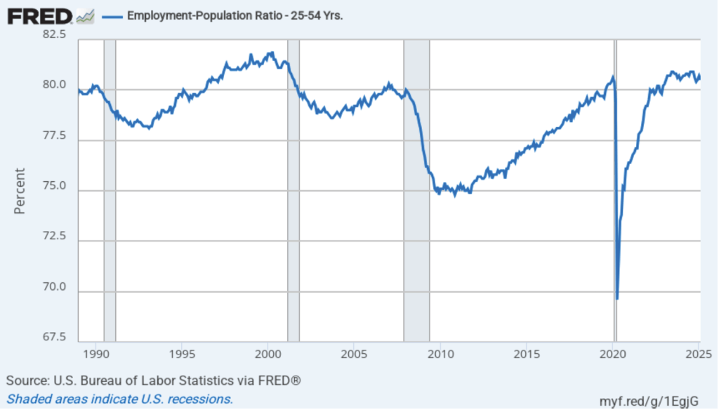
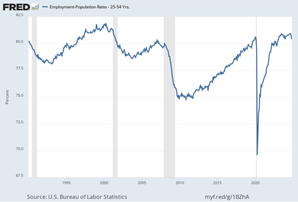
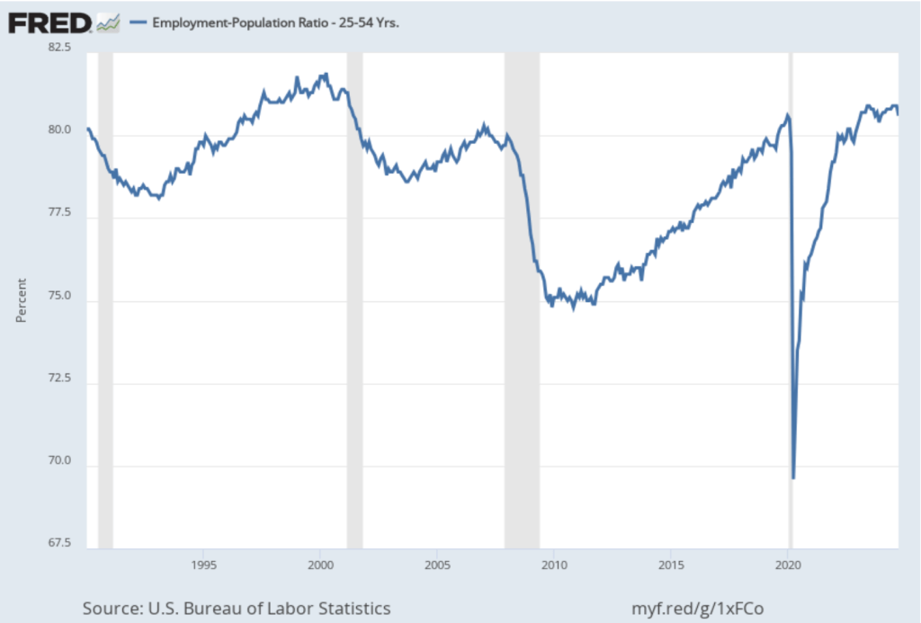
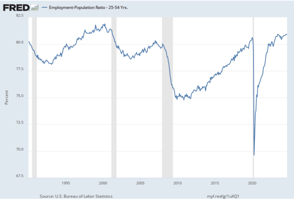
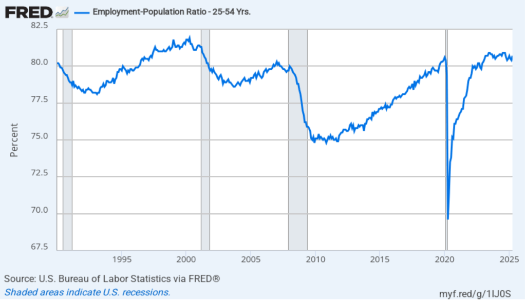
The household survey has another indication of continuing strength in the labor market. The employment-population ratio for prime age workers—those aged 25 to 54—increased from 80.4 percent in March to 80.7 percent in April. The prime-age employment-population ratio is somewhat below the high of 80.9 percent in mid-2024, but is above what the ratio was in any month during the period from January 2008 to January 2020.
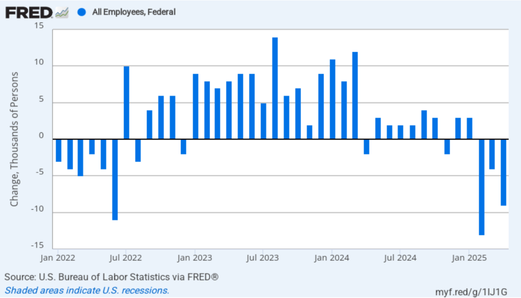
It remains unclear how many federal workers have been laid off since the Trump Administration took office. The establishment survey shows a decline in total federal government employment of 9,000 in April. However, the BLS notes that: “Employees on paid leave or receiving ongoing severance pay are counted as employed in the establishment survey.” It’s possible that as more federal employees end their period of receiving severance pay, future jobs reports may find a more significant decline in federal employment. To this point, the decline in federal employment has been too small to have a significant effect on the overall labor market.
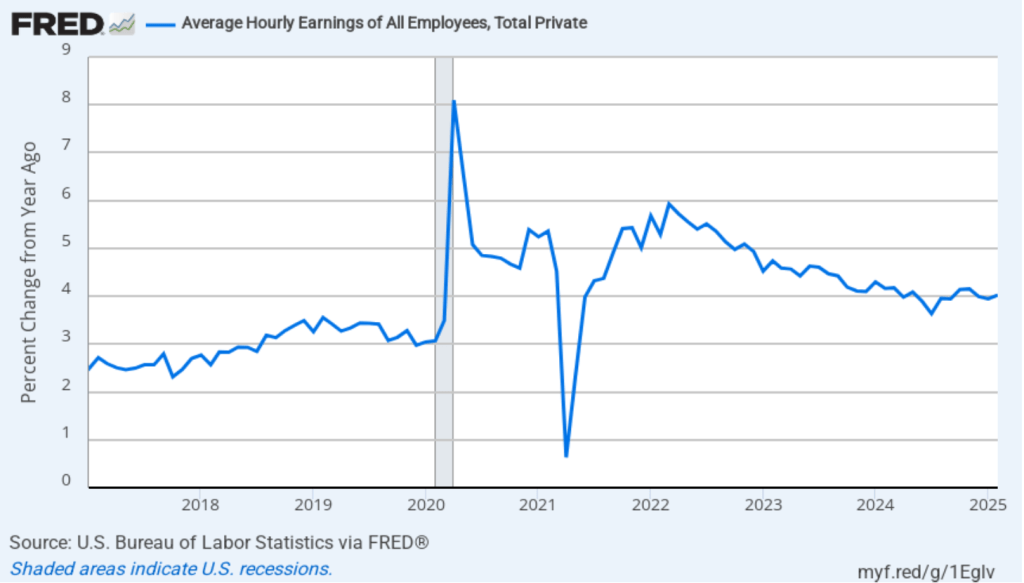
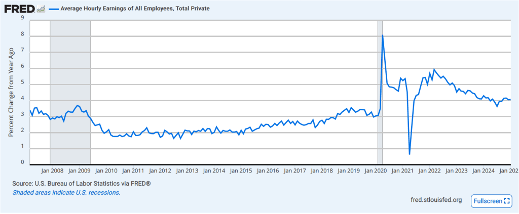
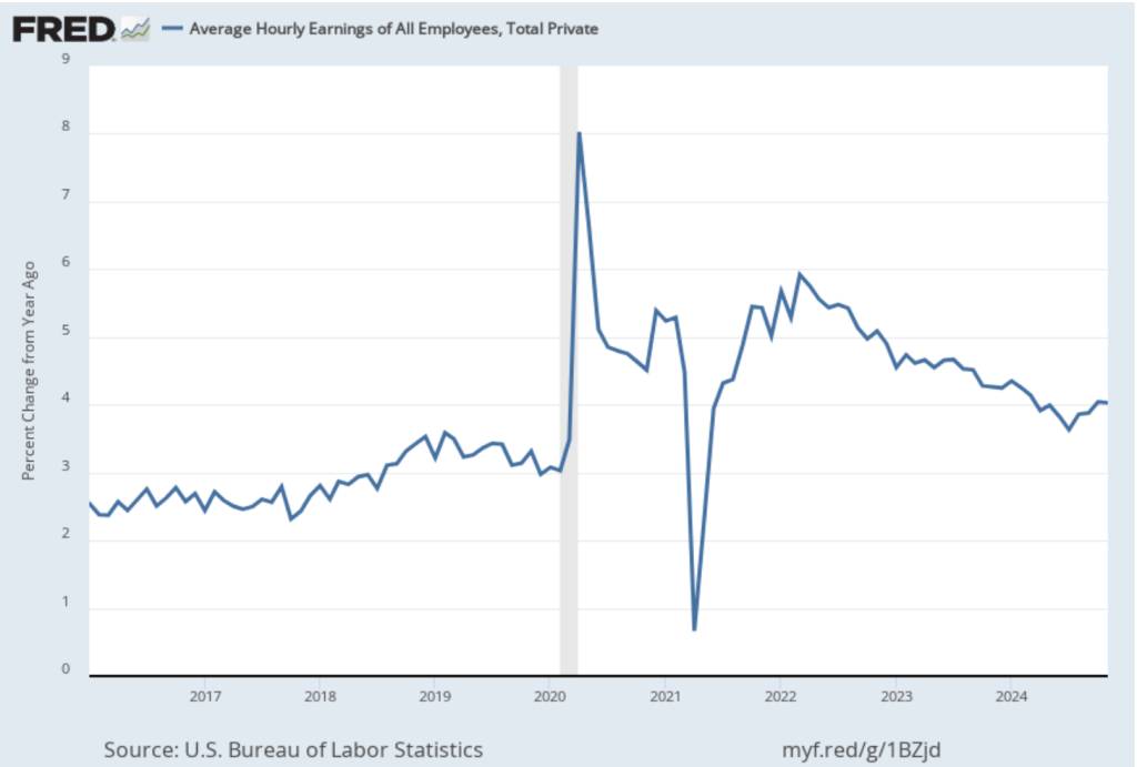
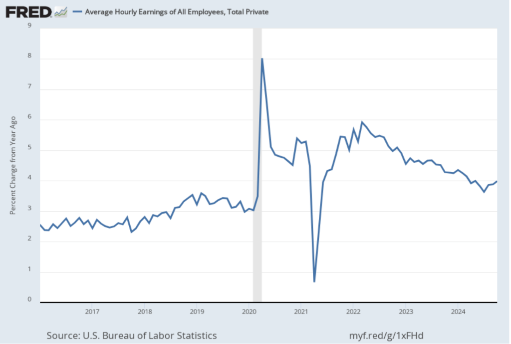
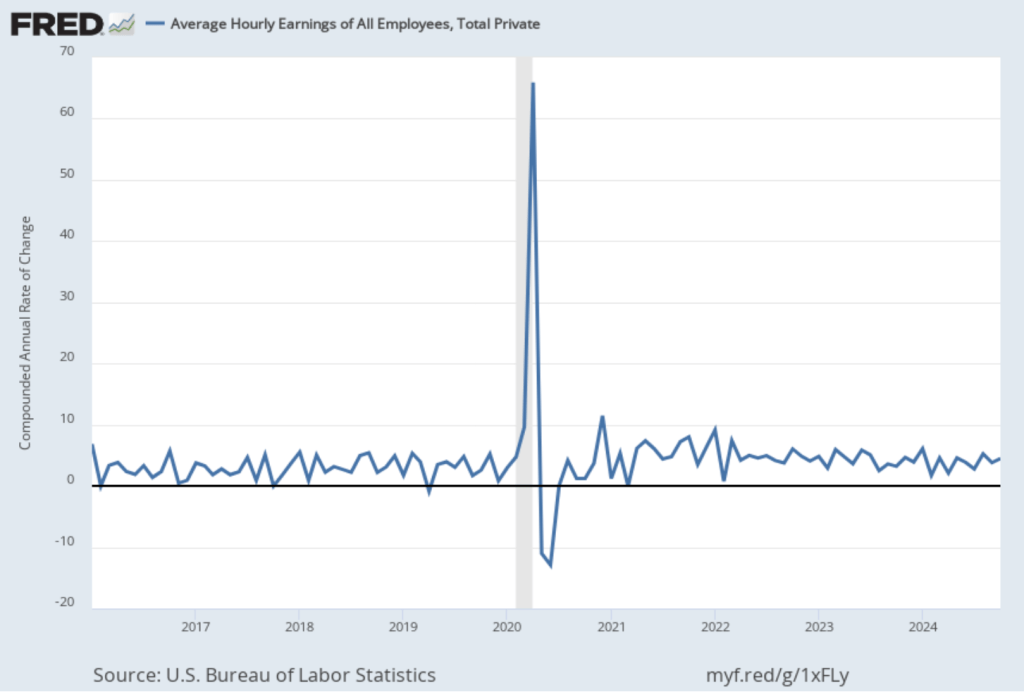
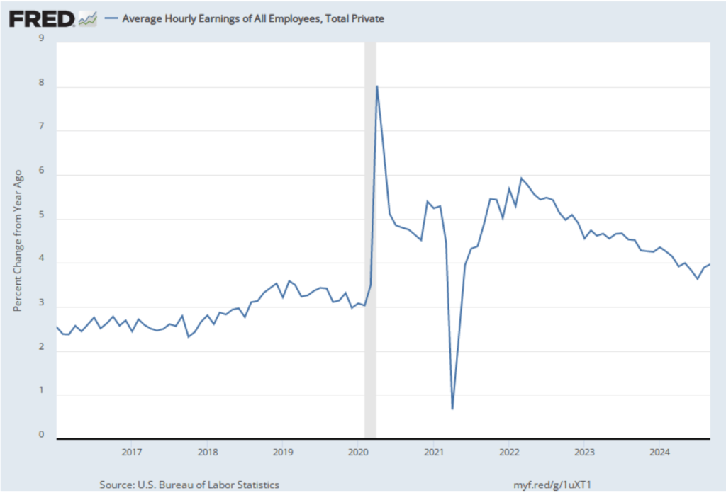
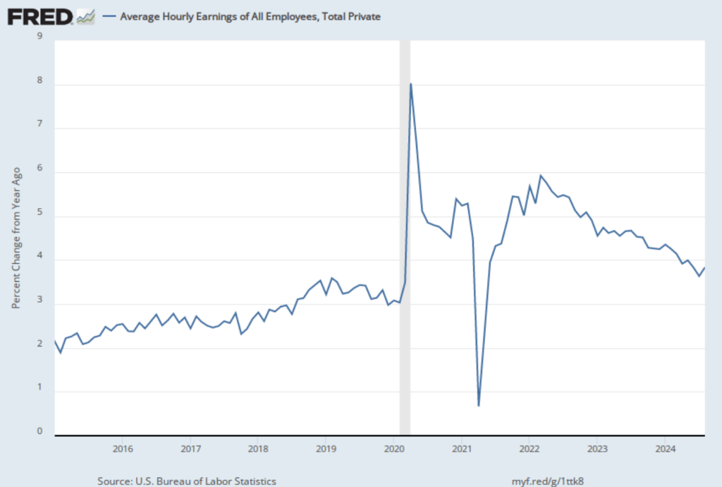
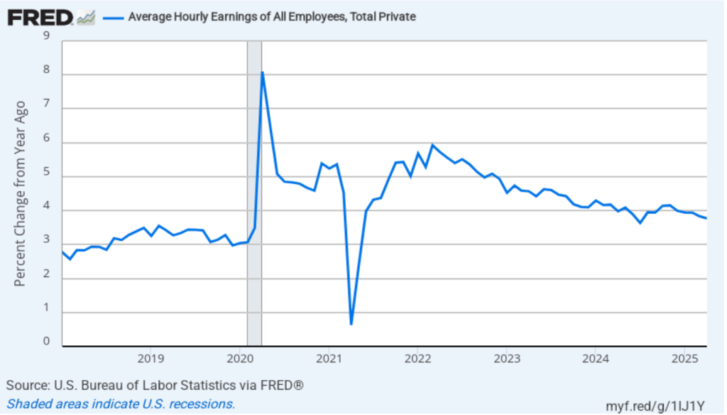
The establishment survey also includes data on average hourly earnings (AHE). As we noted in this post, many economists and policymakers believe the employment cost index (ECI) is a better measure of wage pressures in the economy than is the AHE. The AHE does have the important advantage of being available monthly, whereas the ECI is only available quarterly. The following figure shows the percentage change in the AHE from the same month in the previous year. The AHE increased 3.8 percent in April, which is unchanged from the March increase.
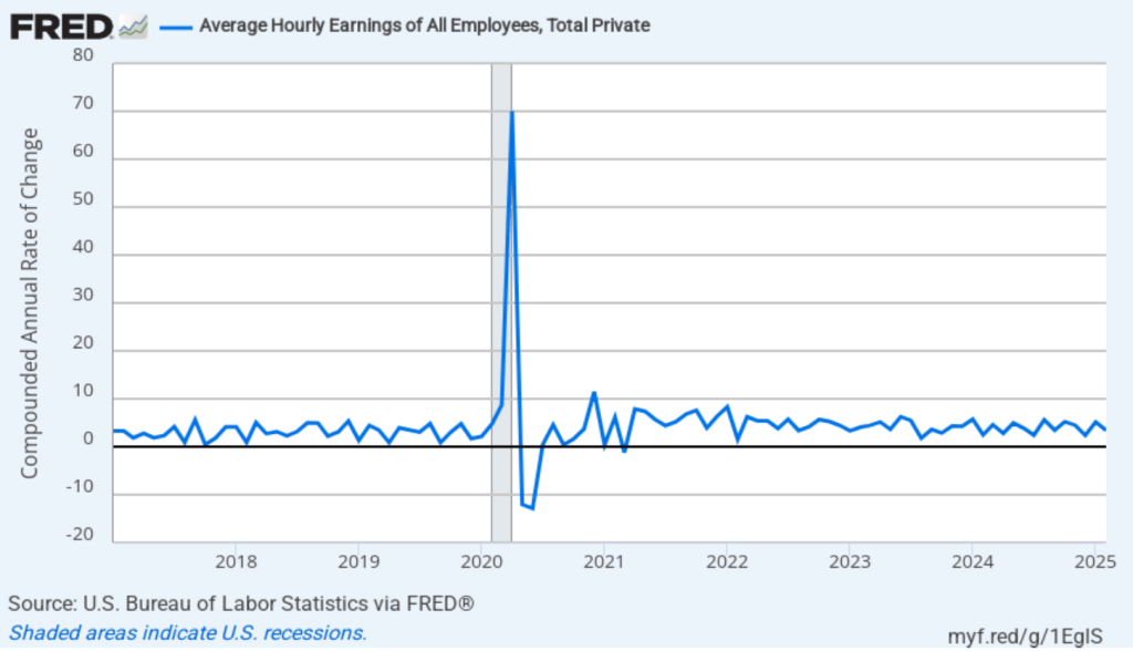
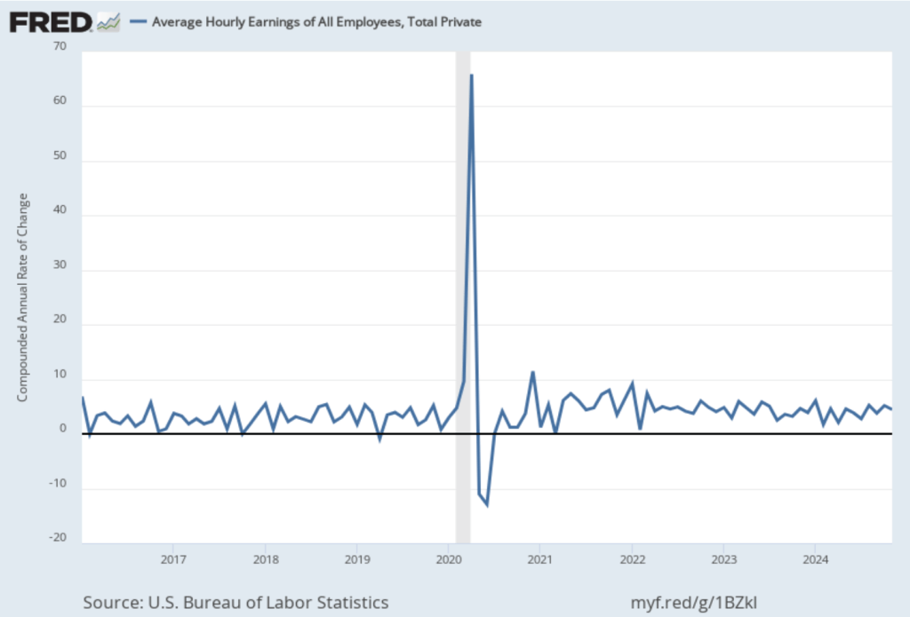
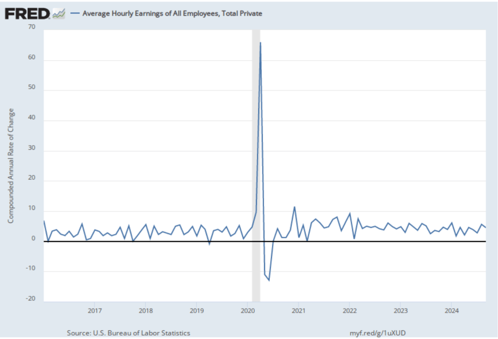
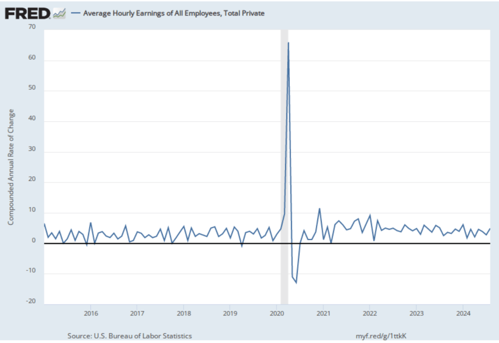
The following figure shows wage inflation calculated by compounding the current month’s rate over an entire year. (The figure above shows what is sometimes called 12-month wage inflation, whereas this figure shows 1-month wage inflation.) One-month wage inflation is much more volatile than 12-month wage inflation—note the very large swings in 1-month wage inflation in April and May 2020 during the business closures caused by the Covid pandemic. The April, the 1-month rate of wage inflation was 2.0 percent, down from 3.4 percent in March. If the 1-month increase in AHE is sustained, it would contribute to the Fed’s achieving its 2 percent target rate of price inflation.

Today’s jobs report leaves the situation facing the Federal Reserve’s policy-making Federal Open Market Committee (FOMC) largely unchanged. Looming over monetary policy, however, is the expected effect of the Trump Administration’s unexpectedly large tariff increases. As we note in this blog post, a large unexpected increase in tariffs results in an aggregate supply shock to the economy. In terms of the basic aggregate demand and aggregate supply model that we discuss in Macroeconomics, Chapter 13 (Economics, Chapter 23), an unexpected increase in tariffs shifts the short-run aggregate supply curve (SRAS) to the left, increasing the price level and reducing the level of real GDP.
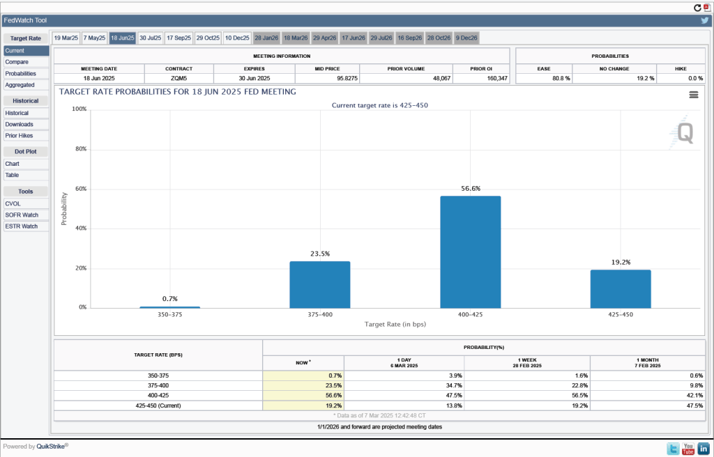
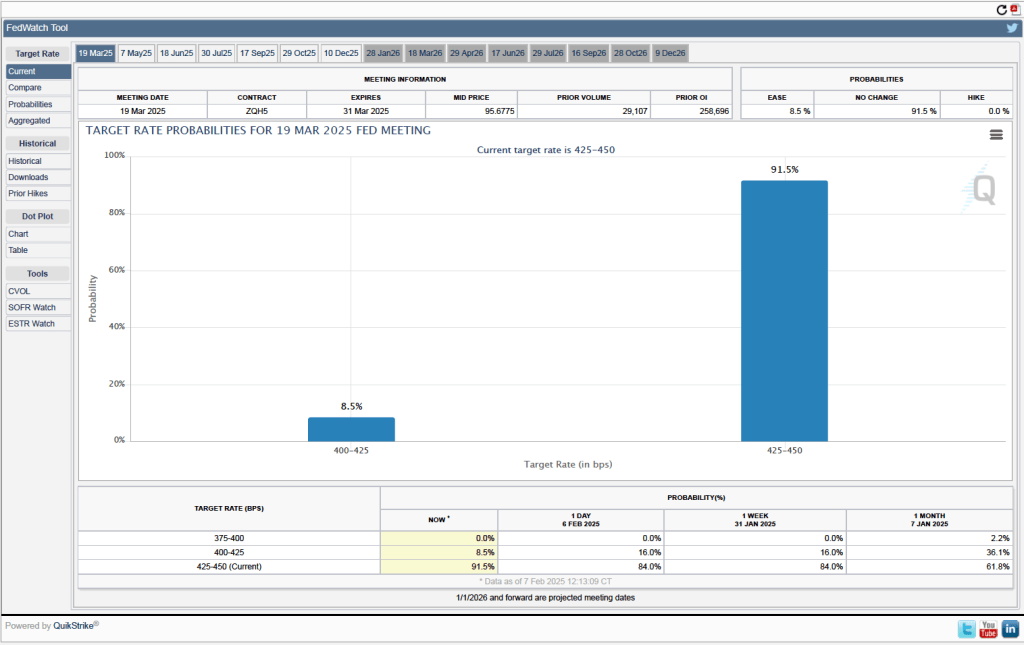
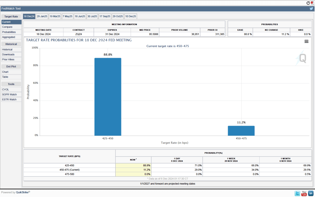
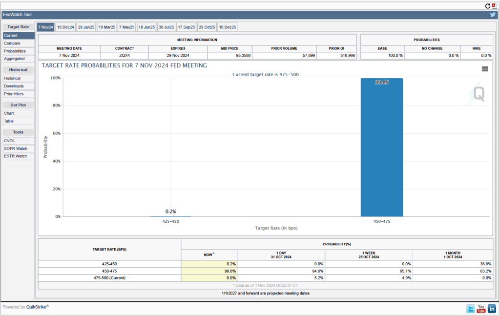
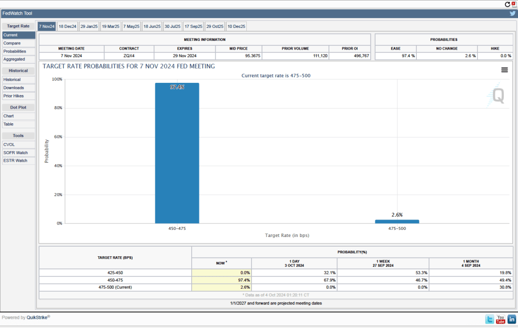
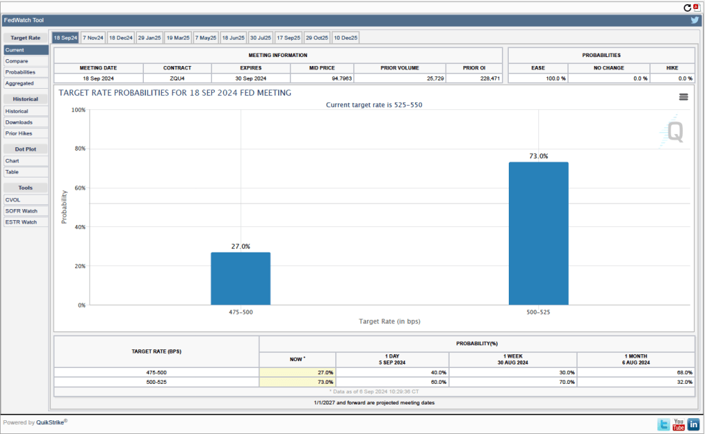
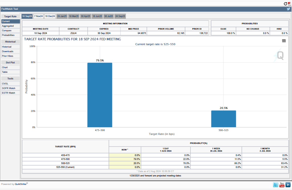
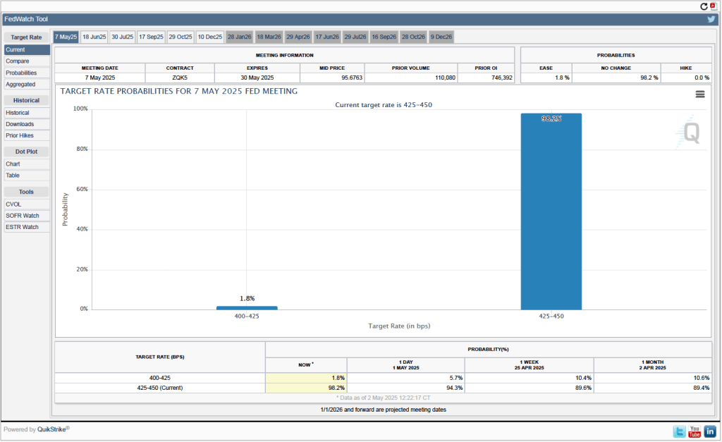
One indication of expectations of future changes in the target for the federal funds rate comes from investors who buy and sell federal funds futures contracts. (We discuss the futures market for federal funds in this blog post.) The data from the futures market indicate that, despite the potential effects of the surprisingly large tariff increases, investors don’t expect that the FOMC will cut its target for the federal funds rate at its May 6–7 meeting. As shown in the following figure, investors assign a 98.2 percent probability to the committee keeping its target unchanged at 4.25 percent to 4.50 percent at that meeting.
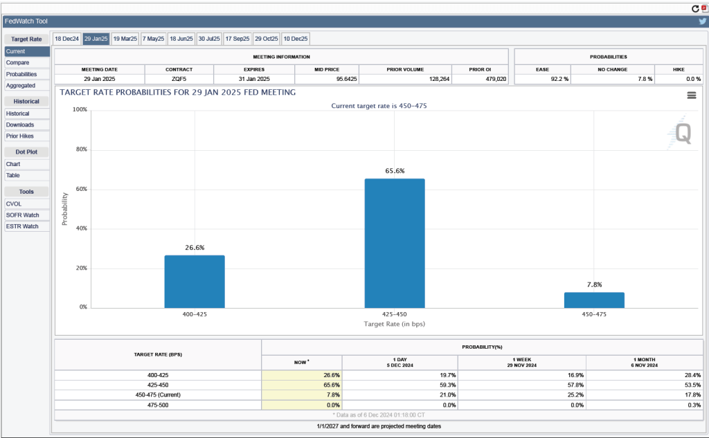
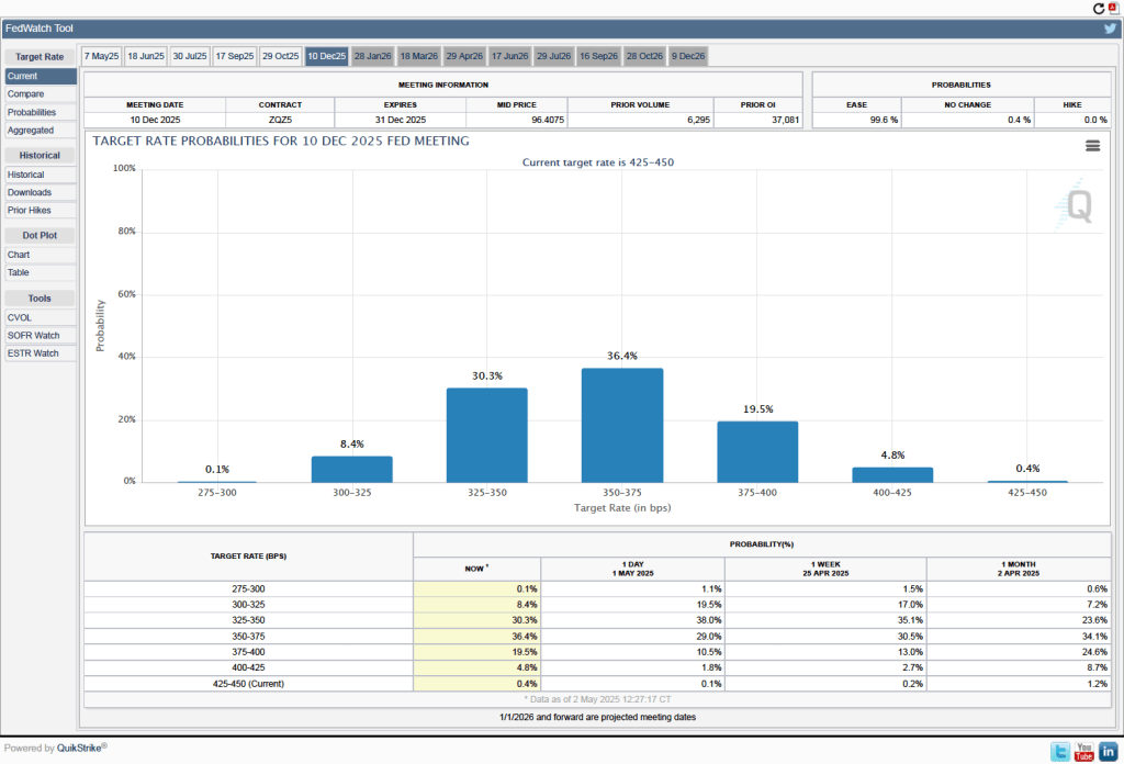
It’s a different story if we look at the end of the year. As the following figure shows, investors now expect that by the end of the FOMC’s meeting on December 9-10, the committee will have implemented at least three 0.25 percentage point (25 basis points) cuts in its target range for the federal funds rate. Investors assign a probability of 75.9 percent that the target range will end the year at 3.50 percent to 3.75 percent or lower. At their March meeting, FOMC members projected only two 25 basis point cuts this year—but that was before the announcement of the unexpectedly large tariff increases.
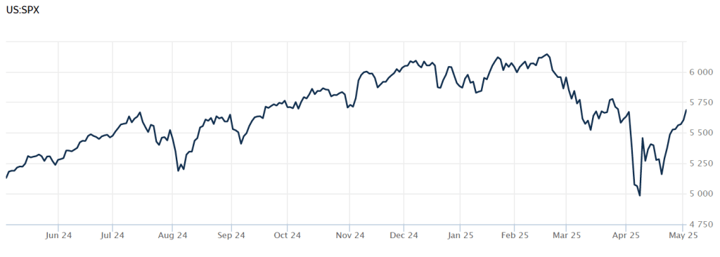
How the economy will fare for the remainder of the year depends heavily on what happens with respect to tariffs. News today that China and the United States may be negotiating lower tariff rates has contributed to rising stock prices. The following figure from the Wall Street Journal shows movements in the S&P stock index over the past year. The index declined sharply on April 2, following President Trump’s announcement of the tariff increases. As of 2 pm today, the S&P index has risen above its value on April 1, meaning that it has recovered all of the losses since the announcement of the tariff increases. The increase in stock prices likely indicates that investors expect that the tariff increases will end up being much smaller than those originally announced and that the chances of a recession happening soon are lower than they appeared to be on April 2.