Supports: Macroeconomics, Chapter 9,Economics, Chapter 19, and Essentials of Economics, Chapter 13.
Image generated by ChatGPT
A recent article on axios.com notes that from April 2023 to July 2024, the U.S. economy generated an average net increase of 177,000 jobs per month. Despite that job growth, the unemployment rate during that period increased by 0.8 percentage point. The article observes that: “At first glance, the combination of a rising unemployment rate and strong jobs growth simply does not compute.” How is it possible during a given period for both total employment and the unemployment rate to increase?
Solving the Problem Step 1: Review the chapter material. This problem is about calculating the unemployment rate, so you may want to review Chapter 9, Section 9.1, “Measuring the Unemployment Rate, the Labor Force Participation Rate, and the Employment-Population Ratio.”
Step 2: Answer the question by explaining how it’s possible for both the total number of people employed and the unemployment rate to both increase during the same period. The unemployment rate is equal to the number of people unemployed divided by the number of people in the labor force (multiplied by 100). The labor force equals the sum of the number of people employed and the number of people unemployed.
Let’s consider the situation in a particular month. Suppose that the unemployment rate in the previous month was 4 percent. If, during the current month, both the number of people employed and the number of people unemployed increase, the unemployment rate will increase if the increase in the number of people unemployed as a percentage of the increase in the labor force is greater than 4 percent. The unemployment rate will decrease if the increase in the number of people unemployed as a percentage of the increase in the labor force is less than 4 percent.
Consider a simple numerical example. Suppose that in the previous month there were 96 people employed and 4 people unemployed. In that case, the unemployment rate was (4/(96 + 4)) x 100 = 4.0%.
Suppose that during the month the number of people employed increases by 30 and the number of people unemployed increases by 1. In that case, there are now 126 people employed and 5 people unemployed. The unemployment rate will have fallen from 4.0% to (5/(126 + 5)) x 100 = 3.8%.
Now suppose that the number of people employed increased by 30 and the number of people unemployed increases by 3. The unemployment will have risen from 4.0% to (7/(126 + 7)) x 100 = 5.3%.
We can conclude that if both the total number of people employed and the total number of people unemployed increase during a during a period of time, it’s possible for the unemployment rate to also increase.
As we noted in yesterday’s blog post, the latest “Employment Situation” report from the Bureau of Labor Statistics (BLS) included very substantial downward revisions of the preliminary estimates of net employment increases for May and June. The previous estimates of net employment increases in these months were reduced by a combined 258,000 jobs. As a result, the BLS now estimates that employment increases for May and June totaled only 33,000, rather than the initially reported 291,000. According to Ernie Tedeschi, director of economics at the Budget Lab at Yale University, apart from April 2020, these were the largest downward revisions since at least 1979.
The size of the revisions combined with the estimate of an unexpectedly low net increase of only 73,000 jobs in June prompted President Donald Trump to take the unprecedented step of firing BLS Commissioner Erika McEntarfer. It’s worth noting that the BLS employment estimates are prepared by professional statisticians and economists and are presented to the commissioner only after they have been finalized. There is no evidence that political bias affects the employment estimates or other economic data prepared by federal statistical agencies.
Why were the revisions to the intial May and June estimates so large? The BLS states in each jobs report that: “Monthly revisions result from additional reports received from businesses and government agencies since the last published estimates and from the recalculation of seasonal factors.” An article in the Wall Street Journal notes that: “Much of the revision to May and June payroll numbers was due to public schools, which employed 109,100 fewer people in June than BLS believed at the time.” The article also quotes Claire Mersol, an economist at the BLS as stating that: “Typically, the monthly revisions have offsetting movements within industries—one goes up, one goes down. In June, most revisions were negative.” In other words, the size of the revisions may have been due to chance.
Is it possible, though, that there was a more systematic error? As a number of people have commented, the initial response rate to the Current Employment Statistics (CES) survey has been declining over time. Can the declining response rate be the cause of larger errors in the preliminary job estimates?
In an article published earlier this year, economists Sylvain Leduc, Luiz Oliveira, and Caroline Paulson of the Federal Reserve Bank of San Francisco assessed this possibility. Figure 1 from their article illustrates the declining response rate by firms to the CES monthly survey. The figure shows that the response rate, which had been about 64 percent during 2013–2015, fell significantly during Covid, and has yet to return to its earlier levels. In March 2025, the response rate was only 42.6 percent.
The authors find, however, that at least through the end of 2024, the falling response rate doesn’t seem to have resulted in larger than normal revisions of the preliminary employment estimates. The following figure shows their calculation of the average monthly revision for each year beginning with 1990. (It’s important to note that they are showing the absolute values of the changes; that is, negative change are shown as positive changes.) Depite lower response rates, the revisions for the years 2022, 2023, and 2024 were close to the average for the earlier period from 1990 to 2019 when response rates to the CES were higher.
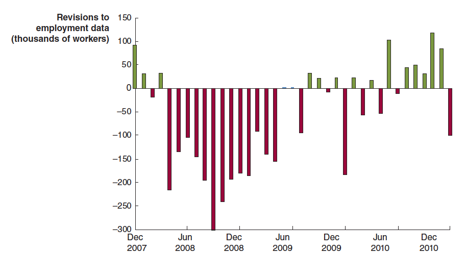
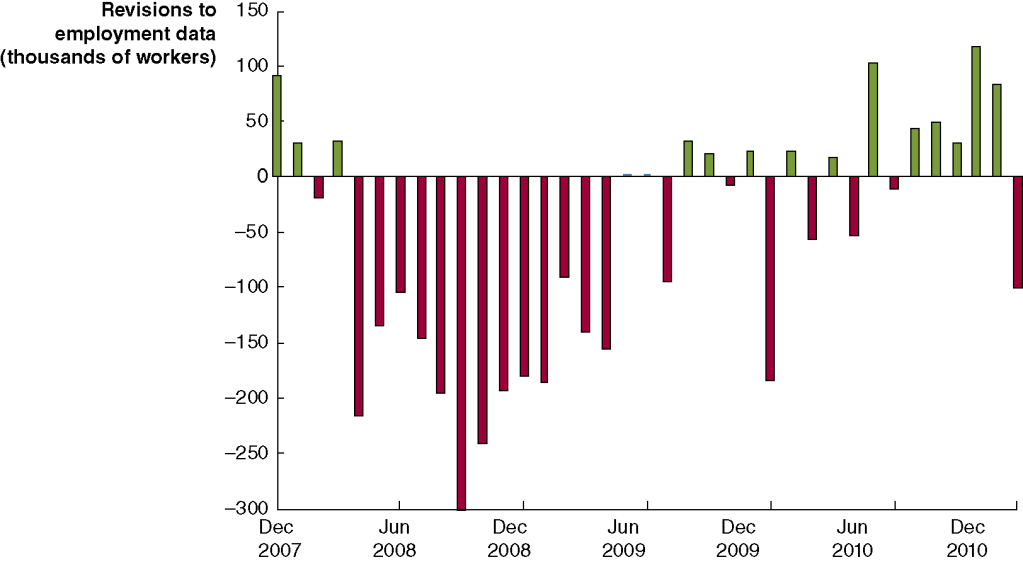
The weak employment numbers correspond to the period after the Trump administration announced large tariff increases on April 2. Larger firms tend to respond to the CES in a timely manner, while responses from smaller firms lag. We might expect that smaller firms would have been more likely to hesitate to expand employment following the tariff announcement. In that sense, it may be unsurprising that we have seen downward revisions of the prelimanary employment estimates for May and June as the BLS received more survey responses. In addition, as noted earlier, an overestimate of employment in local public schools alone accounts for about 40 percent of the downward revisions for those months. Finally, to consider another possibility, downward revisions of employment estimates are more likely when the economy is heading into, or has already entered, a recession. The following figure shows the very large revisisons to the establishment survey employment estimates during the 2007–2010 period.
At this point, we don’t fully know the reasons for the downward employment revisions announced yesterday, although it’s fair to say that they may have been politically the most consequential revisions in the history of the establishment survey.
Supports: Macroeconomics, Chapter 9,Economics, Chapter 19, and Essentials of Economics, Chapter 13.
Image generated by GTP-4o.
In its “Employment Situation” report for July 2024, the Bureau of Labor Statistics (BLS) stated that according to the household survey the total number of people employed, the total number of people unemployed, and the unemployment rate all increased. Would we expect this result to always hold? That is, in a month in which both the total number of people employed and the total number of people unemployed increased will the unemployment rate always increase? Briefly explain.
Solving the Problem Step 1: Review the chapter material. This problem is about calculating the unemployment rate, so you may want to review Chapter 9, Section 9.1, “Measuring the Unemployment Rate, the Labor Force Participation Rate, and the Employment-Population Ratio.”
Step 2: Answer the question by explaining whether we can be certain what happens to the unemployment rate in a month in which both the total number of people employed and the total number of people unemployed increased. The unemployment rate is equal to the number of people unemployed divided by the number of people in the labor force (multiplied by 100). The labor force equals the sum of the number of people employed and the number of people unemployed.
Suppose, for example, that the unemployment rate in the previous month was 4 percent. If both the number of people employed and the number of people unemployed increase, the unemployment rate will increase if the increase in the number of people unemployed as a percentage of the increase in the labor force is greater than 4 percent. The unemployment rate will decrease if the increase in the number of people unemployed as a percentage of the increase in the labor force is less than 4 percent.
Consider a simple numerical example. Suppose that in the previous month there were 96 people employed and 4 people unemployed. In that case, the unemployment rate will be (4/(96 + 4)) x 100 = 4.0%.
Suppose that during the month the number of people employed increases by 30 and the number of people unemployed increases by 1. In that case, there are now 126 people employed and 5 people unemployed. The unemployment rate will have fallen from 4.0% to (5/(126 + 5)) x 100 = 3.8%.
Now suppose that the number of people employed increased by 30 and the number of people unemployed increases by 3. The unemployment will have risen from 4.0% to (7/(126 + 7)) x 100 = 5.3%.
We can conclude that what happened in July 2024 need not always happen. If both the total number of people employed and the total number of people unemployed increased during a given month, we can’t be sure whether the unemployment rate has increased or decreased.
The monthly “Employment Situation” report from the Bureau of Labor Statistics (BLS) is closely watched by economists, investment analysts, and Federal Reserve policymakers. Many economists believe that the payroll employment data from the report is the best single indicator of the current state of the economy.
Most economists, inside and outside of the government, accept the dates determined by the Business Cycle Dating Committee of the National Bureau of Economic Research (NBER) for when a recession begins and ends. Although that committee takes into account a variety of macroeconomic data series, the peak of a business cycle as determined by the committee almost always corresponds to the peak in payroll employment and the trough of a business cycle almost always corresponds to the trough in payroll employment.
One drawback to relying too heavily on payroll employment data in gauging the state of the economy is that the data are subject to—sometimes substantial—revisions. As the BLS explains: “Monthly revisions result from additional reports received from businesses and government agencies since the last published estimates and from the recalculation of seasonal factors.” The revisions can be particularly large at the beginning of a recession.
For example, the following figure shows revisions the BLS made to its initial estimates of the change in payroll employment during the months around the 2007–2009 recession. The green bars show months for which the BLS revised its preliminary estimates to show that fewer jobs were lost (or that more jobs were created), and the red bars show months for which the BLS revised its preliminary estimates to show that more jobs were lost (or that fewer jobs were created).
For example, the BLS initially reported that employment declined by 159,000 jobs during September 2008. In fact, after additional data became available, the BLS revised its estimate to show that employment had declined by 460,000 jobs during the month—a difference of 300,000 more jobs lost. As the recession deepened between April 2008 and April 2009, the BLS’s initial reports underestimated the number of jobs lost by 2.3 million. In other words, the recession of 2007–2009 turned out to be much more severe than economists and policymakers realized at the time.
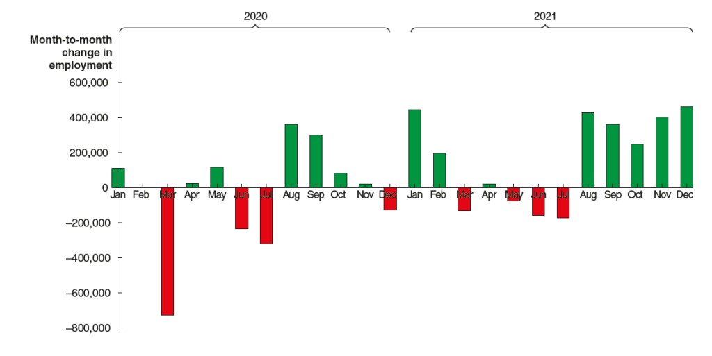
The BLS also made substantial revisions to its initial estimates of payroll employment for 2020 and 2021 during the Covid pandemic, as the following figure shows. (Note that this figure appears in our new 9th edition of Macroeconomics, Chapter 9, Section 9.1 (Economics, Chapter 19, Section 19.1 and Essentials of Economics, Chapter 13, Section 13.1).)
The BLS initially estimated that employment in March 2020 declined by about 700,000. After gathering more data, the BLS revised its estimate to indicate that employment declined by twice as much. Similarly, the BLS’s initial estimates substantially understated the actual growth in employment from August to December 2021. After gathering more data, the BLS revised its estimate to indicate that nearly 2 million more jobs had been created during those months than it had originally estimated.
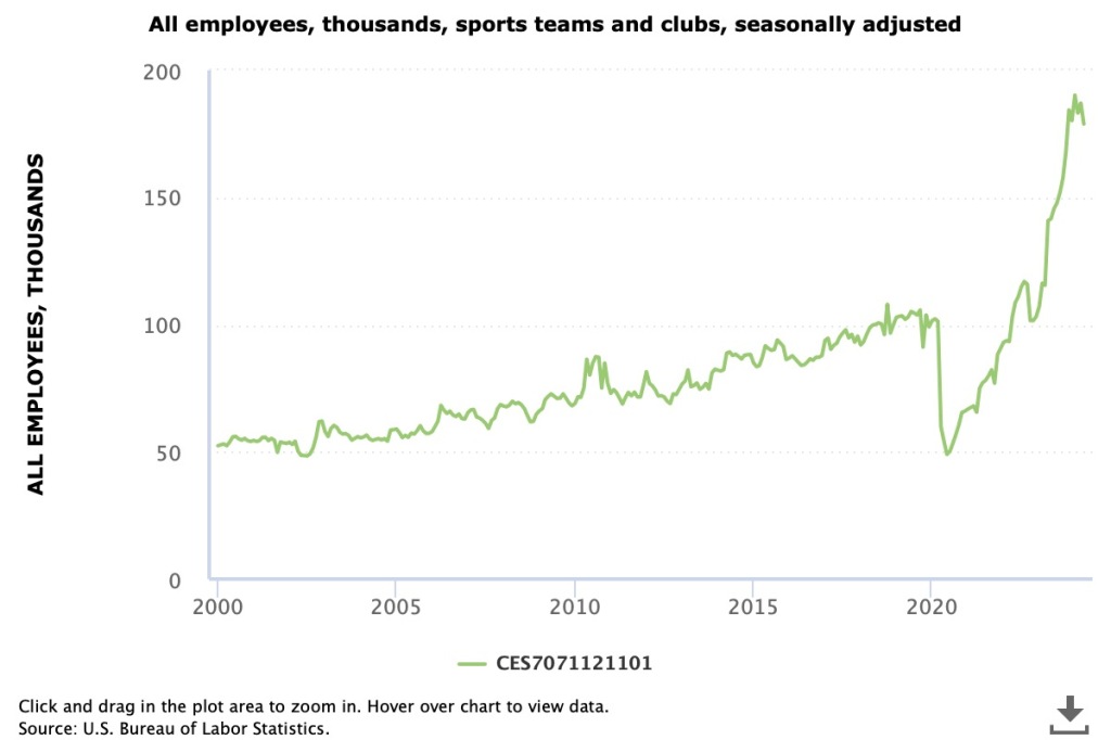
Just as the initial estimates for total payroll employment are often revised by sutbstantial amounts up or down, the same is true of the initial estimates of payroll employment in individual industries. Because the number of establishments surveyed in any particular industry can be small, the initial estimates can be highly inaccurate. For instance, Justin Fox, a columnist for bloomberg.com recently noted what appears to be a surge in employment in the “sports teams and clubs” industry. As the following figure shows, employment in this industry seems to have increased by an improbably large 75 percent. Was there a sudden increase in the United States in the number of new sports teams? Certainly not over just a few months. It’s more likely that most of the increase in employment in this industry will disappear when the initial employment estimates are revised.
One source of data for the BLS revisions to the monthly payroll employment data is the BLS’s “Quarterly Census of Employment and Wages.” The QCEW is based on the reports required of all firms that participate in the state and federal unemployment insurance program. The BLS estimates that 95 percent of all jobs in the United States are included in the QCEW data. As a result, the QCEW surveys about 11.9 million establishments as opposed to the 666,000 establishments included in the establishment survey.
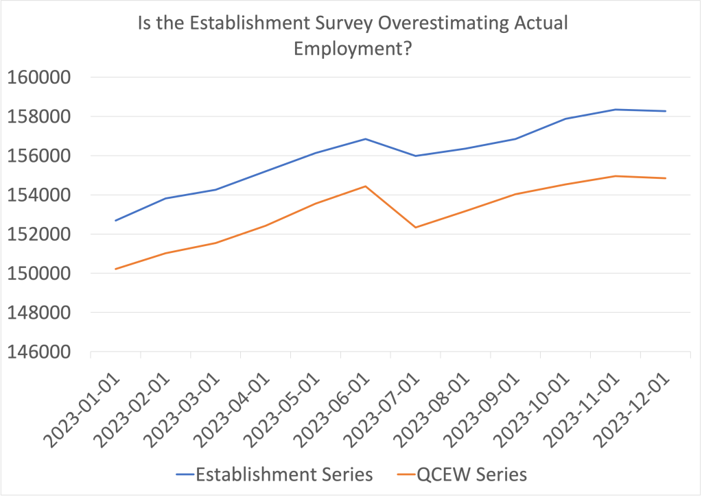
The BLS uses the QCEW to benchmark the payroll employment data, which reconciles the two series. The BLS makes the revisions with a lag. For instance, the payroll employment data for 2023 won’t be revised using the QCEW data until August 2024. Looking at the 2023 employment data from the two series shows a large discrepancy, as seen in the following figure.
The blue line shows the employment data from the establishment survey and the orange line shows the data from the QCEW survey. (Both series are of nonseasonally adjusted data.) The values on the vertical axis are thousands of workers. In December 2023, the establishment survey indicated that a total of 158,347,000 people were employed in the nonfarm sector in the United States. The QCEW series shows a total of 154,956,133 people were employed in the nonfarm sector—about 3.4 million fewer.
How can we interpret the discrepancy between the employment totals from the two series? The most straightforward interpretation is that the QCEW data, which uses a larger sample, is more accurate and payroll employment has been significantly overstating the level of employment in the U.S. economy. In other words, the labor market was weaker in 2023 than it seemed, which may help to explain why inflation slowed as much as it did, particularly in the second half of the year.
However, this interpretation is not clear cut because the QCEW data are also subject to revision. As Ernie Tedeschi, director of economics at the Budget Lab at Yale and former chief economist for the Council of Economic Advisers, has pointed out, the QCEW data are typically revised upwards, which would close some of the gap between the two series. So, although it seems likely that the closely watched payroll employment data have overstated the strength of the labor market, we won’t get a clearer indication of how large the overstatement is until August when the BLS will use the QCEW data to benchmark the payroll employment data.
A bookstore in New York City closed during Covid. (Photo from the New York Times)
Four years ago, in mid-March 2020, Covid–19 began to significantly affect the U.S. economy, with hospitalizations rising and many state and local governments closing schools and some businesses. In this blog post we review what’s happened to key macro variables during the past four years. Each monthly series starts in February 2020 and the quarterly series start in the fourth quarter of 2019.
Production
Real GDP declined by 5.8 percent from the fourth quarter of 2019 to the first quarter of 2020 and by an additional 28.0 percent from the first quarter of 2020 to the second quarter. This decline was by far the largest in such a short period in the history of the United States. From the second quarter to the third quarter of 2020, as businesses began to reopen, real GDP increased by 34.8 percent, which was by far the largest increase in a single quarter in U.S. history.
Industrial production followed a similar—although less dramatic—path to real GDP, declining by 16.8 percent from February 2020 to April 2020 before increasing by 12.3 percent from April 2020 to June 2020. Industrial production did not regain its February 2020 level until March 2022. The swings in industrial production were smaller than the swings in GDP because industrial production doesn’t include the output of the service sector, which includes firms like restaurants, movie theaters, and gyms that were largely shutdown in some areas. (Industrial production measures the real output of the U.S. manufacturing, mining, and electric and gas utilities industries. The data are issued by the Federal Reserve and discussed here.)
Employment
Nonfarm payroll employment, collected by the Bureau of Labor Statistics (BLS) in its establishment survey, followed a path very similar to the path of production. Between February and April 2020, employment declined by an astouding 22 million workers, or by 14.4 percent. This decline was by far the largest in U.S. history over such a short period. Employment increased rapidly beginning in April but didn’t regain its February 2020 level until June 2022.
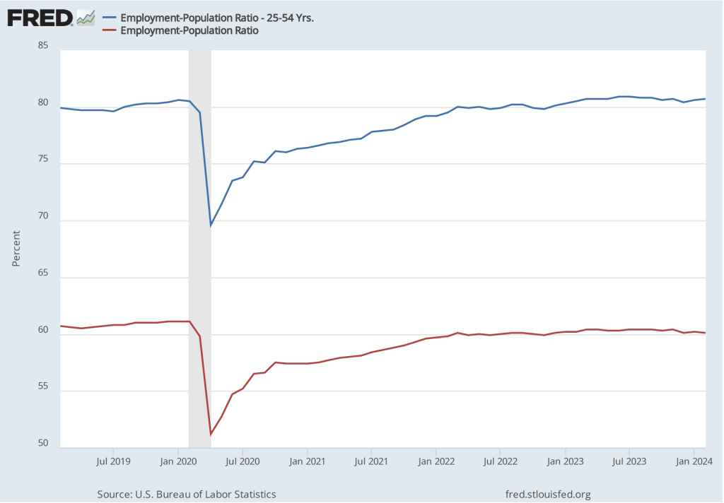
The employment-population ratio measures the percentage of the working-age population that is employed. It provides a more comprehensive measure of an economy’s utilization of available labor than does the total number of people employed. In the following figure, the blue line shows the employment-population ratio for the whole working-age population and the red line shows the employment-population ratio for “prime age workers,” those aged 25 to 54.
For both groups, the employment-population ratio plunged as a result of Covid and then slowly recovered as the production began increasing after April 2020. The employment-population ratio for prime age workers didn’t regain its February 2020 value until February 2023, an indication of how long it took the labor market to fully overcome the effects of the pandemic. As of February 2024, the employment-population ratio for all people of working age hasn’t returned to its February 2020 value, largely because of the aging of the U.S. population.
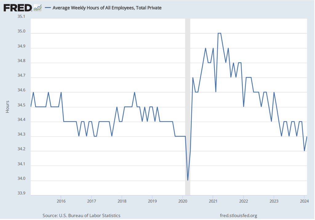
Average weekly hours worked followed an unusual pattern, declining during March 2020 but then increasing to beyond its February 2020 level to a peak in April 2021. This increase reflects firms attempting to deal with a shortage of workers by increasing the hours of those people they were able to hire. By April 2023, average weekly hours worked had returned to its February 2020 level.
Income
Real average hourly earnings surged by more than six percent between February and April 2020—a very large increase over a two-month period. But some of the increase represented a composition effect—as workers with lower incomes in services industries such as restaurants were more likely to be out of work during this period—rather than an actual increase in the real wages received by people employed during both months. (Real average hourly earnings are calculated by dividing nominal average hourly earnings by the consumer price index (CPI) and multiplying by 100.)
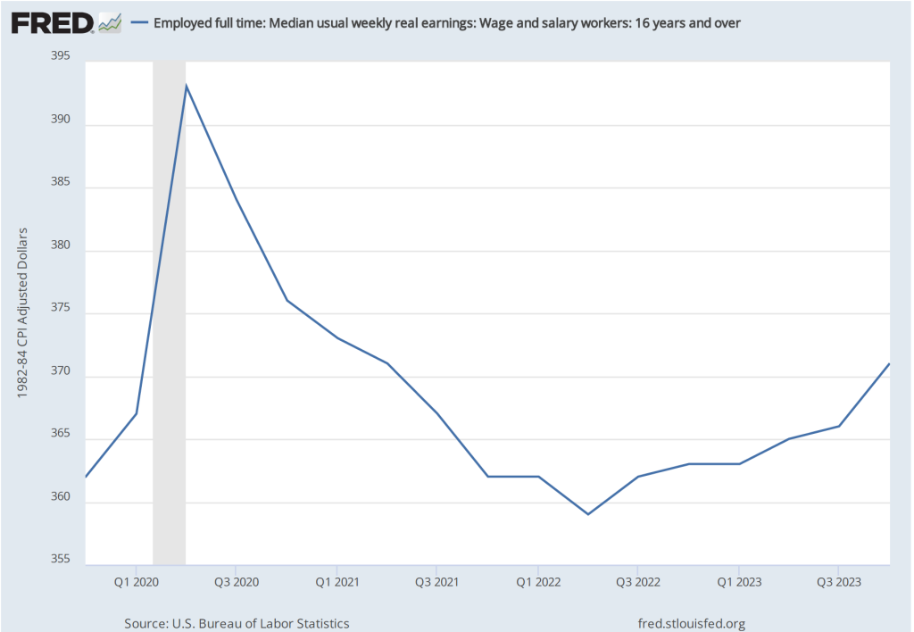
Median weekly real earnings, because it is calculated as a median rather than as an average (or mean), is less subject to composition effects than is real average hourly earnings. Median weekly real earnings increased sharply between February and April of 2020 before declining through June 2022. Earnings then gradually increased. In February 2024 they were 2.5 percent higher than in February 2020.
Inflation
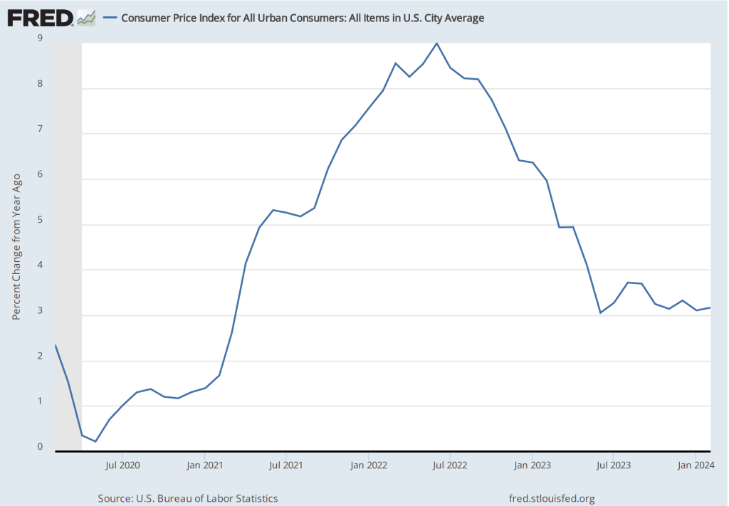
The inflation rate most commonly mentioned in media reports is the percentage change in the CPI from the same month in the previous year. The following figure shows that inflation declined from February to May 2020. Inflation then began to rise slowly before rising rapidly beginning in the spring of 2021, reaching a peak in June 2022 at 9.0 percent. That inflation rate was the highest since November 1981. Inflation then declined steadily through June 2023. Since that time it has fluctuated while remaining above 3 percent.
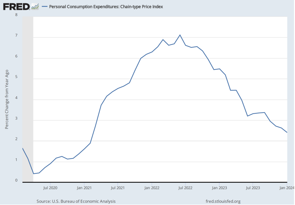
As we discuss in Macroeconomics, Chapter 15, Section 15.5 (Economics, Chapter 25, Section 25.5), the Federal Reserve gauges its success in meeting its goal of an inflation rate of 2 percent using the personal consumption expenditures (PCE) price index. The following figure shows that PCE inflation followed roughly the same path as CPI inflation, although it reached a lower peak and had declined below 3 percent by November 2023. (A more detailed discussion of recent inflation data can be found in this post and in this post.)
Monetary Policy
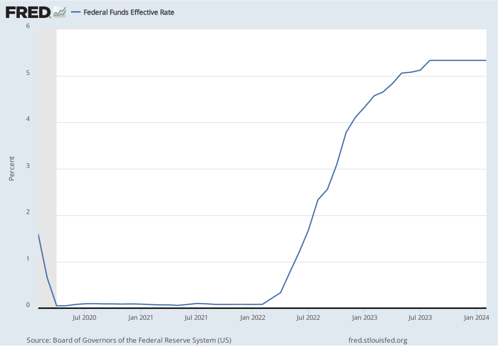
The following figure shows the effective federal funds rate, which is the rate—nearly always within the upper and lower bounds of the Fed’s target range—that prevails during a particular period in the federal funds market. In March 2020, the Fed cut its target range to 0 to 0.25 percent in response to the economic disruptions caused by the pandemic. It kept the target unchanged until March 2022 despite the sharp increase in inflation that had begun a year earlier. The members of the Federal Reserve’s Federal Open Market Committee (FOMC) had initially hoped that the surge in inflation was largely caused by disuptions to supply chains and would be transitory, falling as supply chains returned to normal. Beginning in March 2022, the FOMC rapidly increased its target range in response to continuing high rates of inflation. The targer range reached 5.25 to 5.50 percent in July 2023 where it has remained through March 2024.
Although the money supply is no longer the focus of monetary policy, some economists have noted that the rate of growth in the M2 measure of the money supply increased very rapidly just before the inflation rate began to accelerate in the spring of 2021 and then declined—eventually becoming negative—during the period in which the inflation rate declined.
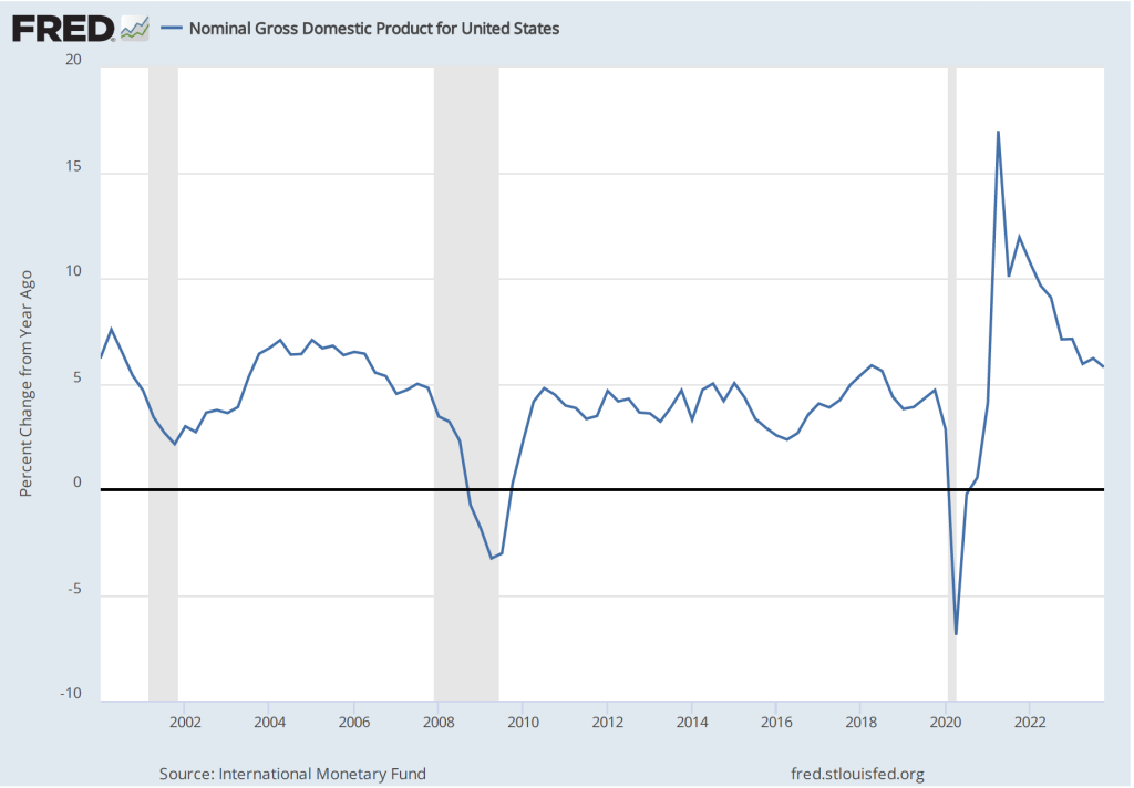
As we discuss in the new 9th edition of Macroeconomics, Chapter 15, Section 15.5 (Economics, Chapter 25, Section 25.5), some economists believe that the FOMC should engage in nominal GDP targeting. They argue that this approach has the best chance of stabilizing the growth rate of real GDP while keeping the inflation rate close to the Fed’s 2 percent target. The following figure shows the economy experienced very high rates of inflation during the period when nominal GDP was increasing at an annual rate of greater than 10 percent and that inflation declined as the rate of nominal GDP growth declined toward 5 percent, which is closer to the growth rates seen during the 2000s. (This figure begins in the first quarter of 2000 to put the high growth rates in nominal GDP of 2021 and 2022 in context.)
Fiscal Policy
As we discuss in the new 9th edition of Macroeconomics, Chapter 15 (Economics, Chapter 25), in response to the Covid pandemic Congress and Presidents Trump and Biden implemented the largest discretionary fiscal policy actions in U.S. history. The resulting increases in spending are reflected in the two spikes in federal government expenditures shown in the following figure.
The initial fiscal policy actions resulted in an extraordinary increase in federal expenditures of $3.69 trillion, or 81.3 percent, from the first quarter to the second quarter of 2020. This was followed by an increase in federal expenditures of $2.31 trillion, or 39.4 percent, from the fourth quarter of 2020 to the first quarter of 2021. As we recount in the text, there was a lively debate among economists about whether these increases in spending were necessary to offest the negative economic effects of the pandemic or whether they were greater than what was needed and contributed substantially to the sharp increase in inflation that began in the spring of 2021.
Saving
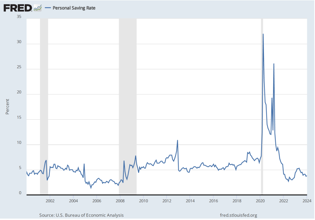
As a result of the fiscal policy actions of 2020 and 2021, many households received checks from the federal government. In total, the federal government distributed about $80o billion directly to households. As the figure shows, one result was to markedly increase the personal saving rate—measured as personal saving as a percentage of disposable personal income—from 6.4 percent in December 2019 to 22.0 in April 2020. (The figure begins in January 2020 to put the size of the spike in the saving rate in perspective.)
The rise in the saving rate helped households maintain high levels of consumption spending, particularly on consumer durables such as automobiles. The first of the following figure shows real personal consumption expenditures and the second figure shows real personal consumption expenditures on durable goods.
Taken together, these data provide an overview of the momentous macroeconomic events of the past four years.
On the first Friday of each month, the Bureau of Labor Statistics (BLS) releases its “Employment Sitution” report for the previous month. The data for February in today’s report at first glance seem contradictory: The BLS reported that the net increase in employment in February was 275,000, which was above the increase of 200,000 that economists participating in media surveys had expected (see here and here). But the unemployment rate, which had been expected to remain constant at 3.7 percent, rose to 3.9 percent.
The apparent paradox of employment and the unemployment rate both increasing in the same month is (partly) attributable to the two numbers being from different surveys. The employment number most commonly reported in media accounts is from the establishment survey (sometimes referred to as the payroll survey), whereas the unemployment rate is taken from the household survey. The results of both surveys are included in the BLS’s monthly “Employment Situation” report. As we discuss in Macroeconomics, Chapter 9, Section 9.1 (Economics, Chapter 19, Section 19.1), many economists and policymakers at the Federal Reserve believe that employment data from the establishment survey provides a more accurate indicator of the state of the labor market than do either the employment data or the unemployment data from the household survey. Accordingly, most media accounts interpreted the data released today as indicating continuing strength in the labor market.
However, it can be worth looking more closely at the differences between the measures of employment in the two series because it’s possible that the household survey data is signalling that the labor market is weaker than it appears from the establishment survey data. The following table shows the data on employment from the two surveys for January and February.
Establishment Survey
Household Survey
January
157,533,000
161,152,000
February
157,808,000
160,968,000
Change
+275,000
-184,000
Note that in addition to the fact that employment as measured by the household survey is falling, while employment as measured by the establishment survey is increasing, household survey employment is significantly higher in both months. Household survey employment is always higher than establishment survey employment because the household survey includes employment of three groups that are not included in the establishment survey:
Self-employed workers
Unpaid family workers
Agricultural workers
(A more complete discuss of the differences in employment in the two surveys can be found here.) The BLS also publishes a useful data series in which it attempts to adjust the household survey data to more closely mirror the establishment survey data by, among other adjustments, removing from the household survey categories of workers who aren’t included in the payroll survey. The following figure shows three series—the establishment series (gray line), the reported household series (orange line), and the adjusted household series (blue line)—for the months since 2021. For ease of comparison the three series have been converted to index numbers with January 2021 set equal to 100.
Note that for most of this period, the adjusted household survey series tracks the establishment survey series fairly closely. But in November 2023, both household survey measures of employment begin to fall, while the establishment survey measure of employment continues to increase. Falling employment in the household survey may be signalling weakness in the labor market that employment in the establishment survey may be missing, but it might also be attributed to the greater noisiness in the household survey’s employment data.
There are three other things to note in this month’s employment report. First, the BLS revised the initially reported increase in December establishement survey employment downward by 35,000 jobs and the January increase downward by 124,000 jobs. The January adjustment was large—amounting to more than 35 percent of the initially reported increase of 353,000. It’s normal for the BLS to revise its initial estimates of employment from the establishment survey but a series of negative revisions is typical of periods just before or at the beginning of a recession. It’s important to note, though, that several months of negative revisions to establishment employment are far from an infallible predictor of recessions.
Second, as shown in the following figure, the increase in average hourly earnings slowed from the high rate of 6.8 percent in January to 1.7 percent in February—the smallest increase since early 2022.. (These increases are measured at a compounded annual rate, which is the rate wages would increase if they increased at that month’s rate for an entire year.) A slowing in wage growth may be another sign that the labor market is weakening, although the data are noisy on a month-to-month basis.
Finally, one positive indicator of the state of the labor market is that average weekly hours worked increased. As shown in the following figure, average hours worked had been slowly, if irregularly, trending downward since early 2021. In February, average hours worked increased slightly to 34.3 hours per week from 34.2 hours per week in January. But, again, it’s difficult to draw strong conclusions from one month’s data.
In testifying before Congress earlier this week, Fed Chair Jerome Powell noted that:
“We believe that our policy rate [the federal funds rate] is likely at its peak for this tightening cycle. If the economy evolves broadly as expected, it will likely be appropriate to begin dialing back policy restraint at some point this year. But the economic outlook is uncertain, and ongoing progress toward our 2 percent inflation objective is not assured.”
It seems unlikely that today’s employment report will change how Powell and the other memebers of the Fed’s Federal Open Market Committee evaluate the current economic situation.
Some interesting macro data were released during the past two weeks. On the key issues, the data indicate that inflation continues to run in the range of 3.0 percent to 3.5 percent, although depending on which series you focus on, you could conclude that inflation has dropped to a bit below 3 percent or that it is still in vicinity of 4 percent. On balance, output and employment data seem to be indicating that the economy may be cooling in response to the contractionary monetary policy that the Federal Open Market Committee began implementing in March 2022.
We can summarize the key data releases.
Employment, Unemployment, and Wages
On Friday morning, the Bureau of Labor Statistics (BLS) released its Employment Situation report. (The full report can be found here.) Economists and policymakers—notably including the members of the Federal Reserve’s Federal Open Market Committee (FOMC)—typically focus on the change in total nonfarm payroll employment as recorded in the establishment, or payroll, survey. That number gives what is generally considered to be the best indicator of the current state of the labor market.
The previous month’s report included a surprisingly strong net increase of 336,000 jobs during September. Economists surveyed by the Wall Street Journal last week forecast that the net increase in jobs in October would decline to 170,000. The number came in at 150,000, slightly below that estimate. In addition, the BLS revised down the initial estimates of employment growth in August and September by a 101,000 jobs. The figure below shows the net gain in jobs for each month of 2023.
Although there are substantial fluctuations, employment increases have slowed in the second half of the year. The average increase in employment from January to June was 256,667. From July to October the average increase declined to 212,000. In the household survey, the unemployment rate ticked up from 3.8 percent in September to 3.9 percent in October. The unemployment rate has now increased by 0.5 percentage points from its low of 3.4 percent in April of this year.
Finally, data in the employment report provides some evidence of a slowing in wage growth. The following figure shows wage inflation as measured by the percentage increase in average hourly earnings (AHE) from the same month in the previous year. The increase in October was 4.1 percent, continuing a generally downward trend since March 2022, although still somewhat above wage inflation during the pre-2020 period.
As the following figure shows, September growth in average hourly earnings measured as a compound annual growth rate was 2.5 percent, which—if sustained—would be consistent with a rate of price inflation in the range of the Fed’s 2 percent target. (The figure shows only the months since January 2021 to avoid obscuring the values for recent months by including the very large monthly increases and decreases during 2020.)
Job Openings and Labor Turnover Survey (JOLTS)
On November 1, the BLS released its Job Openings and Labor Turnover Survey (JOLTS) report for September 2023. (The full report can be found here.) The report indicated that the number of unfilled job openings was 9.5 million, well below the peak of 11.8 million job openings in December 2021 but—as shown in the following figure—well above prepandemic levels.
The following figure shows the ratio of the number of job opening to the number of unemployed people. The figure shows that, after peaking at 2.0 job openings per unemployed person in in March 2022, the ratio has decline to 1.5 job opening per unemployed person in September 2022. While high, that ratio was much closer to the ratio of 1.2 that prevailed during the year before the pandemic. In other words, while the labor market still appears to be strong, it has weakened somewhat in recent months.
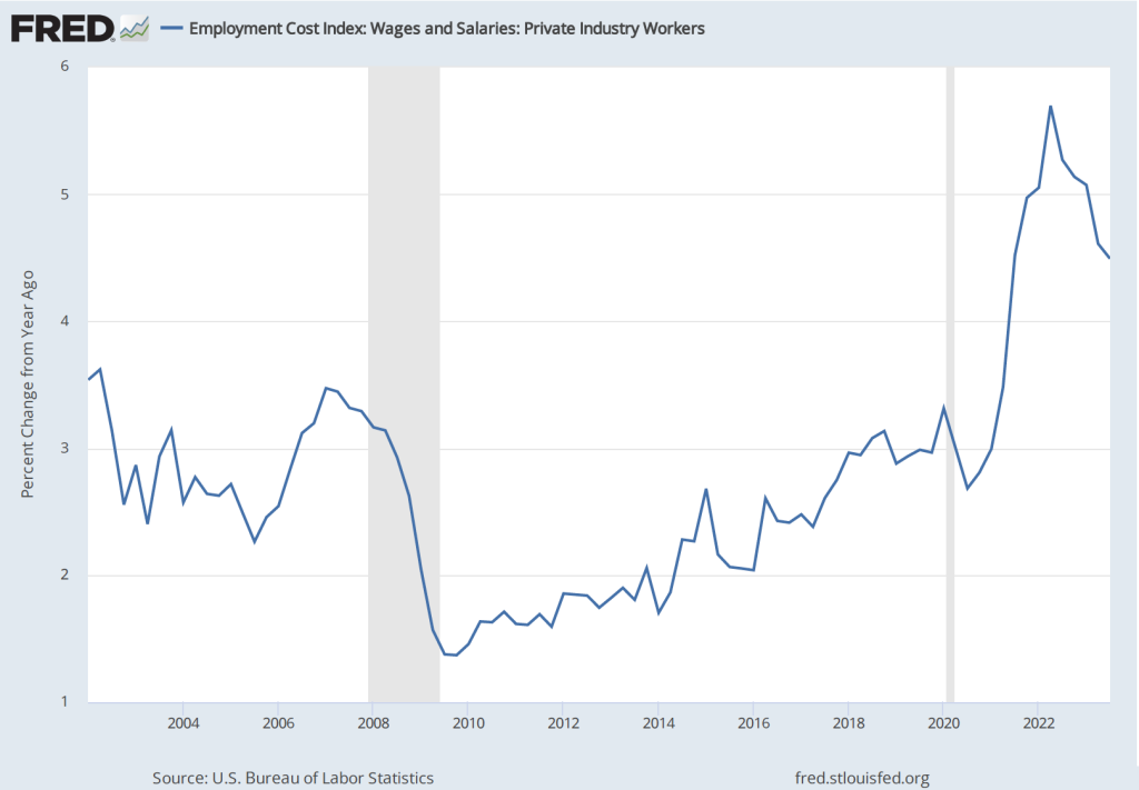
Employment Cost Index
As we note in this blog post, the employment cost index (ECI), published quarterly by the BLS, measures the cost to employers per employee hour worked and can be a better measure than AHE of the labor costs employers face. The BLS released its most recent report on October 31. (The report can be found here.) The first figure shows the percentage change in ECI from the same quarter in the previous year. The second figure shows the compound annual growth rate of the ECI. Both measures show a general downward trend in the growth of labor costs, although compound annual rate of change shows an uptick in the third quarter of 2023. (We look at wages and salaries rather than total compensation because non-wage and salary compensation can be subject to fluctuations unrelated to underlying trends in labor costs.)
The Federal Open Market Committee’s October 31-November 1 Meeting
As was widely expected from indications in recent statements by committee members, the Federal Open Market Committee voted at its most recent meeting to hold constant its targe range for the federal funds rate at 5.25 percent to 5.50 percent. (The FOMC’s statement can be found here.)
At a press conference following the meeting, Fed Chair Jerome Powell remarks made it seem unlikely that the FOMC would raise its target for the federal funds rate at its December 14-15 meeting—the last meeting of 2023. But Powell also noted that the committee was unlikely to reduce its target for the federal funds rate in the near future (as some economists and financial jounalists had speculated): “The fact is the Committee is not thinking about rate cuts right now at all. We’re not talking about rate cuts, we’re still very focused on the first question, which is: have we achieved a stance of monetary policy that’s sufficiently restrictive to bring inflation down to 2 percent over time, sustainably?” (The transcript of Powell’s press conference can be found here.)
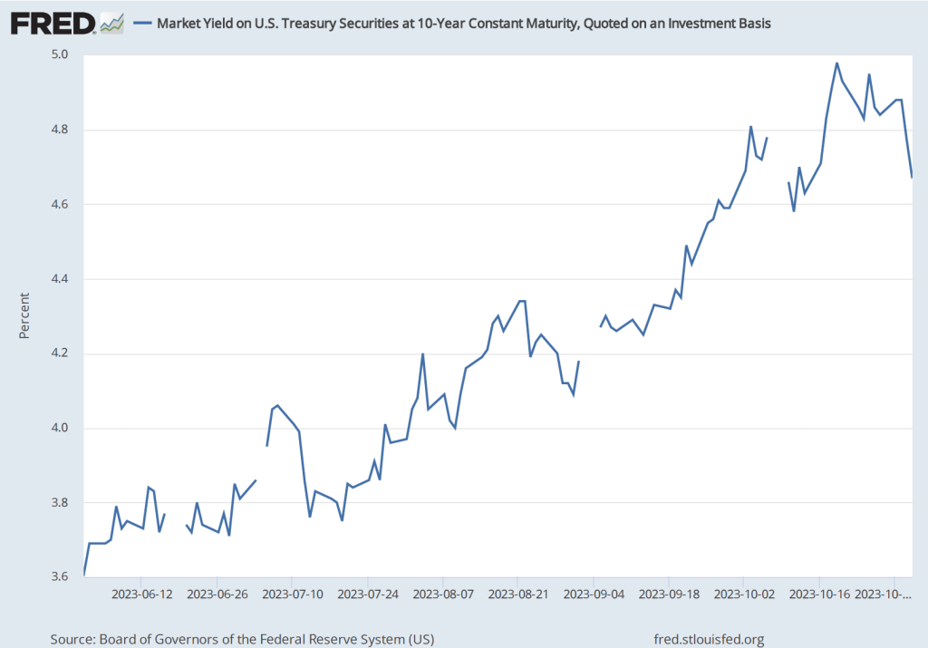
Investors in the bond market reacted to Powell’s press conference by pushing down the interest rate on the 10-year Treasury note, as shown in the following figure. (Note that the figure gives daily values with the gaps representing days on which the bond market was closed) The interest rate on the Treasury note reflects investors expectations of future short-term interest rates (as well as other factors). Investors interpreted Powell’s remarks as indicating that short-term rates may be somewhat lower than they had previously expected.
Real GDPand the Atlanta Fed’s Real GDPNow Estimate for the Fourth Quarter
On October 26, the Bureau of Economic Analysis (BEA) released its advance estimate of real GDP for the third quarter of 2023. (The full report can be found here.) We discussed the report in this recent blog post. Although, as we note in that post, the estimated increase in real GDP of 4.9 percent is quite strong, there are indications that real GDP may be growing significantly more slowly during the current (fourth) quarter.
The Federal Reserve Bank of Atlanta compiles a forecast of real GDP called GDPNow. The GDPNow forecast uses data that are released monthly on 13 components of GDP. This method allows economists at the Atlanta Fed to issue forecasts of real GDP well in advance of the BEA’s estimates. On November 1, the GDPNow forecast was that real GDP in the fourth quarter of 2023 would increase at a slow rate of 1.2 percent. If this preliminary estimate proves to be accurate, the growth rate of the U.S. economy will have sharply declined from the third to the fourth quarter.
Fed Chair Powell has indicated that economic growth will likely need to slow if the inflation rate is to fall back to the target rate of 2 percent. The hope, of course, is that contractionary monetary policy doesn’t cause aggregate demand growth to slow to the point that the economy slips into a recession.
As we discussed in this post, most recent data are consistent with the labor market having cooled, which should reduce upward pressure on wages and prices. On Friday morning, the Bureau of Labor Statistics (BLS) released its employment report for August 2023. (The report can be found here.) On balance, the data in the report are consistent with the labor market continuing to cool.
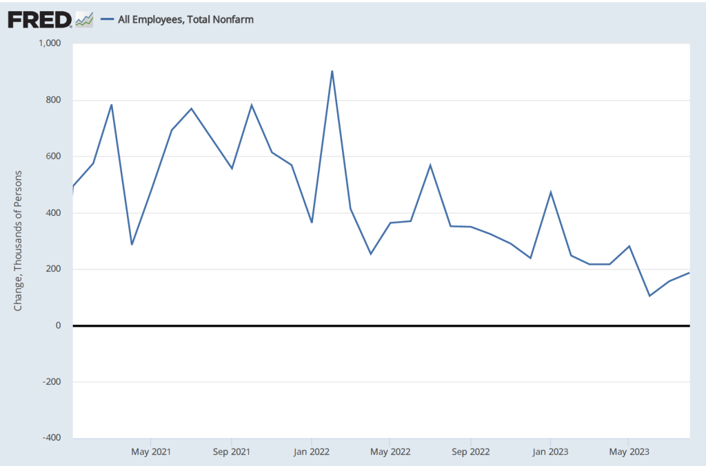
Data from the establishment survey showed an increase in payroll employment of 187,000, which is close to the increase of 170,000 economists surveyed by the Wall Street Journal had forecast. The following figure shows monthly changes in payroll employment since January 2021.
Although the month-to-month changes have been particularly volatile during this period as the U.S. economy recovered from the Covid–19 recession, the general trend in job creation has been downward. The following table shows average monthly increases in payroll employment for 2021, 2022, and 2023 through August. In the most recent three-month period, the average monthly increase in employment was 150,000.
Period
Average Monthly Increases in Employment
2021
606,000
2022
399,000
Jan.-Aug. 2023
236,000
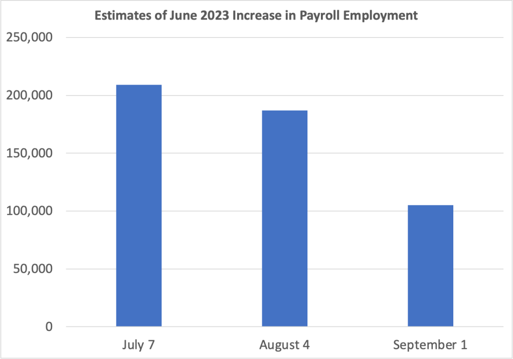
The BLS revised downward its previous estimates of employment increases in June and July by a combined 110,000. The changes to the estimate of the employment increase for June are particularly notable. As the following graph shows, on July 7, the BLS initially estimated the increase as 209,000. The BLS’s first revision on August 4, lowered the estimate to an increase of 187,000. The BLS’s second revision on September 1, lowered the estimate further to 105,000. In other words, the BLS now estimates that employment increased by only half as much in June as it initially reported. As we discuss in Macroeconomics, Chapter 9, Section 9.1 (Economics, Chapter 19, Section 19.1 and Essentials of Economics, Chapter 13, Section 13.1), the revisions that the BLS makes to its employment estimates are likely to be particularly large when the economy is about to enter a period of significantly lower or higher growth. So, the large revisions to the June employment estimate may indicate that during the summer economic growth slowed and labor market conditions eased.
Data from the household survey showed the unemployment rate increasing from 3.5 percent in July to 3.8 percent in August. The following figure shows that the unemployment rate has fluctuated in a narrow range since March 2022. Employment as estimated from the household survey increased by 222,000. The seeming paradox of the number of people employed and the unemployment rate both increasing is accounted for by the substantial 736,000 increase in the labor force.
Finally, as the first of the following figures shows, measured as the percentage change from the same month in the previous year, the increase in average hourly earnings (AHE) remained in its recent range of between 4.25 and 4.50 percent. That rate is down from its peak in mid-2022 but still above the rate of increase in 2019, before the pandemic. But, as the second figure shows, if we look at the compound rate of increase in AHE—that is the rate at which AHE would increase for the year if the current rate of monthly increase persisted over the following 11 months—we can see a significant cooling in the rate at which wages are increasing.
As a reminder, AHE are the wages and salaries per hour worked that private, nonfarm businesses pay workers. AHE don’t include the value of benefits that firms provide workers, such as contributions to 401(k) retirement accounts or health insurance. As an economy-wide average they suffer from a composition effect during periods in which employment either increases or decreases substantially because the mix of high-wage and low-wage workers may change. AHE are also subject to significant revisions. Therefore, short-range changes in AHE can sometimes be misleading indicators of the state of the labor market.
(Photo from the Associated Press via the Wall Street Journal.)
During most periods, the “Employment Situation” report that the Bureau of Labor Statistics issues on the first Friday of each month includes the most closely watched macroeconomic data. Since the spring of 2021, high inflation rates have made the BLS’s “Consumer Price Index Summary” at least a close second in interest to the employment report. The data in the CPI report is usually more readily comprehensible than the data in the employment report. So, we think it’s worth class time to go into some of the details of the employment report, as we do in Macroeconomics, Chapter 9, Section 9.1, Economics, Chapter 19, Section 19.1, and Essentials of Economics, Chapter 13, Section 13.1.
When the BLS released the May employment report, the Wall Street Journal noted that: “Employers added 339,000 jobs last month; unemployment rate rose to 3.7%.” Employment increased … but the unemployment rate also rose? How is that possible? One key to understanding media accounts of the report is to note that the report contains data from two separate surveys: 1) the household survey and 2) the employment or establishment survey. As in the statement just quoted from the Wall Street Journal, media accounts often mix data from the two surveys.
The data showing an increase of 339,000 jobs in May are from the payroll survey, while the data showing that the unemployment rate rose are from the household survey. Below we reproduce part of the relevant table from the report showing some of the data from the household survey. Note that total employment in the household survey falls by 310,000, so there appears to be no contradiction to explain—the unemployment rate increased because the number of people employed fell and the number of people unemployed rose. But why, then, did employment rise in the payroll survey?
Employment can rise in one survey and fall in the other because: 1) the types of employment measured in the two series differ, 2) the periods during which the data are collected differ, and 3) because of measurement error. The household survey uses a broader measure of employment that includes several categories of workers who are not included in the payroll survey: agricultural workers, self-employed workers, unpaid workers in family businesses, workers employed in private households rather than in businsses, and workers on unpaid leave from their jobs. In addition, the payroll employment numbers are revised—sometimes substantially—as additional data are collected from firms, while the household employment numbers are subject to much smaller revisions because data in the household survey are collected during a single week. A detailed discussion of the differences between the employment measures in the two series can be found here.
Usefully, the BLS publishes a series labeled “Adjusted employment” that estimates what the value for household employment would be if the household survey was measuring the same categories of employment as the payroll survey. In this case, the adjusted employment series shows an increase in employment in May of 394,000—close to the payroll survey’s increase of 339,000.
To summarize, the May employment report indicates that payroll employment increased, while the non-payroll categories of household employment declined, and the unemployment rate rose. Note also in the table above that the number of people counted as not being in labor force rose slightly and the employment-population ratio fell slightly. Average weekly hours (not shown in the table above) decreased slightly from 34.4 hours per week to 34.3.
A reasonable conclusion from the report is that the labor market remains strong, although it may have weakened slightly. Prior to release of the report, there was much speculation in the business press about how the report might affect the deliberations of the Federal Reserve’s Federal Open Market Committe (FOMC) at its next meeting to be held on June 13th and 14th. The report showed stronger employment growth than economists surveyed by Dow Jones had expected, indicating that the FOMC was likely to remain concerned that a tight labor market might continue to put upward pressure on wages, which firms could pass through to higher prices. Members of the FOMC had been signalling that they were likely to keep their target for the federal funds rate unchanged in June. The reported employment increase was likely not large enough to cause the FOMC to change course.
On Friday, July 8, the Bureau of Labor Statistics (BLS) released its monthly “Employment Situation” report for June 2022. The BLS estimated that nonfarm employment had increased by 372,000 during the month. That number was well above what economic forecasters had expected and seemed inconsistent with other macroeconomic data that showed the U.S. economy slowing. (Note that the increase in employment is from the establishment survey, sometimes called the payroll survey, which we discuss in Macroeconomics, Chapter 9, Section 9.1 and Economics, Chapter 19, Section 19.1.)
Data indicating that the economy was slowing during the first half of 2022 include the Bureau of Economic Analysis’s (BEA) estimate that real GDP had declined by 1.6 percent in the first quarter of 2022. The BEA’s advance estimate—the agency’s first estimate for the quarter—for the change in real GDP during the second quarter of 2022 won’t be released until July 28, but there are indications that real GDP will have declined again during the second quarter. For instance, the Federal Reserve Bank of Atlanta compiles a forecast of real GDP called GDPNow. The GDPNow forecast uses data that are released monthly on 13 components of GDP. This method allows economists at the Atlanta Fed to issue forecasts of real GDP well in advance of the BEA’s estimates. On July 8, the GDPNow forecast was that real GDP in the second quarter of 2022 would decline by 1.2 percent.
Two consecutive quarters of declining real GDP seems inconsistent with employment strongly growing. At a basic level, if firms are producing fewer goods and services—which is what causes a decline in real GDP—we would expect the firms to be reducing, rather than increasing, the number of people they employ. How can we reconcile the seeming contradiction between rising employment and falling output? One possibility is that either the real GDP data or the employment data—or, possibly, both—are inaccurate. Both GDP data and employment data from the establishment survey are subject to potentially substantial future revisions. (Note that because they are constructed from a survey of households, the employment data in the household survey aren’t revised. As we discuss in the text, economists and policymakers typically rely more on the establishment survey than on the household survey in gauging the current state of the labor market.) Substantial revisions are particularly likely for data released during the beginning of a recession.
In Macroeconomics, Chapter 9, Section 9.1 (Economics, Chapter 19, Section 19.1), we give an example of substantial revisions in the employment data. Figure 9.5 (reproduced below) shows that the declines in employment during the 2007–2009 recession were initially greatly underestimated. For example, the BLS initially reported that employment declined by 159,000 during September 2008. But after additional data became available, the BLS revised its estimate to a much larger decline of 460,000.
Similarly, in Macroeconomics, Chapter 15, Section 15,3, in the Apply the Concept “Trying to Hit a Moving Target: Making Policy with ‘Real-Time Data’,” we show the BEA’s estimates of the change in real GDP during the first quarter of 2008 have been revised substantially over time. The BEA’s advance estimate of the change in real GDP during the first quarter of 2008 was an increase of 0.6 percent at an annual rate. But that estimate of real GDP growth has been revised a number of times over the years, mostly downward. Currently, BEA data indicate that real GDP actually declined by 1.6 percent at an annual rate during the first quarter of 2008. This swing of more than 2 percentage points from the advance estimate is a large difference, which changes the picture of what happened during the first quarter of 2008 from one of an economy experiencing slow growth to one of an economy suffering a sharp downturn as it fell into the worst recession since the Great Depression of the 1930s.
The changes to the estimates of both employment and real GDP during the beginning of the 2007–2009 recession are not surprising. The initial estimates of employment and real GDP rely on incomplete data. The estimates are revised as additional data are collected by government agencies. During the beginning of a recession, these additional data are likely to show lower levels of employment and output than were indicated by the initial estimates. If the U.S. economy is in a recession in the second quarter of 2022, we can expect that the BLS and BEA will revise their initial estimates of employment and real GDP downward, which—depending on the relative magnitudes of the revisions to the two series—may resolve the paradox of rising employment and falling output.
Or it’s possible that the U.S. economy is not in a recession. In that case, the employment data may be correct in showing an increase in the number of people working, and the real GDP data may be revised upward to show that output has actually been expanding during the first six months of 2022. Economists and policymakers will have to wait to see which of these alternatives turns out to be the case.