Do ATMs that Dispense Gold Rather Than Currency Make Economic Sense?

An Automated Teller Machine (ATM) located in Egypt that dispenses gold bars rather than currency. (Photo from ahrm.org.)

A recent article in the New York Times (available here, but a subscription may be required) discusses how consumers in Egypt are dealing with inflation.  According to statistics from the International Monetary Fund, consumer prices in Egypt rose 23.5 percent in 2023 and are projected to increase by 32.2 percent in 2024, although in early 2024 inflation may have been running at an annual rate of 50 percent. In response to the inflation, many Egyptian businesses have begun quoting prices in U.S. dollars rather than in Egyptian pounds. The value of the Egyptian pound has declined from about 18 pounds to the U.S. dollar in early 2022 to about 48 pounds to the dollar today. In practice, many Egyptian consumers can have difficulty obtaining dollars except on the black market, where the exchange rate is generally worse than the rate quoted by the Egyptian central bank. 

According to the article, many Egyptians, losing faith in value of the pound and unable to easily obtain U.S. dollars, have turned to gold as a potentially “safe financial harbor.” The article notes that: “The market [for gold] grew so fevered that the government announced in November that it was partnering with a financial technology company to install A.T.M.s [Automated Teller Machines] that would dispense gold bars instead of cash.” That ATM is shown in the photo above.

This episode raises two questions:

  1. Is gold a good hedge (a “safe harbor”) against inflation?
  2. Are ATMs that dispense gold rather than currency a good idea?

As we discuss in Chapter 14, Section 14.3 of Money, Banking, and the Financial System, gold has not been a good hedge against inflation for U.S. investors. Although many people believe that the price of gold can be relied on to increase if the general price level increases, in fact, the data show that the price of gold can’t be counted on to keep up with increases in the general price level. In the following figure, the blue line shows the market price of gold during each month since January 1976. The red line shows the real price of gold, which is calculated by dividing the nominal price of gold by the consumer price index (CPI). (For convenience, we set the value of the CPI equal to 100 in January 1976.) The price of gold is measured in dollars per ounce. 

The figure shows that the market price of gold can fall even as the price level rises. For example, the price of gold rose from $132 per ounce in January 1976 to $670 per ounce in September 1980. As a result, during that period the real price of gold more than tripled, and holding gold during this period was a good hedge against inflation. Unfortunately, the market price of gold then went into a long decline and didn’t again reach its September 1980 value until April 2007, a period during which the CPI more than doubled. In other words, over this more than 25-year period gold provided no hedge at all against the effects of inflation. Consumers in India today shouldn’t count on buying gold as way to protect the real value of their savings from being reduced by inflation.

The New York Times article refers to only a single ATM in Egypt that dispenses gold bars rather than Egyptian pounds. Would we expect that the number of these ATMs will increase in Egypt and other countries experiencing very high inflation rates? Does the existence of these ATMs indicate that people in Egypt are now—or will likely begin—using gold bars rather than currency for routine buying and selling?

The answer to both questions is likely “no.” Although the article refers to an “ATM,” it might be better to think of this facility as instead being a vending machine. Similar ATMs/vending machines that dispense gold bars are available in the United States (as indicated here, here, and here), and, most likely, in other countries as well.

We usually think of vending machines as selling soda and water or snacks. But there are many vending machines that sell other products as well. For instance, most large airports have vending machines that sell small electronic products, such as cell phone batteris or earphones. The term ATM is usually reserved for machines that enable people who have deposits at a bank or other financial firms to withdraw currency. So, the article seems to be describing something that is more a vending machine than an ATM. The article discusses the many small businesses in Egypt that buy and sell gold, which makes it likely that most consumers will continue to rely on those businesses rather than on a machine when they want to buy and sell gold.

It seems unlikely that people in Egypt will beging using gold bars for routine buying and  selling—that is, using gold as a medium of exchange. Most goods in Egypt have their prices denominated in either Egyptian pounds or in U.S. dollars or in both. Anyone attempting to buy goods with gold bars would need first to determine the market price of gold at that time before making the purchase and would have to locate a seller who was willing to accept gold in exchange for their goods. In effect, sellers would be engaging in two transactions at the same time: buying gold from the buyer and selling goods to the buyer. Although in a time of high inflation a seller takes on the risk that currency he accepts for a purchase may decline in value while the seller is holding it, a seller accepting gold also takes on the risk that the market price of gold may fall while the seller is holding it.

It’s interesting that the Egyptian government reacted to consumers buying gold as a hedge against inflation by partnering with a financial firm to make available an “ATM” that dispenses gold bars. But it probably doesn’t represent a significant development in the Egyptian financial system.

Consumer Price Inflation Comes in Somewhat Higher than Expected

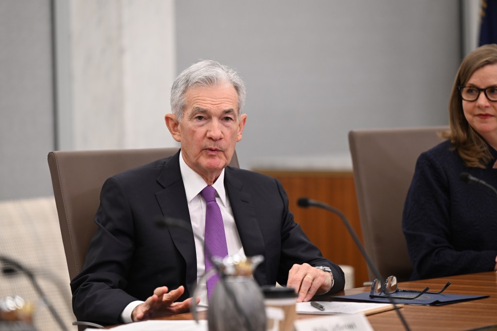
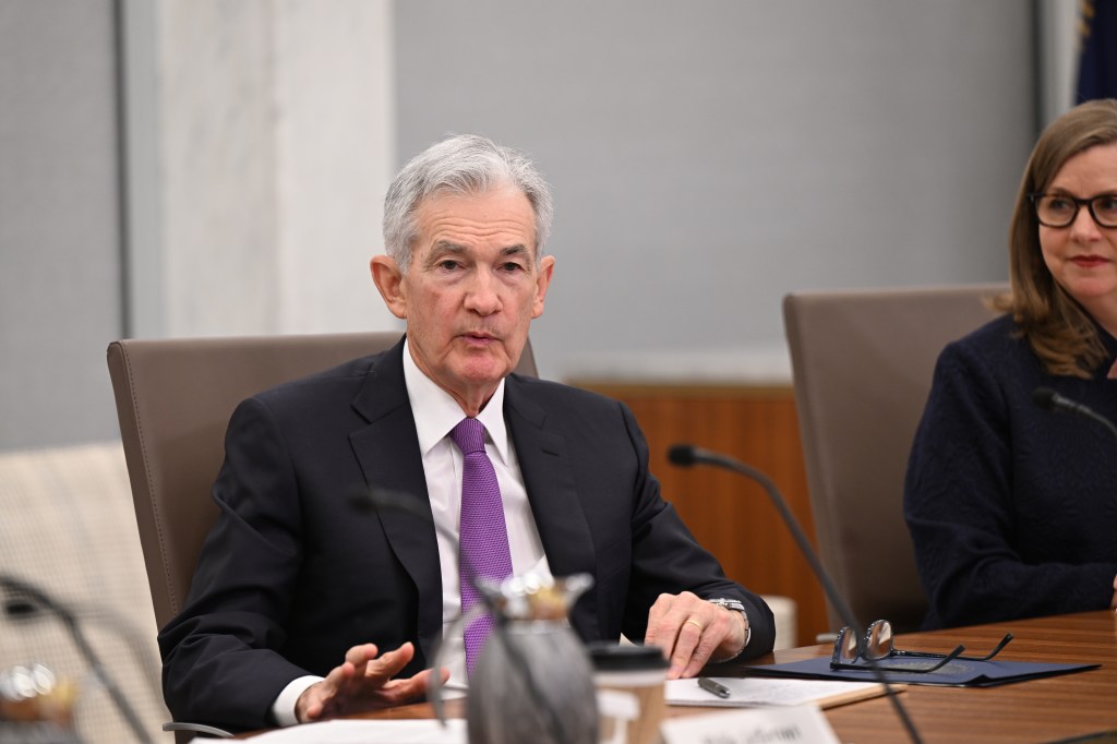
Federal Reserve Chair Jerome Powell (Photo from Bloomberg News via the Wall Street Journal.)

Economists, policymakers, and Wall Street analysts have been waiting for macroeconomic data to confirm that the Federal Reserve has brought the U.S. economy in for a soft landing, with inflation arrving back at the Fed’s target of 2 percent without the economy slipping into a recession. Fed officials have been cautious about declaring that they have yet seen sufficient data to be sure that a soft landing has actually been achieved. Accordingly, they are not yet willing to begin cutting their target for the federal funds rate.

For instance, on March 6, in testifying before the Commitee on Financial Services of the U.S. House of Representatives, Fed Chair Jerome Powell stated that the Fed’s Federal Open Market Committee (FOMC) “does not expect that it will be appropriate to reduce the target range until it has gained greater confidence that inflation is moving sustainably toward 2 percent.” (Powell’s statement before his testimony can be found here.)

The BLS’s release today (March 12) of its report on the consumer price index (CPI) (found here) for February indicated that inflation was still running higher than the Fed’s target, reinforcing the cautious approach that Powell and other members of the FOMC have been taking. The increase in the CPI that includes the prices of all goods and services in the market basket—often called headline inflation—was 3.2 percent from the same month in 2023, up slightly from 3.1  In January. (We discuss how the BLS constructs the CPI in Macroeconomics, Chapter 9, Section 19.4, Economics, Chapter 19, Section 19.4, and Essentials of Economics, Chapter 3, Section 13.4.) As the following figure shows, core inflation—which excludes the prices of food and energy—was 3.8 percent, down slightly from 3.9 percent in January.

If we look at the 1-month inflation rate for headline and core inflation—that is the annual inflation rate calculated by compounding the current month’s rate over an entire year—the values are more concerning, as indicated in the following figure. Headline CPI inflation is 5.4 percent (up from 3.7 percent in January) and core CPI inflation is 4.4 percent (although that is down from 4.8 percent in January). The Fed’s inflation target is measured using the personal consumption expenditures (PCE) price index, not the CPI. But CPI inflation at these levels is not consistent with PCE inflation of only 2 percent.

Even more concerning is the path of inflation in the prices of services. As we’ve noted in earlier posts, Chair Powell has emphasized that as supply chain problems have gradually been resolved, inflation in the prices of goods has been rapidly declining. But inflaion in services hasn’t declined nearly as much. Last summer he stated the point this way:

“Part of the reason for the modest decline of nonhousing services inflation so far is that many of these services were less affected by global supply chain bottlenecks and are generally thought to be less interest sensitive than other sectors such as housing or durable goods. Production of these services is also relatively labor intensive, and the labor market remains tight. Given the size of this sector, some further progress here will be essential to restoring price stability.”

The following figure shows the 1-month inflation rate in services prices and in services prices not included including housing rent. Some economists believe that the rent component of the CPI isn’t well measured and can be volatile, so it’s worthwhile to look at inflation in service prices not including rent. The figure shows that inflation in all service prices has been above 4 percent in every month since July 2023. Although inflation in service prices declined from January, it was still a very high 5.8 percent in February. Inflation in service prices not including housing rent was even higher at 7.5 percent. Such large increases in the prices of services, if they were to continue, wouldn’t be consistent with the Fed meeting its 2 percent inflation target.

Finally, some economists and policymakers look at median inflation to gain insight into the underlying trend in the inflation rate. If we listed the inflation rate in each individual good or service in the CPI, median inflation is the inflation rate of the good or service that is in the middle of the list—that is, the inflation rate in the price of the good or service that has an equal number of higher and lower inflation rates. As the following figure shows, although median inflation declined in February, it was still high at 4.6 percent and, although median inflation is volatile, the trend has been generally upward since July 2023.

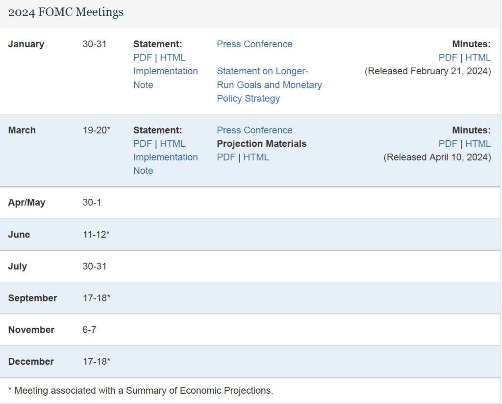
The data in this month’s BLS report on the CPI reinforces the view that the FOMC will not move to cut its target for the federal funds rate in the meeting next week and makes it somewhat less likely that the committee will cut its target at the following meeting on April 30-May 1.

The Latest Employment Report: How Can Total Employment and the Unemployment Rate Both Increase?

Photo courtesy of Lena Buonanno.

On the first Friday of each month, the Bureau of Labor Statistics (BLS) releases its “Employment Sitution” report for the previous month. The data for February in today’s report at first glance seem contradictory: The BLS reported that the net increase in employment in February was 275,000, which was above the increase of 200,000 that economists participating in media surveys had expected (see here and here). But the unemployment rate, which had been expected to remain constant at 3.7 percent, rose to 3.9 percent.

The apparent paradox of employment and the unemployment rate both increasing in the same month is (partly) attributable to the two numbers being from different surveys. The employment number most commonly reported in media accounts is from the establishment survey (sometimes referred to as the payroll survey), whereas the unemployment rate is taken from the household survey. The results of both surveys are included in the BLS’s monthly “Employment Situation” report. As we discuss in Macroeconomics, Chapter 9, Section 9.1 (Economics, Chapter 19, Section 19.1), many economists and policymakers at the Federal Reserve believe that employment data from the establishment survey provides a more accurate indicator of the state of the labor market than do either the employment data or the unemployment data from the household survey. Accordingly, most media accounts interpreted the data released today as indicating continuing strength in the labor market.

However, it can be worth looking more closely at the differences between the measures of employment in the two series because it’s possible that the household survey data is signalling that the labor market is weaker than it appears from the establishment survey data. The following table shows the data on employment from the two surveys for January and February.

Establishment SurveyHousehold Survey
January157,533,000161,152,000
February157,808,000160,968,000
Change+275,000-184,000

Note that in addition to the fact that employment as measured by the household survey is falling, while employment as measured by the establishment survey is increasing, household survey employment is significantly higher in both months. Household survey employment is always higher than establishment survey employment because the household survey includes employment of three groups that are not included in the establishment survey:

  1. Self-employed workers
  2. Unpaid family workers
  3. Agricultural workers

(A more complete discuss of the differences in employment in the two surveys can be found here.) The BLS also publishes a useful data series in which it attempts to adjust the household survey data to more closely mirror the establishment survey data by, among other adjustments, removing from the household survey categories of workers who aren’t included in the payroll survey. The following figure shows three series—the establishment series (gray line), the reported household series (orange line), and the adjusted household series (blue line)—for the months since 2021. For ease of comparison the three series have been converted to index numbers with January 2021 set equal to 100. 

Note that for most of this period, the adjusted household survey series tracks the establishment survey series fairly closely. But in November 2023, both household survey measures of employment begin to fall, while the establishment survey measure of employment continues to increase. Falling employment in the household survey may be signalling weakness in the labor market that employment in the establishment survey may be missing, but it might also be attributed to the greater noisiness in the household survey’s employment data.

There are three other things to note in this month’s employment report. First, the BLS revised the initially reported increase in December establishement survey employment downward by 35,000 jobs and the January increase downward by 124,000 jobs. The January adjustment was large—amounting to more than 35 percent of the initially reported increase of 353,000. It’s normal for the BLS to revise its initial estimates of employment from the establishment survey but a series of negative revisions is typical of periods just before or at the beginning of a recession. It’s important to note, though, that several months of negative revisions to establishment employment are far from an infallible predictor of recessions.

Second, as shown in the following figure, the increase in average hourly earnings slowed from the high rate of 6.8 percent in January to 1.7 percent in February—the smallest increase since early 2022.. (These increases are measured at a compounded annual rate, which is the rate wages would increase if they increased at that month’s rate for an entire year.) A slowing in wage growth may be another sign that the labor market is weakening, although the data are noisy on a month-to-month basis.

Finally, one positive indicator of the state of the labor market is that average weekly hours worked increased. As shown in the following figure, average hours worked had been slowly, if irregularly, trending downward since early 2021. In February, average hours worked increased slightly to 34.3 hours per week from 34.2 hours per week in January. But, again, it’s difficult to draw strong conclusions from one month’s data.

In testifying before Congress earlier this week, Fed Chair Jerome Powell noted that:

“We believe that our policy rate [the federal funds rate] is likely at its peak for this tightening cycle. If the economy evolves broadly as expected, it will likely be appropriate to begin dialing back policy restraint at some point this year. But the economic outlook is uncertain, and ongoing progress toward our 2 percent inflation objective is not assured.”

It seems unlikely that today’s employment report will change how Powell and the other memebers of the Fed’s Federal Open Market Committee evaluate the current economic situation.

At Wendy’s Price Discrimination Encountered Behavioral Economics

Wendy’s management intends to begin using dynamic pricings in its fast-food restaurants.  As we discuss in Microeconomics and Economics, Chapter 15, Section 15.5 (Essentials of Economics, Chapter 10, Section 10.5), dynamic pricing is a form of price discrimination, which is the business practice of charging different prices to different customers for the same good or service. The ability of firms to analyze customer data using machine learning models has increased the ability to price discriminate.

One form of price discrimination involves charging customers different prices at different times, as, for instance, when movie theaters charge a lower price during afternoon showings than during evening showings. As a group, people who can choose whether to attend either an afternoon or an evening showing are more sensitive to changes in the price of a ticket—that is, their demand for tickets is more price elastic—than are people who can only attend an evening showing. Price discrimination with respect to movie tickets results in movie theaters earning a greater profit than if they charged the same price for all showings.

In a conference call with investors in February, Wendy’s CEO Kirk Tanner indicated that next year the firm would begin using dynamic pricing of its hamburgers and other menu items by charging different prices at different times of the day. Tanner didn’t provide details on how prices would differ in high demand times, such as during lunch and dinner, and low demand times, such as the middle of the afternoon. Some business commentators, though, assumed that Wendy’s dynamic pricing strategy would resemble Uber’s surge pricing strategy. As we discuss in Microeconomics, Economics, and Essentials of Economics, Chapter 4, Section 4.1, Uber increases prices during periods of high demand, such as on New Year’s Eve.

The idea that Wendy’s would increase prices at peak times sparked a strong reaction on social media with many people criticizing the firm for “price gouging.” Rival fast-food restaurants joined the criticism. Burger King posted on X (formerly Twitter) that “we don’t believe in charging people more when they’re hungry.” As we note in Microeconomics and Economics, Chapter 10, Section 10.3 (Essentials of Econmics, Chapter 7, Section 7.3), surveys indicate that many people believe that it is fair for firms to raise prices following an increase in the firms’ costs, but unfair to raise prices following an increase in demand.

One way for firms to avoid this reaction from consumers while still price discriminating is to frame the issue by stating that they charge regular prices during times of peak demand and discount prices during times of low demand. For example, recently one AMC theater was charging $13.99 for a 7:15 PM showing of Dune: Part Two, but a “Matinee Discount Price” of $10.39 for a 1:oo PM showing of the film. Note that there is no real economic difference between AMC calling the evening price the normal price and the afternoon price the discoung price and the firm calling the afternoon price the normal price and the evening price a “surge price.” But one of the lessons of behavioral economics is that firms should pay attention to how consumers intepret a policy. Many consumers clearly see the two pricing strategies as different even though economically they aren’t. (We discuss behavioral economics in Microeconomics and Economics, Chapter 10, Section 10.4, and in Essentials of Economics, Chapter 7, Section 7.4.)

Not surprisingly, following the adverse reaction to its annoucement that it would begin using dynamic pricing, Wendy’s responded with a blog post in which it stated that its new pricing strategy was “misconstrued in some media reports as an intent to raise prices when demand is highest at our restaurants. We have no plans to do that and would not raise prices when our customers are visiting us most.” And that: “Digital menuboards could allow us to change the menu offerings at different times of day and offer discounts and value offers to our customers more easily, particularly in the slower times of day.” In effect, Wendy’s was framing its pricing strategy the way movie theaters do rather than the way Uber does.

Wendy’s CEO probably realizes now that how a pricing strategy is presented to consumers can affect how successful the strategy will be.  

Solved Problem: Do Firms Always Raise Their Prices When Their Costs Go Up?

SupportsMicroeconomics and Economics, Chapter 12,  and Essentials of Economics, Chapter 9.

The entrance to the Lincoln Tunnel, which connects New Jersey to Midtown Manhattan. (Photo from the Associated Press via the New York Times.)

This spring, New York City will begin charging an additional fee—referred to as a congestion price or congestion toll—on vehicles entering the borough of Manhattan below 60th Street. The purpose of the fee is to reduce the congestion and pollution that additional vehicles cause when driving in that part of the city. (Note that the fee can be thought of as Pigovian tax because it is intended to address a negative externality caused by driving a vehicle. We discuss Pigovian taxes in Microeconomics and Economics, Chapter 5, Section 5.3, and in Essentials of Economics, Chapter 4, Section 4.5.)

Trans-Bridge Lines operates buses between the Lehigh Valley in Pennsylvania and Manhattan. The firm will have to pay a fee of $24 each time one of its buses enters Manhattan. An article in the (Allentown, PA) Morning Call quotes the president of Trans-Bridge Lines as objecting to the fee: “It doesn’t make sense and punishes bus operators who are part of the solution to the congestion problem.” However, the article also notes that “Trans-Bridge is not considering fare increases at this time.”

If Trans-Bridge’s cost of providing bus service between the Lehigh Valley and Manhattan increases by $24 per bus, shouldn’t the firm raise the price it charges passengers? Does the failure of Trans-Bride to raise ticket prices following the enactment of the fee mean that the firm isn’t its maximizing profit? Briefly explain. 

Solving the Problem

Step 1:  Review the chapter material.This problem is about what costs firms take into account when determining the profit-maximizing price to charge in the short run, so you may want to review Microeconomics or Economics, Chapter 12, Section 12.2, “How a Firm Maximizes Profit in a Perfectly Competitive Market” (Essentials of Economics, Chapter 9, Section 9.2)

Step 2: Answer the two questions by explaining what type of cost the $24 fee is and whether the fee should affect the profit-maximizine price Trans-Bridge Lines should charge passengers for a ticket on a bus going to Manhattan. The fee is a flat $24 per bus and, so, it doesn’t change with the number of passengers on a bus. Therefore, the fee is a fixed cost to Trans-Bridge. Trans-Bridge should set the price of a ticket so that the last ticket sold on a bus increases the firm’s marginal cost and marginal revenue by the same amount. Because the $24 fee doesn’t change the marginal cost (or the marginal revenue) to the firm of transporting another passenger, the fee doesn’t change the firm’s profit-maximizing price. The answer to the first question in the problem is that an increase (or decrease) in a firm’s fixed cost won’t cause the firm to change its profit-maximizing price in the short run. The answer to the second question follows from the answer to the first question: That Trans-Bridge isn’t raising the price of a ticket following the enactment of the doesn’t mean that the firm isn’t maximizing profit.

Extra credit: Note that in the answer we refer to Trans-Bridge’s decision in the short run. It’s possible that the $24 fee will cause Trans-Bridge to suffer an economic loss on at least some of the bus trips it offers during different times during the day. As we discuss in Microeconomics and Economics, Chapter 12, Section 12.4 (Essentials of Economics, Chapter 9, Section 9.4), in that case, Trans-Bridge will continue to offer those bus trips in the short run, but, if nothing else changes, it will stop offering the trips in the long run.

The Latest PCE Report and PCE Inflation v. CPI Inflation

Photo courtesy of Lena Buonanno.

Wall Street Journal columnist Justin Lahart notes that when the Bureau of Labor Statistics (BLS) releases its monthly report on the consumer price index (CPI), the report “generates headlines, features in politicians’ speeches and moves markets.” When the Bureau of Economic Analysis (BEA) releases its monthly report “Personal Income and Outlays,” which includes data on the personal consumption expenditures (PCE) price index, there is much less notice in the business press or, often, less effect on financial markets. (You can see the difference in press coverage by comparing the front page of today’s online edition of the Wall Street Journal after the BEA released the latest PCE data with the paper’s front page on February 13 when the BLS released the latest CPI data.)

This difference in the weight given to the two inflation reports seems curious because the Federal Reserve uses the PCE, not the CPI, to determine whether it is achieving its 2 percent annual inflation target. When a new monthly measure of inflation is released much of the discussion in the media is about the effect the new data will have on the Federal Open Market Committee’s (FOMC) decision on whether to change its target for the federal funds rate. You might think the result would be greater media coverage of the PCE than the CPI. (The PCE includes the prices of all the goods and services included in the consumption component of GDP. Because the PCE includes the prices of more goods and services than does the CPI, it’s a broader measure of inflation, which is the key reason that the Fed prefers it.)

That CPI inflation data receive more media discussion than PCE inflation data is likely due to three factors:

  1. The CPI is more familiar to most people than the PCE. It is also the measure that politicians and political commentators tend to focus on. The media are more likely to highlight a measure of inflation that the average reader easily understands rather than a less familiar measure that would require an explanation. 
  2. The monthly report on the CPI is typically released about two weeks before the monthly report on the PCE. Therefore, if the CPI measure of inflation turns out to be higher or lower than expected, the stock and bond markets will react to this new information on the value of inflation in the previous month. If the PCE measure is roughly consistent with the CPI measure, then the release of new data on the PCE measure contains less new information and, therefore, has a smaller effect on stock and bond prices.
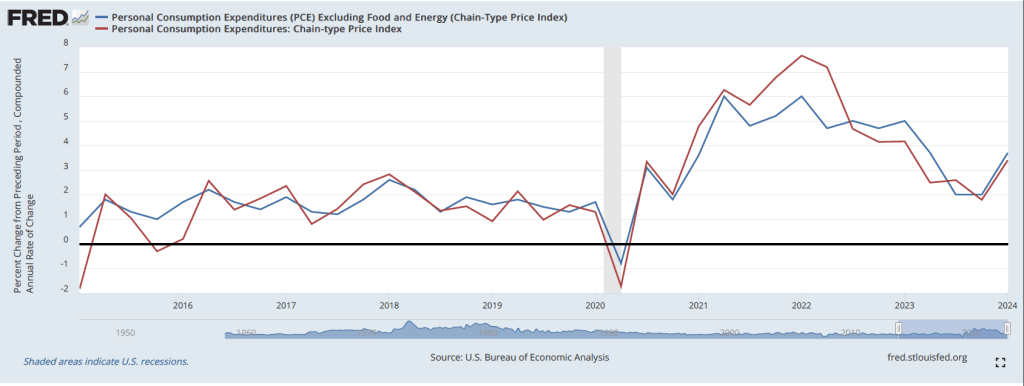
  3. Over longer periods, the two measures of inflation often move fairly closely together as the following figure shows, although CPI inflation tends to be somewhat higher than PCE inflation. The values of both series are the percentage change in the index from the same month in the previous year.

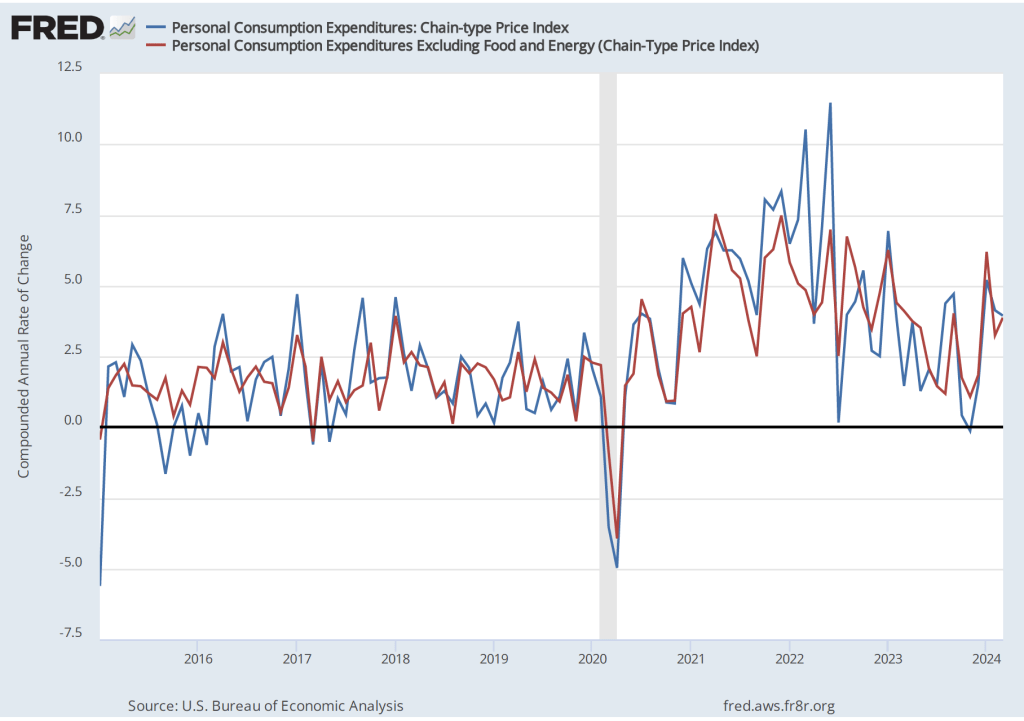
Turning to the PCE data for January released in the BEA’s latest “Personal Income and Outlays” report, the PCE inflation data were broadly consistent with the CPI data: Inflation in January increased somewhat from December. The first of the following figures shows PCE inflation and core PCE inflation—which excludes energy and food prices—for the period since January 2015 with inflation measured as the change in PCE from the same month in the previous year.  The second figure shows PCE inflation and core PCE inflation measured as the inflation rate calculated by compounding the current month’s rate over an entire year. (The first figure shows what is sometimes called 12-month inflation and the second figure shows 1-month inflation.)

The two inflation measures are telling markedly different stories: 12-month inflation shows a continuation in the decline in inflation that began in 2022. Twelve-month PCE inflation fell from 2.6 percent in December to 2.4 percent in January. Twelve-month core PCE inflation fell from 2.9 percent in December to 2.8 percent in December. So, by this measure, inflation continues to approach the Fed’s 2 percent inflation target.

One-month PCE and core PCE inflation both show sharp increases from December to January: From 1.4 percent in December to 4.2 percent for 1-month PCE inflation and from 1.8 percent in December to 5.1 percent in January for 1-month core PCE inflation.

The one-month inflation data are bad news in that they may indicate that inflation accelerated in January and that the Fed is, therefore, further away than it seemed in December from hitting its 2 percent inflation target. But it’s important not to overinterpret a single month’s data. Although 1-month inflation is more volatile than 12-month inflation, the broad trend in 1-month inflation had been downwards from mid-2022 through December 2023. It will take at least a more months of data to assess whether this trend has been broken.

Fed officials didn’t appear to be particularly concerned by the news. For instance, according to an article on bloomberg.com, Federal Reserve Bank of Atlanta President Raphael Bostic noted that: “The last few inflation readings—one came out today—have shown that this is not going to be an inexorable march that gets you immediately to 2%, but that rather there are going to be some bumps along the way.” Investors appear to continue to expect that the Fed will cut its target for the federal funds rate at its meeting on June 11-12.

Will the United States Experience a Sustained Boom in the Growth Rate of Labor Productivity?

Blue Planet Studio/Shutterstock

Recent articles in the business press have discussed the possibility that the U.S. economy is entering a period of higher growth in labor productivity:

“Fed’s Goolsbee Says Strong Hiring Hints at Productivity Growth Burst” (link)

“US Productivity Is on the Upswing Again. Will AI Supercharge It?” (link)

“Can America Turn a Productivity Boomlet Into a Boom?” (link)

In Macroeconomics, Chapter 16, Section 16.7 (Economics, Chapter 26, Section 26.7), we highlighted  the role of growth in labor productivity in explaining the growth rate of real GDP using the following equations. First, an identity:

Real GDP = Number of hours worked x (Real GDP/Number of hours worked),

where (Real GDP/Number of hours worked) is labor productivity.

And because an equation in which variables are multiplied together is equal to an equation in which the growth rates of these variables are added together, we have:

Growth rate of real GDP = Growth rate of hours worked + Growth rate of labor productivity

From 1950 to 2023, real GDP grew at annual average rate of 3.1 percent. In recent years, real GDP has been growing more slowly. For example, it grew at a rate of only 2.0 percent from 2000 to 2023. In February 2024, the Congressional Budget Office (CBO) forecasts that real GDP would grow at 2.0 percent from 2024 to 2034. Although the difference between a growth rate of 3.1 percent and a growth rate of 2.0 percent may seem small, if real GDP were to return to growing at 3.1 percent per year, it would be $3.3 trillion larger in 2034 than if it grows at 2.0 percent per year. The additional $3.3 trillion in real GDP would result in higher incomes for U.S. residents and would make it easier for the federal government to reduce the size of the federal budget deficit and to better fund programs such as Social Security and Medicare. (We discuss the issues concerning the federal government’s budget deficit in this earlier blog post.)

Why has growth in real GDP slowed from a 3.1 percent rate to a 2.0 percent rate? The two expressions on the right-hand side of the equation for growth in real GDP—the growth in hours worked and the growth in labor productivity—have both slowed. Slowing population growth and a decline in the average number of hours worked per worker have resulted in the growth rate of hours worked to slow substantially from a rate of 2.0 percent per year from 1950 to 2023 to a forecast rate of only 0.4 percent per year from 2024 to 2034.

Falling birthrates explains most of the decline in population growth. Although lower birthrates have been partially offset by higher levels of immigration in recent years, it seems unlikely that birthrates will increase much even in the long run and levels of immigration also seem unlikely to increase substantially in the future. Therefore, for the growth rate of real GDP to increase significantly requires increases in the rate of growth of labor productivity.

The Bureau of Labor Statistics (BLS) publishes quarterly data on labor productivity. (Note that the BLS series is for labor productivity in the nonfarm business sector rather than for the whole economy. Output of the nonfarm business sector excludes output by government, nonprofit businesses, and households. Over long periods, growth in real GDP per hour worked and growth in real output of the nonfarm business sector per hour worked have similar trends.) The following figure is taken from the BLS report “Productivty and Costs,” which was released on February 1, 2024.

Note that the growth in labor productivity increased during the last three quarters of 2023, whether we measure the growth rate as the percentage change from the same quarter in the previous year or as growth in a particular quarter expressed as anual rate. It’s this increase in labor productivity during 2023 that has led to speculation that labor productivity might be entering a period of higher growth. The following figure shows labor productivity growth, measured as the percentage change from the same quarter in the previous year for the whole period from 1950 to 2023.

The figure indicates that labor productivity has fluctuated substantially over this period. We can note, in particular, productivity growth during two periods: First, from 2011 to 2018, labor productivity grew at the very slow rate of 0.9 percent per year. Some of this slowdown reflected the slow recovery of the U.S. economy from the Great Recession of 2007-2009, but the slowdown persisted long enough to cause concern that the U.S. economy might be entering a period of stagnation or very slow growth.

Second, from 2019 through 2023, labor productivity went through very large swings. Labor productivity experienced strong growth during 2019, then, as the Covid-19 pandemic began affecting the U.S. economy, labor productivity soared through the first half of 2021 before declining for five consecutive quarters from the first quarter of 2022 through the first quarter of 2023—the first time productivity had fallen for that long a period since the BLS first began collecting the data. Although these swings were particularly large, the figure shows that during and in the immediate aftermath of recessions labor productivity typically fluctuates dramatically. The reason for the fluctuations is that firms can be slow to lay workers off at the beginning of a recession—which causes labor productivity to fall—and slow to hire workers back during the beginning of an economy recovery—which causes labor productivity to rise. 

Does the recent increase in labor productivity growth represent a trend? Labor productivity, measured as the percentage change since the same quarter in the previous year, was 2.7 percent during the fourth quarter of 2023—higher than in any quarter since the first quarter of 2021. Measured as the percentage change from the previous quarter at an annual rate, labor productivity grew at a very high average rate of 3.9 during the last three quarters of 2023. It’s this high rate that some observers are pointing to when they wonder whether growth in labor productivity is on an upward trend.

As with any other economic data, you should use caution in interpreting changes in labor productivity over a short period. The productivity data may be subject to large revisions as the two underlying series—real output and hours worked—are revised in coming months. In addition, it’s not clear why the growth rate of labor productivity would be increasing in the long run. The most common reasons advanced are: 1) the productivity gains from the increase in the number of people working from home since the pandemic, 2) businesses’ increased use of artificial intelligence (AI), and 3) potential efficiencies that businesses discovered as they were forced to operate with a shortage of workers during and after the pandemic.

To this point it’s difficult to evaluate the long-run effects of any of these factors. Wconomists and business managers haven’t yet reached a consensus on whether working from home increases or decreases productivity. (The debate is summarized in this National Bureau of Economic Research Working Paper, written by Jose Maria Barrero of Instituto Tecnologico Autonomo de Mexico, and Steven Davis and Nicholas Bloom of Stanford. You may need to access the paper through your university library.)

Many economists believe that AI is a general purpose technology (GPT), which means that it may have broad effects throughout the economy. But to this point, AI hasn’t been adopted widely enough to be a plausible cause of an increase in labor productivity. In addition, as Erik Brynjolfsson and Daniel Rock of MIT and Chad Syverson of the University of Chicago argue in this paper, the introduction of a GPT may initially cause productivity to fall as firms attempt to use an unfamiliar technology. The third reason—efficiency gains resulting from the pandemic—is to this point mainly anecdotal. There are many cases of businesses that discovered efficiencies during and immediately after Covid as they struggled to operate with a smaller workforce, but we don’t yet know whether these cases are sufficiently common to have had a noticeable effect on labor productivity.

So, we’re left with the conclusion that if the high labor productivity growth rates of 2023 can be maintained, the growth rate of real GDP will correspondingly increase more than most economists are expecting. But it’s too early to know whether recent high rates of labor productivty growth are sustainable.

Shrinkflation in the Comic Book Industry

Action Comics No. 1, published in June 1938, is often consider the first superhero comic book. (Image from comics.org.)

In a political advertisement that ran before the broadcast of the Super Bowl, President Joe Biden discussed shrinkflation, which refers to firms reducing the quantity of a product in container while keeping the price unchanged. In this post from the summer of 2022, we discussed examples of shrinkflation—including Chobani reducing the quantity of yogurt in the package shown here from 5.3 ounces to 4.5 ounces—and noted that shrinkflation complicates the job of the Bureau of Labor Statistics when compiling the consumer price index. 

This yogurt remained the same price although the quantity of yogurt in the container shrank from 5.3 ounces to 4.5 ounces.

Shrinkflation isn’t new; firms have used the strategy for decades. Firms are particularly likely to use shrinkflation during periods of high inflation or during periods when the federal government implements price controls.  Firms also sometimes resort to shrinkflation when the the price of a product has remained constant for long enough that the firms fear that consumers will react strongly to the firms increasing the price.

Comic books provide an interesting historical example of shrinkflation. David Palmer, a professor of management at South Dakota State University published an article in 2010 in which he presented data on the price and number of pages in copies of Action Comics from 1938 to 2010. When DC Comics introduced Superman in the first issue of Action Comics in June 1938, it started the superhero genre of comic books. Action Comics No. 1 had a price of $0.10 and was 64 pages.

After the United States entered World War II in December 1941, the federal government imposed price controls to try to limit the inflation caused by the surge in spending to fight the war. Rising costs of producing comic books, combined with the difficulty in raising prices because of the controls, led comic book publishers to engage in shrinkflation. In 1943, the publishers reduced the number of pages in their comics from 64 to 56. In 1944, the publishers engaged in further shrinkflation, reducing the number of pages from 56 to 48.

In 1951, during the Korean War, the federal government again imposed price controls. Comic book publishers responded with further shrinkflation, keeping the price at $0.10, while reducing the number of pages from 48 to 40. In 1954, they shrank the number of pages to 36, which remains the most common number of pages in a comic book today. At that time, the publishers also slightly reduced the width of comics from 7 3/4 inches to 7 1/8 inches. (Today the typical comic book has a width of 6 7/8 inches.)

By the late 1950s, comic book publishers became convinced that they would be better off raising the prices of comic books rather than further shrinking the number of pages. But they were reluctant to raise their prices because they had been a constant $0.10 for more than 20 years, so children and their parents might react very negatively to a price increase, and because no firm wanted to be the first to raise its price for fear of losing sales to its competitors. They were caught in a prisoner’s dilemma: Comic book publishers would all have been better off if they had raised their prices but the antitrust laws kept them from colluding to raise prices and no individual firm had an incentive to raise prices alone. (We discuss collusion, prisoner’s dilemmas, and other aspects of oligopolistic firm behaviour in Chapter 14 of Microeconomics and Economics.)

The most successful publisher in the 1950s was Dell, which sold very popular comic books featuring Donald Duck, Uncle Scrooge, and other characters that particularly appealed to younger children. Because the prices of Dell’s comic books, like those of other publishers, been unchanged at $0.10 since the late 1930s, the firm didn’t have a clear idea of the price elasticity of demand for its comics. In 1957, the firm’s managers decided to use a market experiment to gather data on the price elasticity of demand. In most cities, Dell kept the price of its comics at $0.10, but in some cities it sold the identical comics at a price of $0.15.

The experiment lasted from March 1957 to August 1958 when the company discontinued it by reverting to selling all of its comics for $0.10. Although we lack the data necessary to compare the sales of Dell comics with a $0.15 price to the sales of Dell comics with a $0.10 price, the fact that no other publisher raised its prices during that period and that Dell abandoned the experiment indicates that the demand curve for Dell’s comics was price elastic—the percentage decline in the quantity sold was greater than the 50 percent increase in price—so Dell’s revenue from sales in the cities selling comics with a price of $0.15 likely declined. Dell’s strategy can be seen as a failed example of price leadership. (We discuss the relationship between the price elasticity of demand for a good and the total revenue a firm earns from selling the good in Chapter 6, Section 6.3 of Microeconomics and Economics. We discuss price leadership in Microeconomic and Economics, Chapter 14, Section 14.2.)

In March 1961, Dell increased the price of all of its comics from $0.10 to $0.15. At first, Dell’s competitors kept the prices of their comics at $0.10. As a result, in September 1961, Dell cut the price of its comics from $0.15 to $0.12. By early 1962, Dell’s competitors, including DC Comics, Marvel Comics—publishers of Spider-Man and the Fantastic Four—along with several smaller publishers, had increased the prices of their comics from $0.10 to $0.12. The managers at DC decided that raising the price of comics after having kept it constant for so long required an explantion. Accordingly, they printed the following letter in each of their comics.

H/T to Buddy Saunders for the image.

Comic book publishers have raised their prices many times since the early 1960s, with most comics currently having a price of $4.99. During the recent period of high inflation, comic publishers did not use a strategy of shrinkflation perhaps because they believe that 36 pages is the minimum number that buyers will accept.

The first 25 years of the comic book industry represents an interesting historical example of shrinkflation.

Surprisingly Strong CPI Report

Photo courtesy of Lena Buonanno.

As we’ve discussed in several blog posts (for instance, here and here), recent macro data have been consistent with the Federal Reserve being close to achieving a soft landing. The Fed’s increases in its target for the federal funds rate have slowed the growth of aggregate demand sufficiently to bring inflation closer to the Fed’s 2 percent target, but haven’t, to this point, slowed the growth of aggregate demand so much that the U.S. economy has been pushed into a recession.

By January 2024, many investors in financial markets and some economists were expecting that at its meeting on March 19-20, the Fed’s Federal Open Market Committee would be cutting its target for the federal funds. However, members of the committee—notably, Chair Jerome Powell—have been cautious about assuming prematurely that inflation had, in fact, been brought under control. In fact, in his press conference on January 31, following the committee’s most recent meeting, Powell made clear that the committee was unlikely to reduce its target for the federal funds rate at its March meeting. Powell noted that “inflation is still too high, ongoing progress in bringing it down is not assured, and the path forward is uncertain.”

Powell’s caution seemed justified when, on February 2, the Bureau of Labor Statistics (BLS) released its most recent “Employment Situation Report” (discussed in this post). The report’s data on growth in employment and growth in wages, as measured by the change in average hourly earnings, might be indicating that aggregate demand is growing too rapidly for inflation to continue to decline.

The BLS’s release today (February 13) of its report on the consumer price index (CPI) (found here) for January provided additional evidence that the Fed may not yet have put inflation on a firm path back to its 2 percent target. The average forecast of economists surveyed before the release of the report was that the increase in the version of the CPI that includes the prices of all goods and services in the market basket—often called headline inflation—would be 2.9 percent. (We discuss how the BLS constructs the CPI in Macroeconomics, Chapter 9, Section 19.4, Economics, Chapter 19, Section 19.4, and Essentials of Economics, Chapter 3, Section 13.4.) As the following figure shows, headline inflation for January was higher than expected at 3.1 percent (measured by the percentage change from the same month in the previous year), while core inflation—which excludes the prices of food and energy—was 3.9 percent. Headline inflation was lower than in December 2023, while core inflation was almost unchanged.

Although the values for January might seem consistent with a gradual decline in inflation, that conclusion may be misleading. Headline inflation in January 2023 had been surprisingly high at 6.4 percent. Hence, the comparision between the value of the CPI in January 2024 with the value in January 2023 may be making the annual CPI inflation rate seem artificially low. If we look at the 1-month inflation rate for headline and core inflation—that is the annual inflation rate calculated by compounding the current month’s rate over an entire year—the values are more concerning, as indicated in the following figure. Headline CPI inflation is 3.7 percent and core CPI inflation is 4.8 percent.

Even more concerning is the path of inflation in the prices of services. Chair Powell has emphasized that as supply chain problems have gradually been resolved, inflation in the prices of goods has been rapidly declining. But inflaion in services hasn’t declined nearly as much. Last summer he stated the point this way:

“Part of the reason for the modest decline of nonhousing services inflation so far is that many of these services were less affected by global supply chain bottlenecks and are generally thought to be less interest sensitive than other sectors such as housing or durable goods. Production of these services is also relatively labor intensive, and the labor market remains tight. Given the size of this sector, some further progress here will be essential to restoring price stability.”

The following figure shows the 1-month inflation rate in services prices. The figure shows that inflation in services has been above 4 percent in every month since July 2023. Inflation in services was a very high 8.7 percent in January. Clearly such large increases in the prices of services aren’t consistent with the Fed meeting its 2 percent inflation target.

How should we interpret the latest CPI report? First, it’s worth bearing in mind that a single month’s report shouldn’t be relied on too heavily. There can be a lot of volatility in the data month-to-month. For instance, inflation in the prices of services jumped from 4.7 percent in December to 8.7 percent in January. It seems unlikely that inflation in the prices of services will continue to be over 8 percent.

Second, housing prices are a large component of service prices and housing prices can be difficult to measure accurately. Notably, the BLS includes in its measure the implicit rental price that someone who owns his or her own home pays. The BLS calculates that implict rental price by asking consumers who own their own homes the following question: “If someone were to rent your home today, how much do you think it would rent for monthly, unfurnished and without utilities?” (The BLS discusses how it measures the price of housing services here.) In practice, it may be difficult for consumers to accurately answer the question if very few houses similar to theirs are currently for rent in their neighborhood.

Third, the Fed uses the personal consumption expenditures (PCE) price index, not the CPI, to gauge whether it is achieving its 2 percent inflation target. The Bureau of Economic Analysis (BEA) includes the prices of more goods and services in the PCE than the BLS includes in the CPI and measures housing services using a different approach than that used by the BLS. Although inflation as measured by changes in the CPI and as measured by changes in the PCE move roughly together over long periods, the two measures can differ significantly over a period of a few months. The difference between the two inflation measures is another reason not to rely too heavily on a single month’s CPI data.

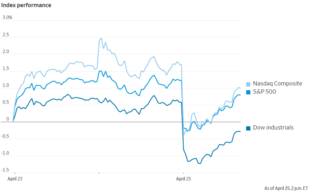
Despite these points, investors on Wall Street clearly interpreted the CPI report as bad news. Investors have been expecting that the Fed will soon cut its target for the federal funds rate, which should lead to declines in other key interest rates. If inflation continues to run well above the Fed’s 2 percent target, it seems likely that the Fed will keep its federal funds target at its current level for longer, thereby slowing the growth of aggregate demand and raising the risk of a recession later this year. Accordingly, the Dow Jones Industrial Average declined by more than 500 points today (February 13) and the interest rate on the 10-year Treasury note rose above 4.3 percent.

The FOMC has more than a month before its next meeting to consider the implications of the latest CPI report and the additional macro data that will be released in the meantime.