Weaker Than Expected Jobs Report Shakes Up Investors’ Expectations of FOMC Rate Cuts

This morning (August 1), the Bureau of Labor Statistics (BLS) released its “Employment Situation” report (often called the “jobs report”) for July. The data in the report show that the labor market was weaker than expected in July. There have been many stories in the media about firms becoming cautious in hiring as a result of the Trump administration’s tariff increases. Some large firms—including Microsoft, Walt Disney, Walmart, and Proctor and Gamble—have announced layoffs. In addition, real GDP growth slowed during the first half of the year. Nevertheless, until today it appeared that employment growth remained strong.

The jobs report has two estimates of the change in employment during the month: one estimate from the establishment survey, often referred to as the payroll survey, and one from the household survey. As we discuss in Macroeconomics, Chapter 9, Section 9.1 (Economics, Chapter 19, Section 19.1), many economists and Federal Reserve policymakers believe that employment data from the establishment survey provide a more accurate indicator of the state of the labor market than do the household survey’s employment data and unemployment data. (The groups included in the employment estimates from the two surveys are somewhat different, as we discuss in this post.)

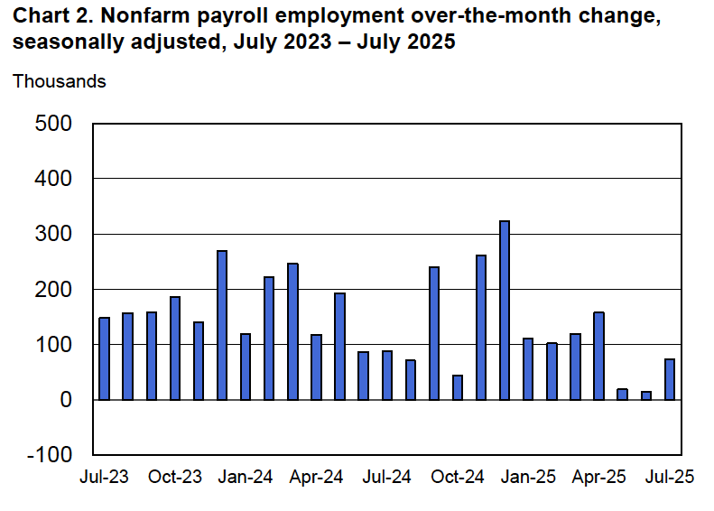
According to the establishment survey, there was a net increase of only 73,000 nonfarm jobs during July. This increase was below the increase of 1115,000 that economists surveyed by Factset had forecast. In addition, the BLS revised downward its previous estimates of employment in May and June by a combined 258,000 jobs. (The BLS notes that: “Monthly revisions result from additional reports received from businesses and government agencies since the last published estimates and from the recalculation of seasonal factors.”) The following figure from the jobs report shows the net change in nonfarm payroll employment for each month in the last two years. The figure shows the striking deceleration in job growth during the second quarter of this year.

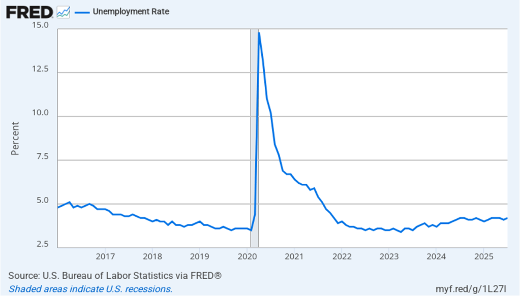
The unemployment rate increased from 4.1 percent in June to 4.2 percent in July, which is the same rate as economists surveyed had forecast. As the following figure shows, the unemployment rate has been remarkably stable over the past year, staying between 4.0 percent and 4.2 percent in each month since May 2024. In June, the members of the Federal Open Market Committee (FOMC) forecast that the unemployment rate for 2025 would average 4.5 percent. The unemployment rate would have to rise significantly in the second half of the year for that forecast to be accurate.

Each month, the Federal Reserve Bank of Atlanta estimates how many net new jobs are required to keep the unemployment rate stable. Given a slowing in the growth of the working-age population due to the aging of the U.S. population and a sharp decline in immigration, the Atlanta Fed currently estimates that the economy would have to create 111,573 net new jobs each month to keep the unemployment rate stable at 4.2 percent. If this estimate is accurate, continuing monthly net job increases of 73,000 would result in a slowly rising unemployment rate.

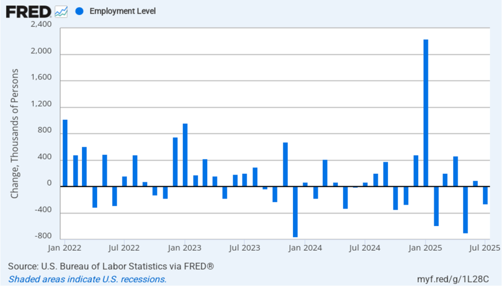
As the following figure shows, the monthly net change in jobs from the household survey moves much more erratically than does the net change in jobs from the establishment survey. As measured by the household survey, there was a net decrease of 260,000 jobs in July, following an increase of 93,000 jobs in June. As an indication of the volatility in the employment changes in the household survey note the very large swings in net new jobs in January and February. In any particular month, the story told by the two surveys can be inconsistent with employment increasing in one survey while falling in the other, which was the case this month. (In this blog post, we discuss the differences between the employment estimates in the two surveys.)

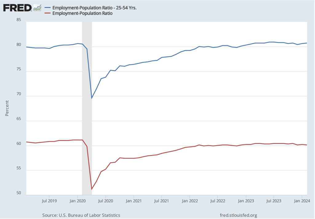
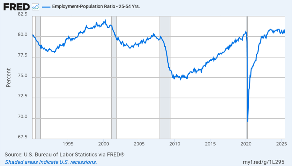
The household survey has another important labor market indicator: the employment-population ratio for prime age workers—those aged 25 to 54. In July the ratio declined to 80.4 percent from 80.7 percent in June. The prime-age employment-population ratio is somewhat below the high of 80.9 percent in mid-2024, but is still above what the ratio was in any month during the period from January 2008 to November 2019. Further declines in the prime-age employment-population ratio would be a strong indication of a softening labor market.

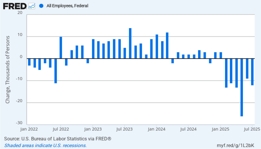
It is still unclear how many federal workers have been laid off since the Trump Administration took office. The establishment survey shows a decline in federal government employment of 12,000 in June and a total decline of 84,000 since the beginning of February 2025. However, the BLS notes that: “Employees on paid leave or receiving ongoing severance pay are counted as employed in the establishment survey.” It’s possible that as more federal employees end their period of receiving severance pay, future jobs reports may report a larger decline in federal employment. To this point, the decline in federal employment has been too small to have a significant effect on the overall labor market.

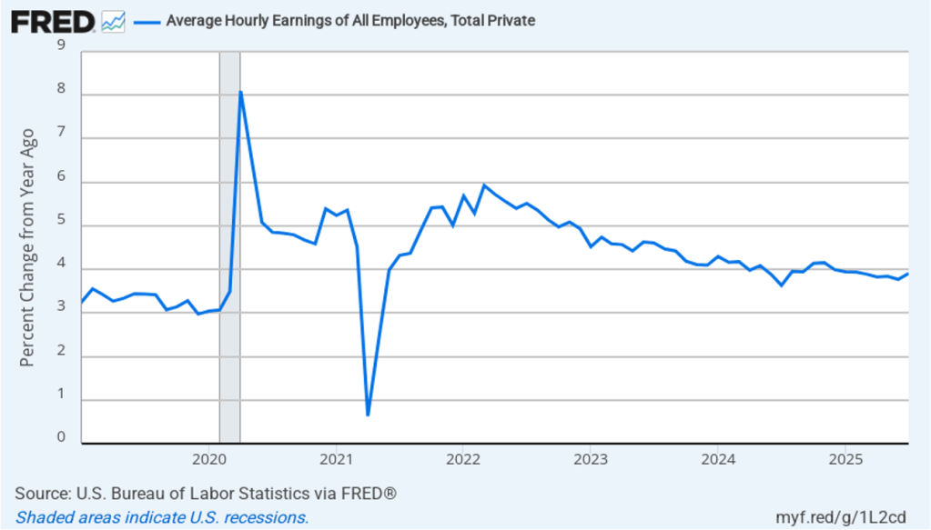
The establishment survey also includes data on average hourly earnings (AHE). As we noted in this post, many economists and policymakers believe the employment cost index (ECI) is a better measure of wage pressures in the economy than is the AHE. The AHE does have the important advantage of being available monthly, whereas the ECI is only available quarterly. The following figure shows the percentage change in the AHE from the same month in the previous year. The AHE increased 3.9 percent in July, up from an increase of 3.8 percent in June.

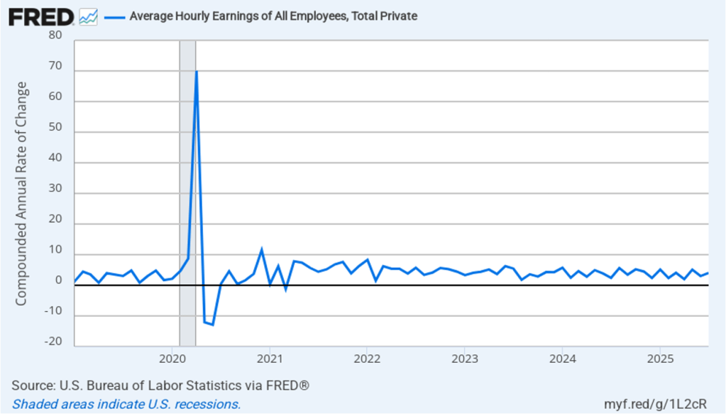
The following figure shows wage inflation calculated by compounding the current month’s rate over an entire year. (The figure above shows what is sometimes called 12-month wage inflation, whereas this figure shows 1-month wage inflation.) One-month wage inflation is much more volatile than 12-month wage inflation—note the very large swings in 1-month wage inflation in April and May 2020 during the business closures caused by the Covid pandemic. In July, the 1-month rate of wage inflation was 4.0 percent, up from 3.0 percent in June. If the July rate of wage inflation is sustained, it would complicate the Fed’s task of achieving its 2 percent target rate of price inflation. But one month’s data from such a volatile series may not accurately reflect longer-run trends in wage inflation.

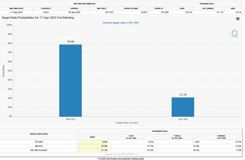
What effect might today’s jobs report have on the decisions of the Federal Reserve’s policymaking Federal Open Market Committee (FOMC) with respect to setting its target for the federal funds rate? One indication of expectations of future changes in the FOMC’s target for the federal funds rate comes from investors who buy and sell federal funds futures contracts. (We discuss the futures market for federal funds in this blog post.) Yesterday, as we noted in a blog post, investors assigned a 60.8 percent probability to the committee keeping its target unchanged at 4.25 percent to 4.50 percent at its September 16–17 meeting. As the following figure shows, there has been a sharp change in investors’ expectations. As of this morning, investors are assigning a 78.9 percent probability to the committee cutting its target by 0.25 percentage point (25 basis points) to a range of 4.00 percent to 4.25 percent.

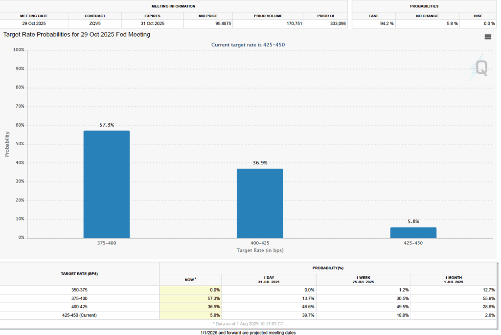
There is a similarly dramatic change in investors’ expectations of the target range for the federal funds rate following the FOMC’s October 28–29 meeting. As the following figure shows, investors now assign a probability of 57.3 percent to the committee lowering its target range to 3.75 percent to 4.00 percent at that meeting. Yesterday, investors assigned a probability of only 13.7 percent to that outcome.

Key Macro Data Series during the Time Since the Arrival of Covid–19 in the United States

A bookstore in New York City closed during Covid. (Photo from the New York Times)

Four years ago, in mid-March 2020, Covid–19 began to significantly affect the U.S. economy, with hospitalizations rising and many state and local governments closing schools and some businesses. In this blog post we review what’s happened to key macro variables during the past four years. Each monthly series starts in February 2020 and the quarterly series start in the fourth quarter of 2019.

Production

Real GDP declined by 5.8 percent from the fourth quarter of 2019 to the first quarter of 2020 and by an additional 28.0 percent from the first quarter of 2020 to the second quarter. This decline was by far the largest in such a short period in the history of the United States. From the second quarter to the third quarter of 2020, as businesses began to reopen, real GDP increased by 34.8 percent, which was by far the largest increase in a single quarter in U.S. history.

Industrial production followed a similar—although less dramatic—path to real GDP, declining by 16.8 percent from February 2020 to April 2020 before increasing by 12.3 percent from April 2020 to June 2020. Industrial production did not regain its February 2020 level until March 2022. The swings in industrial production were smaller than the swings in GDP because industrial production doesn’t include the output of the service sector, which includes firms like restaurants, movie theaters, and gyms that were largely shutdown in some areas. (Industrial production measures the real output of the U.S. manufacturing, mining, and electric and gas utilities industries. The data are issued by the Federal Reserve and discussed here.)

Employment

Nonfarm payroll employment, collected by the Bureau of Labor Statistics (BLS) in its establishment survey, followed a path very similar to the path of production. Between February and April 2020, employment declined by an astouding 22 million workers, or by 14.4 percent. This decline was by far the largest in U.S. history over such a short period. Employment increased rapidly beginning in April but didn’t regain its February 2020 level until June 2022.

The employment-population ratio measures the percentage of the working-age population that is employed. It provides a more comprehensive measure of an economy’s utilization of available labor than does the total number of people employed. In the following figure, the blue line shows the employment-population ratio for the whole working-age population and the red line shows the employment-population ratio for “prime age workers,” those aged 25 to 54.

For both groups, the employment-population ratio plunged as a result of Covid and then slowly recovered as the production began increasing after April 2020. The employment-population ratio for prime age workers didn’t regain its February 2020 value until February 2023, an indication of how long it took the labor market to fully overcome the effects of the pandemic. As of February 2024, the employment-population ratio for all people of working age hasn’t returned to its February 2020 value, largely because of the aging of the U.S. population.

Average weekly hours worked followed an unusual pattern, declining during March 2020 but then increasing to beyond its February 2020 level to a peak in April 2021. This increase reflects firms attempting to deal with a shortage of workers by increasing the hours of those people they were able to hire. By April 2023, average weekly hours worked had returned to its February 2020 level.

Income

Real average hourly earnings surged by more than six percent between February and April 2020—a very large increase over a two-month period. But some of the increase represented a composition effect—as workers with lower incomes in services industries such as restaurants were more likely to be out of work during this period—rather than an actual increase in the real wages received by people employed during both months. (Real average hourly earnings are calculated by dividing nominal average hourly earnings by the consumer price index (CPI) and multiplying by 100.)

Median weekly real earnings, because it is calculated as a median rather than as an average (or mean), is less subject to composition effects than is real average hourly earnings. Median weekly real earnings increased sharply between February and April of 2020 before declining through June 2022. Earnings then gradually increased. In February 2024 they were 2.5 percent higher than in February 2020.

Inflation

The inflation rate most commonly mentioned in media reports is the percentage change in the CPI from the same month in the previous year. The following figure shows that inflation declined from February to May 2020. Inflation then began to rise slowly before rising rapidly beginning in the spring of 2021, reaching a peak in June 2022 at 9.0 percent. That inflation rate was the highest since November 1981. Inflation then declined steadily through June 2023. Since that time it has fluctuated while remaining above 3 percent.

As we discuss in Macroeconomics, Chapter 15, Section 15.5 (Economics, Chapter 25, Section 25.5), the Federal Reserve gauges its success in meeting its goal of an inflation rate of 2 percent using the personal consumption expenditures (PCE) price index. The following figure shows that PCE inflation followed roughly the same path as CPI inflation, although it reached a lower peak and had declined below 3 percent by November 2023. (A more detailed discussion of recent inflation data can be found in this post and in this post.)

Monetary Policy

The following figure shows the effective federal funds rate, which is the rate—nearly always within the upper and lower bounds of the Fed’s target range—that prevails during a particular period in the federal funds market. In March 2020, the Fed cut its target range to 0 to 0.25 percent in response to the economic disruptions caused by the pandemic. It kept the target unchanged until March 2022 despite the sharp increase in inflation that had begun a year earlier. The members of the Federal Reserve’s Federal Open Market Committee (FOMC) had initially hoped that the surge in inflation was largely caused by disuptions to supply chains and would be transitory, falling as supply chains returned to normal. Beginning in March 2022, the FOMC rapidly increased its target range in response to continuing high rates of inflation. The targer range reached 5.25 to 5.50 percent in July 2023 where it has remained through March 2024.


Although the money supply is no longer the focus of monetary policy, some economists have noted that the rate of growth in the M2 measure of the money supply increased very rapidly just before the inflation rate began to accelerate in the spring of 2021 and then declined—eventually becoming negative—during the period in which the inflation rate declined.

As we discuss in the new 9th edition of Macroeconomics, Chapter 15, Section 15.5 (Economics, Chapter 25, Section 25.5), some economists believe that the FOMC should engage in nominal GDP targeting. They argue that this approach has the best chance of stabilizing the growth rate of real GDP while keeping the inflation rate close to the Fed’s 2 percent target. The following figure shows the economy experienced very high rates of inflation during the period when nominal GDP was increasing at an annual rate of greater than 10 percent and that inflation declined as the rate of nominal GDP growth declined toward 5 percent, which is closer to the growth rates seen during the 2000s. (This figure begins in the first quarter of 2000 to put the high growth rates in nominal GDP of 2021 and 2022 in context.)

Fiscal Policy

As we discuss in the new 9th edition of Macroeconomics, Chapter 15 (Economics, Chapter 25), in response to the Covid pandemic Congress and Presidents Trump and Biden implemented the largest discretionary fiscal policy actions in U.S. history. The resulting increases in spending are reflected in the two spikes in federal government expenditures shown in the following figure.

The initial fiscal policy actions resulted in an extraordinary increase in federal expenditures of $3.69 trillion, or 81.3 percent, from the first quarter to the second quarter of 2020. This was followed by an increase in federal expenditures of $2.31 trillion, or 39.4 percent, from the fourth quarter of 2020 to the first quarter of 2021. As we recount in the text, there was a lively debate among economists about whether these increases in spending were necessary to offest the negative economic effects of the pandemic or whether they were greater than what was needed and contributed substantially to the sharp increase in inflation that began in the spring of 2021.

Saving

As a result of the fiscal policy actions of 2020 and 2021, many households received checks from the federal government. In total, the federal government distributed about $80o billion directly to households. As the figure shows, one result was to markedly increase the personal saving rate—measured as personal saving as a percentage of disposable personal income—from 6.4 percent in December 2019 to 22.0 in April 2020. (The figure begins in January 2020 to put the size of the spike in the saving rate in perspective.) 

The rise in the saving rate helped households maintain high levels of consumption spending, particularly on consumer durables such as automobiles. The first of the following figure shows real personal consumption expenditures and the second figure shows real personal consumption expenditures on durable goods.

Taken together, these data provide an overview of the momentous macroeconomic events of the past four years.