
Photo of U.S. President Donald Trump and China President Xi Jinping from Reuters.
The tit-for-tat tariff increases the U.S. and Chinese governments have levied on each other’s imports have reached dizzying heights today (April 11). The United States has imposed a tariff rate of 134.7 percent on imports from China, while China has imposed a tariff rate of 147.6 percent on imports from the United States. On all other countries—the rest of the world (ROW)—the United States imposes an average tariff rate of 10.5 percent, which is a sharp increase reflecting the Trump Administration’s imposition of a tariff of at least 10 percent on all countries. The government of China imposes a tariff rate of 6.5 percent on the ROW.
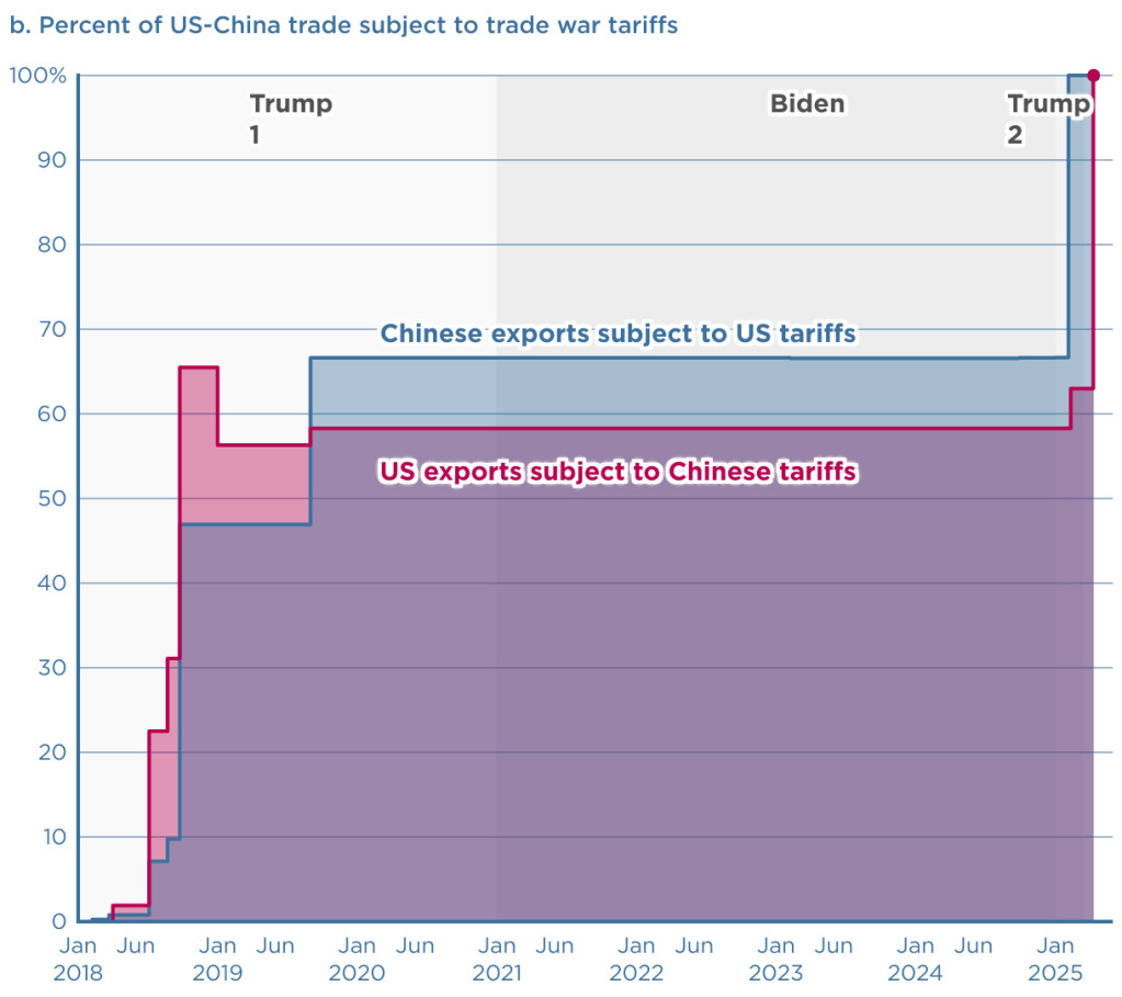
The Peterson Institute for International Economics (PIIE) is a think tank located in Washington, DC. Chad Brown, a senior fellow at PIIE, has created two charts that dramatically illustrate the current state of the U.S.-China trade war. The first chart shows the changes since the beginning of the first Trump Administration in 2017 in the tariff rates the countries have imposed on each other’s imports.

The second chart shows the percentage of each country’s exports to the other country that have been subject to tariffs. As of today, 100 percent of each country’s exports are subject to the other country’s tariffs.
Finally, we repeat a figure from an earlier blog post showing changes over time in the average tariff rate the United States levies on imports. The value for 2025 of 16.5 percent is an estimate by the Tax Foundation and assumes that the tariff rates that the Trump Administration announced on April 2 go into force, although the rates are currently suspended for 90 days—apart from those imposed on China. (An average tariff rate of 16.5 percent would be the highest levied by the United States since 1937.)

Thanks to Fernando Quijano for preparing this figure.
